
Acknowledgements: Thanks are due to Graham Dry for commenting on an earlier draft and providing research material and invaluable advice. I am also indebted to Jane Gleeson-White, Gleeson White’s great-grandaughter and to Sarah Hill, another great-grandaughter. The family was more than generous in recounting anecdotes and providing me with access to archive material.
Introduction
Joseph William Gleeson White (1851–98), more generally known only as Gleeson White, was a late Victorian critic, bookman, and man of letters. In his own time he was best known as the founding editor of The Studio (1893–5), and was instrumental in promoting the latest developments in art, literature and design. Under his guidance the new aesthetic of Art Nouveau was given a wider currency, with artists such as Aubrey Beardsley and the ‘Glasgow Four’ making their first appearance before the general public. The editor’s promotion of new ideas was further embodied in a series of books and articles. He wrote extensively on the principles of design, Christmas cards, book-plates, book-binding, modern painting in Britain, furniture and children’s illustration, and supplemented these interests with accounts of the history of art, English cathedrals, literary subjects such as the rondeau, contemporary poetry, and the nude in photography. Gleeson White is best known today as the author of English Illustration: The 1860s (1897), a compendious study of the period he designated the ‘Golden Age’ of Victorian book art.
Though diverse, these writings express a consistent body of thought and White’s commentaries were well-known and influential. As Catherine Delfyer explains, he ‘championed new talents and the most innovative trends in design and poetry’ (‘Gleeson’), and was regarded, in the words of Haldane Macfall as ‘one of the men’ of the nineties ‘who made the artistic and literary life of London’ (35). Especially important as an advocate of ‘Uranian’ aesthetics; an associate of Charles Ricketts and other gay artists, White helped to move the avant-garde into the mainstream. This inside knowledge accentuated the focus of his writing and made him into an expert in contemporary art and literature.
None of his criticism was disinterested, however: unlike most critics of the time, Gleeson White was a practitioner of some of the subjects he wrote about. Though self-trained, he was an accomplished designer and became in 1895 a member of the Art Workers’ Guild. His principal work was book art, divided between book-plates, decorative end-papers and book-covers. His bindings, always in cloth or paper, were mostly published by the art-specialists George Bell and are mainly in the style of Arts and Crafts while occasionally reflecting the impact of Art Nouveau. This work sits between the two idioms, a prime example of the influence of competing styles in the final years of the nineteenth century.
White produced more than thirty covers, but his contribution to the field is relatively little known; mentioned in general studies, there is no authoritative bibliography of his works. Hermann Muthesius’s essay in Decorative Kunst (1901), one of Gleeson White’s friends, is the most complete and sympathetic account, but in recent criticism the only useful account appears in Malcolm Haslam’s catalogue of 2012. Clearly, a detailed analysis remains to be done, the subject of an extended monograph. The main features of Gleeson White’s bindings are introduced in the following sections.
Gleeson White as a Critic of Book Binding
Gleeson White wrote at least two detailed articles on the art of book binding in which he projected his ideas on the subject. The first of these, ‘The Artistic Decoration of Cloth Book Covers’ (The Studio, 1894), is a detailed reflection on the aesthetics and practicalities of ‘modern binding’, and is most important for its definition of an ‘effective’ cover. Gleeson White’s writing style is usually over-elaborate, but in this article he narrows his requirements down to six criteria. A good binding, he says, involves appropriateness in each of these dimensions (20):
1. Fitness of the design to the contents of the book.
2. The size and style of lettering.
3. The proportion of the details of the decoration to the character of the surface of the fabric to be decorated.
4. The larger symmetry of the whole design in relation to the cover.
5. The cost of carrying out the design.
6. The skill of the firm who will undertake the production of the design.
He takes up parallel arguments in the second essay, ‘Some Recent Book-bindings by T. J. Cobden-Sanderson and Miss E. M. MacColl’ (The Studio, 1897, and reproduced on The Victorian Web). In this article he concentrates on aesthetics and functionality, stressing the interconnectedness of the two in the usual manner of Arts and Crafts practice. One of his key points is the need for originality: tired of ‘sham Japanese designs … naturalistic flowers [and] Beardsleyesque patterns’, he makes a direct appeal for a freshness that is ‘not fettered’ by ‘precedent’. ‘What we need,’ he says, is ‘originality without eccentricity’. More especially, these original designs should be closely matched with the purpose for which they were intended and could only function in this context. Decoration should ‘beautify the appearance of the book’ but not be a form of design that ‘would not be less appropriate upon a dozen other objects, in a dozen other materials’. Mindful of the many mid-Victorian bindings where the elaborate front covers could just as easily embellish a piece of architectural ornament – as in the case of bindings by Owen Jones or John Sliegh – White insists on cover designs being unambiguously conceived as decoration for a book. He stresses this connection by insisting that liveries should be structurally linked to the volume’s material form. The artist, he says, should make a ‘logical attempt to analyse the structural features of the book, and to plan the decoration accordingly’.
He complements this emphasis on functionality by highlighting the need for animated and vigorous pattern-making. Taking Cobden-Sanderson’s as an exemplar, he notes how the most harmonious cover will include ‘well-placed’ title lettering combined with ‘unending patterns’ which invigorate the surface. Further, the ‘mobile line’ as practised by Aubrey Beardsley and E. M. MacColl is a visual delight, and will always have the effect of ‘vitality’, of ‘subtle curves’ which become ‘part and parcel’ of the book’s aesthetic impact.
These reflections are developed at length and Gleeson White’s analysis of good practice is one of the few extended pieces of Victorian writing on the subject of book covers. Interestingly, he applied his definitions of effective binding to his own practice, and his bindings are almost programmatically linked to his pronouncements: he practised what he preached, and tried to embody his views on good design in his own creations. This theorizing is important, in other words, not only as an interesting meditation on contemporary binding, but also as a set of rules which enables us to make sense of his covers.
Consonance, Style, Structure
Gleeson White was centrally concerned with the ‘fitness of the design to the contents of the book’, and all of his covers are elegantly linked to the texts they enclose. None of his bindings is a literal representation of the contents, but always take the form of abstracted patterns which reflect on the writing’s character or tone.
In his design for English Illustration, his account of the complexities of book illustration of the 1860s, he visualizes the creativity of the movement in a pictorial metaphor, casing his book in a design made up of an elaborate topiary: geometrical in arrangement, the decorative units are arranged in a pattern of alternating bushels of rosettes and leaves which suggest the notion of endless growth and development. Sinuous, interlocked stems complete the impression of interconnectedness, projecting the idea of the artists’ interrelationships as part, so to speak, of a family tree.
This organic imagery is further deployed to visualize the contents of books as diverse as volumes of poetry and criticism of contemporary artists. The cover for another of his books, Ballades and Rondeaus (1888), is a dense foliate pattern in gilt, animating the surface of the boards with a swirling arabesque: lively and lyrical, its movement suggests the rhythmical lines of poetry. He uses similar patterns on his uniform casings for books appearing in the Aldine edition of popular poets’ works, and for the front cover of The Girl’s Annual (1895); both imply the vigour of the contents and the second of these is an especially dynamic arrangement in which a plant made up of radiating yellow flowers interlinks with a grid of lemon trees. Colour is important in this design, but the designs are principally conceived, in the terms applied to Beardsley and MacColl, as compositions made up of ‘unending patterns’ drawn with a ‘mobile line’, the undulating pattern derived from nature and found throughout Arts and Crafts design. It is only through this line, White insists, that ‘vitality’ is achieved, and his approach makes many other bindings of the period seem lifeless and dull.
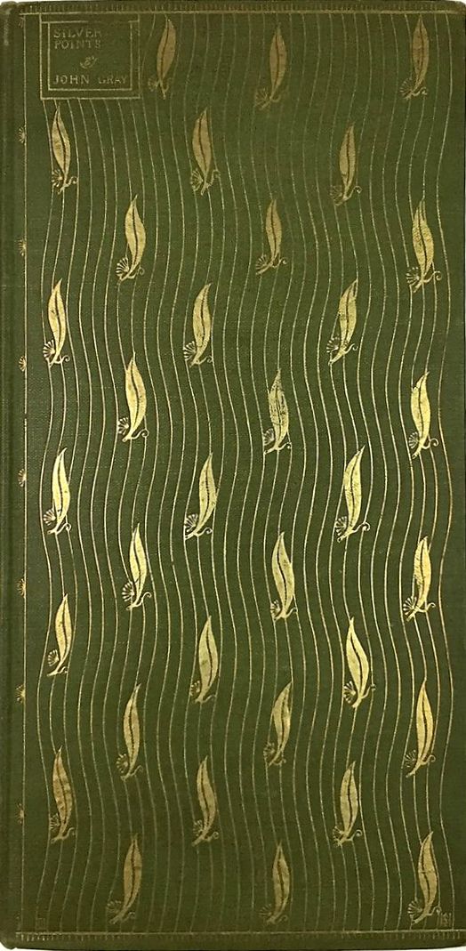
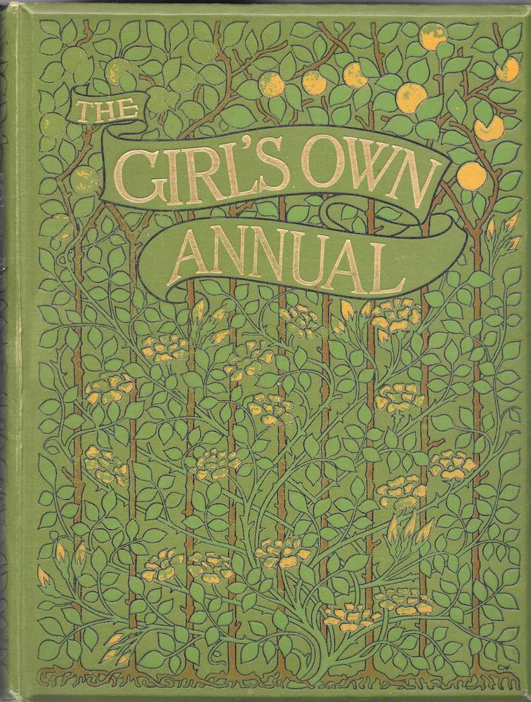
Left: A cover design by Charles Rickets for John Gray’s Silverpoints. Right: A cover design by Gleeson White for The Girl’s Own Annual. [Click on images to enlarge them.]
Equally important in animating the covers’ surfaces, however, is ‘the size and style of lettering’, the titling on the front board and spine. The titles are an imposing part of his designs and each is conceived as part of their dynamic. This treatment of the lettering as an element in the composition is partly learned from Charles Ricketts’s imaginative titles, but unlike his friend’s treatments, which are sometimes contained in a small panel as in the case of his work for John Gray’s Silverpoints (1893), White’s are exuberant proclamations of the volume’s identity. In his work, the emphasis is on clarity and balance, and most of his wording is larger and more prominent than that of either Ricketts or Beardsley. For The Girl’s Annual, he places the lettering in an imposing banner; for the title-panels of English Illustration and Albert Moore the words are contained in bold rectangular panels, geometrical interludes to contrast with the flowing natural forms that enclose them; and in the front cover for J. L. Thudichum’s Treatise on Wines the title is provocatively placed half-way down the board, moved to the right margin, and accentuated by two leaf-motifs. Most imposing of all is the titling for Ballads and Rondeaus, which takes the form of angular lettering placed within a dense field of swirling tendrils – a contrast of considerable impact.

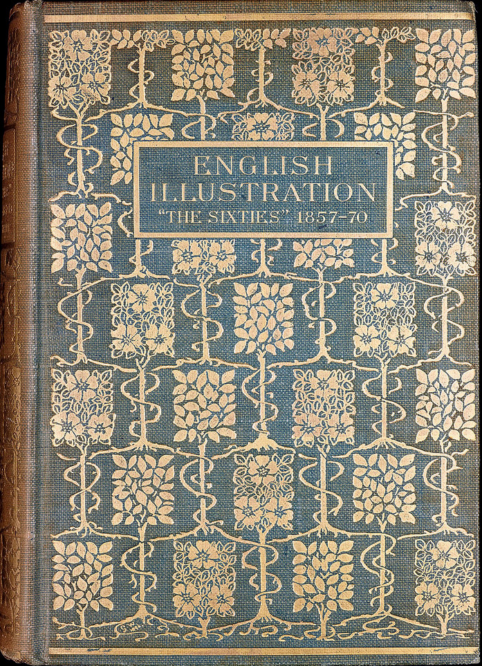
Two book cover designs by Gleeson White: Left: Albert Baldry’s Albert Moore. Right: his own classic English Illustration: The Sixties, 1855–70. [Click on images to enlarge them.]
All of these bindings are bold creations, but White never loses sight of the need for harmonious unties. ‘The proportion of the details’ to the whole is carefully considered and he also reminds us of the relationship between the composition and the book’s ‘structural features’. Essentially, his designs stress the fact that a book is made up of three physical elements: two oblong boards and a narrower, flexible oblong for the spine. In his work for Mrs Jameson’s Shakespeare’s Heroines he reaffirms the shape of the front board by creating a concentric pattern, with a rustic border enclosing an oblong panel; rosettes are placed at intervals which map the book’s shape while highlighting the lower border and title at the top edge. He likewise conceives the cover of Practical Designing, with its broken columns, as a piece of calculated asymmetry which defines the space of the upper board, and in the binding for Albert Moore the radiating foliage is framed in a thrice-repeated line, mapping the volume’s outer edges.
Gleeson White is most effective, however, fusing the boards and the spine. In Ballads and Rondeaus the two elements are linked by the same foliate pattern and in other books he stresses their interconnectedness by continuing lines and motifs from the front cover onto the back-strip. The Treatise on Wines gives another twist by reversing the situation so that lines from the spine reach out to connect with the boards. In this elegant design the back-strip is decorated with a sinuous vine-tendril; leaves emanate on either side and appear along the inner margins of the front cover. This principle is borrowed from the example of D. G. Rossetti’s cover for The Prince’s Progress (1866) and White was further influenced by the compressed gilt blocking on the binding of Rossetti’s Poems (1870), a visual connection that is especially evident in the relationship between the Poems and Practical Designing.
So Gleeson White embodied his ideals in his own design. In his criticism he appeals for a highly nuanced approach to the art of cover-design in which sinuous patterns are combined with bold titling and compositions that define the book’s external components while acting as an appropriate symbol of the book’s written text; and this is precisely what he does in his covers.
Arts and Crafts and Art Nouveau
Gleeson White’s designs are mainly based on the aesthetics of Arts and Crafts. Haslam brackets his work with the bindings of William Morris and Selwyn Image and there is clearly a continuity between his creations and those working in the idiom. His bindings, though intended for mass rather than elite audiences, embody the two central tenets of Morrisonian aesthetics. One is the emphasis on functionality – on covers symbolizing the text while defining the parameters of the material book; and the other is the focus on the ‘book beautiful’, the making of an object which though commonplace is made as appealing as it can be. In Morris’s resonant terms, Gleeson White’s creations are both beautiful and useful, ensuring that ‘whatever is made is good, and thoroughly fit for purpose’ (Morris, 267).
White’s membership of the Art Workers’ Guild meant he was immersed in these principles, and he also absorbed specific aspects of Morris’s style. Floral motifs, from daisies to roses, combined with dense interlaces of briars or tendrils, are as much a part of his art and they are of Morris’s; for example, the front covers for Albert Moore and The Poems of Herrick are strongly reminiscent of the congested borders appearing on the pages of the Kelmscott Chaucer while also alluding to Morris’s wall-papers, carpets, and textiles. White may have insisted that bindings should be defined only in terms of their application to a book, but he drew heavily on motifs embellishing many other types of objects, and does not seem to have noticed the inconsistency of his stance.
In part naturalistic and in part heavily patterned in the manner of Arts and Crafts design, these covers are generally defined, in the celebrated terms of Mario Praz, by their fear of emptiness, the horror vacui. In most of his works, space is filled with floral motifs in restless patterns. Yet White experimented, somewhat paradoxically, with the emerging conventions of Art Nouveau as well. Some of his work reflects the influence of liveries by Beardsley and Ricketts, with their emphasis on lean patterns and blank spaces; Rossetti’s exemplars from the sixties, which prefigure Art Nouveau, are another presence, and so is the applied art of C. R. Mackintosh. The Master Painters of Britain presents a floral motif of extended, sinuous forms in the manner of the Glasgow school, but White’s most accomplished designs in this idiom are the Treatise on Wines, the cover for Malcolm Bell’s monograph, Sir Edward Burne-Jones, and the binding for David Martin’s The Glasgow School of Painting.
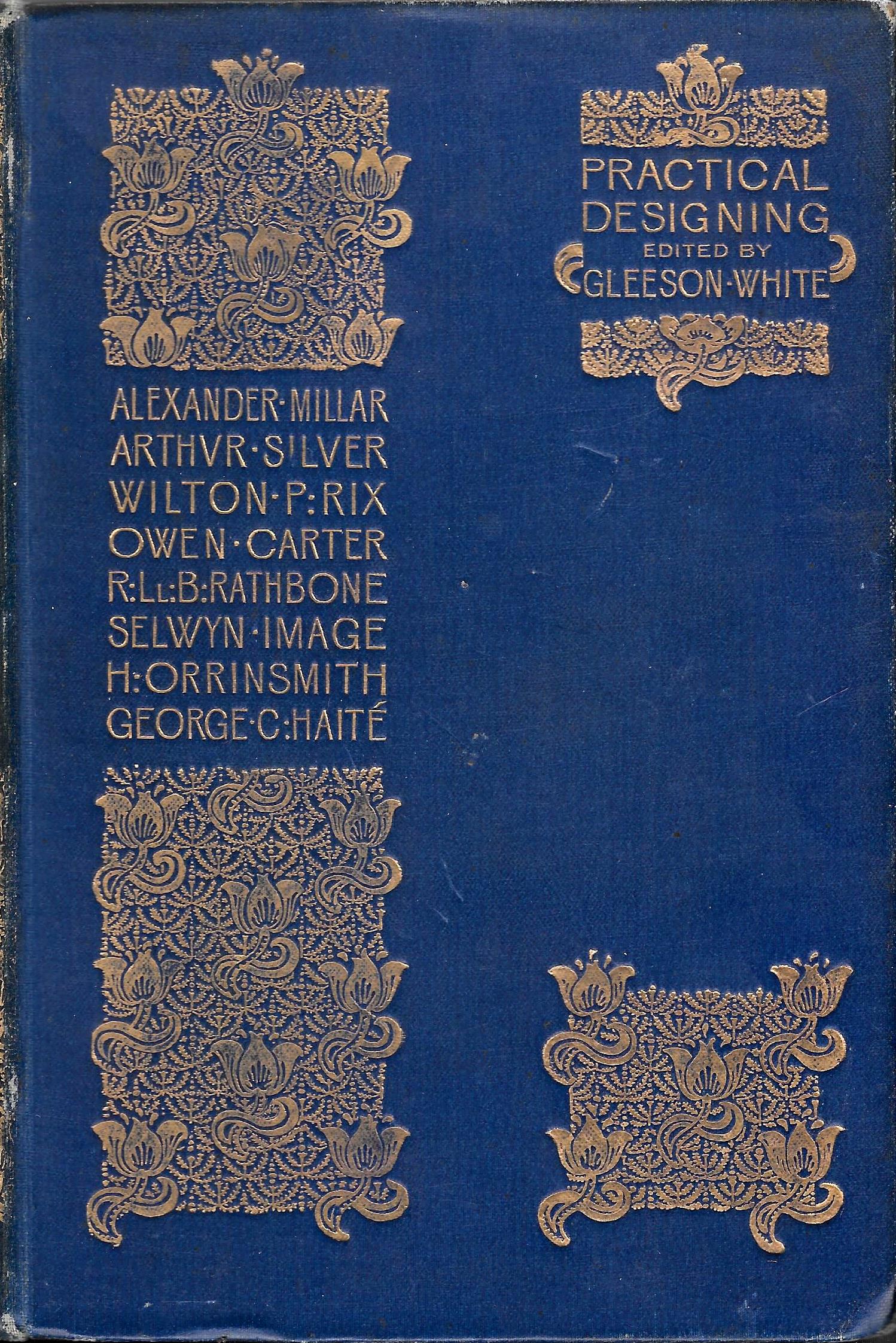
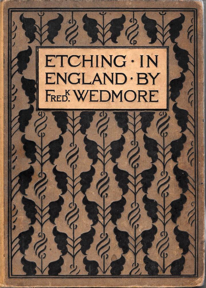
Left: Gleeson White’s Practical Designing. Right: Etching in England. [Click on images to enlarge them.]
In each of these the emphasis is on restraint rather than exuberance. The Treatise on Wines is a piece of minimalism in the manner of Ricketts at his most refined. Daringly, the main design appears on the spine while the boards, as we have seen, display a series of elegantly simplified leaves; according to Haslam, the novel approach reflects the influence of the American designer Sarah Wyman Whitman and was derived from ‘metal mounted bindings of the late Middle Ages’ (108). Burne-Jones, on the other hand, is the artist’s version of a well-known motif found on several occasions in Art Nouveau covers – the image of extended shrubs or trees which are both naturalistic and heraldic, mediating between the decorative and the realistic. This treatment bears interesting comparison with parallel work by Ricketts and A. A. Turbayne and here, as elsewhere, White exploits a pre-existing vocabulary of forms. Perhaps the most imposing, however, is The Glasgow School of Painting. This design is an elegant pattern recalling the styles of Mackintosh and Talwin Morris, elegantly alluding if not to two painters, then at least to prominent Glasgow designers.
Gleeson White as Book Cover Designer
Gleeson White’s bindings are a significant contribution to late Victorian book design. None is as radical as covers by Ricketts or Beardsley, but they are carefully-conceived and harmonious in effect. White’s theorizing about the nature of the art-form is cleverly embodied in the work itself, and all of his items convey a strong sense of a powerful intellect applied to the task of finding the best solutions to the brief. Though only engaged in the making of commercial bindings, he approached each project as if he were working in the more elaborate field of craft-work: a true proponent of Morris’s aesthetics, he made everyday products into functional art. York Powell provides a telling comment:
He had a great power of work, and here he was probably over-conscientious, exhausting himself over labour often less than moderately paid, and doing the most ordinary work in the most careful and elaborate way. But he could not bear to do less than his best, and he would sacrifice strength and time ungrudgingly to act up to his ideal. [Catalogue, vi]
This mentality is especially expressed in his approach to each commission as a unique opportunity, with every binding to be worked out in relation to the contents of the text and the size and format of the book, each project discovered afresh. White believed binding should be unfettered by precedent, ‘originality without eccentricity’. His books are not entirely original – being influenced by Rossetti, Morris, and Ricketts – but they are distinctive, and worth investigating in detail.
Related Material
- The Gleeson White Archive in the Houghton Library. Harvard University
- The Applied Art of Gleeson White: Bookplates
- The Applied Art of Gleeson White: Monograms
Bibliography, and a Misattribution
The Houghton Library, Harvard University, contains a large archive of preparatory material by Gleeson White. This consists of drawings for bindings along with other projects. Though the library catalogue claims that it is accompanied with a finding aid, this is not the case and the collection has never been the subject of detailed investigation. My own, limited enquiries turned up a series of studies for covers, including drawings for Sir Edward Burne-Jones (also identified by Haslam, 109) and for Mrs. Molesworth’s The Cuckoo Clock. In an earlier article I misattributed this work to Walter Crane.
Bibliography of Gleeson White’s Bindings
This is almost certainly incomplete, awaiting further research on the Houghton collection. The following is a list assembled from Haslam, Muthesius, and the Catalogue of Books from the Library of the Late Gleeson White.
Alexandre, Arsène. L’Art du Rire et de la Caricature. Paris, Quantin, Librairies-imprimeries réunies [1892].
Baldry, A. Albert Moore: His Life and Work. London: Bell, 1894.
Bell, Mrs Arthur. Masterpieces of the Great Artists. London: Bell, 1895.
Bell, Malcolm. Sir Edward Burne-Jones. London: Bell, 1894.
Blake, William. Poetical Works. London: Bell, 1893. Aldine Edition.
Books and Bookselling: A Journal of Information. (1895–97).
Bridges, Robert. Eros and Psyche. London: Bell, 1894.
Burns, Robert. Poetical Works. London: Bell, 1893. Aldine Edition.
Calverley, C.S. Works. 4 Vols. London: Bell, 1896.
Coleridge, S. T. Poetical Works. London: Bell, 1893. Aldine Edition.
Fanshawe, Reginald. Two Lives: A Poem. London: Bell, 1894.
The Girl’s Own Annual XVI (October 1894–September 1895). London: The Leisure Hour Office, 1895.
Gray, John. The Blue Calendar. London: Privately Printed by the Author, 1898.
Gray, Thomas. Poetical Works. London: Bell, 1893. Aldine Edition.
Henley, W. E. A Book of Verses. London: David Nutt, 1888.
Herrick, Robert. Poetical Works. London: Bell, 1893. Aldine Edition.
Jameson, Anna. Shakespeare’s Heroines. London: Bell, 1897.
Keats, John. Poetical Works. London: Bell, 1893. Aldine Edition.
Lang, Andrew. Letters to Dead Authors. New York: Scribners, 1886.
Martin, David. The Glasgow School of Painting. London: Bell, 1897.
Molesworth, Louisa. The Cuckoo-Clock. London: Macmillan, 1901.
Parkes, Kineton. The Pre-Raphaelite Movement. London: Reeves & Turner, 1889.
Potter, John. Antiquities of Greece. 2 Vols. (This book is identified in the Catalogue of Books from the Library of the Late Gleeson White (93) as being published in 1728, although this appears to be an error. It seems likely that this volume was a unique copy, designed by White for himself).
Procter, A. Legends and Lyrics. London: Bell, 1899.
Rhys, Ernest. Frederic Lord Leighton. London: Bell, 1898.
Salon Artiste, Le. Album de Dessins Originaux. 2 Vols. Paris: A. Quantin, 1885–86. (The Catalogue of Books (102) notes that this book has a parchment cover with an original design in ink on the front covers).
Sweetman, Elinor. Footsteps of the Gods and Other Poems. London: Bell, 1893.
Thudichum, John Louis William. A Treatise on Wines. London: Bell, 1894.
Wedmore, Frederick K. Etching in England. London: Bell, 1895.
White, Gleeson. Ballades and Rondeaus. London: Scott, 1887.
White, Gleeson. English Illustration: The Sixties, 1855–70. London: Constable, 1897.
White, Gleeson, Ed. The Master Painters of Britain. 4 Vols. Edinburgh: T. C. Jack, 1897–8.
White, Gleeson, Ed. Practical Designing. London: Bell, 1893.
Wratislaw, Theodore. Caprices. Privately published, 1893. (Catalogue, 132) notes that only 20 copies were published).
Secondary Material, Cited and Consulted
A Catalogue of Books from the Library of the Late Gleeson White. With a preface by York Powell. London: Isaacs, 1899.
Barber, Giles. ‘Rossetti, Ricketts, and Some English Publishers' Bindings of the Nineties’. The Library 5th Series 25 (1970): 314–30.
Brothers, Ann. A Studio Portrait. Parkville, Victoria: University of Melbourne History Department, 1993.
Delyfer, Catherine. ‘Gleeson Joseph William White (1851–1898). The Yellow Nineties Online. Eds. Dennis Denisoff and Lorraine Janzen Kooistra. Web, accessed 20/9/2018.
Gleeson White, Joseph. ‘The Artistic Decoration of Cloth Book Covers.’ The Studio 4 (October 1894): 15–23.
Gleeson White, Joseph. ‘Some Recent Bookbindings by T.J. Cobden-Sanderson and Miss E. M. Maccoll.’ The Studio. 10 (February 1897): 40–47.
Haslam, Malcolm. Arts and Crafts Book Covers. Shepton Beauchamp: Richard Dennis, 2012.
Macfall, Haldane. Aubrey Beardsley: The Man and His Work. London: John Lane, 1928.
Morris, William. Selected Writings and Designs. Ed. Asa Briggs. Harmondsworth: Penguin, 1962.
Muthesius, Hermann. ‘Gleeson White.’ Dekorative Kunst (1901): 66–74.
Strange, Edward. ‘The Decorative Work of Gleeson White.’ The Library 21:1 (December 1899): 11–18.
Taylor, John Russell. The Art Nouveau Book in England. 1966; rpt. Edinburgh: Harris, 1980.
Tidcombe, Marianne. ‘The Development of Modern Design in British Bookbinding.’ The Private Library Fifth Series 1:4 (Winter, 1998): 146–185.
Willis, Frances. ‘Innovative Cover Design: An Exploration of Nineteenth and Early Twentieth Century Publishers’ Cloth Binding Designs.’ Art Libraries Journal 38 (2013): 5–11.
Wood, Esther. ‘British Trade Book Bindings and their Designers.’ The Winter Number of The Studio (1899–1900): 3–37.
Created 20 October 2018