
William Harry Rogers was one of a number of talented artists who worked on providing illustrations for books in the middle of the nineteenth century.2 He was born in 1825, the son of William Gibbs Rogers, who achieved distinction as a wood carver.3 Rogers had two brothers, Edward Thomas (1830-84) and George Alfred (b. 1837). George adopted his father's profession of wood carver. Rogers also had a sister, Mary Eliza (b. 1827).4 She accompanied Edward Rogers to reside in Palestine between 1855 and 1859, and wrote a book based on her diaries of these years, entitled Domestic life in Palestine. By 1855, Edward was the Consul in Damascus, a fact recorded in her dedication of the work to him.5 She also wrote a book of poems. My vis-a-ris, or Harry's account of his courtship, and other poems.6 Given these family circumstances, it is hardly surprising that Rogers sought distinction for himself, and found an outlet in the field of book illustration and design.
Work for book design and illustration came early for Rogers.7 As with several other artists, the Great Exhibition of 1851 provided significant opportunity and work, and Rogers provided the cover design for deluxe copies of The Art Journal illustrated catalogue. John Leighton designed the title-page of the work, but it was Rogers who provided designs for the head-pieces, the tail-pieces and the letter capitals. This was done for the preface and for the first page, and also for the additional articles included at the end. The enormous popularity of this volume allowed his artwork to be widely viewed.9
Work came from many commercial publishers, and this article is primarily concerned with Rogers's designs for these bindings. Like his contemporaries, Rogers was commissioned to provide designs for whole covers, for upper-cover vignettes, for spines, for multi-volume works, and for magazines. The commissions came from a variety of sources; of the designs so far found, work was executed for twenty-one different publishers.10
One of Rogers's early designs is to be found on Excelsior; or, the realms of poesie. The work was published hv William Pickeringm 1852, following a privately printed edition in the previous year. The spine design features lilies, which are blocked from the head to the tail, with Rogers's monogram blocked at the tail. Both covers of the 1851 edition are blocked identically, featuring a globe and a hand emerging from it, which points to the stars and a moon blocked above. The cover design cannot be attributed with certainty to Rogers, since it is not signed.12 Rogers also signed the spine design on an edition of Frere's Wonder Castle of the following year. The binding is remarkable for its two-tone red marbled cloth, also embossed with a diaper-grain; the upper cover has the title blocked in gold on the centre, and the capital 'C' of Castle ends in castellation. The same title words are blocked along the spine in gold. Rogers's monogram is woven into a length of thin cord, which ends in a hand and a wrist.

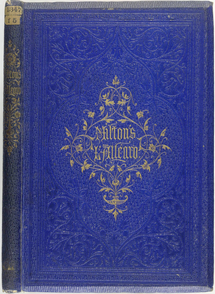
Left: Central vignette in naturalised setting. Harriet Myrtle. A visit to the New Forest. 1859. BL 12804.e.31. Right: Vignette on 15 mm. spine. Milton. L'Allegro. 1868. BL 1347.f.5.
It is clear that Rogers had an extended relationship with the publisher Sampson Low.14 Sampson Low published the 1855 edition of Goldsmith's Vicar of Wakefield, for Joseph Cundall. The covers of this copy are of orange morocco vertical-grain cloth, with an elaborate design of strapwork and plant tracery. A year later. Songs of the Brave appeared, also published tor Joseph Cundall, with a design by Rogers. Rogers provided a straightforward design for the upper-cover vignette, with the title letters in gothic style. In 1858, Rogers provided a spine design for Wordsworth's Pastoral poems; in 1859, another spine design is found on a copy of Milton's L'Allegro. In the same year, Rogers also produced upper-cover vignettes for three books, all with a pastoral theme. The vignette on Thomas Warton's The Hamlet has tendrils as a feature, which was popular at this time. The attachment of leaves and stems to title letters was also in vogue, and Rogers used this feature for his vignette design for The children's picture hook of birds. Also in 1860, he provided a vignette design for Shakespeare's Merchant of Venice, which has elaborate fanciful title letters.
Seven years later, when spine and cover blocking in black as well as gold was becoming more common, Rogers made a design for Walter Thornbury's Two Centuries of Song. Only the spine is signed, although it is likely that Rogers also provided the designs for the covers. The design is elaborate, making extensive use of fillets to make panels, and black blocking for leaf and stem decoration, to contrast with the blocking in gold. In 1868, Christian lyrics was published, with an elaborate design by Rogers for the upper cover. The cover is divided into squares and rectangles by the design, with contrasting use of blocking in gold and in blind to highlight the effect. Rogers also makes use of a 'chequerboard' pattern.
Taken as a whole, though, Rogers's designs for Sampson Low are not particularly adventurous, and his designs for other publishers give a far better idea of his artistic talent. Griffith & Farran published Spiritual Conceits in 1862. This has an intricate cover design, fully blocked in gold on both covers of the green morocco horizontal-grain cloth, indicating an early issue. The title words are blocked in relief in gothic letters within large rectangular gold lettering-pieces at the head and tail of each cover. The letters stand out strongly against a variety of small patterns blocked within these rectangular panels. The centre-piece of each cover is a cross and a crown, intertwined, and highlighted by surrounding small decoration. The spine repeats the symbolism of the motto 'no cross, no crown'. There is a single cross and a single crown blocked in gold at the head and at the tail, and the two again are blocked intertwined on the centre. Although only the spine is blocked with Rogers' monogram, the design is clearly intended to be seen across both covers and spine. Rogers also provided the illustrations to accompany the text, and several of these are witness to the power and vividness of his imagination.
This design was repeated, in its essentials, but with a change of title, on Emblems of Christian Life, with the same text and illustrations by Rogers. The design is blocked on purple sand-grain cloth, and remains visually effective, although some of the small decorative detail of the earlier work is absent. Another example of design spread across cover and spine is to he found on Tupper's Proverbial philosophy (Col. pl. II). There is a 'chequerboard' pattern blocked in gold across the upper cover and the spine, with elaborate border decoration providing contrast. The title is blocked in relief within ribbon-shaped gold lettering-pieces on both the upper and on the lower board. As was common at this time, the publisher's monogram is prominently blocked in gold on the upper cover and the spine. Rogers's monogram is blocked at the base of the spine, and is one of his smallest, showing how well engravers could cut such letters.

Chequerbpoard design. Martin F. Tupper. Proverbial Philosophy, 1867. BL 11651.f11
Another small Rogers monogram is found on the central vignette of Eugene Rimmel's Book of Perfumes, published in 1865. Here, Rogers creates a delightful coat of arms of the Parfumiers, containing in emblematic form some of the details of the manufacture of perfumes, together with a motto. Rogers's monogram is blocked in gold at the end of one of the branches of a sprig of flowers, blocked to the right of the armorial.
Rogers created another exotic binding for Quarles' Emblems, published by James Nisbet in 1861.28 Both covers have an identical design blocked in gold and in blind on bright red morocco horizontal-grain cloth. The wide border decoration shows many emblems blocked in gold inside medallions. The centre-piece of each cover is a heart-shaped gold lettering-piece with the title letters blocked inside in relief. The spine decoration is equally elaborate. It is also readily distinguishable for having the monograms of Rogers and of Charles Henry Bennett combined together, blocked in relief within another heart-shaped gold lettering-piece. This is a rare feature.

Left: Proportional design. Alexander F. Lyndon, Fairy Mary's Dream. 18970. BL 11651.c.19. Right: Bolt and strap design. Shakespeare, Works. 1864. BL 11762.cc.10.
The rather more balanced design created by Rogers for A. P. Lydon's Fairy Mary's Dream of 1870 stands in contrast to earlier elaborate ones. Frank Lydon was for many years the illustrator of books published by Benjamin Fawcett, and this work was printed by Fawcett in Driffield (Maclean and Maclean, 17-22). For the upper cover, there is strong contrast between the four fillets on rhe borders, blocked in black, and the decoration blocked in gold. Both the gold and black blocking show well against the bright red sand-grain cloth. The decoration in gold shows thin curling stems, ending in fuchsia-like flowers. The three words of the title are blocked in capitals, and are blocked to be in symmetry with the stems. The whole design displays a strong sense of proportion in relation to the size of the book.
Rogers created designs that were used for multi-volume works, as well as for monograms. Two examples show this. Bickers & Son published Shakespeare's Works in 1864, in four volumes. The work was edited by Charles and Mary Cowden Clarke, for whom Rogers provided a further design for another work in 1869. The Works were printed in Edinburgh by Ballantyne and the binding was carried out in London by Bone & Son. The upper-cover vignette design by Rogers is blocked in gold, and is the same for all four volumes. It has a Jacobean appearance, with a bolt and strap design, which forms the central frame. The title is blocked inside the frame in gold. For The mansions of England in the olden time, there is identical blocking on the four volumes published between 1869 and 1872. Rogers's work shows panels delineated by fillets blocked in black, with medallions and crowns blocked in gold.
Late designs by Rogers. Routledge's Five-Shilling Juvenile Books, 1869-73.
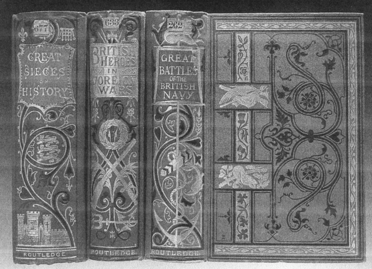
In the same period, 1869-73, Routledge was publishing its Five-shilling Juvenile Books. Four books in the series have covers and spines designed by Rogers. They are: The Great Battles of the British Army; The Great Sieges of History; The Great Battles of the British Navy; and British Heroes in Foreign Wars. All four books have identical upper-cover designs. Rogers's monogram is blocked in black towards the bottom left-hand corner, the wrong way round. The design juxtaposes curling stems and leaf decoration, blocked in black, with the use of red onlays running vertically near the spine sides. The onlays are blocked in gold showing flower symbols of Britain in relief, in red. Between these onlays, there are two small blocks in gold, depicting military objects. For each spine, Rogers provided a different design, which is signed with his monogram in gold. The designs make common use of red or black paper onlays, on which the title words are blocked in gold. Wide stems, blocked in black and in gold, curl up the spines, providing the structure for the symbols of each book to be expressed (the Army, the Navy, etc.). The Great Battles of the British Army was bound by Bone & Son. It is likely that the other volumes were also executed by the same company, with re-use of the engraved blocks for the upper covers being simple to achieve. Although clearly executed to a formula, there are significant differences to the details of each spine, showing Rogers's preparedness to create a separate appearance for each book.

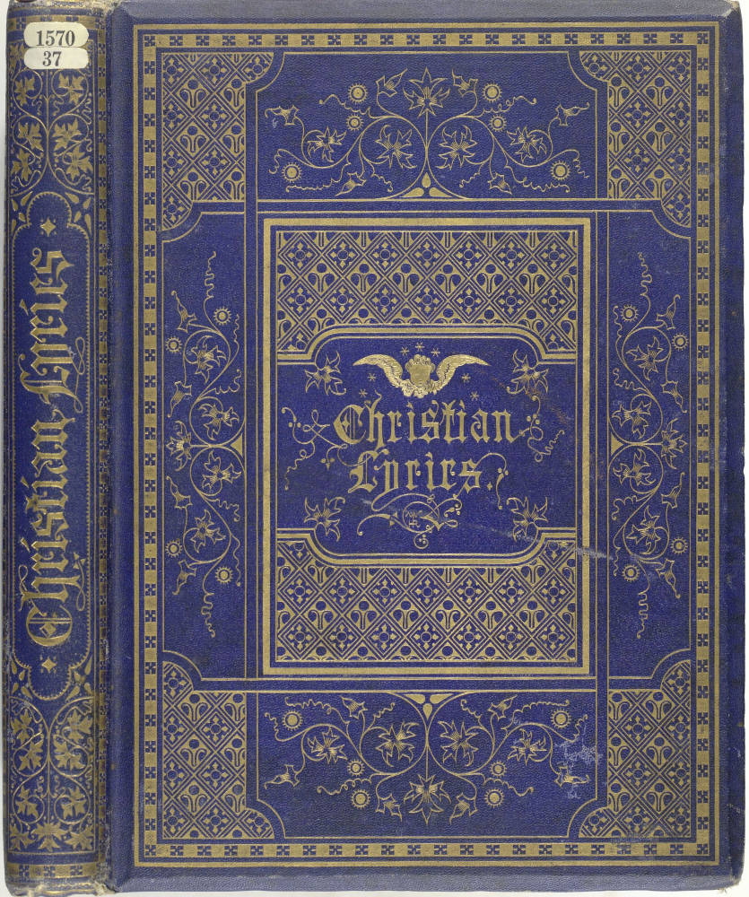
Left: Gold blocking on colored onlays. Charles and Mary Cowden Clarke. 'Many Happy Returns of the Day!'. 1869. BL 12808.g.23. Right: Rectangles and chequerboard design. Christian Lyrics. 1868. BL 1570/37.
Rogers was generally entirely conventional in creating designs printed on paper covers for magazines.37 An example appears on Our Own Fireside; the British Library copy has parts 1 to 15, for 1863-64, each originally issued at 6d. Rogers created a rusticated gothic arch design, with supporting decorated pillars. At the base a cartouche joins the pillars. This form permitted the printing of the title and of the contents within, there being no necessity to re-design the outer decoration for each part. John Leighton's design for the paper covers of The Churchman's Family Magazine also has an arch design, with pillars on each side, with the title printed within the arch.
Rogers died on 19 January 1873, aged only forty-seven, and we are thus deprived of the possibility of assessing his design work in the years after his middle age. This is in contrast with an artist such as John Leighton, who remained active in book illustration and cover design in his sixties and seventies. Engen, in his Dictionary of Victorian Wood Engravers. describes Rogers as an "Occasional draughtsman on wood, designer of ornamental letters and vignettes' (223).
From the available evidence, there is no doubt whatever that Rogers was a highly accomplished draughtsman from an early age. As this article has shown, he was very active in the field of book cover design. His designs exhibit a strong, even obsessional, attention to the detail of ornament, and a mastery of the forms of its proportion. Rogers clearly delighted in the intricacy and denseness of ornament. This is as true of his book cover vignettes and spine designs as of his book illustration work. However, his imaginative powers did not extend much into the pictorial. The delineation of human or of animal forms scarcely occurs on his cover designs. He stands alongside other artists of his time for the certainty of his handling of form. On occasions, he shows a combination of opulence and attention to detail that is quite unsurpassed.
Links to Related Material
- Gregory Jones's William Harry Rogers, Victorian Book Designer and Star of the Great Exhibition, reviewed on this website by Paul Goldman
- Rogers's cover for The Vicar of Wakefield
- Rogers's cover for The Vicar of Wakefield (a variant)
Created 14 September 2013
Last modified 13 June 2023