
In every figure that he drew it was his object to promote the views of the writer whose work he had under-taken to illustrate, and he never spared himself any pains in studying the works so as to enable him to do so. I have carried on some of those characters from book to book, and have had my own ideas impressed indelibly on my memory by the excellence of his delineations. — Anthony Trollope, quoted in Life and Letters of Millais, 1: 283.
John Everett Millais was perhaps the most accomplished book-artist of his time, although his achievement in illustration, like his oeuvre in painting, is large and difficult to classify. He produced hundreds of illustrations in all sorts of venues, from periodicals such as Good Words, Once a Week, and (most characteristically), The Cornhill Magazine; he contributed to gift books of the 1860s; he illustrated children's books; he responded to poetry and, most notably of all, perhaps, he provided a sustained response to the fictions of Anthony Trollope, visualizing six of his novels and creating one of the great artistic collaborations of the age.
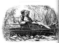
Examples of Millais's range and versitility (left to right): (a) Love. (b) The Miller's Daughter. (c) A Dream of Fair Women. (d) Edward Gray. [Click on thumbnails to obtain larger images.]
His versatility as an interpreter is registered, as Goldman explains, in his 'remarkable ability to alter his style' in order to 'suit the particular text upon which he was engaged' (4). Never limited to one single type of material, Millais was a natural illustrator, a 'chameleon' (Goldman, 4) who knew how to re-visualize written texts in the most appropriate form. His range extends from the Pre-Raphaelite images that he applied to Tennyson'sPoems (1857) to the poetic contributions appearing in magazines such as Once a Week. It also includes the bold blocking and dramatic designs of The Parables (1863-4); and the modish modernity of Framley Parsonage(1860) and The Small House at Allington(1864).
Making sense of this achievement is a complex task, and critics have approached his work from a number of perspectives. N. John Hall offers detailed readings of his collaboration with Trollope; Goldman is more interested in formal aspects of his art; and a variety of others have viewed him as a Pre-Raphaelite revolutionary whose contribution to the 'Moxon Tennyson' (1857) was one of the defining moments in the history of Victorian illustration. Another way of reading his work is to see it as a continuing struggle with the key question of how to show or interpret a text's psychological content. This endeavour lies at the heart of Millais's constant changing of styles, and his illustrative style can viewed as having three main strategies. One is is the emphasis on dramatic grouping and significant gesture, and another is the expressive use of line. He also makes use of emblematic detail which is sometimes contained in a text, and sometimes added by the artist.
Millais and Significant Gesture
Millais focuses his texts' emotional and psychological content by highlighting his characters' gestures. These are not theatrical but naturalistic, the outer signs of inner turmoil. In his illustrations for The Parables(1863-4), for instance, he condense the drama into a series of resonant tableaux. The intense emotion of the Prodigal Son's return is figured as a single, overwhelming embrace; while the 'Unmerciful Servant' is composed as a contrasting series of arms and hands, with the merciful lord holding his fingers to his mouth as he contemplates the best course of action.
Parallel treatments feature in the Moxon Tennyson and The Poets of the Ninetenth Century. The emphasis on gesture is taken even further in the illustrations for Trollope. Trollope makes only passing reference to pose, being more concerned with authorial commentary and dialogue. Millais, by contrast, puts a heavy emphasis on what at the time were regarded as 'significant attitudes'. These are placed at the most important moments, allowing him use gesture as a central part in the telling of narrative. This approach is typified by his illustrations for Framley Parsonage (1860).
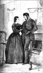
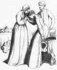
"Mark", she said, "the men are here" by John Everett Millais.
A prime example is provided by the scene between Mark and Fanny, when the debtors arrive. Trollope describes the event in the barest terms; however, the illustration conveys the characters' suffering by highlighting their gestures. Mark's anguish is suggested by showing him with his hands digging deeply into his pockets, a sign which hints at his defensiveness — almost as if he wished he could disappear into himself — and also his desire to find the money, which seems to be hidden away in some secret domain. With his head down, his gaze averted and his back resting awkwardly against the mantle-piece, Mark's feelings of shame are vividly embodied in his outer form. Fanny's gesture, which is literally a matter of supporting him as if he might fall, is likewise a telling sign of her psychological profile. Figured as Patmore's Angel in the House, Fanny is represented as the necessary foil to Mark's foolishness. Trollope treats her conventionally, but Millais (whose paintings reflect a fascination with female psychology) endows her with an underlying strength.
This interest in gesture closely reflects the formal language of Millais's paintings. Treating each illustration as if it were a large scale work in oil, Millais endows his graphic designs with a complexity which in the mid-nineteenth century was usually associated with painting, but rarely with illustraions in black and white.
Millais and Expressive Line
Millais's expressive, changing line (left to right) The heavy, form outline used in The Parables of Our Lord — (a) The Hidden Treasure and (b) The Unmerciful Servant. (c) The delicate line of Polly. (d) The rythymic line of On the Water. [Click on thumbnails to obtain larger images.]
Millais changed his line to suit his text. In The Parables (1863-64), the figures are heavily modelled, with firm outlines. These images stress universality, and Millais highlights his characters' status by presenting them in fixed, monumental forms. Elsewhere he takes a contrary approach, typically describing romantic and lyrical scenes with a sketchy, impressionistic line which creates a feeling of lightness and ephemerality. In his children's books the line is invariably delicate, providing a visual equivalent to the lightness of the verse while evoking a sense of childish naivete. 'Polly' in Lilliput Levee (1867) is a good example. Rhythmic line is similarly used to match the poetic ambience of romantic verse, and there is often an interesting counterpoint between the lyricism of the written language and the delicacy of the lines in black and white.
In his design for the anonymous 'On the Water' in Once a Week, Millais uses line to recreate a sense of the poem's dreamy yearning. The subtle movements of light, ripples, 'drooping hair' and 'softest accents' are visualized in the form of languorous rhythms which link the parts of the composition. Recreating the effects of the poem, the illustration highlights the sense of still reverie. The repetition, especially the sibilants in the fourth stanza, is elegantly re-visualized by the recurring lines of the enclosing bower, and that enclosure is itself an lyrical representation of the lovers' sense of ecstatic yearning, 'on the water.
The illustration is in this sense precisely the sort of tonal responsiveness that Millais was trying to achieve by matching his style to this text. According to Allan Life, who writes convincingly of Millais's 'literary interpretation', the image preserves an exact 'stylistic appropriateness' (52), allowing the artist to create a visual equivalent through the exercise of sensitive line.
Millais and Emblematic Detail
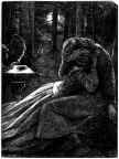
Millais's approach to the Moxon Tennyson embraces all of these strategies, but his work is arguably at its most insightful when he offers an emblematic reading of his source material. A good example is provided by his interpretation of 'The Death of the Old Year'. The artist's starting point is Tennyson's melancholy exploration of loss and ageing.
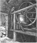
The Death of the Old Year by John Everett Millais.
Tennyson personifies the 'old year' as a sort of melancholy Jack Frost, but Millais's focus is on two central emblems: the owl (which does not appear in the the poem, but was traditionally associated with death, knowledge, the cruelty of nature and sadness); and the stilled, funereal bell. Both are signifiers of change and mortality and, as such, they powerfully convey Tennyson's emphasis on loss. The artist similarly stresses the wheel (which turns the bell): a treatment which has puzzled many critics but must surely be read as another sign of change. Literally a mechanism, with carefully specified grain and rough joints, a Pre-Raphaelite portrait of the 'real' which copies from 'nature', it is also the great wheel of life, a visual betokening of the passage of time which matches and extends Tennyson's mordant verse.
Sometimes diverging from the verse, the illustration might thus be viewed as a sort of visual counterpoint, a new showing which preserves the writer's emotional tone but gives it a greater universality and suggestiveness. Tennyson's figuring of the year as a person may have impressed Victorian readers who were familiar with such Dickensian techniques, but Millais's image of the brooding owl, of death contemplating the turning wheel of life, is more enduring and far more suggestive. It notably lacks Tennyson's optimism, giving no evidence of the renewal associated with the new year, but exists, instead, as a sort of timeless representation, a moment when time and timelessness are momentarily suspended.
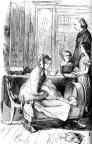
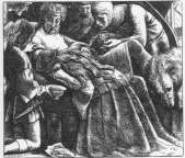
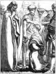
The Crawley Family by John Everett Millais.
The use of emblematic detail to enrich and extend the source material is similarly applied to the visualization of Trollope. Trollope's texts are characterized by a sort of journalistic bareness, but Millais adds an extra dimension by re-casting them as a series of sign-rich fields. His approach is typified by two scenes from Framley Parsonage, which first appeared in The Cornhill Magazinein 1860.
In his treatment of the Crawley Family, he tellingly highlights the image of the cradle. This appears in the text as an incidental detail, but Millais's placing of the cot at the base of a compositional triangle with Crawley at the head is surely intended to visualize an allegorical message. The bottom of the design implies the beginnings of life, and its apex what life becomes in adulthood: a process which leads from youth to age, from innocence to experience, from hope and possibility to the failures of maturity. At face value no more than a naturalistic representation, 'The Crawley Family' can be read, in other words, as a universal representation of the cycle of life. Recalling the emblem books which were popular at the time, such as Pigot's Life of Man (1866), Millais's static, dignified, melancholy image is charged with a personal reflection on life and mortality. It has the gravitas of a painting and, significantly, was re-painted as an independent work of art.

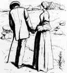
Lord Lufton and Lucy Robartes
Such seriousness also features in the illustration of 'Lord Lufton and Lucy Robartes', although his focus, this time, is on the imagery of love. As Hilary Gresty has observed, Millais extends the author's theme by including symbolic items which are not mentioned in the text, but suggest the 'idea of forthcoming love' (46). Foremost among these is the dovecot with fluttering doves, a sign of mutuality and affection that features in spoony Victorian paintings such as Madox Brown's An English Autumn Afternoon (1852-53, Birmingham City Art Gallery, UK; image of site). The gate similarly connotes the opening of a new life, and the dead game can be read as evidence of Lufton's possession or 'killing' of Lucy's 'heart'. There are other emblems as well: the chickens to the bottom left represent (forthcoming) domesticity; the lightly registered ivy surrounding the gate is a mid-Victorian emblem of fidelity, memory and enduring love; the battered stones of the gateway are the tokens of fortitude; and the opening sky a metaphor of optimism and happiness. Most obvious of all — though I have never seen it analysed in modern criticism — is the ring. Nominally a naturalistic detail of a metal ring in the far wall, it hovers mysteriously over their hands, the sure sign of marriage and commitment. Indeed, every item in Millais's apparently straightforward design is significant, charging the scene with a depth and complexity which is otherwise missing from Trollope's bare text. The author is cryptic, the artist expansive, infusing his designs with a passionate depth of love and longing, yearning, the fear of loss and the desire for mutuality. In both illustrations we can see how Millais converts Trollope's journalistic novel into a site of universal meaning. Uninterested in the process of showing a text in the sense of merely repeating its information, Millais deploys significant emblems to significant effect.
Related Material
- Chaste Longing: Illustrations of Rossetti and Millais for the Moxon Tennyson
- Artistic Choices in Millais's Illustration for Tennyson's "Mariana"
Bibliography and Works Consulted
Goldman, Paul. Victorian Illustration: The Pre-Raphaelites, the Idyllic School and the High Victorians. Aldershot: Scolar, 1996.
Gresty, Hilary. 'Millais and Trollope: Author and Illustrator'.Book Collector 30 (1981):43-61.
Hall, N. John. Trollope and His Illustrators. London: Macmillan, 1980.
Life, Allan R. 'The Periodical Illustrations of John Everett Millais and Their Literary Interpretation', Victorian Periodicals Newsletter 10:2 (June 1977): 47-68.
Millais, John Guille. The Life and Letters of Sir John Everett Millais President of the Royal Academy. 2 vols. London: Methuen, 1899.
Reid, Forrest. Illustrators of the Eighteen Sixties. 1928; reprint, New York: Dover, 1975.
Last modified 11 November 2009