
Aubrey Beardsley (1872–98) is primarily known as the most celebrated (and infamous) illustrator of the 1890s. Only active from 1893 until 1898, when he died of tuberculosis at the age of 25, his curious designs in black and white combine eroticism with a style which veers between austere linearity and rococo excess. Associated with Oscar Wilde and a contributor to The Yellow Book and The Savoy, Beardsley is routinely identified as a Decadent or fin-de siècle artist whose version of British Art Nouveau is both challenging and influential.
Many studies have explored the complexities of his graphic art, although less attention has been directed at his work in the field of cover design. Nicholas Frankel (2000, 2002) offers the most sustained analysis. In a series of detailed readings that examine the artist’s interest in the notion of the ‘perfect book’, Frankel points out that Beardsley’s bindings are as diverse and experimental as his illustrations. Parallel comments are made by John Russell Taylor in his classic account of Art Nouveau books in Britain (1966, 1988), noting that Beardsley was an ‘absolute master of cover-design’ who managed to unite ‘extreme sophistication’ with ‘technical control’ of the elements of Victorian binding (p.103).
The aesthetic impact of these artefacts is considerable. The bindings for Wilde’s Salomé (1894) and Malory’s Morte d’Arthur (1893–4) are strikingly intense, and the vivid boards for the first four issues of The Yellow Book remain as modishly ‘modern’ – both grotesque and elegant – as when they first appeared. Beardsley’s contribution to late Victorian book-design is considered in the following sections.
Style and idiom: the periodicals
Beardsley’s cover designs, which include books and periodicals, were mounted on a variety of materials, from dyed cloth (as in the case of the livid boards of The Yellow Book) to vellum and paper. His casings include trade and luxury issues, and for some of his works he made extensive use of gilt patterns which recreate the ostentation of Christmas books of the 1860s. His design for Jonson’s Volpone (1898) is a swirling golden confection, as splendid and excessive as the gilt-clad liveries of John Leighton, and part of his significance is the way in which he reasserts the glamour of attractive trade bindings after years of decline in the 1870s and 80s (Maclean, p.224).
Despite this period of stagnation in the mainstream, other trends were at work within the avant garde. The publication of Dante Rossetti’s Poems in 1870 had encouraged an ongoing debate about the function of book design; by the nineties a ‘self-conscious aesthetics of bookbinding’ had emerged (Frankel, pp.113–14), and this focus would ultimately change the appearance of late Victorian books. The new pathway asserted elements of Aestheticism and was closely linked to Pre-Raphaelite imagery and the Arts and Crafts emphasis on handicraft and bespoke design, a value that also informed the industrialized production of books for the general public.
Beardsley played an important part in the emergent discourse. Indeed, his bindings are versions of the ‘Book Beautiful’ as it was formulated by practitioners such as J. Cobden Sanderson and Charles Ricketts, William Morris at the Kelmscott Press for elite audiences, and A. A. Turbayne and Laurence Housman for the trade. Each of the books designed by these artists provides a model of extravagant, self-referring Beauty, and there are close connections between Beardsley’s gilt patterns and those by his contemporaries. Excess is part of the aesthetic of Decadence, but Beardsley’s covers also reflect the value of omission: less is more, and there is a close connection, for example, between his minimalist binding for Ernest Dowson’s Verses (1896) and the cryptic bareness of Ricketts’s vellum-mounted design for Wilde’s The Sphinx (1894).
Influenced, in short, by the sixties and new developments in the nineties, Beardsley’s bindings are contextualized by the work of other designers, creating a style that was both distinctive and bound by the conventions of its time. Within the complexities of his approach it is possible to establish a series of overlapping patterns. One is the artist’s differentiation between designs for periodicals and those for books.
Beardsley’s compositions for The Yellow Book (1894–5) and The Savoy (1895–96) employ figurative images that deploy the styles of his illustrations. Beardsley, the art editor who directed the journals’ ‘look’, was directed by the publishers John Lane and Leonard Smithers to endow the magazines with a distinct visual identity. He therefore used the covers to project his experiments on paper, for, as Frankel explains, the bindings ‘mediate … our encounters with [the] illustrations’ (2002, p 268).
In his four designs for The Yellow Book (volumes 1–4), which are printed in outline on coloured cloth, he presents his characteristic iconography of distorted figures, stylized costumes, flattened space, decorative linear patterns in which naturalistic elements are refigured as abstractions, contrasts of absolute black and white – here converted into a tension between blocked shapes and yellow – and curious detail. Positioned between verisimilitude and cartoon, elegance and mockery, decoration and a journalistic or satirical reportage of contemporary fashion, his covers are a dense and unsettling fusion of motifs.

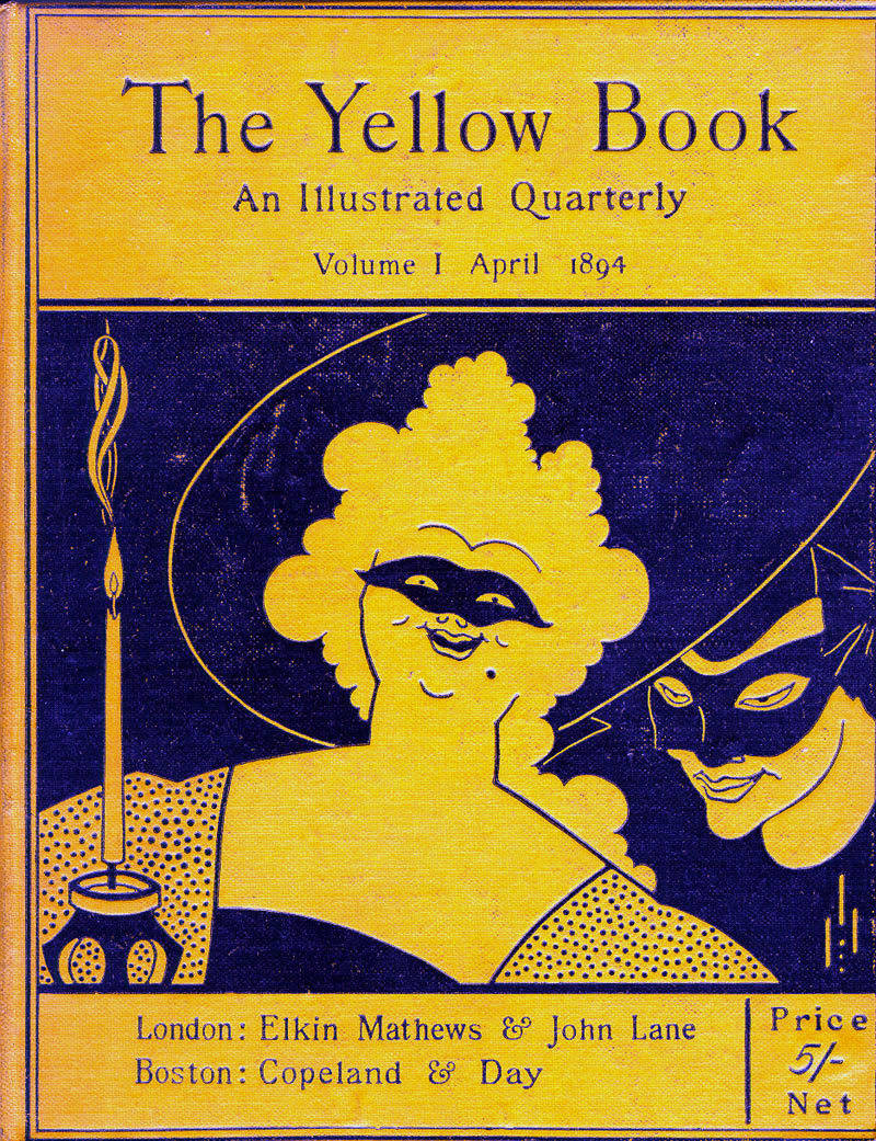

Three covers of The Yellow Book (from left to right): The prospectus for the new magazine, the issue of April 1894 (I), and that for January 1895 (IV). [Click on these images and those that follow to enlarge them.]
The cover image for volume one of The Yellow Book is a prime example of his complicated approach. Intended to establish the magazine’s avant-garde credentials, it represents the artist’s capacity to synthesise elements. On the face of it is only a decorative arrangement, with a huge woman smiling at the viewer and a man emerging from the darkness. However, the image is nuanced with suggestion: both figures wear masks as if participants at a Venetian ball, although its reference is contemporary life; for the original audience the implications were clear. The intimacy of the group reads in the context of its time as a representation of a flâneur arranging a sexual liaison with a street-walker. The openness with which the encounter is depicted was scandalous, and its risqué nature is amplified by the contrast between the woman’s laughter and the client’s sinister silence. The colour yellow evoked the yellow bindings of scandalous French novels of the period as Beardsley proclaims the magazine’s affiliation with the (apparent) sexual liberality of Britain’s closest neighbour by showing a scene which was part of its urban iconography.
Beardsley’s borrowing of a sexualized imagery is matched by his manipulation of the conventions of Art Nouveau. Though satirical and with a distinct narrative, the image is flattened and abstracted, with contrasts between types of line (the outline of the woman’s hair being measured against the smooth sweep of the line describing the brim of her hat), areas of decoration (the stippled foreground), and the blank areas of absolute black and yellow. In part elegant pattern and in part caricature, the scene creates an ambiguous effect; though drawing on a contemporary currency in the form of a reflection on the urban experience, it moves between the implications of figurative art and the contemplation of decorative beauty. Like many art-works of the time embodies Wilde’s idea of all art being ‘surface and symbol’.
Schooled in the complex aesthetics of his time, Beardsley’s cover is tart provocation: it presented a notion of challenging ‘foreignness’ by referring to French urban culture, and its tensions between idioms and styles was unsettling. This first cover was an unfamiliar sight for the original audience, at the very least presenting a type of binding which seemed entirely new. Commentators described it as ‘un-British’ – and his art often seems more French or German than home-grown.
Binding for The Yellow Book, volume 2
Beardsley’s other three bindings for The Yellow Book are less confrontational but still suggestive. For volume two, he figures a Rossettian beauty dressed in the Aesthetic manner and placed next to abstracted flowers in the style of C. R. Mackintosh. Volume three is apparently innocuous, but the inclusion of street lamps in a lady's boudoir is another link to the sexual trade of the street. Four is a neo-classical idyll, but once again carries an erotic implication. All four are airless and dream-like, delicately drawn and vulgar at one and the same time. Beardsley was employed to project a notion of bohemianism, and his bindings for The Yellow Book have an synthetic, super-refined intensity that is both fascinating and (for many) repellent.
Beardsley’s role as art editor of The Yellow Book was abruptly terminated following Wilde’s arrest for homosexual offences, in April 1895.Following Wilde’s arrest Lane’s offices were attacked by a mob that seemed to believe that Beardsley was involved in the scandal. This was purely guilt by association, but association was more than accidental. If Wilde gave the Decadence its voice, Beardsley was instrumental in developing its imagery; he illustrated Wilde’s Saloméin 1894, and the two were associated as fellow ‘degenerates.’ His illustrations were provocative and his covers projected that vision before a page had been turned; as Frankel remarks, his covers constituted the text’s ‘public face’ (2002, p.270), advertising a perverse world of transgressive sexuality. Before he was condemned for his illustrations, he was condemned for his bindings.
Beardsley found other opportunities as the art-editor of The Savoy, which was set up in 1896 in competition with The Yellow Book by Leonard Smithers, a publisher of pornography and esoterica. John Lane regarded Beardsley as too controversial for The Yellow Book, but for Smithers he was precisely the sort of risqué artist he needed to promote his new periodical, demonstrating a bohemian fearlessness which was itself an important selling point. Beardsley went on to illustrate and design the covers for eight issues of The Savoy, using the magazine as a fresh start and as a chance to develop and apply a new style. Printed in black and white on paper, his wrapper designs for this magazine are presented in the rococo style he otherwise deploys in his response to Pope’s mock-heroic poem, The Rape of the Lock (1895), which was also published by Smithers.


Bindings for the January and April issues of Savoy.
The emphasis in these compositions is on super-refined detail, creating a world of elaborate particularization in which the figures, as before, are distorted versions of elegance. As in the opening design for The Yellow Book, Beardsley’s cover for the first monthly issue of The Savoy (January 1896) is a piece of calculated provocation which set out to offend the conservative middle classes and appeal to the magazine’s projected audience of liberals and bohemians. Its target is the proprieties of the ruling classes, embodying its satire in the form of an elegant lady walking in her country estate who appears to be exercising a tiny hermaphroditic incubus. She holds a whip and by implication would use it to strike her bizarre companion; naked except for a hat, slippers and cloak, it gambols among grotesque and suggestive vegetation. In the original drawing the putto (as Stephen Calloway describes it) is urinating on a copy of Beardsley’s previous magazine (p.145), although this detail was deleted in the published copy (not even Smithers being able to promote such outspokenness), and the emphasis is on a more oblique satire. In the middle distance is a neo-classical temple, while Picturesque trees, the currency of landscape gardening and landscape paintings, ironically frame the artist’s lewd suggestion of sexual perversion. The mockery is completed by the distortion of the main figure – with its disproportionately small head – and by the contrast between the extreme verisimilitude of the detail, implying the scene is real, and the absurdity of the characters and situation.
The overall effect is grotesque, combining sado-masochism and gender confusion with social commentary. This, the cover persuades the viewer, is the elegant classes’ true taste; there may be a pretence of appreciating classical aesthetics in the form of the temple and the landscaped garden, but for the idle there are plenty of opportunities for sexual experimentation. Beardsley produced pornographic images for Lysistrata (1896), and in his work for The Savoy he comes as close as he could to subverting conventional expectations, pitching the magazine into an uncertain space and inviting censure. As it turned out, The Savoy contained only limited material of the iconoclastic quality of Beardsley’s first design, but this front cover, and the less controversial ones that followed it, ensured that the mainstream stationers – notably W. H. Smith – were unwilling to display the magazine on the grounds of indecency; constrained by public disapproval which outweighed the appeal of the unconventional, the journal closed after just eight monthly issues.
Such notoriety endows the outer surfaces of The Savoy and The Yellow Book with considerable historical interest as examples of the combative approach of the counter-culture of the 1890s and its limitations in reaching a wider audience. Sophisticated in their projection of a bohemian credo, Beardsley’s cover designs were for the many consumers of the period the first point of contact with this fantastic world of transgressive sexuality, mockery and strange states of mind.
Idiom and ambience: the book covers
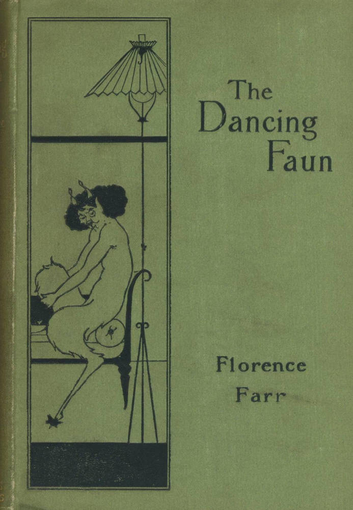


Left to right: Bindings for Florence Farr’s The Dancing Faun, Grant Allen’s The British Bartbarians, and H. T. Wharton’s Sappho.
As noted in the previous sections, Beardsley’s cover designs for The Yellow Book and The Savoy are polemical and outspoken. They were intended to appeal to certain types of audience, and courted controversy as a sales pitch. For his book bindings, on the other hand, the focus is on aesthetic effect, on pleasing the reader rather than posing a challenge. Mounted on cloth and vellum, these elaborate compositions project a notion of luxury and refined taste which also sets out to embody or represent the book’s contents. These strategies involve both elaboration and minimalism, the figurative and abstract pattern-making.
Several of his bindings present narrative images which link directly to their texts and reproduce the composition appearing on the title page. This technique is deployed in Beardsley’s 22 titles for John Lane’s Keynote series (1894–6). Printed on cloth in black or gilt line and intended for the general public, these covers are suave, sophisticated designs combining neo-classical motifs, scenes from contemporary life and the usual range of patterns, often mingling these motives in unusual and startling combinations. In the cover for Florence Farr’s The Dancing Faun (1894), Beardsley presents a typically droll and unsettling juxtaposition in which a faun of indeterminate gender is placed in the light of a stylised modern lamp-shade. The artist’s eroticised version of the neo-classical is given another variant in the binding for Arthur Machen’s fantasy, The Great God Pan (1894), with the pan-pipes positioned in the centre ground as the main figure looks morosely at the viewer. These cover-images encapsulate aspects of the story; others are more oblique. In his binding for the luxury edition of Pope’s Rape of the Lock (1897), the artist places a gilt scissors, in allusion to the cutting of Belinda’s hair, within a pair of rococo candelabra framing a looking-glass, the very emblems of vanity and wealth. The binding for H. T. Warton’s Sappho (1896) similarly deploys a narrative sign, this time in the form of an abstracted harp.

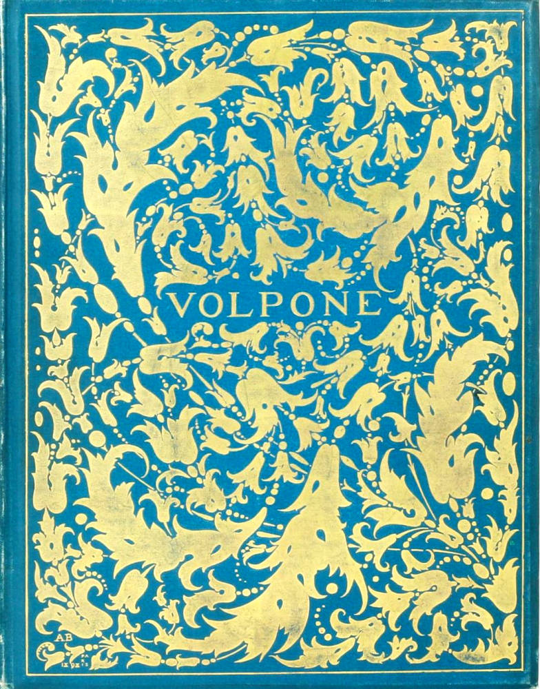
Left: Binding for Dowson’s Poems. Right: Binding for Jonson’s Volpone.
Sappho is a piece of neo-classical minimalism, and Beardsley takes understatement to an absolute extreme in his cover for Ernest Dowson’s Verses (1896). This work is described by Stephen Calloway as ‘a mastery exercise in spare, but highly tensile and steely Art Nouveau (p.168); however, its decoration might also reads in more organic terms as a tendril-like arabesque which emanates from the bottom right hand corner and divides into three leaf-bearing stems. Printed in gold firstly on cream and later on a smooth light green cloth, the effect is one of plant or vine-like simplicity, suggesting growth and (by implication) decay: a subtle pattern which visualizes the poet’s concern with the ephemerality of life and inscribes his underlying theme in the book’s material form.
The binding for Dowson’s poems represents a shift from narrative clue-giving to the evocation of tone, and several of Beardsley’s covers connote their text’s ambience rather than their events. For Malory’s Le Morte d’Arthur, which was issued firstly as parts and then as a limited edition (1893–4), he designed a striking foliate image of two flowering stems with blossoms and leaves in a symmetrical pattern. This design bears no direct relationship to the text but evokes a sense of neo-medieval fancy, alluding to the stylised forms of Gothic art as they appeared in manuscript and sculpture. This is essentially a notion of the past as a time of rarefied beauty, and links to Pre-Raphaelite ideas on the purity of the medieval world.
In his work for Jonson’s Volpone (1898), on the other hand, the emphasis is on a sort of dynamic abstraction which expresses the play’s rapid movement and chicanery in the form of a centripetal foliate design in gilt. Resplendent in the manner of a Renaissance binding, it invokes the energy of the culture that produced Jonson’s comedy of manners and deception, a world in which change is symbolised by the swirl of flowers. The match may have been accidental insofar as it was originally designed for Ali Babi (Calloway, p.199), but the effect is fortuitous.

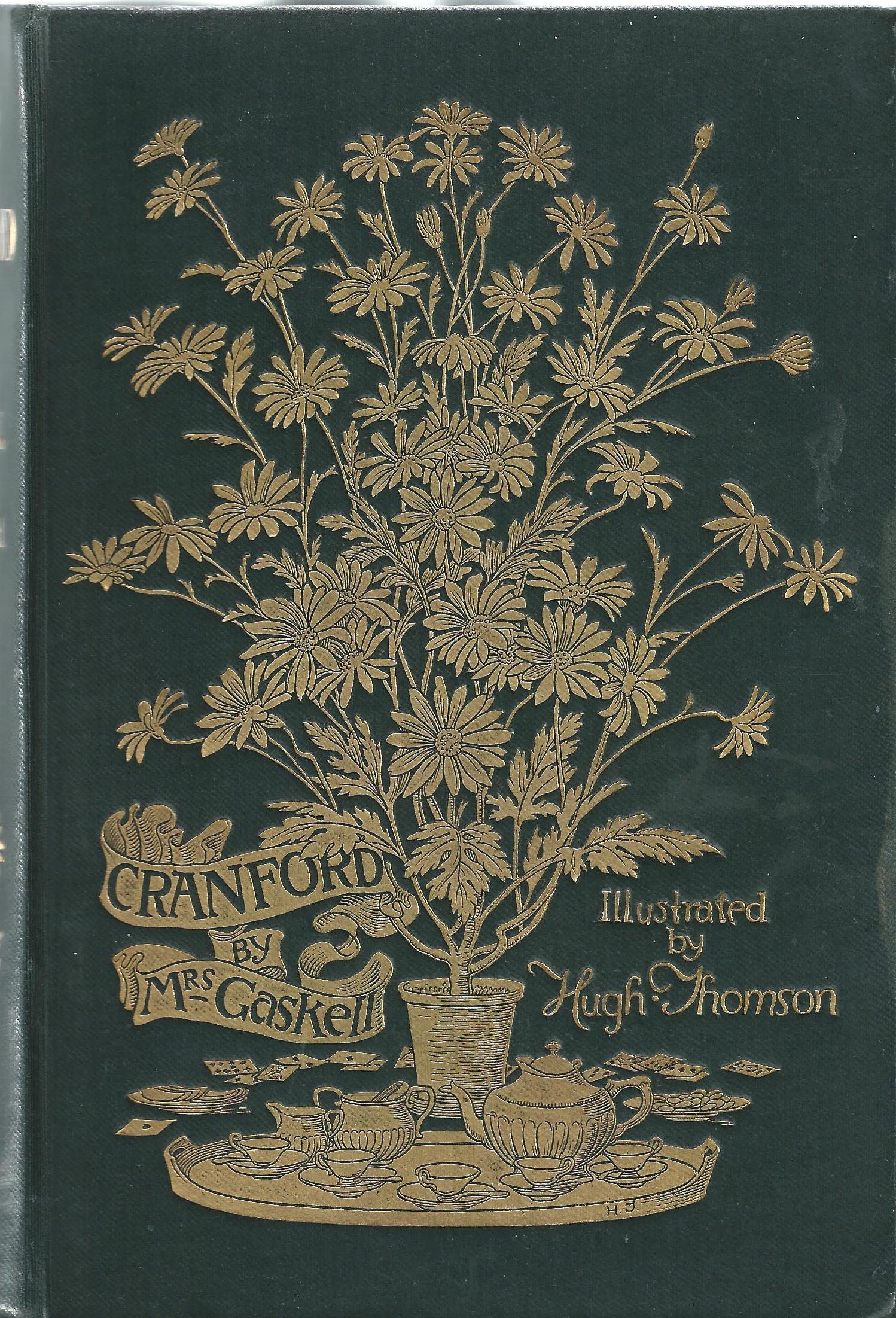
Left: Binding for Oscar Wilde’s Salomé. Right: Binding for Gaskell's Cranford by Hugh Thomson
Movement is also embodied in the design for Oscar Wilde’s Salomé (1894). Figured as a radiating pattern of peacock-feathers, this cover elegantly denotes the elegance of the contents. Influenced, perhaps, by A. Turbayne’s cover for Austen’s Pride and Prejudice (1891), it further recalls Hugh Thomson’s binding for Elizabeth Gaskell’s Cranford (1891), connections which remind us once again that Beardsley, though an innovator, was bound by the context in which he operated and owed a great deal to his contemporaries.
Related material
Works cited and sources of information
Barber. Giles. ‘Rossetti, Rickettes and Some English Publishers’ Bindings of the Nineties’. The Library 25 (1970): 314–330.
Calloway, Stephen. Aubrey Beardsley. London: V & A, 1998.
Frankel, Nicholas. ‘Aubrey Beardsley “Embroiders” the Literary Text.’ The Victorian Illustrated Book. Ed. Richard Maxwell. London & Charlottesville: UP of Virginia, 2002. pp. 259–96.
Frankel, Nicholas. Oscar Wilde’s Decorated Books. Ann Arbor: University of Michigan Press, 2000.
Haslam, Malcolm. Arts and Crafts Book Covers. Shepton Beauchamp: Richard Dennis, 2012.
Maclean, Ruari. Victorian Book Design and Colour Printing. London: Faber & Faber, 1972.
Taylor, John Russell. The Art Nouveau Book in Britain. London: Methuen, 1966.
Thomson, Ellen Mazur. ‘Aesthetic Issues in Book Cover Design, 1880-1910.’ Journal of Design History 23:3 (2010): 229–45.
Wood, Esther. ‘British Trade Book Bindings and their Designers.’The Studio, Winter Number (1899–1900): 3–37.
Last modified 8 March 2016