
[Click on thumbnails for larger images and additional information]
Introduction: problematic collaborations
he elaborate illustrated books of the mid-nineteenth century (1850–1875) were the product of a series of professional collaborations conducted under the auspices of the publisher. The writer provided the text, the illustrator created the images, and the binding designer was responsible for the book’s exterior. There were, in addition, a series of technical partnerships: the engravers on wood translated the original drawings into cuts that could be printed in black and white, and the printer arranged the letterpress and the printing; other technicians created the brass dies that were used to impress the cloth bindings with gilt patterns and polychromatic panels; and a binder was employed to create the cloth boards and assemble the book using stitching or – more characteristically – the gutta percha that was used to produce a ‘perfect binding’.
The expertise displayed in the creation of each part was often impressive, although the final product, with no single hand to guide it, was sometimes disparate; as John Russell Taylor remarks, the middle of the period was characterised by a situation in which there was very little concern ‘with the [books’] overall design’ (p.40). This type of production was market-driven, serving a vast market; expediency, rather than consistency, was the underlying principle. It is also interesting to note that aspects of mid-Victorian production remain under-researched, with limited understandings of how the various collaborations were arranged.
Of course we do know in many cases how writers and illustrators worked together, but it is not at all clear if the author and illustrator had any influence on the binding designer; nor is it known if the designer were employed by the publisher or by the binder who was engaged to bind the pages. These working patterns and arrangements remain obscure and were probably conducted on an informal basis. Created as the product of several hands, and developed within a ‘regime’ that Douglas Ball describes as far from ‘rigid’ (p.67), it is barely surprising to find that some books achieve a sense of artistic unity, and many others do not.
There were nevertheless several exceptions to this seemingly improvised pattern, with evidence, from at least the 1850s, of concerted attempts to co-ordinate the stages of production. The impact of Joseph Cundall has been explored by Ruari Maclean (pp. 141–154); untypical of his age, Cundall stands out, and Maclean has demonstrated how the publisher-designer exerted the sort of unifying control that would only become standard practice under the auspices of William Morris at the Kelmscott Press.
Another tactic, informally applied, was using the illustrator as the binding designer, so producing, at least in theory, unities between the designs on the outside and those in the pages. Dante Rossetti designed his sister Christina’s two books, Goblin Market(1862) and The Prince’s Progress(1866), in each case establishing a calculated contrast between the austere exteriors and the sensuous arabesques of his illustrations. Rossetti’s control over his sister’s books has been charted in detail, and this practice, as numerous critics have observed, was later imitated by Laurence Housman and again by Aubrey Beardsley. Though practically undocumented, it is also likely that other illustrators took a measure of control. Richard Doyle and Arthur Hughes are notable examples of graphic artists who designed the covers of some of their books.
Richard Doyle as binding designer
Richard Doyle is well-known as one of the foremost fairy artists of his time, and as an inventive cartoonist and parodist whose best known works include the front cover to Punch and the coloured illustrations for In Fairyland(1870). His contribution to the development of mid-Victorian bindings has never been examined in detail, although his presence is noted in accounts by Douglas Ball (1985) and Edmund King (2003). These authorities tentatively credit him with just two designs, although it is my view that he was responsible for at least two more.


Three bindings designed by Richard Doyle: Left: Thomas Hughes's The Scouring of the White Horse (1859). Middle: Charles Dickens's The Chimes (1845). Right: Julie Gourard's The Adventures of a Watch (1864).
Doyle is identified as the designer of covers for Julie Gouraud’s The Adventures of a Watch [1864] and for Thomas Hughes’s The Scouring of the White Horse (1859; Ball, p.66, p.95; King, p.xiii; p.10). Both are illustrated by Doyle and according to Ball neither covers could be said to be designed by him in the conventional sense of the term. In the case of Gouraud’s book the image of the watch appearing on the front board is a replica of the wood-engraving on the title page. Doyle would not have produced this gilt design, which was likelier to have been the work of an unknown technician who copied the image within. Ball further insists that the front cover of Scouring of the White Horse was the product of ‘a skilled die-cutter interpreting’ the book’s illustrative style. However, on this occasion Ball is probably in error: the elaborate gilt interlace does not ‘derive from an illustration in the work’ (p.66), but is entirely original.
Though unsigned, this front cover is clearly Doyle’s work; and King’s tentative attribution on stylistic grounds (p.10) is understating the case. On the contrary, it encapsulates the key ingredients of his style, replicating the artist’s prime motifs of the 1850s. Composed as a rustic arabesque that frames the margins and contains a series of interlocked comic figures, it bears a close relationship to the teeming front cover of Punch. The ‘woody’ letters replicate his elaborate pastiches of the Germanic style , and the grotesque figures link back to the swirling characters appearing in the pages of Punch and in the early letters and ‘Nonsense’ drawings (Victoria and Albert Museum, London; Engen, pp.32–33).
The overall effect, as in so many of Doyle’s designs, is one of dynamic movement; at once a parody of illuminated manuscripts, it is also a droll invitation to read on. As in the designs appearing on the front covers of many Victorian books, the image is a proleptic one: the characters engaged in the comic situations that feature within, and are introduced in the form of the gilt interlace long before they appear in the pages. More than ornamental, the binding partakes of the process of anticipation and interpretation, and is clearly planned to unite the outer surface of the material book with its contents.
This approach similarly features in two other designs, one for The Chimes (1845) by Dickens, and another for the artist’s In Fairyland (1870). Neither has been attributed to Doyle and neither is signed, although it is very likely, once again, that he created both of them. The Chimes presents a gilt device of five bells, each a letter written inside them; fairy figures disport on the supporting gantry, and two others recline on the letters G and S. The grotesque faces of each character recreate the faces of those in Doyle’s illustration of Trotty Veck at his moment of crisis (p.92), surrounded by the little people; the relationship between the two images is very close, and although we cannot be certain that Doyle created the exterior, the stylistic similarities between the two designs suggest he was. The same can be said of the exterior of In Fairyland, which presents another elaborate gilt title. This is linked to the rustic lettering on the title-page, but is not the same. Figured as an extravagant combination of letters, a butterfly, an imp suspended from a butterfly and a figure riding a bat, it works once again to project the imagery contained within the covers into the viewer’s space. As in the case of The Scouring of the White Horse and The Chimes, it connects outer and inner and is also a blatant sale-pitch, persuading us, or at least the original audience, to judge the books by their covers.
Arthur Hughes as a binding designer
Well-known as a Pre-Raphaelite illustrator, Hughes designed at least five pictorial bindings to accompany works containing his designs in black and white. None of these is signed and have to be attributed on stylistic grounds, and on attributions listed in the publications themselves. His designs appear on the front covers of his two commissions for Christina Rossetti’s Sing Song (1872) and Speaking Likeness (1874); on the front cover of Thomas Hughes’s Tom Brown’s School Days (1869); on the upper board of Francis Palgrave’s Five Days’ Entertainment at Wentworth Lodge (1865); and on the spine, front and rear boards of Alfred Tennyson’s Enoch Arden (1866).
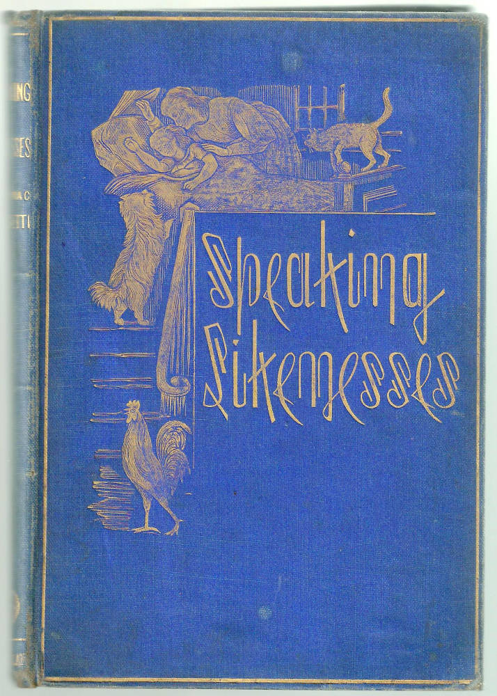
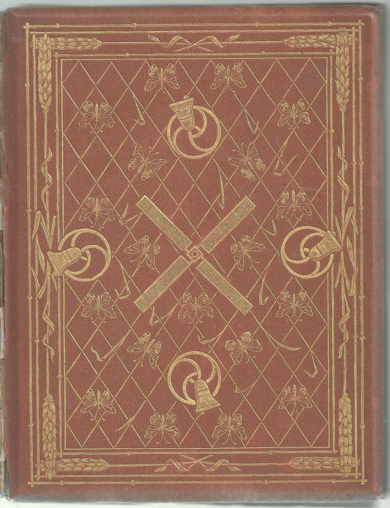

Three bindings designed by Arthur Hughes: Left: Christina Rossetti's Speaking Likenesses (1874). Middle and right: Alfred Tennyson's Enoch Arden (1866).
The binding designs for Speaking Likenesses and The Five Days’ Entertainments are Pre-Raphaelite devices that prefigure the books’ contents. Speaking Likenesses is a gilt image in the domestic style, showing a bed-time scene complete with a dog, cat, and cockerel; touchingly direct, it is unusual in its representation of a head-piece and border, the border taking the form of the stairs and balustrade leading up to the child’s bedroom. In The Five Days’ Entertainment, conversely, the design is more abstract; a roundel containing two of the book’s characters is encircled by five stars.
The effect recalls the geometry and abstraction of D.G. Rossetti’s book designs, and there can be little doubt that Hughes drew from of his inspiration from Rossetti’s example. Hughes’s best design, for Enoch Arden, can be linked to the example of the older artist, although in itself it is practically unique.
Issued in cloth variants in green, blue, and sand, the binding is an elaborate combination of motifs that symbolize the story of Enoch’s dismal career. The front board unites signs of the sea: swirling fish, bells turning on roundels in direct echo of Rossettian design, an interlace to represent a net, an outer border of chains with shells at each corner, and, in the centre, an anchor. The title is itself spelled out in miniature gilt rope and the roundel beneath has another rope attached – almost, as it were, encouraging the reader to sound the bell and start the story. This nautical imagery prefigures the main body of Enoch’s narrative, as a sailor away at sea.
On the rear board, on the other hand, the gilt devices signal his life as a land-lubber – or at least the life he would have had if he had remained, as the text and illustrations suggest, a child of nature. The bells, emblems of passing time, are retained; but the fish and net have been replaced by an interlace overlaid with butterflies, while the chain and shells have been transposed into stalks of wheat. The two parts of the binding function, in other words, to suggest the polarities of Enoch’s experience – away at sea when he should have stayed on land. The most telling detail is the windmill vane on the rear. This is a symbol of the change in fortune, quite literally the vagaries of the changing winds that keep him away from home, and ruin his life.
The binding is thus deployed as a means of suggesting the poem’s narrative, projecting it through the medium of symbols – which signify both proleptically and analeptically – into the viewer’s space. Elegant in effect, its formal sophistication as a mode of story-telling is further reinforced by its formal arrangement; though symbolising a grim tale, the binding as a whole is a light, lyrical composition, full of movement, and managing to combine both delicacy and boldness in its organization of motifs.
Link to Related Material
Works Cited
Ball, Douglas. Victorian Publishers’ Bindings. London: The Library Association, 1985.
Dickens, Charles. The Chimes. London: Chapman & Hall, 1845.
Doyle, Richard. In Fairyland. With a poem by William Allingham. London: Longmans, Green & Co, 1870 [1869].
Engen, Rodney. Richard Doyle. Stroud: The Catalpa Press, 1983.
Gourard, Julie [Louise d’Aulnay]. The Adventures of a Watch. Dublin: James Duffy, n.d. [1864].
Hughes, Thomas. The Scouring of the White Horse. Illustrated by Richard Doyle. Cambridge: Macmillan, 1859.
Hughes, Thomas. Tom Brown’s Schooldays. Illustrated by Arthur Hughes. London: Macmillan, 1869.
King, Edmund. Victorian Decorated Trade Bindings, 1830–1880. London: The British Library & Newcastle: The Oak Knoll Press, 2003.
Maclean, Ruari. Victorian Book Design and Colour Printing. London: Faber & Faber, 1963.
Palgrave, Francis. The Five Days’s Entertainments at Wentworth Grange. Illustrated by Arthur Hughes. London: Macmillan, 1865.
Rossetti, Christina. Goblin Market. Cambridge: Macmillan, 1862.
Rossetti, Christina. Prince’s Progress, The. London: Macmillan, 1866.
Rossetti, Christina. Sing Song. London: Macmillan, 1872.
Rossetti, Christina. Speaking Likenesses. London: Macmillan, 1874.
Russell-Taylor, John. The Art-Nouveau Book in Britain. 1966; rpt. London: Methuen, 1980.
Tennyson, Alfred. Enoch Arden. Illustrated by Arthur Hughes. London: Moxon, 1866.
Last modified 15 October 2013