
 he Municipal School of Art in Birmingham was one of the most productive and influential institutions of its type. First set up in the mid-nineteenth century in order to train designers for local trades as they competed for world-wide markets in the 1870s and 80s, it became a forward-looking provider of advanced skills offering a wide-ranging curriculum. Operating as a provincial school in an age when the epithet ‘provincial’ had a pejorative connotation and most creative activity was focused in the London institutions, it was of great importance, nevertheless, in the ‘progress of Art’ (Vallance 344).
The School was developed by its enlightened management and supporters. The patrons, John Swift explains, were ‘believers in Ruskin’s idealistic plans for the future of art, craft and design’ (77) who admired William Morris and the Pre-Raphaelites: carried forward by the liberal ideas of non-conformism, civic pride and the desire for change, they set out to promote Arts and Crafts ideals in the practical shape of a training college.
To that end, the School was transformed into an organ of Morrisonian aesthetics and practice. In the late seventies the board of employment only engaged new staff ‘whose persuasion was that of the emerging’ movement in design (Swift 77), and a significant step forward was taken in 1877 when Edward Taylor, a painter and designer, was appointed as the headmaster. Taylor was a firm advocate of Arts and Crafts and was instrumental in a number of reforms. He built an experiential curriculum based on project development in which the students worked with traditional materials in the manner of handicraft and guild-based production. This training in the form of ‘art laboratories’ prepared students for professional activity and reduced the distinction between learning at college and the pragmatic requirements of the work-place.
Taylor was supported in developing this new mode of learning by the School’s chairman and architect of the college building, J. H. Chamberlain, who persuaded Morris to act as president. Morris became a regular visitor: he lectured, delivered a series of addresses in which he espoused his principles, and examined work. Encouraged by Taylor, Morris became a close associate of the teaching staff and an inspiration for the students. Taylor also facilitated visits by Morris’s prime practitioner Edward Burne-Jones (Hodson 3), who grew up in Birmingham and maintained close contacts with the city; Walter Crane, another champion of Arts and Crafts, made similar visits to speak to the students and engaged in hands-on teaching.

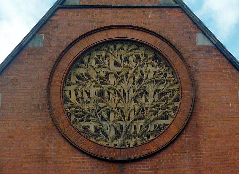
Two views of the Birmingham School of Art, Margaret Street, designed by J. H. Chamberlain, 1884–5. Left: The main entrance. Right: A large medallion of lilies on the north wing by Samuel Barfield. The treatment of the stems typifies the aesthetics of Arts and Crafts and stands as an emblematic sign of the School’s values.
Placed under firm direction and supported by the foremost proponents of the Arts and Crafts movement, the School produced quality work in many fields, and some of its graduates, among them Sidney Meteyard and Arthur and Georgie Gaskin, went on to become influential designers and artists. Especially significant is the fact that most of them could practise in several arts. Taylor’s broad-based syllabus was fluid and cross-curricula, allowing practitioners to shift between disciplines; Morris modelled this approach in his free movement as a designer of wallpaper, books, furniture, tapestries and stained glass, and Birmingham craftspeople were bound by the same demands for versatility. A prime example of this multiplicity is Arthur Gaskin, one of the most distinguished teachers, who worked as a jewellery designer, painter, illustrator and as a designer of book covers.
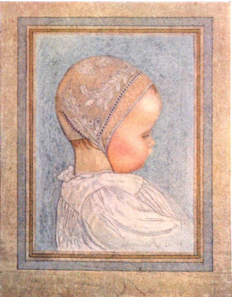
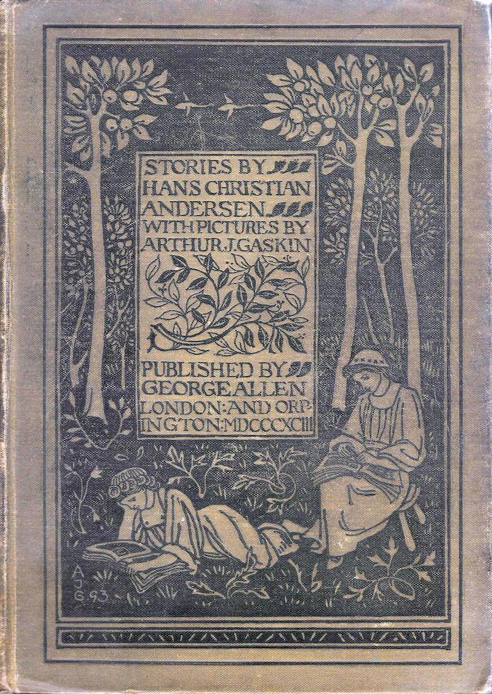

Three works by Arthur Gaskin. Left to right: (a) A painting of the baby Margaret, from around 1900. (b) His book cover for Stories by Hans Christian Andersen (1893). (c) A suite of jewellery co-designed with his wife, Georgie Cave France (1890s).
Practice was unified, moreover, by a close adherence to the principles and styles that were learned while in training. This approach led to the creation of a subset of the idiom of Arts and Crafts. Work produced by the Birmingham School is both a product of a generic visual language and a distinctive interpretation of its possibilities; in looking at each product, it is possible to discern a ‘Birmingham look’, which is unmistakeably a nuanced version of its Morrisonian exemplars.
Male artists were prominent in developing the Birmingham style of illustration, notably Bernard Sleigh, Arthur Gaskin, Charles Gere and Fred Mason, but equally important work was made by Celia Levetus, Florence Rudland, Georgie Gaskin and Mary Newill; in contrast to the male coteries of artists that dominated the Victorian age – such as the Pre-Raphaelites or The Clique – the Birmingham School included a number of important female contributors whose publications, even at the time of production, had parity with the work of the men. Taken as a whole, these designers designed some of the most striking illustrations of the 1890s.
Aesthetics, Materials, Techniques
Working within the styles of Arts and Crafts, the Birmingham artists set out, so Walter Crane explains, in a ‘sincere attempt to apply what may be called traditional principles’ (207) to book illustration and ornament. They were heavily influenced by Morris’s pronouncements in the form of his regular addresses. These lectures focused the purpose and methods of handicraft, and it is possible to make direct connections between Morris’s emphasis on beautiful functionality and ‘truth to materials’, and the School’s aesthetics.
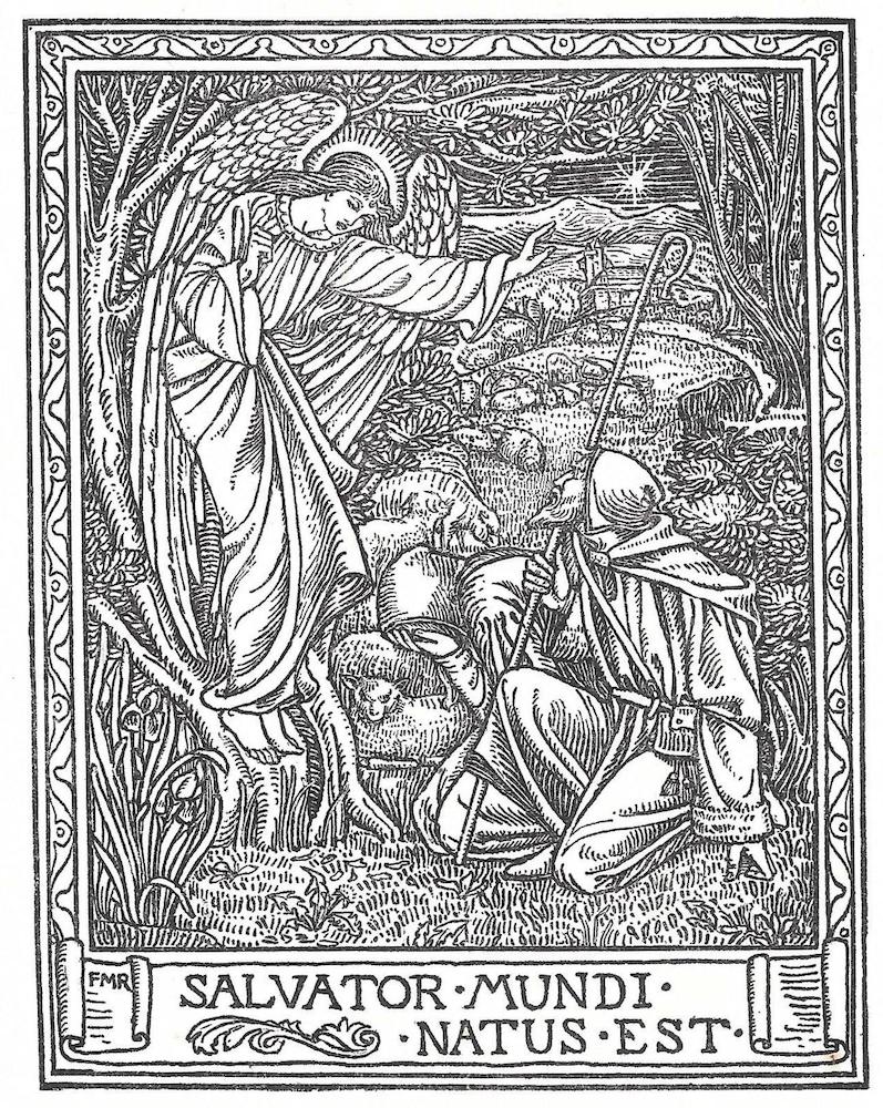
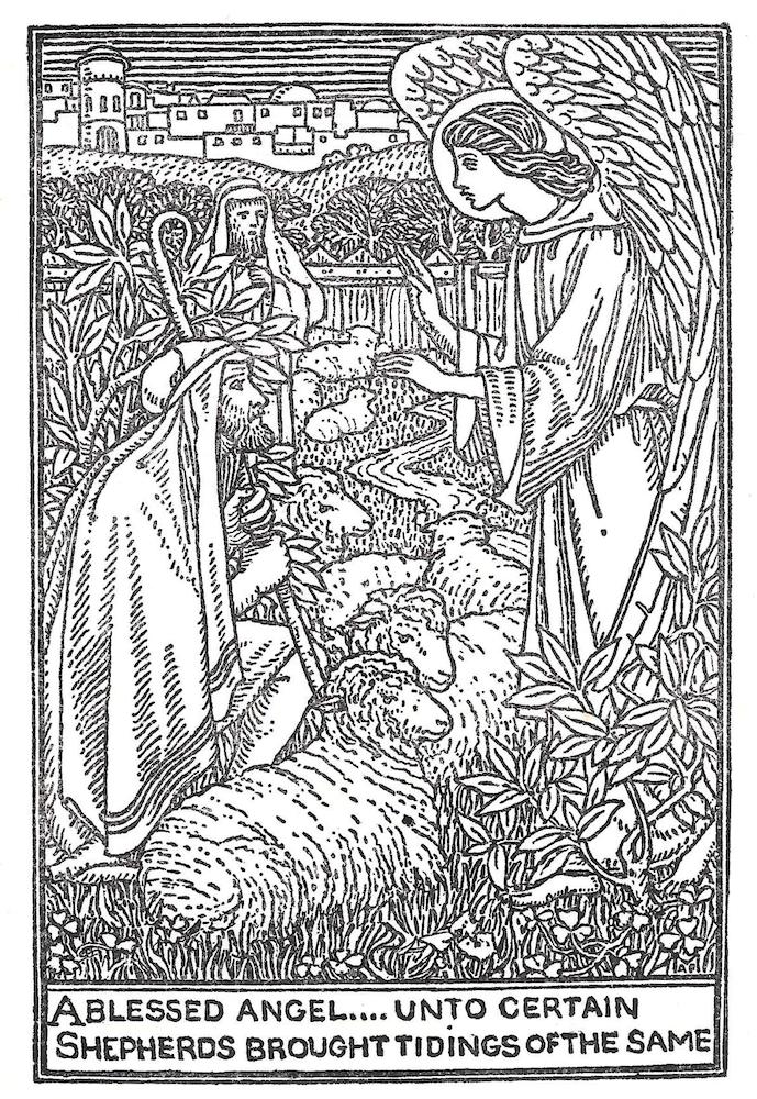
Of special importance is Morris’s insistence on the need for illustrators to break free, as he puts in his Address … at the Distribution of Prizes (1894), from the ‘thralldom of utilitarianism’ (4), with most books being mass-imprints with poor quality illustrations. Directed by Arthur Gaskin, the School’s initial response to this demand was to create a series of volumes which contradict the conventions of the popular market in the form of small-scale hand-crafted books. The first of these, A Book of Pictured Carols (1893), exemplifies the School’s approach. Printed on rough paper, bound in a card binding, issued in a small run by George Allen, and embellished with wood-engravings cut by the artists, the book is radically different from any mainstream publications of the time: designed for a small, appreciative audience, it looks homemade, and was. It was linked, of course, to the great productions of the Kelmscott Press, recreating on a limited scale Morris’s central emphasis on the ‘truthfulness’ of handicraft. But A Book of Pictured Carols is radically different from Morris’s books insofar as it has none of the epic showiness and expense associated with the Kelmscott productions. Gaskin’s imprint is far more artisanal – creating a work which was made by the labour of artist/designers and could be purchased by all. Working with the simplest of materials, the illustrators present a book which is a genuine attempt to make its readers find beauty in the most functional and unelaborated of publications.
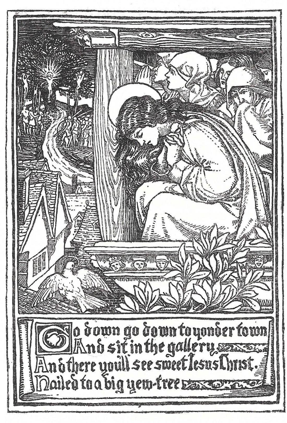
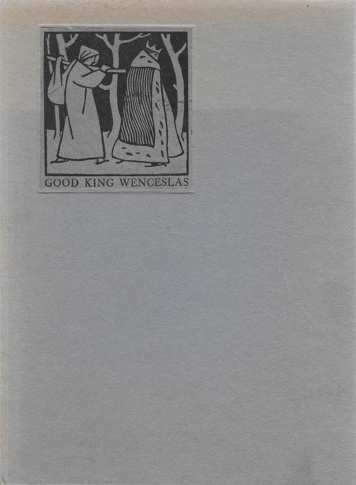
Morris’s Address sets the tone for Birmingham productions, but even more influential, it can be argued, was his lecture On the Woodcuts of Gothic Books (1894). This lengthy presentation highlights a number of key concepts which Morris detected in late medieval books and the Birmingham artists applied to their imprints. First and foremost is the emphasis on unifying the roles of artist and craftsman. Morris notes that ‘the woodcutter must be an artist translating the designer’s drawing’, or that artists should ‘be able to cut’ and understand the features of the medium (Woodcuts); inspired by this pronouncement, Mason, Gaskin and others of the School go one stage further by fusing artist and technician and engraving their own work. Morris also insists on illustration that should represent the book’s contents in a direct and economical way and on the need to have a balance between interpretive images, text and ornamentation – qualities which can certainly be seen in Mason’s Renaud of Montauban (1897) and Gaskin’s Good King Wenceslas (1895).
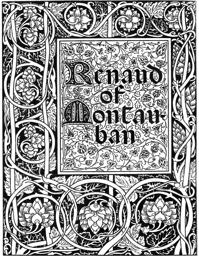

Two illustrations showing the balance of elements within the printed page. Left: Mason’s title-page for Renaud of Montauban, essentially an imitation of the Kelmscott Chaucer, Right: A page by Gaskin for Wenceslas, with a closely co-ordinated harmony between the illustration, lettering and decorative panel.
Morris has his greatest impact, however, in his comments on the medieval style of illustration, which, he says, should be emulated by the moderns. According to Morris, the greatest drawing for book design should be composed of a ‘well drawn line, crisp and clean, suggesting a simple and beautiful silhouette (Woodcuts). Anything ‘vague’ or over-elaborated should be avoided, and all illustrations should be ‘simple’ in the sense of recreating the pared-down directness of the medieval woodcut, even if the process itself is engraving (along the end of the block) rather than cutting (where it is excavated along the grain). Morris proclaims, in other words, that the best illustration is simplified, linear and pared down, and it is precisely this approach that determines the visual language of the Birmingham School of illustrators. Indeed, all of the artists deploy a muscular linearity, of bold outlines and simplified forms. Gaskin’s illustration of the poor man gathering fuel to represent the poem ‘Good King Wenceslas’ epitomizes this approach; Agnes P. Manley’s design for God Rest You, Merry Gentlemen and Florence Rudland’s In Betheleem that Noble Place follow a parallel trajectory (1893).
Left: Manley, God Rest You, Merry Gentlemen. Right: Rudland, In Bethleem that Noble Place.
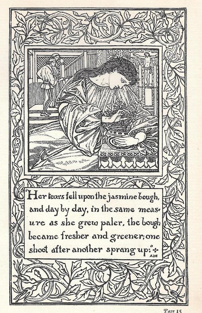
Following Morris’s advice, these designers and their associates create a style which is self-consciously archaic, a modern version of Gothic imagery. Produced in the 1890s, Birmingham illustrations look like the woodcuts of incunabula of the fifteenth century and invoke a supposedly lost excellence by recreating the idioms of an idealized past. This approach fits exactly with Morris’s Arts and Crafts, with its revival of medieval forms and its promotion of pre-industrial art-forms. At the same time, the School echoes the archaism of Pre-Raphaelite painting as it was formulated in 1848: the original members of the Brotherhood set out to recreate what they saw as the depth of feeling in painting before Raphael, and the Birmingham designers were inspired by the directness of printed books produced during the same period. This antiquarianism is reinforced by the School’s appropriation of Pre-Raphaelite imagery, which was a prime ingredient in the style of Arts and Crafts and offers a visual lexicon based on close observation of nature combined with escapist neo-medievalism.
The Birmingham School of Illustration and Pre-Raphaelite Art
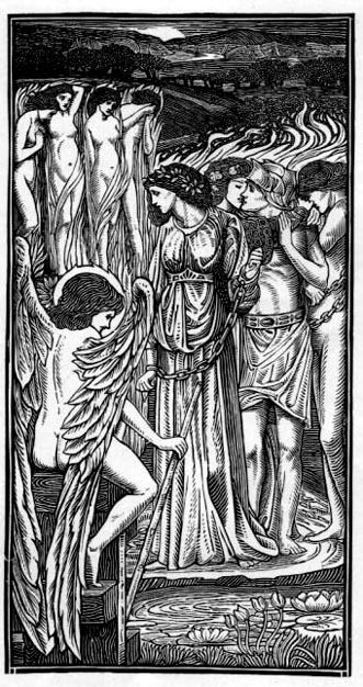
The Birmingham illustrators moved between the two polarities of Pre-Raphaelitism, varying between escapism and verisimilitude. Bernard Sleigh was heavily influenced by Rossetti and Burne-Jones, recreating the idealized beauty, angular lines, compressed space and microscopic detail that feature in both artists’ paintings and illustrations. There is a marked relationship, for example, between Sleigh’s design, I Saw Three Ships (1893), and Rossetti’s illustration of the ‘Lady of Shalott’ in the Moxon Tennyson of 1857. Sleigh’s treatment is essentially a simplification of Rossetti’s image, taking the tendency to flatness one stage further while retaining the psychological focus and emphasis on decorative accessories.
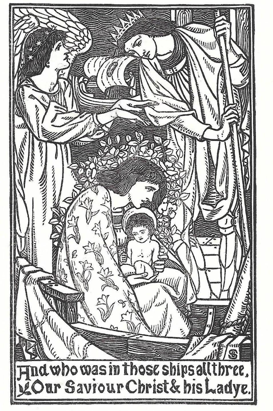
Left: Sleigh, I Saw Three Ships. Right: Rossetti, illustration for The Lady of Shalott.
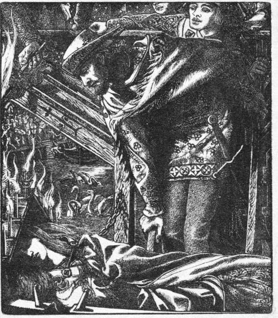
In A Vale of False Lovers (1898), conversely, the inspiration is drawn from Burne-Jones. The elongated figures with small heads and faces, conveying a cryptic, mysterious effect, are clearly derived from Jones’s illustrations for the Kelmscott Chaucer (1897), and Sleigh also borrows the older artist’s treatment of swirling forms while reproducing his characteristically mannered armour. Following the details of Burne-Jones’s visualization of the medieval, he creates an idealized otherworld which runs in strict parallel with the painter’s airless spaces, the dream-worlds of heroes and heroines that we see in compositions such as Laus Veneris (1870–75).


Left to right: (a) Sleigh, A Vale of False Lovers. (b) Burne-Jones’s illustration of The Frankleyn’s Tale. (c) The same artist’s Laus Veneris.
At the other extreme are illustrations which reproduce the Pre-Raphaelite emphasis on verisimilitude and ‘copying from nature’, although interpretation of the aesthetics of realism is widely varied. Edmund Hort New, best known for his topographical illustrations and book bindings, offers a mild version of Pre-Raphaelite exactitude in the form of The Fishing House (The Yellow Book (1896). This image reports the details of an unobtrusive scene, journalistically noting the constituent parts of the architecture and setting. At the same time, several of Birmingham artists pursue the extremities of Pre-Raphaelitism realism, producing realistic compositions which, like those of J. E. Millais and William Holman Hunt, go beyond the notion of copying and create an effect of hallucinatory intensity, of reportage invested with the all-seeing vision of a dream. Mary J. Newill’s Study of Trees (Yellow Book (1896: 34) is figured in these terms, offering a scene that records all that can be seen; Gaskin is similarly focused on phenomenal detail in his cuts of King Wenceslas (1895), focusing especially on the bark of trees and the weave of costumes.
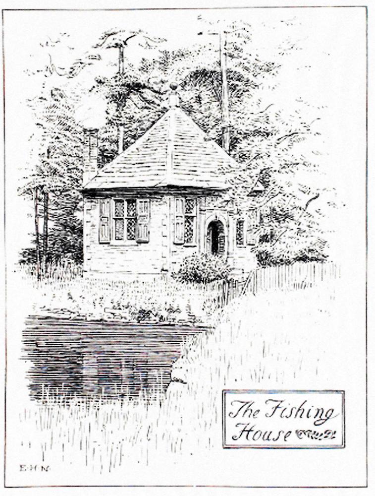

Left: Hort New, The Fishing House. Right: Gaskin, Monarch and Page Forth They Went.
Such realism resonates throughout the School, sometimes in competition with the emphasis on escapism. In keeping with Pre-Raphaelitism generally, the Birmingham illustrators project the movement’s fundamental inconsistencies, its paradoxical vacillation between opposites. Their gallery of representative work, assembled in The Yellow Book in April 1896, epitomizes this conundrum. Also telling is the way in which several of the artists, again in strict adherence to Pre-Raphaelite aesthetics, reproduce these contradictions in single designs; imitating Rossetti, they depict the imaginary as if it were real. This tendency is especially marked in the work of Fred Mason, whose Seven Virgins exemplifies this approach. The main figure is a Rossettian type, resembling Jane Morris, that could have been borrowed from Proserpine (1880); yet the phenomenal detail is carefully registered, with the far distance being as vividly particularized as the objects in the foreground.

Left: Mason, Seven Virgins. Right: Rossetti, Proserpine.
In short, we can position the Birmingham School within the category of third generation Pre-Raphaelitism, which operates within and is part of the discourse of Arts and Crafts. Originating in one of great industrial cities with its role to create wealth through the production of objects and the capitalist exploitation of markets, it defies the materialism of its time and reasserts Morris’s demand for hand-crafted visions of the past. Revolutionary or merely indulgent, its intentions were as sincere as those which motivated its exemplars.It was not the case, however, that every critic was in support of its aims or approved of its home-spun style. In her influential study of 1903, R. E. D. Sketchley voices a complaint that was often heard. The Birmingham illustrators, she believed, were sometimes too bound by the conventions they observed, noting how their work was ‘too consistent’ to ‘be delightful’. Put another way, and rather more bluntly, she thought their work was monotonous, merely the unoriginal outcrop of a pre-existing idiom. ‘Perhaps the best result’, she continues, will only take place when the ‘formal effect’ of training is ‘less patent’ (13). Not only limited in range, she implies that there is an absence of individuality. Gleeson White (1897–8) repeats the point but qualifies it with careful observation, noting how the books:
illustrated by past or present students of the Birmingham School will be best noticed in a group, as, notwithstanding some distinct individuality shown by many of the artists, especially in their later works, the idea that links the group together is sufficiently similar to impart to all a certain resemblance. In other words, you can nearly always pick out a ‘Birmingham’ illustration at a glance, even if it would be impossible to confuse the work of Mr. Gaskin with that of Miss Levetus. [57]
Gleeson White’s qualification is nuanced, stressing the fact that the artists worked with a recognizable idiom while exploiting it for their own ends. Sketchley’s judgement is nevertheless the more influential opinion of the two, a situation embodied in the generic nature of most critical commentaries, with little attention being directed at the artists’ personal inflections. Analysing the work of all of the School’s designers would require an extended study, but it is possible to navigate a pathway through the styles of several of the outstanding contributors.
Some Observations on the Work of Birmingham Illustrators
The leading illustrators of the Birmingham School were Arthur Gaskin, his wife Georgie Cave France, Charles Gere and Celia Levetus. Each of these created an idiosyncratic version of a general style. The prime figure, without doubt, was Arthur Gaskin: not only responsible for publishing the work of his students and colleagues, he developed a highly distinctive manner.
Gaskin’s illustrations are typified by narrative drive and strong characterization. A sensitive interpreter of text, he is especially adept at representing physical and psychological duress in the form of dramatic scenes enriched with telling detail. He applies these emphases in his striking designs for Stories by Hans Christian Andersen (1898), but his most sensitive work is embodied in his treatment of the story of King Wenceslas. His illustration in the Book of Pictured Carols (1893) typifies his capacity to show moments of self-absorption as the ‘poor man’ comes in sight ‘Gath’ring winter fuel’ (18). He depicts the figure as a massive form; his gaze is directed downward at the task of tugging bare twigs from a sapling, with the other hand holding a bundle of bare rods. This is economic illustration of a high order, focusing on the action while adding a distinct sense of the character’s resolve. Indeed, Gaskin highlights the dignity of work in strict accordance with Ruskinian principles: the face is worn and the hands are the exaggeratedly massive hands of a labourer. The effect, as Crane notes, is one of immediacy and emotional depth: ‘simple’ and ‘bold’, it is in ‘harmony with its subject’ (203). It is also interesting to compare it with another version of the subject, featuring in Good King Wenceslas, in which the artist stresses not strength, but frailty.
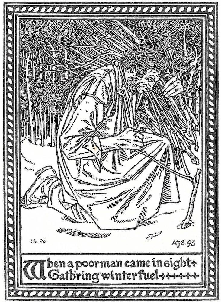
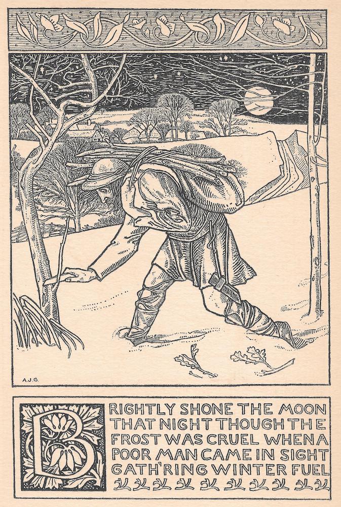
Two versions of the peasant gathering fuel, both by Gaskin. Left: from the The Book of Carols. Right: from Good King Wenceslas.
The same can be said of his other illustrations on the theme of King Wenceslas, which were published in 1895 by Cornish Brothers of Birmingham. The best of these focus the sense of physical privation, privileging the impact of intense cold and ‘cruel’ frost by showing the peasants as they toil through snow. The bleakness of the scenes is intensified by the stark contrasts of black and white and by the fractured staccato rhythms of the bare trees, which twist expressionistically and act as metaphors for human suffering. The dynamic outlines of the figures, as they struggle with their burdens, is a powerful affirmation of hope – of heroic resilience in a preternaturally hostile environment.
This imagery is masculine in orientation, celebrating male achievements in a pronounced linear style. Gaskin is also an accomplished illustrator of the feminine, celebrating female beauty in the form of nuanced portraits of Pre-Raphaelite beauties, notably in his designs for Andersen. If the Wenceslas illustrations have the robustness of the woodcut, the portraits of women are delicately drawn; though a radical in art, Gaskin’s illustrations confirm the usual Victorian stereotypes.
Two idealized, Pre-Raphaelite beauties by Gaskin, both from Andersen’s Stories.
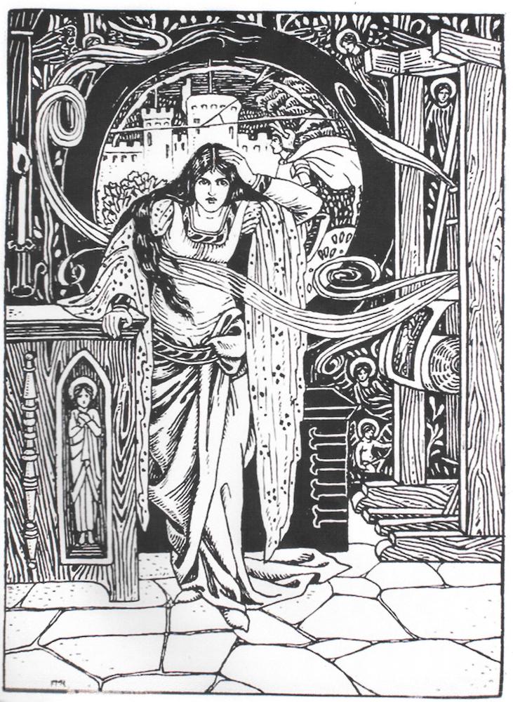
The same is true of Charles Gere’s designs, which feature idealized gender types. Gere’s illustrations are otherwise characterized by a strong emphasis on arrested actions either in the form of a significant encounter or a moment in anticipation of an imminent event or meeting. This interest features in his response to R. Nisbet Bain’s Russian Fairy Tales (1901) in which a series of characters are shown at a moment of psychological suspense or surprise. In The Sage Damsel, for instance, he shows the very minute at which the ‘good youth’ and ‘lovely damsel’ (222) begin a conversation. The connection between them is expressed in the exchange of looks: though far apart, the blankness of the sky is a void that propels them towards each other. Similarly intimate is Tsarevna Loveliness Inexhaustible. This illustration visualizes the archetypal situation of the young prince awakening the sleeping princess, showing the moment before he kisses her; his face and back are presented to the viewer and his face is in the process of descending towards her lips. Prince Ivan’s stance, formalized into the shape of a triangle, embodies his urgency, a device Gere amplifies by contrasting his outlines with the horizontals of the bed and the sinuous lines of its covering. Concerned, like Gaskin, with visual storytelling, Gere presents a situational immediacy that greatly enhances the movement of the narrative while animating characters within a dynamic series of encounters.
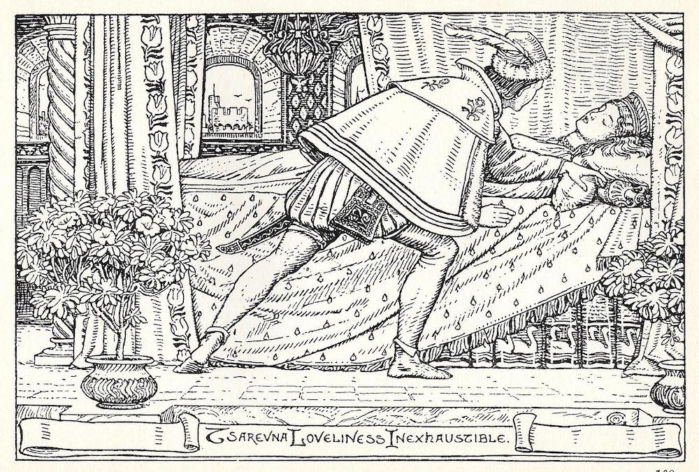
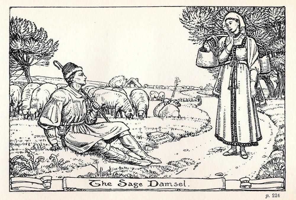
Two idealized illustrations by Gere. Left: The romantic Tsarevna Loveliness Inexhaustible. Right: The Sage Damsel. In both designs, Gere excels at creating a mystical, inner world in the manner of Pre-Raphaelite fantasy.
More complicated and difficult to classify, perhaps, is the work of Celia Levetus. Levetus focuses less on narrative and more on characterization and setting. In keeping with most of the other members of the group, she was primarily concerned with the illustrating of poetry and children’s books, and in each of these she provides memorable portraits of the key characters as they engage within a series of self-consciously ‘magic’ places. In her work for Turkish Fairy Tales (1901) she vividly projects the personality of the witch, placing her against a knobbly tree which forms a visual rhyme with her distorted face. This is quirky design, quaint and amusing, and pitched at exactly the right level for the juvenile reader.
On the other hand, Levetus is an accomplished interpreter of the metaphysical, a quality encapsulated in her visual response to Blake’s dual-texts, Songs of Innocence (1899) and Songs of Experience (1902). These series are radical insofar as they compete with Blake’s visionary originals, replacing his symbolism with Levetus’s own.
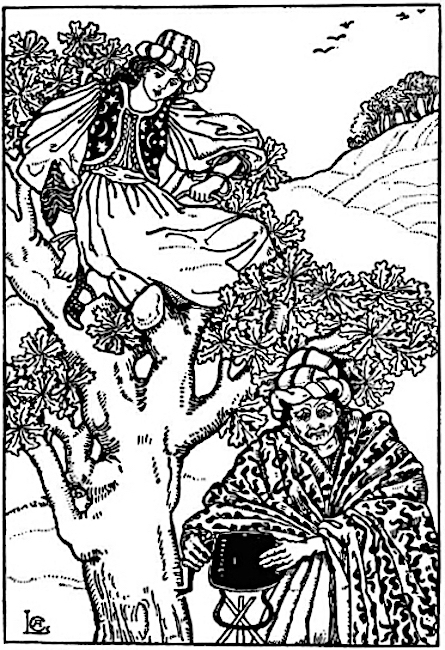
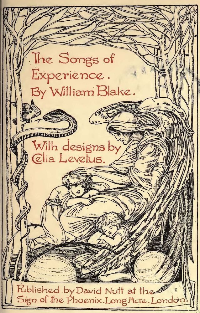
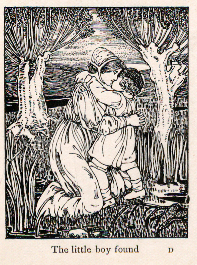
Three illustrations by Levetus: (a) The Damsel and the Old Witch, (b) Title-page for Blake’s poems, and (c) Little Boy Found.
In complete contrast is the art of Georgie Gaskin. Gaskin was purely an illustrator for juveniles and, though not as well-known as either Kate Greenaway or Beatrix Potter, created a distinctive idiom. Using the pared-down economy of the Birmingham line, she places monumental figures in flattened settings and blank backgrounds, in each case presenting a version of the child-like directness associated with art for nursery-age readers. Gaskin was a prolific artist, but her work is exemplified by two publications. In the Horn Book Jingles (1893), the figures are shown in simplified outlines; faces are reduced to schematic patterns with dots for eyes and the action is suggested. She goes even further in her updated version of the Divine and Moral Songs by Isaac Watts, a book first published in 1715 and the subject of numerous illustrative responses in the nineteenth century. Her treatment (1901) is a montage of nursery figures in bold outlines and printed in colour by Edmund Evans, the engraver who engraved Greenaway’s books. The overall effect is one of intense clarity, appealing to the child’s eye by eliding unnecessary detail. Some aspects of her design recall the example of Greenaway, sharing with the older artist the airless, timeless qualities of a dream-world where children play; The Little Grey Lady (1893) also reflects the influence of Walter Crane. However, Gaskin’s art has a directness that is purely her own.
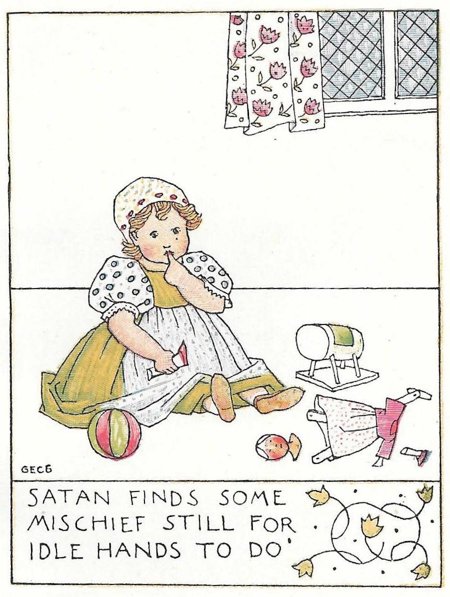
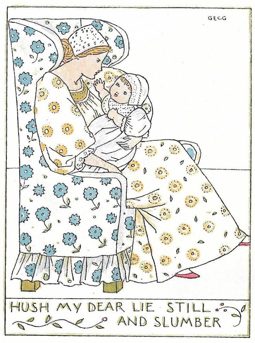
Left to right: (a) Greenaway, The Bubble. (b) Gaskin, Satan Finds Some Mischief. (c) Gaskin, Hush My Dear.
Georgie Gaskin and Celia Levetus are distinctive contributors, but they shared an interest in the layout of the pages. Characteristically, they place their texts within decorative borders or merge the print and the enclosing designs. The interface between figurative illustration, lettering and ornamental decorations is dissolved; on several occasions they designed the typeface as well as the art-work, so that the whole effect is one of harmonious merging and balance. In this approach all parts of the whole are integrated, a strategy in close accordance with Morris’s belief in the unified book. In Morris’s words in The Woodcuts of Gothic Books, all ‘organic art, all art that is genuinely growing … has two qualities in common: the epical and the ornamental: its two functions are the telling a story and the adornment of a space or tangible object’. That delicate, ‘organic’ balance, telling the ‘written tale’ with ‘conscientious directness’ (Woodcuts) within an ornamental scheme is the central interest of these artists’ work. Indeed, they take Morris’s credo to its logical extreme by designing their book covers too, creating another version of the ‘book beautiful’ by presenting their book as a pictorial unit, with the exterior and interior acting as aspects of a whole.
Unification of the parts was also a key concern of other members of the group: Mason designed the illustrations, borders and bindings for his work, and so did Arthur Gaskin and Charles Gere. Largely overlooked, their covers constitute another, and generally neglected, aspect of their work.
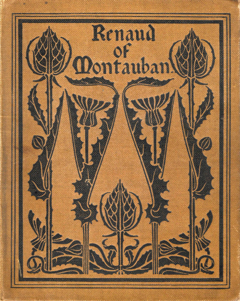
Left to right: (a) Mason, binding for Renaud of Montauban. (b) Gere’s design for Russian Fairy Tales. (c) Gaskin’s designifor Good King Wenceslas.
Publishers, Popularity and Stylistic Change
As noted earlier, the Birmingham School’s work was initially disseminated in small-scale, hand-crafted editions. Their illustrations appeared in The Quest, an in-house magazine issued in only a few numbers and in the card-bound imprints, Good King Wenceslas (1895) and A Book of Pictured Carols (1893). The Quest and Wenceslas were published by the Cornish Brothers, a bookseller based in New Street, Birmingham, which sold books and pamphlets of local interest; printed in small runs, both are now rare. However, the illustrators’ work quickly attracted the interest of larger publishers who were able to issue their work in the conventional form of cloth bindings, and printed in large imprints for the general public.
The illustrators’ profile was nevertheless uneven, with some books being issued by companies at the esoteric end of the market and others by houses in the populist mainstream. The minority firms Lawrence and Bullen, the Leadenhall Press, David Nutt and H. R. Allenson were all involved in promoting the School’s designs, but their impact was heightened by their association with the more powerful publishers of the age, among them George Allen, Methuen, Elkin Matthews and Chapman and Hall. The Birmingham School was always intended to produce designers who would serve the public rather than the elite, and the illustrators’ appearance in these imprints ensured they would have a direct influence on contemporary taste.
Other aspects of the School’s development are both predictable and surprising. As we might expect, the Birmingham artists worked for Morris at the Kelmscott Press. E. H. New designed a pictorial frontispiece, depicting Kelmscott House, for News from Nowhere (1890), and Gaskin was engaged to illustrate The Shepheards Calendar (1896). But the Birmingham artists only had a limited impact of their mentor’s productions. Curiously, Morris disliked Gaskin’s style and never offered another commission (Faulkner 7), and the illustrators as a whole remained outside Morris’s control and practised in parallel rather than within his immediate circle. This produced a paradoxical effect. Inspired by Morris’s philosophy, they did far more to popularize the style of Arts and Crafts, disseminated through ordinary editions rather than expensive imprints for the wealthy, than he did.
The Birmingham artists also questioned the rather stern puritanism of a Morrisonian style. Though publishing books which promoted Arts and Crafts aesthetics, a number of them exhibited their work in a volume of The Yellow Book (April 1896). The significance of this venue is its apparent inappropriateness: Lane’s periodical was an organ for the promotion of Art Nouveau, not Arts and Crafts, and the appearance of Gaskin, Newill, Levetus and others within its pages seems incongruous. It should be a mismatch, and to some extent it is. Yet closer inspection shows that several of the practitioners were producing work which was undergoing change, morphing from the severity of Arts and Crafts, with its ‘rather mannered angularity’, as Houfe describes their style (14), into the sensuous, sensual linearity of the idiom exemplified by the art of Aubrey Beardsley. At the very least, the illustrators accommodate the influence of Art Nouveau; like many designers of the 90s, such as Gleeson White, their imagery is poised between alternatives.
This ambiguity is exemplified by Florence M. Rudland’s illustration of The Lady of Shalott. Though it contains some of the Pre-Raphaelite emphasis on detail that features in Arts and Crafts design, it also includes the sinuous line and blocked oppositions of black and white that characterize British Art Nouveau. Levetus similarly introduces Nouveau elements in A Reading from Herrick, particularly in the sinuous stems of the daffodils, which are purely decorative rather than naturalistic. Most pronounced of all, however, is Ernest Treglown’s Three Blind Mice. This design, Houfe observes, is in a ‘strong Beardsley idiom’ (331), with patterned black and white, distortions of perspective – making the mice seem gigantic – and curvaceous lines. Treglown pays direct homage in his manipulation of the main figure, which has the too-small head associated with many of Beardsley’s designs, giving it a sense of mannered artificiality. All of these features are in marked opposition to the ‘honesty’ of Arts and Crafts, invoking the slightly menacing atmosphere of the ‘yellow nineties’.
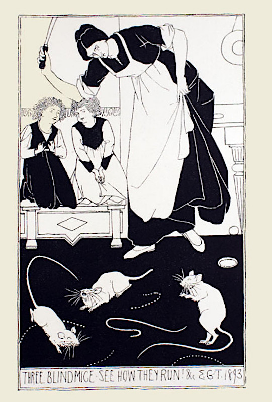
Left to right: (a) Rudland, The Lady of Shalott. (b) Levetus’s design of A Reading from Herrick. (c) Treglown’s Three Blind Mice.
The Birmingham illustrators thus underwent a process of transformation, and much of their illustration after 1900 looks more like Nouveau than Arts and Crafts. Speaking more generally, their large and diverse body of work can be viewed as an enriching contribution to late Victorian graphic art. Starting, we might say, as followers of the cult of Morris’s handicrafts, the Birmingham illustrators played as significant part in raising the standards of book illustration, especially as it was applied to juveniles. Their work is also remarkable in originating in a single institution, which became the cradle of many aspects of nineteenth century design.
Bibliography
Primary Sources
Andersen, Hans Christian. Stories and Fairy Tales. 2 Vols. London: George Allen, 1893.
Blake, William. Songs of Experience. London: Nutt, 1902.
Blake, William. Songs of Innocence. London: Wells, Gardner, Darton and Co, 1899.
[Gaskin, Arthur]. A Book of Pictured Carols. London: George Allen, 1893.
[Gaskin, Arthur]. Good King Wenceslas: A Carol Birmingham: Cornish Bros. 1895.
Gaskin, Arthur, Mrs [Georgina Cave France]. Horn Book Jingles. London: Leadenhall Press, 1896–7.
Gaskin, Arthur, Mrs [Georgina Cave France]. The Little Grey Lady. London: SPCK, 1893.
Morris, William. An Address by William Morris at the Distribution of Prizes to Students of the Birmingham Municipal School of Art. London: Longmans, 1898.
Morris, William. News from Nowhere. London: The Kelmscott Press, 1890.
Morris, William. The Shepheard’s Calendar. London: The Kelmscott Press, 1896
Morris, William. The Woodcuts of Gothic Books, 1892; reproduced online https://www.marxists.org/archive/morris/works/1892/woodcuts.htm
Nisbet Bain, R. Russian Fairy Tales. London: Bullen, 1901.
The Quest (1894–96).
Steele, Robert (translator). Renaud of Montauban. London: George Allen, 1897.
Turkish Fairy Tales and Folk Tales. Translated from the Hungarian by R. Nisbet Bain. London: Lawrence and Bullen, 1901.
Watts, Isaac. Divine and Moral Songs. London: Elkin Matthews, 1896.
The Yellow Book 9 (April, 1896).
Secondary Sources
Crane, Walter. Of the Decorative Illustration of Books Old and New. London: Bell, 1896.
Faulkner, Peter, and Preston, Peter. ‘Introduction.’ William Morris: Centenary Essays. Exeter: University of Exeter Press, 1999.
Gleeson White, J. ‘Children’s Books and Their Illustrators.’ The Studio, Special Winter Number, 1897–8.
Hodson, Laurence W. ‘The Birmingham Group: Arthur J. Gaskin and Joseph Southall.’ The Studio 324 (March 1920): 2–11.
Houfe, Simon. The Dictionary of Nineteenth Century British Book Illustrators. Woodbridge: The Antique Collectors’ Club, 1978; revd ed., 1996.
Sketchley, R. E. D. English Illustration of Today. London: Kegan Paul, Trench, Trübner and Co., 1903.
Swift, John. ‘Birmingham and its Art School: Changing Views 1840–1921.’ Histories of Art and Design Education. Ed. Mervyn Romans. Bristol: Intellect, 2005. 67–91.
Vallance, Aymer. ‘A Provincial School of Art.’ The Art Journal (1892); 344–48.
Created 30 June 2020