
Introduction: author and artist

arly and mid-Victorian fiction was characteristically presented to the reading public in the form of as a dual text in which some of the meaning was generated by the interplay between the words and the illustrations that accompanied them. With the notable exceptions of the Brontës, whose works were illustrated posthumously, all of the major Victorian novelists of the period were engaged in a series of creative partnerships with an artist who set out to interpret their messages and acted as an intermediary between the texts and their audiences.
These partnerships have been the subject of considerable argument and debate. Charles Dickens’s collaborations with George Cruikshank and H. K. Brown have been explored in a series of sustained investigations, and so have Anthony Trollope’s relationship with J. E. Millais, George Eliot’s pairing with Frederick Leighton, and W.M. Thackeray’s with Richard Doyle and Frederick Walker. Extending the historical period into the seventies and to the end of the century, we might also note Thomas Hardy’s work with Robert Barnes, George du Maurier and Hubert Herkomer. In each case, study of the working relationships has yielded rich insights into the process of collaboration and its impact on the visualized text.
The understanding of text and image is problematized when there is only a passing relationship between the author and artist, an antagonistic relationship, or no relationship at all. Charles Reade’s collaborations are a case in point: he worked productively with Robert Barnes, the illustrator of Put Yourself in His Place (1869–70), but snubbed and insulted Charles Keene, the interpreter of A Good Fight (1859). The absence of straight dealing between Reade and Keene denies us any understanding of how the artist viewed the work – and nothing of the reasons for the author’s hostility. Knowledge of this dynamic would surely help us to reassess the illustrations, and we can only speculate on what might have been said.
The same critical problem attends the pairing of Elizabeth Gaskell and George Du Maurier, who illustrated eight of her works including her monumental Wives and Daughters and North and South (1863–67), and Gaskell and the late Victorian illustrator, Hugh Thomson, the interpreter of Cranford (1891). Of Gaskell’s attitude to these collaborators nothing can be said. The author was not involved in a professional relationship with either of them, died (in the November of 1865) before any dealings could develop, and, with the exception of a small note of approval for du Maurier’s work, left no comment on how her fictions were visualized. The effect, as Thomas Recchio remarks, is one of disjuncture, of being ‘out of sync’ (p.75) with the loquacious discourse of the illustrated novel and its monumental arguments, both positive and acrimonious, over the construction of a hybrid text. Indeed, our knowledge of Gaskell’s illustrated fiction is materially diminished by the author’s truancy from a traditional arrangement. What the artists thought is likewise a matter of speculation, although it is possible to reconstruct their views by considering other materials.
No doubt both would have benefitted from some authorial guidance and advice, but they may also have viewed the situation as liberating rather than constraining, an opportunity rather than a threat. As I suggested in a recent essay, du Maurier preferred working on his own as opposed to responding to an author’s demands (‘The Fountain’), and Thomson, the illustrator of so many classic texts, would barely have experienced the travails of collaborating with a living author. What we can say is that both illustrators were free to interpret the text as they saw fit, without the yoke of a writer’s interference. If they lost the reassurance of a guiding hand such as Thackeray’s, they were free from the sometimes outrageous demands of Dickens and Reade. This small release may have contributed more to the quality of their responses than if they had been forced to concur with authorial directions.
Writing on Gaskell’s illustrations has underplayed this aspect of the artists’ work, exploring instead the accordance between the writing and the designs. Criticism is limited, however; Wives and Daughters is the only novel to be considered at length. Bill Ruddick (1988) examines du Maurier’s emphasis on Gaskell’s ‘domestic realism’, and parallel trajectories, which stress the appropriateness of his homely vision, ‘illustrating the everyday’, are followed by Alan Shelston and Paul Goldman (2016). A more theorized focus on the positioning of the designs is adopted by M.E. Leighton and Lisa Surridge in their influential essay of 2008, ‘The Plot Thickens’, and other evaluative comments can be traced in contemporary and modern criticism.
The only other novel to be explored in detail is Cranford. Thomas Recchio (2014) argues that the illustrations by du Maurier and Thomson are important constituents in the construction of the author’s reputation, and Valentina Polcini offers a more general assessment of the two artists’ contribution to the fiction’s meaning (2011). The only analysis to consider all of the books is Gillian Cumiskey’s doctoral thesis (1994), a major study that remains unpublished.
These commentaries clear new ground but criticism as a whole is either repetitious or speculative A wider approach, investigating the historical positioning of these texts, is long overdue. The aim of the following sections is to consider the illustrations as autonomous responses in which the artists deployed varying interpretive strategies; unfettered by authorial involvement, their illustrations were bound by the economic and aesthetic contexts in which they operated.
Smith, du Maurier and Gaskell: some economic contexts

u Maurier was engaged to illustrate Gaskell by the publisher George Smith of Smith Elder. He was employed, first and foremost, to increase the appeal of the writer’s work by offering the reader the added attraction of his designs. Gaskell’s work of the fifties had been published unillustrated in Dickens’s Household Words, and was unlikely in this form to realize a good return on Smith’s considerable investment in her work. His strategy, in short, was to raise her profitability by re-casting her as an illustrated writer whose fiction was modelled on the dual texts appearing in his flagship journal, The Cornhill Magazine.
By the middle of the sixties The Cornhill contained illustrated fiction by George Eliot, W.M. Thackeray, Wilkie Collins and Anthony Trollope, and Smith’s matching of Gaskell and du Maurier was driven by the need to place the author in the same company of popular writers who sold the magazine in vast numbers and continued to generate profits when the serials were re-issued in book-form. By paying an artist to enhance her work he could be sure of making large profits; this strategy had worked by using J.E. Millais’s illustrations to sell Trollope’s Framley Parsonage (1860–61), and Smith’s intention was to generate the same advantage by engaging du Maurier.
Smith facilitated this process in a two-pronged strategy. Having purchased the copyrights of Gaskell's work, he published them unillustrated and then almost immediately re-issued them in a cheaper edition with du Maurier's illustrations. Sylvia’s Lovers appeared first of all in 1863, and this was followed by Cranford,Cousin Phillis,The Grey Woman and Lizzie Leigh (1864–5), and North and South in 1867. These small books, bound inexpensively in red cloth, were used to penetrate the popular market. Smith’s second strand was to present Wives and Daughters as a fresh new serial which featured in The Cornhill (1864–6) and subsequently as an expensive two volume set.
This flagrant marketing was ‘driven’, as Recchio remarks, ‘by the publisher’s commercial concerns’ (p.78). It is important to note, as the same time, that Du Maurier’s reputation at this point in his career was no guarantee of success; his name does not even appear until the cheap editions were reprinted and Wives and Daughters was issued as a book. What mattered at this stage was having illustrations – any illustrations by a competent artist – as a selling point. Nevertheless, du Maurier’s growing reputation, acknowledged by the inclusion of his name in advertisements and on the revised title-pages, was soon to become an important part of bolstering Gaskell’s saleability.
His effectiveness as a means to create returns can be judged by considering some of the surviving figures. These clearly demonstrate a huge and lucrative difference between Smith’s investment in the illustrator’s work and the amounts he made for his employer. Smith paid the artist a paltry £10 – £15 per large engraving with less, perhaps £3 – £5, for initial letters (Cooke, Illustrated Periodicals, p.54): small amounts which from his total output of 38 full page illustrations and 18 initials only generated a modest £460 or so, spread over a three year period from 1864 to 1867. The earnings, it has to be said, were the going rate for the job at the time. But they are far less than Smith’s fees paid to Gaskell, which consisted of £2000 for Wives and Daughters and probably £1000 for all of her other fiction. This was paid without negotiation or quibble despite the fact that it was the artist’s contribution that allowed Smith to issue her earlier books in mass-market editions priced for every pocket (from 2/6 to 10 shillings) and converted them into best-sellers. Gaskell gave the texts, but it was Du Maurier who made many thousands of pounds for the canny publisher.
Smith’s margin, viewed conservatively and taking into account all other production and distribution costs, must have been at least fifty times the fees he paid to his illustrator, and probably much more. Used as a marketing tool, Du Maurier helped to popularize Gaskell to an audience that was not only used to having its fiction illustrated, but wanted striking illustrations as well. In an age when the work of Sensationalists such as M. E. Braddon were routinely issued with imposing designs, du Maurier’s bold and impressive pictures re-branded Gaskell as a modern new voice, revising her reputation as a meek writer of domestic genre and restoring her place on the ‘desirable’ list of bourgeois readers.
Indeed, du Maurier became one of the publisher’s outstanding commodities. Smith’s financial control of ‘his’ artist was clinched by the fact that his purchase of the work was absolute: the small fees du Maurier received were for the work and its copyright, and Smith had no obligation to pay him any royalties. For example, the wage paid for the illustrations to Cranford in 1864 did not have to be renewed when the book was re-printed in 1866, 1867 and 1870, and the publisher could re-use the electrotypes of the illustrations whenever he wished. This arrangement, as I explain in Illustrated Periodicals of the 1860s, is typical practice of the time, although it was most effective as a means of manipulating an inexperienced artist at pains to establish himself. du Maurier fitted this bill exactly: in the early sixties he needed work, would accept any terms in return for a promise of continuing employment, and would do practically anything to ingratiate himself with a publisher as influential as Smith.
His approach to his Gaskell commissions was certainly dynamic. Writing to his mother in January 1864 as he began work on Sylvia’s Lovers and in the wake of his single illustration for The Cornhill’s Cousin Phillis in December 1863, he notes how he has to ‘work like bricks at another book of Mrs Gaskell’s’ (Young du Maurier, p.224). Derived from the idea of laying stones in a road, the phrase vividly conveys the artist’s willingness to graft as a hard as any navvy of the period. In August of the same year he is in a ‘hurry’ to complete ‘two books’ of Gaskell’s (Young, p.238), and in September he is working on the single volume editions as well as the serial of Wives and Daughters. Under Smith’s direction he gained ‘plenty of work’ (p.241); writing, again, to his mother, on his work for Sylvia’s Lovers, he notes that he will ‘take the same pains and time’ (p.215) if he is paid 3 guineas (on this occasion) or ten.
What mattered for du Maurier was advancement, short term pain for a longer term outcome. However, he always knew the disadvantages of working on a piece-meal basis, with no remuneration for the reprinting of his work. As he was illustrating Gaskell’s fiction in 1864 he tellingly comments on Smith’s exploitation of his artists’ contribution to sales, noting how Millais, who had generated a fortune for the publisher in the form of his illustrations for Trollope’s novels, was considering taking the issue to law:
I met Millais who was in a terrible state of indignation; he has written to Smith to protest against the exploitage [sic] of his work and wants me and others to do the same. So that the grave question of artistic property being protected is broached at last. It is indeed unfair to think that perhaps the sale of these drawings, Millais’s especially, will be bringing in a regular income to the publishers, and that the artist shall not benefit by it, and Millais swears that if he spends £500 in going to law it shall not be done. This question has been occupying us draughtsmen on wood, and I hope something profitable may turn out of it [Young, p.243].
Nothing was done, and du Maurier, in a tenuous economic situation, was unwilling to offend the publisher who was giving him the opportunity to showcase his talent. The terms under which he was engaged were certainly exploitative, but, as we have seen, he never allowed doubts about the financial arrangement to undermine his commitment to the task at hand.
Quality prevailed, and the reprinting of her work ‘with illustrations by Du Maurier’ was in the long term a great advertisement. His images helped to sell her books, but he gained from the association as well. The names ‘Gaskell’ and ‘du Maurier’ were linked in the public mind in all of the later editions, and helped him to establish his reputation not only as comic designer, whose work appeared in Punch, but also, to use his own term, as a ‘serious’ illustrator with the capacity to interpret one of the foremost writers of the age. As Alan Shelston remarks, his work for Gaskell ‘played a major part in the foundation of his career’ (p.66).
du Maurier and Gaskell: making the match
u Maurier’s dedication to the picturing of Gaskell’s fictions is voiced throughout his letters. His energetic turn-around of work on a short schedule is matched by his relish for the challenge; he speaks, for example, of enjoying ‘mightily’ the task of illustrating Sylvia’s Lovers (Young du Maurier, p.215). What is more important, however, is the fact that du Maurier was qualified (and felt he was qualified) for the work: his capacity to represent domestic interiors combined with strong characterization and psychological drama made him an ideal interpreter of Gaskell’s vision of middle-class life, and his eye for detail and visual continuity was a perfect match with her emphasis on the minutiae of everyday experience. This correspondence, creating equivalences between the visual and verbal texts, is another example of the matching of talents and can be traced in other great collaborations of the period, notably those of Trollope and Millais and Dickens and Phiz.
Yet this linkage was rather more tenuous than the end result might suggest. The author of the match, as in the case of Trollope and Millais, was George Smith, and with the advantage of hindsight it would seem that the pairing was another example of his astute marriage of compatible talents. On this occasion, however, the partnership was a probably a fortuitous accident. As noted earlier, Smith needed illustrations to enhance Gaskell’s work, but in choosing du Maurier he was taking a risk. du Maurier had produced little by 1863 that would suggest his suitability; the only work he had done for The Cornhill was a series of illustrations for poems, and his experience in illustrating fiction was limited to his picturing of the Sensational texts published in Once a Week: Santa (August–September 1862), Charles Adams’s The Notting Hill Mystery (November 1862–January 1863), and M. E. Braddon’s Eleanor’s Victory (March–October 1863). For each of these the artist provided racy, dynamic, lurid designs, but could barely be said to have produced the sort of imagery that would match with Gaskell’s domestic realism. Nevertheless, when he turned his hand to Gaskell it immediately became clear that he could provide appropriate illustrations, and Smith’s appointment was more than justified.


Left: Hugh Thomson, No one could black his books except himself. Right: George du Maurier, Molly’s New Bonnet. [Click on images to enlarge them.]
The strength of this arrangement was quickly established following the publication of Sylvia’s Lovers at the end of 1863. Du Maurier’s success in making sense of this novel proved his ability; the artist’s hold on her work was further proved by the production of a single illustration for Cousin Phillis in the December issue of The Cornhill (8: facing 688), and thereafter Smith commissioned him to embellish all of the works for which he held the copyright. Positioned, as it were, as Gaskell’s ‘official’ illustrator, du Maurier went on to visualize the characters and situations of this most nuanced of Victorian writers; tellingly, Smith made no attempt to influence his approach, trusting him to interpret the texts as he wished. Gaskell let him do as he wished, and so did his publisher: an almost unique situation and one that required both tenacity and self-confidence.
du Maurier’s illustrative strategies: ways of visualizing Gaskell

u Maurier’s position as an autonomous artist was part of a broader historical change in which illustrators moved from the status of a servant, who was inferior to, and controlled by, the author, to repositioning as the writer’s equal. At the same time, the situation could be problematic and was characterized by advantages and disadvantages, pros and cons. As a relatively inexperienced illustrator and an absolute novice as an interpreter of the sorts of fictions written by Gaskell, du Maurier might have benefitted from some sort of guidance from the author or publisher. On the other hand, it could be argued that the openness of the arrangement allowed the artist to express his understandings of the texts and add new inflections and nuances of his own.
These two positions – doing what he was told or working entirely for himself – are debated at the end of his career in ‘The Illustrating of Books from the Serious Artist’s Point of View’ (The Magazine of Art, 1890). There is some virtue, du Maurier contends, in undergoing the ‘discipline’ of ‘working in harness’ (p.374). Authorial direction undoubtedly made the task of illustration relatively straightforward, he argues, and lifts responsibility, or ‘blame’ (p.374) from the artist’s shoulders. Yet there is no doubt that independence was his favoured position, allowing him to work as an autonomous professional and not as the writer’s inferior. His preference for this situation is spelled out in ‘The Illustrating of Books’ when he argues that the writer’s words inspire the most inventive illustrations and are used without interference and purely as an artistic starting point:
Sometimes [the author’s work] lets loose the fountain of one’s originality [and the text becomes] a theme or motif for endless contrapuntal additions and variations, and fugues, and unforeseen embellishments [‘Illustrating’, p. 374].
du Maurier thus promotes the liberation of the artist, making him into an interpreter rather than a faithful illustrator, a producer of new meanings and not (or not entirely) the creator of a literal paratext. This position is essentially Pre-Raphaelite in spirt: Dante Rossetti spoke of needing to be free to ‘allegorize’ Tennyson’s ‘St Cecilia’ (qtd.. Reid, pp. 31–2) for himself, creating imaginative constructions which used the text, in the words of William Michael Rossetti, as a ‘hint and an opportunity’ (p.189); and du Maurier, who admired the ‘Moxon Tennyson’ and writes about it at length in ‘The Illustrating of Books’, was committed to the same principle. This notion is evident in his early work for The Notting Hill Mystery (1862–3), hugely improving Adams’s tale, and he responds with similar creativity in his work for Gaskell’s narratives.
His visual interpretations deploy a number of strategies which are used consistently across the corpus of work, endowing it was a pictorial coherence that matches and extends the unities of Gaskell’s stories. These foci can be divided into scene setting; characterization and the development of psychological drama; the implications of realism and realistic detail; and ways of depicting the limitations of the characters’ lives. Each of these involves privileging aspects of the writing, adding new information, eliding some elements and foregrounding others.
du Maurier accentuates the fictions’ setting, with many of his illustrations representing their time and place. In Sylvia’s Lovers, for instance, he provides a detailed topography of Whitby, the novel’s Monkshaven. Unaware, when he started the work, that Whitby was the model for Gaskell’s fictional town, he based his illustrations on drawings by Henry Keene (Charles Keene’s brother), only discovering the felicity of his approach after the book had been published (Chadwick, p. 261).
His treatment of Monkshaven reinforces the author’s historical specificity, and this type of imagery features throughout the series. The streets of Cranford, the countryside of Lizzie Leigh and the by-ways and landscapes enclosing the ‘little straggling town’ of Wives and Daughters (Cornhill, 10, p.130) are a continuing presence. du Maurier typically shows the setting as the opening design, so matching the author’s exposition with a material re-inscription of ‘what’ and ‘where’. In the single volume editions this device features on the pictorial title page: the fields of Lizzie Leigh, Cousin Phillis and The Grey Woman are displayed as the reader opens the book, North and South enshrines the novel’s polarities in the form of factories and fields, and Cranford’s narrow panorama frames the action before the tale has begun.
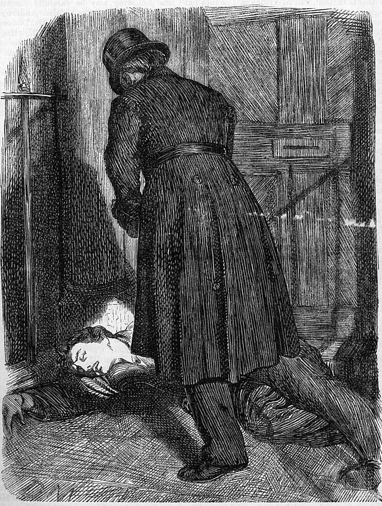

Two of du Maurier’s illustrations for Charles Warren Adams’s The Notting Hill Mystery. Left: The policeman found him lying on the doorstep. Right: Madame hypnotised.
du Maurier’s title pages are thus deployed as proleptic designs which root the stories in a notion of reality and stress the fictions’ purpose as explorations of provincial experience. The signifiers of the provincial – landscapes, farm-yards, gated fields and old-fashioned architecture – are crystallized in these single designs, forging a series of expectations. If Gaskell creates a rural world, then du Maurier co-creates it, establishing the physical correlates of a limited space that will reveal its secrets in the unfolding narrative. The use of the gate-motif – on the title-pages of Lizzie Leigh and The Grey Woman – is particularly effective as an inducement to advance, encouraging the reader to step, metaphorically, through the fiction’s portal, or, in the case of Cranford, to pursue the destinations suggested by its thoroughfare. At once concise encapsulations of Gaskell’s small world, Du Maurier projects the fictions into the interpreter’s own space and invites a response. This strategy negotiates the artist’s brief to help to popularize Gaskell’s writing, and it is telling that the name of the publisher is worked into the design, cleverly suggesting that Smith Elder has brought a new fictional world to readers of the 1860s.
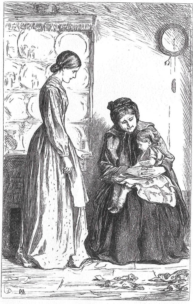
This visualization of Gaskell’s settings invests them with rich possibilities. du Maurier also enhances her characterization, deepening its psychological resonance by focusing on small details of facial expression and gesture; this process is sometimes a matter of discovery, uncovering submerged aspects of the text and sometimes a matter of addition, adding emphases of his own invention. He is especially adept at representing buried or uncomfortable emotions. In Wives and Daughters, he focuses on the underlying difficulties in the relationships between Dr Gibson, Molly and Mrs Kirkpatrick. The New Mamma (Cornhill, 10, facing p.583) pictures the awkwardness suggested by the caption and teased out in an extended reporting of their conversation. The contrast between the two personalities is cleverly conveyed in the opposition between their facial expressions and even in the positioning of their heads: Mrs Kirkpatrick’s ambivalence is implied in the turn of her face, only half-gazing at Molly while she coos compliments at her adopted daughter; while Molly, alarmed by the new situation, is shown full-face, her eyes directed at the evasive gestures of her new parent. This contrapuntal arrangement crystallizes the idea of Molly’s uncertainty, giving visual form to a semantic field composed of negatives: ‘her heart began to harden’, a ‘strange woman’, the ‘cloud in Molly’s eyes’ and the telling adjective, ‘discordant’ are all used to dismal effect (10, pp. 600–602). But the intensity of Molly’s gaze adds more, suggesting not just embarrassment but distrust leavened with fear. This much is not yet evident in the text, but du Maurier amplifies the situation by showing Molly’s anxiety, in essence a growing panic, just at the moment when it starts to undermine her contentment.
du Maurier’s sensitivity to the workings of the female psyche is one of the key characteristics of his depiction of Gaskell’s women in Wives and Daughters, and the same capacity to represent suffering and frustration informs his other titles. Cousin Phillis’s conflicted emotions, torn between shamefulness and desire, is crystallized the illustration depicting the moment when Holdsworth arranges her hair (Cousin Phillis, facing p.78); and in a single design for the same text in The Cornhill, which was never reprinted, we see her ‘peeling apples’, caught between petulance and curiosity, shyness and an awareness of her admirer’s gaze (8, facing p. 683). Again, the facial expression and turn of the head are telling, and greatly expand the writing’s inferences. The frontispiece for Lizzie Leigh, the illustration Nanny, Nanny (facing p.29), in the same text and the pictorial frontispiece for Sylvia Lover’s all deploy the same strategy, emotionalizing texts that might be described as reticent or over-restrained.


Three title-pages by du Maurier.
It could be argued, once again, that du Maurier manipulates this type of representation to re-package the texts, catering for a public taste which by the mid-sixties was more entertained by the excesses of Sensationalism than the subtle observations of Gaskell’s social dramas; he does does not re-cast them in the febrile terms of The Notting Hill Mystery or Eleanor’s Victory, but he does suggest the characters’ inner lives in ways which go beyond the author’s delicate suggestiveness. Gaskell’s technique is one of understatement, but du Maurier converts her characters and situations into a visual drama, a montage of tightly-focused conversations, intense looks and meaningful gestures. Only occasionally does he slip into melodramatic excess.
du Maurier focuses other aspects of the characters’ lives that are never spelled out. One of these is the narrowness of their milieu and its psychological implications. Gaskell maps small-town, small-time life and Du Maurier takes the idea much further, expressing the restrictions of bourgeois society in a spatial metaphor. In his designs, the limitations of provincialism are represented in the form of claustrophobic interiors: pressed in by restrictive social codes, his characters’ frustration is symbolized by the oppressive closeness of walls, objects and constricted spaces. Rooms are constructed as narrow stages, with the fourth wall opened as if in a theatrical production; the characters can barely move and any implied action is constrained by the elaborate female costumes of the period. Molly, Mrs Kirkpatrick, Cynthia and Cousin Phillis are imprisoned in their crinolines as they are in their lives, and there are few examples where space is opened to suggest a greater psychological freedom. Even the pictorial title-pages are cramped; commissioned to interpret a small world, du Maurier converts Gaskell’s settings into cupboard-like metaphors of manners and mind.
Sustaining the interpretation: du Maurier’s illustrations for Wives and Daughters

ives and Daughters was first published in The Cornhill Magazine from August 1864 to January 1866. By far the most substantial of du Maurier’s commissions, it was embellished with 18 full-page engravings and 18 initials. Positioned after Millais’s series for Trollope’s The Small House at Allington (September 1862–October 1864) and run in near parallel with George Thomas’s visualization of Wilkie Collins’s Armadale (November 1864–June 1866), it was offered as a feature serial, one of the monumental illustrated novels that appealed to a large middle-class audience and formed the mainstay of the Cornhill’s programme in the sixties; it was reprinted in two volumes, with only the full-page illustrations, in 1866.
With this sustained work du Maurier moved from the periphery to the centre stage, placing him in the company of Millais, Leighton (who had illustrated George Eliot’s Romola, July 1860 – August 1863), Walker and others in Smith’s inner circle of favourites. Though regarded as unremarkable at the time and just another of the magazine’s illustrated serials – the expectation of quality having already been established – du Maurier’s designs are considered by Goldman (1996, 2016) and Shelston (2016) as some of the best of the period. Both commentators stress the compatibility of Gaskell’s letterpress and the images. Goldman notes that they are ‘at one with the text’ (Victorian Illustration,1996 p.116), while Shelston views the composite novel as a seamless whole, brilliant draughtsmanship at the service of the author’s messages. Leighton and Surridge (200) likewise view the novel as a complex interaction, a dynamic interplay in which the positioning of the illustrations is especially important as a means of inflecting the material.
These critical approaches identify the power of the images. Operating as illustration and interpretation, they act as a literal mirror of whatever information is inscribed in a written form while suggesting other strata of inference. In this novel, as in the others in the series, ‘working in harness’ (Young, p.38) is finely balanced against the liberating effects of releasing the ‘fountain’ (‘Illustrating of Books’, p.374) of original interpretation.
du Maurier’s designs are carefully developed as faithful illustrations. Influenced, perhaps, by his experience at Once a Week, where the editor Samuel Lucas insisted that his illustrators were the servants of their texts and should only produce literal representations of written information, his images for Gaskell adhere to their source. This is particularly evident in his depiction of the characters. Dr Gibson, Molly, Cynthia, Mr Preston, Mrs Kirkpatrick, Roger and all of the cast are carefully shown; figured as the embodiments of Gaskell’s somewhat cryptic descriptions, they synthesise information scattered throughout the narrative and epitomize the essentials of their physical appearance, gestures, dress, demeanour and personality. As the artist explains, they encapsulate the author’s ‘conceptions’ in a ‘concrete form’ (‘Illustrating’, p.349). Trollope claimed that Millais set out to ‘promote’ his ‘views’ (Autobiography, 1: p.199), notably in his development of his characters, and du Maurier does the same worthy service for Gaskell
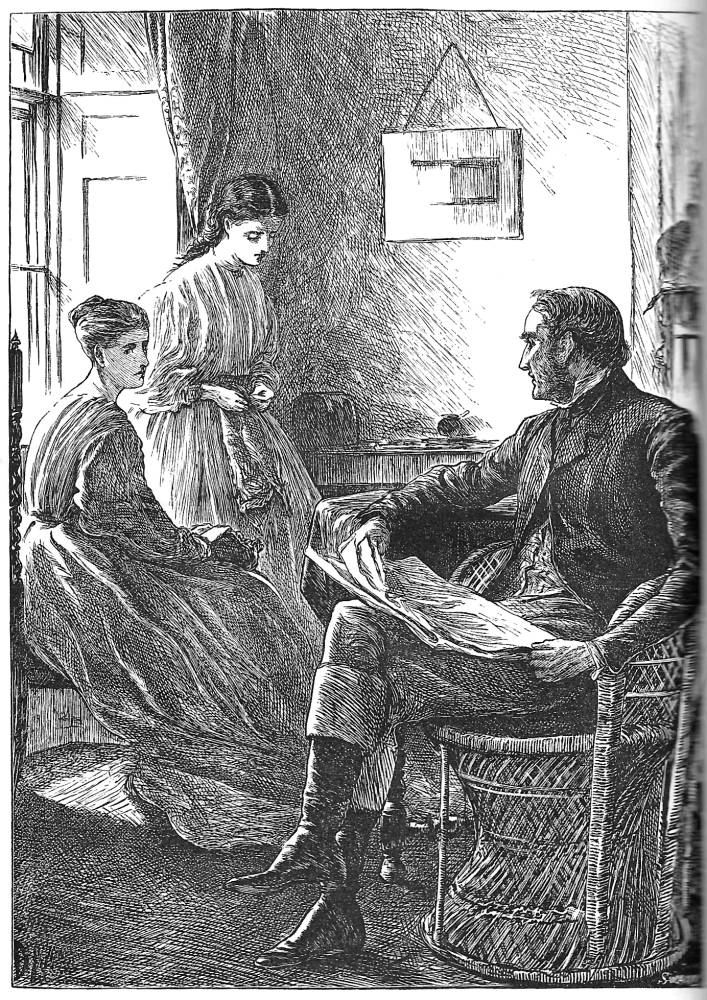
His treatment of Dr Gibson exemplifies this fidelity. Gibson is identified throughout the tale as physically and psychologically unbending, a man of ‘Scotch blood’ who possesses a kind of ‘thistly dignity’ (Cornhill, 10, p. 357). His behaviour is focused by the illustration showing the moment when he takes his trainee’s love letter from Molly (10, facing. p.355). His facial expression suggests his authority and asserts the ‘respect’ (p.357) everyone accords him; his assuredness is implied by his pose, and the outstretched hand is unambiguous in its demand. Gibson’s coolness is revisited later in the book when he has to chastise Cynthia for receiving letters from the same miscreant; once again, the penetrating gaze and impassive face convey the character’s unflinching toughness (12, facing 129). Literally faced down, the girls seem to wilt under his frosty reprimand.


Left: Cousin Phillis and her Book . Middle: ‘You would like a portrait?’ — both from Cousin Phillis. Right: ’Nanny, Nanny’ frontispiece to Lizzie Leigh and Other Tales.
du Maurier’s other visualizations are similarly developed. Molly is identified as a plain-speaking but sensitive; we first see her as a girl (10, facing p.129), and the artist maps the book’s central concern with her passage from childhood to early adulthood by representing stages in her growing up (for example, 10, facing p. 355; facing p. 385; facing p. 583; 11, facing p. 65; facing p. 197; facing p.320; 12, facing p.1). Each illustration is a telling portrait; working only from small textual clues such as the comment that Molly has black hair and eyelashes and looks rather French (10, p.143), he endows her with a large face and well-defined features. The uniformity of the portraiture intensifies the psychological resonance of the characterization by making it physically plausible. Caught in time at key moments in her development, the illustrations function as a montage, by implication a photographic record of a real person. This verisimilitude underscores and supports the narrative and her place within it.

Two of du Maurier’s illustrations for Gaskell’s Wives and Daughters. Left: A Love Letter. Right: I trust.
It also provides the central point of reference. Molly, the novel’s focus and the one acted upon rather than acting, is placed in a series of juxtapositions with the other characters, in each case forming a visual contrast in which her personality is contrasted with her new family and friends. Molly’s stolid presence notably contrasts with the insubstantial figures of Cynthia and Mrs Fitzpatrick; Molly’s broad face and black hair connote her solid personality, while the essential triviality of the two other women is implied in the over-elegant turn of their faces, their light hair and their airy crinolines. Drawing on the pseudo-science of physiognomy to reinforce the patterned contrasts of Gaskell’s characterization, du Maurier frames the women in terms of a marked opposition: strength, integrity and simple goodness is connoted by Molly’s square face, black hair and steadfast gaze; while fecklessness, modishness and opportunism are inscribed in the mother and daughter’s light hair, round faces and curvaceous necks and jawlines.
This gallery of portraits reinforces the novel’s concern with a small-scale, domestic drama, and du Maurier’s montage is so close to the narrative that it almost seems possible to work out the story on the basis of the illustrations alone. Samuel Lucas, du Maurier’s employer before he worked for Smith, insisted that illustrative series should be clear enough to reconstruct the main thrust of the story without the words, and du Maurier’s strategy in responding to Gaskell must surely be informed by this philosophy. Gaskell depicts small lives in a provincial setting living in the near- present, and the artist does precisely the same, working in the same realistic register while supporting the characterization with contemporary details of furniture, dress and other minutiae. Indeed, du Maurier’s mirroring of the text gives visual form to a novel which is otherwise lacking in the sort of pictorial detail that appears, for example, in the fictions of Dickens and George Eliot. In the classic manner of illustrative design, the artist illuminates the story by re-presenting it.
This process is extended by the illustrator’s interpretive designs. Du Maurier’s approach to developing the text, using it as a prompt and stimulus, involves several approaches. Sometimes it is a matter of selecting what he thinks is the most crucial scene, and not necessarily the one given the most prominence in the tale. As Goldman remarks, his choice of subject is unorthodox, distorting the emphases in the writing in order to discover what he believes is the most telling moment:
Left to work on his own, the aptness of his designs can be demonstrated by quoting the text at the point or moment du Maurier chose to depict, focusing on where he intervened and which moments he selects to illustrate … throughout this work the artist … does not invariably choose to show the most dramatic moment. As another example we can see with ‘The new Mamma’ – Molly and Mrs Kirkpatrick sitting together – in itself an un-dramatic scene but it is a crucial one in the development of the novel (12: facing 513). Mrs Kirpatrick is dressed in black while Molly herself is in white – a clever comparison which hints at the conflict between the two from the outset of their meeting one another. This design, at first glance simply two figures seated together, is in truth a compelling psychological study of the protagonists in conflict, but where that conflict is simmering beneath the surface and Du Maurier is able to hint to the reader or viewer in a manner that is full of depth and power [‘George du Maurier, Draughtsman’, p.26].
Another strategy, and in complete (and somewhat paradoxical) contrast to the avoidance of drama, is du Maurier’s heightening of climactic moments by borrowing the visual tropes of his Sensational commissions. Wives and Daughters is a novel of deep and repressed feeling, but du Maurier chooses on some occasions to hint at the simmering power that is barely contained between the surface-treatment of social manners and class etiquette. In two designs, Gaskell’s text is briefly transformed into a Sensational fiction of melodramatic excess. Mamma, Mamma shows the physical prostration of Osborne’s French mistress with their children trying to revive her (12, facing p.513). The composition recalls the Sensational attitudinizing in The Notting Hill Mystery and the effect, as Shelston remarks, is one of ‘deep feeling’ (p.62). Likewise in The Last Turning (13, facing p.1) the impression of one of emotional intensity. Roger is seen as an isolated figure surrounded by lashing rain; the vigorous hatching of the lines create a febrile and unsettling impression and, like Mamma, Mamma, confounds the reader by fracturing the novel’s (apparent) equilibrium.
du Maurier is at his most suggestive, however, in the several scenes of Molly in moments of loneliness, reverie and self-examination. These situations are carried in the full-page engravings and in the small-scale initials, with the small illustration revealing the character’s inner feelings and the large one depicting her struggles to maintain propriety as she is faced with unpalatable changes and conflicts. This arrangement is well-managed at the opening of Chapter 10: the full page engraving shows her transfixed with grief and uncertainty as she engages with Mrs Fitzpatrick, her face a mask of tension and disbelief, while the initial depicts the release of her emotion as she collapses in tears (10, p.583 and facing p.583). The opening of Chapter 4 (10, p. 385 and facing p. 385) is similarly handled. In the initial she is gazing into a mirror, a sign of her search of a new identity as circumstances change around her and alter her status. But it is in the main illustration, (Vae Victis!, that Maurier provides the most complicated representation of her innermost thoughts.
On the face of it this design is entirely straightforward, a representation of a moment when Molly, who is staying at the Hamley’s, looks out through the window and sees Roger in conversation with the squire:
(After dinner, too, the gentlemen lingered long over their desert, and Molly heard them laughing; and then she saw them loitering about in the twilight, out-of-doors; Roger hatless, his hands in his pockets, lounging at his father’s side who was now able to talk in his usual loud and cheerful way, forgetting Osborne. [10, p.395].
This event is a small release from the difficulties faced by the Hamleys: ‘Vae Victis’ [‘woe to the conquered’] refers to the idea that the Squire has momentarily banished his troublesome son, Osborne, and can enjoy a relaxed meeting with Roger. However, the focus of the design is Molly, who is also ‘vanquished’ in the sense of being detached or driven away from her father as he drifts ‘into matrimony’ (10, p.396) and ‘vanquished’ insofar as Roger has captured or defeated her heart.
du Maurier finds a perfect formulation to suggest her loneliness and sense of detachment, manipulating the conventions of contemporary art as a means of implying her inner life. Foremost among these is the treatment of space and the placement of the character. In the text, Molly hears and sees the two men, but the illustrator adds other information, positioning her in in the alcove of a bow-window which is both real and symbolic of her state of mind. In Victorian illustration windows and doors routinely represent an interface between two worlds, and in this design the barrier between Molly and the other characters is an emblem of her introspection. Physically isolated from others, she is psychologically removed as well. Her inertia, quietly contemplating the two men, further suggests her sense of powerlessness: invoking the semiotics of Pre-Raphaelite paintings and illustration, du Maurier shows her as a troubled beauty in the manner of the Millais’s treatment of Lady Mason for Trollope’s (Orley Farm, 1862) and Sandys’s woman in From my Window from Once a Week (24 August 1861, p. 328), which similarly invokes the tradition of the opened portal. The declining light is similarly enhanced for expressive purposes and features, as in so many Victorian paintings, as a signifier of change. As Shelston remarks, the twilight has a metaphorical implication, suggesting Molly’s ‘uncertainty’ (p.59), as if her life is no longer clearly seen or understood; it further implies the fading of her youth and the loss of childhood innocence. An obvious comparison can be drawn with Millais’s crepuscular painting, Autumn Leaves (1856; Manchester Art Galleries, UK). Like the girls in this picture, Molly is trapped in time and subject the inevitable process of growing-up, and like them is shown at a moment of self-realization.

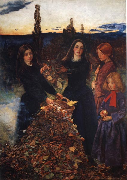

Left: du Maurier, Vae Victis from Wives and Daughters. John Everett Millais, Middle: Autumn Leaves. Courtesy of City Art Galleries, manchster. Right: Frederick Sandys, From my Window.
du Maurier adds a final dimension in his treatment of Molly’s figure, especially her costume. Though wrapped in silent reverie, Molly’s inner turmoil is powerfully conveyed by the agitated folds of her elaborate dress, which acts as an expressive unit. This, again, is an established sign, and bears close comparison with the tumultuous crinoline drawn by Millais for Lucy Robartes in Trollope’s Framley Parsonage (1861), and more generally with the elaborate folds of female costumes by Sandys.
Vae Victis! might thus be read in the terms of Bill Ruddick as a ‘delicate and sensitive comment’ (p.53) on Molly’s emotional condition. Though illustrative of a specific event, it embodies the sort of ‘contrapuntal additions and variations’ (‘Illustrating’, p.374) that Du Maurier sees as the fundamental process of interpretive design, greatly enlarging the implications of the source material and enriching the reader/viewer’s responses to it. In particular, it typifies his expressive manipulation of inter-pictoriality; drawing on well-established signs from the language of Victorian art, the artist deploys visual language as a means to elucidate his literary text in a process that parallels George Cruikshank’s use of Hogarthian tropes as a means to interpret Dickens. du Maurier’s application of this visual code would have been familiar to Gaskell’s original audience; shifting seamlessly between her written language and his pictorial discourse, these contemporary readers would have found no difficulties in applying the illustrator’s signs to the process of decoding, enhancing and complicating those enshrined in words. In the words of Lorraine Kooistra, this sort of illustrated novel demands a reading strategy operating both visual and verbal interpretation in order to understand how the dialogue between picture and word produces meaning within a network of cultural discourses (qtd. Recchio, p.5).
This type of symbiosis, with one language meshing with another, is typical of du Maurier’s approach to Gaskell’s text and is applied to all of his large engravings. His strategy exemplifies the interpretive approach deployed by the Pre-Raphaelites and champions a type of mid-Victorian illustration that appears to be purely literal, but is in reality extremely subtle and suggestive. The final result, as many critics have observed, bears comparison with the great composite novels of the middle period. du Maurier wanted to establish himself on the same terms as the outstanding illustrators of his time and his work for Gaskell, with its movement between fidelity and rich suggestiveness, gained him the reputation he was looking for.
Illustrating Cranford: Hugh Thomson

u Maurier’s illustrated editions of Gaskell were constantly reprinted and remained in circulation until the 1890s, although they are now surprisingly difficult to find. The first editions, which were issued in a fragile cloth binding and are usually in a poor state, are rare indeed, and command high prices in the antiquarian book-trade. The author was never again to be the subject of a sustained visual interpretation, but in 1891 Cranford was re-issued as a gift book with photomechanical reproductions of pen and ink drawings by Hugh Thomas. This flamboyant edition was a great success; its combination of Regency-style designs and elaborate binding defined a new direction in book-design, inaugurating a line for Macmillan that was collectively known as the ‘Cranford series’.
It had a wider resonance too. In his recent study of the novel’s publishing history Thomas Recchio explains Thomson’s illustrations as part of the retrospection of the 1890s, creating a ‘cultural narrative’ that articulated a ‘nostalgic sense of national identity’, and provided a ‘literary visual definition of what it is to be English’ (p.76). At the very time when Victorian certainties were being questioned by the emergence of the New Women, the ideas of the Decadence, the impact of technology and the rise of tension between Britain and its imperial competitors, Thomson’s Cranford offered a highly sentimental escapism, a verbal and visual retreat into a notion of pre-industrial England when the world was apparently Edenic.


Left: No-one could black his boots except himself, illustration to Gaskell’s Wives and Daughters. Middle: To show your tight ankles. Frontispiece to George Eliot’s Scenes of Clerical Life. Right: The Autumn Idyll illustration for Austin Dobson’s The Story of Rosina.
The new Cranford was projected by more practical considerations as well, and is not as dissimilar from du Maurier’s editions as might be expected. Both artists were part of an economic system, and it is important to point out that each was employed to make the text appealing. As I suggested in a previous section, du Maurier was engaged to re-cast Gaskell’s work in the terms of the 1860s as dual texts which would promote her somewhat reserved tales as complex interactions of image and word; in an age obsessed with visual reading, nothing buttressed a letterpress more effectively than striking images. The same was true in the nineties. Cranford was not an obvious best-seller for readers of the end of the century – being already forty years out of date – and Thomson’s prime role, like du Maurier’s, was to market what was (and always had been) a hard sell. The elaborate gilt binding, also designed by Thomson, helped it some of the way, but the illustrations were the principal means of catching the consumer’s eye.


Two illustrations to Gaskell’s Cranford. Left: Miss Matty. Right: To see the Alderney.
Thomson’s illustrations are the reverse of du Maurier’s sonorous pictures of the dignity of small people in limited circumstances. The psychological explorations of the art of the sixties is replaced by humour, sentimentality and nostalgic idealism; the style veers between near-caricature and the simplifications of books for children. Thomson usually follows the textual directions but adds an emotionalism, sometimes sickly, of his own. The illustration of the rector typifies this approach. Gaskell describes an encounter with the churchman who is described as a
tall thin, dry, dusty rector, sitting surrounded by National School boys His kind face was all agape with broad smiles, and the boys around him were in chinks of laughing [Cranford, pp. 160–61].
Thomson provides a close approximation to the mechanics of the scene, but the overall effect is maudlin rather than mischievous. The boys are simpering cherubs, and the rector a stereotype of benign goodness and eccentricity.
Other eccentrics people this imaginary dream-world which, as Edward Hodnett remarks, seems to exist outside time and place (p.218). Though the text fixes Cranford firmly in the opening years of the nineteenth century, the Regency dresses and fittings are generic, evocative of a lost time rather than historically exact. du Maurier’s title-page is a plausible representation of a provincial town of its period, but Thomson’s settings could have existed at any time in the nineteenth century. It is noticeable, especially, that Thomson only represents the middle-classes despite the fact that Gaskell mentions the town’s ‘general but unacknowledged poverty’ (p.5); in the illustrations, for sure, it remains invisible. Thomson’s focus, on the other hand, is domestic minutiae. The characters’ main activity is taking tea and gossiping, and this situation is preserved in several of the illustrations which focus on the tea-table, surrounded by the china-shop minuteness of well-dressed interiors.
Thomson’s illustrations might thus be read as a sort of abstracted meditation on the English idyll. Unlike du Maurier’s, they are too generalized to be regarded as interpretations of a specific text, and pay no attention to the tensions complicating the under-surface of Gaskell’s writing. Thomson went on to apply the same strategy to others in the ‘Cranford’ series, ultimately creating a distinctive imaginative world, a Regency land of ornamental characters, quaint interiors and, for the readers of the nineties, reassuring charm and prettiness. The contrast with du Maurier’s penetrating interpretation of the text could barely be more pronounced, and the difference between them exemplifies some of the reasons why illustration, regarded in the sixties as an essential part of the experience of reading a novel, would ultimately become redundant.
Primary Works Cited
[Adams, Charles Warren]. ‘Felix, Charles’. The Notting Hill Mystery. Once a Week (November 1862–January 1863). London: Bradbury & Evans, 1862–3.
Braddon, M. E. Eleanor’s Victory.’ Once a Week (March–October 1863). London: Bradbury & Evans, 1862–3.
Chadwick, A. E. Mrs Gaskell: Haunts, Homes, and Stories. London: Pitman, 1913.
Collins, Wilkie. Armadale. Illustrated by George Thomas. The Cornhill Magazine (1864 – 66).
du Maurier, George. ‘The Illustrating of Books from the Serious Artist’s Point of View.’ The Magazine of Art (1890): 349–53; 371–75.
Eliot, George. Romola. Illustrated by Frederic Leighton. The Cornhill Magazine (1860–63).
Gaskell, Elizabeth. Cousin Phillis and Other Tales. Illustrated by du Maurier. London: Smith Elder, 1865.
_____. Cranford.A single illustration by du Maurier. The Cornhill Magazine (December 1863).
_____. Cranford. Illustrated by Du Maurier. London: Smith, Elder, 1864.
_____. Cranford. Illustrated and with a decorative binding by Hugh Thomson. London: Macmillan, 1891.
_____. The Grey Woman and Other Tales. Illustrated by du Maurier. London: Smith Elder, 1865.
_____. Lizzie Leigh and Other Tales. Illustrated by du Maurier. London: Smith Elder, 1865.
_____. Sylvia’s Lovers. Illustrated by du Maurier. London: Smith Elder, 1863.
_____. Wives and Daughters. The Cornhill Magazine (1864–66).
_____. Wives and Daughters. 2 Vols. London: Smith Elder, 1866.
Reade, Charles. A Good Fight. Illustrated by Charles Keene. Once a Week (1859).
_____. Put Yourself in His Place. Illustrated by Robert Barnes. The Cornhill Magazine (1869–70).
Rossetti, William Michael. Dante Gabriel Rossetti: His Family Letters, with a Memoir. London: Ellis & Elvey, 1895.
Trollope, Anthony. An Autobiography. 2 vols. London: Blackwood, 1883.
_____. Framley Parsonage. Serialized in The Cornhill Magazine (February 1860–March 1861). First book issue: London: Smith, Elder, 1861. Illustrated by Millais.
_____. Orley Farm. Sold in parts (March 1861–October 1862); published in London by Chapman & Hall: 1862. Illustrated by Millais.
_____. The Small House at Allington. Illustrated by Millais. The Cornhill Magazine. (1862 – 64).
The Young George du Maurier: a Selection of His Letters. Ed. Daphne du Maurier. London: Peter Davis, 1951.
Secondary Works Cited
Cooke, Simon. ‘The Fountain of One’s Own Originality: Du Maurier’s Theories of Illustration and How he Applied Them to his Work’. George du Maurier: Illustrator, Author, Critic. Eds. Simon Cooke & Paul Goldman. Farnham: Ashgate, 2016. pp.83–100.
_____. ‘George du Maurier’s Illustrations for M.E. Braddon’s Eleanor’s Victory in Once a Week.’ Victorian Periodicals Review 35: 1 (Spring 2002): 89–106.
_____. Illustrated Periodicals of the 1860s: Contexts and Collaborations. Pinner: PLA; London: The British Library; Newcastle, Delaware: Oak Knoll Press, 2010.
Cumiskey, Gillian H. Elizabeth Gaskell: The Function of Illustration in the Novels and Short Stories. Unpublished doctoral thesis. King’s College, University of London: 1994.
Goldman, Paul. ‘George du Maurier as a Draughtsman and Illustrator.’ George du Maurier: Illustrator, Author, Critic. Eds. Simon Cooke & Paul Goldman. Farnham: Ashgate, 2016. pp.17–31.
_____.Victorian Illustration. Aldershot: Scolar, 1996; rpt. 2004.
Hodnett, Edward. Five Centuries of English Book Illustration. Aldershot: Scolar, 1988.
Leighton, M. E., and Surridge, Lisa. ‘The Plot Thickens: Towards a Narratology of Illustrated Serial Fiction in the 1860s.’ Victorian Studies 51:1 (2008): 65–101.
Polcini, Valentina. ‘Illustrating Cranford: George du Maurier and Hugh Thomson.’ Elizabeth Gaskell and the Art of the Short Story. Eds. Francesco Morroni, Renzo D’Agnillo. New York: Peter Lang, 2011. pp. 145–54.
Reccio, Thomas. Elizabeth Gaskell’s ‘Cranford’: a Publishing History. Burlington, V.T: Ashgate, 2009.
Reid, Forrest. Illustrators of the Eighteen Sixties. 1928; rpt. New York: Dover, 1975.
Ruddick, Bill. ‘George du Maurier: Illustrator and Interpreter of Mrs Gaskell.’ The Gaskell Society Journal 1 (Summer 1987): 48–54.
Shelston, Alan. ’Illustrating the Everyday: Illustration and Text in Gaskell’s Wives and Daughters.’ George du Maurier: Illustrator, Author, Critic. Eds. Simon Cooke & Paul Goldman. Farnham: Ashgate, 2016. pp.51–66.
Last modified 29 January 2017