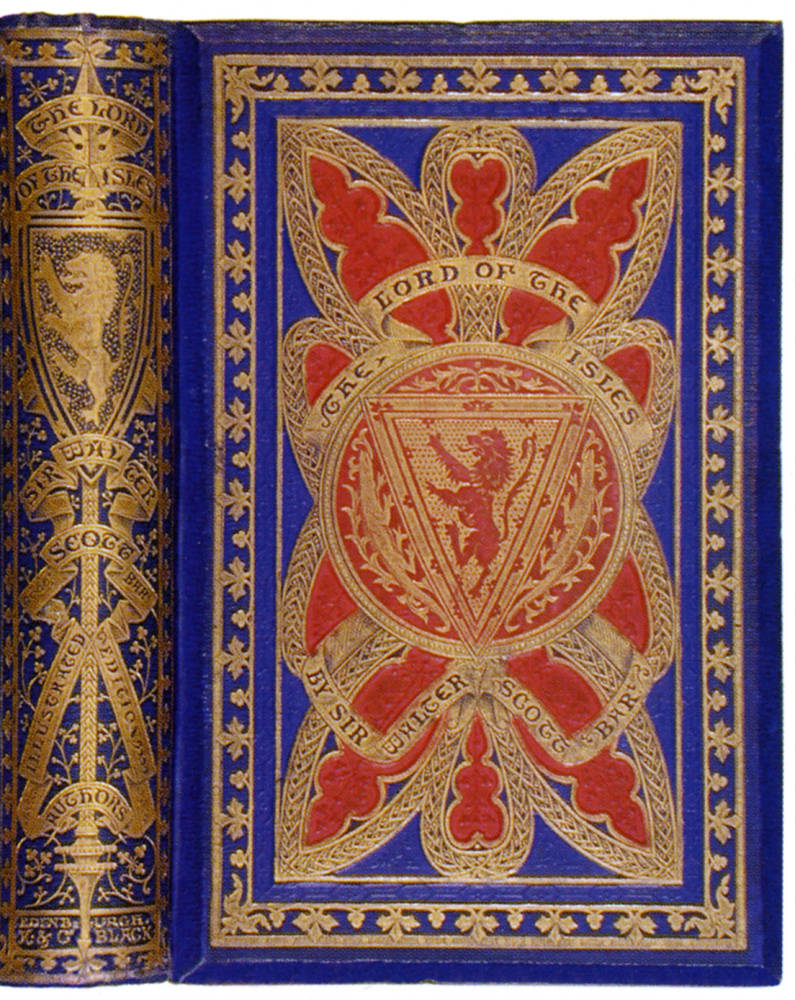


Three variant bindings of Sir Walter Scott's The Lord of the Isles. 1857. Binding design almost certainly by John Leighton. These books vary slight in size: (left) 224 x 130 x 32 mm., (middle) 203 x 131 x 31 mm., (right) 211 x 135 x 35 mm. [Click on images to enlarge them.]
These examples display the phenomenon of variant colors and variant designs in bookbinding production of the period. Series bindings, edition bindings, deluxe and standard issues, and alternate color choices are among the many developments explored by British and European publishers. The rise of a new merchandising sensibility in the middle of the nineteenth century led to publishers issuing books in multiple colors, for the first time offering the customer a choice in appearance without resorting to custom bookbinding. Thus, Adam and Charles Black offered the prospective purchaser of their l857 edition of The Lord of the Isles the choice of standard bindings in green (left) or the very exotic but not very colorfast, rose madder (middle), or blue, further embellished with color blocking in red (right).
Photographs and text from The Art of Publishers' Bookbindings, 1815-1915. With thanks to Ellen K. Morris and Edward S. Lervin
References
Scott, Sir Walter. The Lord of the Isles. Edinburgh: Adam and Charles Black, 1857. Printer: R. and R. Clark, Edinburgh; binder: Leighton Son & Hodge, London.
Morris, Ellen K. and Edward S. Lervin. The Art of Publishers' Bookbindings, 1815-1915. Exhibition Catalogue. Los Angeles: William Dailey rare Books, 2000. Nos. 89-91.
Last modified 17 January 2014