
I am again grateful to Mr Edmund King, who generously provided research material for parts of this entry and read the text in first draft.
Warren as a designer: life and career
Albert Henry Warren (1830–1911) was a versatile designer. Proficient as a painter in watercolours and oils, he was also an architectural draughtsman, a chromolithographer, an expert on book-illumination, an art-instructor and a free-lance practitioner whose work included the design and making of picture frames. His most enduring achievements, however, are in the field of book-binding, where he made a significant contribution to the design of cloth casings of the middle of the century.
Of course, Warren’s versatility was not exceptional in his own time, and his long and productive career is emblematic of a certain type of jobbing artist who was bound by the market and could only flourish by being flexible and inventive. Like his contemporary John Sliegh – who designed everything from bindings to bottle labels – Warren made a virtue out of necessity, applying his considerable skills to the embellishment of many different types of product. Warren’s biography is less familiar; there are surviving memoirs, and no likenesses. The known facts of his life, circumstances and corpus of work are outlined here.
Albert Henry Warren was born in Chelsea on 5 May 1830 and died on 2 March 1911, perhaps at his last home, in Tooting Graveney, south-east London. His background was middle-class and well-connected, at least in the sense of having contacts in the art-world: his father was Henry Warren (1794–1879), one-time President of the Royal Institute of Painters in Watercolour, and his uncle was John Martin, the celebrated creator of vast apocalyptic canvasses. These highly successful painters influenced Albert’s career path and may have acted as tutors; there is no evidence of his attendance at art-school and it is probable that he learned the rudiments of painting within the family circle. Equipped with some knowledge of painting, Warren became a minor artist in oils and watercolour. Always eclipsed by his astonishingly productive father and famous uncle, his achievements in this field were limited, and his main contribution was in the form of technical support. He assisted his father in the preparation of panoramas of the Nile and Holy Land in the manner of H.C. Selous’s dioramas. This task involved painting on a vast scale, although none of his work survives and, like all of this type of art-work, was condemned to the status of ephemera. For himself, he exhibited nature, landscape and genre works at Suffolk Street and The Royal Academy (1860–70).
However, Warren was primarily an applied artist. He was articled to Owen Jones and worked with him in preparing the interiors of the Exhibition held at the Sydenham Crystal Palace (1854), where he was chiefly involved in the design of the Egyptian, Greek, Roman and Alhambra courts. He did similar work for the Exhibition of 1862, and assisted Jones in drawing the Moorish decorations for St James’s Hall, Piccadilly, which opened in 1858. Warren’s expertise as an architectural designer and draughtsman was also put to use in his drawings for his uncle Martin, who had proposed significant improvements to the sewerage and water-systems of the Thames Embankment, and he probably undertook other, unrecorded commissions.
This facility suggests a talent with three-dimensional design, but Warren’s greatest talent lay in the preparation of flat, decorative surfaces and linear patterns. He assisted Jones in the production of the influential Grammar of Ornament (1856), although his role seems to have been routine rather than creative. As Jones explains his preface, the original drawings were ‘reduced’ by his ‘pupils Mr A.H. Warren and Mr Charles Aubert’, who prepared ‘them for publication’. The drawing on stone to create the chromolithographs was the job of another team under the direction of Francis Bedford. However, Warren quickly progressed to the higher level skill of making the drawings into chromos. Interestingly, he interpreted designs for Jones and for his own father. Jones and Warren senior collaborated on Paradise and the Peri (1860), Joseph and His Brethren (1865) and Scenes for a Winter’s Tale (1867). Albert is credited for rendering their work ‘on stone’ although by this time, when he was in his thirties, he was also creating decorative work for himself. The most notable of these endeavours was The Promises of Jesus Christ (1860), in which he composed the designs in the form of elaborate borders and lettering and drew them on the block. As an able technician, he combined artistic skills with practical expertise, creating or helping to create a series of virtuoso publications.
All of these books were published by Day and Co., the foremost purveyors of elaborate works containing vivid chromolithographs. As noted above, Warren was a leading contributor to the development of the mid-Victorian colour book, and his career at Day’s runs in parallel to that of Robert Dudley, another expert chromolithographer who created The Atlantic Telegraph (1866) and, like Warren, became a designer of book-covers. Warren also published work with the Chiswick Press, notably Arms of the Episcopates of Great Britain and Ireland (1868), in which he displayed a series of armorial designs in the style of the Gothic revival. The effect, as a noted in contemporary review in The Art Journal, was one of ‘great beauty’ (1868: 80).
These precious and elaborate gift books were part of the interest in ‘illumination’ in the form of printed works which recreated the intense polychromatic colours of hand-crafted tomes of the middle ages. As Ruari Maclean explains in Victorian Book Art and Colour Printing (1963), ‘the medieval art of illumination was a source of inspiration and material for exploiting the new art of chromolithography’ (85). Following in the footsteps of Owen Jones and Noel Humphreys, Warren was an able practitioner in this new form and, like these artists, was very much a champion of the cause. Jones’s books were intended to improve the taste of the public in the manner of Henry Cole and John Ruskin, and Warren was part of this didactic tradition. Not just ornamental, his work was presented as a model of refinement, intended to amuse and educate the audience. He makes this process explicit in a series of books in which he instructs the mid-Victorian audience on how to create good design and acquire good taste.
He published a slim guide, A Guide to Beginners On the Art of Illuminating [1860], in which he offers ‘preliminary instruction and advice’ for the enthusiastic ‘beginner’ (5). The manual reproduces a series of models that the student can copy, and advice is given on ‘heraldic methods of expressing colours’ (34) and ‘manipulation generally’ (36); he recommends close study of original manuscripts, or, failing that, illuminated volumes by Noel Humphreys and Henry Shaw, and finishes with several pages of advertisements for painting materials offered by Barnard and Sons, the company that published the book. His manual is slightly precious in the pejorative sense of affectedly reproducing a ‘Gothick’ font – notably in the lengthened esses to look like effs – but its intentions are genuinely educational, and he went on to publish a number of educational guides in the same manner. These included Drawing Examples for Technical and Art Students (1882) and Albert Warren’s Garden Painting Book (1889).
Warren’s manuals were one way of instructing, and he seems to have had an interest in education. He spent some time as a teacher of art. He had the unusual distinction of working for Queen’s College, London, which was one of the first public schools intended solely for girls. Set up by the social reformer F.D. Maurice in 1848, Queen’s was a progressive institution offering a broad curriculum, and Warren was employed from the middle of the 1860s as an instructor of ‘Drawing and Pictorial Art’ and ‘Landscape Drawing’ (Kay, 93). His status was purely that of a member of the teaching staff, and it is probably inaccurate to describe him, in the terms of Christopher Wood, as ‘Professor of Landscape’ (498). But he was certainly engaged in teaching at various levels, and may also have worked from home as a tutor. Interestingly, his wife Augusta is also identified in the census returns of 1871 and 1881 as a ‘teacher of materials’, or art and design; it is not known if she worked for an institution.
This activity seems to have been an integral part of the Warrens’ lifestyle and suggests the need to gain income from every available source. Albert’s ex-curricular range of clients is mainly supposition, but King notes that he gave lessons in illuminating and floral painting for the Queen’s daughters, Alice and Helena (xvi); as the legend proudly proclaims in his Guide, he was ‘Instructor to the Royal Family’ and must have attended at Windsor. Yet Warren may have exaggerated his claims; recent research by King in The Royal Archives drew a complete blank in the search for evidence of teaching-related payments or correspondence, and all that came to light was a couple of invoices, dated 1855 and 1857, for the design and alteration of decorative mounts and gilt frames, both for pictures by the royal personages. This find suggests that while Warren worked with the princesses, the status of ‘instructor’ seems misleading. Like many others, he may have exploited the association for his own purposes; in a period when a royal connection was a pathway to success, he made the best he could of what was probably a very mundane relationship in which he was treated as an upper servant rather than a professional artist.
Warren was paid just over twenty-one shillings for his royal service, and small sums would have been generated by his involvement with fine art, as such, and took the form of ‘rustic’ pictures, as Graves describes them: one at the Royal Academy, and four at Suffolk Street (293). Among the Suffolk pictures were Surrey Peasant Boy and Prize Chrysanthemums. The locations of these works is unknown and it would be interesting to see Warren’s essentially untutored efforts. Other fees would have been earned by his practice as a book-cover designer. His bindings were produced over a twelve-year period from 1858 to 1872, and during this time he tackled a wide variety of subjects, although most were for literary gift books which reproduced popular and standard texts such as Poe’s poetical works (1858) and Wordsworth’s The Deserted Cottage (1859).
Taken as a whole, Warren’s diverse areas of expertise enabled him to continue the middle-class lifestyle he was familiar with. The prosaic details of his life confirm his success as a hard-working professional. He was the father of six children, living in comfortable homes in Upper Cheyne Row, Chelsea (1861), Lonsdale Terrace, Barnes (1871) and Battersea (1881), and finally Tooting Graveney (1901). The Census records his occupation as ‘Artist and Ornamental Designer’, and ‘Artist Painter’, that reflect the range of his professional life. All other details seem conventional, although he was a long-standing member of The Artists’ Rifles.
Warren as book-cover designer
Warren is mainly remembered as a designer of book-covers in cloth, and occupies a place next to John Sliegh, Harry Rogers, John Leighton and Robert Dudley as one of the most significant figures of his time. This position was claimed by Sybille Pantazzi in an influential article of 1961, and later commentators, notably Ruari Maclean (1974), Douglas Ball (1983) and Edmund King (2003) have concurred in this judgement. However, Warren’s bindings are not without their complications. One problem is the (apparent) instability of his corpus of work. King and Ball provide detailed catalogues of key items, but Warren failed to sign all of his covers and some of his bindings have been identified on stylistic grounds. The true extent of his catalogue has never been defined – with Ball identifying 40 items and King only 20 – and the lack of records complicates the task of definition. Decoding and attributing his designs is far more problematic than it appears to be and although much is known, some of our current understandings, as Ball comments, are ‘speculative’ (162). New perspectives are needed and one way of approaching the work is to trace its stylistic affiliation with other aspects of Warren’s imagery and to link it with other influences.
It is important to note that Warren was an eclectic designer who deployed a range of styles, matching each of them to the books’ content. This type of proleptic design is exemplified by his Oriental casing for Thomas Moore’s Lallah Rookh (1861), and again in the Persian or middle-Eastern patterns which appear on the binding for Lays of the Holy Land (1858). The same strategies is used in his work for The Merrie Days of England (1859), which suggests Shakespeare’s time by using a Renaissance pattern, and in The Poetical Works of Edgar Poe (1858) he combines Oriental motifs with Gothic lettering – a curious mix which suggests the exoticism of Poe’s writing. In each case there is a clear relationship with the literary and pictorial material that is made available as soon as the volume is opened, and his approach to this task of visual preparation is sophisticated and inventive. Much has been written of the dis-junctures and lack of unity that are found in publications of the 1860s, but Warren’s approach – and that of his fellow cover-designers – suggests a calculated attempt to present the material book as an integrated whole.
The emphasis on making the binding match the book necessitates a shifting of idioms, but in Warren’s designs there is also a distinct sense of having a signature style which is unlike that of any of his contemporaries. Leighton, Sleigh and Dudley are sometimes so similar that it is difficult to differentiate between them, but Warren’s most characteristic covers can be identified by focusing on key motifs which are carried across a variety of bindings and appear in his designs for the printed page.
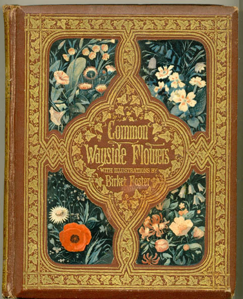
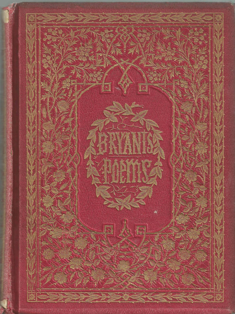
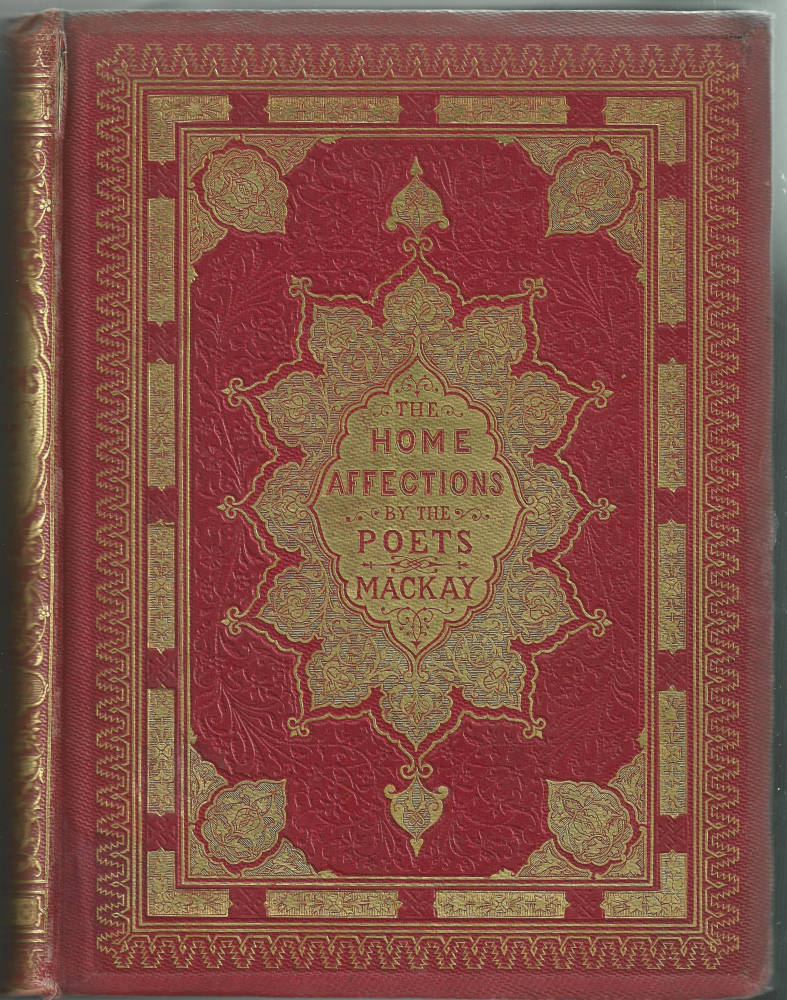
Left: Common Wayside Flowers. Middle: Bryant’s Poems. Right: The Home Affections of the Poets [Click on these images for larger pictures.]
These primarily take the form of floral motifs: fascinated by the forms of nature, he deploys a distinct vocabulary of flowers, shrubs, rustic bowers – in recollection of ‘woody’ Germanic illustration of the 1840s – leaves, roots, and vines. One of these is a three-cornered leaf surrounded by tendrils. This device appears in the ornamental borders in the pages of the Book of Favourite Modern Ballads (1860), and again in the form of a border on the upper board of Common Wayside Flowers of the same year; variants can be found on the front cover of Thomson’s Seasons (1859). Another device is a rosette, again surrounded by vines. This features on the binding for Alfred Tennyson’s Poems (a reprint of the ‘Moxon Tennyson’ which was republished in 1861), on Bryant’s Poems of 1858, and again on a collection of Wordsworth’s verse (1859). A third ingredient is the fluid and radiating ivy. This figures on the front cover of Treasures of Art [1865] and the spine of Home Affections of the Poets (1858). Other variations appear elsewhere and all create an effect, as The Art Journal observes of one treatment of Warren’s motifs, which is ‘exceedingly pretty’ (1860:32).
This visual vocabulary characterizes Warren’s hand, and represents a personal interpretation of a well-established decorative code. As noted earlier, the artist presents his own version of the rusticity of Germanic design, and was probably influenced by British practitioners of the style such as the illustrators H. C. Selous and John Franklin. It is also likely that Warren was influenced by Owen Jones’s Grammar of Ornament (1856). He worked on this book preparing Jones’s designs, and must have been extremely familiar with its contents; more than this, it is quite likely that he used some of its plates as a source. The section entitled ‘Leaves from Nature’ provides a template, it can be argued, for several of Warren’s rustic arabesques. At least two of the designs appear to be the prototypes for his tiny gilt leaves. The first of these, ‘No. 2 – Vines’ is surely the origin of Warren’s three-pointed leaf. There is a marked similarity between Jones’s treatment and his pupil’s and the two are virtually interchangeable. The notion of Jones’s influence is further suggested by No. 9. This shows stylized versions of the mallow: a flowering shrub which appears on the binding for Wordsworth’s Poems, the poems of Bryant, and the poems of Tennyson (1858–61). The relationship between Jones and Warren is also useful as a means to suggest attributions. The Art Album (1861) and Cowper’s Works (1864) are unsigned bindings that look as if they might be by Warren, and his authorship is further suggested by the marked similarity between the leaves appearing in Jones’s No. 7 and the flowing, abstracted forms featuring on the bindings for these publications.
Speaking more generally, it is quite possible that Warren was responsive to Jones’s ‘General Principles in the Arrangement of Form and Colour’, a monumental mantra of what constitutes good design and appears in the opening pages of the Grammar. Reading Jones’s instructions seems like a gloss on Warren’s style, and we can link these pronouncements, which preface his coloured plates, with the practicalities of his design.
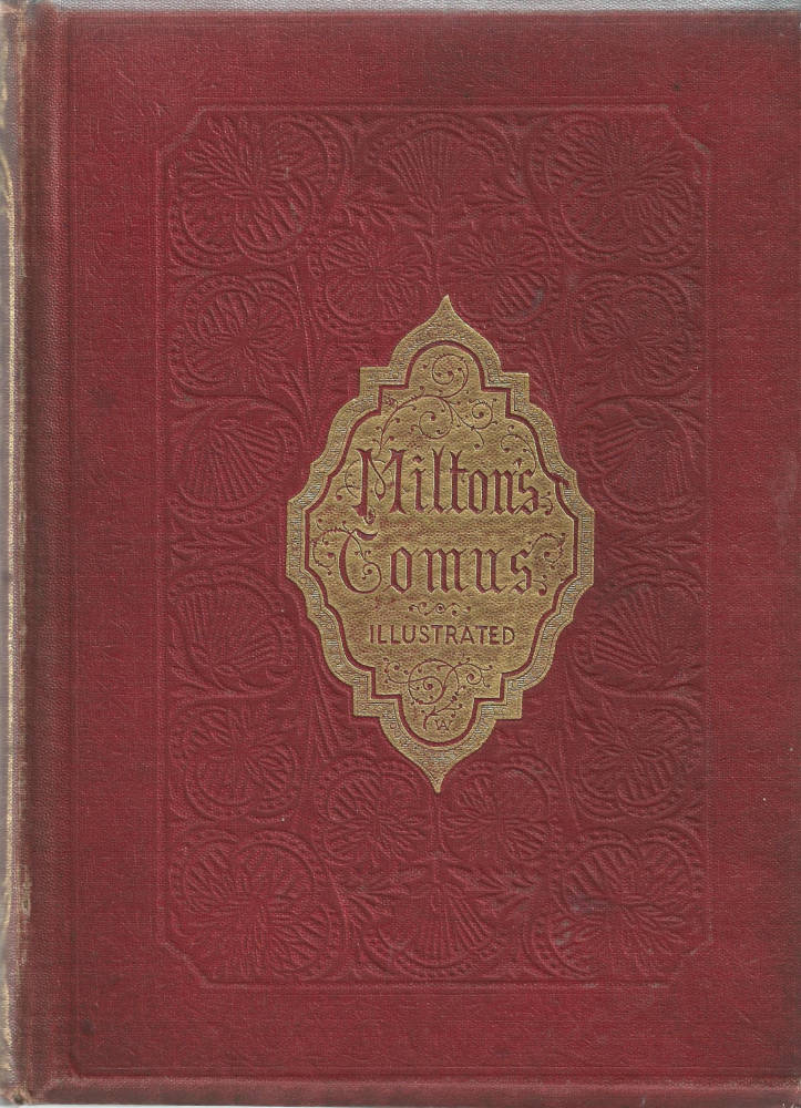
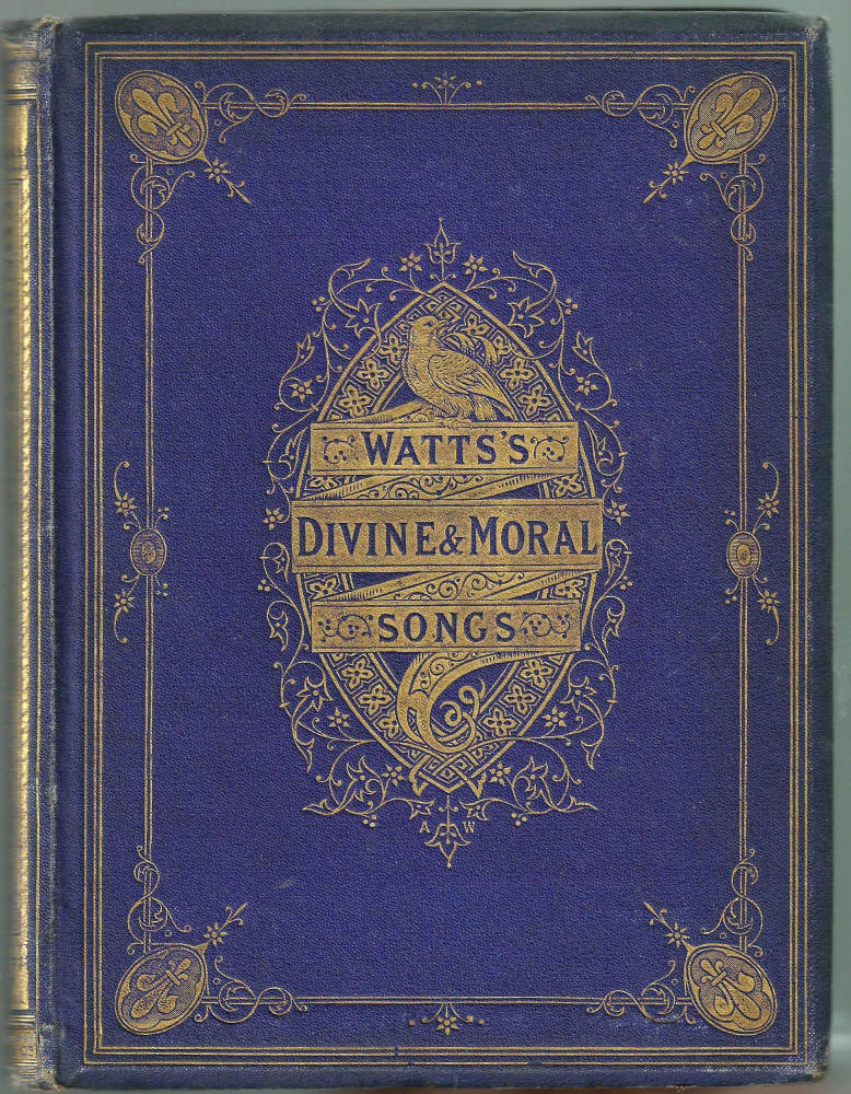
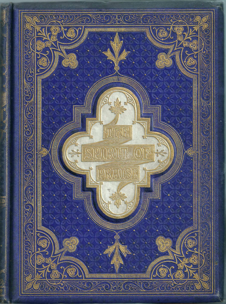
Left: Milton’s Comus. Middle: Watts’s Divine and Moral Songs. Right: The Spirit of Praise [Click on these images for larger pictures.]
Jones argues, for example, that ‘In surface decoration all lines should flow out of a parent stem. Every ornament [must be connected] to its branch and root.’ This is a plea for organic unities in the nature of growing forms, and this precisely what we see in bindings for Milton’s Comus (1858), in which the tendrils radiate around the title and again in the dense interlace appearing on the front covers of Tennyson’s May Queen (1860) and Watts’s Divine and Moral Songs (1866). Though including geometrical elements, the bindings of The Spirit of Praise and Jean Ingelow’s Poems (1867) are also examples of this type of fluid, flowing arabesque, as if the tiny lines were growing and radiating outwards in the manner of a plant. As Jones comments in Proposition 6, ‘Beauty of form is produced by lines growing out from the other in gradual undulations.’ This is the strategy deployed by Warren in all of his designs, and the effect, as Jones intended, is lyrical and harmonious.
Jones provided Warren with sources on which to draw, and which helped him to formulate what must have been a considerable interest in floral and rustic imagery and is further evidenced by his interest in floral paintings and genre scenes. If Leighton specialized in the sort of severe Gothic design that we see in Lyra Germanica, then Warren was the champion of a notion of English pastoralism that was especially suited to the front covers of gift-books. These publications were intended to please a large urban audience at Christmas time, and Warren’s designs are part of the package. Drawn in gilt, and writhing with the energy of regenerative nature, his arabesques are reassuring signs of the rural idyll; presented at a time when nature itself was in retreat during the long winter months, his bindings are celebrations of plenty and the Romantic values of rustic innocence and purity. Of course, all of this is imaginary – but Warren’s bindings link to a pastoral alternative to urban life as surely as Leighton’s act as a link between the bourgeois audience and the alleged purities of a medieval past. Far more than decorative, the books designed by these artists articulate and reaffirm the values of those who purchased them.
Questions of attribution: some personal reflections
As noted in the previous section, identification of Warren’s bindings is a problematic issue. Most of his work is signed, but some of his covers lack a monogram and have to be identified, as already argued, on the basis of style or external information.
An important resource is found in the form of advertisements and publishers’ records. The covers of Wayside Posies are claimed for Warren in the endpapers of Robert Buchanan’s North Coast, where the binding is described as a ‘superb’ work, and the bookseller Robin de Beaumont identified Ingelow’s Poems by tracing its entry in the Longman records at the University of Reading, UK (Ball, 165). Nevertheless, the canon of Warren’s work remains uncertain, and a portion of the detail in Ball’s bibliography seems to be based on previous speculation. It is noticeable, for example, that he includes a number of volumes he has ‘not seen’, and attributes at least one, with no concrete evidence, on the basis of a library entry in the National Art Library (Victoria and Albert Museum, London).
Knottiest of all is the question of the manner of Warren’s signature. Pantazzi argues that Warren’s books can be identified by an A within a W, or by an A followed by a W (93). On the other hand, King comments that the separately blocked A and W may not be work by Warren. Yet several of Warren’s most characteristic works are marked by A W: Gems from the Poets has an A placed over a W on the back-strip, and Watts’s Divine and Moral Songs is signed with a tiny AW. It is surely the case that AW is work by Warren, just as it is when the A is placed inside the W.
A further complication is the fact that some of the books only have a W. Ball is uncertain about that these publications are by Warren (162), and King lists several as a separate section (255–7) and does not attribute them to him. This is a complex issue because the works signed with the single initial are very similar to Warren’s bindings; combining floral motifs and swirling arabesques, they seem at first glance to be his, and are often attributed to him. On closer examination, however, it is clear that they are in the style of Warren, but not from his hand. Heber’s Hymns, Early English Ballads and Robert Buchanan’s Ballad Stories of the Affections are certainly bound with designs using Warren’s lexicon, but lack the flexibility of his style. Ballad Stories is a case in point. Ball thinks this W-signed book is by Warren (167), but the central mandorla and foliate decorations are stiff and inflexible, imitations of a more fluid style; the same criticism can made of Heber and the English Ballads. Who, then, is W? This is impossible to know, but it is not impossible that someone emulated Warren’s style and signed his work with a W with a fraudulent aim to deceive. Would this plagiarism have gained the unknown practitioner some economic advantage? The publishers would have had to have been complicit, though it is notable that none of these books is offered as being designs by Warren, a name the book-buying public would have known. More research is needed to unravel this mystery.
Works by Warren: written, illustrated, and with bindings designed by him, cited in the text
Probably the most complete listing of Warren’s work is to be found in Ball, pp. 162–67. Several attributions are insecure and a comprehensive bibliography has yet to appear.
Albert Warren’s Garden Painting Book. Text by Warren. Engraved by Edmund Evans. London: Routledge, 1889.
The Art Album. Binding designed by A. H. Warren. London: Griffin, 1860.
A Book of Favourite Modern Ballads.Borders designed by A. H. Warren. London: Ward Lock [1860].
Bryant, William Cullen.Poems. Binding designed by A. H. Warren. London: Kent, 1861.
Gems from the Poets. Binding designed by A. H. Warren. London: Groombridge [1867].
The History of Joseph and His Brethren. Designed by Henry Warren and Owen Jones. Drawn on stone by A.H. Warren. London: Day [1865].
The Home Affections of the Poets. Binding designed by A. H. Warren. London: Routledge, 1858.
Ingelow, Jean. Poems Binding designed by A. H. Warren. London: Longman, 1867.
Lays of the Holy Land. Binding designed by A. H. Warren. London: Nisbet, 1858.
The Merrie Days of England. Binding designed by A. H. Warren. London: Kent, 1859.
Miller, Thomas. Common Wayside Flowers. Binding designed by A. H. Warren. London: Routledge, 1860.
Milton, John. Comus. London: Routledge, 1858. Binding designed by Warren.
Moore, Thomas. Lallah Rookh. Binding designed by A. H. Warren. London: Routledge, 1860.
Moore, Thomas. Paradise and the Peri. Designed by Henry Warren and Owen Jones. Drawn on stone by A.H. Warren. London: Day [1860].
Poe, Edgar Allan. Poetical Works. Binding designed by A. H. Warren. London: Ward, Lock [1867].
Poetical Works of William Cowper. Binding designed by A. H. Warren. Halifax: Milner & Sowerby, 1864.
Scenes from A Winter’s Tale. Designed by Henry Warren and Owen Jones. Drawn on stone by A.H. Warren. London: Day [1866].
The Spirit of Praise. Binding designed by A. H. Warren. London: Warne [1867].
Tennyson, Alfred. The May Queen. Binding designed by A. H. Warren. London: Sampson Low, 1861.
Tennyson, Alfred. Poems. Binding designed by A. H. Warren. London: Moxon, 1861.
Thomson, James. The Seasons. Binding designed by A. H. Warren. London: Nisbet, 1859.
Treasures of Art. Binding designed by A. H. Warren. London: Ward Lock [1867].
Warren, Albert. Drawing Examples for Technical and Art Students. Text and illustrations by Warren. (1882)
Warren, Albert. A Guide to Beginners On the Art of Illuminating.Text and illustrations by Warren. London: Barnard [1860].
Warren, Albert. The Promises of Jesus Christ.Page decorations and binding designed by Warren. London: Day [1860].
Watts, Isaac. Divine and Moral Songs for Children.London: Sampson Low, 1866.
Wayside Posies.Ed. Robert Buchanan. Binding designed by Alfred Warren. London: Routledge, 1867.
Woodward, John. Arms of the Episcopates of Great Britain and Ireland.With decorations by A. H. Warren. London: Chiswick Press, 1868.
Wordsworth, William. Poems. Binding designed by A. H. Warren. London: Routledge, 1859.
Other contemporary material
Jones, Owen. The Grammar of Ornament. London: Day, 1856.
Russell, William Howard. The Atlantic Telegraph. With chromolithographs and a binding designed by Robert Dudley. London: Day [1865].
Designed by ‘W’
Buchanan, Robert. Ballad Stories of the Affections. Binding signed ‘W’. London: Routledge [1866].
Heber’s Hymns.London: Sampson Low, 1867. Binding signed ‘W’.
Secondary works cited
‘Arms of the Episcopates of Great Britain and Ireland.’ Art Journal 1868: 80.
Ball, Douglas. Victorian Publishers’ Bindings. London: The Library Association, 1985.
‘A Book of Favourite Modern Ballads.’ Art Journal 1860: 32.
British Census Returns, 1841–1881. Accessed through Ancestry.co.uk
Graves, Algernon. A Dictionary of Artists, 1760–1893. 1895; Bath: Kingsmead Reprints, n.d.
Kaye, Elaine. A History of Queen's College, London. London: Chatto & Windus, 1972.
King, Edmund. Victorian Decorated Trade Bindings, 1830–1880. London: The British Library & Newcastle: The Oak Knoll Press, 2003.
Maclean, Ruari. Victorian Book Design and Colour Printing. London: Faber & Faber, 1963.
Maclean, Ruari. Victorian Publishers’ Book-bindings. London: Gordon Fraser, 1974.
Pantazzi, Sybille. ‘Four Designers of English Publishers’ Bindings, 1850-1880’.Papers of the Bibliographical Society of America 55 (1961): 88–99.
Last modified 3 November 2014