
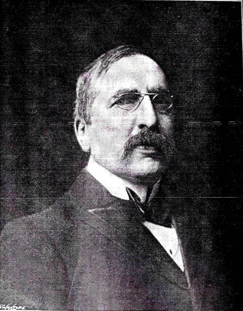
Gleeson White. [Click on images to enlarge them.]
Gleeson White was a highly productive designer of book covers and book plates, creating a large number of compositions in the period from 1887 to 1898. His activities were cut short by his untimely death at the age of 47. His impact on late Victorian book-art was nevertheless considerable, and his bindings, especially, were instrumental in raising the aesthetic standards of covers for trade publications. Practising as an Arts and Crafts designer and as a practitioner in the emerging style of Art Nouveau, his liveries combine naturalism in the manner of William Morris with the abstractions associated with the bindings of Charles Ricketts and Aubrey Beardsley.
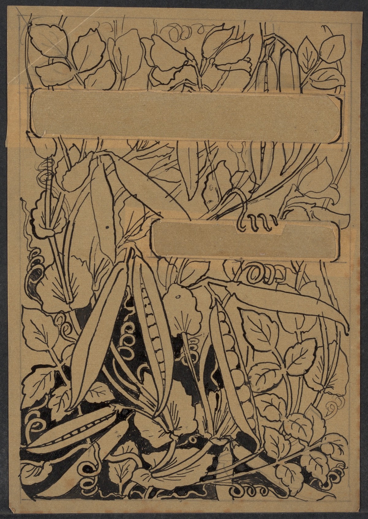
White synthesized these influences, exploiting the visual languages of the ’90s to create his own, idiosyncratic designs. These embrace a number of approaches; sometimes he deploys a realistic image connected to the book’s contents, as in the case of the cornucopia of peas appearing on the front cover of Mrs Bowden’s Vegetarian Cookery; sometimes he applies a purely decorative design; and sometimes the binding is tonally linked through allusion, as in the antique devices on the boards of Bell’s Classical Translations. Gleeson White’s visual strategies can be traced by close examination of his large oeuvre of more than sixty original covers, and it is also interesting to explore the mental processes by which he arrived at his finished design.
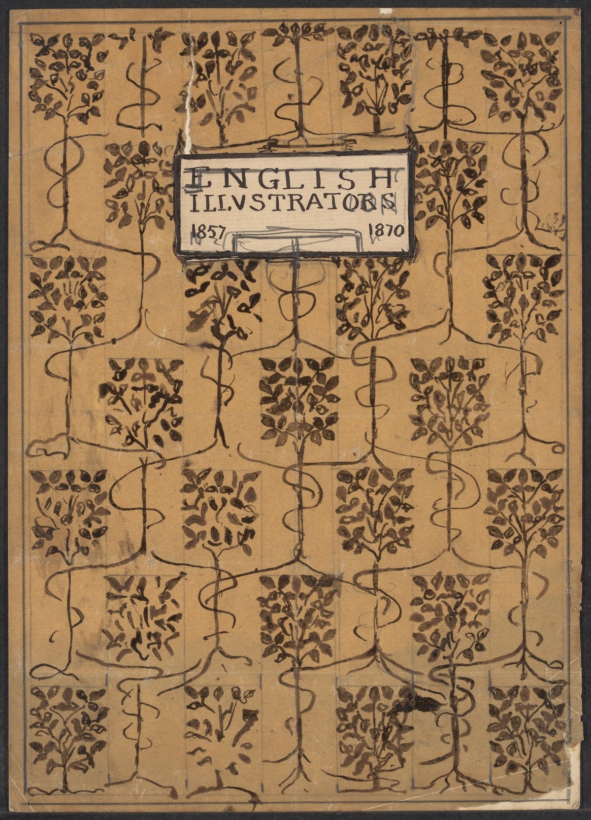
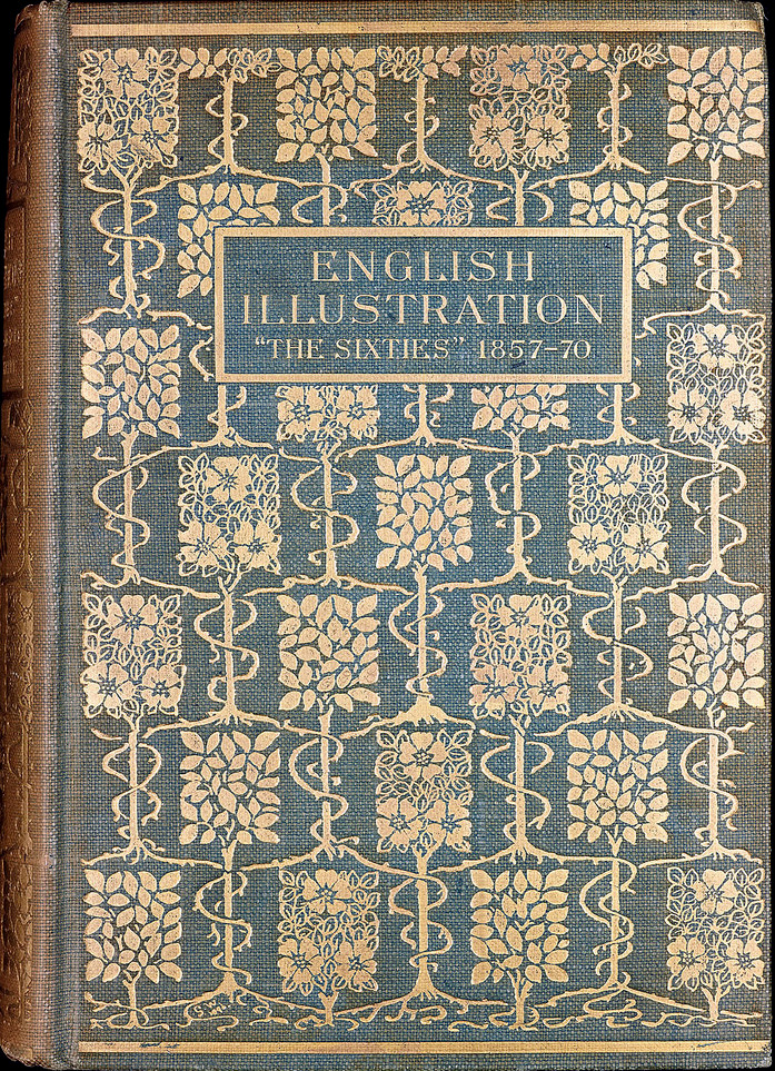
Initial sketch and completed book cover for English Illustration.
It is possible to trace these developments by examining the artist’s extensive portfolio of preparatory material. Many of his drawings have been preserved in the family’s archives and another, larger collection is held in the Houghton Library, Harvard University. White was a systematic worker, and the surviving studies provide an important opportunity to trace his experiments with forms and ideas, sometimes pursuing them through multiple works. None of these drawings has previously been published, and the Houghton archive, though acquired for the library in 1968, has never been catalogued or studied. It is examined here for the first time.
The Houghton Collection
Left: Initial sketch and completed book cover for English Illustration. Right: Preparatory design for New Vegetarian Dishes.
The Houghton collection consists of 290 items on paper, many of them in fragile state, with folds and abrasions. Some leaves present multiple sketches and studies, combining rough preparatory material in pencil and pen with watercolours and sketches in crayon; proofs, and parts of proofs are also included. Of the total amount, about 100 are drawings for covers in various states: some are simply outlines or rough drafts, and others are practically the same as the final, published design. White’s development of an idea is exemplified by a series of drawings which bear comparison with the cover and mark stages in its development. Some of the roughs are radically different from the finished product: at some stage, the artist became dissatisfied with the work and made significant changes.
This creative process is exemplified by the relationship between the preliminary stages of the front cover of Bookselling (1895) and the published proof. A surviving rough shows White was experimenting with a composition of trees or bushes, blossoming a type of unidentifiable flower; stalks and stems are contrasted with the curvilinear foliage that emanate from them, and the title is placed in the centre, compressed between the curves of the framing vegetation. The effect is dense, perhaps overcrowded, and the next and final stage in the cover’s preparation, perhaps responding to the artist’s sense of the need for simplification, is pared down. The abstract flowers have been changed into stylized orchids and the stems and stalks reduced to a formalized pattern in the shape of a mandorla, with the naturalism of the first draft changed into a strict geometry. Gleeson White also changes the title; always an advocate of clear lettering, he rejects his earlier scheme and places the journal’s name along the cover’s top edge in the form of a large banner, making it possible to include more written information and announce the work in distinctive terms. Movement from the earlier draft to the finished proof is thus a matter of careful rethinking and revision, and the only element to survive from the initial idea is the colour scheme: the preparatory design is made up of a contrast between black and orange, at first in watercolour, and in the final product White retains this vivid arrangement.
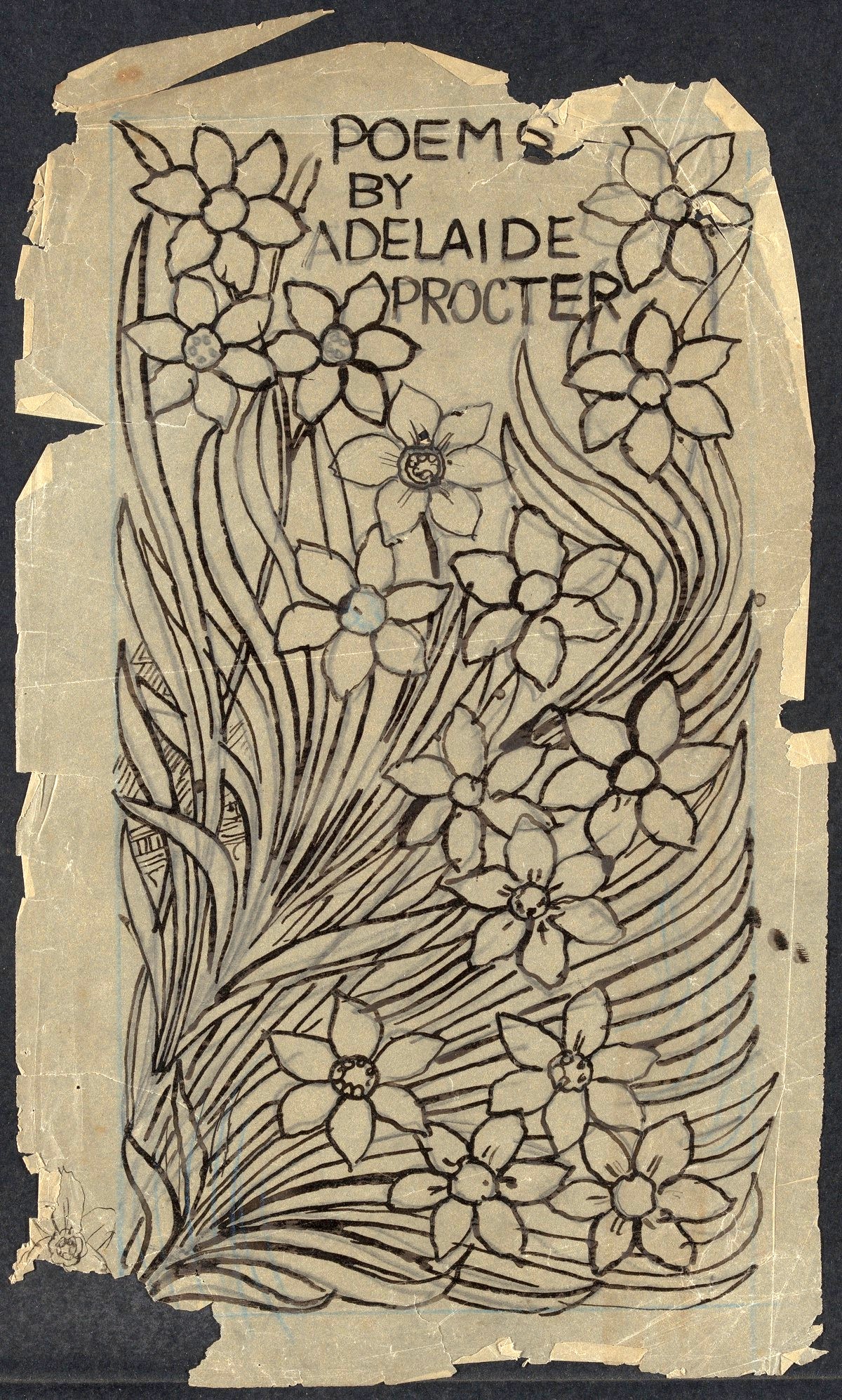
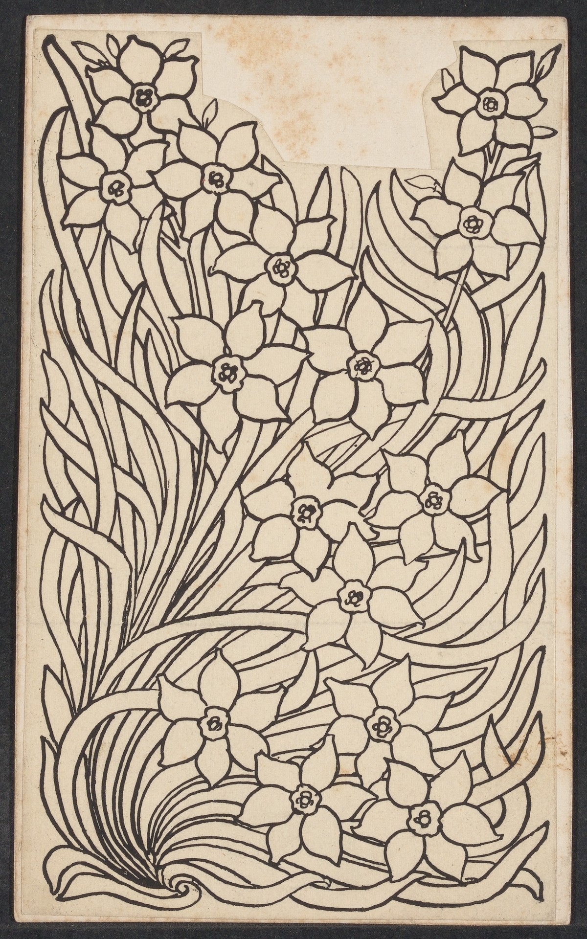
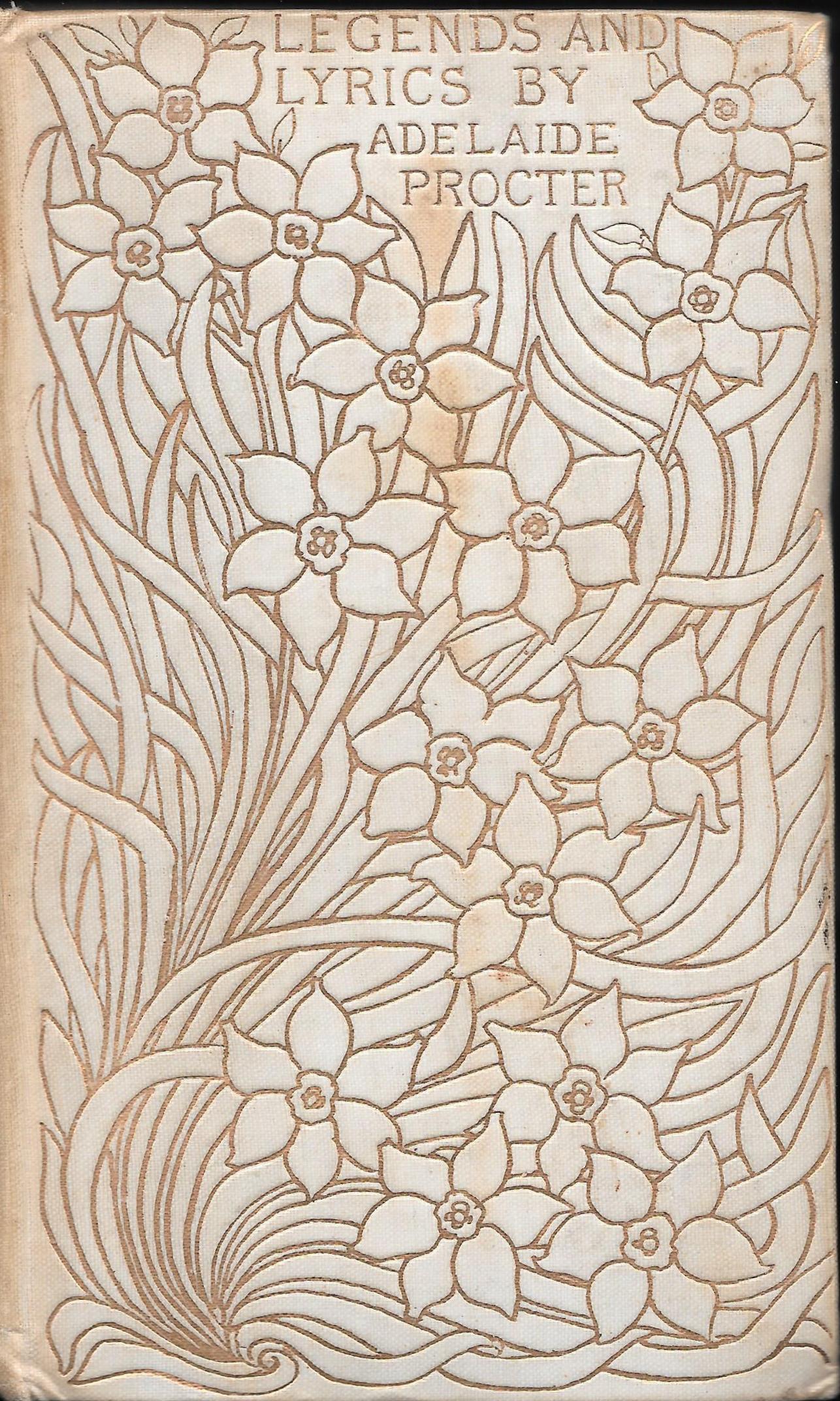
Preparartory design, proof, and production version for paper cover for Legends and Lyrics.
White simplifies other commissions along the same lines. For instance, his early design for Frederic Whyte’s Actors of the Century (1898) is far more complicated than the finished result: the first shows details of the theatre curtain contained with the proscenium arch, while the printed cover is simply a gilt swag. Many other designs display parallel revisions, and it is clear that Gleeson White expended a great deal of energy in finding what he regarded as the best formulation. Obviously a perfectionist, he ensured all his work was as good as it could be. In the words of one contemporary:
He had a great power of work, and here he was probably over-conscientious, exhausting himself over labour often less than moderately paid, and doing the most ordinary work in the most careful and elaborate way. But he could not bear to do less than his best, and he would sacrifice strength and time ungrudgingly to act up to his ideal. [Powell, vi]
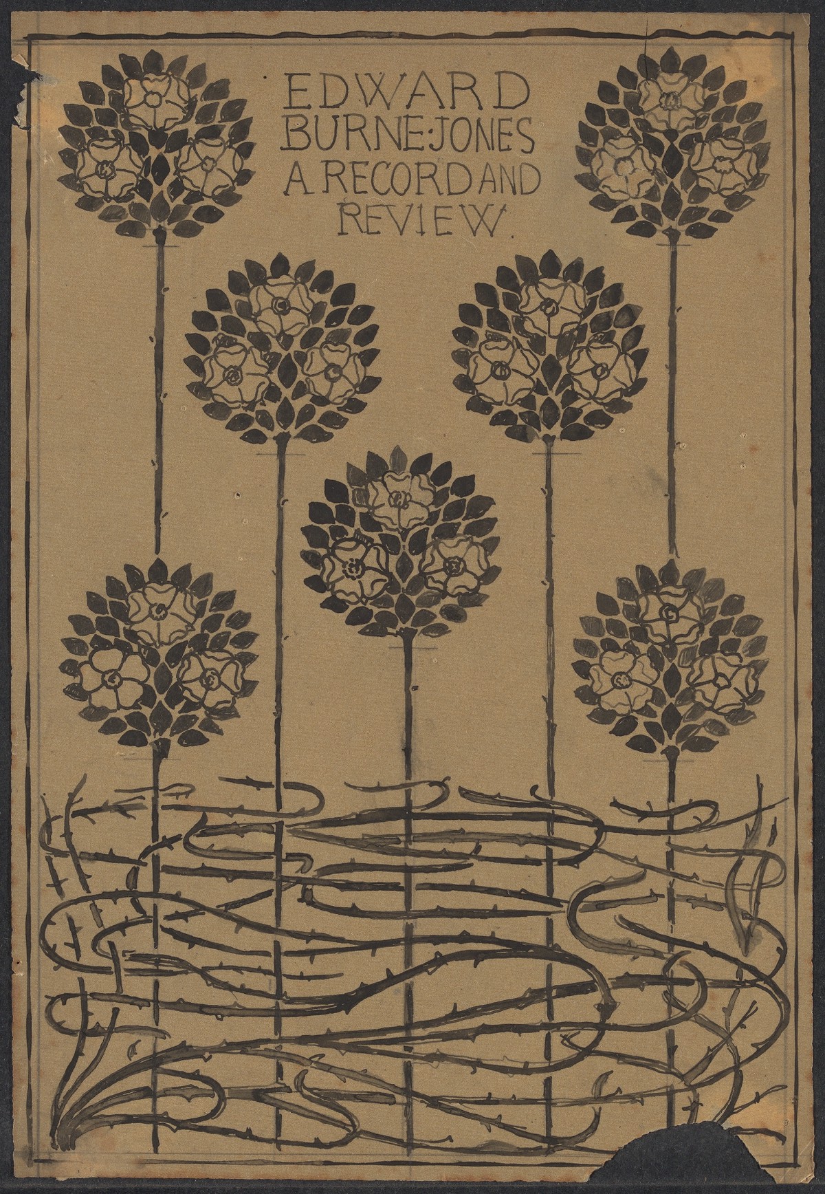
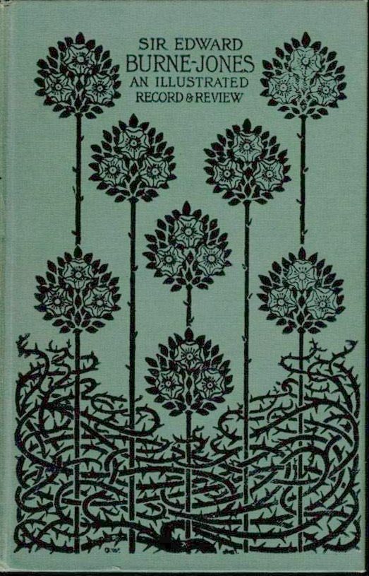
Yet he also recognized that inspired work was complete in itself. Many of the surviving works on paper show that his first instincts were often his best, there being a number of preliminary designs which make a direct transfer from drawing into gilt and cloth. His preparatory composition for his own English Illustration (1897) is practically identical to the published cover, and the same is true of others such as the covers for Arthur Bell’s Burne-Jones and A. Baldry’s Albert Moore (1894): there are no earlier works for each of these and White seems to have achieved the desired results without important change, a process also exemplified by the three pieces of work mapping the development of the cover for Adelaide Procter’s Legends and Lyrics (1894). The first is a rough drawing; the second a proof; and the third a proof with its title. Comparing the first with the third we can see how White once again achieved a near-final design at his first attempt.
Varying between scrupulous revision and inspired facility, Gleeson White also worked on his covers in proof. Interestingly, he seems to have added his titles onto his proofs, only judging the effect of the whole once his drawings had been converted into prints. Several of the surviving documents exemplify this approach, with the titling written onto the proof in pencil. This rough was then returned to the binder, who would imprint it in gilt lines into the cloth boards.
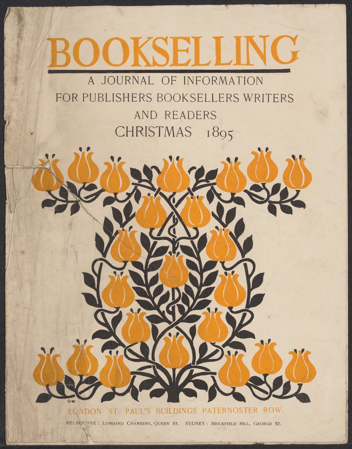
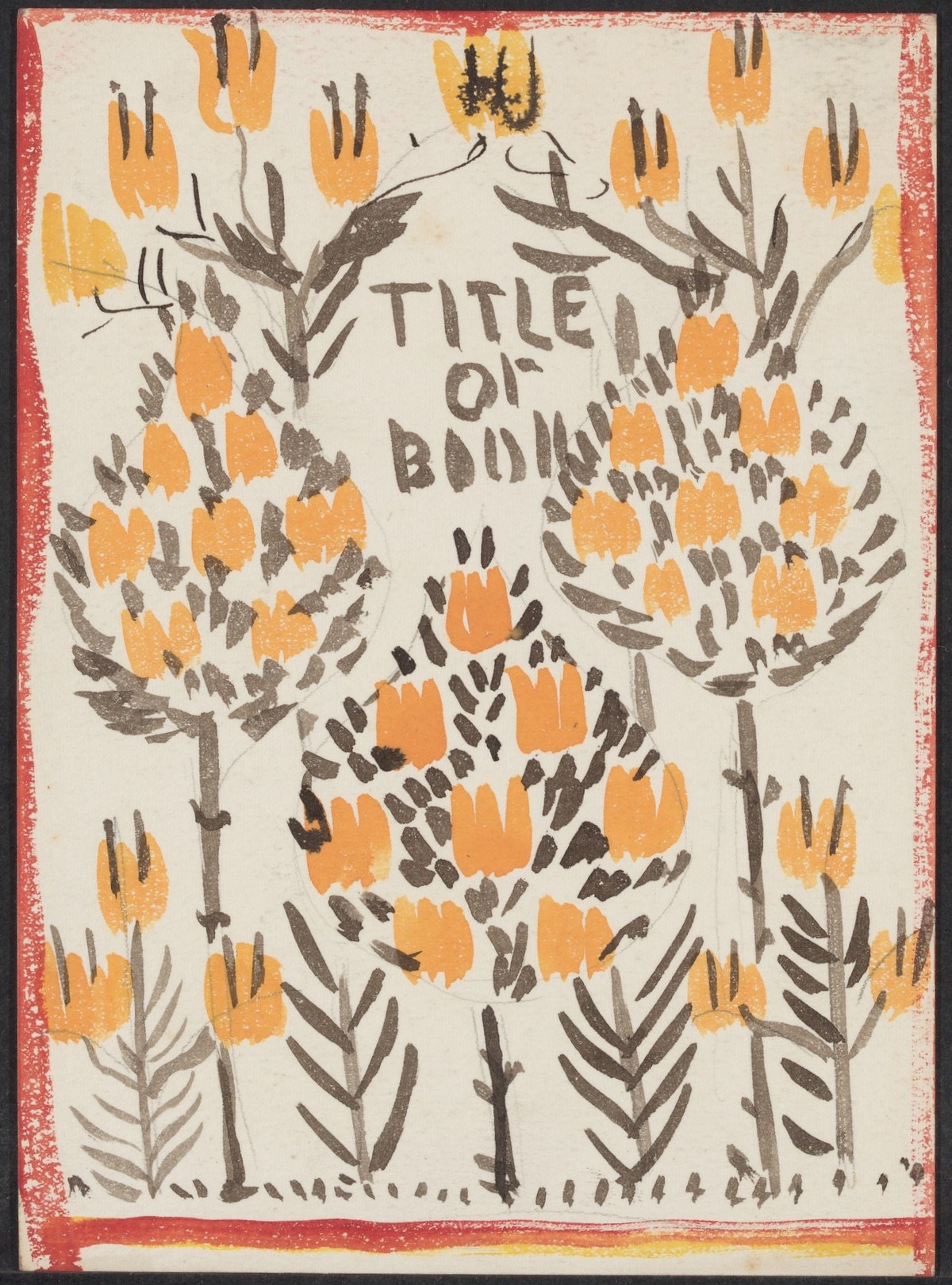
Initial sketch and completed book cover for Bookselling.
All in all, the Houghton archive provides a vivid record of the ways in which Gleeson White engaged with his work. It suggests more generally how his contemporaries must have proceeded, and gives us a clear idea of the arduousness of producing even the simplest design.
Work Cited
Powell, York. A Catalogue of Books from the Library of the Late Gleeson White. London: Isaacs, 1899.
Created 22 December 2019