
Pictorial Frontispieces
'Pictorial frontispieces, though decorative in effect, are complex texts made up of complementary and sometimes competing signs. As Vera Chiquet explains, they ‘can be described as hybrids, because they fuse writing, including titles, with pictorial representations such as symbols, portraits or allegories’ (150). In the specific case of Victorian imprints, pictorial frontispieces play an important part in promoting, enhancing or anticipating information contained in the text while acting as another sign of the book’s cultural positioning.
The importance of books on ‘serious’ matters – philosophy, history, literature – was typically signalled by the inclusion of a frontispiece portrait of the author, sometimes in the form of a photograph and sometimes as an engraving. These images are hagiographic and idealized, especially when attached to volumes of poetry; no matter how commonplace, the Victorian poets are projected as sages with dignified expressions and noble features, or with the enlarged eyes and fine features associated within the physiognomical code with sensibility and moral character. Writers forgotten today – for example, William Bryant or James Montgomery – are routinely afforded this treatment. These images set the tone and remind the reader that s/he has entered the company of a literary elite, even though the quality of the verse may not always justify the claim.
A more complicated example is the frontispiece depicting Alfred Tennyson in the famous Poems, known as the ‘Moxon’ edition (1857). This is an engraving of Thomas Woolner’s profile relief sculpted in marble, which emphasises the poet’s noble silhouette and links him to classical excellence. Juxtaposed with an encomium to the Queen, it proclaims the book’s credentials as a work of high culture, insisting on Tennyson’s status as an English bard. Yet it is interesting to note that its status is far more complex than it might seem. It is not, for example, a true representation of the author. Woolner’s piece was ten years old when the Moxon Tennyson was published and bore little resemblance to the bearded, middle-aged poet of the fifties. Its assertion of authorship, the work of one great man, is similarly undermined by the fact that the book was illustrated by eight outstanding artists, among them the Pre-Raphaelites and Daniel Maclise. These artistic hands were at work in helping to create the edition’s multi-modal communication of messages, and it is misleading to suggest Tennyson was the sole author: a judgment that holds true of every illustrated gift book of the 1860s which visualizes the writer but never shows likenesses of the artists.
However, illustrations are often used as a frontispiece rather than a portrait, especially in fiction. Positioned as proleptic designs intended to engage the reader in the following narrative, these illustrations build anticipation by introducing a key event and/or characters while suggesting the story’s atmosphere, tone or theme. Leighton and Surridge have explored this oscillation between proleptic illustrations and their texts in expansive detail, and it is interesting to analyse the ways in which the visual emphases vary according to the nature of the text.

Left: Frontispiece, Amy Woolner’s Thomas Woolner, R. A.: Sculptor and Poet. Right: Frontispiece, Wilkie Collins’s No Name by John Everett Millais. [Click on images to enlarge them.]
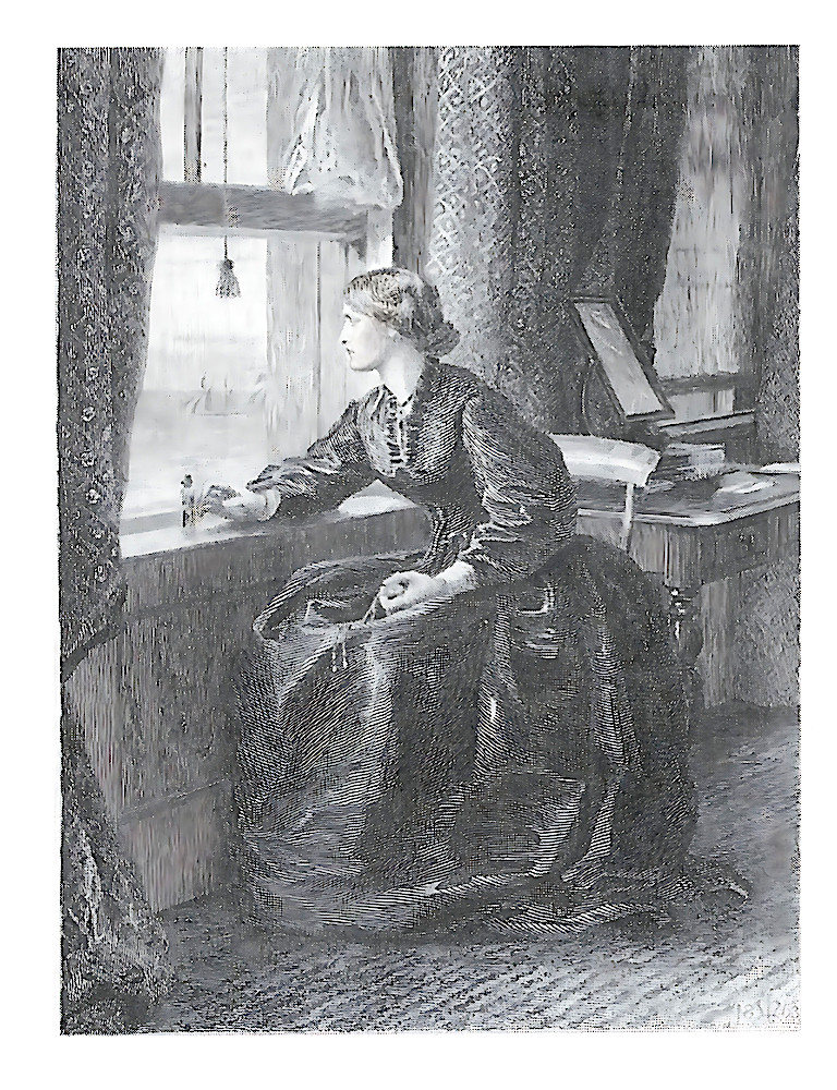
In sensational narratives the frontispiece almost always prepares the reader for the tale’s febrile tone by showing a dynamic moment of emotional crisis, revelation, a shocking encounter or some other melodramatic moment. J. E. Millais’s frontispiece for the illustrated edition of Wilkie Collins’s No Name (1864) exemplifies this approach. Digging deep into the novel, Millais shows the moment when Magdalen Vanstone considers suicide, about to clutch the vial of poison as she looks out of the window at the sea; if a certain ship goes by she will take it, if not, she will live. Millais depicts the figure in a tense pose, intently looking outward, the embodiment of anxious stress. In so doing he projects the character’s situation and suggests her psychological resilience. Acting as a crystallized epitome of the book’s theme – should she face up to the shame of illegitimacy or despair and kill herself? – it is a powerful means of immersing the reader in situations that are yet to unfold.
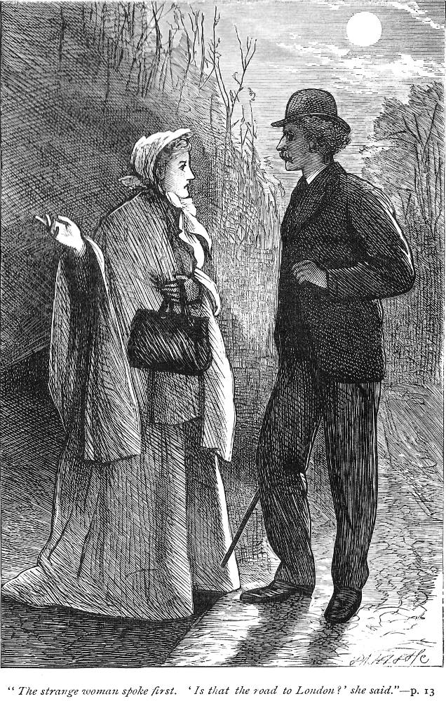
Frontispiece for Wilkie Collins’s The Woman in White by F. A. Fraser.
F. A. Fraser’s frontispiece for the 1875 reissue of Wilkie Collins’s The Woman in White (1860) follows a parallel trajectory, this time illustrating the crucial moment when Walter Hartright meets Anne Catherick: the very moment, of course, on which the novel is based and the starting point for its narrative. Fraser is not entirely successful in capturing the eeriness of the encounter – he does not, for example, recreate the startling whiteness of Anne’s dress –but he does engage the reader/viewer’s interest: what is the significance of this moment? This question demands an answer, and the pull forwards into the text is enhanced by the inclusion of a quotation and even the page number on which it appears, a device which features in most Sensational frontispieces. All in all, these images act as an integral part of their narratives, ensuring that the reader is immersed in the world of Sensational extremes before the text has been perused.
The deployment of proleptic images features more generally elsewhere, with key characters and situations appearing on the frontispiece. Richard Doyle always adopts this approach, focusing our attention by illustrating the most dynamic moment in the text, a crucial strategy for children’s books, where generating the juvenile reader’s enthusiasm is of central importance. His frontispieces for Ruskin’s The King of the Golden River (1851) and Mark Lemon’s The Enchanted Doll (1849) epitomize his capacity to condense key events into a single frame, stimulating a curious response. These images are weirdly imaginative, and we can imagine a Victorian parent and child looking perplexedly at Doyle’s stimulating designs: what will happen as the story unfolds?
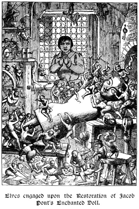
Left: Elves engaged upon the Restoration of Jacob Pout's Enchanted Doll, Frontispiece, Mark Lemmon’s The Enchanted Doll by Richard Doyle. Right: Frontispiece, Charles Dickens’s Dombet and Son by Phiz and a detail fiorm the frontispiece. [Click on images to enlarge them.]
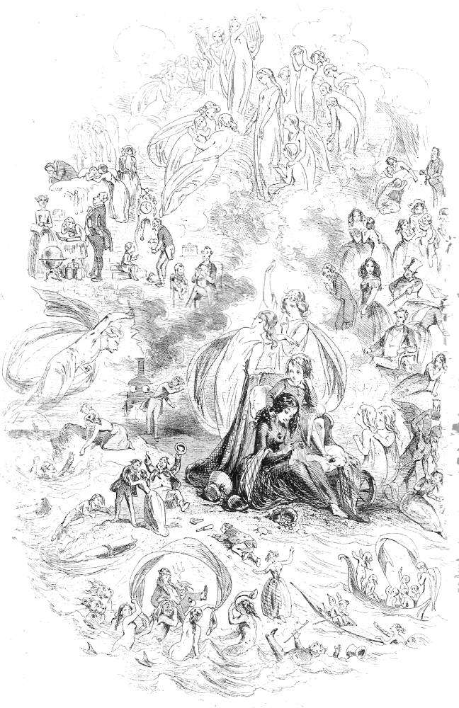
More complicated still are the pictorial frontispieces for multi-plot novels, which do not have a single narrative strand but are composed of a thick weave of interlinked stories. However, the solution, as practised by George Cruikshank and Phiz (Hablôt Knight Browne), is elegantly simple: instead of showing a single, resonant image, they show several interlocked scenes in the form of vignettes depicting crucial scenes and characters. In part comic-book and in part recalling the multiple scenes of Trencento altarpieces, these compound images are a rich source of information, anticipating what will happen and privileging the author’s focus. This approach is adopted in the wrappers of Dickens’s serialized parts, where the front cover performs the same function as a frontispiece; as Philip Allingham observes, the imagery of these designs is often weighted with allegorical implications. It is only in the first book editions, however, that the pictorial frontispiece can tell the full story, condensing events and characters which are drawn together into a coherent whole.
Phiz’s pictorial frontispiece for Dickens’s Dombey and Son (1848) is a fine example of the type. The artist figures the image as a centripetal composition with Paul and Florence at the centre, combining real and actual characters. Paul’s life and death feature in tiny detail, with angels carrying him up to heaven; a demon bearing a timeglass menaces Mrs Skewton; Carker is cut down by a personified train, its cartoon eyes weirdly ogling its victim; and Captain Cuttle celebrates Walter’s return. The effect is one of minute complexity, inviting the reader to engage in code-breaking, tracing the connections between the vignettes in a manner which exactly parallels the complicated interpretive process demanded by the text.
Acting to enhance the reading process, these frontispieces are an important part of the fictions’ overall effect. Although it is impossible to know how the original readers approached their texts, we can only surmise that they regarded perusal of the opening designs as a significant transaction.
Pictorial Title-Pages
‘Pictorial title-pages repeat some of the work of the frontispieces, adding another image to visualize an important character or situation, establish a setting, embody the tone, or introduce a theme or series of themes.
George Du Maurier’s designs exemplify these strategies in his readings of novels by Elizabeth Gaskell. In his title for Cranford, for instance, the small-town milieu is suggested by a street-scene; The Grey Woman captures the bucolic atmosphere; and Cousin Phillis introduces some of the characters. All three insist on the importance of the everyday, rooting the action in a realistic observation of ordinary life while validating the importance of common values. Du Maurier works, then, to define Gaskell’s focus on provincial experience and the lives of the apparently unimportant. Even the titling (also drawn by Du Maurier) suggests an unsophisticated homeliness, so underlining the tales’ domesticity.
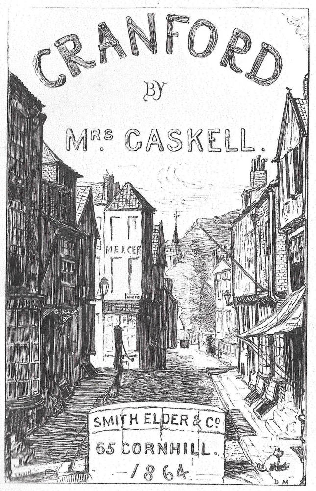
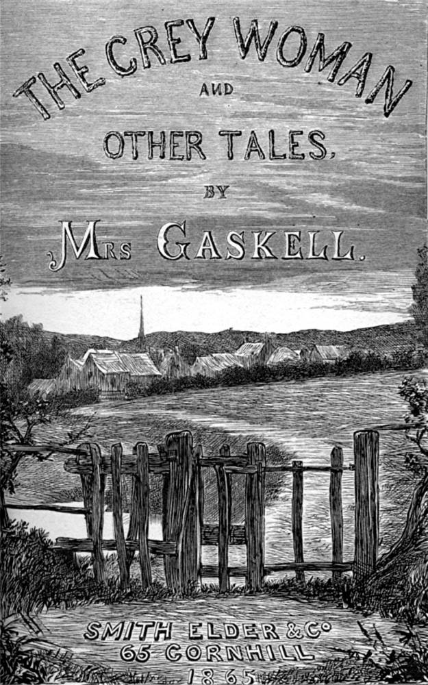
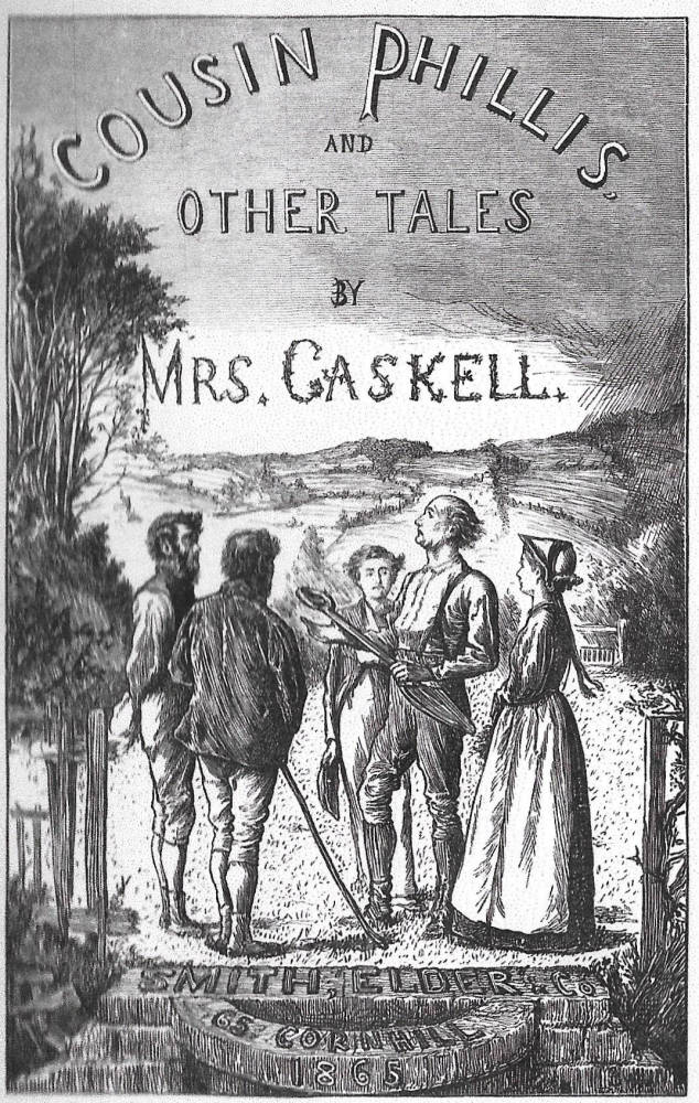
Three of George Du Maurier’s pictorial title-pages.
In Doyle’s title-page for W.M. Thackeray’s The Newcomes (1854–5), by contrast, the artist introduces the author’s manipulation of patterns of animal imagery in the manner of Aesop’s Fables. Doyle presents scenes from the bestiary, preparing the reader for Thackeray’s complex analogies and comparisons between human and animal behaviour, a theme he also privileges in his initial letters.
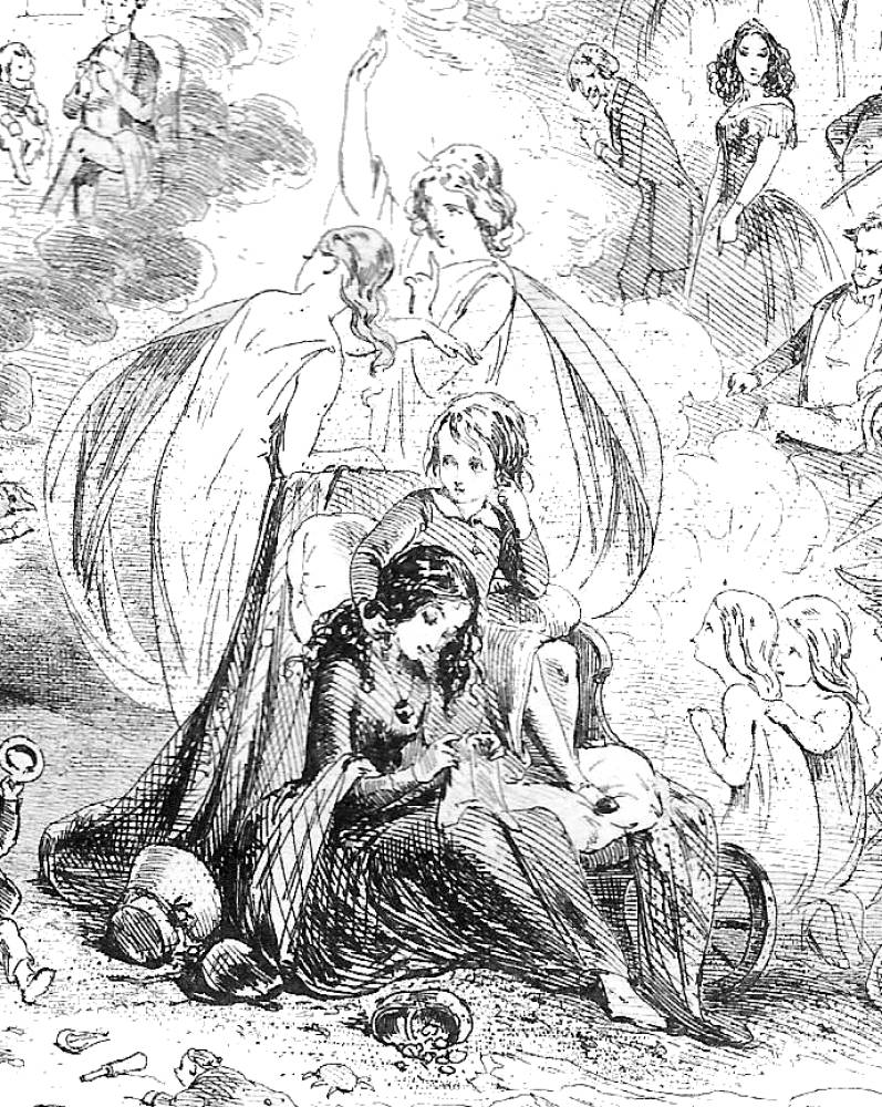
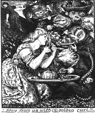
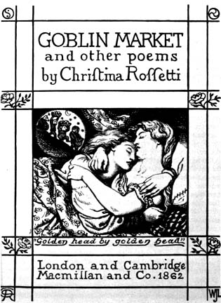
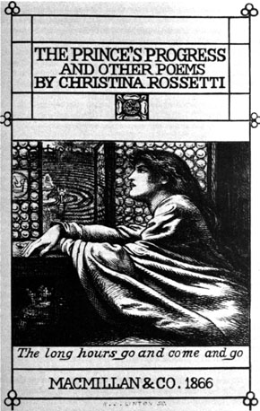
Another variant is found in pictorial title-pages which are linked to and expand the information visualized in the pictorial frontispiece. This arrangement is exemplified by Dante Rossetti’s work for href="../../../../authors/crossetti/index.html">Christina Rossetti’s Goblin Market (1862) and The Prince’s Progress (1866). In both of these the two images are conceived as part of a visual scheme, figuring as a diptych. In Goblin Market, Rossetti shows the main situation (Laura’s temptation by the goblins) in the frontispiece, and an earlier event (the sisters in each other’s embrace) on the title. Quirkily, the scenes are out of sequence, an organization seemingly illogical, and apparently at odds with their proleptic role. However, the placement does make sense: Rossetti captures the reader/viewer’s attention by first showing the poem’s dramatic crisis, and then focuses on the yearning eroticism which suggests that the goblins are symbols of sisters’ desire, creatures of the unconscious. Should be point be missed, Rossetti includes a detail (missing from the text) in the form of a roundel containing an image of the little folk, a scene from Laura’s dream; he shows the event, and then explains or at least implies how she arrives at this encounter. The same strategy is applied to The Prince’s Progress. This time the frontispiece depicts the prince arriving too late, while the title-page focuses on the story from the princess’s point of view as she waits endlessly. Rossetti manipulates a well-used trope in Victorian illustration, showing his heroine waiting at an opened window, gazing outward, with her hands tensely placed one over the other; but her sense of frustration is more powerfully conveyed by the circular forms of the concentric garden and the glazed roundels. In her world, the artist insists, there is no linear progression: it is only a matter of endless circling as her lover procrastinates and time itself, like the time in Tennyson’s ‘Mariana’, is endlessly stalled, time’s arrow bent into a hoop.
A sampling of Dante Gabriel Rossetti’s illustration and pictorial title-pages.
Rossetti’s linkage of the title-page and frontispiece became a standard format, with many books of the 80s and 90s presenting a diptych of visual information. Crane deploys this device in his many Toy Books, inscribing a variety of visual clues in densely worked panels uniting the imagery and titling to harmonious effect; The Baby’s Bouquet exemplifies his approach. Crane’s brightly-coloured pages were extremely influential, with Kate Greenaway and Beatrix Potter following his example. Heywood Sumner also elides the distinction between the title-page and the pictorial frontispiece.
Some conclusions
The materiality of the Victorian book is a complicated issue, and the preceding sections have only considered selected elements of the publications’ layout. I have not considered the role of advertising, nor have I explored the implications of head and tail-pieces. Variations between genres is another fertile ground and deserves to be investigated. However, on the basis of the reading given here it is possible to conclude that end-papers are crucial sites for all sorts of information related to the books’ publishing context while suggesting their cultural orientation and the values of their owners. Pictorial frontispieces and title-pages are especially significant as signs of the hybridity of Victorian literature, revealing to modern audiences the extent to which the original interpreters engaged in a bi-modal transaction. Indeed, in its final formulation the reader is compelled to engage with a huge amount of pictorial material before s/he has turned to the opening lines of the text proper.
Examples
Works Cited: Primary
Bunyan, John. Taith Y Pererin [The Pilgrim’s Progress]. Illustrated by J. D. Watson. Wrexham: Hughes & Son [1864].
Collins,Wilkie, No Name. With a frontispiece by J. E. Millais. London: Sampson & Low, 1864.
Collins, Wilkie. The Woman in White. Illustrated by F. A. Fraser. London: Chatto & Windus, 1875.
Crane, Walter. The Baby’s Bouquet. Engraved in colour by Edmund Evans. London: George Routledge, 1878.
Dickens, Charles. Dombey and Son. London: Bradbury & Evans, 1848.
Gaskell, Elizabeth. Cousin Phillis and Other Tale. London: Smith Elder, 1865.
Gaskell, Elizabeth. Cranford. London: Smith, Elder, 1864.
Gaskell, Elizabeth. The Grey Woman and Other Tales. London: Smith Elder, 1865.
Lemon, Mark. The Enchanted Doll. London: Bradbury & Evans, 1849.
Longfellow, H. W. Evangeline. London: Bell & Daldy, 1866.
Marzials Theo. Pan Pipes. London: George Routledge & Sons, 2nd edition, 1883.
Peacock, Thomas Love. Melincourt. London: Macmillan, 1896.
Roses and Holly. London: Nimmo, 1874.
Rossetti, Christina. Goblin Market. London: Macmillan, 1862.
Rossetti, Christina. The Prince's Progress and Other Poems. London: Macmillan & Co., 1866.
Rossetti, Dante Gabriel. Poems. London: Ellis & Elvey, 1870.
Ruskin, J. The King of the Golden River. London: Smith Elder, 1851.
Tennyson, Alfred. Poems. London: Moxon, 1857.
Thackeray, W. M. The Newcomes. 2 Vols. London: Bradbury & Evans, 1855.
Works Cited: Secondary
Chiquet, Vera. ‘The Leviathan Frontispiece.’ Theorizing Visual Studies: Writing Through the Discipline, ed. James Elkins. New York: Routledge, 2013. 150–154.
Duran, Teresa and Bosch, Emma. ‘Before and After the Picture-Book Frame: a Typology of Endpapers.’ Picture-Books: Beyond the Borders of Art, Narrative and Culture. Ed. Evelyn Arizpe. London: Routledge, 2013. 42–63.
Leighton, Mary Elizabeth & Lisa Surridge, eds. ‘Object Lessons: The Victorians and the Material Text.’ Cahiers victoriens et édouardiens 84 (Automne 2016).
Leighton, Mary Elizabeth & Surridge, Lisa. The Plot Thickens: Illustrated Victorian Serial Fiction from Dickens to Du Maurier. Columbus, Ohio: Ohio University Press, 2018.
Leighton, Mary Elizabeth & Surridge, Lisa. ‘The Plot Thickens: Towards a Narratology of Illustrated Serial Fiction in the 1860s.’ Victorian Studies 51:1 (2008): 65–101.
Moylan, Michele. ‘Introduction’. Reading Books. Amherst: University of Massachusetts Press, 1996. 1–16.
Last modified 1 July 2019