
This article comes from The Decorator and Furnisher 1, no. 3 (1 December 1882), available via Jstor on the Internet Archive here. The initial letter and illustrations have been added. The illustrations all come from Crace's watercolours in the Met Museum's collections, and are classified as "Prints, Ornament & Architecture," each with the credit line: Dodge and Fletcher Funds, 1967. Accession numbers are given under the individual illustrations. They are all identified as being in the public domain. — Jacqueline Banerjee

n decoration, it may be laid down as a principle that one color should dominate; that this dominant should be a primary or, secondary; and that the other colors must be subsidiary to it. In the majority of cases the most perfect and beautiful harmony is produced by employing neutralised hues of color for the larger masses, and then giving freshness, cheerfulness, and beauty to the whole by the introduction in small masses of the primary or secondary colors that may form the proper equivalents to the prevailing color. It should be always remembered that the eye is seldom satisfied with any arrangement of color unless all the primaries are present in some shape or other.
Crace's business card (Met Museum, accession no. 67.736.56).
In carrying out decorations, it will be found that all colors have two kinds of harmony — that of analogy or sympathy, and that of contrast.
For instance, we will suppose the walls of a room to be of a soft green color, and that curtains are required. Two colors are open to us: on the one hand, a rich yellow-brown, which is the softer or more sympathetic harmony; on the other hand, a warm maroon, which is the harmony of contrast.
The principal colorings of a room being decided, the decorator will have to consider how best to relieve with color his cornice and frieze, the ceiling, and the woodwork. The cornice is a very important feature in a room; it acts as a kind of frame to the walls, between these and the ceiling; but it should always be borne in mind that, except in peculiar cases, it should be made to belong to the walls; and with that view, particular care must be taken in the coloring of it, either by a soft contrast to the wall color, or by a color referring to the curtains or other harmonising hue.
There are three masses of color to be con- sidered in living-rooms — the walls, the curtains, and the carpets; but it is by no means necessary that these should be all of different colors; two of them may accord, either the walls and curtains, or the curtains and carpet.
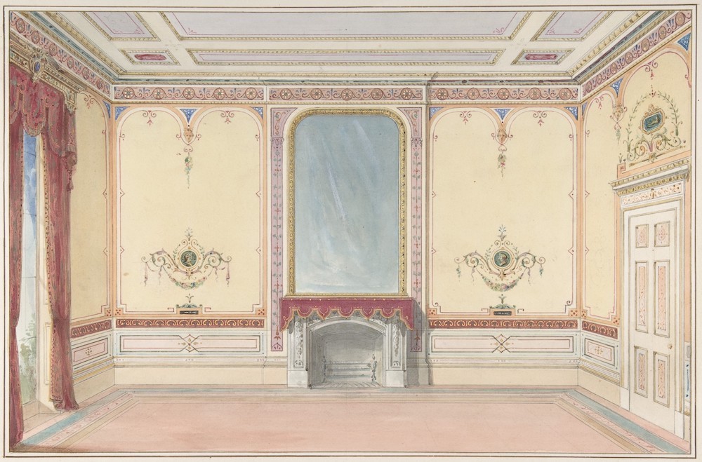
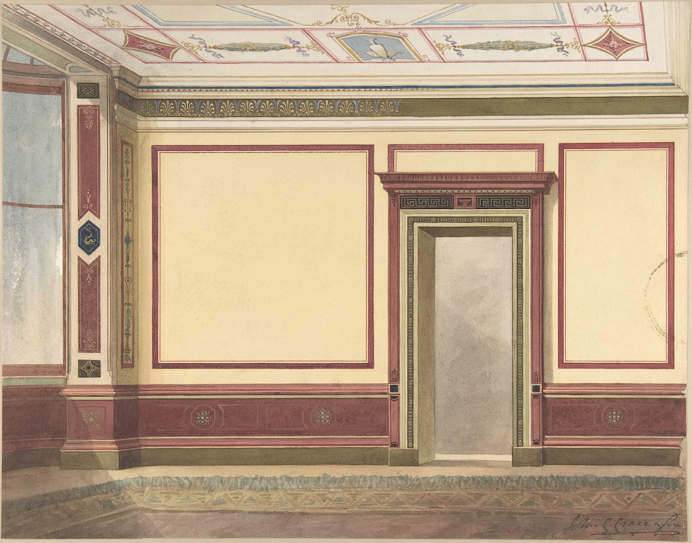
Interior, Fireplace Wall — "carpet [preserving] a subdued effect, that does not interfere with the decoration of the walls... quiet, retiring, and harmonious in their colouring" (Met Museum, accession no. 67.736.53).
If the walls of a room are highly ornamented in color, either by arabesque painting or otherwise, it is desirable that the curtains be quiet in tone, and not of contrasted colors; also that the carpet preserve a subdued effect, that does not interfere with the decoration of the walls. On the other hand, if the walls of a room are of a quiet tone, or are white and ornamented with gilding, various colors in ornament or flowers may be introduced with propriety in the carpet.
As regards the coloring of carpets, I should generally recommend the ground to be of a deep, rich, retiring color, such as maroon or green, and the patterns, whether in ornament or flowers, to be as flat as possible, and entirely without cast shadows. The Indian carpets imported from Masulipatam are at all times quiet, retiring, and harmonious in their coloring, and worthy of particular study for the well-designed distribution of their ornament. It is surprising, when we consider the poverty and general ignorance of the men who work at these carpets, that the result should show such refinement and delicacy in the modulations of the colors.
When rooms are papered or painted in tints of color, the combination necessary to carry out a pleasing effect is sufficiently simple and easy; but even in these great care should be taken to have those tints of a soft, agreeable tone. There are greens and greens, buffs and buffs, and greys and greys: in the one case as ugly, raw, discordant, offensive, and displeasing, as in the other they may be soft, harmonious, agreeable, and refreshing to the sight.
What can be more incompatible than a crude emerald green? Soften it, however, with a little sienna,, or other moderating color, and make it suitable in depth of tone to the size of the room, and your skill and taste will make it as agreeable as it would be otherwise repulsive. These tinted colors may be made considerably more effective by an harmonious combination with a contrasting tone of color in the stiles or margins.
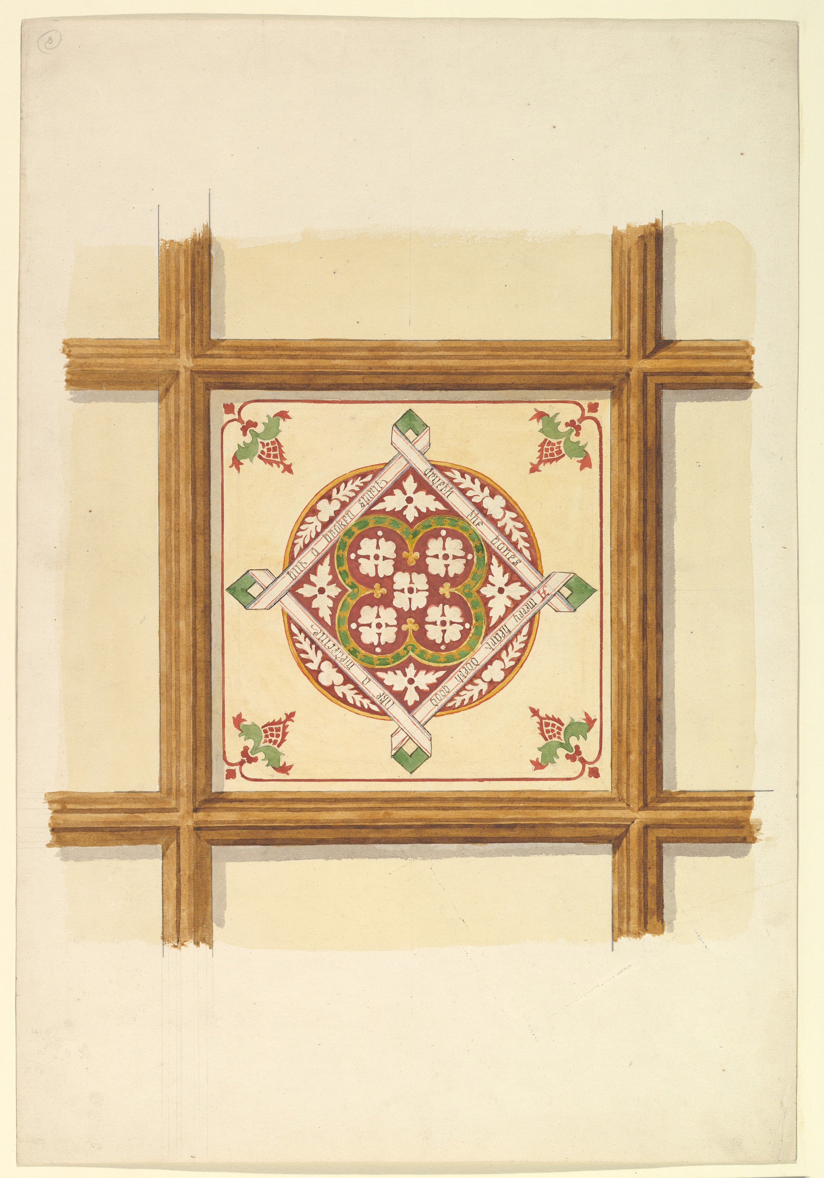
"Above all, however, I like the real wood." Design for a Coffered and Painted Ceiling in Rust and Olive Green, with a Quatrefoil Motif (Met Museum, accession no. 67.736.41).
In the woodwork of our rooms it seems to be too generally considered that it must be either tinted white, or grained in imitation of some wood. Now I do not proscribe graining; on the contrary, I like it occasionally; but I think it is used far too frequently. Why not employ a good brown, or maroon, or black, well relieved with light-colored lines, taking care to face up the work to a very smooth surface, and to varnish it? Above all, however, I like the real wood, even if it be plain deal or pitch pine; for this, if well finished by the joiner, and kept clean, will, when varnished, have a very handsome effect, and can be readily ornamented to any degree by painting dark lines and ornament, as if inlaid upon it. The wear of this kind of work is far beyond any painting.
Again, on walls of staircases or entrance vestibules, or dados of rooms, imitations of marbles are often painted, and very beautifully painted too; for many of our English artists excel in this kind of work ; but these imitations are adopted, not always because they are appropriate to the place, or particularly required, but because, being varnished, they wear well, and nothing else is suggested.
I think, however, that in a moderately sized house, where quiet taste is appreciated, stenciling in geometric patterns, in two shades of one color, is preferable to marbling, which, if done in an inferior manner, is a most unsightly sham.
In determining the colors for rooms, regard should be had to their aspect; giving cool and refreshing shades to the south, and warm, comfortable colors to the north. The use of a room should also, of course, influence the color. Then, 'also, pictures require particular consideration. If there are many in the room, and they are truly works of art, the color of the walls must be subservient to them. If the pictures are not very large, and the coloring of them not dark or heavy, sage green is a good tone. In this case the windows and doors might be cinnamon color, if not real wood; the cornice of the room might be vellum color, relieved with the cinnamon and dull violet in suitable parts of it; the ceiling might be pale grey. If, however, the room be large and the. pictures boldly painted, red is an excellent color for the walls; it gives freshness and vigor to the paintings; and if the room is lighted from above, it renders it bright and cheerful — not undesirable qualities where there is no external prospect.
The woodwork, if already painted, may be black or vellum color, properly relieved on the moldings. The cornice and ceiling of the room should be carefully toned, so that nothing be too obtrusive ; but no special colors can be proposed, as they would depend on the design of the architecture. Only I would warn my readers not to follow the advice of a clever writer in a popular magazine, saying that "a red room with a black ceiling, starred with dull sea green or yellow, is very bright and good." I doubt it.
Considerable discussion has occurred in late years as to the proper background for statues — whether it should be a quiet neutral tone of grey, or a more decided color, such as maroon red. I am strongly in favor of the decided color.
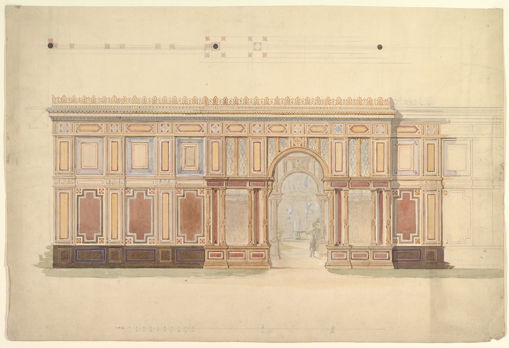
Elevation and Cross-Section of of Gallery Wall (Met Museum, accession Number: 67.736.54)
There may be special circumstances making the light neutral tone desirable for one or two statues; but taken as a rule for a gallery, or for even a single statue, I prefer the deep color. This must be modified, of course, according to the condition of the marble: if the statues are old and stained, the coloring must be lowered in tone accordingly.
The hue for walls where prints or photographs are to be hung should be a rich yellow-brown, or a leather color. This, gives lustre to the black of the print, or the tone of the photograph.
Occasionally there may be some special object in a room requiring a corresponding modulation of the coloring, such as an allegorical painting in a ceiling, much darkened and obscured by age. Such cases have often occurred to me, and have caused difficulty; for you must manage to make the painting look well, and the ceiling not too gloomy.
I will give an example. In an old castellated house there was a room in which was to be arranged a series of family portraits. As the room faced the south, it was desired that the walls might not be red; so it was decided to have a bold damask pattern, green flock upon a brown leather and gold ground. The ceiling was divided by projecting beams into fifteen compartments, in each of which was a large oval painting of a cardinal virtue, in chiaro oscuro on a dark olive ground; these ovals were surrounded by low relief framing, and outside that by very light foliage ornament.
We made the framing deep vellum color, relieved with gilding, and in the margin put a tone of maroon red, the light ornament vellum, and the ground of the surrounding panel was painted blue, sufficiently modulated. The beams which were enriched we painted a brown color, and the ornaments on them were picked out vellum color, and relieved with maroon red and gilding. The curtains of the room were dull red. and the carpet a Turkey pattern in subdued colors. The ceiling of this room was of the nature of a discord, as it would be called in music; and yet to my eye it was satisfactory and harmonious.
You cannot lay down precise laws as to what colors shall be brought together: a careful modulation will enable an experienced artist to bring any colors together. Discords can always be made to modulate, if you but know how to do it. I once heard a learned man observe that "science is a collection of laws, but knowledge is a collection of facts" and there are facts which experience teaches us which it would be difficult to explain by reference to the laws of harmony, though these laws are just, sound and indisputable.
Hitherto we have been considering the principles of contrast and harmony, or their application to simple forms, under ordinary circumstances; but in churches, large halls, or public buildings of importance, it is necessary to consider very carefully the peculiar circumstances of each of them before designing the decoration or arranging the colors.
I am not surprised at architects dreading the indiscriminate use of color in a building on which they have bestowed much careful study and labor. Judicious and well-designed arrangements of «olor should add to the architectural effect; by these the principal constructive features of a building should be emphasised or clearly expressed; and the whole, avoiding confusion, should present a combination of symmetry of form and harmony of color.
As for me, I abominate whitewash. I see not the beauty of interior stone walls unrelieved; nor do I see the impropriety of covering those real stone walls with glowing color.
In Egypt, examples of decorative coloring done nearly three thousand years ago are still in fine preservation, and excite the warmest admiration. The interior walls of the temples are often covered with historical representations, brought out in color; the main architectural features were also painted.
In the British Museum and at the Crystal Palace may be seen reproductions of some of these, well worthy attention.
The Greeks, I have no doubt, carried the art of colored decoration to the same perfection as the other arts in which they so excelled.
Their descendants show us, by their decorative works executed in a provincial Roman city eighteen hundred years ago, how beautifully the art was still practised in their day.
I say their descendants, because it is generally understood that the art works of Rome were carried on by. Etruscans and Greeks. The Romans were soldiers.
Dining Room Elevation in a Simplified Third Pompeian Style (Met Museum, accession no. 67.736.52).
The City of Pompeii, submerged, almost forgotten, during eighteen hundred years, and now brought to light again, shows us all the details of Roman life as it existed at that distant period.
The walls of the houses and public buildings, though roofless, are still glowing with colors, fresh as the day on which the awful calamity overtook the city. It is, indeed, a mine of wealth to the art student. Here he will find wonderful combinations of color, and the utmost elegance, fancy, and beauty of ornament.
One of my favorite subjects from Pompeii is a yellow frieze, treated so simply and yet so harmoniously; the brilliance of the yellow, quieted and toned by white and grey, and force given to it by a black medallion, with its surrounding color; the whole resting on the chocolate-brown plinth. Under it is a frieze in black, forming part of the same decoration, relieved by light gold-color stems, with brown medallion in centre, a red one on each side, and the lilac-grey birds between. The walls below these have yellow panels, with black margins, ornamented with slender columns in white and red.
Another very clever bit is a frieze in black, with a light stem, and leaves branching in a graceful form, and letting in portions of yellow ground above the line, and red below it, and the little bits of green and brown in centre; the green birds, too, with gold-color and lilac wings, perched on the branch on either side, all combined, form a perfect piece of harmony.
My next example is in the Casa del Labirinto. Here the red walls are relieved with black pilasters, on which are birds and light foliage, with openings of bright yellow most cleverly introduced.
In another room of the Casa del Labirinto the walls are full green, relieved with delicate white pilasters and columns; in the centre is a panel of yellow, framed by light lilac. The dado is black, relieved with fine white lines and ornament. Above, in the cornice, is maroon.
In a room in the Casa del Poeta Trajico the walls are white. Pilasters are formed by green margins, and in them are slender spiral columns. There are gold-color margins to the panels, and small subjects in them. The dado is black, divided by white lines, and green plants springing from the base — so little work, and yet so great result.
In the Casa del Gran Duca there is a black wall, with a red pilaster, on which are light gold- color ornaments, with suspended masks, birds, etc. The black panels are relieved with diagonal stems, with leaves and flowers; above is a frieze, colored [85/86] maroon, on which is a violet medallion, and two others in green.
All over Italy are to be seen very interesting specimens of decoration dating between the fifteenth and sixteenth centuries. In the palaces at Mantua, Giulio Romano exercised his genius with grand effect; but the power of distributing color, as he has done it, requires a master mind.
In Munich, decoration has been applied to most of the palaces, churches, and public build- ings. The Bavarian artists have carefully studied the decorations of Pompeii, and those of more recent times in Italy, and their works show excel- lent results. The decoration of the Allerheiligen Capelle, or All Saints Chapel, pleased me much, because great effect was produced by simple means.V
In the Royal Library at Munich there is an effective decoration in the ceiling of the staircase, which is vaulted, and the bays are alternately colored blue and red ; great brilliancy is given by this interchange of colors, and the various modulations of the lines and ornaments are worthy your notice.
I have endeavored to explain to you the principles which should guide you in the employment of color. The subject is so various and so extensive that it is impossible to do niofe than point out some of the main features of the art.
Created 17 February 2022