
he collection of reprints by Alfred Tennyson published in 1857 and usually known as the ‘Moxon Tennyson’, is widely regarded as a landmark in the development of Victorian illustration. In this book, as generations of critics have noted, the principal Pre-Raphaelites offer a series of intense visual designs which provocatively interpret their texts while revolutionizing the styles of contemporary illustration. But we should not forget that the Pre-Raphaelite contribution was only part of the story. Aiming to spread the publication’s appeal as widely as possible and engage a middle-class audience which was both conservative and adventurous, the publisher Edward Moxon divided the work between two sets of artists. One cohort, aimed at those with a more radical taste, was made up of the three leading artists of the still controversial Brotherhood, Dante Gabriel Rossetti, John Everett Millais and William Holman Hunt; and the other was a team comprised of the older, more established names of Daniel Maclise, William Mulready, Thomas Creswick and Clarkson Stanfield. The latter artists were Royal Academicians and at first glance it appears that the Pre-Raphaelites were again positioned as the iconoclasts – establishing a new approach to book art as they revolutionized painting a decade earlier. Some of this is true, although the reality is more finely nuanced.
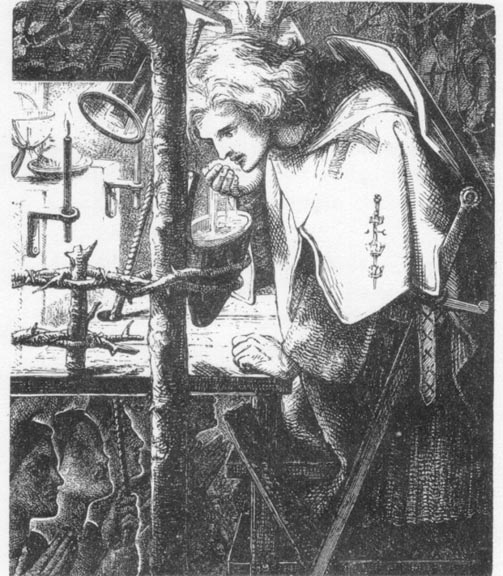
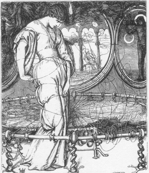
Left: Sir Galahad by Dante Gabriel Rossetti. Middle: The Lady of Shalott by William Holman Hunt. Right: The Death of the Old Year by John Everett Millais. [Click on images to enlarge them.]
All of the illustrators engaged on the Moxon Tennyson benefited from artistic freedom. Working in diverse styles and idioms and at liberty to choose whatever subjects they wanted with no editorial guidance from the publisher or author, the artists visualized exactly as they saw fit. The result is a combination of brilliance – showcasing some of the most striking illustrations of the nineteenth century – and the workmanlike. As G.S. Layard has observed, the book is remarkably uneven, producing a ‘splendid bundle of incongruities’ (9), and it is is usually read as an uneasy mingling, a jostling of the old and the new. Judgements, however, are markedly asymmetrical. In modern criticism, at least, the Pre-Raphaelites are the recipients of all the praise, while the work of the older artists is almost entirely condemned as old-fashioned, conventional, and uninteresting, the obsolete residue, according to this line of reasoning, of an outmoded idiom that was comprehensively replaced by the aesthetics of the Brotherhood. This position is voiced by Percy Muir, who, in comparing the two types of illustration remarks how the disparity “goes on through the volume, the younger men scoring heavily all the time. Again and again one remarks how splendid [the Pre-Raphaelites' illustrations] are – and how shoddy are [the works of the older designers” (131). Others take a parallel view, with condemnation of established talent focusing on two main elements. One is the quality of draughtsmanship. In contrast to the bold stylistics of the Pre-Raphaelites, the more traditional artists are censured for the alleged weakness of their drawing, with Horsley, especially, singled out for opprobrium. More damning still is the assertion that the Pre-Raphaelites were more effective illustrators. This is the more controversial of the claims, and it is far more questionable than the confident assertions of generations of critics would suggest. In this short essay I re-assess the heavily criticised work of Creswick, Mulready, Horsley and Maclise, focusing on their responses to Tennyson’s texts and how they present and re-present his messages.
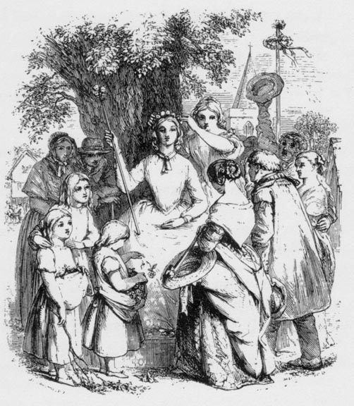
Left: The May Queen by J. C. Horsley. Middle: Illustration for Tennyson's "The Golden Year" by Thomas Creswick, RA. Right: Life and Thought have gone away Side by side by William Mulready, RA. [Click on images to enlarge them.]
The Question of Illustration: Anachronism and Modern Taste
The difference between the older designers and the Pre-Raphaelites is usually framed in terms of a binary opposition in which Rossetti and his associates are identified as interpreters who make a symbolic or personal reading of their material, while the ‘traditional’ artists provide a paratext which repeats the written information and adds nothing new to what is already inscribed in the verse. This claim is made despite the fact several of the illustrations by Holman Hunt and Millais are relatively straightforward and provide a literal mirroring of the source material. Nevertheless, the binary model has prevailed. In the words of Martin Hardie, writing in the early years of the twentieth century: “The older men … clung to the old traditions; they picked a piece out of a poem and illustrated it with the same dogged fidelity and commonplace honesty with which they painted a patch of nature, [while the Pre-Raphaelites offered a] symbolic and interpretive art [which expressed] their own instinct and temperament” (10–11). Of course, this position is informed with Rossetti’s claim that the illustrator's role should be one of an interpreter who is free to ‘allegorize on [his] own hook on the subject of the poem’ (qtd. Reid, 31–32), and arrive at a personal reading suggested by the words. First accepted as a truism in the 1890s and repeated without modification ever since, the assumption is always that interpretive illustration is necessarily the ‘best’ or most revealing illustration. Applying this criterion, the older illustrators of Tennyson are reduced to an inferior status because they do not impose an idiosyncratic view of the sort presented in Rossetti's enigmatic Palace of Art or Millais’s intensely emotional responses in illustrations such as The Sisters and Edward Gray.
But is it necessarily the case that imaginative illustration – which may bear only a peripheral relationship to the text – is always superior to the images that set out to provide a mirror of the source-material? As Hardie's comments suggest, modern criticism insists on the value of the former; but this position does not reflect the views of the original audience or the views of Victorian critics and authors. In the mid-nineteenth century the situation was reversed: ‘faithful’ illustration which served its text was admired above images which did not obviously picture the words. It was commonplace to complaint, as the editor and critic Samuel Lucas did, that illustration was too often self-indulgent and marred by the illustrator’s unwillingness to work, in the terms of George Du Maurier, ‘in harness’. As Lucas writes of the very artists whose designs are now the subject of endless praise, “The most common defect [of books such as the Moxon Tennyson] is the way in which [the artists fail] to give the best possible thought or attention to the text. It is really extraordinary to what an extent they can mistake or contradict the meaning of the author confided to them” (‘Illustrated Books’, 10). Lucas elsewhere deplores the tendency to privilege ‘interpretation’ over ‘illustration’, and throughout his reviews insists on the need for ‘accord’ between the text and the images, which should always provide a ‘telling representation’ (‘More Gift Books’, 12). Nor was he alone in this belief. Among the writers themselves, Charles Dickens believed an illustrator should serve the text; so did W. M. Thackeray; so did Anthony Trollope; so did George Eliot; so did Wilkie Collins; so did Charles Reade; so did M. E. Braddon; so did Lewis Carroll; and so, most tellingly of all, did Tennyson, who was completely baffled by the Pre-Raphaelites’ response to his verse and regarded it as deeply misleading. An illustrator, he claimed, ‘should always adhere to the words of the poet’ (Holman Hunt, 2:125), and seems to have regarded all such interpretive work as a challenge to the authorship of his creations. This view echoes throughout the reviews and notices, with critics deploring the fancifulness of so much of contemporary illustration.
In short, the type of illustration preferred by the mid-Victorians was not the Pre-Raphaelites’, with its bold inventiveness and free association, but, on the contrary, the work of those embellishing the Moxon Tennyson who have for many generations been the subject of contempt. As far as majority of contemporaries were concerned, Maclise, Mulready, Creswick and Stanfield were superior to the new set of artists because their images closely relate to their texts and subordinate the artists’ personalities to the task of presenting the writer’s settings, ideas and themes. Even Holman Hunt had to concede that the older school was preferred to the new, remarking that ‘those who liked the work of artists long established … felt that the pages on which our designs appeared [were of the sort] they did not value’ (2:103). When it is claimed that the Pre-Raphaelites are better illustrators than their bed-mates we must therefore qualify the assertion with the statement that the notion of their superiority, like the insistence on the value of interpretive design, is a late-Victorian and twentieth-century construction. We may find the Pre-Raphaelites’ approach more provocative, more modern, perhaps, than that of their co-contributors; but the original audience was more interested in fidelity to the text than personal inventiveness.
Illustration versus Interpretation
Hardie speaks dismissively of the older illustrators’ ‘commonplace honesty’ in trying to convey the content of the text. When we look closely at the illustrations, however, we find that that ‘honesty’ is not just a matter of showing details; rather, it involves the offering of strict visual equivalents to the writer’s most important information. While not diverging from the text in the manner of Rossettian fantasy, the work provided by Maclise and his associates is often highly focused: exploiting the formal language of composition and line, it elucidates its source-material by highlighting its primary messages.
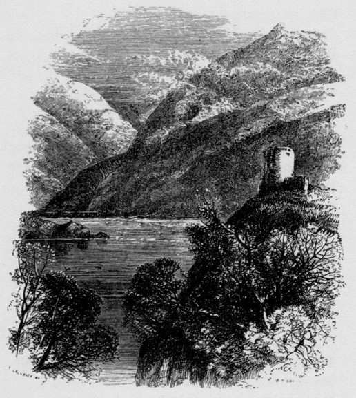
Particular emphasis is placed on the visualization of atmosphere and tone, and this purpose informs the illustrations of landscape, which focus entirely on the formations of setting and only include figures as small elements within the design as a whole. In contrast to the most of the illustrations, which have bold figures placed in the centre, these images are concerned with the expressiveness of the English countryside. A good example is provided by the opening design to Claribel, by Creswick (Tennyson, 1). Dismissed by Muir as a piece of ‘appalling pretty-prettiness’ (131), the illustration is nevertheless an effective materialization of Tennyson’s elegy in which the artist underscores the melancholy tone by placing the ‘moss'd headstone’ in the foreground within a frame of nature at peace. Claribel ‘low-lieth’, and the serenity of the sighing oak is recreated in Creswick’s showing of a Picturesque nocturne. It is certainly ‘pretty’ in its manipulation of the conventions of landscape in echo in Constable and Gainsborough, and its delicacy embodies the highly stylized and artificial language of the poem in an equally artificial form.
Indeed, Creswick’s emphasis on the Pathetic Fallacy, the intermingling of emotion and setting, nature and human nature, is deployed throughout the landscape illustrations. Tennyson presents an emotionalized physical world, and so do his illustrators. The many moments of serene contentment are exemplified by designs such as Stanfield’s Oenone and Horsley’sCircumstance. Yet the landscape idiom is equally responsive to Tennyson’ s exploration of anguish, not only in the representations of death and burial (1, 23, 63), but also in his fascination with the power and indifference of nature to human suffering
Left Two: Illustrations for Tennyson's “Circumstance” both by J. C. Horsley. Right: Illustration for Tennyson's "Break, Break, Break" by Clarkson Stanfield, RA. [Click on images to enlarge them.]
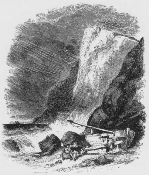
A potent closing design is provided by Stanfield’s ‘Turner-like’ (Lewis, 176) treatment of 'Break, break, break' (Tennyson, 373-4). The theme of the poem is the contrast between human loss and the immutability of the breaking waves, and Stanfield underscores the message by drawing an absolute contrast between the insignificance of the figures in the foreground (the ’ fisherman's boy’ and his sister) and the colossal power of the huge rain-swept cliff face and the waves breaking upon it. Tennyson struggles to express his ‘thoughts of loss and his desire for the day that is dead’ but the illustration graphically represents the fact that the ‘tender grace’ is meaningless in the face of nature’s unfeeling power. In the Pre-Raphaelites' designs the figures are the central focus, but the work of the established designers provides a telling re-visualization of the poet’s other obsession with man's insignificance within a natural world which may reflect his emotions, or may be little more than dead matter. If Creswick applies the Picturesque to the visualization of the verse, then Stanfield deploys the Sublime to contrary, but equally telling effect.
The illustrations of Creswick and Stanfield also figure the exoticism of Tennyson’s verse, with its heroic emphasis on the landscapes of a mythologized classical world. The poet describes the epic sweep of the settings of ‘Ulysses’ and ‘The Lotos Eaters’, and illustrations by Mulready and Stanfield help to evoke this world by offering a neo-classical imagery which is in close accord with the poet’s. This approach is exemplified by Mulready’s The Sea-Fairies (31). On the face of it this is precisely the type of conventional illustration reviled by the critics. But it is undoubtedly a telling design: the poet describes ‘Sweet faces, rounded arms, and bosoms prest’, and the engraving shows a neo-classical idyll of luscious semi-nudes. It also enshrines a sophisticated re-telling of Tennyson’s emphasis on eroticism and temptation. The first is conveyed by the fact that, as in the poem, we see only the sirens’ bodies, not their faces: this is the medium of their deadly power. Temptation is also conveyed by the fact that the viewpoint is placed behind the female figures, with the sensual emblems of human delight, wine and fruit, placed in the foreground. The women provide the poetic voice and the illustration shows the mariners, in the form of a tiny ship, entirely from their point of view.
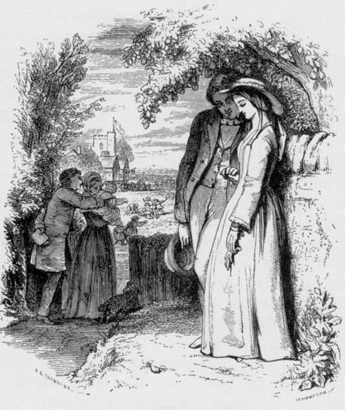
Mulready’s design catches both the tone and focus of Tennyson's fascination with the life of the senses. The work of his contemporaries is equally effective in illustrating Tennyson's romantic themes. Horsley, an illustrator of genre, offers a close approximation to Tennyson's ‘Circumstance’ (62–3) in the form of two linked designs. The poet’s theme is the pattern of life, from ‘two children/Playing mad pranks’, which then becomes ‘Two lovers’, and concludes with ‘Two graves’. Each of these stages is illustrated: in the far distance of the first image we see children playing; in the foreground, the ‘lovers whispering’; and in the middle distance parents holding a child. These gainful stages of life are condensed into the one frame, with death being consigned to the second illustration. The effect, it has to be said, is purely sentimental. The simpering lovers are in sharp contrast to Pre-Raphaelite notions of beauty, and the impression presented by the two designs is cloying in the extreme; we might also note the weakness of the draughtsmanship, notably the figure of the women in the first illustration, whose head is disproportionately small. However, the point is simply this: Tennyson’s verse, with its imagery of lives bound in ‘golden ease’ and life running ‘from hour to hour’ is the source, and Horsley’s brief is to provide an illustration to recreate the tone of the poetry. If Horsley is accused of being sickly-sweet, then we have also to criticise the poet for a lapse of taste. Such judgements are rarely made by critics who look at the illustrations but fail to read the verse. If Tennyson wants to present a sentimental poem, then it is not the illustrator's prerogative to contradict him; in Lucas's terms, the artist should preserve the writer’s ‘spirit’(‘More Gift Books’, 12).
That emphasis is preserved in the illustrations exploring the poet’s psychological readings of heroes. The most effective illustrator of this idiom is Maclise, who visualizes two scenes from the ‘Morte d'Arthur’. The first of these, which represents Arthur taking Excalibur from the Lady in the Lake, is one of the most denigrated of all of the Moxon illustrations. Many critics have found it absurd, with exception being taken to Arthur’s melodramatic pose as he faces the raised Excalibur. In the words of Nancy Weston, ‘He clasps his hand together and holds them close to his face in a gesture that can best be described as cringing. At worst, Arthur mimics a maidenly swoon’ (223), an attitude that was probably derived from the artist’s study of the acting journals that were popular at the time and were a source for many mid-Victorian painters.
However, what Weston and other critics fail to see is that Maclise uses gesture to suggest Arthur’s weakness. It is not the response of a hero, and designedly so. Indeed, Maclise's strategy is one in which he crystallizes the emotional tone of the poem as a whole. This is not celebratory, but focused on loss and personal weakness as Arthur moves towards death. All Maclise does is project his current uncertainty backwards in time, so underscoring the point – as exemplified in the poem as a whole – that Arthur is both a mythic archetype and a frail man. Thinking of the responsibility that possession of Excalibur imposes upon him, his response is understandably one of doubt rather than euphoria or pride.
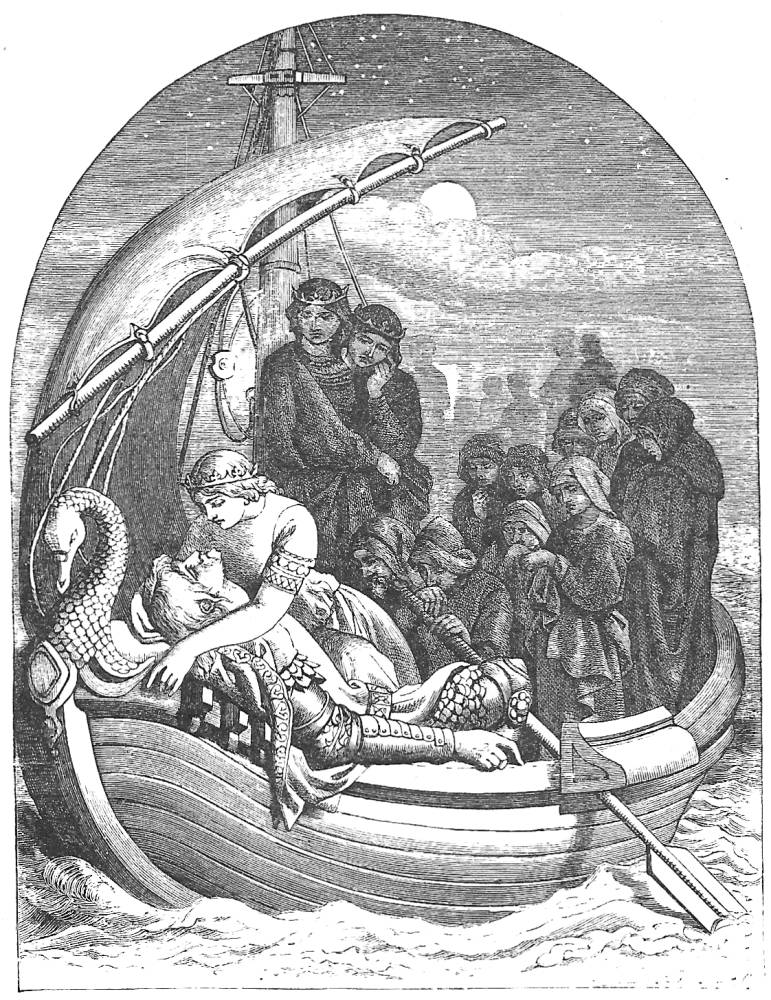
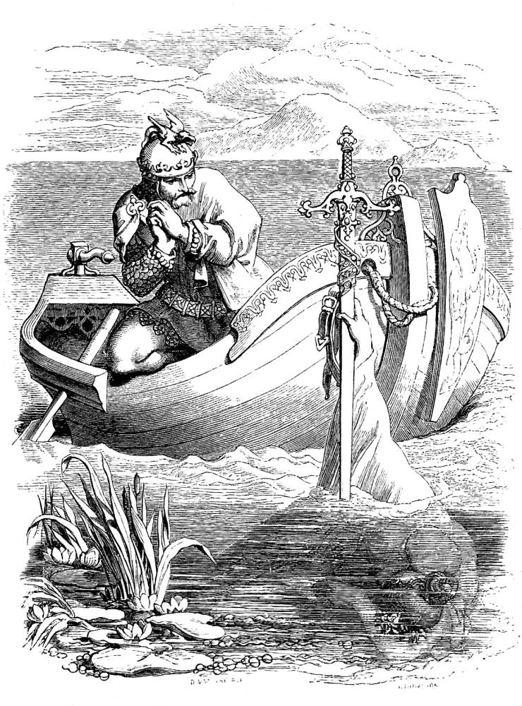
Left: Arthur and Excalibur. Right: The Passing of Arthur — both by Daniel Maclise. Click on images0 to enlarge them.
The note of loss and human weakness is further developed in his illustration of Arthur’s final journey. This is as exact a representation as possible: the details of the ‘tingling stars’ and ‘stately forms’ are carefully preserved, and Maclise visualizes the lines describing the king's prostration, lying ‘like a shattered column’. The illustration’s particular strength, however, is its treatment of Arthur’s final enclosure in a place of safety. The curve of the sail above his head rhymes with the outline of the ship and the curve of the arched head of the frame, thus putting the whole emphasis on a curvaceous sinuousness The first illustration focuses the idea of the phallic Excalibur, but the second suggests the feminine, a womb-like space where he will be healed of his ‘grievous wound’ and re-born; he may die, but ‘Merlin sware that [he] should come again’. This complicated notion is exemplified in Maclise’s enclosing space: elegant in its dramatization of a single moment, it crystallizes the underlying theme of a circular pattern of death and regeneration.
Maclise’s sensitive response to Tennyson’s text matches the treatments of Mulready, Horsley, Creswick and Stanfield. Each of these buttresses the author's effects through a process of re-visualization, reinforcement and elucidation. This is not, of course, to diminish the achievements of Rossetti, Millais and Holman Hunt. Their illustrations open new worlds of speculation and possibility. But it is worth remembering the existence of the ‘other’ Moxon Tennyon – the one in which the artists set out to serve their author. In so doing, they help to make sense of the complexities of Tennyson’s verse without imposing what many mid-Victorian regarded as the dangerous tendency of some illustrators to visualize their own material, not the writer’s.
Works Cited
Hardie, Martin. ‘The Moxon Tennyson, 1857’. First published in The Booklover’s Magazine. Reprinted in Edwardian Illustration. London: The Imaginative Book Illustration Society, 2005: 7–16.
Holman Hunt, William. Pre-Raphaelitism and the Pre-Raphaelite Brotherhood. 2 Vols. London: Macmillan, 1905.
Layard, G. S. Tennyson and His Pre-Raphaelite Illustrators. London: Elliot Stock, 1894.
Lewis, Becky Wingard. ‘A Conflict of Intentions: Tennyson versus Pre-Raphaelite Illustrators’ Collecting the Pre-Raphaelites: an Anglo-American Enchantment. Edited by Margaretta Frederick Watson. Aldershot: Ashgate, 1997. 175–84.
[Lucas, Samuel]. ‘Illustrated Books’. The Times. 24 December 1858: 10.
[Lucas, Samuel]. ‘More Gift Books’. The Times. 2 January 1865: 12.
Muir, Percy. Victorian Illustrated Books. London: Batsford, 1971.
Reid, Forrest. Illustrators of the Eighteen Sixties. 1928; reprint New York: Dover, 1975.
Tennyson, Alfred. Poems. London: Moxon, 1857.
Weston, Nancy. Daniel Maclise: Irish Artist in London. Dublin: Four Courts Press, 2001.
Created 13 June 2018