
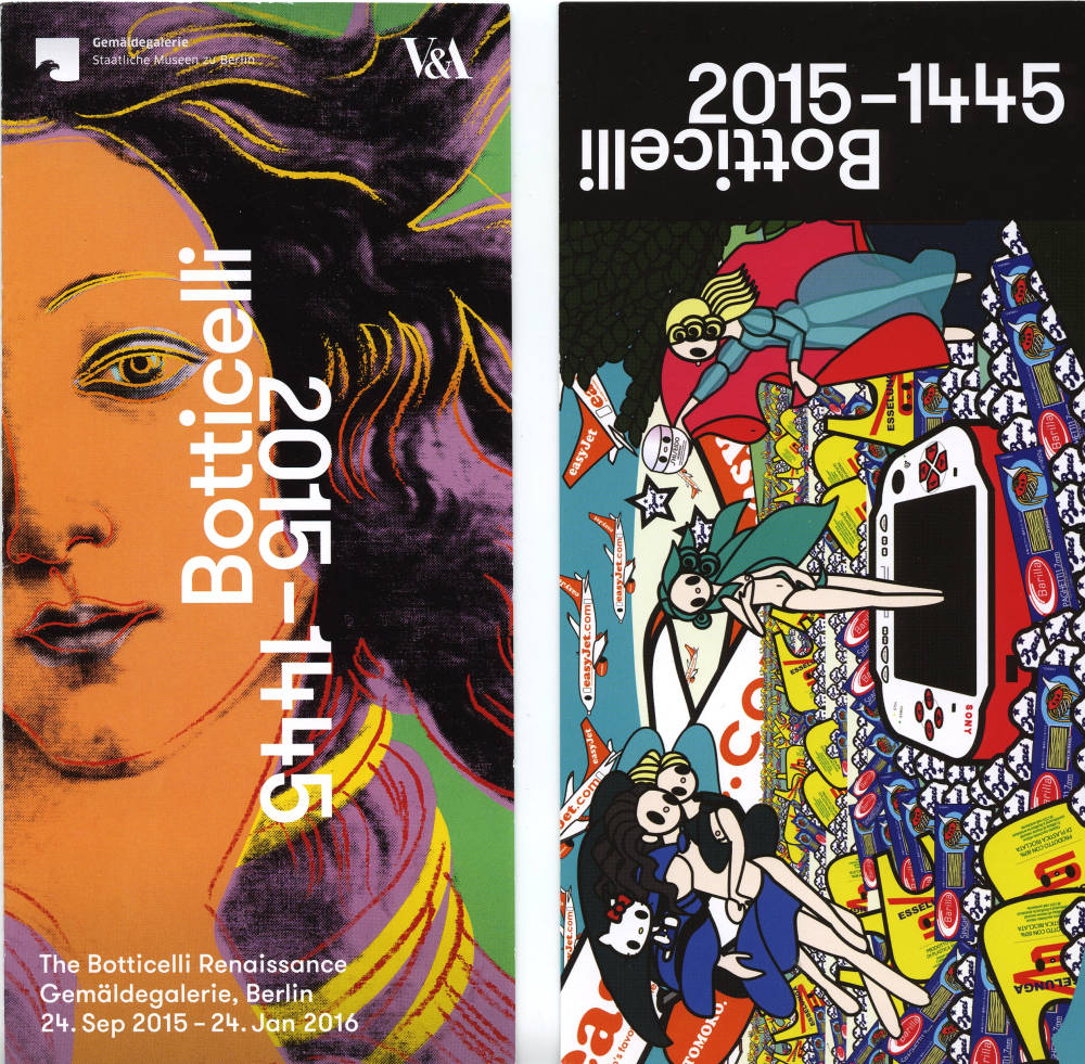
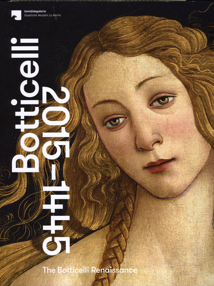
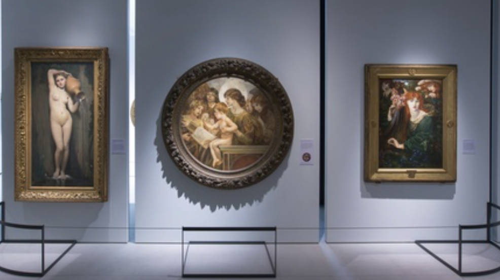
Left two: Publicity handouts for the exhibition. Right: Cover of the massive, beautifully designed catalogue. [Click on images to enlarge them.]

fter two weeks of traveling through parts of the former East Germany last September, I arrived in Berlin. Never having seen the Gemäldegalerie during previous visits — I always ended up returning to Museum Island — I decided to make my way to the museum, in part because a poster announced a Botticelli exhibition there. Not having seen that much of the publicity, I expected a fairly small scholarly show. Instead, I found what is essentially two shows or even three: first, probably the largest assemblage of Botticelli's works that has ever appeared in any exhibition, second, works by nineteenth-century British and European artists, and finally the the section that greets one as one enters that the organizers accurately entitled “The Twentieth and Twenty-first Centuries: Botticelli as brand” — with all that the word brand implies about the corruption of art by commerce.
Organizing the exhibition in this manner stirred some controversy in the British press when the show, somewhat changed, traveled to the V & A. (I have not checked the Berlin newspapers to see their reaction). Boyd Tonkin seems to have been very vexed. His review in The Independent begins with the recognition that “as the nation’s prime venue for applied arts, the V&A has a licence to thrill. . . no one bats an eyelid to find rock-star memorabilia or catwalk creations in its rooms,” and he even likes that visitors quickly encounter Ursula Andress “emerging from the sea in Terence Young’s film of Dr No. It’s a witty and knowing allusion to the Florentine painter’s The Birth of Venus.”
Only then does the real shock begin. In the show’s first section proper (entitled “Global, Modern, Contemporary”), the museum has assembled perhaps the grossest heap of kitsch and dross ever to litter its eclectic exhibition halls. From the soft-porn fantasia of David La Chapelle’s Rebirth of Venus to Dolce & Gabbana’s hideous Botticelli-in-fragments dress (from their 1993 collection), from Andy Warhol’s zombified mimicry of the goddess to Yin Xin’s vapid Chinese-featured Venus after Botticelli: we tumble from one circle of art hell to another.
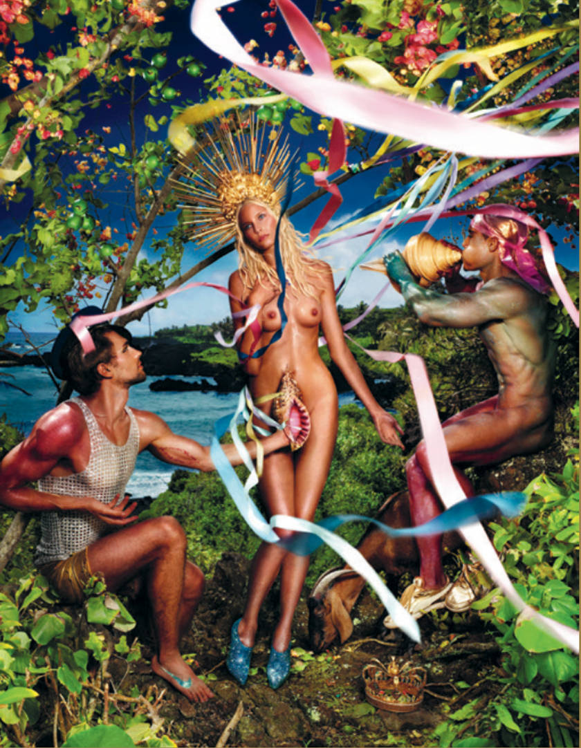
Left: Rebirth of Venus. David La Chapelle. 2009. Right: Venus after Botticelli. 2008. [Click on images to enlarge them.]
The curators Mark Evans and Ana Debenedetti have consciously chosen to run their show backwards. So Sandro Botticelli’s recent afterlife of schlock-horror comes first. Then we encounter his 19th-century worshippers and imitators, and only then see some wonderful works from the main man – and his studio – himself. It’s the nature of that afterlife that turns the stomach. Debenedetti assures us that “every single work presented here has to be meaningful: we didn’t just want quotations and pastiches of Botticelli.” Meaningful, perhaps – but still nasty.
In contrast, Jonathan Jones of The Guardian sees the same contrasts of culture, taste, and artistic skill as Tonkin but enthuses, “by submerging Botticelli and his Venus in the trashy pool of pop and tourist culture they have inspired, this landmark show elevates them both.” Many of the more recent pieces, however, do seem little more than “quotations and pastiches.”
Why after all does one artist borrow from other artists or make obvious allusions to their work? Great artists (or would-be great ones), like great poets, often challenge their precursors, implying, “this is the way to paint that subject.” William Bougoureau’s Birth of Venus (1879) is an obvious challenger in this mode, as is Walter Crane’s The Renaissance of Venus (1877; see below). The fact that however well painted are their works, they have far fewer imitators than the master, suggests they didn't convince others their way was superior. Some painters simply pay homage, and some simply try to hitch their name to a star. The Chinese features in Yin Xun’s Venus after Botticelli make an obvious very politically correct statement about the non-universality of Western notions of female physical beauty — or do they, since his work makes only minor changes the basic shape of the original? However interesting one finds the argument implicit in Venus after Botticelli, it’s not a particularly good painting. It's a better argument, convincing or not, than a painting. Many works included in the modern section fall into the category of conceptual art, but, like much art in this mode, concept dominates, and the concepts are often banal.
I certainly sympathize with Tonkin. Nonetheless, the heap of very large and very bad work through which one had to make one’s way before reaching the Victorian paintings and then the Botticellis did not bother me all that much because the show beautifully succeeded in accomplishing the main task of any exhibition — assembling many works in one place that would otherwise require a great deal of time and effort to see, even if access to private collections were possible. In Berlin after I came upon the largest Ruskin drawing I had ever seen and paintings by Eleanor Fortescue Brickdale and Evelyn De Morgan, I realized I had come upon some very interesting Victorian art. I was therefore grateful enough not to mind the inclusion of work that didn’t particularly interest me. Then, walking from the galleries containing art of the last few centuries into the long dark room filled with Botticellis, I realized that I was in the midst of three exhibitions, at least two of them very much to my taste. Let's review: one enters through a room with La Chapelle, Nabil, Nagao, Orlan, Warhol, Witkin, and others, after which one encounters some beautiful Victorian works, some of them delightful discoveries, and then one ends at Botticelli himself.
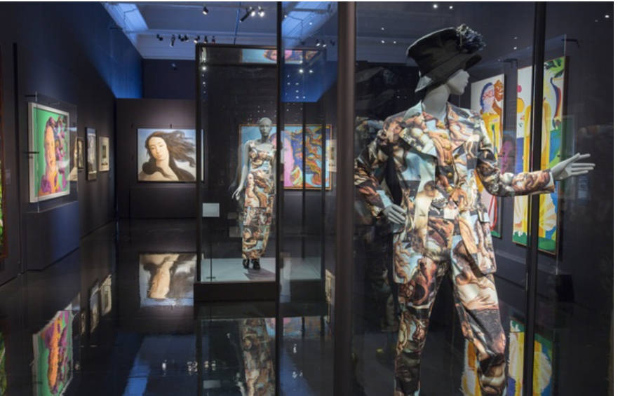
The first room one enters at the exhibition. This photograph contains some of the objects scorned by some reviewers. [Click on images to enlarge them.]
In other words, did the organizers — Ana Debendetti, Mark Evans, Ruben Rebmann, and Stefan Weppelmann — organize The Botticelli Renaissance/Botticelli Reimagined like The Divine Comedy, moving from hell upwards?

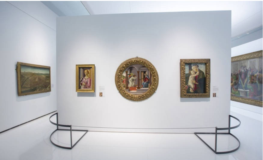
Left: The installation of the nineteenth-century paintings in London. Right: A partitions in the Botticelli room on which one of the tondi hangs. [Click on images to enlarge them.]
The V&A’s version of the exhibition certainly seemed to reinforce that idea: unlike the Berlin show in which the most recent work appeared in a room with light walls, the V&A designers presented it in a room with black ones, and whereas the Gemäldegalerie presented the Botticellis in a very dark room, the V&A’s Botticelli Reimagined displayed them against white or cream-colored walls. Botticelli Reimagined also offered a much superior spatial exhibition design, hanging the twentieth- and twenty-first century works in a room divided into small areas by partitions set at angles to the walls. Somewhat similarly, the Botticellis were grouped grouped by genre and subject in a room divided into smaller spaces by partitions. Equally important, the Berlin designers hung the paintings in a completely darkened room on both sides of long partition aligned perpendicularly to widest walls of the previous galleries; the V&A groupings made much more sense. The V&A version, whose title “Botticelli Reimagined,” seemed more accurate than Berlin’s “The Botticelli Renaissance,” since much about the show’s initial third doesn’t suggest much of a rebirth or Renaissance.
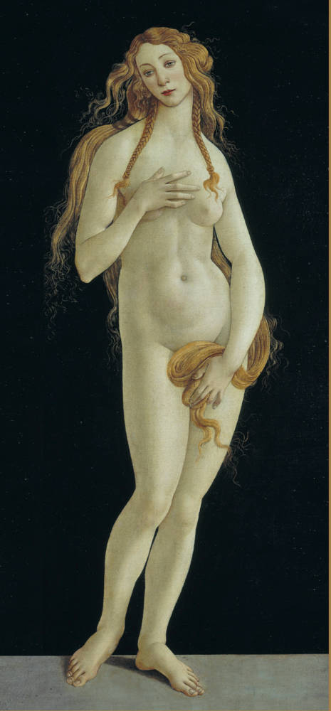
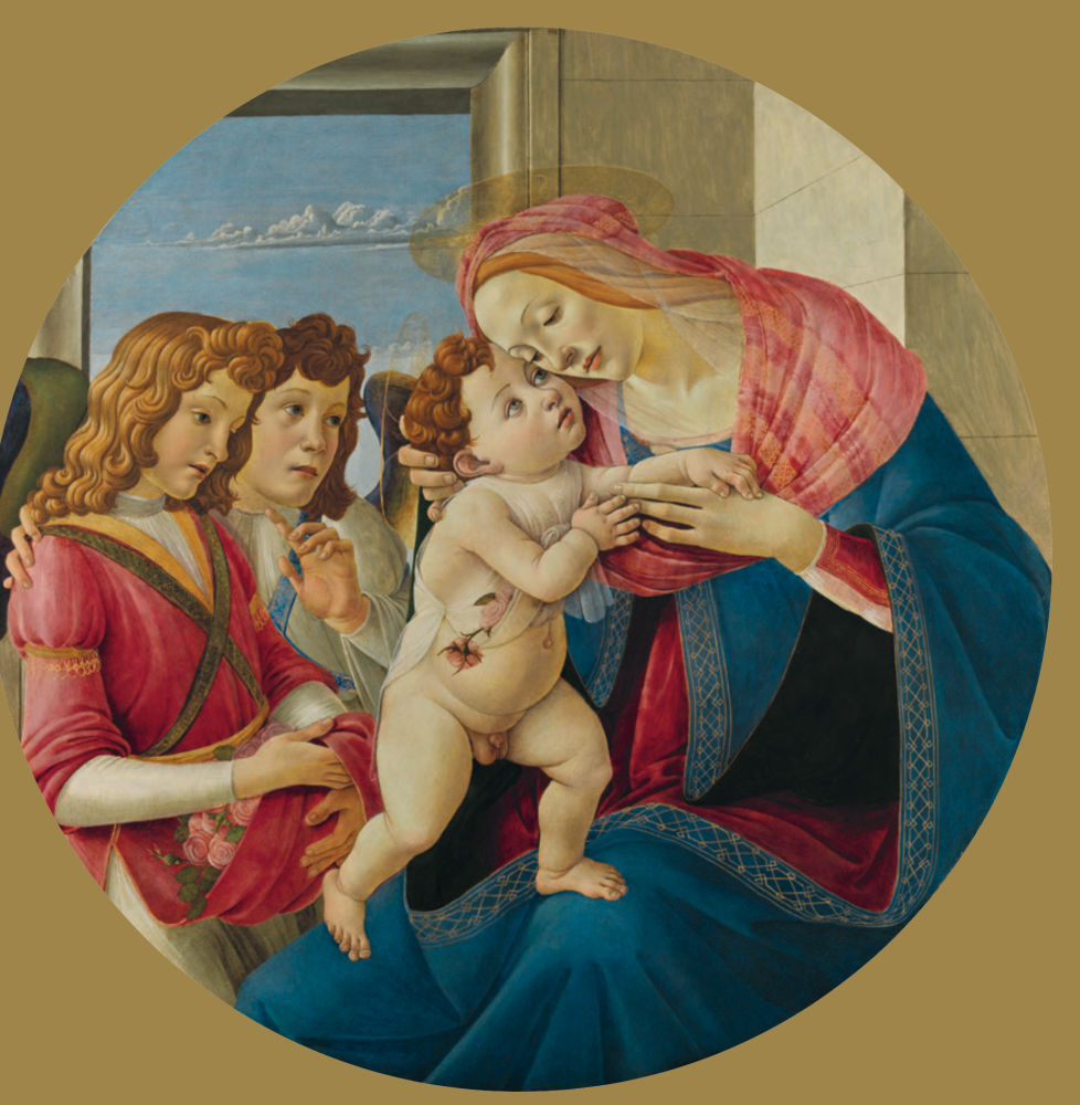
Left: Venus. Sandro Botticelli. 1490s. Gemäldegalerie, Staatliche Museen zu Berlin. Right: The Virgin and Child with Two Angels. c.1490. Gemäldegalerie de Akademie den Bildenden Künst Vienna. [Click on images to enlarge them.]
Botticelli and the Victorians
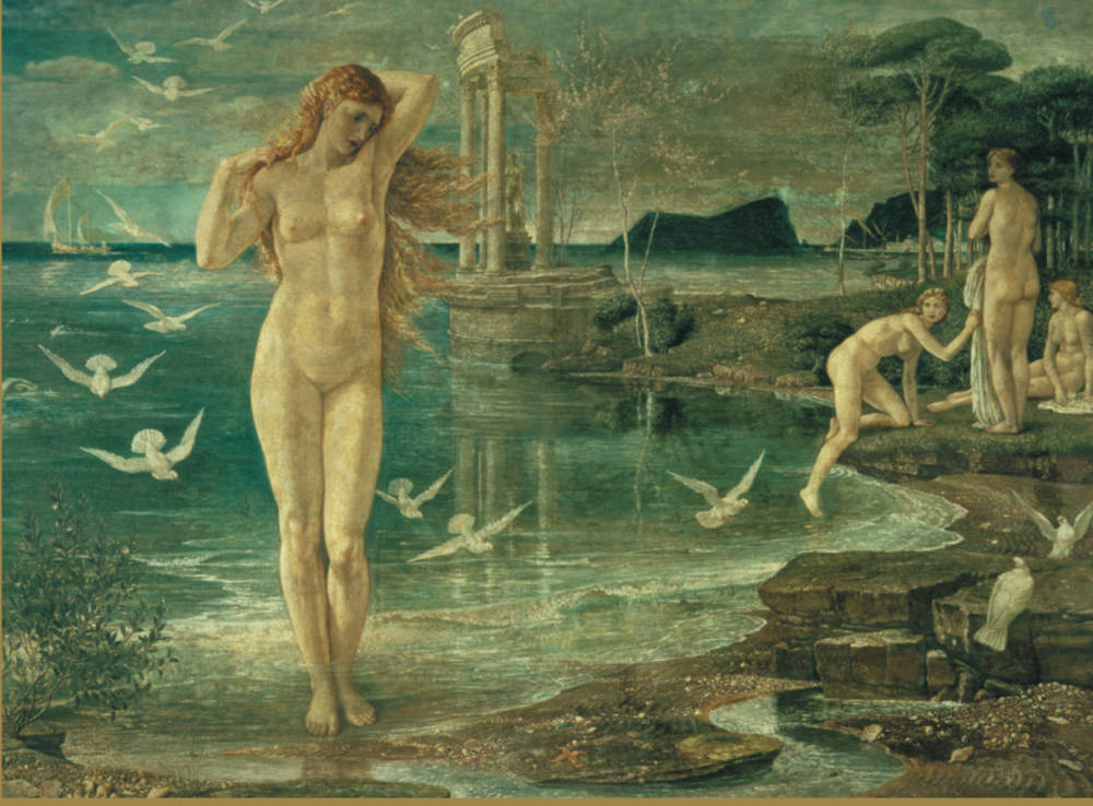
Left: Zipporah. John Ruskin. 1874 Watercolor, bodycolor, and pencil, 143 x 54 cm (56 x 21 inches). Right: The Renaissance of Venus. Walter Crane, RWS (1845-1915). 1877. Oil and tempera on canvas, 138.4 x 184.1 cm (9.45 x 13.19 inches. [Click on images to enlarge them.]
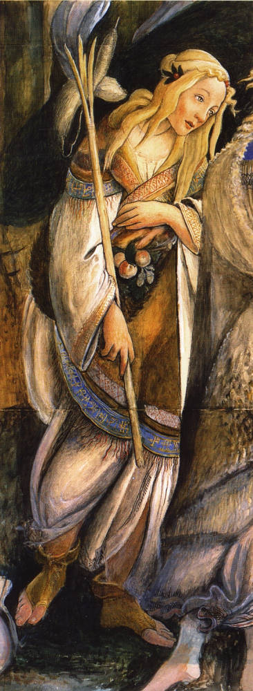
The part of The Botticelli Renaissance that most interested me, as I assume will interest most of you reading this review, was the Victorian section, which included Aubrey Beardsley’s Portrait of Sandro Botticelli, Edward Burne-Jones's Evening (1870), Luna (1872-75), Love (1880s), and The Mill: Girls Dancing to Music by a River (1870-82), Eleanor Fortescue Brickdale’s Botticelli’s Studio: The First Visit of Simonetta Presented by Giulio and Lorenzo de medici (1922), Walter Crane’s The Renaissance of Venus (1877), Evelyn De Morgan’s Cadmus and Harmpnia (1877), and Flora (1894), Charles Fairfax Murray’s Mystic Nativity (1870s-80s) and Adoration of the Magi (1875), Noel Laura Nisbet’s Dyrads in Flight or Startled Wood Nymphs (c. 1935), Dante Gabriel Rossetti’s The Day-Dream (1880), La Ghirlandata (1873), and two versions of La Donna della Finestra (1870), and Simeon Solomon’s Love in Autumn (1866). The partial or complete Victorian copies of the master’s work include those by Charles Fairfax Murray and John Ruskin’s 1874 study Zipporah, which at 143 x 54 cm (56 x 21 inches) is one of the largest Ruskin drawings of which I know. (They also have a sketch by him of the background vegetation in Primavera).
The catalogue devotes all or part of four essays to the Victorians — Susanna Avery-Quash’s “Botticelli and Victorian Art Collecting,” Elizabeth Prettejohn on “Botticelli and the Pre-Raphaelites,” Susan Owens on “Beardsley and Botticelli.” and outside of England, Gabriel Montua’s “Botticelli’s Path to Modernity: Continental Reception 1850-1900.” All are useful, though by “Pre-Raphaelite” Pettejohn means only Rossetti and aesthetic Pre-Raphaelitism. Ruskin, who is represented here by an impressive Botticellian study, is not even mentioned and neither are Evelyn De Morgan and other late women followers of Pre-Raphaelitism. What exactly appealed to Victorian and later artists in Botticelli's work? Was it the even, bright lighting, the firm, even sharp-edged outlines, the ideal contemplative woman from the Birth of Venus, or the look of intoxication in the nymph in Primavera? Botticelli’s inward-looking Woman, the embodiment of contemplation (or longing) certainly seems to have influenced Rossetti and Burne-Jones, but that alone doesn’t account for his enormous appeal to nineteenth-century artists and audience.
Ingres’s La Source, Sartorio’s Madonna of the Angels, and Rossetti’s Ghirlandata. [Click on images to enlarge them.]
Final thoughts: Rossetti’s Ghirlandata “popped” on the walls, Brickdale’s painting of Botticelli’s studio certainly looked like early Millais, and DeMorgan’s Flora combined the lighting and hard edges of the PRB with the expressions and shallow depth of field of Burne-Jones. Giulo Aristide Sartorio’s Madonna of the Angels (1895), which used Gabriele D'Annunzio’s wife and child as models, is practically the embodiment of non-impressionist art, 1890-1910. What were those nude male bathers doing in the left background of Burne-Jones’s The Mill?
Related material
Bibliography
McMahon, Mary. The Botticelli Renaissance. Berlin: Gemäldegalerie Staatliche Museen zu Berlin, 2015. Pp. 360. 170 color plates.ISBN 978/3-88609-767-8 [for Berlin museum edition].
Tonkin, Boyd. “Botticelli Reimagined: The V&A has assembled the grossest heap of kitsch and dross ever to litter its halls.” The Independent. Date of original publication not indicated. Web. 28 March 2016.
Jones, Jonathan. “Botticelli Reimagined review – Venus in the gutter, more beautiful than ever.” The Guardian (2 March 2016). Web. 28 March 2016.
Last modified 31 March 2016