
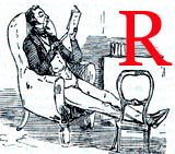
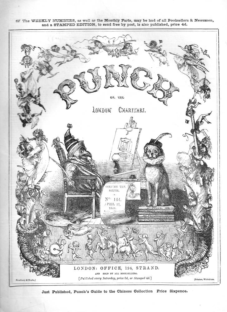
ichard Doyle’s most famous work is the front cover for Punch. First published in 1849 as a re-working of the artist’s earlier design of 1844, Doyle’s fantastical cover was retained until 1954. Throughout that time it acted as a tangible sign of the magazine’s brand, representing the journal’s emphasis on good-humoured satire, parody, and unconventional mockery. Apparently a simple combination of amusing imagery, a decorative and lyrical piece with fairies cascading and ascending on each side of the frame with Punch and Toby at the centre, it is more demanding, and suggestive, than it might seem to be. Doyle’s imagery attracts the reader’s attention, but close analysis suggests how carefully he enshrines the magazine’s messages while testing the bounds of mid-Victorian propriety. Indeed, the development of this second and definitive cover is revealing of the artist’s engagement with a specific brief; never considered in detail in any previous criticism, its complexities are worth considering in detail.
Making the cover: stylistic evolution and design
Making an impression on its readers and potential readers, Punch, like all magazines, needed to have a front cover that would engage its audience. Founded in 1841 under the editorship of Mark Lemon, and for the opening years at least far from certain of its success, it had to establish its customer-base by defining its identity and purpose while matching it with its readers’ tastes and expectations. Functioning, to put it crudely, like a label on a packet, the cover had to advertise its wares.
Finding the right design was more difficult than Lemon expected, and for the first three years the editor commissioned five artists to create an appropriate cover: Archibald Henning, H. K. Browne (Phiz) , William Harvey, John Gilbert and Kenny Meadows. Three of these – Phiz, Meadows and Henning – were experienced comic artists, but their covers they produced were not to Lemon’s satisfaction; another, by H. G. Hine, never proceeded beyond a preparatory drawing (1842). By the end of 1843 it was decided that regular change was not serving the need to have a distinctive identity, and Doyle, then a relative newcomer to the staff, was instructed to produce a new design.
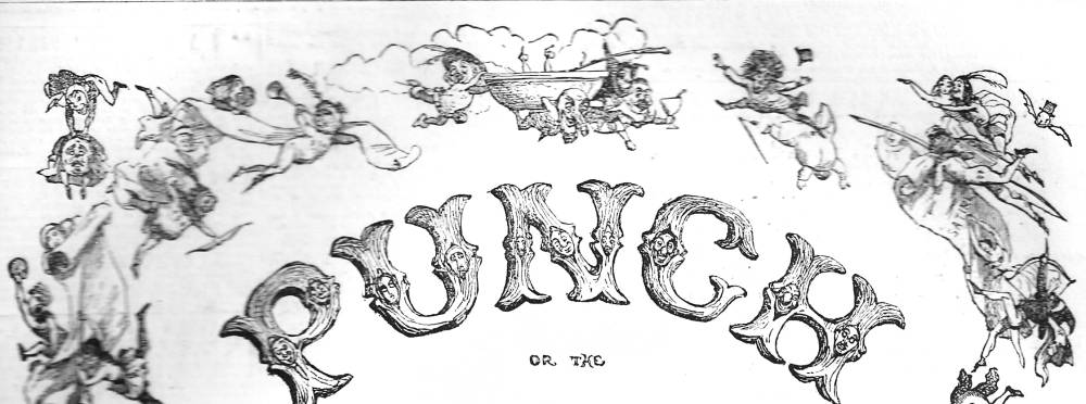
Above: The lettering of the first version of Doyle's cover in the style of the fairground attractions. Below: Quaint goblins and fairies rise and ascend from classical cornucopia at the bottom corners
Doyle’s first version of the cover was introduced on 6 January 1844. Unlike the earlier designs – which lack structure – Doyle’s image is composed as a decorative border enclosing Punch and Toby on a podium; a neo-classical frieze is positioned below and lettering, in the style of the fairground attractions where Mr Punch would in reality make his appearance, above their heads. The effect is calculatedly jovial: quaint goblins and fairies rise and ascend from classical cornucopia at the bottom corners and Punch leers knowingly in a sideways gaze at the audience, as if sharing an irreverent secret. The tone of droll humour is effectively conveyed, and the whole composition is infused with a dynamic vitality which is carried forward in the linear arrangement of the figures. The end result, as M. H. Spielmann remarks, is ‘far more in accord with the true spirit of Punch [and] more sportive and rollicking than its predecessors’ (p.47).
These qualities are carried forward in the second and more famous design, which appeared exactly five years later on 6 January 1849. The composition is the same, but the style has changed. Doyle’s five years’ experience as a draughtsman on wood as the second Punch artist after John Leech is reflected in a much greater fluidity than in the earlier design: the tiny figures are bolder and more clearly defined that before, and the central characters and classical frieze are both enlarged and simplified. The effect is more imposing than the version of 1844, but at the same time Doyle introduces greater variety in the drawing-style. While the first treatment deploys outlines in the same register, the second combines great delicacy, in the form of tiny line-work to describe the figures and twigs, with the confident draughtsmanship displayed in the representation of Toby and Punch. Viewed retrospectively, the original piece seems like a rough draft for the second, which manages to unite dynamism with subtle arabesques. This clever fusion of delicacy and visual outspokenness became Punch’s mast-head, with various minor changes – for a period it was printed with red additions – for the next century.
The development of the iconography
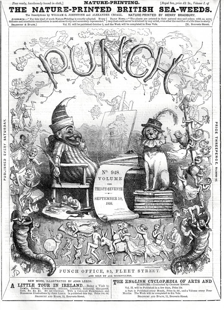
Left: The 1844 (left) and the 1859 (right) covers of Punch. Note the change in lettering and the retained classical frieze at the bottom. [Click on images to enlarge them.]
In his second cover Doyle found a formal synthesis that made the magazine seem both charming and self-confident. However, Punch’s complex messages are principally encoded in its imagery. For the mid-Victorian audiences this field of signs would have been a legible text which read in the manner of contemporary paintings. For the modern interpreter, however, the emblematic significance of its parts is less intelligible, and has to be recovered.
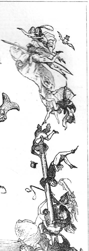
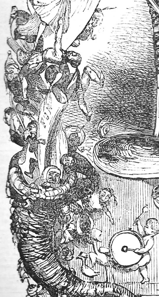
As noted earlier, the idea that Punch should be fun is conveyed in the swirl of little people who cavort up and down the margins: in the first cover these figures are a combination of medieval and modern grotesques, but in the second Doyle strengthens the emphasis on jollity by presenting a cast of jesters and clowns whose task, to amuse the reader, is conveyed by the simple device of making them smile – a small but effective detail missing from version one, where drawing of the faces is poorly realized. Yet these tumbling figures are not harmless buffoons, but enshrine a type of ambiguous humour which is both innocently amusing and threatening. Although comic, the little people were linked with cruelty in the manner of Shakespeare’s Puck and the spirits in The Tempest (Silver, p.159); they make the audience laugh, but they carry with them the menace of punishment and recrimination. This is the implication carried in Doyle’s illustrations for Lemon’s fairy tale The Enchanted Doll (1849), where the imps threaten the main character, and despite the laughter proposed on the front cover of Punch the original audience would have understood the fairies’ purpose as a moral scourge. They are, in other words, extensions of Punch, the Puck-like imp whose smile conceals his capacity to berate the evils of society. The swirling decorative border is thus figured as a crystallized representation of the magazine’s satirical technique – demolishing the vices of the age through the relentless application of mockery and cruel humour. Nor is accidental that the rising and falling carries an echo of Flemish altarpieces in which the saved and the condemned move between Heaven and Hell: in Doyle’s cover, it is impossible to say which is which, with Punch, sitting on his throne, a God-like figure making judgement.
This satirical pitch is continued in the other framing elements within the design. Doyle cleverly ridicules contemporary taste in art, a theme which features throughout the magazine in the form of parodies of ‘High Art’, the Pre-Raphaelites, the ‘outline-style’ and the Nazarenes.
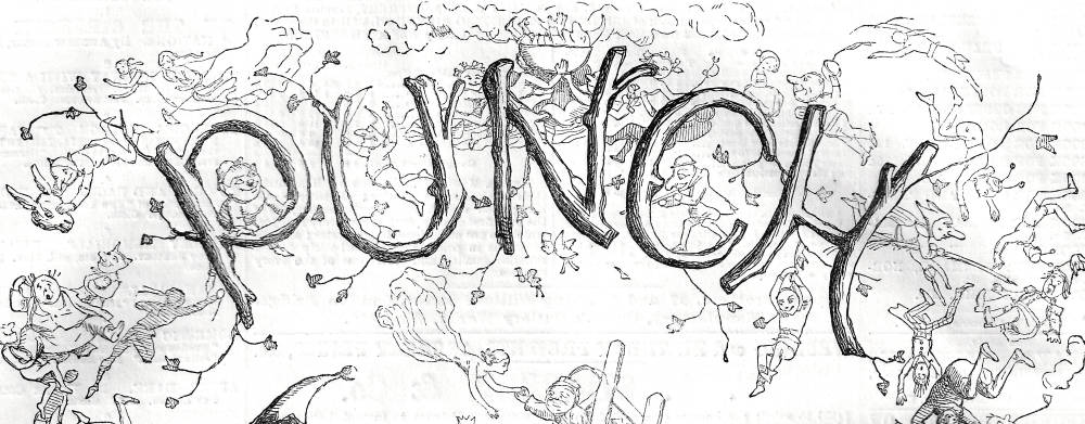
The second version of the letter mocks the conventions of German illustration as it was practised by artists such as Alfred Rethel and developed in the art of ‘English Germanists’.
The cover parodies the conventions of German illustration as it was practised by artists such as Alfred Rethel and developed in the art of ‘English Germanists’ such as John Franklin and H. C. Selous. Doyle’s lettering satirizes Germanic rusticity, which mocks the original by presenting his title as a ridiculous construction of branches with little twigs protruding on all sides. Such ‘woody’ letters feature in his other books, but here their satirical purpose is clear, reducing the strap-work and arabesques of the German school to the level of incompetent gardening, as if the words needed to be pruned or better formed. One of Doyle’s favourite targets, he reduces German book-art to the status of absurdist mannerism.
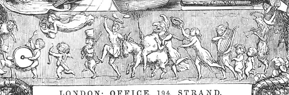
Doyle’s parody of the conventions of the classical bas-relief remained basically the same in first and second versions.
Doyle also travesties the taste for classicism in the form of the mock-frieze that extends along the lower margin. Both versions parody the conventions of the classical bas-relief by showing its figures as comic versions of Greek revellers and by anachronistically combining antique and modern instruments, with Pan at the right playing pipes and the cherub on the left beating a modern drum; a nymph (or angel) hovers ahead, playing in the first version a French horn (invented circa 1814), and in the second a tuba (1835). Doyle’s pastiche is therein presented as a version of the mock-heroic, reducing the elevated language of classicism as exemplified by the Elgin Marbles to the level of the prosaic in which the heroes of the past become modern buffoons, playing on everyday instruments. The mockery of Victorian heroism is stressed by the tiny detail of a cherub pulling a mask of Lord (Peter) Brougham along on a string; reviled by Punch throughout the forties for his attempts to repeal the corn laws, Brougham becomes an accessory in a drunken procession and is reduced to the level of a child’s plaything.
This small detail merges the parody of popular aesthetics with the satire of contemporary politics. It is also a lightly disguised commentary on sexual ethics. It has often been noted that Victorian classicism was a surrogate for sexual expression, a means of presenting erotic themes while deflecting the charge of impropriety by transferring it onto the painting of aestheticized nudes. William Etty’s paintings of the thirties and forties partake of this discourse, a mode of displacement which was later practised in the art of Frederic Leighton and G. F. Watts. But Doyle ridicules the hypocrisy of this stance by presenting a highly sexualized figure in the form of the classical version of Punch, apparently riding on a donkey while holding a pole to support the scroll above his head. This image is trompe d’oeil: the pole stops short of the banner and is really a large erect member. Punch is shown not as Bacchus – as sometimes suggested – but Priapus. This connection is continued by showing him astride a donkey, the creature with which he compared himself in terms of his vital dimensions.
Such calculated vulgarity is another sign of Punch’s irreverent, iconoclastic stance, diminishing the high claims of classical art to a gross sexual joke. It is also a crude insistence on Punch’s willingness to shock, on defying conventions by asserting an adolescent version of masculinity. In an age when display of male genitalia was proscribed, and never, explicitly, in a sexual context, Doyle positions the magazine at the periphery of good taste.
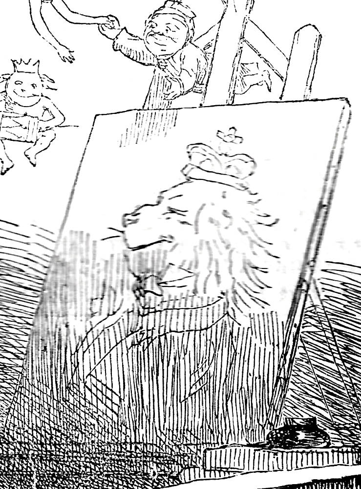
Left: Punch pen in hand before a canvas on which appears a puppet theater. 1844. Right: In the later version Doyle has placed the British lion on the canvas. [Click on images to enlarge them.]
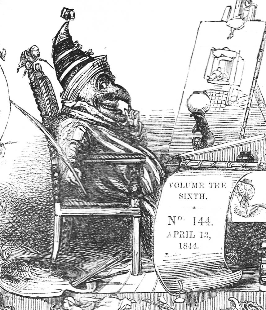
Propriety is restored in Doyle’s characterization of Punch in the centre of the image. Once again, the illustration appears unambiguous but carries with it a range of connotations which suggest the magazine’s homeliness and its application beyond the fireside. Punch is figured in his chair, as if sitting by the fireside: exactly the place where the journal will be read; Toby the dog adds another domestic touch. But the chair is also a mock-throne, and Doyle presents his character as a sardonic monarch who rules Britannia, casting a side-long glance at his subjects. As ruler it is his task, the cartoon suggests, to re-create Britannia in his own, knowing image: the quill held in his right hand will be deployed to re-write society, and the canvas in front of him shows that he is constantly in the process of re-drawing the British lion, who is shown as a knowing and moth-eaten raconteur, his whiskers and mane worn thin by experience, looking more like a stuffed head than the dynamic maker of Empire.
Punch is figured, in short, as the scourge of modern society and the author of change. In keeping with the idea of the play-group puppet, Doyle asserts the moral and social radicalism of a figure traditionally associated with challenge and commentary. This is a king who presides over pretension and hypocrisy, but his weapons, as the enclosing bower reveals, are mockery, vulgarity, and pastiche.
Doyle’s front cover is thus figured as a dense semiotic scheme which focuses the magazine’s ethos and purpose in a complex and suggestive image. Far more than decorative, it pictures all of the essential facts about that most controversial of satirical magazines at a time when Punch was indeed a radical and challenging read.
Modern Re-Interpretations of Doyle’s Front Cover
Doyle’s teeming front cover epitomizes the Victorian aesthetic of dense and overcrowded surfaces. Such calculated overloading can be traced in the congested pictorial frontispieces of H. K. Browne (Phiz) and many other contemporaries. Yet Doyle’s schema is in many ways a timeless, classic solution to the problem of visualizing diverse information, and this is partly why it endured well into the twentieth century. Combining elements which seem to be decorative but connote a range of meanings, his composition is elegantly simple, guiding the viewer’s eye through zones of significant images.
Its style is affectionately parodied in Michael Ffolkes’s re-tread of 21 March 1984. Ffolkes travesties Doyle’s rustic lettering – complete with feeble twigs – and transforms the original imps and fairies into literary figures. Joyce, Orwell, Shakespeare, Hemingway, Wilde and other luminaries rise and fall on either side of a self-portrait of Ffolkes, who is humorously seated in an office chair of the eighties rather than Punch’s mock-throne. More amusing still is the classical frieze which transforms Priapus into a figure of D. H. Lawrence (who else?), surrounded by a jovial Dr Johnson and Boswell and the Three Graces in the body of the Brontë sisters; G.K. Chesterton mills around between them. Other gurning figures, British and American, complete the composition in droll mockery of Doyle’s Victorian original: a pastiche of a pastiche.
But perhaps the most interesting reflection of Doyle’s influence is found in Peter Blake’s sleeve design for The Beatles’ celebrated record of 1967, Sgt. Pepper’s Lonely Hearts’ Club Band. Blake recreates the formal arrangement of Doyle’s theatrical arrangement, with The Beatles in centre-ground (in place of Punch) and their name (where the classical frieze would be) outlined in flowers. Fairies and imps are again translated into media stars and the overall effect is one of surreal excess – the world of Victorian fantasy re-imaged through the psychedelic lens of British pop culture of the sixties. Blake’s design has been the subject, of course, of dedicated analysis in search of The Beatles’ ‘secret meanings’. Like Doyle before him, Blake ensures that his (apparently) decorative scheme is indeed a dense text, and invites the viewer to read it symbolically. An admirer of Doyle (Lambirth), Blake ensures his cover has the same sort of suggestiveness as that memorable design of 1849.
Related material
Works Cited
Silver, Carole G. Strange and Secret People: Fairies and Victorian Consciousness. Oxford: Oxford University Press, 1999.
Lambirth, Andrew. ‘Visual Arts: the Beatle Fan who Still has Fairies at the Bottom of his Garden.’ The Independent
(2 December 1997). On-line version.Spielmann, M.H. The History of Punch. NY: Cassell, 1895.
Last modified 13 May 2015