
‘The adoption of a pseudonym greatly complicates the question of authorship. It was sometimes believed that both brothers were artists and writers, switching between the two roles; however, it has been established that Charles was purely a writer while Alfred was an author and illustrator. Charles wrote the satirical text to accompany Alfred’s pictures in their early collaborations, such as Absurdities in Prose and Verse (1827), but following Charles’s retirement in 1843 the letterpress and cuts were entirely the product of the younger brother’s hand. ‘Crowquill’ became Alfred’s name alone, a moniker he maintained for the rest of his life.
The works he produced on his own were the most accomplished and reflect the unifying effect of a single hand. A.H. Forrester’s/Crowquill’s work was a vast catalogue of illustrated texts, among them series and single illustrations for Bentley’s Miscellany, Punch, The Illustrated London News and a variety of ephemeral publications. Book-art was only a part of his output, however, and he was also active as both a painter and applied artist.
He exhibited four ‘domestic subjects’ at the Royal Academy in 1845–46 (Graves 69) and surviving evidence, in the form of a sketch-book (Huntington Library, San Marino, USA), suggests he was a prolific painter of landscapes, bucolic scenes and quaint interiors. The works arising from these preparatory designs were produced for private patrons; though untraced, and with no examples being held in British or American museums, watercolours and pastels occasionally appear in auction. These paintings were a part of his portfolio and he supplemented this work with commissions in a variety of fields.
Principal among these were his commissions as a ceramic artist. He designed pottery and porcelain for Samuel Alcock and Co., a leading maker based in Burslem, Staffordshire, over a ten year period, 1845–55. Much of this work was domestic and practical. He created patterns for tureens, vases, plates and carafes for middle-class buyers in an elaborate, neo-classical or rococo style, most of it giving the impression of expense even though it was mass-produced and available to most bourgeois pockets. Original drawings were collected in an album (The Metropolitan Art Museum, New York), and many of the pieces based on his designs survive.
He was also commissioned to create ornamental, occasional works, and made a significant contribution to Alcock’s display stand at The Great Exhibition in 1851, where nineteen of his objects, among them a Plate of All Nations, a series of cups and a butterfly pen-holder, were displayed in the ceramics section (Victoria & Albert Catalogue). Other, more luxurious work for Alcock’s included the Nelson Jug – a commemorative piece for Trafalgar Day (Victoria & Albert, 1851) – and a Parian figure of Wellington (1851), dedicated to the Queen. These pieces are robustly modelled and although much of their effect must depend on their maker, it is interesting to note how Crowquill, a two-dimensional designer, could turn his hand to the production of three-dimensional artefacts.
His work in this field is distinguished, but his list of other activities stretches in surprising directions. Not only a painter, illustrator, writer and porcelain designer, Crowquill designed free-standing prints in the Regency manner, sets for pantomimes, theatrical posters (Victoria & Albert, London), calling and commemorative cards, playing cards, comic postcards showing Dickensian characters, and a number of vigorous book covers (The Pierpont Morgan Library & Museum, New York). His extraordinary versatility is enshrined in the album sketch-book in the Huntington Library in which he changes, page by page, from one activity to the next, shifting freely from elaborate designs for pottery to comic grotesques for his satirical books and studies of gnarled trees for the landscapes appearing in his illustrations. Gifted with a flexible mind, he moved seamlessly across genres and idioms with no apparent sense of incongruity. In a period when saturation of the art-market meant artists had to diversify and produce work wherever they could, Crowquill is the embodiment of a multi-talented professional, whose ability in design was applied to a wide range of products.
Crowquill’s Book-Art: Illustration
Separate studies are needed to evaluate Crowquill’s talents as a writer, applied artist and designer of theatrical back-drops. There is currently no monograph exploring the work of this complicated figure, and in modern criticism he is usually dismissed as a secondary talent and inferior to the more famous names of George Cruikshank, Richard Doyle and H. K.Browne. Simon Houfe typifies this approach in his DNB synopsis (2004), describing Crowquill as never ‘first rate’ and ‘outclassed’ in the 1840s by John Leech and John Tenniel, whose comedy superseded his early contributions to Punch. John Buchanan-Brown similarly describes him as a ‘minor talent’ (181).
In Crowquill’s own time, however, the critical responses were more measured. It was generally accepted that he was not a first rate draughtsman. Though an expert caricaturist in terms of his capacity to draw a ridiculous face, his line is querulous and sometimes surprisingly unsure; space and perspective are likewise inconsistent. His obituary in Publisher’s Circular (1872) notes that his pencil was ‘not very powerful’ (340), but his technical expertise, or lack of it, was never regarded as an important issue. Writing later in the century, Graham Everitt describes him as ‘not a genius’ in the sense of being formally accomplished but otherwise ‘talented and clever’ (370), an artist of high imaginative quality. Indeed, Crowquill was always praised for his comedic ideas. Criticisms of the period laud his efforts as humorous and ‘quaint’ (Notes & Queries 199) and it was the conceptual quality of his art that readers most enjoyed. Though he lacked the technical brilliance of George Cruikshank (who etched some of his engravings), he possessed inventiveness and the capacity to make his audience laugh: a rare gift. This was the mainstay of his long and successful career as an illustrator and made him ‘a universal favourite’ (Everitt 370).
Crowquill’s comic idiom was essentially grotesque and farcical, ‘bizarre and pantomimic’ (Publishers’ Circular 340), but a closer definition is provided by analysing his soubriquet. Houfe passes over the significance of the absurd sounding name, commenting only that a ‘Crowquill’ was a joke, a literal allusion to ‘a quill taken from a crow for writing and drawing’ (DNB). However, the name is more nuanced than it might appear to a modern observer and was laden with significance for the original readership. A ‘crowquill’ was a pen with a fine steel nib first developed in the 1820s, the instrument used for his ink drawings; and the word also resonates with the noun ‘croquis’, which means a quickly executed sketch of a live model. ‘Crowquill’ and ‘Croquis’, used interchangeably, might thus be taken as descriptive labels for his technique, catching passing moments of satirical interest in rapidly created designs. The name is also loaded with connotations of mockery. The term ‘to crow’ was and is in British usage a claim of superiority, celebrating the misfortunes or inadequacies of others; and this must surely suggest the satirist’s stance, standing back as he scornfully observes the behaviour of those unable to see their own absurdity. We might add that a ‘crowquill’ is a type of fishing lure which catches its prey as surely as the satirical artist hooks his subjects.
In short, Crowquill’s polysemic name positions his art as the work of a satirical outsider sketching the changing behaviour of the world around him, interpreting its stupidity and making and re-making punning observations. There is, further, something childish or at least child-like about the name, inviting us to unlock its connotations as if we were interpreting a riddle in a fairy-tale.
Indeed, these inferences collectively provide a critical tool with which to decode his art, enabling us to focus on three strands of activity: the creation of visual conceits, absurd distortions and visual elisions (‘crowing’); rapid joke-making and amusing situations based on portraiture and the passing impressions of urban society (‘croquis’ and the application of the crowquill); and an interest in the faux-naif, the sort of humour that celebrates the gauche while presenting the unpalatable and disturbing in a coded form (the crowquill hook that bites when it is least expected).
Crowquill’s punning is found in his early work for Punch and throughout his album-sized picture books for an adult readership. His most sustained exercise in this type of humour is found in his (largely unsigned contributions) to Merry Pictures by the Comic Hands of H. K. Browne, Crowquill, Doyle, Leech, Meadows [and] Hine (1857). Made of up folio sized pages decorated with a large central image surrounded by vignettes, Merry Pictures showcases the artist’s interest in the ironic interactions between captions and images.

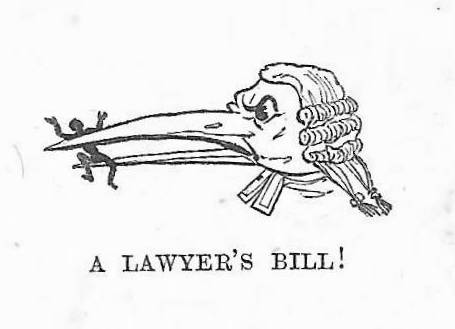
The Human Race (23) typifies Crowquill’s humorous inversions by reversing the usual situation, this time showing horses, decked with jockeys’ caps, riding men. He’s Bringing His Boy Up by Hand (20) takes a similar line, with a diminutive figure standing on his father’s extended palm. What a Horse to Bolt figures a horse ‘bolting’ down a man and A Lawyer’s Bill an aggressive stork, complete with a wig, holding a tiny man in its beak (19). The cartoons work, in short, by distorting the connection between context and connotation: a race in the racial sense becomes a running contest, a bolting horse bolts in the sense of eating quickly, ‘by hand’ means literally by hand and a bill a beak.
This punning approach creates comedy in the space between meanings, but it also has a satirical purpose, so that, for example, the horses riding men become images of the burden of life as everyone struggles to be in front, while the bill devouring the man will gobble him down as surely as a lawyer’s expenses will ruin the exploited client. These apparently simple conceits are telling mockery; the slippage inherent in the signs of language is exposed in a visual form by literally figuring what the words appear to mean, and the distortion, as in all effective satire, is used for a moral purpose. Everitt described Crowquill as an ‘inveterate punster’ (369) and in many ways the artist shared this talent with his brother, whose linguistic jokes are matched by his playful cartoons. Charles’s writing was described as ‘repartee after repartee, pun after pun flung from him with such rapidity … that it was succeeded by another’; the same is true of Alfred’s bizarre inversions, misappropriations and playful silliness (‘Obituary: Charles Robert Forrester’ 545).
This parallelism made Alfred into an effective illustrator of Charles’s words, but the artist sometimes extended his puns into startling extremes. In the pictorial title-page of Merry Pictures by the Comic Hands, the hands become over-large hats or head-pieces worn by the contributing artists as they struggle to support a gigantic palette.
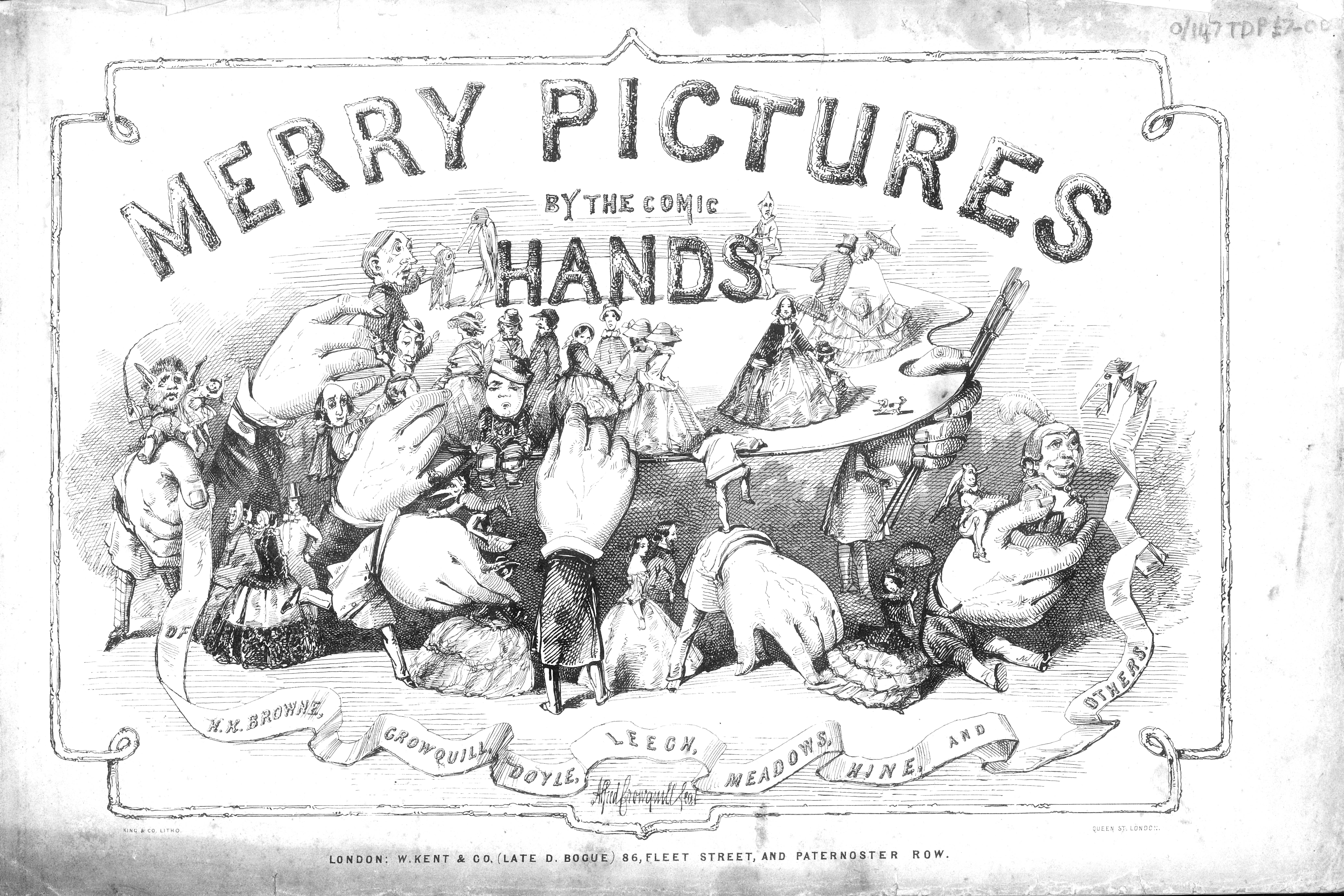
Title-page for Merry Pictures. Alfred Crowquill. Wood engraving by the Dalziels. 9 ½ x 14½ inches.
Directing their tiny subjects, the hands of artists become the hands of God – controlling everyone as if they had omniscient power; according to Crowquill, we are subject to a force both all-powerful and mocking, as if humanity were being arranged by a band of satirical artists.
Crowquill’s punning re-visualization of reality often has the effect of creating an alternative, dream-like reality, and even when he is not exploring the connotations of language the artist preserves a grotesque ambience. His caricatures are distorted beyond the need for satirical commentary and he seems to relish the menace created by nightmarish imagery. Contradictions of scale and perspective, bizarre juxtapositions and – stranger still – unexpected substitutions are all central to his joke-making strategy. Bon Gaultier’s Book of Ballads (1849) contains many examples of his art of fusion and free association. In the illustration for ‘The Queen in France’, for instance, the opposing shorelines of England and its neighbour are transformed into emblematic figures, with the British lion crouching on the one side and the face of Louis-Napoleon returning the gaze (115).
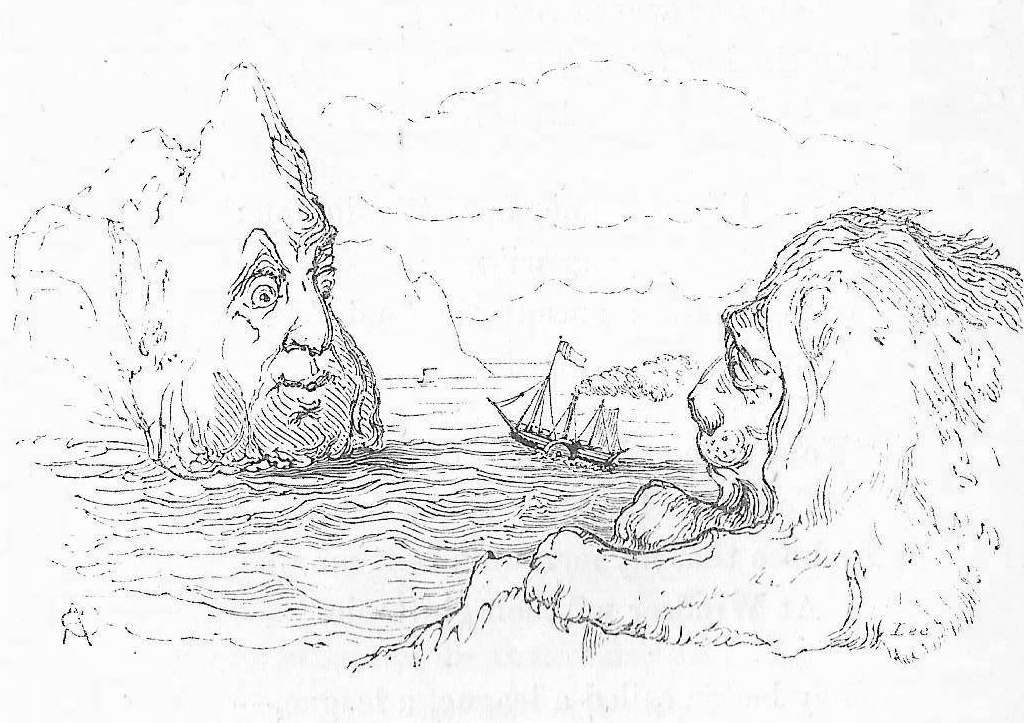
The Queen in France. Alfred Crowquill. Wood engraving by the Dalziels. 2¼ x 3½ inches.
Gathering for the Pantomine, an illustration for the Christmas Supplement of The Illustrated London News (21 December 1870) goes even further in the form of a montage of anthropomorphic animals, leering, pop-eyed grotesques, strange costumes, disconnected figures and tiny imps running among gigantic heads.
This child-like vision is infused with menace, and seems to anticipate the mask-like faces of James Ensor and, more generally, the experiments of Max Ernst and the dislocations of Surrealism. It also bears a marked resemblance to the fairy imagery of Richard Dadd. Crowquill was probably aware of his illustrations although he would not have seen the paintings Dadd produced during his incarceration in an asylum.
Less impressive, though still inventive, are his caricatures of everyday life. These tend to be comic situations in the manner of Leech, with recognizable, everyday subjects under the social microscope. A particular interest is physical oddity. Obesity, the perennial Fat Joke, recurs in illustrations of Napoleon (Book of Ballads 100) and Stout! More Stout! (158), which plays on the vastness of overweight ladies in colossal crinolines.
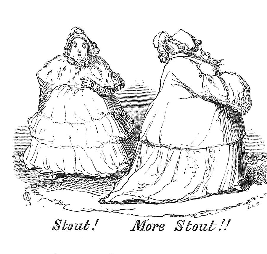
Stout! More Stout. Alfred Crowquill. Wood engraving by the Dalziels, 2 ¼ x 3 inches. From Book of Ballads (1852).
Racial types – blacks with impossibly curly hair, Frenchmen with ridiculous moustaches and Arabs with absurd turbans – are other, stereotypical elements in his visual vocabulary, and so are jokes related to wasp-waisted girls and vanity-driven beaux wearing elaborate costumes. These types are burlesque creations in accordance with the coarse slapstick of the time.
Though primarily concerned with physical distortion, of generating laughs by exaggerating anything visual in the human form – from flapping aprons to over-sized nostrils and silly beards – Crowquill was fascinated by portraiture and the pseudo-science of physiognomy. Seemingly unlimited in their variety, his portraits embody the visual classifications developed by Lavater, and he often takes the opportunity to showcase his capacity to depict significant faces. The Tour of Doctor Syntax (1854) presents exactly this type of gallery, reaching from the angular face of the main character (frontispiece) to the (supposedly) more primitive profile of a shepherd-boy (85) and the pure features of a ‘village damsel’ (204). The heterogeneity of the face as a complex but legible text is further displayed in the groups of characters in Dr Syntax’s circle (237, 295). The companions in Dickens’s Pickwick are likewise anatomized in a range of unauthorized. ‘extra illustrated’ books such as Pickwick Abroad (1839), and Pictures Picked from the Pickwick Papers (1837). Moving between caricature and realism, Crowquill’s portraits are both amusing and infused with psychological meaning; as with his satirical cartoons, they are underpinned by a serious purpose.
He adopts another approach in his fairy tale and children’s books, for which he provided both text and illustrations. The letterpress, as Jack Zipes observes, is purely conventional, with a strong emphasis on ‘overbearing moral messages’; however, Zipes identifies a disparity between the didacticism of the writing and the ‘fantastic’ style of the engravings (58). Sometimes quaint in the manner of Germanic illustration, Crowquill also produced images which are self-consciously child-like, combining rudimentary draughtsmanship with the effects of hand-applied colour. These books, both for his own texts and for those of others, are an unsettling mix of energy and a livid palette. The Careless Chicken [1853] epitomizes this approach in a series of vivid plates mapping the fox’s murderous pursuit of his prey. Dreamy in effect, the book typifies the unsentimental publications that competed for children’s attention with emollient ‘improvers.’
Left: . Middle: . Right: . [Click on images to enlarge them.]
Crowquill’s graphic art might thus be characterized as a rich fusion of grotesque and comedic idioms. By turns a punning satirist and commentator on the mores of contemporary society, he also created a hermetic world of child-like images for the entertainment of children and – perhaps more tellingly – for the parents who displayed his images and read his texts. Multi-talented, his capacity to shift idiom is matched by the eclecticism of his styles.
Crowquill and Dickens
Crowquill plays an unusual part in the development of Dickensian illustration. His intention was to replace Robert Buss when he was dismissed from his role as the illustrator of The Pickwick Papers (1836). The publishers Chapman and Hall put the job out for tender and Crowquill had to compete with W. M. Thackeray and John Leech (Kitton 59). As it turned out, none of these artists was appointed; H. K Browne (Phiz) become Dickens’s collaborator and continued in this employment until the 1860s.
Crowquill’s failure must have been a disappointment, but he became one of Dickens’s illustrators all the same. With no authority from the author or publisher, he proceeded to offer his own versions of Dickens’s Pickwick, exploiting what Joseph Grego calls a ‘mine of wealth and fame’ (59). Pictures Picked from the Pickwick Papers was published by Ackerman May–Novemeber 1837 and issued concurrently with Dickens and Phiz’s original text. Crowquill’s book, primarily a picture-album, was a great hit and if not as popular as the genuine article was nevertheless a stiff competitor for sales. Others followed in the same vein: Pickwick Abroad was issued by Tegg with a text by George W. M. Reynolds in 1838, and other editions, made up of plates from both books, were published and re-published for some years. Other miscellanea monopolized on Dickens’s name. A musical score based on A Christmas Carol appeared with a Crowquill illustration (Yale University Library), and the artist issued postcards with scenes from the novels. Greetings cards representing characters from Dombey and Son (1870) were a final strand in the artist’s unauthorized plundering of Dickens’s intellectual property (Victoria & Albert Museum), making money, as Grego remarks, ‘without [the author’s] leave’ (59).
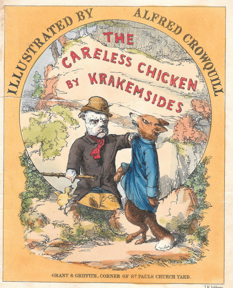
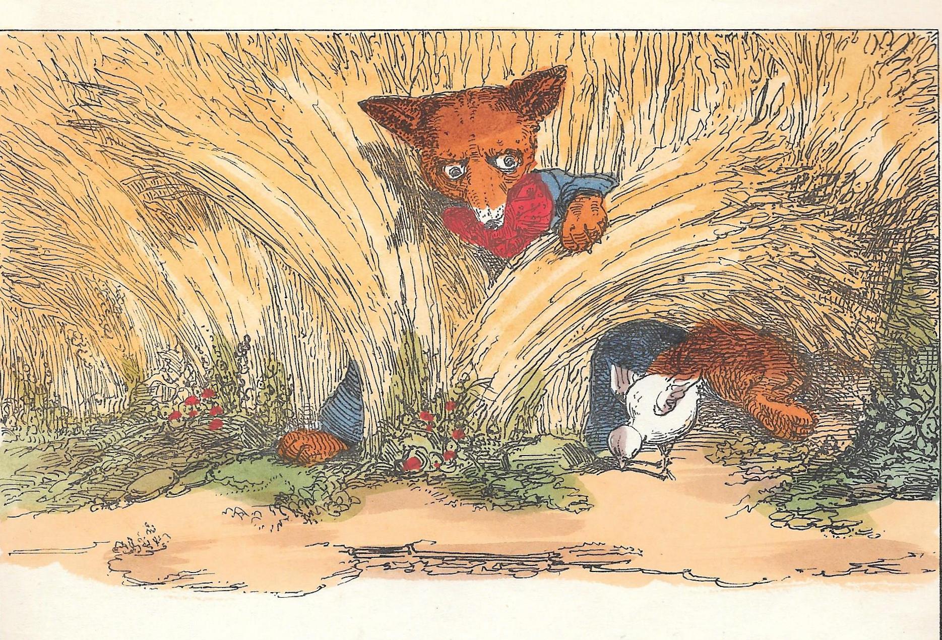
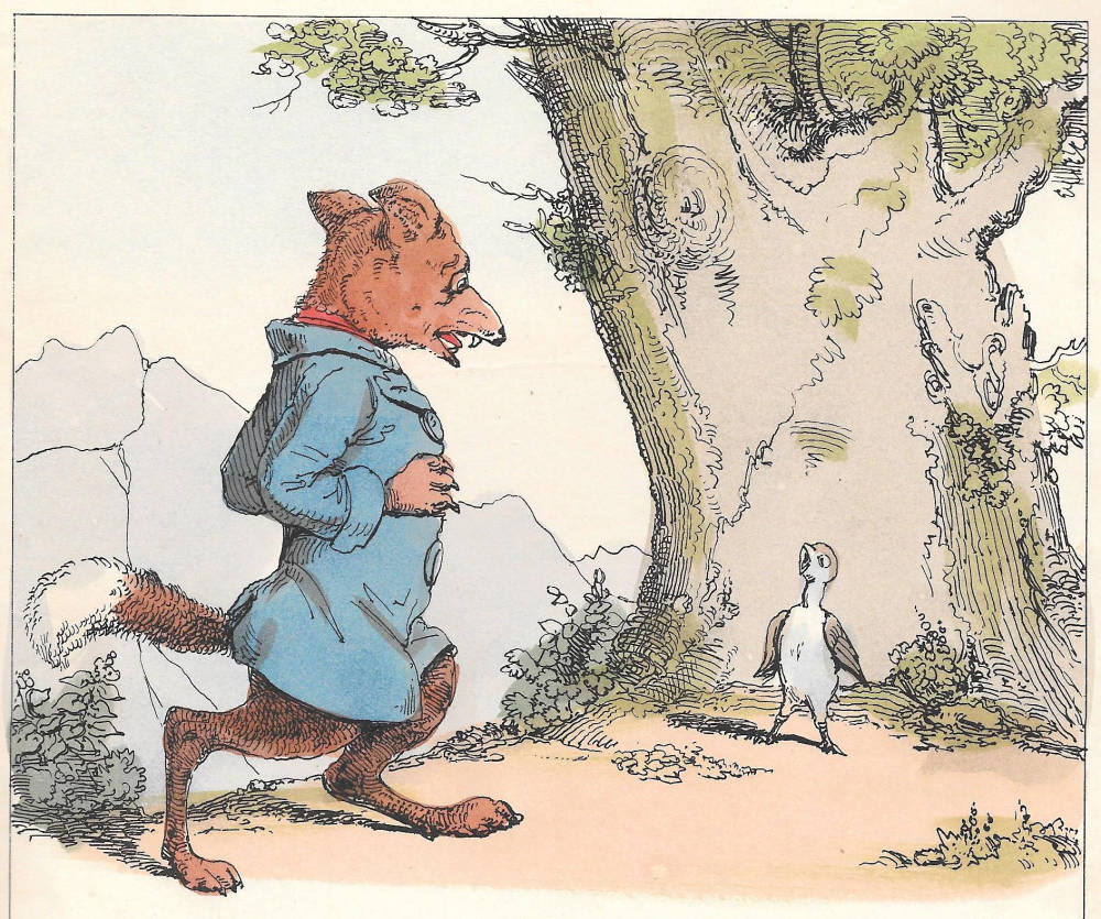
Left: Title-page for The Careless Chicken. Middle: The Fox Fattens up his Victim. Right: The Fox Discovered. [Click on images to enlarge them.]
In an age when copyright was ill-defined or non-existent and with little protection for authors or illustrators, Crowquill was free to make his own interpretations of the literary treasure-trove of Dickens’s texts. Am eclectic, chameleon-like figure who constantly adapted his art to public taste, he was an opportunist working the free-market system of the day. His redemption, we might say, was the quality of his illustration. Though rejected by Dickens and his publishers, Crowquill’s drawing of Pickwick, Sam, and the other Pickwickians is spirited work, with a strong emphasis on their facial expressions and physiognomies. He has no interest in the emblematic detail enshrined in Phiz’s illustrations, but adds sharply defined nuance to the characters in scenes that are entirely his own.
Crowquill’s Style: Contexts and Influences
As noted earlier, Crowquill was never admired for the distinctiveness or power of his draughtsmanship. His art is not as clear cut in the formal sense of the term as the distinctive imagery created by his contemporaries working in the comic vein of the middle of the century; and identification of his work, when it is not signed, can be problematic. There is no mistaking the work of Doyle, Cruikshank, Phiz and Leech, but Crowquill sits ambiguously between the creations of these idiosyncratic artists. His wit is changing and his styles unstable, drawing on a wide variety of sources and influences.
Like many of his contemporaries in the field of illustration, Crowquill responded to influences from home and abroad. Among his British mentors were his contemporaries, H. K. Browne, Cruikshank and Doyle. The art of each of these is mirrored in Crowquill’s synthesis: for example, Crowquill’s scratchy, febrile line is an echo of Cruikshank’s, and his capacity for grotesque shorthand, catching a passing impression of a face or situation, is very much in the style of both Cruikshank and Doyle. Crowquill’s high-octane dynamism, with animated figures jostling each other in linear patterns and congested surfaces, also reflects the influence of the teeming designs of his contemporaries. These is a close connection, for instance, between Crowquill’s full-page designs for The Illustrated London News and the noisy commotion of figures on the front cover of Doyle’s Punch and in Cruikshank’s designs in his Omnibus and Table Book. Working within a period style, Crowquill takes from this emphasis on comic plenty – with the viewer’s eye restlessly moved from one grotesque to the next, from one visual joke to the next. This is the idiom that Mario Praz described as the ‘horror vacui’ of applied art of the mid-Victorian period and it is equally applicable to illustration. Crowquill, drawing upon and assimilating examples from the greater illustrators of his time, partakes of this discourse.
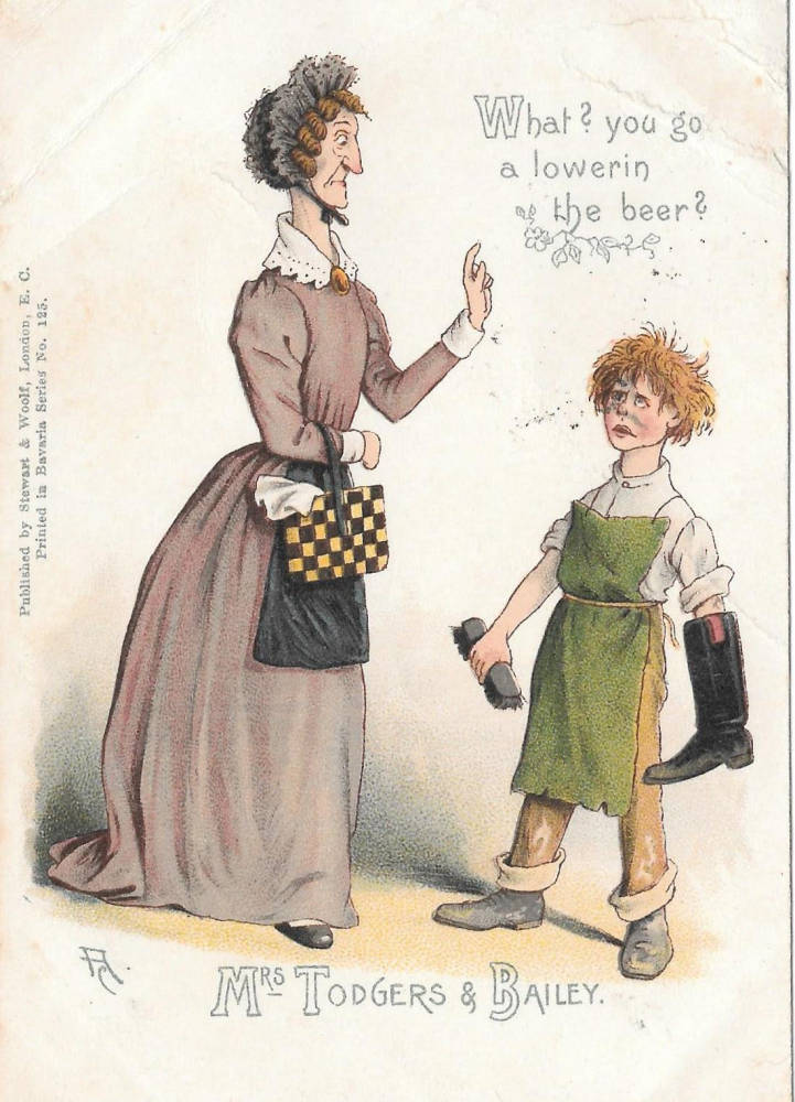
Mrs Todgers and Bailey
French and German illustration were also important as a source of motifs and styles. Crowquill drew heavily on the anthropomorphic satire of J. J. Grandville. Like Doyle, Cruikshank, Leech and Charles Bennett, Crowquill fused animal and human types, turning them into an instrument of social commentary. German illustration, hugely influential in the 1830s and 40s, was another storehouse of imagery which in Crowquill’s hand is parodied in the form of mock outline-books (Buchanan-Brown 181). Like Doyle, whose Manners and Customs of Ye Englyshe (1849) is a send-up of Retzsch’s picture-books, Crowquill exploited the suspicion that German design was pretentious and a natural target for ridicule. Faust (1834) and The Tournament (1839) are droll versions of the German master’s Shakespearean epics, and Crowquill returned to this sort of pastiche throughout his long career.
Working in a congested field and participating in an evolving style, Crowquill was in many ways a synthetic artist. It is for this reason that he is regarded as a second-rater. However, much of his art is original and entirely his own. His punning, with its delight in verbal and visual language, is memorable, and so are his dream-scenes. In both respects he excels his contemporaries, demonstrating that although he borrowed from their styles and from pre-existing semiologies, he refigured these materials for his own, idiosyncratic purposes. Above all else, Crowquill succeeds in what he set out to do: to entertain and amuse his audiences. Much Victorian humour seems for the modern consumer arcane and inaccessible, but Crowquill’s books retain a rich vein of word-play and weird jokiness, in part lyrical and in part menacing, that still appeals to readers of today. The strange and the unexpected are traditional, unsettling ingredients in British wit, and Crowquill is one of the Victorian progenitors of this type of domesticated surrealism.
Primary Sources: Books and Periodicals
Combe, William. The Tour of Doctor Syntax. London: Ackermann & Tegg, 1854. Illustrated by Crowquill.
Crowquill, Alfred.Absurdities in Prose and Verse. London: Thomas Hurst, 1827.
Crowquill, Alfred [contributions to]. Bentley’s Miscellany. London: Richard Bentley, 1842–50.
Crowquill, Alfred [contributions to]. Bon Gaultier’s [T. Martin’s] Book of Ballads. With contributions by Doyle and Leech. London: W. Orr, 1849, 1851 and later editions.
Crowquill, Alfred. The Careless Chicken by Krakemsides. London: Grant & Griffith, n.d. [1853].
Crowquill, Alfred. Faust. London: King, 1834.
Crowquill, Alfred [contributions to]. The Illustrated London News. London: ILN, 1842–1870.
Crowquill, Alfred [contributions to].Merry Pictures by the Comic Hands of H. K. Browne, Crowquill, Doyle, etc . London: Kent, 1857.
Crowquill, Alfred. Pickwick Abroad.London: Tegg, 1838.
Crowquill, Alfred. Pictures Picked from The Pickwick Papers. London: Ackermann, 1837.
Crowquill, Alfred [contributions to]. Punch. London: Bradbury & Evans, 1842–44.
Crowquill. The Tournament. London: Thomas McLean, 1838.
Cruikshank, George. Omnibus. London: Tilt, 1842–43.
Cruikshank, George. Table Book. London: Bell, 1845.
Doyle, Richard.Manners and Customs of Ye Englyshe.With text by Perceval Leigh.London: Bradbury & Evans [1849].
Original art work in Museum Collections
The Huntington Library, San Marino, California, has an album of drawings for book illustration and other designs. An album of drawings for the ceramics maker, Samuel Alcock & Co, Stafford, is in the collection of the Metropolitan Art Museum, New York, the Pierpont Morgan Library, New York has a collection of 72 graphite and watercolour designs for a range of books, including yellowbacks and other material. The Victoria & Albert Museum, London, has Crowquil’s Ceramics, drawings and prints in several collections
Secondary sources
Buchanan-Brown, John. Early Victorian Illustrated Books. London: British Library & Delware: Oak Knoll Press, 2005. Everitt, Graham. English Caricaturists and Graphic Humourists of the Nineteenth Century. London: Sonnenschein, 1893.Graves, Algernon. A Dictionary of Artists. 1901; rpt. Bath: Kingsmead, 1970.
Grego, Joseph. Pictorial Pickwickians: Charles Dickens and His Illustrators. London: Chapman & Hall, 1899. Houfe, Simon. ‘Forrest, Alfred Henry [Alfred Crowquill]’ (1804–1872), Oxford Dictionary of National Biography. Oxford University Press, 2004. Online version, accessed 14 April 2017.King, Edmund. Victorian Decorated Trade Bindings, 1830–1880. London: The British Library & Newcastle: The Oak Knoll Press, 2003.
Kitton, F. G. Dickens and His Illustrators. London: Redway, 1900. ‘Notes on Books.’ Notes & Queries n.s 114 (6 March 1858): 199. ‘Obituary: A. H. Forrester.’ Publishers’ Circular and Booksellers’ Record (1 June 1872): 340. Obituary: Charles Robert Forrester.’ The Gentleman’s Magazine XXXIII (May 1850): 545–6. Praz, Mario.An Illustrated History of Interior Decoration from Pompeii to Art Nouveau. London : Thames & Hudson, 1964.Ray, Gordon, N. The Illustrator and the Book in England from 1790 to 1914. NY: Pierpont Morgan Library, 1976.
Zipes, Jack. Victorian Fairy Tales. New York: Routledge, 1987.Last modified 27 May 2017