
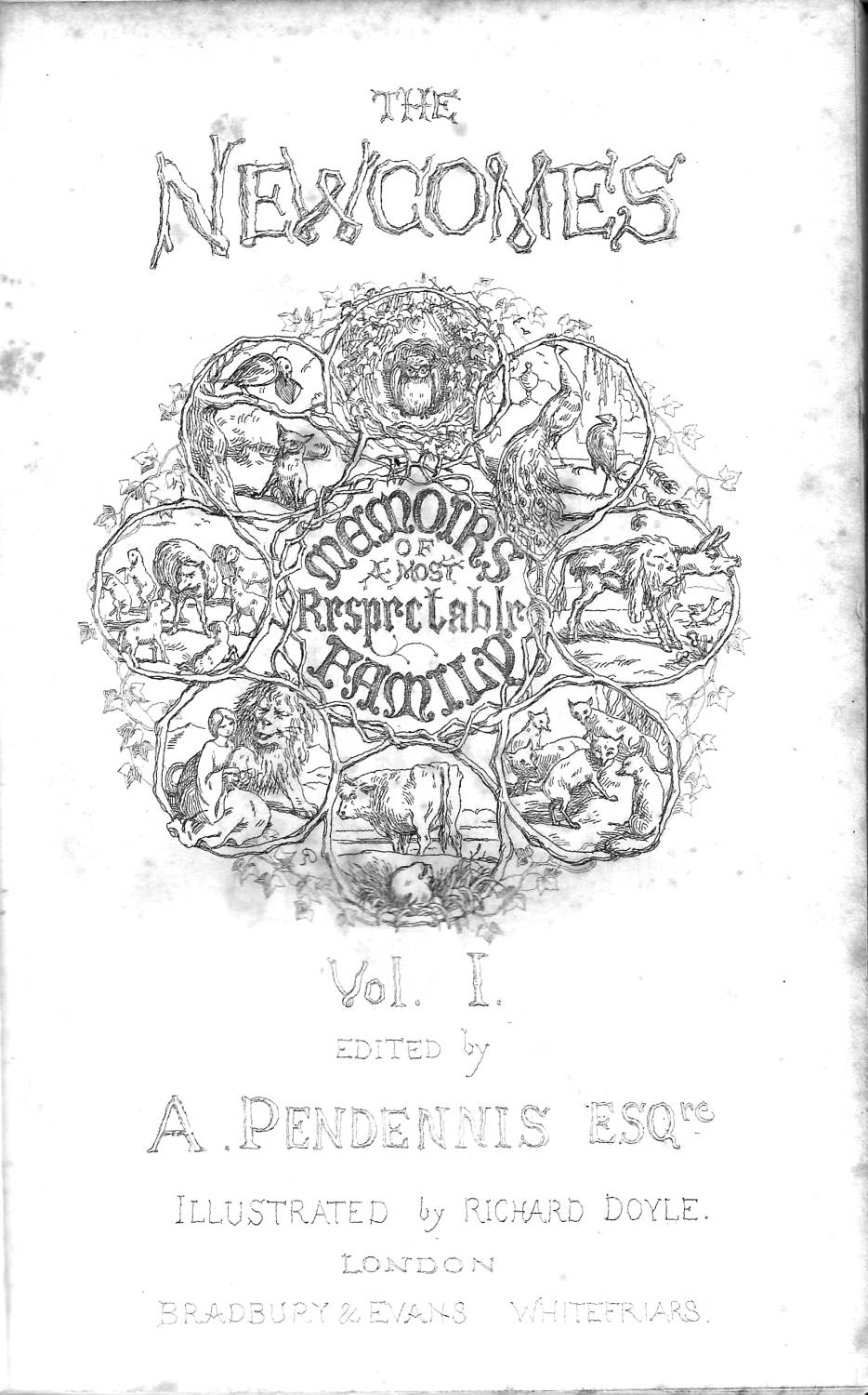
The Narrative Etchings
Doyle’s illustrations for The Newcomes have to be approached as the product of professional discord combined with the effects of hurried completion. Thackeray’s terse commentary condemns the work as generally of an inferior quality, and the overall impression, viewed objectively, is one of aesthetic unevenness. Doyle’s drawing certainly contains numerous infelicities and several of the full-page etchings ‘on steel’ are poorly executed, a reflection of his status as an essentially self-taught designer. Writing in 1908, the critic P. G. Hamerton described them as a matter of ‘artless … carelessness’ and ‘of no value as works of art’ (p.317–18); his judgement is probably sound. Doyle is far more successful, on the other hand, in his wood-engravings, which, as noted in the section above, were not condemned as the etchings were. The ‘small cuts’ inserted at key moments are more carefully drawn and his initial letters and pictorial title-pieces are strikingly inventive, the work of an artist who excelled in design of a non-realistic nature and on a microscopic scale. They are also, more significantly, the illustrations over which Thackeray had the least influence.
What is more important, of course, is the images’ effectiveness as illustrations, and here again the effect is mixed and unstable. Doyle’s etchings are the most part pedestrian representations of the principal scenes and the actors within them; Colonel Newcome, Clive and Ridley are effectively characterized, but Ethel is purely a sentimental type, a compound of ‘wasp’ waist, ‘ripe lips’ and ‘huge eyes’ (Harvey, p.95). The etchings are at their least successful in treating Thackeray’s many intimate scenes in small, enclosed spaces at the table or a ball or soirée, or in a series of enclosed bowers. Though his characterization is an approximate match in terms of recreating the author’s physical detail, the illustrations fail to re-inscribe the urbane nature of Thackeray’s social observation, replacing it with farce, and are (sometimes) at odds with the text’s droll irony.
The Marquis
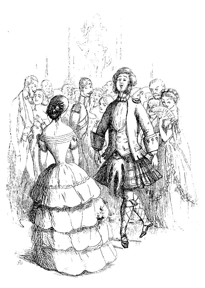
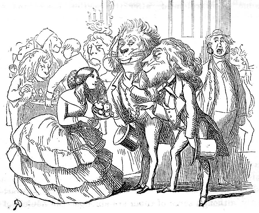
The Marquis embodies this uncomfortable clash of tone (Newcomes, II, facing p.78), and it is instructive to compare the letterpress with the artist’s response. Thackeray describes the Marquis as a sophisticate ‘in training’ at one of numerous ‘polite amusements’ (II, 78):
His English conversation was not brilliant as yet, although his French was eccentric; but at the court balls, whether he appeared in his uniform of the Scotch Archers, or in his native Glenlivat tartan, there certainly was not in his own or the public estimation a handsomer young nobleman in Paris that season. It has been said that he was greatly improved in dancing; and for a young man of his age, his whiskers were really extraordinarily large and curly. [I, p.78]
Doyle catches some of the sarcasm of Thackeray’s description, but misses its subtlety. The juxtaposition of ‘his own’ and the ‘public estimation’ of his appearance must surely suggest he is naïve rather than ridiculous, but the illustration makes him into a buffoon in an ill-fitting and ludicrous costume. Thackeray’s writing is a piece of affectionate satire; the illustration converts it into burlesque. These comedic near-approximations, with the artist almost but not quite finding an equivalent to the writer’s humour, are found throughout the narrative cuts.
Doyle is much more effective, however, in visualizing and re-visualizing the wider social milieu. If the interiors and pairings of characters are purely conventional with little psychological content, then Doyle finds a creative seam in representing the life of the times, especially the contrasts between the characters’ narratives and the teeming excess of urban crowds. Drawing on the imagery of human congestion as it appeared in Manners and Customs of Ye Englyshe (1849), and anticipating his Birds’ Eye Views of Society (1864), Doyle provides a vivid portrait of The Newcomes’ exteriors.
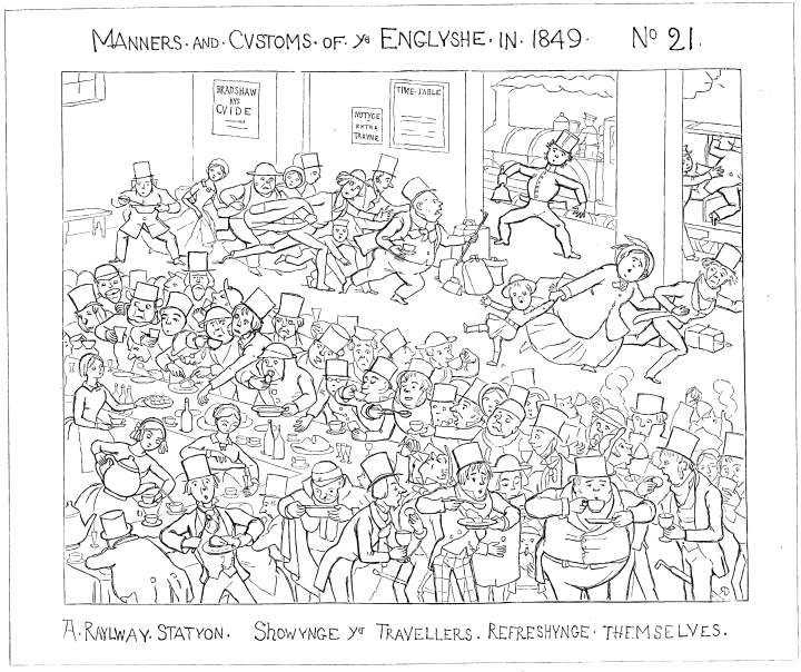
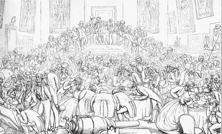
Left: Railway Station . . . Showynge ye Travellers Refreshyng Themselvess. 1849. Right: A science and Art Conversazione. 1864. [Click on images to enlarge them.]
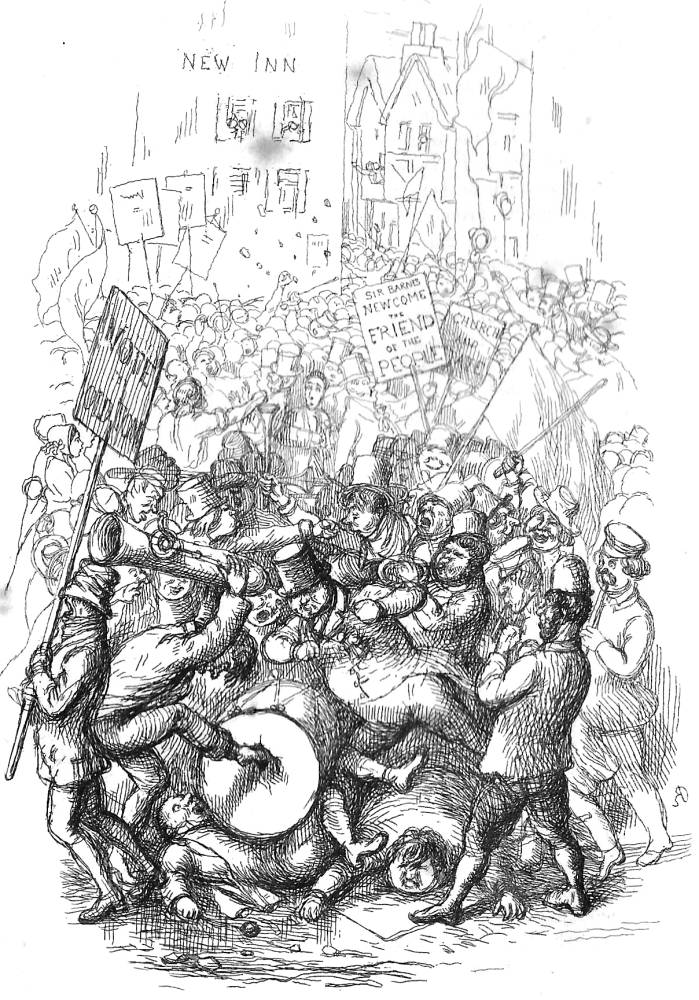
These show the populace engaged, in a Darwinian struggle to survive. The election scene is a typical piece of urban excess:
How came it that whenever Sir Barnes and his friends essayed to speak, such an awful yelling and groaning took place … When Sir Barnes and his staff were hustled in the market-place and most outrageously shoved, jeered, and jolted, the Colonel from the King’s Arms organized a rapid sally. [II, 284]
To match this text Doyle presents a vigorous tableau; neither candidates appears and the emphasis is placed on the sheer chaos of ‘the dregs of the people’, the ‘scum’ (II, p.284) who practically flow out of the page in a mêlée of violence and destruction. This emphasis on claustrophobic crowds is sustained throughout the novel, and in each case the artist extends the implications of the writing by showing the Newcomes’ social contexts, repeatedly drawing attention to their snobbery by making a contrast between the characters – who are physically isolated – and teeming, seedy backgrounds of a milling proletariat or a déclassé bourgeoisie.
Left: Newcome vs Newcome . Right: Sir Barnes Newcome. [Click on images to enlarge them.]
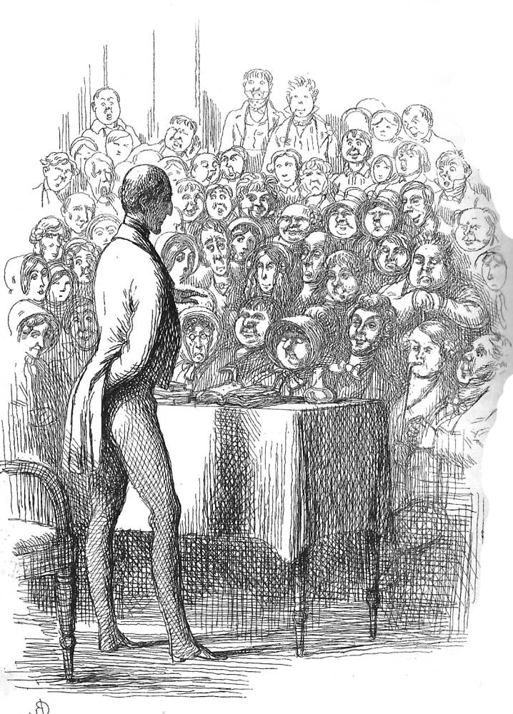
The Effect of the General’s Song (I, facing p.11) focuses on the contrast between the snooty Colonel and the bunched-up audience of heavy drinkers, and a parallel effect is created, this time in the opposition between the Colonel and a crowd or wealthy revellers at a ball (His Highness, I, facing 74). This chapter opens with Thackeray’s admonition that every ‘struggler’ must ‘use his shoulders’ in order to survive in a crowd (I, 72), and Doyle tellingly conveys the suffocating conditions of social interaction. Indeed, the oppressiveness of ‘modern living’ is highlighted throughout, and some of the best full-page etchings – notably a Student of the Old Masters (I, facing. 129), Laying a Train (I, facing 341) and Sir Barnes Newcome on the Affections (II, facing 263) – are tart visual accompaniments to the writer’s withering critiques of the human animal struggling to survive in a confined space.
Doyle’s widening of the novel’s scope is matched, somewhat paradoxically, by his representation of some of the characters as fairy-tale types. Responding to Thackeray’s extended metaphor that likens the personae to participants in a fable, he reinforces the author’s effects. The children are presented as doll-like innocents (1, facing pp. 16, 242; II, facing 98), Clive is the handsome prince (1, facing 29), Ethel a Princess and Lady Kew the wicked witch (II, facing 58). This imagery lightens the tone and conveys the multi-layered nature of the narrative: moving between realism and fairy-tale, the artist negotiates the text’s complexity. He does the same by representing social scenes (with their emphasis on behaviour) as fantasies, the signs of the character’s imaginative lives. The most successful suggestion of desire extending beyond the domains of wealth and status is the artist’s treatment of J. J. Ridley, the painter who is supposed to have been Thackeray’s portrait of his dreamy collaborator (Harvey 95). Doyle’s pictorial frontispiece for the second book-volume is probably a self-portrait, surrounded by the fanciful imagery he preferred and acts as a reminder of the emptiness of the Newcomes’ jostling pursuit of money and social acceptance.
Left: The Effect of the General's Song. Right: A Student of the Old Masters. [Click on images to enlarge them.]
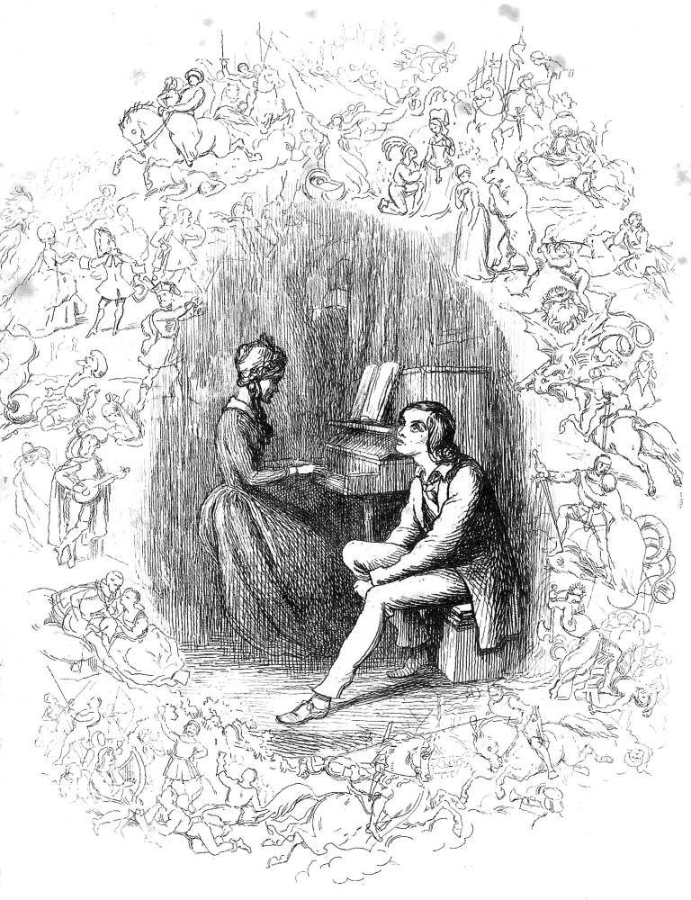
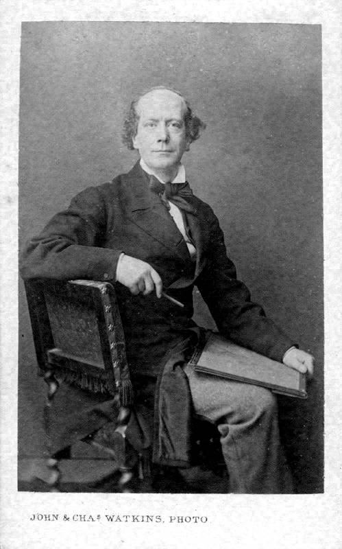
Left: J J in Dreamland. Right: Richard Doyle. Photograph by J. Watkins. Courtesy of the National Portrait Gallery, London. [Click on images to enlarge them.]
Doyle’s full-page designs might thus be described as a curious mix of social observation and the fanciful, awkward pairings and eloquent crowds, broad humour at odds with Thackeray’s irony and social comment which effectively roots the novel in the turbulent times of the 1830s. The approach is uncoordinated, sometimes enhancing the reader’s understandings and sometimes confusing them. Modern critics have been unsure of where to place them, but contemporaries were quick to identify the lack of coherence. Writing in The Oxford and Cambridge Magazine in 1856, Edward Burne-Jones summarizes the problems. The etchings, he notes, are sometimes at odds with the text, lack focus as illustrations and are poorly drawn. Nevertheless, he insists, ‘we have no right to be disappointed’ (qtd. Engen 110). Uneven and sometimes unsure, they still make an important contribution to the development of Thackeray’s dual-text.
The Initial Letters and Small Cuts: ‘Poetical Comprehension’
If the large ‘cuts’ lack coherence, the same cannot be said of the initial letters. In contrast to the uncertainties of the etchings, the wood-engravings are robustly composed, dynamic, full of arch detail, and framed with the artist’s favourite motif – the ‘woody’ bower in parody of Germanic rusticity of the 1840s. Drawing on his experience as a designer of some of Punch’s most amusing versions of this device, Doyle uses the initials to focus attention on key aspects of theme and character. This programme is realized through the invention of comic scenes which deepen the text’s resonance by a process of allusion, by the deployment of emblematic detail, and through the manipulation of other forms of commentary. Thackeray’s influence on this aspect of production is unknown, although it is clear that Doyle’s initials were influenced by the author’s satirical capitals in Vanity Fair and Pendennis; at the same time, Doyle’s designs are more sophisticated than Thackeray’s and create a far-reaching field of implication.
Freed from the need to represent the narrative in mirror or literal images, the artist asserts what is (probably substantially) his own reading of the text. The starting point for his initials, as with some aspects of the etchings, was Thackeray’s likening of his text to events in ‘Fable-land’ (II, 374). In Vanity Fair the author compares his characters to puppets, a metaphor extended in his initials, and in The Newcomes Doyle develops the idea of the characters as emblematic types satirizing their behaviour. The ‘fable’, as the illustrator reads it, is visualized in four main sorts. Taking up the imagery of the etchings, one involves fairies and neo-medieval fay (as it is presented in the artist’s earlier fairy books and pastiches of history); another is faux Rococo after Boucher; and the third is ‘fable’ in the sense of Aesop’s Fables, and deploys anthropomorphic devices in the manner of the French satirist, J. J. Grandville in Scènes de la Vie Privée et Publique des Animeaux (1843–44), one of the artist’s prime sources (Engen 42–43). The programme is completed by a more general group of designs composed of a variety of emblematic devices, some modern, some purely fantastical.
Doyle draws clues for his animal imagery from the text. Thackeray manipulates the conventions of Aesop’s Fables to identify the personality traits of his characters so that each is labelled. The novel’s opening pages open with reference to the Fables and, as Juliet McMaster explains, this type of imagery is a ‘connecting motif’: Clive is identified as a peacock; Lady Kew as an eagle; Farintosh is likened to a lamb; Rosey to a mouse; Honeyman is a lion; Hoby a falcon; and Barnes a vulture (173–74). These classifications symbolize the characters’ personality traits – a matter of vanity, innocence and timidity measured against predatory cruelty – and this approach seems a ready-made programme for the artist to develop.
But Doyle’s response is to take the idea of Aesop’s Fables and turn it to his own purposes. The Fables are visualized in the pictorial title-page of Volume I in accompaniment of Thackeray’s exposition, but on no other occasion, perhaps illogically, does he refer directly to either Aesop’s types or to Thackeray’s Aesop-like classifications. Instead, he creates another stratum of animal devices that overlays the author’s, visualizing the characters in ways which both complement and expand the moral emblems inscribed in the text.
Doyle’s anthropomorphism is typified by his initial for Chapter XXXIII. It represents Lady Kew’s ill-temper, which Thackeray describes as ‘unmuzzled’, an ‘animal’ prone to ‘barking and biting’ and a ‘Black Dog’ (I, p.321); however, the artist personifies her rage not in these terms but as an angry bull butting its opponents. Doyle’s illustration suggests the maniacal nature of her fury, invoking the old adage that she is ‘like a bull in a china-shop’. The emphasis on brute power adds another dimension to her predatory status as a bird of prey, and it also suggests the complete lack of opposition to her will – a notion wittily implied by the bull’s tossing of doll-like figures.
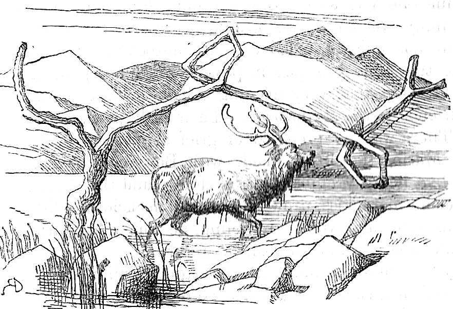
Left: Lady Kew as a Bull . Middle: Highland Stag. Right: Social Lions. [Click on images to enlarge them.]
Commentary on behaviour is similarly developed in a small cut representing the Newcome males as (social) lions (I 71) at a ball, and a complex message is conveyed in the initial for the opening of Chapter XXXVI. This design show a Highland stag as it crosses a river; the text describes Clive’s emergence into the adult world, with all its ‘trials’ and ‘disappointments’ (II, p.321), and Doyle symbolizes his struggle as a wild animal asserting his right, in allusion to Edwin Landseer’s painting of 1851, as The Monarch of the Glen. The metaphor of the struggle to survive underscores Thackeray’s symbolic bestiary, adding another inflection of the artist’s own.
These images crystallize aspects of the characters’ personalities. Other animal imagery is used to visualize the emphasis on cruelty and absence of feeling. For example, Lady Kew’s passing is satirised by a lachrymose crocodile in funeral dress. Thackeray makes no comment on the sense of relief felt at her death, but Doyle crystallizes the characters’ fake grief in the form of ‘crocodile tears’ and suggests, once again, the cold-hearts of those of her social milieu: reptiles all.
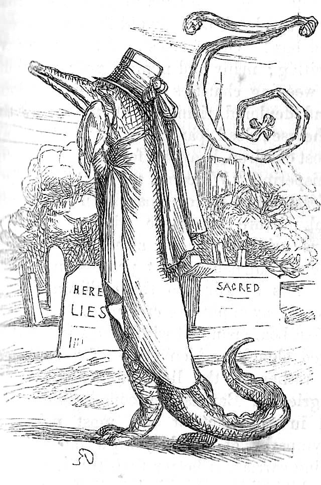
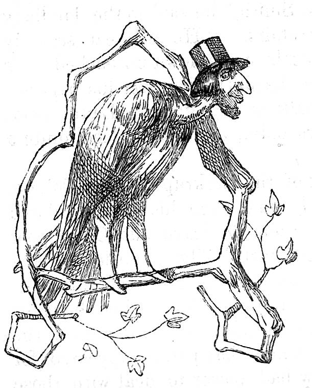
Left: Crocodile. Right: Vulture. [Click on images to enlarge them.]
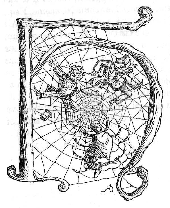
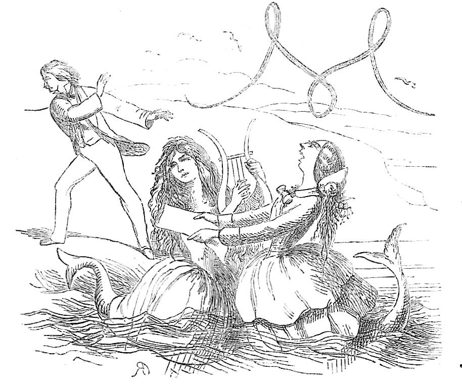
The emotional deadness of the Newcomes’ world is taken to another extreme in initials converting anthropomorphic into zoomorphism – fusing human heads with animal bodies to create a moral type. The Colonel’s financial ruin at the hands of speculators is grotesquely symbolized by a man/vulture, a cartoon Jew waiting to pick over its victim’s bones (II, .296), and in the opening of Chapter III Clive is shown escaping from the siren-songs of the Misses Baynes (I, 114–15), who have been turned into mermaids – nymphs as slippery as fish and dangerous enough to draw him under the water. Another, taking the technique further, is a representation of the Duchesse as a zoomorphic spider – dressed, absurdly, in a crinoline and shawl – with Lord Kew and another victim in her web (I, 353).
Three of the book’s grotesque symbolic illuminated upper-case letters. [Click on images to enlarge them.]
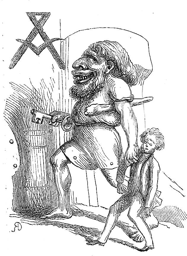
This imagery underscores the brutal ugliness of Thackeray’s tale of greed and deceit, and Doyle also deploys fairy illustrations, somewhat paradoxically, to suggest the hard facts behind the façade of deception. These intricate devices present harsh realities in a fey and amusing idiom at ironically at odds with the plain truths. In the treatment of Honeyman’s ruin, for example, the text specifies his debts while the initial crystallizes his predicament in the form of a gigantic ogre, complete with a huge key, who drags him away to prison. The impression is one of droll humour, fairy-tale at the service of satire; but the comedy is dark and unsettling, using sweetness for sarcastic purposes and lyricism to articulate irony.
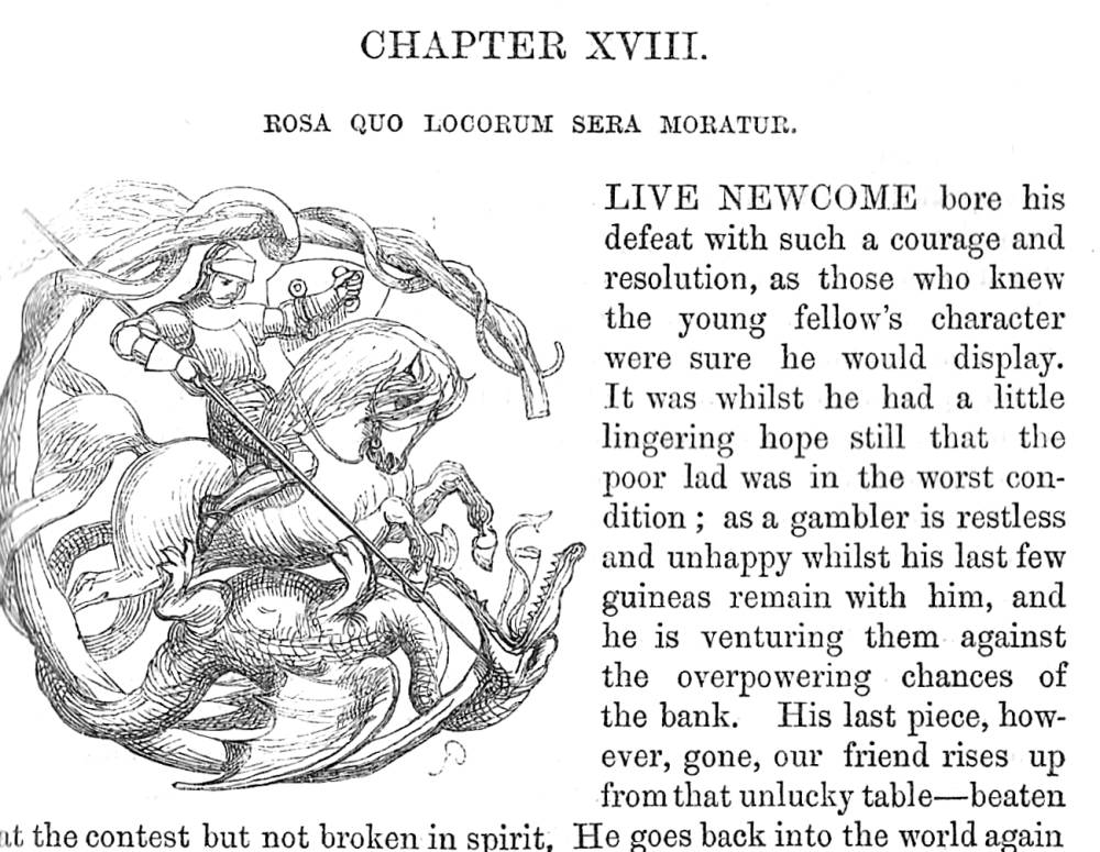
Medieval pastiche, a subset of Doyle’s fairy imagery, similarly inscribes suffering inside charming, child-like devices. Clive’s turbulent courting of Ethel is anatomized in a series of tiny narratives which chart his difficulties, one showing his rejection as a courtly knight and another, in the figure of St. George, as he fights the personified dragon of disappointment (I, p.289; II, p. 169). The inferences of what might otherwise read as purely decorative additions have been cleverly analysed in a recent study by Sandra Martina Schwab, who identifies the nuance of Doyle’s tiny designs and their relationship to the narrative as a whole:
The retreat of the lovesick Clive is echoed by a little knight taking leave of his lady-love who sits on a rose and is so fully engrossed with her pet bird that she does not even spare him a glance … The artist and writer’s mockery is intensified when Clive loses Ethel for a second time to yet another rich man ... The initial of St George and the dragon stands for Clive’s courage and resolution. [61]
Schwab further notes the irony of casting Clive as St George, since George successfully won the hand of Princess Sabra, while Clive is doomed to fail. Schwab’s interpretation is revealing, but close scrutiny of the initials reveals other layers of irony and contradiction. In the ‘Courtly knight’ initial, for instance (Chapter XXX, 1, p.289), it is not only the case, as Schwab remarks, that the lady barely affords her love a glance as she feeds her bird; in fact, the bird is a falcon on a tether – an apt metaphor for Ethel’s control of Clive and at the same time another allusion to the predatory nature of the relationships in Thackeray’s misanthropic world-view, and interesting to compare with Thackeray’s initial of Becky Sharpe hooking Jos Sedley on her fisherwoman’s line.
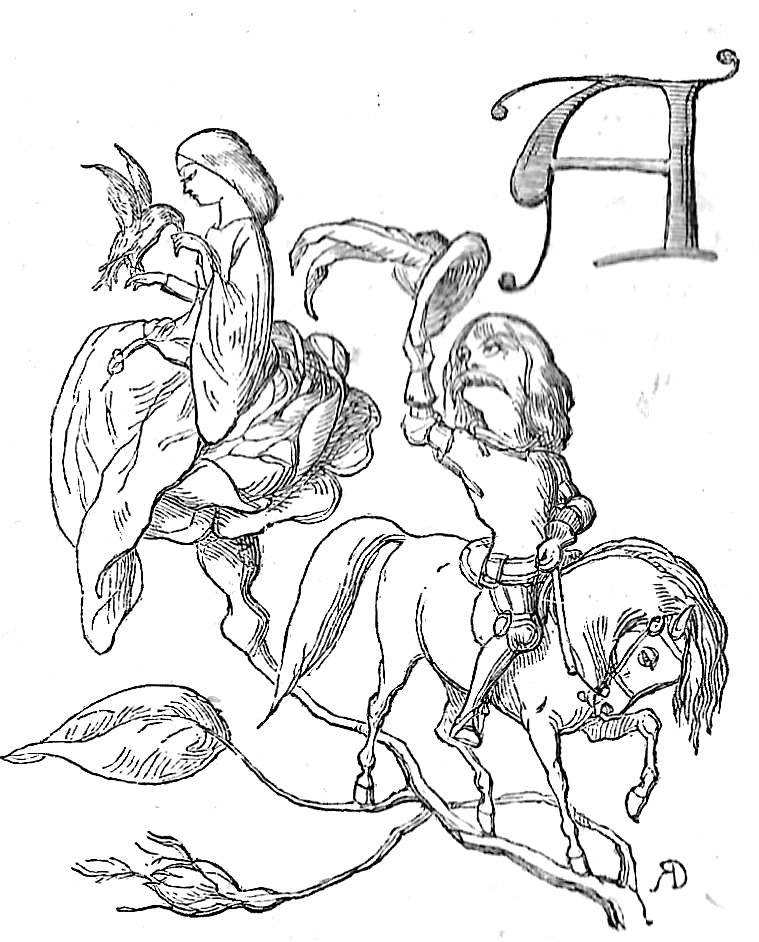
Illuminated Initial ‘A’ illustrating Courtly Love. Click on image to enlarge it.
In this and other-medieval initials even the tiniest detail reflects upon and enriches the meanings of the text. The image opening Chapter XXXVII (1, 364) is tightly packed with possibilities. It nominally shows the result of the duel where Lord Kew is shot and killed by the ‘maddened Frenchman’ (1, 364), Castillonnes. However, Doyle’s depiction is at odds with the text’s; Thackeray condemns the murder’s coldness in stereotypical terms as the province of the French, but the artist focuses on the horror of losing the young nobleman. Though set in the 1830s and slain by a gun, Doyle dresses Kew in armour, attended by characters in medieval costume; he is re-represented, in other words, as a chivalric hero, by implication a knight of The Round Table struck down by the wickedness of an enemy of Albion whose presence is signalled by the crowing cockerel, emblem of France. Doyle further implies the Lord’s martyrdom, adopting the compositional arrangement of the Lamentation as it figured in medieval and Renaissance art. Using the text purely as a starting point, the initial expands the imaginative scope of the situation and invites a poetic reading in counterbalance to Thackeray’s emotional understatement.
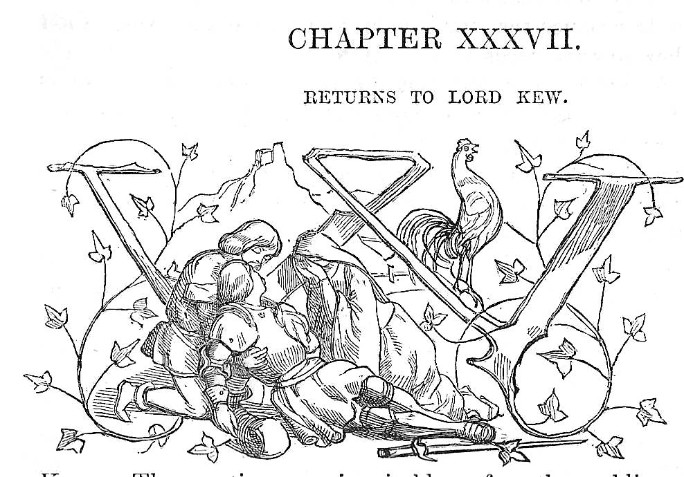
Illuminated Initial ‘A’ illustrating the Death of Lord Kew
Indeed, each of the medieval initials reflects on Thackeray’s writing of themes of power, suffering, loss and disappointment. Figured as a montage, as Gordon Ray comments, in which ‘fancy gets full play’ (90), they allegorize the situations and ironically remind us, once again, of the complications of human feeling, the simple emotions that are problematized by the demands of ambition and status and are constantly under pressure.
The initials function more generally to suggest falsity rather than truthfulness, an approach exemplified by designs in the manner of French neo-classicism. In these images the artist comments on the novel’s emphasis on display – of progressing in the world simply by appearing among the ‘right’ people and engaging with the correct etiquette. The superficiality of this mode of living is fawning love (II, 20, 33, 220), with courtiers in the idiom of Versailles worshipping their objects of desire. The opening to Chapter III in volume 2 typifies this approach. It represents Ethel surrounded by potential suitors whose simpering manner satirised in their ridiculous proffering of comforts – one offering a cup of tea, another propping her feet on a stool and a third presenting a bouquet of flowers. Clive, who does not yet belong to ‘that great world’ (II, 21), is notable by his absence and is not, and will never become, this type of character.
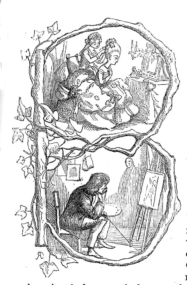
Upstairs, Downstairs. Click on image to enlarge it.
The contrast between his status as an artist, necessarily as an outsider, and the puffed vanities of social behaviour is signalled by an initial containing a telling juxtaposition: Clive is in the lower compartment of a capital ‘B’, looking disconsolately at one of his paintings, while Lady Betty is in the space above having her ‘hair powdered’ (I,161). In Clive’s space a lay-figure (a painter’s dummy) is sketched in the background, an inert body that comments on the inert and bewigged body of the lady upstairs, just another dummy in a world of appearances; typically, the small detail is used to sharpen the satire.
These neo-classical designs add the sort of levity later developed in The Virginians (1858), and Doyle’s placing of early Victorians in the idiom of the doomed aristocracy of France conveys another, unspoken implication. He completes his readings in the form of a number of initials produced extemporaneously. These, variously, make satirical points, indicate narrative developments, or comment on the very process of writing.
Thackeray’s novelistic voice, the omniscient narrator as raconteur, is introduced in the first image of a travelling pedlar selling his wares from a sack and wearing several hats at the same time, surrounded by children willing to buy (I, 1). This type of individual, a common figure on Victorian streets, is the artist’s symbol for the author, who sells his wares to the public and adopts many hats in presenting his numerous characters. The writer later becomes an oriental story-teller (II, 44) and a puppeteer (II, 53). These initials remind us of the artifice of Thackeray’s narrative, while others comments on events (II, 266, 366) and even the passing of time itself (II, 356).
This heterogenous group completes the sustained work of the artist’s other types of design and completes his programme, in the words Victor Kennedy, of using ‘pictures as metaphors.’ As noted throughout the preceding analysis, the effect is always one of enhancement, of expanding the author’s imaginative world by engaging the viewer in an active process, through allusion and reference, of imaginative interpretation. Thackeray offers his text, but Doyle unpicks it, adds possible ways of reading it, mocks it, enlarges it, develops its resonance and underscores its ironic and sometimes unsettling vision of social mores. The most telling commentary on this process is Burne-Jones’s, who noted in his article of 1855 that Doyle’s ‘symbolic drawings’ are ‘no faint echo of other men’s thoughts’, but ‘a voice concurrent or prophetical, full of meaning … full of real art and poetical comprehension’ (qtd. Engen 110). If the full-page etchings are among the weakest in Doyle’s oeuvre, then his wood-engravings are among his best, positioning The Newcomes as a complicated dual text. Whatever its shortcomings, it remains one of the richest hybrids of the period.
Related material
Works Cited and Consulted
Allingham, William. The Music Master. Illustrated by Rossetti, Millais and Hughes. London: Routledge, 1855.
The Cornhill Magazine. London: Smith Elder, 1860–64.
[Doyle, Richard]. Bird’s Eye Views of Society. London: Smith Elder, 1864
[Doyle, Richard]. Foreign Tour of Messrs. Brown, Jones and Robinson, The. London: Bradbury & Evans, 1854.
[Doyle, Richard]. Manners and Customs of Ye Englyshe. Text by Perceval Leigh.London: Bradbury & Evans [1849].
Lemon, Mark. The Enchanted Doll. London: Bradbury & Evans, 1849.
Punch. London: Bradbury & Evans, 1843–50.
Ruskin, J. The King of the Golden River. Illustrated by Richard Doyle. London: Smith Elder, 1851.
Tennyson, Alfred. Poems. Illustrated by Millais, Rossetti, Holman Hunt, Maclise. London: Moxon, 1857 [the ‘Moxon Tennyson’]
[Thackeray, W. M.]. The Letters and Private Papers of W. M. Thackeray. Ed. Gordon Ray. 4 Vols. London: Oxford University Press, 1945–6.
Thackeray, W. M. The Newcomes: Memoirs of a Most Respectable Family. With illustrations on steel and wood by Richard Doyle. London: Bradbury & Evans, 1854–55. First published in 23 monthly serial parts, October 1853–August 1855.
Note: the original parts in wrappers are extremely rare; however, the first book editions of the novel are extremely common. The book was reprinted in the 1860s and in subsequent editions; Doyle’s illustrations were retained.
Thackeray, W. M. Pendennis. Illustrations wood and steel by Thackeray. London: Bradbury & Evans, 1849–50. The novel was first published in parts, 1849–50.
Thackeray, W. M. Philip. Illustrations on wood by Thackeray and Walker. First published in The Cornhill Magazine, January 1861–August 1862. London: Smith Elder, 1861–2.
Note: The first book edition was published by Smith Elder in 3 volumes in 1862, but without the illustrations. Subsequent editions restored Walker’s contributions.
Thackeray, W. M. Vanity Fair. Illustrations on steel and wood by Thackeray, London: Bradbury & Evans, 1848. The novel was first published in parts, 1847–8.
Thackeray, W. M. The Virgininians. Illustrations on steel and wood by Thackeray. London: Bradbury & Evans, 1858–9. The novel was first published in parts, 1858–9.
Titmarsh, M.A. [W.M. Thackeray]. The Kickleburys on the Rhine. Written and illustrated by Thackeray. London: Smith, Elder, 1850.
Titmarsh, M.A. [W.M. Thackeray]. Mrs Perkins's Ball.. Written and illustrated by Thackeray. London: Chapman & Hall, 1847.
Titmarsh, M. A. [W. M. Thackeray]. Rebecca and Rowena. London: Chapman & Hall, 1850.
Titmarsh, M.A. [W.M. Thackeray]. The Rose and the Ring. Written and illustrated by Thackeray. London: Smith, Elder, 1855.
Secondary Sources
Burton, Anthony. ‘Thackeray’s Collaboration with Cruikshank, Doyle and Walker.’ Costerus n.s 2 (1974): 141–184.
Canham, Stephen. ‘Art and the Illustrations of Vanity Fair and The Newcomes.’ Modern Language Quarterly 43:1 (1982): 43–66.
[Dalziel]. The Brothers Dalziel, A Record of Work, 1840-1890. Foreword by Graham Reynolds. 1901; reprinted London: Batsford, 1978.
Engen, Rodney. Richard Doyle. Stroud: The Catalpa Press, 1983.
Fisher, Judith. ‘Image versus Text in the Illustrated Novels of William Makepeace Thackeray.’ Victorian Literature and the Victorian Visual Imagination. Eds. Carol T. Christ and John O. Jordan. Berkeley: University of California Press, 1995. pp. 60–87.
Hamerton, Philip Gilbert. Etching and Etchers. Boston: Little, Brown, & Co. 1908.
Harvey, John. Victorian Novelists and Their Illustrators. London: Sidgwick & Jackson, 1970.
Kennedy, Victor R. ‘Pictures as Metaphors in Thackeray Illustrated Novels.’ Metaphor and Symbolic Activity 9:2 (1994): 135–47.
McMaster, Juliet. Thackeray: the Major Novels. Manchester: Manchester University Press, 1971.
Olmsted, John C. ‘Richard Doyle’s Illustrations for The Newcomes.’ Studies in the Novel 13 (1978): 93–108.
Ray, Gordon. The Illustrator and the Book in England from 1790 to 1914. New York: Pierpont Morgan Library, 1976.
Schwab, Sandra Martina. ‘Richard Doyle’s Comic Histories: a Victorian Look at the Middle Ages.’ History and Humour: British and American Perspective. Eds. Barbara Korte & Doris Lechner. Bielfeld: Transcript, 2013.
Stevens, Joan. ‘Thackeray’s Pictorial Capitals.’ Costerus n.s. 2 (1974): 114–40.
Stevens, Joan. ‘Thackeray’s Vanity Fair.’ Review of English Literature 6 (1965): 19–38.
Winner, Viola Hopkins. ‘Thackeray and Richard Doyle, the “Wayward Artist” of The Newcomes’. Harvard Library Bulletin 26 (1978): 193–211.
Last modified 5 April 2017