
Many of us take containers for granted because we are focusing on what is contained within them and because we have bought the same product so many times that the images, the design, and the text no longer register with us; this habituation is true whether the product be soup or chocolate, a DVD, or even a boxed-set of books. The cover of a book, however, is somewhat different because, unless we leave the book open and inverted to mark the place where we left off reading, we are constantly re-engaging with and re-evaluating whatever design, emblem, device, or illustration appears on that cover, whose meaning has changed as a result of further reading and periods of reflection. Significantly, the late paratextual critic Michael Steig in Dickens and Phiz (1978) refers to containers for bound pages of the monthly instalments of Dickens's novels as "covers" rather than "wrappers," perhaps to dispel the illusion of impermanence. The former term, after all, suggests an integral part of a book, the latter (as in fish-and-chip "wrappers") as something best disposed of. In Charles Dickens and His Original Illustrators (1980), Jane Rabb Cohen has reproduced a a dozen of these wrappers "for the Novels of Charles Dickens First Published in Monthly Parts," each being 22.2 by 14.6 cm (8.75 inches high by 5.75 inches wide). The wrapper for Sketches by Boz she places first, even though it was not a novel, and, moreover, was first published in volume form as a collection known as the "First Series" (2 vols.) by John Macrone in February 1836; the wrapper design by Hablot Knight Browne ("Phiz") for Martin Chuzzlewit is the fourth in the series, but just the second by Phiz:
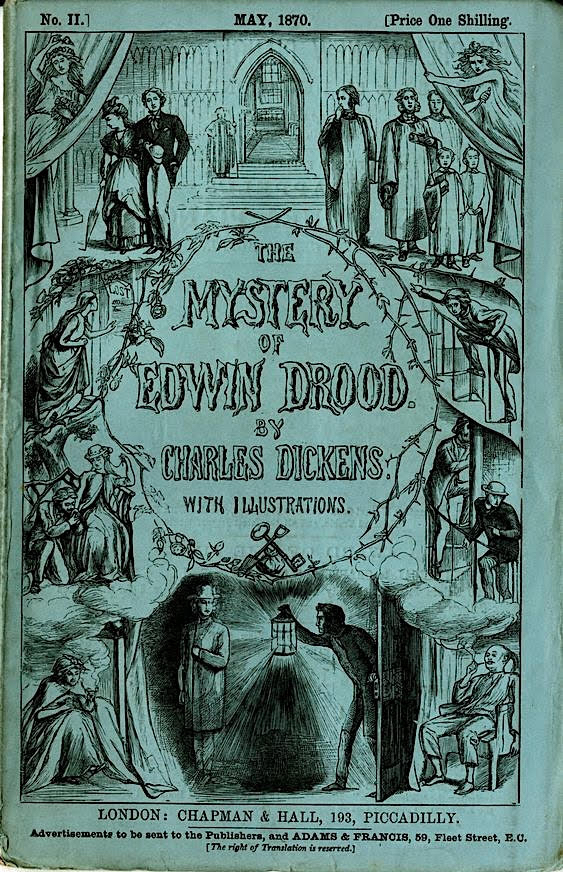
A new system of publishing a first-run novel (rather than the mere re-printing of a book issued in volume form) required perforce a new method of packaging and marketing the product; it is serendipitous that publishers Chapman and Hall for the first (April 1836) number of Pickwick came up with this elegant but cheaply-produced substitute for the boards of a real book. The practice of using wrappers for serial instalments caught on among publishers, and outlived Dickens, in that the September 1870 number of The Mystery of Edwin Drood utilized such a device, albeit by Charles Allston Collins and Luke Fildes rather than by Phiz.
George Cruikshank designed the covers for the monthly reprints of Sketches by Boz and Oliver Twist after their initial serial publication, the former being on pink paper to distinguish them from the green wrappers of novels appearing originally in monthly parts. That Robert Seymour had designed the monthly cover and the first few illustrations for The Posthumous Papers of The Pickwick Club proved somewhat of a constraint upon Phiz's visualizing the characters. From Phiz's Chuzzlewit wrapper (1842-3) George Cruikshank developed the Oliver wrapper with its characteristic clockwise motion of rectangular vignettes in a "Wheel of Fortune" design for when the story was "reserialised" in ten monthly parts 1846 (1 January through 1 October). Finally, young Marcus Stone developed the wrapper design for Our Mutual Friend, and novice Luke Fildes developed from Charles Allston Collins's sketches that for Dickens's last serialisation, The Mystery of Edwin Drood in 1870.
Otherwise, the wrappers as we know them (seven in total) are the fruits of Phiz's marvelously pictorial and emblematic imagination. Neither of the veteran illustrators George Cruikshank and Robert Seymour had exploited the possibilities for using the wrapper design as a vehicle for teasing the reader month by month to speculate as to how the design reflected the trajectory of the narrative. Like them, however, Phiz surrounds the verbal information — title, the names of author and illustrator, instalment number, and price — with the Wheel of Fortune design running up the left margin and falling down the right, echoing the lexical reading of a page of text in the Western European tradition, left to right, and wrapping around to the left again. Robert Patten sees this pattern as emerging clearly in the cover design for Dickens's next full-length novel after Martin Chuzzlewit, Dombey and Son (1846-48). Whereas the Nickleby and Chuzzlewit allegorical wrappers do not feature specific characters and situations from the stories they contained, that for Dombey and Son cues the reader visually for the story: characters such as a young man and a traveller mingle with symbolic objects such as a chequebook and a banker's ledger in a detailed, highly organized visual précis of the plot. "Through such visual indirection Browne is able to hint at the principal pattern of action and something of the character of a leading figure without giving away specifics of a plot not yet devised" (Companion, 289).
The Design of the Monthly Wrapper for the Nineteen Instalments of Martin Chuzzlewit (1843-1844)
Martin Chuzzlewit is of particular interest in having an allegorical wrapper and frontispiece which are directly related, and in being the only novel for which survives Dickens' instructions regarding several successive plates containing emblematic details. [Steig, "Martin Chuzzlewit's Progress," 123-24]
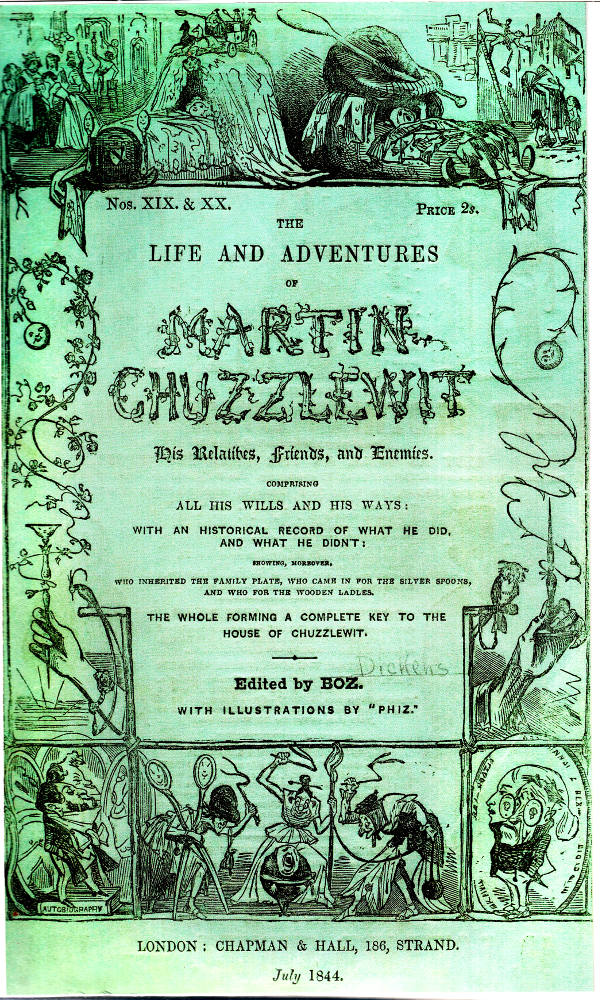
Between January 1843 and July 1844, as was the case with most of his previous full-scale novels, Charles Dickens and Chapman and Hall published his sixth novel, Martin Chuzzlewit, in parts each priced at one shilling; each part consisted of 28 pages of text and two full-page illustrations that Phiz had produced via steel engravings. A similar arrangement had pertained to the physical make-up of the instalments for The Pickwick Papers, and Barnaby Rudge and Nicholas Nickleby in Master Humphrey's Clock; although Martin Chuzzlewit was the tenth Dickens work which Phiz illustrated, it was the fifth novel upon which he had worked since The Library of Fiction (1836), Sunday Under Three Heads (1836), Sketches of Young Gentlemen (1838), Sketches of Young Couples (1840) and The Pic-Nic Papers (1841) were not novels.
For his first full-length novel of the 1840s, The Life and Adventures of Chuzzlewit, His Relatives, Friends, and Enemies. Comparing All His Wills and His Ways: With an Historical Record of What He Did, and What He Didn't: Showing, Moreover, Who Inherited the Family Plate, Who Came in for the Silver Spoons, and Who for the Wooden Ladles, The Whole Forming a Complete Key to the House of Chuzzlewit (full title from the wrapper, 1843-4), Phiz provided 38 plates, including in the last 'double' instalment a pictorial frontispiece and a vignetted title-page, both of which benefit considerably from his having read the entire novel prior to their execution. The monthly wrappers with their Wheel of Fortune design are identical, except for the part, number, and date (bottom centre). Whereas the wrapper design features the full title (thereby relating the text to the motifs of silver spoons and wooden ladles), the printed title-page is considerably briefer and less exuberant: "The / Life and Adventures / Of / Martin Chuzzlewit. / By Charles Dickens. / With Illustrations By Phiz," using the iconic names of author (significantly no longer "Boz" as on the wrapper) and illustrator as guarantees of artistic quality and hours of reading enjoyment. The vignette title-page, with the words "Martin Chuzzlewit / By / Charles Dickens," mentions the celebrated artist only by the ornamental signature "Phiz," which appears in the lower right margin of the vignette in which Phiz's forté, a team of horses (emblematic of artist and author in balanced collaboration) prance away in lively fashion, off right, in contrast to the bony nag in the shafts of Pecksniff's gig, down left, who crops the grass beside Martin's just-deposited trunk. Compared to Phiz's design for the cover of Nicholas Nickleby, that for Martin Chuzzlewit seems a marked advance, with its framed scenes marshaled according to a theme, the left-hand register paralleling and contrasting the right-hand. Over the course of Browne's wrapper designs one detects greater confidence in terms of structure and overall design, beginning with the presentation of allegorical motif through the presentation of a theme to the representation of the narrative in terms of characters, settings, and situations (as in the Bleak House cover), the highest development of the form probably being the result of the novelist's acquainting his illustrator at the outset with the necessary specifics. In that the design of the Chuzzlewit wrapper does not attempt to represent the particulars of plot and character that one finds, for example, in the wrapper for A Tale of Two Cities, it is probably somewhat disappointing for twentieth- and twenty-first century readers. However, Dickens's serial readers must have compared it to that for Nickleby, noting that, in place of generalized motifs based on seventeenth- and eighteen-century title-page design and seen in such early nineteenth-century works as Pierce Egan's Life in London (1821), Phiz clearly presents a dichotomy between misfortune and good fortune from the cradle to old age, a true "progress" contrasting the lives of the poor and rich man. That we do not find the kinds of specific images that inhabit the Dombey and Son wrapper may be due to the fact that Phiz entered the Chuzzlewit project comparatively late (November 1842), after Dickens had failed to recruit Punch illustrator John Leech. In all likelihood, as was the case with the wrapper for Master Humphrey's Clock (for which even Dickens could not anticipate at the outset which documents other writers might contribute for the clock-case), Phiz knew next to nothing except the generalized theme of the work for which he was expected to design the wrapper.
At the bottom of the Chuzzlewit wrapper, the image of a man in the shape of a top being whipped by three Fates suggests that fortune is after all a matter of circumstances beyond one's control. On the left and right sides of the design, good fortune is represented by a bird of paradise on a perch, and a smiling ball, which will land properly in its "cup," and bad fortune is figured forth by thorns, an owl upon a gibbet, and a suffering ball about to be impaled upon the shaft of its inverted cup. It seems at least possible that a source here is the caricature by Gillray, The Giant-Factotum amusing himself (1797), in which a giant Pitt plays with the globe, in the form of a cup-and-ball toy. [Steig, "Martin Chuzzlewit's Progress," 125]
As in the wrapper for Master Humphrey's Clock several years earlier, in the wrapper for Martin Chuzzlewit we find a curling, twisting vine suggestive of organic growth, doubly appropriate for a novel that is both what Steig terms a "progress" and that is commonly described as a bildungsroman. However, in the design of the wrappers for the 1843-4 novel of development the governing principle is not the passage of time, but the contrast between socially and economically advantaged and disadvantaged from birth (exemplified by cradles, upper left and right) and death (in obscurity, lower right, for the child of poverty; in honour, lower right, for the child of affluence. The rotund, bewhiskered figure of the man of wealth and social influence stands atop a volume entitled "autobiography," implying that such a person is in the favoured position to record and comment upon his life's achievements for posterity. At the bottom, centre, the comic Fates in classical garb lash with thorns a groaning character shaped like a child's top, the faces in the scissors of Atropos recalling the silver spoon motif as they smile maliciously.
Together with the vine motif, the imagery implied by the ladles and spoons of the wrapper's full title controls the design of the wrapper. For example, in the upper left, smiling spoons form the posts for the massive cradle's footboard, reinforcing the privileged social status of the infant who smiles, looking up at the ornate cover, the toy carriage, and the team of horses (to be echoed in the vignetted title-page). The context of the upward gazing infant in the splendid cradle is a family celebration in which fashionably dressed women dote upon the child while equally well-dressed males raise their glasses to toast the new arrival. The child, then, is doubly fortunate for it has been born into an affluent, fashionable, and sophisticated extended family who have welcomed it and will (it seems certain) love and nurture it. This vision of a childhood filled with material comfort and happiness and a future of promise is in stark contrast to the context of the child of poverty (upper right, i. e., stage left). The dreary tenement scene is architecturally reminiscent of the neighbourhood of Fagin's den of child-thieves in Oliver Twist. In the foreground of the ghetto appears a woman in rags, unsupported by a husband and encumbered by three young children. The howling infant in the squalid crib, its blankets mere rags, holds up a hand in protest, the whole scene presided over by the ominous figure (the head of the cradle) ready to wield a gigantic ladle. These scenes in the upper registered, like that of the fates whipping and taunting the helpless top, connect birth, childhood, and fortune: the implication is that the accidents of birth determine one's lot in life and that whether one will experience a life of advantage or challenge is entirely beyond one's own control. Thus, the wrapper's theme undermines the concepts of free will and moral choice in terms of one's conduct is at odds with Dickens's view of human nature, as exemplified by the destinies of the cousins Martin and Jonas Chuzzlewit. Socio-economic predestination does not shape their moral choices: even though both young men are initially selfish as a result of their common Chuzzlewit, materialistic upbringing, Martin in Eden renounces the egocentric way while Jonas chooses, by murdering Tigg, the path to the everlasting bonfire.
To the left and right, the wrapper design continues the theme of good (left) versus bad (right) fortune. Both sides involve cup-and-ball children's toys, symbolic birds (left, the peacock, suggestive of affluence and pride; right, the owl, suggestive of poverty and wisdom) and hands. Good fortune is exemplified by the roses; bird of paradise on its slender perch; delicate, female hand; and the smiling ball which will land securely in its elaborate cup. Likewise, misfortune is exemplified by the thorns; the knowing little owl chained to a gibbet; and the melancholy ball who seems doomed to be impaled upon the sharp stem of the inverted handle of its cup. As Michael Steig has noted, these motifs are repeated and clarified by the design of the frontispiece: the beautiful hand now
supports Tom Pinch's head upon a rose-garlanded cup, while the other [the apparently male hand from the wrapper] hand belongs to a disgusting harpy who impales Pecksniff's head upon a thorn-entwined shaft. The comic Fates of the wrapper also show up again as hooded females besetting Jonas. [Steig, Dickens and Phiz, 63]
Although Steig sees the relationship between Phiz's handling of these motifs on the wrapper design and in the title-page vignette as wholly complementary, creating continuity by beginning in the text and plates and by their "resolution in the frontispiece" (63), one senses a very different principle at work in the frontispiece from that which governs the monthly serial wrapper's design for Martin Chuzzlewit, for example. Virtue is tested and pilloried by ill-fortune in the wrapper, whereas in the vignette the hypocritical Pecksniff and the brutal, domineering Jonas are justly punished for their sins, so that the wrapper design exemplifies the cathartic spirit of tragedy while the vignette is imbued with the poetic justice of comedy. We sympathize with the plight of the victim of Fate in the viewing the wrapper, but we delight in the horrific punishments of the hypocrite and the murderer in the vignette.
Through the emblematic details in the wrapper and through the more naturalistic illustrations that accompanied each monthly part (the designs for which respond to developments in plot and character) Phiz connects and comments upon the scenes that he and Dickens in collaboration chose for visual elaboration. Through allegory and symbolism on the one hand, and caricature, pose, gesture, posture, and emblematic detail on the other, Dickens and Phiz have connected the elements of the wrapper and the various plates. Steig pronounces the pictures provided by Phiz as an "integral" ("Martin Chuzzlewit's Progress," 122) part of the novel because they constitute "running commentaries upon the text" (122). It is therefore highly unfortunate that the most reasonably priced, best annotated, and best typeset edition of the novel, namely that published in the Oxford World's Classics series (1984) and edited by Margaret Cardwell, features only the wrapper for April 1843, the title-page for the 1844 edition, the dedication to Miss Burdett Coutts, and eight of the original Phiz plates. The Penguin edition (1968) provides the full set of plates with detailed explanatory notes, the beautifully printed but unannotated Nonesuch Edition (1937, rpt., 2007) offering just the full Phiz programme and Frank Stone's frontispiece for the Cheap Edition (1849), and none of Fred Barnard's more realistic scenes from the 1870s Household Edition.
Bibliography
Cohen, Jane Rabb. Charles Dickens and His Original Illustrators. Columbus: Ohio State U. P., 1980.
Dickens, Charles. The Life and Adventures of Martin Chuzzlewit, His Relations, Friends, and Enemies . . . . Illustrated by 'Phiz' (Hablot Knight Browne). London: Chapman and Hall, 1844.
Dickens, Charles. The Adventures of Oliver Twist; or, The Parish Boy's Progress. Illustrated by George Cruikshank. London: Bradbury and Evans; Chapman and Hall, 1846.
Dickens, Charles. The Adventures of Oliver Twist; or, The Parish Boy's Progress. Illustrated by George Cruikshank. London & New York: Macmillan, 1892 [contains reproductions of the 1846 wrapper, of the first page of the 1838 Bentley volume, and of the first page of the Prest serial, Oliver Twiss].
Patten, Robert L. "Illustrators and Book Illustration." Oxford Reader's Companion to Dickens, ed. Paul Schlicke. Oxford: Oxford U. P., 1999. Pp. 288-293.
—. "Serial Illustration and Storytelling in David Copperfield." The Victorian Illustrated Book, ed. Richard Maxwell. Charlottesville and London: University Press of Virginia, 2002. Pp. 91-128.
Steig, Michael. Dickens and Phiz. Bloomington & London: Indiana U.P., 1978.
—. "From Caricature to Progress: Master Humphrey's Clock and Martin Chuzzlewit." Ch. 3, Dickens and Phiz. Bloomington and London: Indiana U. P., 1978. Pp. 51-85.
—. "Martin Chuzzlewit's Progress by Dickens and Phiz." Dickens Studies Annual, 2 (1972): 119-149.
Stone, Harry. Dickens' Working Notes for His Novels. Chicago and London: U. Chicago Press, 1987. Pp. 17-19.
Waugh, Arthur, and Hatton, Thomas. Nonesuch Dickens Retrospectus and Prospectus. London: Bloomsbury and Nonesuch, 1937. Rpt. New York: Kessinger, 2003.
Created 6 August 2015
Last updated 3 October 2024