
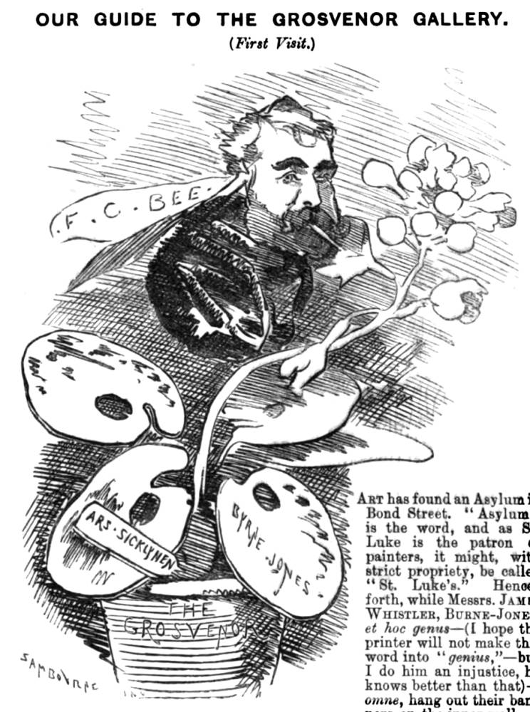
Not long after the Ruskin-Whistler trial Punch reviewed an exhibition at the Grosvenor Gallery featuring two artists who had played a prominent role it in. “Our Guide to the Grosvenor Gallery (First Visit),” which mocks all the works on view, begins scurrilously, “Art has found an Asylum in Bond Street. ‘Asylum’ is the word, and as St. Luke is the patron of painters, it might, with strict propriety, be called ‘St. Luke's.’ Hence forth, while Messrs. JAMES WHISTLER, BURNE-JONES, et hoc genus — (I hope the printer will not make this word into "genius," — But I do him an injustice, he knows better than that)— omne, hang out their banners on the inner walls of the Grosvenor Gallery, let its name be “St. Luke's Asylum for Lunatic Limners.” This, I admit, is hard on the works of the sane patients — I mean painters— who should at once protest.
Whistler had sued Ruskin for libel after he published an intemperate review, Burne-Jones, who was very indebted to Ruskin, testified in his favor, and, as is well known, Whistler won the judgment. However, since he received only a farthing in damages and nothing towards his legal fees, he ended up bankrupt. Cultural historians have tended to interpret the infamous trial as a battle between the old and the new, between Whistler’s daring modern experimental art and conservative criticism. Punch, which published Linley Sambourne’s rather cruel caricature of Ruskin as a grotesquely ugly Narcissus, not only heaped ridicule on the critic and his defender Burne-Jones but it also treated Whistler equally harshly, repeatedly harping on what tiny damages his pyhrric victory had produced. The Punch critic begins by complaining abiut the entrance fee:
A shilling for admission! This is paying for one's whistle with a vengeance. Knowing the rare treat in store for me, I might not have objected to a twelfth of this sum. No one would have grudged that much. Quite enough noise in the world can he made by a Penny Whistler. However, the keepers — I mean the wicket-keepers — at the Asylum in Bond Street, won't take less; so elevenpence more and up goes this donkey. Walk up! walk up! and see the show Symphonies by the Penny Whistler just a-going to begin!
After briefly mentioning Walter Field’s Henley Regatta, the critic asks, “what is this facing us on the landing at the head of the staircase?” and tellign the gallery-goer, “Don't be frightened; don't run away; have your shillingsworth out. This is, in the books, No. 150. Perseus and the Graiæ. By that eminent Artist Mr. E. Burne-Jones. This work turns out to have been not the better-known oil-on-canvas Version formerly in the Huntington Hartford Museum in New York and now in Stuttgart but the magnificent experimental Version one included in the recent Tate Britain exhibition.
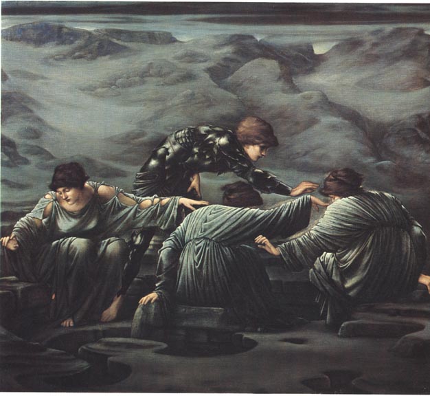
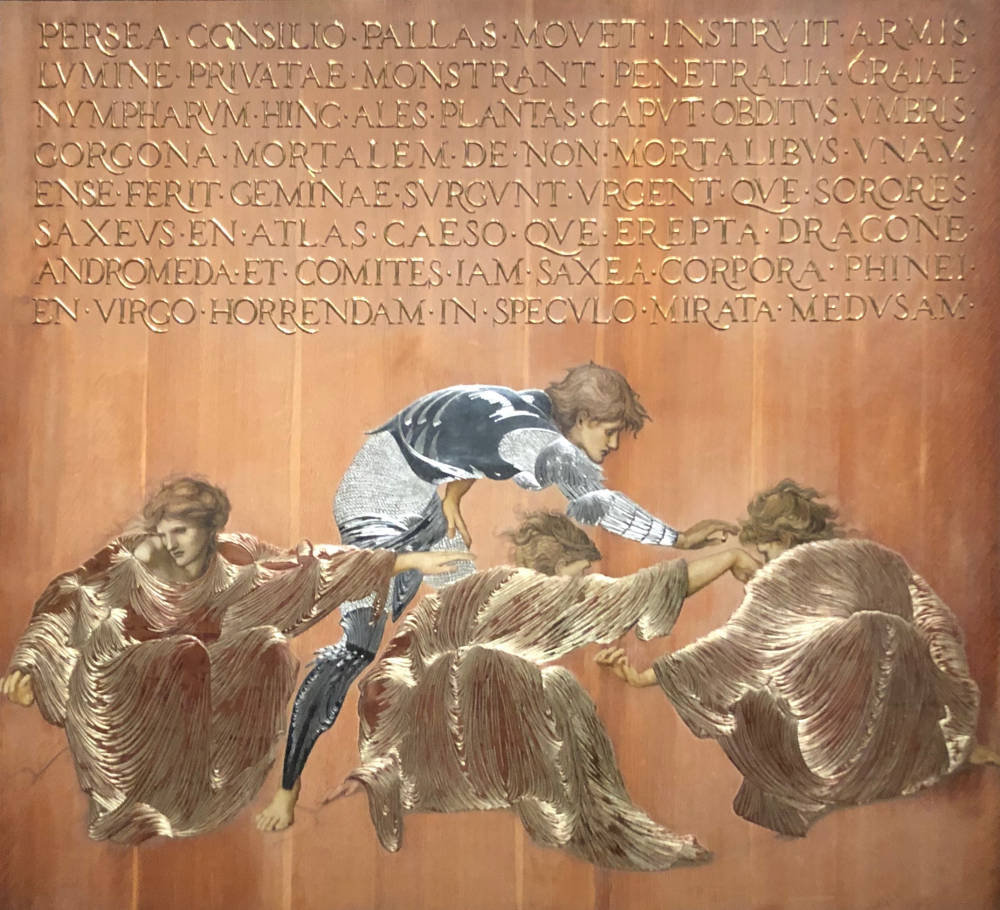
Perseus and the Graiae by Sir Edward Coley Burne-Jones, Bt ARA (1833-1898). Oil on canvas. 1892. [Number 2 in the Perseus Cycle]. Staatsgallerie Stuttgart. This picture, like other members of the series, draws upon the version of the Perseus legend that appears in the following passage in William Morris's "The Doom of King Acrisius" from The Earthly Paradise.
Mr. Punch continues by asking, “What’s in a name? A good deal. Plain-Jones couldn't have achieved what Burne-Jones can. This is a "Design in yellow and white metal fastened on wood." So says Mr. Blackburn in his useful Notes. I thank thee Blackburn for teaching me that word ‘design.’” The critic continues by comparing this work to the “‘plates of characters’ for the larger-sized toy-theatres,” telling us
to this form of “design” Mr. E. Burne-Jones has returned. He can hardly be said to be the “leader of a school” so much as the eldest boy in a nursery. He has yet got to go to school. His Perseus and the Graiæ is worked on the principle above mentioned. Wherever the tinsel would have been, there is the “metal;” and where the bare legs are, there they remain. It may be Perseus and the Graiæ, but it is, apparently a Japanese warrior disturbed, while dressing in full armour, by some larkish young lady-visitors who have hidden his shoes, and he is represented as running about in his armour, bare footed, playing with the flighty intruders a sort of Japanese "Hunt-the-slipper." There! now you know all about it. So, Burne-Jones or Melt Jones, in this instance, and in future, let us have “metal more attractive.”
Obviously, the Punch writer does not expect his readers to take his words as serious art criticism or even as a description of the work at hand. He is just straining for joke. But the emphasis he places on Burne-Jones shows that he lumps his art together with Whistler's rather then understanding the two painters as representing opposed schools or approaches to art. Here, for example, is Mr. Punch on Arrangement in White and Black, the first of Whistler's canvases that he mentions: “The ‘arrangement in white and black’ must allude to the engagement for the ballet at eighteen shillings a week, to which this flimsy, flighty young person has evidently just appended her signature of ‘Mabel de Courcy.’ These arrangements in black and white of Mr. Whistler's are not, thank goodness, ‘fixtures,’ but are ‘arrangements’ which can be easily ‘carried out,’ — whither, it doesn't matter; but the sooner the better.” The critic continues listing Whistler's other works in the exhibition:
Now, pray be seated, and give all your attention to Penny Whistler's harmonies and solos. Here they are, from 52 to 57 : — No. 52. Harmony in Blue and Yellow; No. 53. Nocturne in Blue and Silver; No. 56. Nocturne in Blue and Gold; and No. 57. Nocturne in Grey and Gold. They might be described as "Puzzle-Pictures."
Mr. BLACKBURNE's Guide observes of these pictures, “Landscapes of great subtlety and charm, passed too lightly by the majority of visitors.” Whether too lightly is a matter of opinion; but had Mr. WHISTLER sat by me, and heard the remarks of the “majority of visitors,” he would have ordered a cart, and taken 'em all away there and then. But Whistlers never hear any good of themselves.
This mock review obviously finds pretentious Whistler's use of words like nocturne, symphony, and harmony in the titles of his paintings but doesn't bother to point out (or doesn't notice) that most of the paintings themselves are fairly straightforward Victorian portraits and hence hardly wildly revolutionary at all.
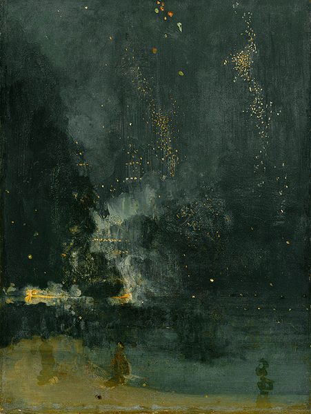
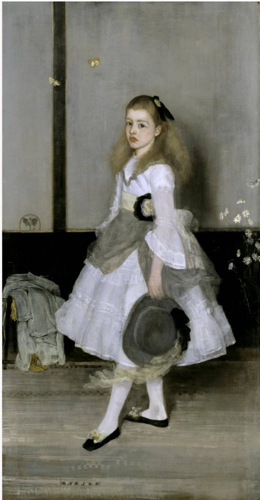
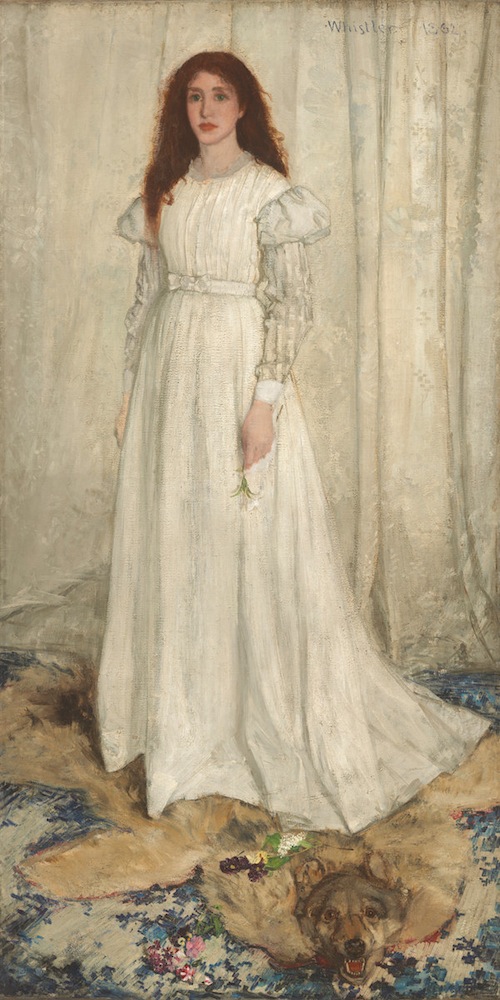
Three of Whistler’s paintings but not necessarily ones mocke dint he review. Left: Nocturne in Black and Gold: The Falling Rocket (1875). Middle: Harmony in Grey and Green: Portrait of Miss Cicely Alexander. Right: Symphony in White, No. 1: The White Girl. [Click on images to enlarge them.]
Mr. Punch next complains that one can’t get a drink at the exhibition, for “among all these ‘harmonies,’ ‘symphonies,’ and ‘Decorative Designs,’ there's one sort of relief that can't be found at the Grosvenor, until the Licence is granted, and that is “bar-relief.” After turning aside to make fun of Mischief and Time and Death by G. F. Watts, one of the most respected artists of the day, he announces, “a few more notes to be suggested by another Penny Whistler's solo, and I've done for to-day. No. 54. Variation in Flesh Colour and Green. From this description an uninitiated person might expect a picture of ‘Bacon and Spinach’ or ‘Ham and Peas.’ Oh dear no, nothing so good.”
Related Material
- The Falling Rocket: Ruskin, Whistler and Abstraction in Art
- “Contemporary Notes on Whistler vs Ruskin” by Henry James
- Mr. Narcissus Ruskin by Edward Linley Sambourne (1880)
- Whistler versus Ruskin by Edward Linley Sambourne (1880)
- “The Grosvenor Gallery: A Lay of the Private View” from Punch (1881)
Bibliography
“Our Guide to the Grosvenor Gallery (First Visit).” Punch (22 June 1878): 285. Hathi Trust Digital Library online version of a copy in the Harvard University Library. Web. 15 May 2020.
Created 18 May 2020