
Introduction
Paul Vincent Woodroffe (1875–1954) was a versatile artist who worked in a variety of genres. His principal work was divided between illustration and stained glass, though he also designed posters, book bindings and book-plates, and spent some time in his later years painting landscapes. Active in the 1890s but continuing well into the twentieth century, he is best remembered today for his windows; his most famous series was installed in St Patrick’s Cathedral, New York (1908, and extending over a period of twenty years). His illustrations are less familiar. Listed in accounts of the period by Simon Houfe (p.355) and Edward Hodnett (pp. 220–24), they have never been the subject of detailed scrutiny and are viewed by many critics, notably John Russell Taylor (pp. 111–12), as derivative and uninteresting.
There is some truth in this judgement: he does, occasionally, rely on formula and repetition. But Woodroffe’s book-art is far more significant than is generally believed, a minority view expressed by Rodney Engen (p.96), and one advanced here. His treatment of the printed page is often striking, and represents a distinct contribution to the twinned styles of Arts and Crafts and Art Nouveau. Usually combining full-page illustrations with decorative borders and head and tail pieces, his books usually produce a unified effect. He made a further contribution in the form of elaborate trade bindings (Haslam, p.178), creating designs for the general public which popularize the avant-garde.
From Madras to the Cotswolds: Woodroffe’s life and art
Woodroffe’s background was upper middle-class and Catholic. Born on 25 January 1875 in Madras, India, and one of seven children (a number usually misreported as nine), his father was a judge in the Civil Service. Wealthy, privileged, and unusually devout, the family was well-connected and played an important part in the colonial circle.
His father died at some time at the end of the seventies and the family returned to England. In 1881 the thirty year old widow and children were living at an address in Bathwick, a genteel suburb of the city of Bath, and Woodroffe was initially educated at home. In 1887 he progressed to Stonyhurst College, Clitheroe, Lancashire, a distinguished public school for Catholics run on Jesuit principles, ‘Ad Maiorem Dei Gloriam’ (For the Greater Glory of God); he was a boarder until 1891. Whilst at Stonyhurst he demonstrated a strong talent in drawing, and won distinctions in art. In 1892 he gained entrance to the Royal Military Academy, although he almost immediately switched to the Slade School of Art when it was found that the Academy had offered more places than were available. He trained for three years at the Slade (1893–6) and won a prize for life drawing (‘In Memoriam,’ pp.436–37).
Commissioned when still a student, his publications of the nineties divide equally between juveniles and work for adults. Ye Book of Nursery Rhymes (1895) was intended for the nursery while Songs from the Plays of Shakespeare (1898), Herrick’s Hesperides (1897) and The Little Flowers of St Francis (1899) were directed at a variety of adult audiences. Drawn in a style which varies between Art and Crafts decorativeness, Art Nouveau sparseness and ascetic religiosity, his illustrations are intricate works which reflect a sensitive awareness of the demands of the text. He also designed a series of elegant cloth bindings and other decorative matter. Foremost among these were his end-papers and binding for The Pageant (1897), as well as an elegant cover for The Little Flowers. In common with several of his contemporaries – especially Laurence Housman and Aubrey Beardsley – he moved seamlessly between illustration, decorative embellishment and binding.
Woodroffe’s practice as a designer, embracing several of the book-arts to harmonious effect, was at its most accomplished in the nineties, although his final publications appeared in the nineteen twenties. However, his overall direction changed in the later 1890s when became a pupil of Christopher Whall (1849–1924), the leading Arts and Crafts painter of stained glass. Under Whall’s tutelage Woodroffe made rapid progress in acquiring the specialist skills associated with the craft. In 1901 he was living as a lodger at an address in Hammersmith, but in 1902 he was elected a member of the Art Workers’ Guild and in 1904 established a workshop in the Workers’ base at Chipping Campden, Gloucestershire, where he produced his glass with the help of several assistants. This was to be his prime activity for the rest of his life. Following a short period in Steyning (1907), he acquired a cottage through a family connection in the village of Westington, near Chipping, and lived here for several years. He settled, married (1907), fathered four children (losing two of them in infancy), and became a highly productive artist creating ecclesiastical glass for a number of British and foreign churches while also producing the occasional set of graphic designs; the Census for 1911 records his occupation as ‘Book illustrator and worker in stained glass’. He made several trips to New York (1913, 1919, 1928) to supervise the installation of the glass in St Patrick’s Cathedral, but his base remained his small house, which was extended by the addition of a studio designed by C.R. Ashbee. Within this rural setting he serviced his international commissions, ultimately employing three servants in addition to his production team.
Many of his contemporaries in Arts and Crafts were unconventional and outspoken, yet Woodroffe was anything but flamboyant or excessive. Constrained by a severe spirituality, he was suspicious of the bohemianism of Ashbee and his fellow workers and during his early years cut an incongruous figure. As Fiona McCarthy notes with some hostility, he was:
a tall austere looking young man with a high-bridged nose and rather beady eyes, an exemplary Catholic who had cold baths every morning [and] a very much more rarefied citizen of Campden [than the locals were familiar with] [p.127].
Though pleasantly spoken and sociable when he was playing in amateur dramatics or visiting the theatre (Housman, Unexpected Years, p. 185), he was regarded by his friends as introspective and ungiving; he collaborated with Laurence Housman and his sister Clemence in the production of Aucassin and Nicolette, and yet they never found him engaging. Clemence, who engraved his designs on wood, described him as their ‘bête grise’, and Janet Ashbee, the wife of the exuberant C. R. Ashbee, called him ‘bachelor-ish’ (McCarthy, p.128) even when he was married. His household was primly conventional and it is perhaps more accurate to call him a puritan than ‘an exemplary Catholic’.
His dedication to his work was pronounced, and he supported himself and his family until well into his later years. The Woodroffe motto was ‘Cor ac manus concordant’ (‘Heart and hands in agreement’) and this aphorism, the perfect formulation for any worker in arts and crafts, was his guiding principle. After the First World War he produced commemorative glass to mark the huge loss of life, and continued to design illustrations and bindings for a range of books. He retired in the forties to Mayfield, Sussex, and died in hospital in Eastbourne, aged 79, on 7 May 1954. His legacy, left to his wife, was £17,680: a surprisingly modest sum in today’s currency (around £450,000, 2016 values). His reputation declined and the first and only retrospective of his work was held at the William Morris House at Walthamstow in 1982. The short catalogue by Peter Cormack, an expert in glass, is still the prime source for information, but there is currently no full-length monograph of Woodroffe’s work in either field.
Woodroffe as an illustrator: eclecticism and originality
Woodroffe’s first commission was (1895), with music by a family friend, Joseph Moorat. The work combines narrative designs and embellishments in the form of head and tail-pieces and the overall effect, as Taylor notes, is ‘closely imitative’ of Walter Crane’s decorative nursery books of the eighties (p.111). This borrowing represents the artist’s uncertainty as he sought to establish his voice; however, the absorption of others’ styles is a characteristic of his illustration as a whole. Much of his work is a complex assimilation of treatments and motifs which he fuses into a new creation, and some of it is entirely original.
His experiments with Crane’s visual language are matched by his manipulation of a Pre-Raphaelite idiom. Cormack suggests that Woodroffe was introduced to Pre-Raphaelite illustration by Housman, noting ‘it is therefore not surprising that [his work] is reminiscent of Sandys and Millais’ (p.3). In a general sense this judgement is accurate, and there are several occasions when Woodroffe’s style is closely linked to the idiom of Sandys. Woodroffe was also influenced by the first generation of Pre-Raphaelite illustrations by Dante Rossetti and Holman Hunt. Housman was a champion of the ‘Moxon Tennyson’ (1857), and it is quite likely that he introduced his associate to the engravings appearing in this most influential book of ‘The Sixties’.
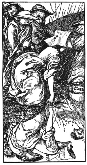
Pre-Raphaelite verisimilitude, in the manner of Hunt and Sandys, informs almost all of Woodroffe’s work; it manifests itself in the form of his intensely detailed floral borders and decorative devices, and it gives a vivid immediacy to narrative scenes such as those appearing in Shakespeare’s Songs (1898). These intricate photogravures of drawings enshrine a close observation of nature, showing the figures within minutely detailed settings in which the floral attributes have the quality of specimens, anatomized as if through a microscope. An intense reportage of the phenomenal world similarly informs the illustrations showing the life of medieval characters in The Life of St Francis (1899). The illustration of St Francis taming the wild turtle-doves (facing p. 72) is a prime example of this type of realism, depicting the buds on the branches and even the nail-heads in the wooden balustrade; and so is the image of the roving pedlar in the Songs (facing, p.40), whose box of wares is obsessively catalogued. These designs recall the registration of details in Hunt’s Lady Godiva in Tennyson’s Poems and articulate the same sacramental view of physical matter.

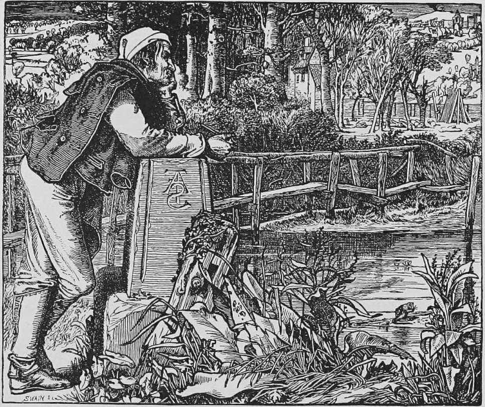
Left: Woodroffe’s Wild Turtle-doves. Right: Frederick Sandys’s The Old Chartist.
Woodroffe generally exploits the Rossettian language of idealised love and abstracted beauty. In Sigh no more in the Songs (facing p. 20), a yearning maiden in imitation of Rossetti’s physical type is engaged in a characteristically Pre-Raphaelite reverie. The hair-style, accentuated jaw-line and fleshly extended throat are clearly modelled on images such as Rossetti’s St Cecilia in the Moxon Tennyson. The replication of physical type and ambience is completed by the another figure playing a lute and positioned within a narrow niche. As in so many of Rossetti’s paintings and illustrations, the atmosphere is sensual and super-refined, a moment of contemplation evoked by music.

Left: Woodroffe’s Sigh No More. Right: Dante Gabriel Rossetti’s The Old Chartist.
Working in a style which combines verisimilitude and romanticism, Woodroffe was essentially a third generation Pre-Raphaelite who projected the art of Rossetti, Holman-Hunt and Sandys into the nineties. In this sense he is very much a part of the Arts and Crafts movement. On the other hand, his decorative arabesques and flexible line are the product of British Art-Nouveau. His title page for the Songs is entirely of its time and bears comparison with the fluid patterns of Heywood Sumner, Arthur Gaskin and those of his friend and mentor, Laurence Housman. His influence is pronounced in Woodroffe’s congested designs for Aucassin and Nicolette (1902), a parallel with Housman’s Goblin Market (1893). The same is true of Woodroffe’s illustrations for The Little Flowers of St Benet (1901).

Left: Woodroffe’s The Descent from the Tower. Right: Laurence Housman’s Frontispiece to The Sensitive Plant.
Housman’s influence was equally pronounced, it can be argued, in helping to formulate Woodroffe’s emphasis on visual interpretation. He may have introduced Woodroffe to Pre-Raphaelite illustration, and he might have suggested visual strategies in which the artist, following in the footsteps of Rossetti, presents his own, idiosyncratic interpretations of the text, rather than providing a paratext. In his celebrated introduction to his collection of engravings by A. B. Houghton (1896), Housman notes how Pre-Raphaelite illustration is purely a matter of ‘personal and intellectual readings’ rather than ‘echoes’ of the writing, positing an ‘allegoric art’ (pp. 13–15) which articulates the artist’s search for meanings in the text. The same could be said of his approach to book-art and the same, crucially, of Woodroffe’s.
Left: Woodroffe’s The Battle of the Mushrooms. Right: Laurence Housman’s Goblin Market.
Indeed, Woodroffe’s illustrations are always interpretive, and it is in this domain that he finds a space for his own, unmistakeable approach. Imaginative and quirky, his visualizations are both powerful and surprising. His colour-plates for The Tempest, published in 1908, are unusual treatments of the characters and their situations. For example, Ariel is shown not as a prisoner of his tree but a resident at one with nature; Prospero, the artist suggests, has misread the situation, so opening a field of new possibilities in the reader/viewer’s mind. The same inventive and thought-provoking approach, adding layers of meaning to the visualized texts, can be found in many of his books after the turn of the century. But this tendency is in place from his earliest productions. The works of the nineties are exercises in visual analysis and in each case the artist finds a means of extending the words.

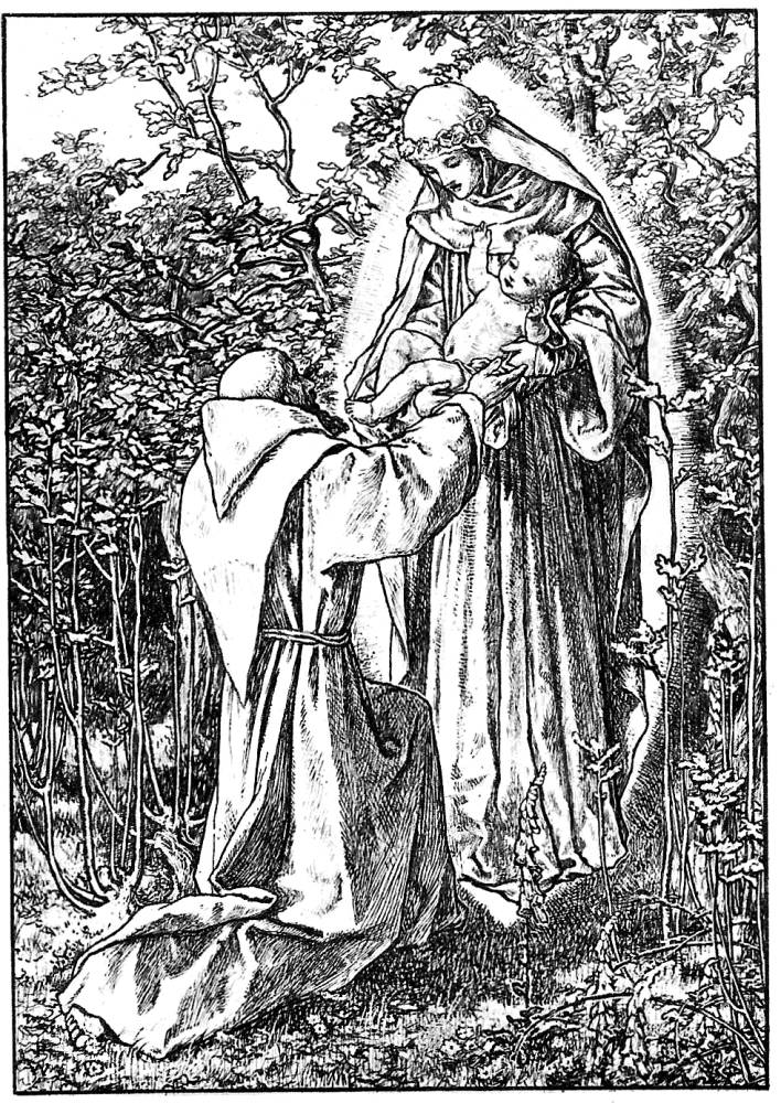
Tow illustrations from Woodroffe’s Little Flowers of Saint Francis: Left: [The Vision of ] St. Fracis. Right: The Blessed Virgin Mary.
In The Little Flowers of Saint Francis he deploys the microscopic detail to suggest the saint’s spiritual validation of the physical world, infusing everything with spiritual significance. In the four illustrations for The Little Flowers of St Benet, on the other hand, the congested, angular scenes convey a sense of spiritual struggle.


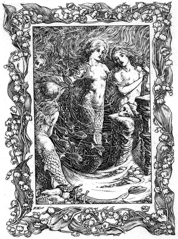
Three of Woodroffe’s illustrations of somgs from Shakspeare's plays: Left: Blow, blow, thou winter wind. Middle: When icicles hang by the wall. Right: Full fathom five.
Perhaps his most inventive illustrations are those in the Songs from the Plays of Shakespeare’s. These designs convey the tenor of the songs, imagining their mixture of the ethereal and the mundane in a series of distinctive images. When icicles hang by the wall shows the English winter in chilly detail (facing p.58). Dick the shepherd ‘blows his nail’ in accordance with the rhyme, but the artist does not represent the other domestic events; instead, he positions his character against a trio of bare pollarded trees, using their stark and angular branches to suggest the physical, almost painful impact of the cold. The sparse border of rose-hips and thorny stems completes the idea of the penury of winter. This imagery also informs Blow, blow, thou winter wind, another reminder of the frigidity of the winter landscape, although the lines noting that ‘life is most jolly’ is suggested by the figure’s playing of a primitive pipe – another type of blowing which raises the spirits and countermands the wind’s physical affect (facing p. 52). In Full fathom five, by contrast, the emphasis is on the exotic, matching and extending Shakespeare’s dreamy verse with an image of multiple implications. The poet’s transformation of death into something ‘rich and strange’ is visualized in the form of mermaids (‘sea nymphs’) contemplating Alonso’s skull; this funereal detail apart, the artist presents a congested field of nature’s plenty. The nymphs’ torsos are treated as eroticised, the source of life, and fish and vegetation crowd the scene. All are caught up in a dynamic rhythm that animates the figures’ Pre-Raphaelite hair and the currents of the water swirling around them. The notion of life transcending death, suggesting a sort of pantheistic absorption into the generative forces of nature, is completed by the border, which shows writhing stems and flowers. Converted into Woodroffe’s own terms, it reinforces Shakespeare’s emphasis on transformation and energy, of life continuing in another form (facing p.64).
Unpredictable in their approach, these designs exemplify Woodroffe’s intelligent approach to his literary sources. He preserves the writer’s intention but usually finds novel solutions to the question of showing. Though not always original in his deployment of pre-existing styles, he is consistently original as an illustrator of the written word; usually condemned as a ‘second hand’ artist (Taylor p.112) whose work was imitative, Woodroffe’s best illustrations have integrity and purpose, the work of a capable interpreter. Hodnett can only describe his work as ‘derivative’ (p.122), but it is much richer and stranger than he, and many other critics, have allowed.
Related material
Acknowledgement
I am indebted to Mr David Knight (Archivist of Stonyhurst College.), who provided me with important information from the school archive.
Works cited and sources of information
Primary sources and key works of the nineties and the turn of the century.
Aucassin and Nicolette. Translated by Laurence Housman, with drawings and a binding designed by Paul Woodroffe and engraved on wood by Clemence Housman. London: John Murray, 1902.
Austen, Jane. Pride and Prejudice. Illustrations and cover design by Hugh Thomson. London: Allen, 1904.
‘Israfel’ [Gertrude Hammond]. Ivory, Apes and Peacocks. Binding designed by Woodroffe. London: Unicorn Press, 1899.
The Little Flowers of Saint Benet. Illustrations and binding by Woodroffe. London: Kegan Paul, 1901.
The Little Flowers of Saint Francis of Assisi. Illustrations and binding by Woodroffe. London & Leamington: The Art and Book Company, 1899.
The Pageant. Binding designed by Woodroffe used for some issues of 1897; others designed by Charles Ricketts. London: Henry, 1897.
The Quarto. Vols. 1–4. Binding designed by Woodroffe. London: Virtue, 1896–8.
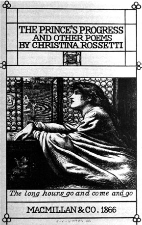
Rossetti, Christina. Goblin Market. Illustrations and cover designed by Laurence Housman. London: Macmillan, 1893.
Shakespeare, William. The Tempest. Illustrations and binding by Woodroffe. London: Chapman & Hall, 1908.
Songs from the Plays of Shakespeare. Illustrated by Woodroffe. London: Dent, 1898.
Tennyson, Alfred. Poems(‘Moxon Tennyson’). London: Moxon, 1857.
Ye Booke of Nursery Rhymes. Set to music by Joseph Moorat and illustrated by Paul Woodroffe. London: Bell, 1895.
Secondary material
Ancestry.co.ukWebsite. 22 May 2016.Cormack, Peter. Paul Woodroffe. London: William Morris Gallery, 1982.
Engen, Rodney. Laurence Housman. Stroud: The Catalpa Press, 1983.
Haslam, Malcolm. Arts and Crafts Book Covers. Shepton Beauchamp: Richard Dennis, 2012.
Hodnett, Edward. Five Centuries of English Book Illustration. Aldershot: Scolar, 1988.
Horne, Alan. The Dictionary of 20th Century British Book Illustrators. 1978; rev. ed. Woodbridge: Antique Collectors’ Club, 1995.
Houfe, Simon. The Dictionary of 19th Century British Book Illustrators. 1978; rev. ed. Woodbridge: Antique Collectors’ Club, 1996.
Housman, Laurence. Arthur Boyd Houghton. London: Kegan Paul, 1896.
Housman, Laurence. The Unexpected Years. London: Jonathan Cape, 1937.
McCarthy, Fiona. The Simple Life: C. R. Ashbee in the Cotswolds. London: Lund Humphries, 1981.
Paul Woodroffe: In Memoriam.’The Stonyhurst Magazine.No. 393 (July –December, 1954): 436–7.
Taylor, John Russell. The Art Nouveau Book in England. 1966; rpt. Edinburgh: Harris, 1980.
Last modified 22 April 2009