
ictorian bindings for the general public underwent a series of stylistic changes which ranged from the plain cloth of the 1830s and 40s to the gilt extravaganzas of the 1860s and the Art Nouveau covers of the 1890s. These ‘trade’ liveries were often the work of distinguished designers, engaging the talents of figures as diverse as Dante Rossetti, Charles Ricketts, Talwin Morris, John Leighton, Robert Dudley and the creators of the mid-Victorian gift-book. However, the sheer demand for cheap publications meant that many were purely industrial products, with no obvious sign of a designer’s hand; indeed, some were cobbled together from a stock of existing elements, with free transference from one book to another with no sense of suitability or appropriateness. These tendencies were especially evident in the transitions between periods, which were further complicated by the aesthetic unevenness of stylistic change: for example, the gift books of the late 1850s prefigure the flamboyance of the sixties, sometimes timidly, while the seventies and eighties offer many debased versions of the best work of the preceding decade.
What, then, of the end of the nineteenth century, as the Victorian (1837–1901) became the Edwardian (1901–1910)? The history of trade covers from the end of the nineties to the start of the Great War has never been the subject of systematic investigation, and this period is usually regarded as a longueur. These years are interesting, nevertheless, as a transition marked by continuity, change and innovation which links the Victorian age to the 1900s and maps the movement from the aesthetics of the nineteenth century to the new shapes of the ‘modern’.
Continuities: the After-Life of British Art Nouveau
Many of the features of book covers of the 90s were carried forward into the Edwardian period. This continuity is not surprising, given that many late Victorian designers were still active. For example, Hugh Thomson (1860–1920) continued to practise the figurative style that he had first developed for the front cover of Elizabeth Gaskell’s Cranford (1891), and in order to complete the eponymous series for Macmillan offered several others in the same idiom. Embellished in gilt with scenes from the novels, these covers are delicious evocations of text: best of all are his designs for two of George Eliot’s tales, Silas Marner (1907) and Scenes of Clerical Life (1906). Intended to charm with their winsome re-imagining of a rustic past while signalling key aspects of character and setting, their lyrical appeal is a natural extension of the artist’s compositions of the previous decade.
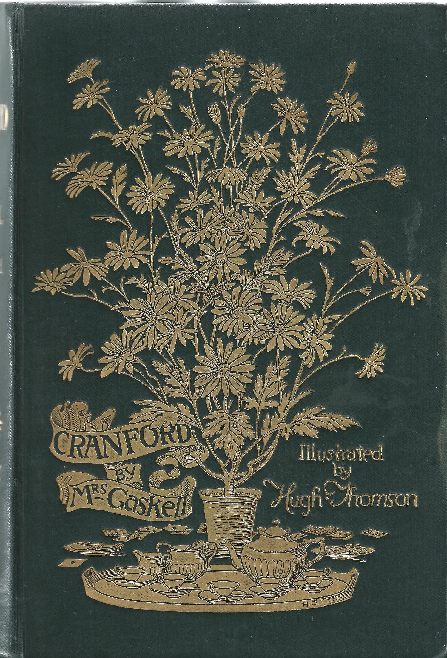
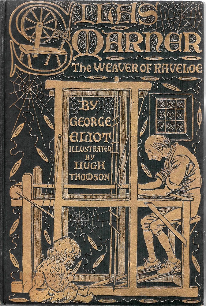

Three designs by Hugh Thomson, continuing his rustic style into the twentieth century. (a) Gaskell’s Cranford; (b) Eliot’s Silas Marner; and (c), the same author’s Scenes of Clerical Life.
Similar continuities were presented in the work of the Art Nouveau designers, Laurence Housman (1865–1959) and Paul Woodroffe (1875–1954). Both of these artists lived most of their lives in the twentieth century, and in each case their Edwardian work is on the same stylistic scale as their earlier creations. Housman’s cover for Bethlehem (1902), one of his own texts, has the same refined elegance of his design for Christina Rossetti’s Goblin Market (1893), while Woodroffe’s Stories by Poe (1908) deploys the same Art Nouveau stylization that we find in his extravagant livery for Israfel’s [Gertude Hammond]’s Ivory, Apes and Peacocks (1899). Masters of Art Nouveau, Housman and Woodroffe were unperturbed by the rise of Modernist styles and projected the idiom of the nineties well into the new century. The same is true of Talwin Morris (1865–1911), whose startling designs in the Glasgow Style were issued and re-issued into the 1920s.


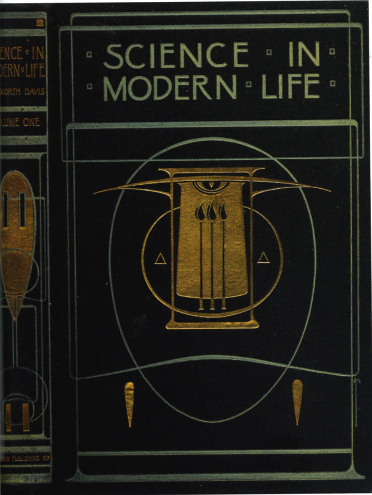
Some bindings which continue into the twentieth century the aesthetics of Art Nouveau, including (a) Housman’s design for his own text, Bethlehem; (b) Woodroffe’s Stories by Poe; and (c), Talwin Morris’s Science in Modern Life.
It was also the case that well-established Art Nouveau motifs were re-used, a process exemplified by the 1904 reissue of D. G. Rossetti’s translation of Dante’s The New Life. This book features part of the floral framework applied by the artist/writer to the covers of his influential Poems (1870); prefiguring Nouveau when it first appeared, it still had currency in the Edwardian period.

An example of an older design being re-used in the Edwardian period. Left: Rossetti’s Poems (1870); and Right: a reprint of the same author’s translation of Dante’s The New Life (1904), embellished with a section of gilt fretwork from the earlier publication. .
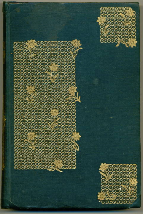
The style was more generally continued in the form of popular editions; though pioneered in the early part of the Nineties by avant-garde artists such as Charles Ricketts and Aubrey Beardsley, Art Nouveau became a commonplace, a formula that was transmitted to the medium range of books, costing a few shillings, and finally to the cheapest imprints, which sold for as little as pennies. There are there are obvious linkages, for instance, between the covers of W. D. Campbell’s Beyond the Border (1898, designed by Helen Stratton) and Alice Meynell’s The Children (1897, Charles Robinson), and the anonymous bindings, at the bottom end of the market, among them Louisa Alcott’s Little Women (1914) and Annie Swan’s The Better Part (1910). The two earlier designs are in gilt rather than colour, but the four bindings are united by their deployment of the Art Nouveau line, with its emphasis on organic flow.
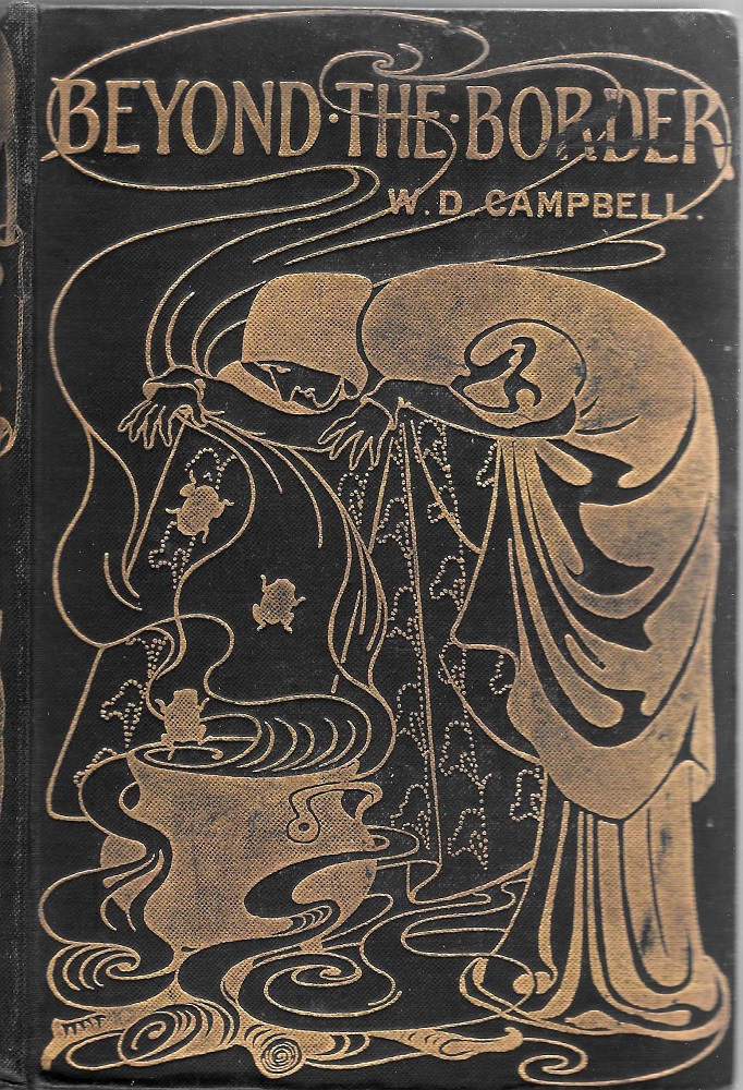
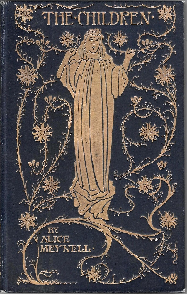
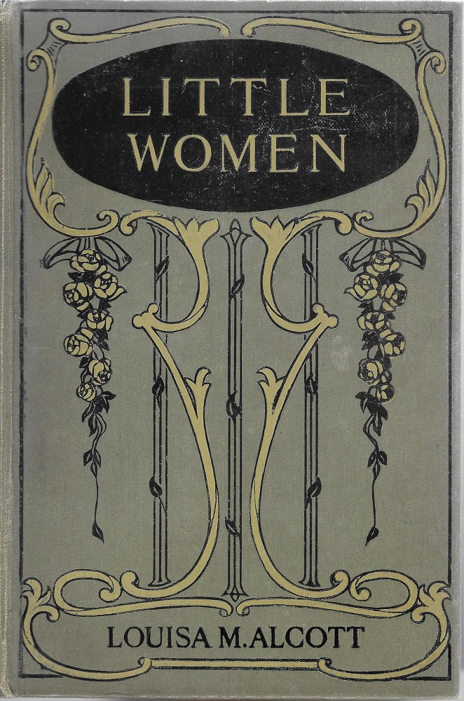
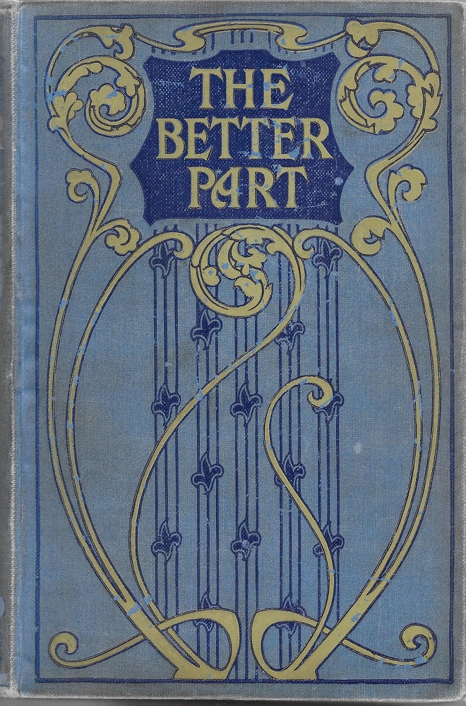
Continuities in Art Nouveau, from the nineteenth to the twentieth century. (a) Stratton’s design for Campbell’s Beyond the Border; (b) Robinson’s cover for Meynell’s The Children; (c), An anonymous binding for Alcott’s Little Women; and (d), another unsigned work for Swan’s The Better Part.
Changes: Victorian and Modern
There were, however, some developments in the Edwardian period. While some Victorian designers continued to practice Art Nouveau, others embraced a new aesthetic which was eventually codified in the twenties as Art Deco. One of those to modify his style was A. A. Turbayne (1866–1940). Well-known as one of leading exponents of Nouveau, whose extravagant gilt designs were some of the showiest and most imposing of the Nineties, in the years after the turn of the century Turbayne moves away from compositions made up of dynamic, radiating lines and replaces them with elegant patterns which were generally more static and sometimes geometrical. It is interesting, for example, to compare his work for Robert Kelly’s Burma (1905) with his front cover for Reynard the Fox (1895). The later design certainly has Art Nouveau elements, but the free flow of the earlier binding has been replaced in the work for Kelly by a careful coordination and balancing of sinuous curves, verticals and horizontals. The effect is synthetic, a feature of all of his transitional products. In Suppressed Plates (1907), especially, Turbayne assimilates the verticality and abstraction of the Glasgow Style and refigures those tendencies in forms that prefigure design of the twenties, could easily be the work of an Art Deco artist, and anticipate the bindings of Thomas Sturge Moore. A master of late Victorian design, Turbayne was also an early modernist. Charles Ricketts followed the same trajectory, producing bindings in the Edwardian years and into the twenties and thirties which bear only a peripheral relationship to his Victorian designs and are more characterized by geometry and rectangularity than abstracted nature or arabesques.

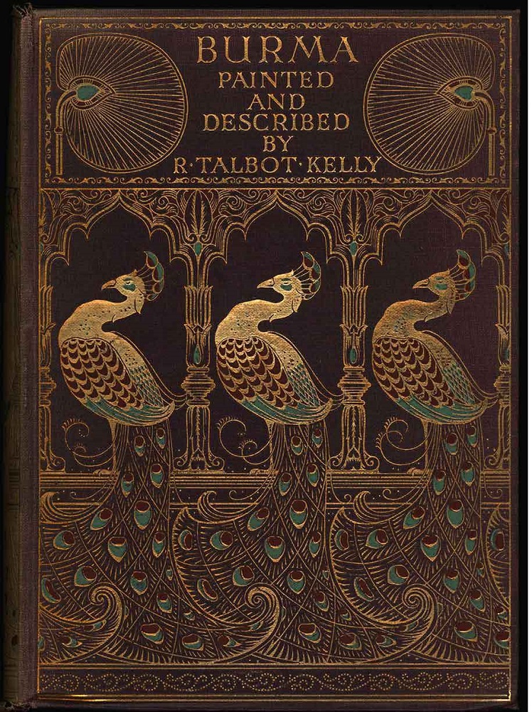

Three bindings by Turbayne, developing from pure Nouveau into a transitional style. (a) Reynard the Fox; (b) Burma; and (c), Suppressed Plates.
These designers register the impact of changes in taste. But there were other developments too, especially in the huge number of books that were cased in anonymous bindings. One of these was the increasing deployment of figurative imagery on the front board. While ‘serious’ literature was traditionally published without embellishment in plain cloth – as it had been throughout the Victorian period – it was commonplace for Edwardian books to be issued with a design printed in black ink, in other colours, and sometimes with gilt lines in echo of Victorian gift books. This practice was followed for the adult market and for juveniles, with many children’s publications presenting lively scenes from their texts; good examples are the covers for L. T. Meade’s A World of Girls, which was first issued in 1891 and reprinted in 1904, and Alfred H. Miles’s Fifty-Two Stories of Courage and Endeavour for Boys [1901].
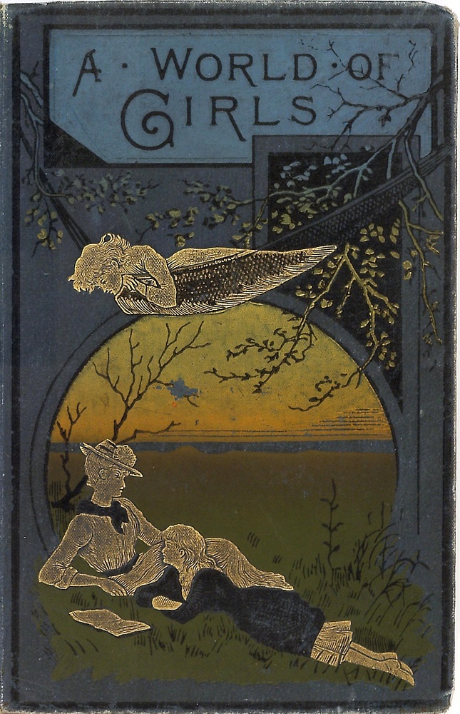

The vigorous pictorial front-covers of the Edwardian period. A World of Girls ; and Right: Fifty-Two Stories of Courage and Endeavour for Boys .
The interest in figurative design was also continued in the form of an increased use of chromolithography. Technical changes and economies of scale had meant that this sort of colour printing was cheaper and easier to produce than in previous decades, a development characteristically applied to children’s books, annuals, and novelty publications. Principally intended as a new tranche of ephemera to supply the needs of the nursery, these cheap and cheerful works were published in vast quantities and it is astonishing to find how many have survived; eliding the distinction between books and magazines and printed in a lurid palette, they enshrine a populist version of childhood, refiguring Victorian kitsch.
Nevertheless, some are genuinely charming. Child-like and direct in their appeal are the covers Beatrix Potter designed for her nursery pieces. These reproduce a colour design from their texts, notably The Tale of Peter Rabbit (1902) and The Tale of Mrs Tiggy-Winkle (1905).
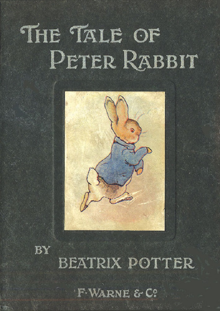
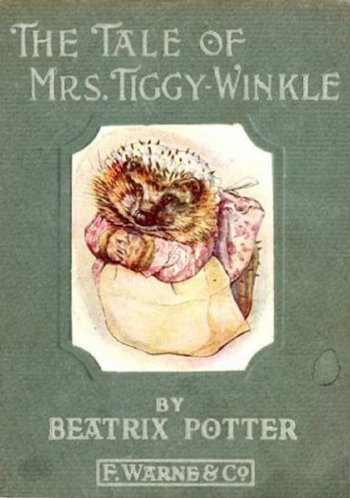
Two covers by Beatrix Potter, with a contemporary annual, (a) Peter Rabbit; (b) Mrs Tiggy Winkle, and (c) An Annual.
Edwardian book covers might thus be described as a continuation and reconfiguration of the tropes of the previous years. In part a transitional era, in which Art Nouveau was both popularized and transformed, while also developing the colour books of the previous decades, the Edwardian period was ultimately unstable, a space in which trade bindings diffused into an fragmented discourse that failed, in most cases, to live up to the dynamic inventiveness of the 1890s.
Bibliography
Alcott, Louisa M. Little Women. London: The Sunday School Union [1910].
Alighieri, Dante. The New Life. Translated by D. G. Rossetti. London: Ellis & Elvey, 1905.
Campbell, W. D. Beyond the Border. Illustrated by Helen Stratton. London: Constable, 1898.
Eliot, George. Silas Marner. London: Macmillan, 1907.
Holidays at the Farm. London: Raphael Tuck [1903].
Housman, Laurence. Bethlehem, a Nativity Play & Other Poems. London: Macmillan, 1902.
Kelly, Robert T. Burma. London: Black, 1905.
Meade, L. T. A World of Girls. London: Cassell, [1904].
Meynell, Alice. The Children. London: John Lane, 1897.
Miles, Alfred H. Fifty-two Stories of Courage and Endeavour for Boys. London: Hutchinson, [1901].
Poe, A. E. Stories by Edgar Allan Poe. London: Jack, 1908.
Potter, Beatrix. The Tale of Mrs Tiggy-Winkle. London: Warne [1905].
Potter, Beatrix. The Tale of Peter Rabbit. London: Warne [1902].
Rossetti, Dante Gabriel. Poems. London: Ellis & Elvey, 1870.
Swan, Annie S. The Better Part. London: Partridge [1910].
Created 14 May 2022