
he application of good or appropriate design to manufactured goods was a topic brought into national prominence by the Great Exhibition of 1851. It was a huge success, with over six million visitors attending between May and October. The enormous catalogues of the Exhibition, and the Reports from the Juries of the Great Exhibition published in 1852, stimulated the production of many compendiums of design. Owen Jones was a leading figure in the 1850s, designing the Alhambra and Egyptian Courts for the Sydenham Palace, opened in 1854. Artists and Illustrators had access to John Leighton’s Suggestions in Design (Bogue, 1853) and Jones’s Grammar of Ornament (Day & Son, 1856). Through these works, they had the designs of centuries past laid out before them. They could pick out motifs or designs or patterns, and apply these to any object, including books and book covers.
Desire was stimulated for goods to display in the home. Publishers realised that a large new market existed for the sale of books, with the understanding that ‘good’ design concepts of all past ages could be applied to production. Profit minded entrepreneurs – among them George Routledge, Thomas Nelson, Adam and Charles Black, Richard Bentley, Longman, John Murray, George Smith of Smith Elder, John Cassell, William Bradbury of Bradbury and Evans, James Hogg and Alexander Strahan – sought new opportunities to sell books and magazines. Books, pamphlets and magazines on all subjects, priced from one penny up to a guinea, were published in large numbers.
Naturally enough, the designs on the covers of these books became the focus of intense efforts, for the designs were seen to be crucial to successful sales. For those books priced between 7/6 and one guinea (21s.), elaborate designs could be commissioned. The medium of book cloth was integral to the production, with dyed material in impressive, vivid colours and multiple types of graining being available by the 1840s. For books in this price range, blocking of designs in gold, or in gold and in black ink, were most favoured, as these caught the eye of purchasers. Artists who were particularly sought to create designs for covers were John Leighton, William Harry Rogers, Robert Dudley, John Sliegh, Albert Henry Warren, and William Ralston. Case studies illustrate the richness and diversity of book cover design for the period 1850–1880.
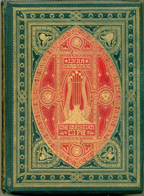


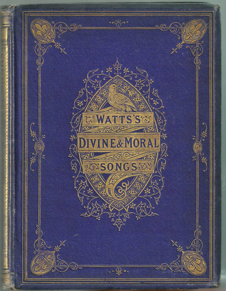
Some representative ‘trade’ bindings of the period by the leading designers. Left to right: (a) John Leighton’s binding for Lyra Germanica (1868); (b) Cloth binding by W. R. Rogers for Two Centuries of Song (1867); (c) Robert Dudley’sFavourite English Poems (1862); (d) John Sleigh’s design ofLongfellow’s Poetical Works (1857); (e) A. H. Warren’s livery for Watts’s Divine and Moral Songs (1866). These books exemplify the extravagant, over-worked, and (some some) vulgar imprints of the age.
Case Study 1: Richard Barham, The Ingoldsby Legends
Richard Bentley had great success with his editions of these comical and supernatural verse tales. His publication of a ‘complete edition’ dates back at least to 1840, with thirty-two further editions/issues of the work being made between 1840 and 1901. This ‘complete edition’ was liberally illustrated by three prominent artists of the day – John Gilbert, George Cruikshank, and John Leech. The engravings were executed by the Dalziel Brothers, and John Leighton was commissioned to make the cover design for the issue of 1864. The covers are blocked identically with floral border patterns, with pseudo-heraldic medallions surrounding the central oval panel. Leighton’s initials are cunningly inserted just below the title words.
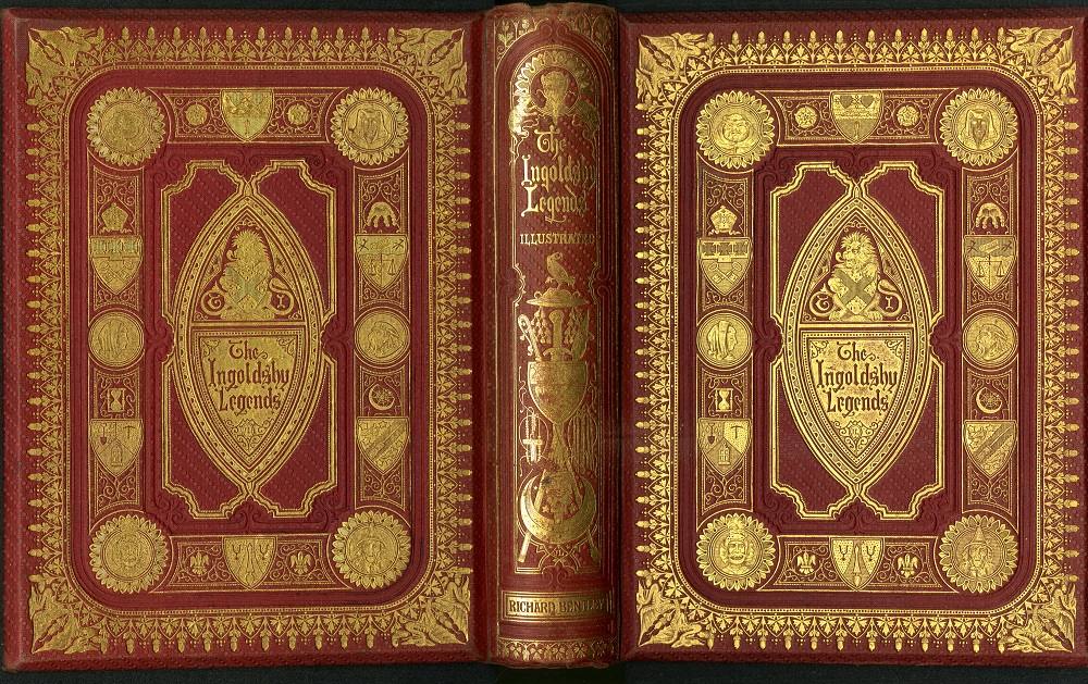
John Leighton’s luxurious cloth binding, in red diagonal beaded red cloth, for Barham’s The Ingoldsby Legends (1864).
This was a ‘guinea book’, advertised in the Dublin Evening Mail in December 1863 as ‘…4to, with magnificent emblematic cover, 21s [cloth], or in morocco extra, 31s 6d. For Christmas there could not be found a more pleasant book’ (1). And on 27 June 1864, The Globe printed Bentley’s advertisement, which included Leighton’s name as the cover designer: ‘Fifth Thousand, In magnificent emblematic cover, designed John Leighton, F.S.A., price 21s.; in morocco extra 36s’ (1). The wide border frame includes gryphons blocked on each border; the fantastical theme, which reflects the book’s contents, is continued with figures blocked in each of the medallions.
The most striking aspect of this book is the number of issues. Seven have been recorded to date, published between 1864 and 1874. All have Leighton’s cover design, and all were printed by Richard Clay. It is likely that the bookbinder Burn bound all of them as their ticket is on three of the issues; all have the same text and illustrations. However, there is variation in the cloth dye colour and grain texture. It is a matter of conjecture whether these differences were deliberate, or simply a matter of the binder having to use new rolls of cloth to bind new copies of the work. p>
Case Study 2: Defoe Robinson Crusoe
Defoe’s Robinson Crusoe was an enormously popular work. For the combined texts of Parts I and 2, the British Library catalogue cites thirty editions/issues published by sixteen publishers, dated 1846–1882. Each publisher endeavoured to have illustrations by a well-known artist, to both differentiate it from the others, and to boost sales. Leighton made different designs for A. & C. Black, and for Knight & Son. He also made at least two designs for Routledge editions of 1864, demonstrating his powers of imagination. The Macmillan edition of 1866 eschewed the gilt decoration and elaborated designs commissioned by other publishers. In the list of publisher’s titles bound at the end, this work is described as a ‘Beautiful Illustrated Edition [with fine type and paper, cloth gilt, choice Artistic plates by [Charles] Keene, 3s., pub. 4s. 6d.’ The non-figurative design on the cover uses commonly used motifs of curling stems and leaves.
Four issues of Crusoe were published by Routledge in 1864, with the cover design by Leighton, in pebble grain cloth in a variety of colours from green to red. Within, there are one hundred illustrations after John Dawson Watson and engraved by Dalziel Brothers; the book was priced at a guinea. Leighton's treatment of the nautical theme is prominent, with a ‘wave’ pattern on the outer border and scallops to the sides, head and the tail. The three-masted ship with full sails, is placed on the centre, with the busts of Crusoe and Friday above and below the ship.
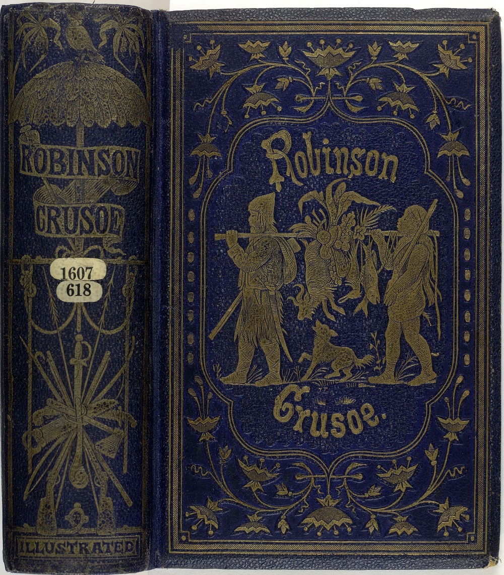

Two dissimilar cloth bindings by John Leighton for Defoe’s Robinson Crusoe (1864). Left: an illustrative design (described below) and Right: a more elaborated composition, combining figurative, emblematic and decorative elements from a later issue of the edition of 1864 (described above).
Routledge also published in 1864 a version with blue pebble grain cloth. This has illustrations by Phiz [Hablôt Knight Browne]. Both the design on the upper cover and the spine design are signed with Leighton’s initials. On the upper cover, he creates a hunting scene for this quarto volume, depicting the hero and Man Friday, carrying game slung on a pole. Other versions of Crusoe include an edition published by Knight & Son, [1864]. This volume is bound in green hexagon grain cloth and illustrated in oil colours by Kronheim. The cover and spine were designed by Leighton, this time showing the view of the stern of the sailing ship.
Case Study Three: Guinea Books as Gifts
From the evidence of surviving copies, a market must have existed for the sale of guinea books. The publisher could afford to commission illustrations from the most sought after artists of the day, and also order a cover design, which would have been cut into brass dies for blocking onto boards covered in cloth. Brightly coloured and grained cloth, bevelled boards, gilt edges, numerous wood-engraved illustrations within the text, and ‘all over’ blocking of covers and spine, with significant amounts of gilt decorations, were the elements of this product. As the profit on sales of these books was likely to be good, many different publishers created and published such works. The following sections present some of the most characteristic books of the period.
The publishers A. & C. Black exploited the popularity of Walter Scott, issuing books of his poetry, lavishly illustrated. An example is The Lord of the Isles, 1857, ‘Illustrated by numerous engravings on wood from drawings by Birket Foster and John Gilbert.’ Copies were printed by R. & R. Clark in Edinburgh, and were bound by Leighton, Son & Hodge in London (hereafter noted as ‘LH’). Some copies were bound in red morocco vertical-grain cloth, and others in bright green and blue. The cover design is again attributed to Leighton.

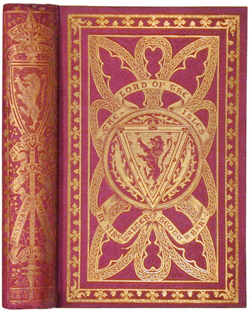

Three copies Sir Walter Scott’s The Lord of the Isles (1857), in green, red, and blue; it was also issued in sand brown, and may have been in other colours too. The emphasis on varying colours exemplifies the ingenious ways in which Victorian publishers packaged and re-packaged their products, aiming to appeal to diverse tastes in an endless display of novelty.
Biblical texts were also attractive to purchasers. James Nisbet issued The Book of Job in 1857. John Gilbert provided all of the illustrations, many of them within the text (LH). The blue morocco vertical grain cloth has borders and the centre-piece of each cover lavishly decorated, in ‘oriental’ motifs. The work was published in time for gift books sales at Christmas 1856.
Longfellow’s poetry was hugely popular in this period. George Housman’s illustrations for The Song of Hiawatha were engraved by his brother William Luson Thomas, and Horace Harral. The book was published in 1860 by W. Kent in blue morocco vertical grain cloth, with covers designed by Robert Dudley. The illustration on page 47 is typical of the idealised posture of a fictional hero, as is the standing figure within the central oval of each cover. Each cover features ten medallions, which draw the eye into the central oval.
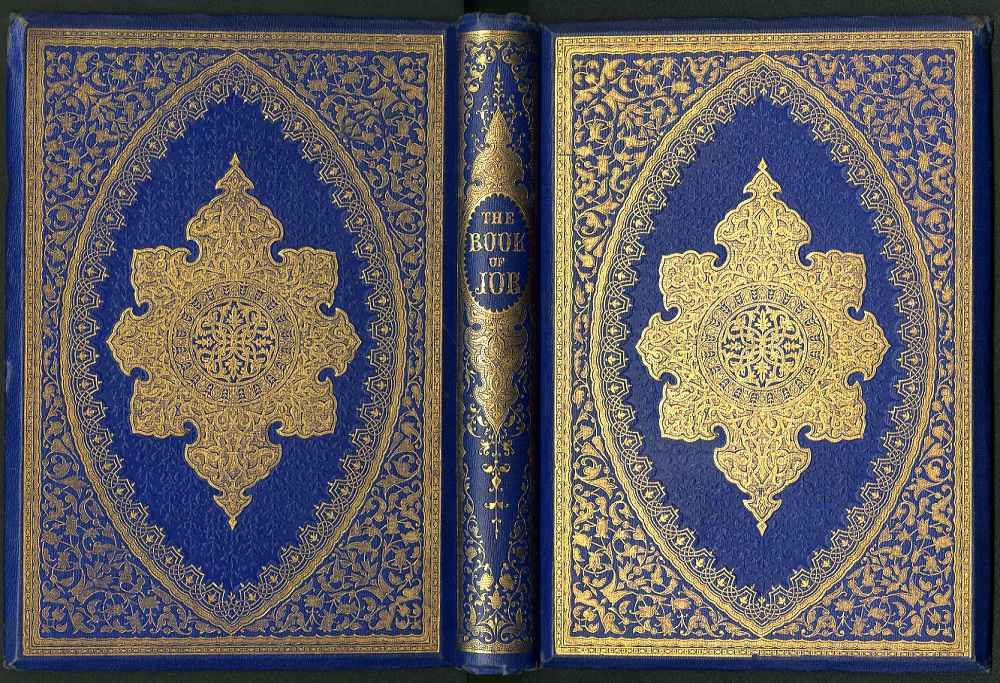
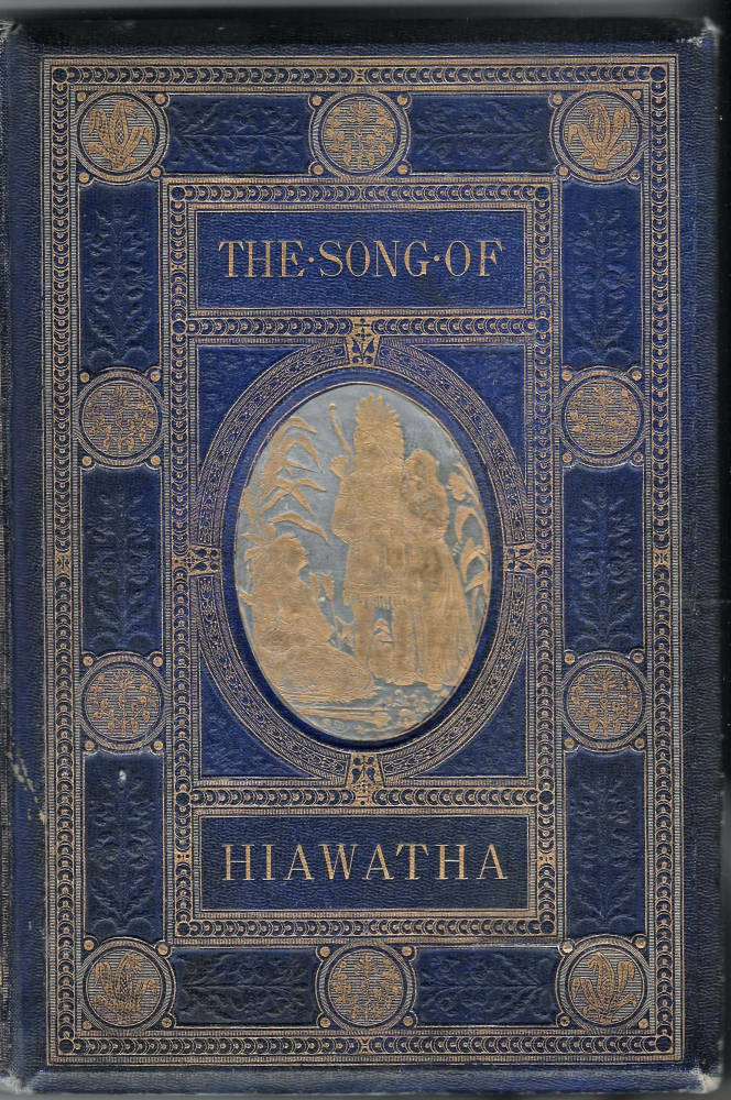
Left: a magnificent cover for The Book of Job (1857); Right: Robert Dudley’s evocative binding for Longfellow’s The Song of Hiawatha
A Dalziel Fine Art Gift Book, seven artists provided illustrations to James Montgomery’s Poems, published by Routledge in 1860, blue morocco vertical grain cloth (LH). The design has elements of the ‘oriental’, with dense plant patterns on each corner. It was quite common for the lettering of the author and title, on the covers and on the spine, to be picked out in relief.
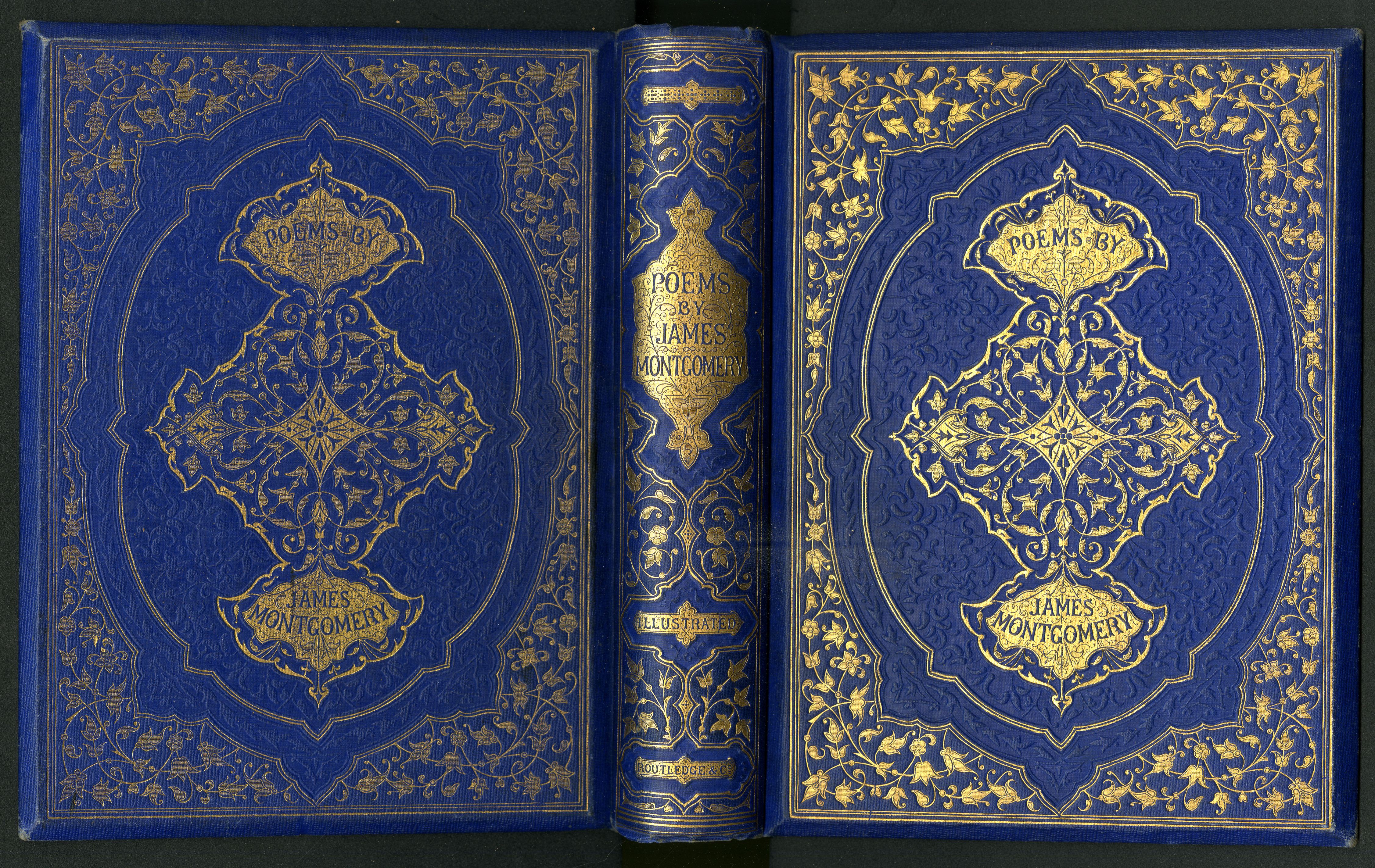
Another magnificent cover, this time for James Montgomery’s Poems (1860).
Published by Routledge in 1860, seven artists were employed to create the illustrations to Thomas Moore’s Lallah Rookh. The cover design by Albert Warren has strap-work across both covers and the spine, interspersed with dense filigree decoration in gold and bound in blue morocco vertical-grain cloth (LH).
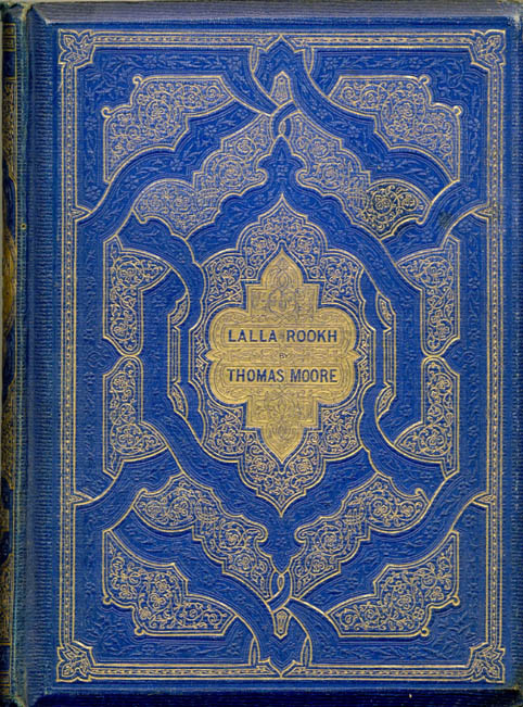
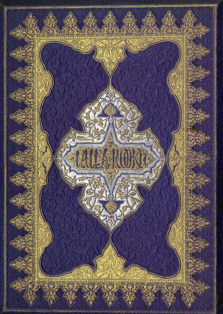
Two versions of Lallah Rookh. Left: Routledge’s version with a cover designed by Warren (1860); and Right: the version published by Longman’s in 1861, probably designed by Thomas Sulman, who provided the ornamental pages.
The publisher Longman issued its own edition of Lallah Rookh in 1861. John Tenniel provided all the illustrations, engraved by the Dalziel Brothers, and listed by them as a ‘Fine Art Gift Book.’ Thomas Sulman Jun. created five ornamental pages of Persian design, the half title page being coloured. This page and the cover design echo each other, in the use stylised ‘floral’ border decoration and ‘oriental’ lettering for the title, and bound in purple coarse pebble grain cloth (LH).
Tom Taylor’sBirket Foster’s Pictures of English Landscape.(Engraved by the Brothers Dalziel.) With Pictures in Words by Tom Taylor, was published in 1863. There are thirty plates, each accompanied by an unnumbered page of verse, printed on the recto only. The Preface states: ‘Birket Foster’s drawings were made quite independently of the verses I have attempted to set to them. I am therefore more free to express, in the first place, my admiration of the singular grace, fertility and facility of invention, felicitous arrangement of line, and harmonious distribution of light and shadow, which distinguish the compositions of this charming artist.’ This book has a gutta-percha binding. Designed by Owen Jones, it has gilt edges, bevelled boards and is bound in green coarse pebble-grain cloth.


Two more elaborate covers for poetry of the period. Left: Owen Jones’s rustic ornamental pattern for the front cover of Tom Taylor’s Pictures of English Landscape (1863); Right: Arthur Hughes’s emblematic design to accompany Enoch Arden (1866).
Alfred Tennyson’s Enoch Arden was published by Edward Moxon in 1866. The cover design as well as the illustrations are by the artist Arthur Hughes, who was associated with the Pre-Raphaelite Brotherhood, and designed several other bindings for the trade. Hughes created a lattice motif with the anchor and chains alluding to the seafaring tale in the poem. Copies were bound in brown honeycomb-grain cloth, as well as in blue and green.
Routledge published in 1867 Robert Buchanan’s Wayside poesies: Original Poems of the Country Life with illustration by George Pinwell, J.W. North and Frederick Walker. Engraved by the Brothers Dalziel, the text and illustrations are printed on the recto of each page. Embellished with a cover design by Albert Henry Warren, it was priced at one guinea.

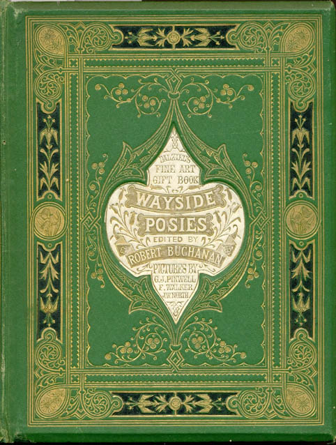
Left: Warren’s rustic design for Wayside Posies (1867); Right: The unsigned binding for Buchanan’s North Coast (1868), probably by Leighton. The cover gives a lift to the author’s lugubrious poems.
In 1868, Routledge published Buchanan’s North Coast and Other Poems, with illustrations by William Small, A. B. Houghton and others. The frontispiece illustration is by Small. This was another Dalziel Fine Art Gift Book, bound in red sand grain cloth bound (probably JL). A striking ‘all over’ design, it makes use of intertwined ‘Celtic’ patterns in the manner of an illuminated manuscript, with green onlays on the covers and on the spine.
Case study 4: William Mackenzie and Other Magazine Publishers
Paper covers and cloth editions issued for single works
With offices in Paternoster Row, London, and in Howard Street, Glasgow, the publisher William Mackenzie adopted the model of publishing works in multiple parts with paper covers; all of the texts of each part and the illustrations were subsequently grouped together and bound in cloth volumes. Such a method covered two markets: at two shillings (possibly less) per part, those less well-off could purchase a part while the more affluent could afford the cloth bound volumes. This marketing/ production formula was continued for over thirty years, and other publishers adopted the same practice. Leighton was regularly employed to provide cover designs, both for the paper wrappers of each part, and also for the cloth bindings.
An early example of this publishing practice was The National Encyclopædia: a Dictionary of Universal Knowledge by Writers of Eminence in Literature, Science, and Art, 1867–1868. The paper cover design is after Leighton. The upper and lower covers for each part are bound into the thirteen volumes using lightgreen paper, printed in black. On the upper cover of each part is the same design by Leighton, with the engraving being carried out by his brother, Henry Leighton.
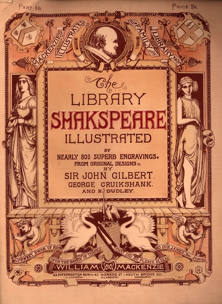
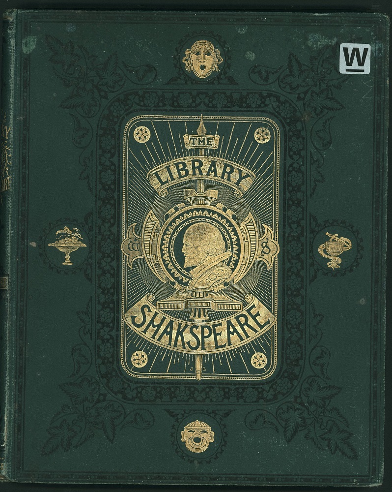
The serialized and book versions of The Library Shakespeare (1873–75).
The ‘Library Shakespeare’ was also issued by Mackenzie, 1873–1875. As in earlier years, the publisher sought well known artists to provide illustrations, in this instance Gilbert, Cruikshank, and Dudley. The cloth bound volumes all have green sand-grain cloth and the five volumes are blocked identically in blind on the lower covers and in gold and in black on the upper covers. Leighton provided designs both for the paper and the cloth bindings. The upper cloth cover features a bust of the bard in profile.
In 1882, the year after Benjamin Disraeli’s death, Mackenzie published The Right Hon. Benjamin Disraeli, Earl of Beaconsfield, K.G., and His Times, by Alexander Ewald. 5 vols. Originally issued, according to the full page Prospectus, in Five Divisions, bound in cloth, bevelled boards, gilt edges, price 8/6d each; or in fifteen parts (with paper covers), price 2/- each, containing 80 pages of letterpress and two plate illustrations. The cloth volumes have blue pebble-grain cloth, with an oval in the centre. An Earl’s coronet is blocked in gold and in black above the motif and in the very centre the Beaconsfield coat of arms is blocked. At the base of the oval, is a block of St. George on a horse, spearing a dragon is blocked in gold. Leighton’s signature, a single capital ‘L’ is at the base of the oval, in black.
The paper covers have heraldic motifs, together with prominent incidents of Disraeli’s life highlighted, for example ‘Suez Canal’ and ‘Treaty of Berlin 1878.’ It is signed at the base of the left hand side rectangle, ‘John Leighton F.S.A.,’ and also signed ‘JL’ as small separate letters near the head of the paper cover, in the orb underneath the small cross. In their different ways, the designs of both sets of covers emphasise Disraeli’s ennoblement.
Two years later, in 1884, Ewald was the author of Leaders of the Senate: a Biographical History of the Rise and Development of the British Constitution. The designs for the paper covers is not signed. Stylistically, it is of John Leighton. The upper cover has the signature ‘JL’ blocked just beneath the open book. The medallions of England, Ireland, Scotland and Wales emphasise the symbolism of the Union of the United Kingdom.
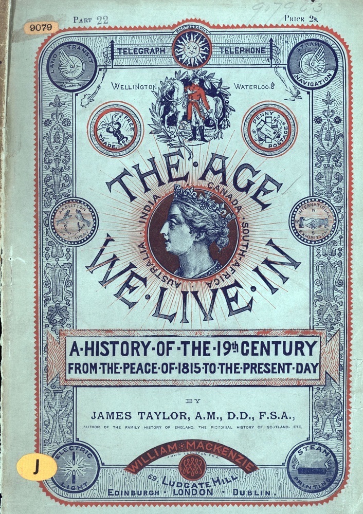
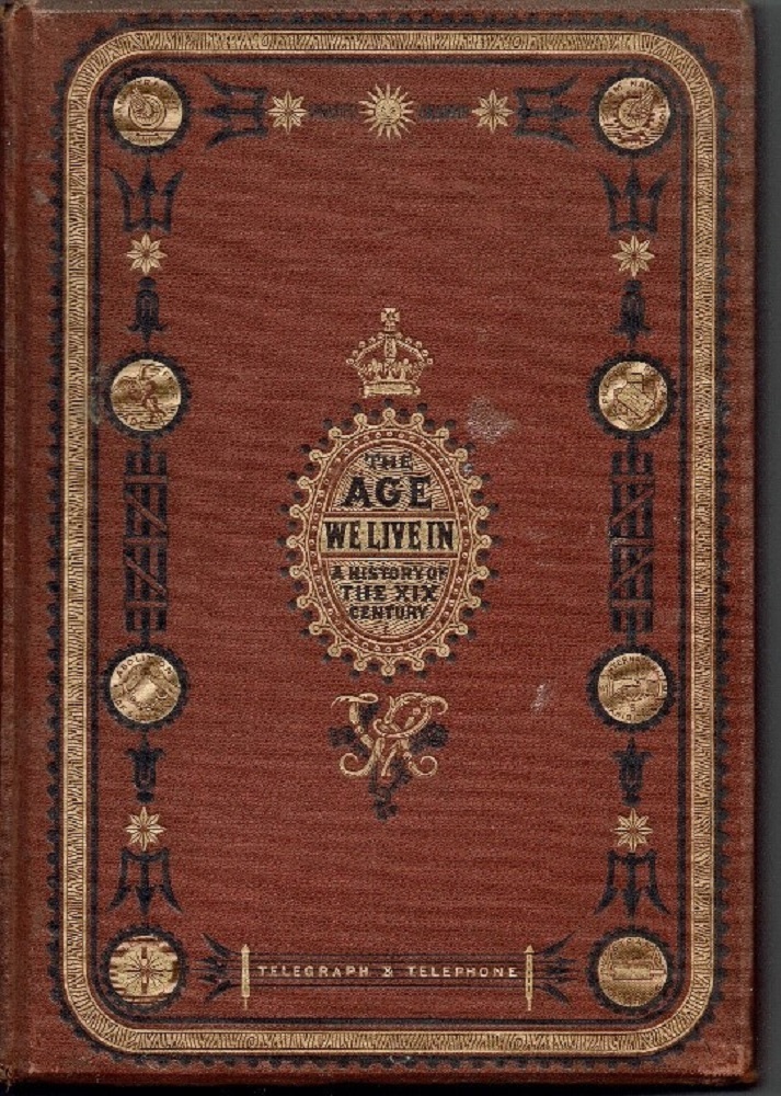
The serialized (left) and book versions (right) of The The Age We Live In [1884]
Leighton is again the cover designer for James Taylor’s The Age we Live in: a History of the Nineteenth Century, from the Peace of 1815 to the Present Time [1884]. The paper cover is after Leighton and has the central figure of Victoria, with the sun’s rays shining from her. The resplendent figure of the Duke of Wellington and his horse Copenhagen are printed top centre. The eight medallions detailing the progress of science and technology on the paper copy are reproduced for the paper and the cloth copies. Looking at the cloth copies, the placement of the medallions, together with the overall gold and black decoration works well against the light brown of the sand grain cloth.
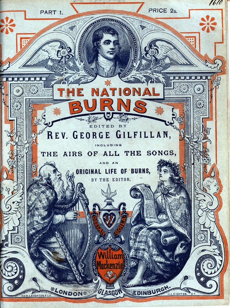
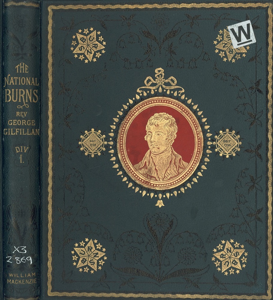
The part-issue and book versions of The National Burns, 1879 –80.
A compendium of Robert Burns’s works, The National Burns, was issued by Mackenzie in 1879–1880. The paper covers are blue. The inks used for the upper cover recto are blue and red for part 1 and blue and yellow for part 15. The design for the paper covers is of monumental baroque, containing a bust of Burns at the top flanked by a broken pediment. Underneath the title are a bard, holding a harp, and a young lady in a cloak, seated, holding a scroll, showing music. Signed ‘John Leighton F.S.A.’ and ‘H. Leighton [ i. e. Henry Leighton] Sc. ’ at the tail. On the upper cover of Div. I, four stars of ‘Burns’ are in gold on each corner, with a bust of the national poet within the central red onlay. There is a specimen book in the National Library of Scotland which shows that subscribers were sought by salesmen, to buy either copies in parts or in bound volumes
.In the 1880s, nearly twenty years after issuing The National Cyclopaedia Mackenzie continued to work with the same publication formats of paper wrappers for each part, and cloth bindings for the cumulated parts. Sales must have been good, with no need to change a successful method for securing dual sales for each publication.
Magazines Issued as Multi-Part Works
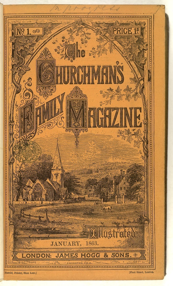
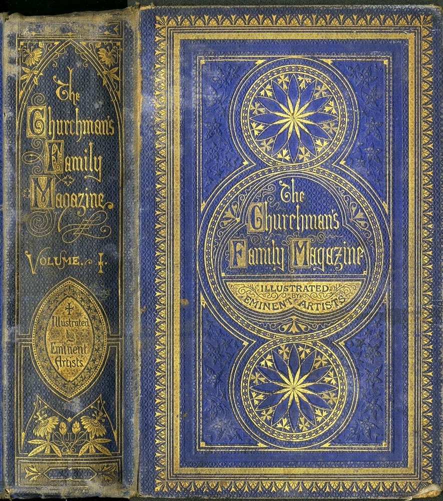
However, Mackenzie’s publishing practice of dual issue of the text and illustrations were not done in isolation. It was commonplace for magazine publishers in this period to issue each weekly, fortnightly or monthly parts in paper wrappers, with cumulative volumes of the parts being bound in cloth, for sale near or at the end of a calendar year, or early in the year after. An example of this was The Churchman's Family Magazine. Started by James Hogg in 1863, plenty of well-known artists were commissioned to provide illustrations. Each issue was in paper covers, price 1/- with an upper cover design by Leighton, showing an idyllic rural scene, with a church in the middle distance. His design for the cloth bound volume was on blue honeycomb-grain cloth, with prominent rule frame borders and a pattern of three circles on each cover and an oval/ mandorla blocked on the lower half of the spine.
The lower covers are blocked in blind, with a rule frame formed by several fillets and three circles within it. On the upper cover, there is a border pattern of leaves and spade shapes. Then three fillets are blocked in gold on the borders. The design blocked within the borders shows an identical circle at the head and the tail. Each circle is made up of petals, with leaves and hatched crosses blocked between each petal. The two circles have two fillets blocked in gold on their borders, with repeating dots in blind. These fillets form a figure of eight, linking the top and bottom circle, and forming a circle on the centre. The central circle contains a trefoil, with two fillets on its borders. The title: ‘The Churchman's Family Magazine’ is blocked in gold in Gothic lettering. The capitals ‘C’, ‘F’ and ‘M’ are blocked in relief within rectangular horizontal hatch gold lettering-pieces. At the base of the trefoil, a gold lettering-piece is blocked, with the words: ‘/ Illustrated / by/ Eminent Artists’ blocked in relief inside.
The spine is blocked in gold and relief. A single fillet is blocked in gold on the perimeter. From the head downwards, the decoration is composed of a rectangle formed by single fillets, with small decoration blocked inside; an arch at the head, with passion flowers and tendrils blocked left and right with the title tblocked in relief within rectangular gold lettering-pieces; a mandorla, with three fillets on its perimeter: one of gold only, one of gold. with dots blocked in relief, one of hatched gold, with small leaf decoration within blocked in relief; a gold lettering-piece is blocked on the centre of the mandorla, with the words: ‘[a cross]/ Illustrated/ by/ Eminent/ Artists/" blocked in relief; passion flowers and leaves in gold; signed "JL"[i.e. John Leighton] in gold as separate letters between two passion flower buds; at the tail, there is a cartouche and two leaves, blocked in gold within a rectangular hatched gold lettering-piece, with a single fillet blocked on its border.]
Another example of parts, with cumulated bound volumes, was The Cornhill Magazine. Published by Smith, Elder, this magazine was issue half-yearly in volumes bound in red morocco horizontal-grain cloth. Both covers are blocked identically in blind and in relief with the same design. The design is a copy of the one printed on the upper cover of each paper wrapper, designed by Godfrey Sykes, which has figures representing the four seasons and engraved by William James Linton.
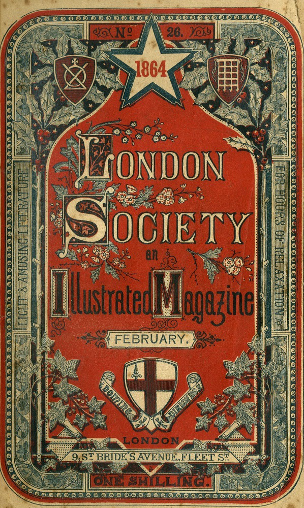
London Society, published and printed by William Clowes was likewise issued monthly and in half-yearly bound volumes. It looks as though this volume had its cloth covers of brown honeycomb grain cloth blocked after the case was attached to the text block. Both covers are blocked with an identical design. The lower cover is blocked in blind and in relief. The spine design is a fine example of the amount of detail that could be engraved and blocked on a spine. The title words are blocked down the spine, blocked in relief within ten gold lettering-pieces. The words ‘/London/ Society/ are blocked within two scroll-shaped lettering pieces followed by ‘/Light/ amusing/literature/ for/ the hours of/ relaxation/ richly/ illustrated/’; these are blocked in relief within eight gold lettering-pieces. Beneath these words, three garter stars are blocked in gold, with decoration within each picked out in relief. The three stars are respectively: the (English) Garter Star – emblem of St George; the (Scottish) Order of the Thistle – emblem of the thistle; the (Irish) Order of St Patrick – emblem of the shamrock. The mottos of each order are blocked in relief within each garter: ‘Honi soit qui mal y pense; Nemo me impune lacessit; Quis separabit MDCCXXXIII’.

Some magazine issues and their appearance in book form: (a) The Churchman’s Family Magazine, and (b) the hard-backed version; (c) London Society, and (d) its issue in the half-yearly volumes.
Each monthly issue, like others in the field, had paper wrappers. The price per issue was one shilling. The lower cover has printed advertisements. The upper cover is printed in colours. Prominent on the upper cover is the coat of arms and the motto of the Corporation of London. The notice on the half title page verso of the separate issue of February 1864 reads: ‘The fourth volume [the issues for July to December 1863] containing upwards One Hundred Fine Engravings, is now ready in cloth, richly gilt, price 9s. 6d. Also, Cloth Cases for the use of Subscribers in Binding, price 1s. 6d. The whole of the Volumes are kept in print from the Stereotype Plates and may be obtained through any Bookseller.’ This shows us that the last six months of each year were bound together into cloth cases, and further printings of the parts could be made from stereotype plates that (presumably) had been made to print each monthly part.
Conclusion
These case studies show how publishers exploited, from the 1840s, a market for richly embellished books with illustrations. The designs on the paper wrappers and cloth covers were important for sales, as were the quality of the images within the text. Thanks to the development of the railway network by the end of the 1840s, books and magazines could be shipped promptly. This realisation drove the placement of advertisements in newspapers and magazines by publishers and booksellers, all over the UK and Ireland. However, changes in fashion and artistic impulses diminished the desire to richly embellish books and magazines, which reduced costs of production. From the 1880s, the expense of creating elaborate designs, combined with arts and crafts concepts applied to book design, resulted in simpler designs, but without the deliberate showiness of the years 1830–1880.
Created 28 March 2023