
Introduction
Once a Week was the first and most influential periodical of its type. Presented as an ‘illustrated miscellany’, which would act as an alternative and rival to Dickens’s All the Year Round, it was set up by Bradbury and Evans as a pictorial magazine that would unite wood-engravings with a variety of written texts. Sold at 3d, Once a Week was aimed at a large middle-class audience; combining fiction with informational pieces, poetry, history, current affairs and other miscellanea while always avoiding the controversial or esoteric, its approach was distinctly middle-brow. Its principal asset was in the form of its remarkable illustrations; All the Year Round was ‘blind’, and Bradbury and Evans regarded the ‘cuts’ in their magazine as its prime selling point.
‘B and E’, as Richard Doyle calls them, had diverse experience of pictorial material; as the publishers of Dickens and Thackeray they were familiar with the processes involved in the production of illustrated books and were also, and most importantly, the proprietors of Punch. Once a Week grew out of the success of Punch, even though it was never projected as a satirical magazine.
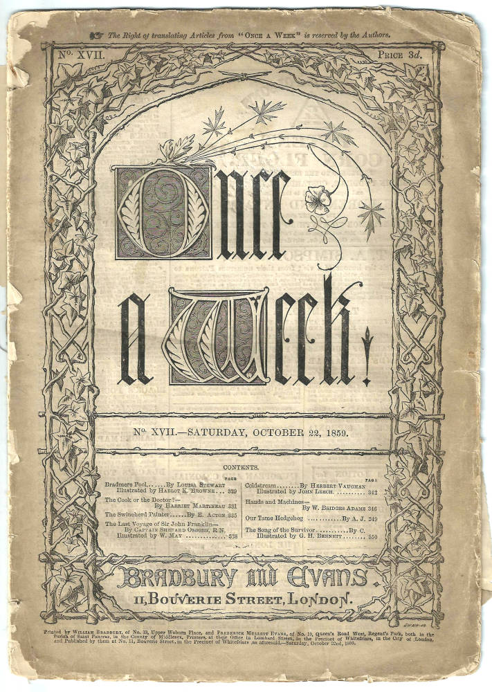
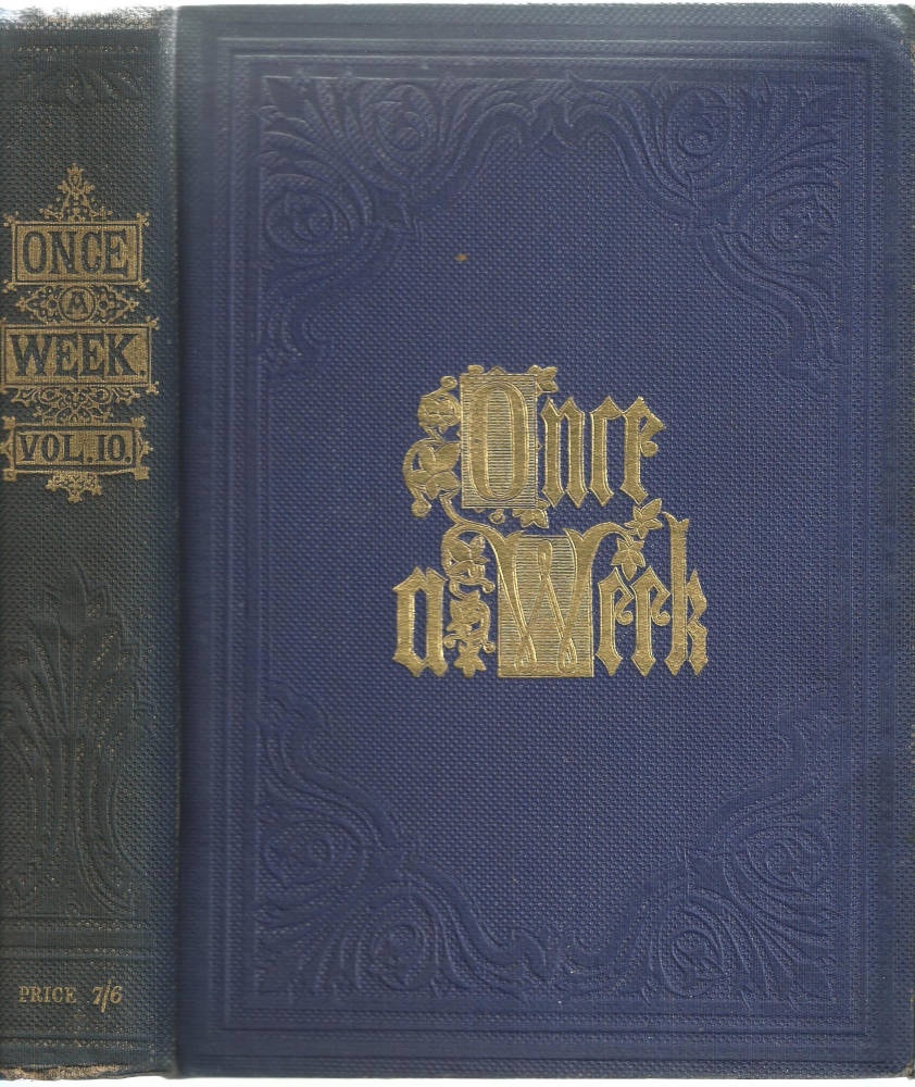
Two covers for Once a Week: Left: Limp paper binding on low-grade paper of the weekly issue. Right: Blue cloth, with gilt lettering of the bi-annual issue, which was printed on good quality paper and sold as a gift-book in an embossed blue cloth with gilt lettering.. [Click on these images for larger pictures.]
The idea from the outset was to create a distinguished periodical in which the illustrations were of the highest quality, and to that end the publishers deployed most of the artists who were already working for Punch and were members of the ‘Punch Table’, that regular dinner-venue for contributors where much of the business was enacted on an informal basis. What made Once a Week come into being, however, was the appointment of the critic and writer, Samuel Lucas (1818–68), who served as its first editor. Lucas guided the magazine from 1859 to his resignation in 1864, when the job was taken by Edward Walford.
Known for his astuteness in critical matters, Lucas was centrally interested in illustration – the subject of several of his reviews for The Times – and immediately set about building a team of the finest graphic artists of the day: a company, as generations of critics have observed, that has never been equalled. Existing talents, notably Leech and Phiz, were employed on the periodical; but the crucial move was the enlisting of many of the ‘new men’ of the Sixties. Keene, du Maurier, Millais, Sandys and Lawless were all signed up to provide designs on wood, and under Lucas’s bold and innovative management the magazine was quickly established as a show-case for these artists’ talent.
The illustrations produced by these designers are among the very best of their time. Cut by Linton and Swain, they vary between the dark and congested expressiveness of Sandys and du Maurier, the lyrical designs of Millais, the sweet lightness of Keene, and the still, pre-Raphaelite introspection of Lawless. Outstanding work includes du Maurier’s response to the Sensational texts by Charles Felix and M. E. Braddon, The Notting Hill Mystery (29 November 1862–17 January 1863) and Eleanor’s Victory (7 March–3 October 1863). Keene, one of Punch’s designers, offers some of his most unusual and penetrating work in his illustrations for George Meredith’s Evan Harrington (11 February–13 October 1860) and Reade’s A Good Fight (July–October 1859), the first version of The Cloister and the Hearth.

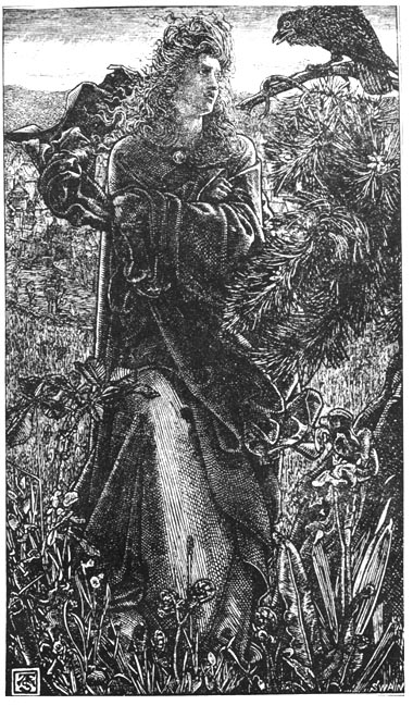
Left: On the Water by John Everett Millais. Right: Harold Harfargr by Frederick Sandys. [Click on images to enlarge them and for additional information.]
However, it is in the domain of illustration for poetry that Once a Week excels. Millais’s design for ‘On the River’ (23 July 1859, p. 70) is a sensitive reading of its text [discussed in the next section], and Sandys provides some brooding illustrations for Borrow’s ‘Harald Harfagr’ (2 August 1862, p. 154) and Meredith’s ‘The Old Chartist’ (8 February 1862, p. 183).
Lucas’s importance in the development of Sixties illustration
Sixties illustration was the creation of several influences: the artists, the authors they illustrated, the publishers and the engravers. To this list we might also add the editors. Most of Sixties design appeared on the pages of the magazines, and editors had a significant influence in promoting the style and role of the illustrations they commissioned. Lucas was the most influential because his choices were informed by a distinct aesthetic combined with a clear idea of what illustration should do. Lucas’s critical stance was outlined in a series of reviews, and the ideas explored in these writings inform his practice during his time at Once a Week.
Lucas’s prime idea was that illustration should only respond to the text: it should add nothing to the information in the text and give a literal response in which the writer’s ideas are recreated and underlined visually. His dislike of the fashion for interpretive design, which was emerging through the activities of the Pre-Raphaelites, is clearly voiced in his articles in The Times. Of Tennyson’s Poems (1857), the famous imprint by Moxon in which the Pre-Raphaelites demonstrate their emphasis on imaginative rather than literal responses, he has only contempt, noting how the illustrations and the poems do not correspond. He complains that Maclise’s image of the taking of Excalibur in ‘Morte d’Arthur’ is irresponsive to the details in the text, and goes on to comment how
the most common defect [is the way in which artists fail] to give the best possible thought or attention to the text. It is really extraordinary to what an extent they can mistake or contradict the meaning of an author confided to them. [‘Illustrated Books’, p.10]
What is needed, Lucas explains in other reviews, is a situation in which the writer’s ‘characteristic effects’ (‘Modern English Caricature’, p.8) are embodied in a ‘telling representation’ of the author’s ‘spirit’ (‘More Gift Books’, p.12). Such literality informs all of his criticism, and he applied this belief in his instructions to illustrators working at Once a Week.
His directions were taken seriously, and there are many occasions where the illustrations are a precise visual re-creation of textual material. If a gesture is described, it is precisely shown in the accompanying design; if the text describes a scene in detail, then the images usually mirror what is written. As William Buckler explains, artists produced illustrations so closely linked to the writing that even ‘if the letterpress were entirely withdrawn, the reader would be able to guess the intended subject of the illustration’ (p. 929). Lucas was sometimes obsessive in his enforcing of this dictum, famously rejecting du Maurier’s response to Whymper’s poem ‘From the Window’ because the artist’s showing of its details, principally the girl’s muslin dress, were insufficiently ‘truthful to the text’ (Ormond, p.126); rather than get him to do it again he passed the commission to Sandys, whose image accurately records the poem’s physical details (24 August 1861, p.328).
Where Lucas was most influential, however, was in his insistence on capturing the writer’s underlying ideas and themes – the ‘spirit’ motivating the text. This emphasis facilitated the production of some penetrating work in which the artist provides a ‘powerful translation’ (‘More Gift Books, p. 12). In Keene’s reading of Meredith’s Evan Harrington, (11 February–13 October 1860), for instance, the artist focuses attention on the text’s fascination with the subtle nuances of class and snobbery. Emphasising moments of embarrassment and incongruity, he visualises some painful facial expressions and small gestures, so privileging the author’s minute charting of the intricacies of manners and social behaviour. Meredith noted how the illustrations were ‘generally apt’ (Letters, 3, p. 1276), and the images exemplify Lucas’s emphasis on ‘accord’ (‘More Gift Books’, p.12). Du Maurier’s illustrations for Felix’s The Notting Hill Mystery, (29 November 1862–17 January 1863) and Braddon’s Eleanor’s Victory (7 March–3 October 1863) are similarly linked to their texts, recreating the dynamics of the Sensational in the form of dynamic compositions, terse exchanges, journalistic realism and an emphasis on melodramatic action.
This capturing of tone and emotional content is also developed in the periodical’s fine illustrations of poetry. Many examples could be given and one of the best is Millais’s design for the anonymous ‘On the Water’ (Once a Week, 23 July 1859, p.70). In this illustration the artist satisfied his employer’s requirement for literality, but his main focus is on the representation of the poem’s dreamy yearning. The ‘drooping hair’ and ‘softest accents’ are visualized in the form of languorous rhythms of lines; the repetition of the sibilants in the fourth stanza is matched by the sinuous forms of the lilies and leaves, and the whole effect is one of still reverie. In this design, as in others, the artist offers a ‘literary interpretation’ and creates what Allan Life describes as an exact ‘stylistic’ linkage and ‘appropriateness’ (p. 52). This sensitivity is partly the product of Millais’s natural capacity to find apt equivalences to the text in hand, but it is also the product of Lucas’s emphasis on matching and accord. Indeed, Lucas’s guiding hand can be traced throughout the pages of Once a Week during his tenure, and the magazine closely reflects his aesthetics and understandings of the purpose of illustration. Although Sixties design is primarily known for its interpretive approach to the text, Lucas’s periodical demonstrates how illustration of the ‘golden age’ could be harmonized with its literary source.
Works Consulted and Cited
Buckler, William E. ‘Once a Week under Samuel Lucas, 1859 – 65’. PMLA 67:7 (1952): 924 –41.
Cooke, Simon. Illustrated Periodicals of the 1860s. Pinner: PLA; London: The British Library; Newcastle, Delaware: Oak Knoll Press, 2010.
Goldman, Paul. Victorian Illustration. Aldershot: Scolar, 1996.
Letters of George Meredith, The. 3 vols. Ed. C. L. Clive. Oxford: The Clarendon Press, 1970.
Life, Allan R. ‘The Periodical Illustrations of John Everett Millais and their Literary Interpretation’. Victorian Periodicals Newsletter 10:2 (June 1977): 50 – 68.
[Lucas, Samuel]. ‘Illustrated Books’. The Times. 24 December 1858: 10.
[Lucas, Samuel]. ‘Modern English Caricature’. The Times. 2 January 1863: 8.
[Lucas, Samuel]. ‘More Gift Books’. The Times. 2 January 1865: 12.
Once a Week. London: Bradbury & Evans, 1859 – 1865.
Ormond, Leonée. George du Maurier. London: Routledge, 1969.
Studies of Illustrated Serials and Poems in Once a Week
Cooke, Simon. Illustrated Periodicals of the 1860s. Pinner: PLA; London: The British Library; Newcastle, Delaware: Oak Knoll Press, 2010.
Garrison, Laurie. ‘The Seduction of Seeing in M.E. Braddon’s Eleanor’s Victory: Visual Technology, Sexuality, and the Evocative Publishing Context of Once a Week’. Victorian Literature and Culture 36 (2008): 111 – 130.
Leighton, Mary Elizabeth & Surridge, Lisa. ‘The Plot Thickens: Towards a Narratological Analysis of Illustrated Serial Fiction in the 1860s’. Victorian Studies 51 (2008): 65 – 102.
Life, Allan R. ‘The Periodical Illustrations of John Everett Millais and their Literary Interpretation’. Victorian Periodicals Newsletter 10:2 (June 1977): 50 – 68.
Last modified 26 November 2012