

alter Crane (1845–1915), whom John Russell Taylor accurately described as ‘too big and unmanageable … to be fitted neatly into any single pigeon-hole’ (64), created paintings in oil and watercolour, book illustration, ceramic tiles, designs for wallpaper and political pamphlets, tapestries, images for book-marks, advertisements, and other ephemera. An associate of William Morris and an active member of the Socialist movement, Crane was an accomplished designer in the idiom of Arts and Crafts (Taylor, 64); he mainly illustrated for children and is best remembered for the Toy Books he produced in collaboration with the wood-engraver Edmund Evans. Crane’s distinctive style (McLean, 186–68), combining bold modelling with intense colour, was hugely popular with late Victorian audiences.
His illustrative work has been examined at length in studies by P. G. Konody (1902), Rodney Engen (1975) and Isobel Spencer (1975), and in numerous more general accounts of the period. It less well-known that Crane designed a wide variety of book covers. Though mentioned in Esther Wood's classic account of late Victorian bindings in The Studio (1900), his work as a binding designer has never been examined in detail. In fact, Crane made important contributions to the development of Victorian book-art. Unlike his contemporaries, most of whom said little of their work, Crane, a reflective practitioner, theorized the key issues surrounding the purpose and aesthetics of the outer surfaces of a book. He anatomized this topic in several of his writings, most notably in Line and Form and The Decorative Illustration of Books. A champion of excellence, he consistently promoted the idea that covers were an important part of decorative art.
Crane, Aesthetics and Audiences

n the absence of a complete bibliography it is difficult to establish the scale of Crane’s activities as a cover-designer, although Gertrude Massé’s 1923 list established many of the details. According to Massé, Crane illustrated 176 books, of which 70 (or so) were issued in bindings he designed. However, this bibliography has numerous omissions: it does not include any of the ‘yellow-backs’ produced for Edmund Evans in the early 1860s, an aspect of Crane’s output that remains undefined, and it omits two titles listed by Edmund King in his account of publishers’ bindings (9). Massé acknowledges the difficulties of establishing a list when so many works – particularly the Toy-Books – were in the process of becoming rare; almost a century later, the situation has deteriorated further.
Indeed, the problems in establishing a bibliography of Crane’s book-covers are manifold. The authorship of his work is a key issue: most of his designs from the seventies onwards can be identified by his elaborate rebus in the form of his avian namesake, but many of his early efforts were unsigned and unrecorded, and throughout his career he alternated between signing his work and remaining anonymous. The fact that he worked principally for a juvenile audience adds another complicating factor, with many of his nursery books having been coloured in or damaged by children; as Heywood Sumner observes, their very ‘popularity has been their undoing’ (Massé, 8). Several titles have disappeared entirely and it is therefore impossible to know if these missing items had covers designed by the artist.
Crane’s versatility is likewise confusing, extending over a range of materials and types of bindings. Impressed in gilt on coloured cloths, or printed in colour on card or paper, on vellum, or on laminated boards, his book-covers are the most diverse of the period; his deployment of styles was likewise eclectic and wide-ranging. Though usually aligned with the Arts and Crafts movement (Taylor, 67, Haslam, 11), his work includes elements of Art Nouveau, motifs derived from neo-classicism and neo-medievalism, flat colours and simplifications of form originating in Japanese prints, the copying of nature taken from Pre-Raphaelitism, and decorative motifs appropriated from Germanic book-design of the 1840s. To complicate matters further, he is often viewed as a defining figure in the development of Aestheticism (Haslam, 54). Never formulaic, his covers extend from the small, highly-coloured limp cards of the Toy-Books to the elaborate cloth binding of Household Tales (1882) and oblong-shaped quartos, with laminated boards, such as Pan Pipes (1882-3).
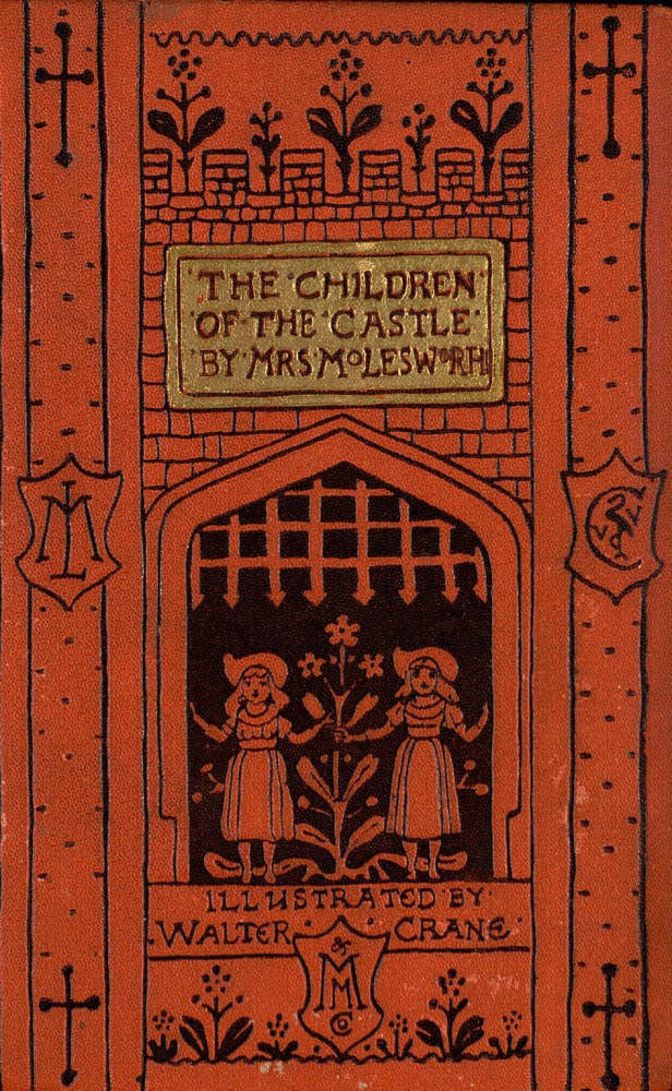
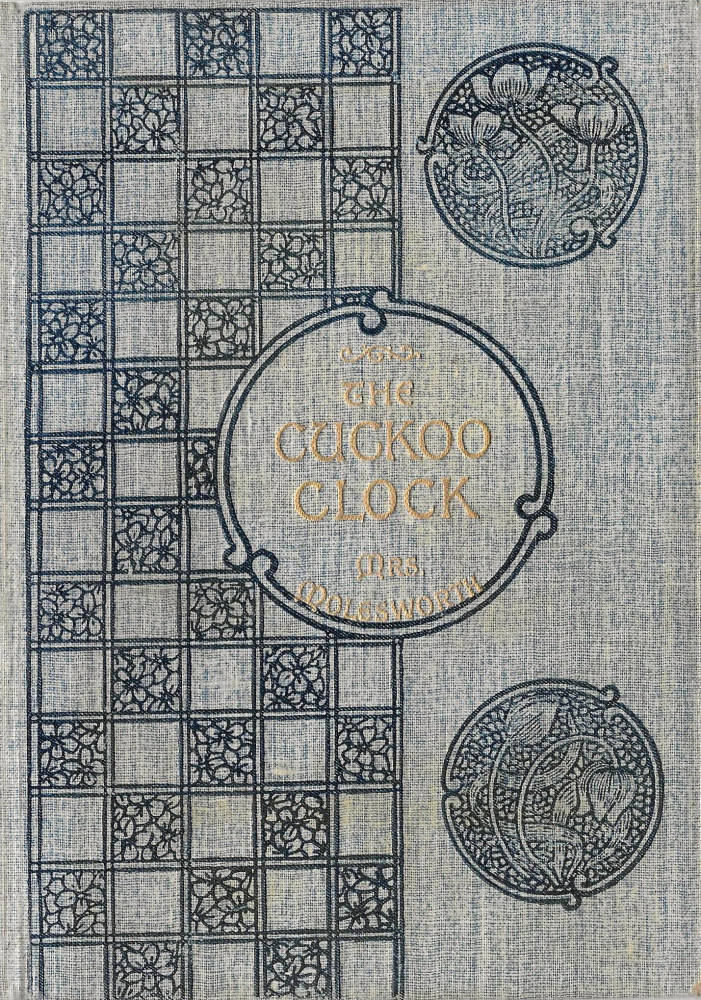
Any assessment of Crane’s oeuvre must thus accommodate his versatility, his complex ranging over styles, and the absence, in many books, of a signature. Nevertheless, two critical strategies permit us to make such an assessment. First of all, we can identify his covers on stylistic grounds, since it is mostly the case that the authorship of the binding corresponds with the authorship of the illustrations. When he designs the interior, Crane usually creates the outer surfaces too. This situation is exemplified by his work for Mrs Molesworth: for example, the binding for The Cuckoo-Clock (1901) is unsigned, but the presence of the internal decorations strongly suggests that the binding is Crane’s. Figured as an elegant combination of Arts and Crafts roundels and checker-board, the front cover recreates the bold decorative effects of his ceramic tiles.
At the same time, we can read the covers in relation to the Crane’s ideas about design. These concepts, essentially writings informed with the aesthetics of Arts and Crafts, provide us with a critical framework which allows us to understand his creative strategies as the embodiment of a well-defined code. Kelmscott publications yield to this sort of theoretical reading, and Crane’s designs, whatever their apparent style, are similarly offered as ‘beautiful bindings’ (The Bases of Design, 355) informed by Morrisonian values.
Crane approached the making of bindings not as an addition to the book, but as an integral part of it. The informing principle of Arts and Crafts book design was that harmonies should be created between the text, the illustrations, and the livery enclosing it, and Crane always followed this credo. In practice, he achieved this effect by making a visual continuum between the imagery of the cover and the illustrations contained within the pages, a process made possible by his artistic control over the book as a whole: in most of his works, the difference between the outer and inner is eliminated as the binding prepares the viewer for the illustrations or, put the other way around, the illustrations are projected outwards onto the binding. This strategy is exemplified by the Toy-Books, in which the covers are exactly in accord with the internal decorations, advertising their intense colour and vigorous motifs in the form of wood-engraved images. The unities of outer and inner interact to create a sense of ‘tastefulness’ (Ideals in Art, 255) and Crane highlights the need to produce an overall effect based on ‘the harmonious … association of similar or allied forms’ (Line and Form, 103).
This interconnectedness creates a perfect, visual fusion of binding and contents. An exemplar of this sort of unity is Pan Pipes (2nd ed. 1883), a book of music by Theo Marzials. The outer cover presents a gigantic set of pipes, framed by a cherub blowing into them and populated by Pan himself; the end-papers repeat the foliate border surrounding the pipes, and the pictorial half-title shows the pipes hanging from the reeds that we have already seen on the cover; the next pages depict Pan cutting a reed and the title-page proper combines a classical frieze and shell. The continuity of motifs is underpinned by the rhythmic simplicity of the floral arabesques, and the visual journey from outer to inner is guided, we might say, by the flight of birds, notably the crane that appears on the binding with a fish in its beak – fishes that will also appear on the end-papers – takes flight in the next pages and arrives at the title-page. This sort of conceit, uniting the binding, the decorative end-papers, the pictorial title and finally the illustrations, which take up and develop the same classical motifs, is typical of Crane’s highly-schematized approach to book-making. As Heywood Sumner explains, his book-art is purely a matter of calculation: “He sought a design; an ordered spacing; a pattern of graphic forms that would adorn the story to be illustrated. Balance. Weight of incidence (black against white). Intricacy. Firm line. Dotted line. Line shading … Walter Crane was at his best in his management of economy of means” (Massé, 8).
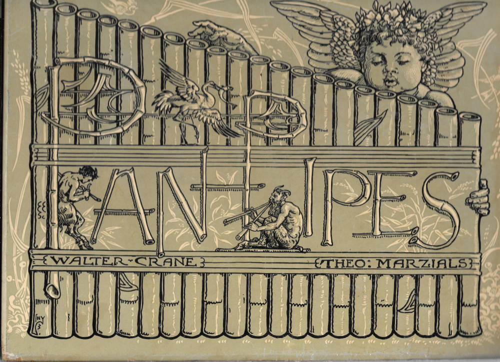
Crane’s bookcover design for Pan Pipes by Theo Marzials.
Crane was also aware of how far his strategy differed from typical trade bindings of the period. Unimpressed by what he saw as the lack of harmony in books as famous as the ‘Moxon Tennyson’ (1857), which he described as disorganized and discordant (Decorative Illustration, 150), Crane approached all of his commissions as opportunities to create an architectural interaction and variation of forms, a spatial progress, as it were, through the portal of the binding to the rooms within. He matched this sort of consonance with a focus on the binding’s decorative qualities: harmonious it should be in the sense of linkage with the rest of the book, but it should also be a pictorial unit of significance, an object of Beauty as well as one of Harmony and Utility.
The importance of the cover is outlined in Ideals in Art, where he devotes a chapter to expound his ideals, explaining his views on the subject in ways unparalleled by any other designer in the field. Though many regarded book-cover design as a secondary activity, the journey-man work of an artist in pursuit of higher goals, Crane delights in its possibilities, noting how the ‘flat rectangular object’ is a chance to create an image of ‘tastefulness’ informed with ‘a sense of scale and proportion’. Indeed, the ‘enclosure’ of the binding is viewed as a unit of design – a shape the designer can manipulate through the application of forms and patterns’ (225–26). This is a creative response to a limited space, and Crane’s approach to the form surely reflects his capacity as a designer of ceramics. The square shape of his Toy-Books, especially, is a field analogous to the shape of a tile and can be patterned in a parallel way. All that matters, however, is Beauty, and this can only be created though the judicious use of ornament.
Crane invokes the architectural metaphor in writing of unities of books, but his analogy for ornament is musical, noting how “ornament in its developed, or sophisticated and conscious, stage, seems to me to have a close analogy to music … in which the sensuous delight in rhythm and melody … constitute the principal charms” (Ideals in Art, 102). Crane here echoes Walter Pater’s famous claim in his ‘The School of Gorgione’ (1873) that art constantly aspires towards the condition of music (114), and also reflects J. M. Whistler’s application of a musical terminology to his paintings, which he described as ‘symphonies’ and ‘harmonies’. Crane’s approach to the decoration of book covers likewise projects the idea of theme, repetition and rhythm; as he explains in Line and Form: “Experience teaches us that the most harmonious arrangement [s] … are those in which the [principal] leading lines and forms through all sorts of variations, continually recur” (21–22). This sense of rhythmic pattern, somewhat in the manner of a musical refrain, is a key principle in Crane’s bindings, most of which display elaborate but tightly structured compositions of arabesques enriched with recurring motifs and modulated with contrasts of forms.
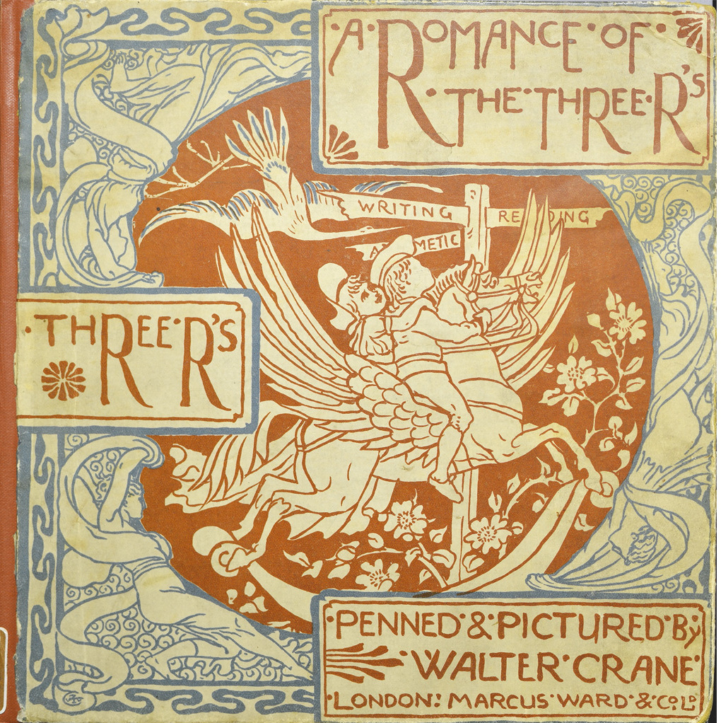
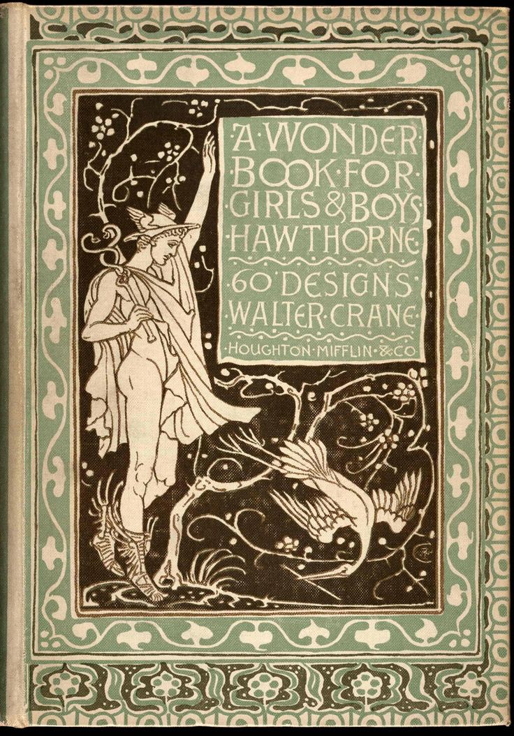
A Romance of Three Rs exemplifies this approach. The binding is constructed as a rhythmic interaction of three oblong title-panels placed in contrast with a roundel, which shows children riding a rocking horse in the form of Pegasus. Another contrast appears in the opposition of the panels’ geometrical outline and the exuberant, sinuous line that animates the interstices between the central circle and the four corners. The cover produces, in other words, a calculated modulation between angular forms and arabesques; according to Crane, horizontal lines should evoke a sense of ‘restfulness’ while the ‘waved or meandering line’ evokes ‘grace and rhythmic sweetness’ (Ideals in Art, 108). Put in these terms, the musical metaphor becomes clear, allowing us to reframe the design as a lyrical tune, full of movement, which is counterbalanced by stillness. Approaching his design as an abstraction, Crane’s cover is a sophisticated pattern that suggests meanings beyond the illustrative. Moreover, other bindings display the same musical structures, notably The Baby’s Own Aesop, The Baby’s Opera, and A Wonder Book for Girls and Boys. Composed of decorative friezes, contrasted forms and oppositions of types of lines, these covers are enlivened by inventive variations within an organic whole.
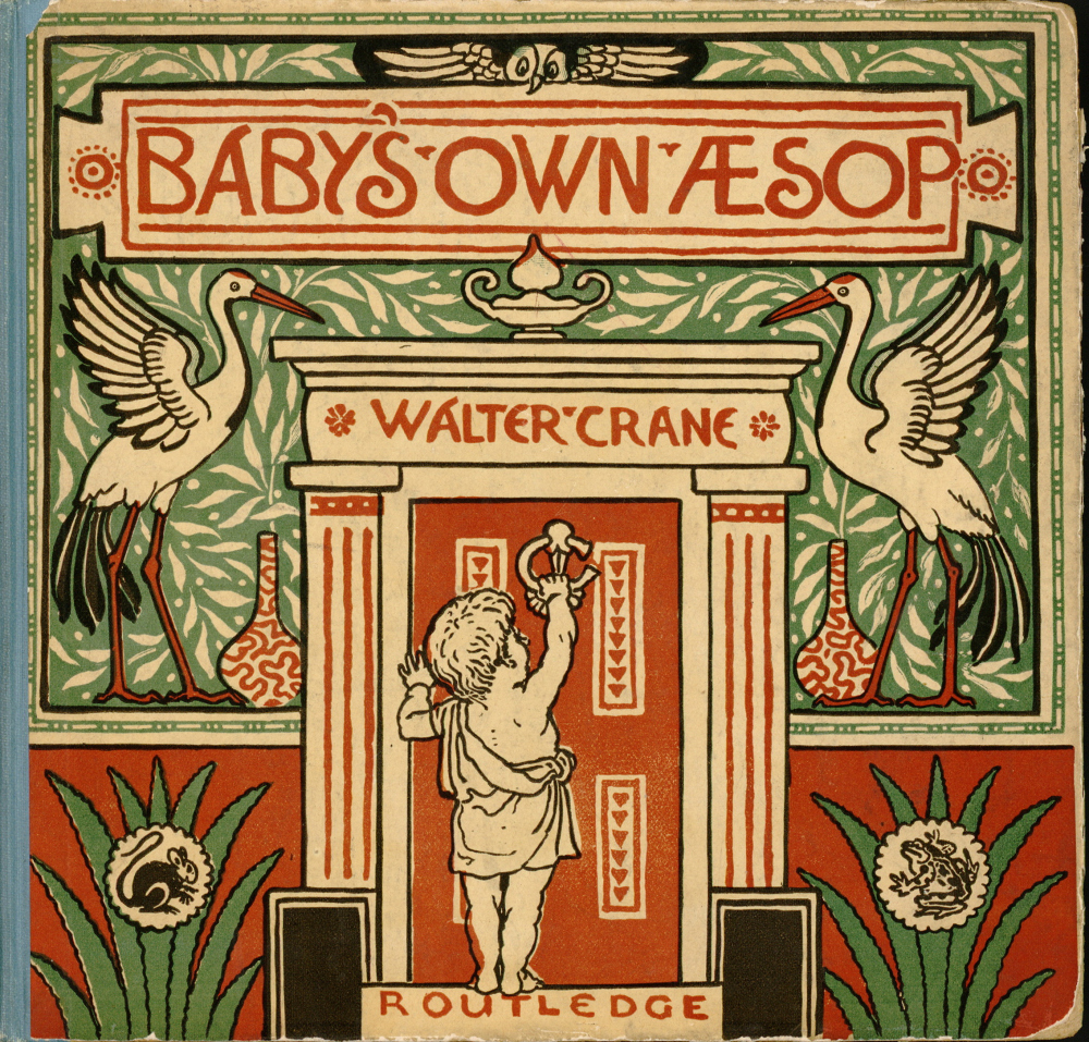
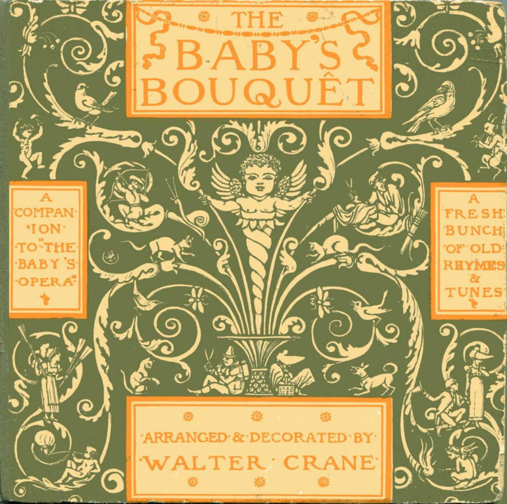
Covers for three of Crane’s own children’s books. [Click on images to enlarge them.]
Crane thus conceived book covers as fine objects that recall the publications of the Kelmscott Press and the elaborate liveries designed by Cobden-Sanderson. What makes them distinctive, of course, is that they are mass-produced bindings in paper and cloth rather than luxurious cuts in leather; offered as populist works for a large audience rather than books for an elite, they democratize the principles of Arts and Crafts aesthetics. As Crane explains, a ‘good design [should not be] dependent upon expensive materials for its effect’ (qtd. Haslam, 11).
Four of Crane’s book covers that show a range of different styles/.
In particular, he significantly improved the standard of book design for children (Muir, 159). In the artist’s own words, he countered the slipshod production of most nursery books, with their ‘careless’ illustration and ‘reckless’ colour (Decorative Illustration, 156), replacing the mediocrity of such publications with ‘good art in the nursery’ (156) which was available, in the case of the original Toy-Books, for either sixpence or a shilling. Crane notes how the book trade disapproved of the sophistication of his children’s publications, thinking his talents ill-directed; but this was merely grist to his reforming mill.
Styles and Influences
s noted in the previous section, Crane’s binding styles vary enormously. Like many Victorian designers, he borrowed eclectically from a range of idioms and switched easily from one to another. Almost all of his covers deploy figurative imagery, sometimes including Pre-Raphaelite detail, cartoon characterizations, domestic detail or classical costumes; the ornamental elements likewise include neo-classical motifs, Renaissance devices, patterns derived from Japanese prints, and motifs borrowed from the broader aesthetic of Morris’s Arts and Crafts. Each of these is put to good effect, preparing the reader for the contents of the pages in a series of images which focus textual and tonal information.
His ‘yellow-backs’ for Evans are typical examples of their type, embellishing reprints of well-known novels, such as those of Edward Bulwer-Lytton (Muir, 162), with lurid scenes printed in bright colours. He also designed bindings for collections of poems. His design for Poe’s Poetical Works is perhaps his most characteristic, establishing the tale’s Gothic credentials in a single, overstated but resonant image with a portrait of the character from ‘The Raven’ contemplating the bird, and with wraith-like forms in the background (1866).
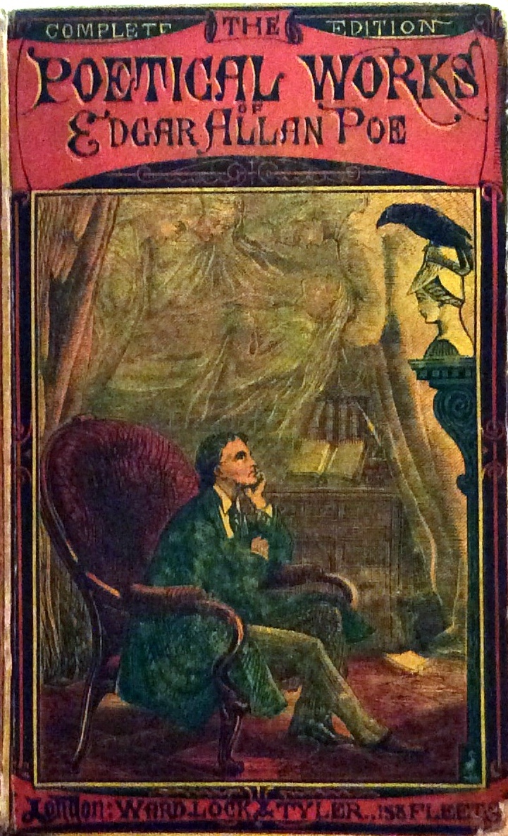
Crane’s bookcover design for Poe’s Poetical Works.
Unashamedly intended to attract the reader’s eye, these fragile bindings, which have rarely survived, seem at odds with the greater part of the artist’s oeuvre. Crane himself seems to disavow this early work as a false start. Writing in Ideals in Art, he notes how ‘the sensational book-cover may startle us by its audacity, but it is apt to stare at us horribly upon the drawing-room table’ (236). What really matters, he continues, is a question of pleasing the eye; ‘can you live with it?’ he asks rhetorically (234). His principal bindings, as we have seen, are set up to provide a harmonious design that will never jar, and he usually concentrates on the creation of’ ‘refined qualities’ (Bases of Design, 355).
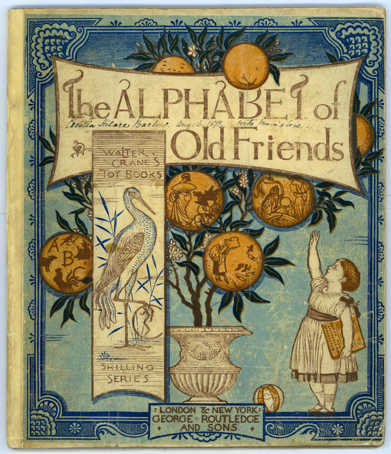
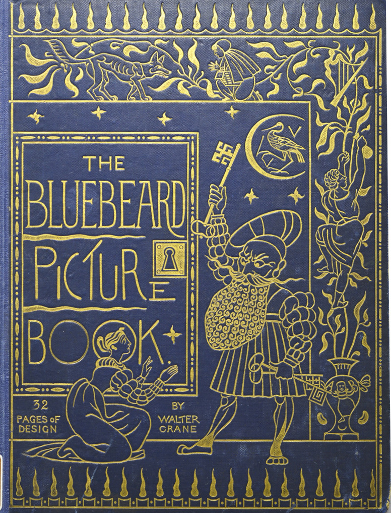
This is especially true of his covers based on Japanese design. In Line and Form he writes in admiration of Bari, Hiroshige, and Hokusai (10), artists whose work was popular in Britain in the 1860s and was an influence on painters such as James McNeill Whistler, Albert Moore and Dante Gabriel Rossetti. Crane, like his contemporaries, emulated a number of features enshrined in Japanese wood-blocks, selecting in particular the emphasis on flat, linear patterns, intense colour and modulated rhythms of carefully positioned forms. Several of the Toy-Books’ covers are animated by ‘Japonisme’ and some are bold appropriations of this style. The Alphabet of Old Friends is an imposing combination of simplified fruit, a decorative, abstracted treatment of foliage and subtle contrasts between the orange globes and the background in light blue. The front board of Baby’s Own Aesop is similarly conceived as an abstract pattern of simplified forms which alternate rhythmically between green and red. Other simplifications, which embody Crane’s belief in the ‘crisp freshness’ (Line and Form, 10) of Japanese design can be traced in covers for The Blue-Beard Picture Book, Flora’s Feast, and several others.
The effect often reminds us of the Japanese prototypes, although Crane freely combines this ‘simple means of expression’ (Line and Form, 10), as he describes it, with motifs drawn for other sources. Crane, we might say, rewrites Neo-classicism in a Japanese style, and other idioms comingle with the linearity of wood-block masters. For example, Baby’s Own Aesop unites a cherub with a neo-classical portal, but is drawn in the manner of the Japanese print, while The Shepherd’s Calendar treats its subject in sweeping lines but is still mimetic; the arboreal motif is a flat, ornamental pattern, neither a tree nor a bush, while the dog and sheep are treated realistically. Crane thus figures abstract and realistic treatments not as separate styles but as a fusion of apparent opposites – an aesthetic synthesis that also appears, for example, in Whistler’s paintings. In Crane’s book covers, as in the work of several of his contemporaries, western and eastern art intermingle and resolve into a new imagery.
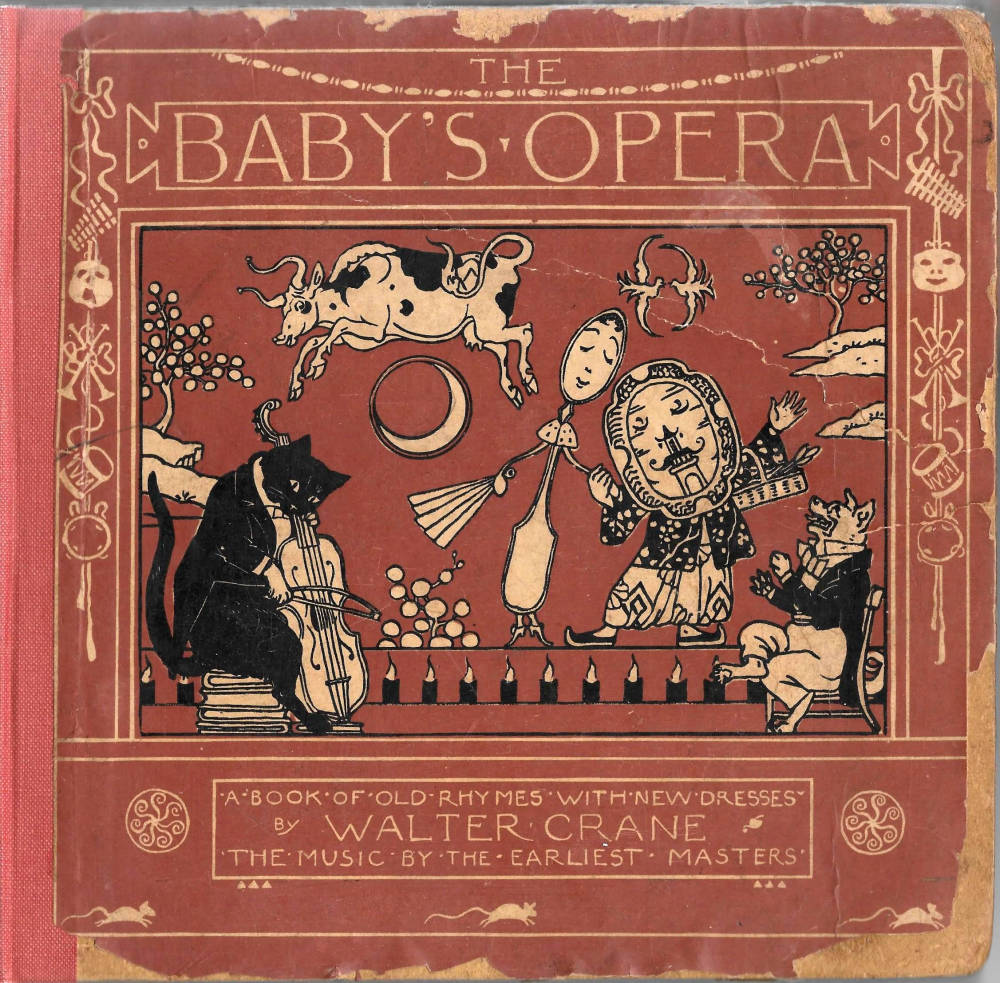
Yet Crane occasionally differentiates between his treatments. For example, his Renaissance designs are usually distinct and make faithful allusion to their prototypes. Household Tales reproduces the coffered effects and sub-divisions of Renaissance architecture and the decorative frieze surrounding the central panel of The Baby’s Opera combines swags and masks. Most striking, perhaps, is The Baby’s Bouquet. Presented as if it were part of an ornamental scheme in a Florentine palace or a grotto, the front cover combines a cherub with a radiating cornucopia of stylized foliation in the style of the Cinquecento with a curious mixture of grotesques – archers, birds, and two prancing cats. Simultaneously elegant and humorous, it typifies Crane’s project of raising the aesthetic standards of children’s books by invoking the spirit of an uplifting style.
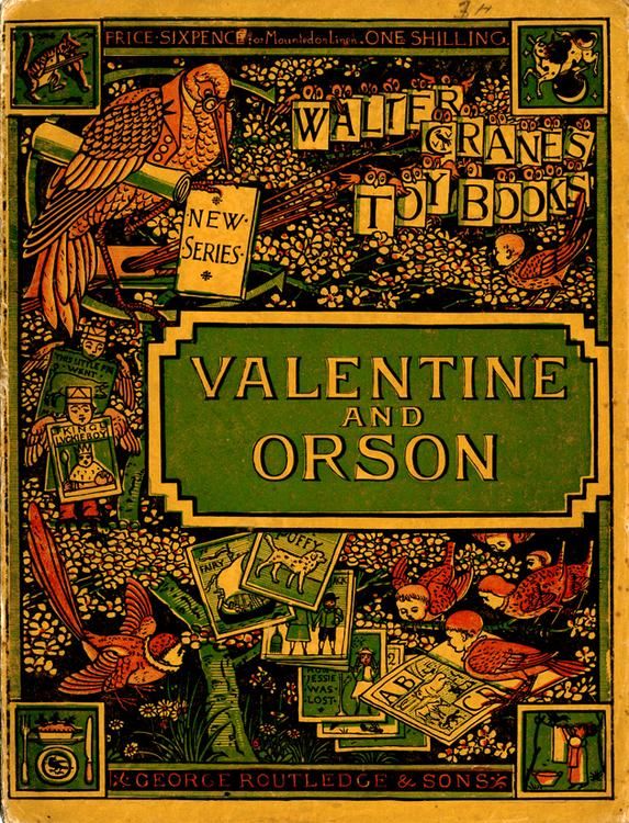
Dynamic and imposing, likewise, are covers in which he deploys the swirling arabesques of late Victorian design. Some of his final work has the lightness and simplicity of Art Nouveau, but most of Crane’s bindings are products of the compressed, linear, intricate style of Arts and Crafts. Heavily influenced by the Kelmscott Press, with its emphasis on claustrophobic ornamentation, his book-covers often have a congested intensity. The front board of Valentine and Orson – a design used on several of the Toy Books – is a prime piece of Arts and Crafts overstatement: laden with objects and structured with a floral pattern, it looks like Morris’s wallpaper. A Romance of Three Rs and the Wonder Book for Girls and Boys are similarly figured as a series of decorative friezes and panels which surround a central character. The overall impression is one of restless movement: embodying Mario Praz’s famous comment on the ‘horror vacui’ of Victorian design, the aesthetic effect derives from working the eye as it scans calculated oppositions of motifs. Precious and overbearing, all of these books stand in stark opposition to the more economical covers created under the influence of Japan.
Four of Crane’s book covers that show the influence of Japanese design principles.
Taken as a whole, Crane’s bindings interact in a complex, eclectic corpus of work. At once classical, neo-classical, sensationalist, Morrisonian, and a reworking of the Japanese print, Crane’s front covers are vivid, sophisticated works. Rare today, having been condemned by the fragility of their bindings, his books represent a radical improvement in the art of the book, making available to large audiences the best of contemporary design.
Acknowledgement
Thanks are due to Dr Graham Dry for information relating to Crane’s cover design for Poe’s Poetical Works and generally for support and encouragement.
Collections of Original Material Related to Book Covers
There is a vast collection of material in the Walter Crane Archive, Rylands Collection, University of Manchester Library, U.K. This contains studies for book-covers and associated studies, proofs, and drawings. The collection is jointly controlled by the University of Manchester and the Whitworth Art Gallery, Manchester. Other relevant holdings are held in the Houghton Library, Harvard University, USA.
Primary Sources: Books with Illustrations and Book-Covers Designed by Crane.
The Alphabet of Old Friends. Engraved in colour by Edmund Evans. London: George Routledge, 1873.
The Baby’s Bouquet. Engraved in colour by Edmund Evans. London: George Routledge, 1878.
The Baby’s Opera. Engraved in colour by Edmund Evans. London: George Routledge, 1877.
The Baby’s Own Aesop. Engraved in colour by Edmund Evans. London: George Routledge & Sons, 1887.
The Blue-Beard Picture Book. London: George Routledge & Sons [1876]. [A collection of Toy-Books bound together, engraved in colour by Edmund Evans.]
Flora’s Feast. Written and illustrated by Walter Crane. London: Cassell, 1889.
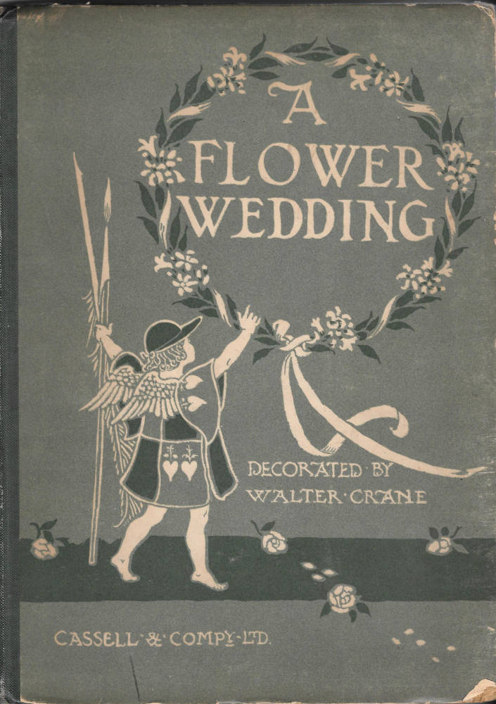
A Flower Wedding. London: Cassell, 1905.
Hawthorne, Nathaniel. A Wonder Book for Girls and Boys. London: Osgood, McIlvaine, 1892.
Household Stories, from the Collection of the Brothers Grimm. London: Macmillan, 1882.
Molesworth, Mary Louisa. The Cuckoo-Clock. London: Macmillan, 1901. [This cloth binding was used for all of Crane’s work for Molesworth].
Pan Pipes. With music by Theo Marzials. Engraved in colour by Edmund Evans. London: George Routledge & Sons, 2nd edition, 1883.
Poe, Edgar Allan. Poetical Works. London: Ward, Lock, & Tyler [1866].
A Romance of Three Rs. Engraved in colour by Edmund Evans. London: George Routledge & Sons, 1886.
Spencer, Edmund. The Shepheard’s Calendar. London & New York: Harper’s, 1898.
Valentine and Orson. Engraved in colour by Edmund Evans. London: George Routledge & Sons, 1870.
Primary Sources: Writings on Art
Crane, Walter. An Artist's Reminiscences. London: Methuen, 1907.
Crane, Walter. The Bases of Design. London: Bell, 1898.
Crane, Walter. Ideals in Art. London: Bell, 1905.
Crane, Walter. Line and Form. London: Bell, 1914.
Crane, Walter. Of the Decorative Illustration of Books Old and New. London: Bell, 1896.
Secondary Sources
Haslam, Malcolm. Arts and Crafts Book Covers. Shepton Beauchamp: Richard Dennis, 2012.
King, Edmund. Victorian Decorated Trade Bindings, 1830–1880. London: The British Library & Newcastle: The Oak Knoll Press, 2003.
Maclean, Ruari. Victorian Book Design. London: Faber & Faber, revised ed. 1972.
Massé, Gertrude. Walter Crane: A Bibliography. London: The Chelsea Publishing Co., 1923.
Muir, Percy. Victorian Illustrated Books. London: Batsford, 1971; revised ed., 1985.
Pater, Walter. The Renaissance. New York: Random House, 1873.
Praz, Mario. An Illustrated History of Interior Decoration from Pompeii to Art Nouveau. London : Thames & Hudson, 1964.
Taylor, John Russell. The Art Nouveau Book in Britain. London: Methuen, 1966.
Tennyson, Alfred. Poems. London: Moxon, 1857.
Wood, Esther. ‘British Trade Book Bindings and their Designers’. The Studio, Winter Number, 1899–1900: 3–37.
Last modified 10 February 2018