
alwin Morris is widely recognized as one of the most prolific and influential designers of the final years of the nineteenth century. An accomplished book-artist who designed head and tail-pieces as well as decorative title-pages, he was primarily the creator of highly distinctive book covers for the trade. He was employed by Blackie’s, the Glasgow publisher; engaged as the director of art in 1893 and forced to retire in 1909 as a consequence of an illness which led his death at the early age of 45, he worked tirelessly throughout this period.
Though influenced by the aesthetics of Arts and Crafts, Morris was closely associated with new developments in Scottish design in the second half of the 1890s. He was a friend of C. R. Mackintosh and on familiar terms with the ‘The Four’: like them, he was a proponent of Art Nouveau and helped to define and promulgate the ‘Glasgow Style,‘ making it available to a wide audience. As one commentator remarked in an early assessment in The Studio (1899), he was essentially a popularizer who helped to democratize the avant-garde: ‘these designs’, the critic remarks, were ‘not for limited editions of high-priced volumes … On the contrary, they are issued upon popular volumes intended for the general reader’ (‘EBS’ 38).
In ‘habituating the public’ (Taylor 130) to Art Nouveau he performed a useful function, one essential for the success of his employers, but he was not alone in pursuing this aim; Charles Ricketts and Gleeson White were working on a parallel trajectory. What differentiates Morris from his contemporaries, however, is the radicalism of his style, which is more forward-looking than their designs, provides a link with European versions of Art Nouveau, and clearly anticipates the development of Modernism.
Morris’s bindings have been charted at some length, notably in essays by Gerald Cinamon, who has published in a range of academic periodicals (1981–1999), and, earlier, by Esther Wood (1899–1900); a general outline has also been provided by Laura Euler in her study of Glasgow design (2008). These scholars have focused on aspects of style, their economic contexts, and the changing commissions as Morris serviced the Blackie catalogue with its subsidiary in the form of Gresham’s issues and series. The approach adopted here is simpler, exploring two themes: Morris’s stylistic development, and his treatment of the cover as a means of representing his books’ contents.
Talwin Morris’s Styles
Morris, like Gleeson White, was a designer who moved between the aesthetics of Arts and Crafts and Art Nouveau. In the earlier part of the nineties Morris’s bindings reflect the influence of that other, more famous Morris, William Morris, creating covers which recall the older artist’s floral patterns for wallpaper and fabrics. These book designs are composed of naturalistic details of flowers, petal-like forms, and stems combined with sinuous lines. Morris’s binding for Mary Debenham’s The Whispering Winds (1895) is a good example of his earliest style. Made up of four roundels, it personifies the four winds as young women, but more important is the way in which he treats their hair, which is blown into a series of tightly-knit, flower-like forms in the manner of Arts and Crafts decoration. Morris’s design for Rosa Mulholland’s Banshee Castle (1895), composed of radiating bushes and orange rose-hips, is another example of his work in this idiom.
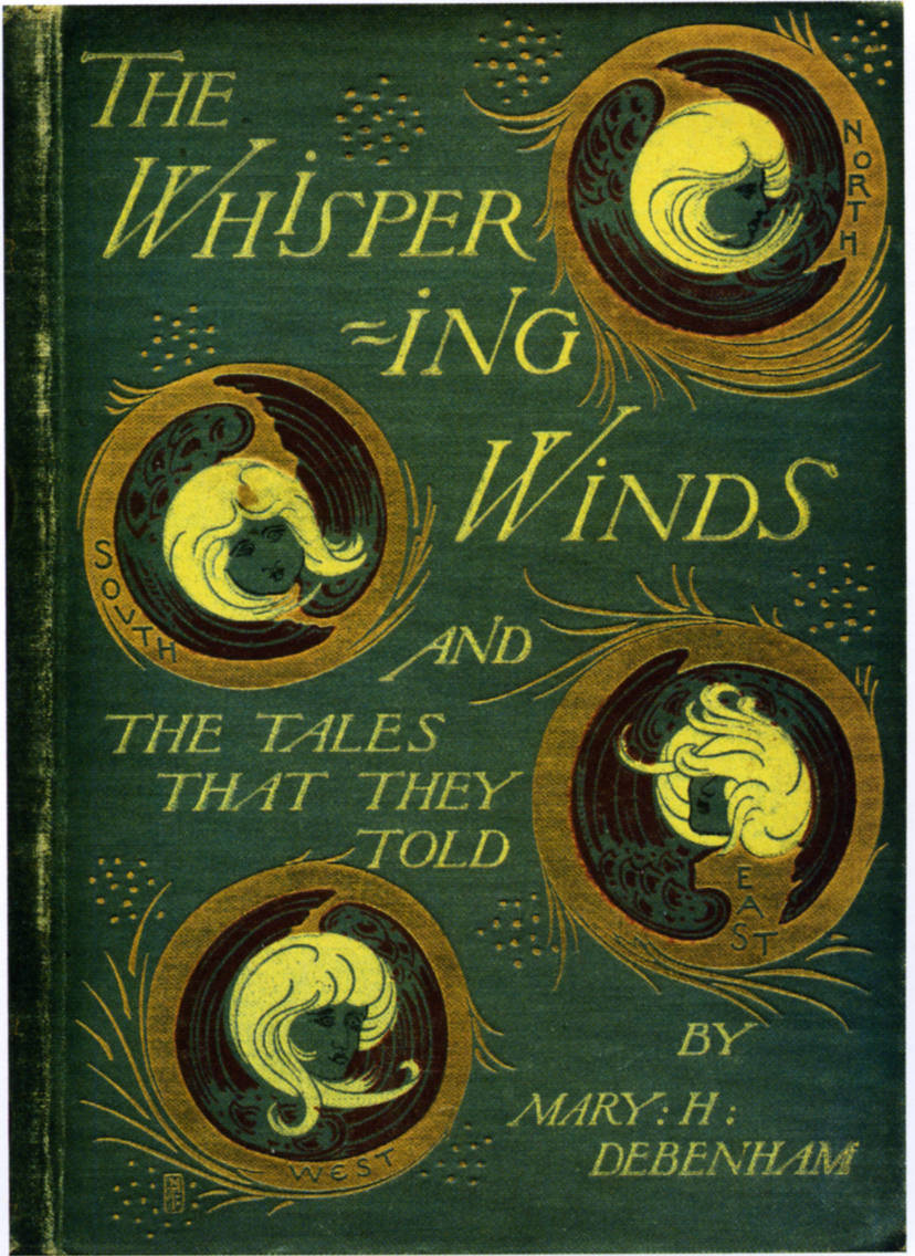
Morris’s binding for Debenham’s The Whispering Winds (1895).
However, Morris quickly developed a version of Scottish Art Nouveau which is a sub-set of the ‘Glasgow Style’. Drawing on and modifying motifs created by Mackintosh and ‘The Four’, he shares their semiotic of design elements. This lexicon is made up of a number of key elements that includes the ‘Glasgow rose’ (a device used extensively by Mackintosh in his furniture design); simplified birds; biomorphic flowers that mediate between abstraction and representation; ovoid panels; elongated stems that carry abstracted blossoms; curvilinear lines; extreme verticality; organic forms combined with or juxtaposed against geometrical shapes; repeating motifs in rhythmical patterns; strong contrasts between void and decoration; flatness; a confident assertion of formal properties and the avoidance of illusionism. Morris deployed each of these elements in endless variation, sometimes combining several into one design and sometimes using a single motif. Underlying all of them is the interest in the ‘decorative value of the line’ (Tschudi-Madsen 32), the tensions between the parts and the resolution of those tensions in order to create a sophisticated pattern.
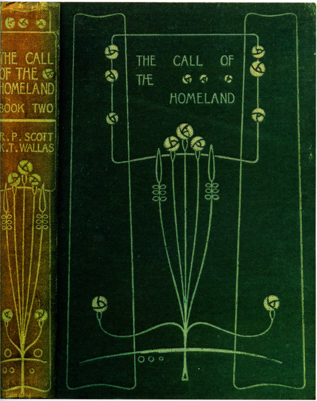
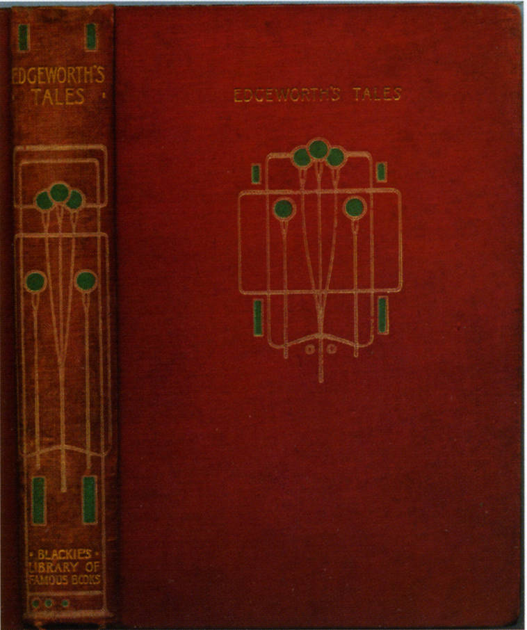
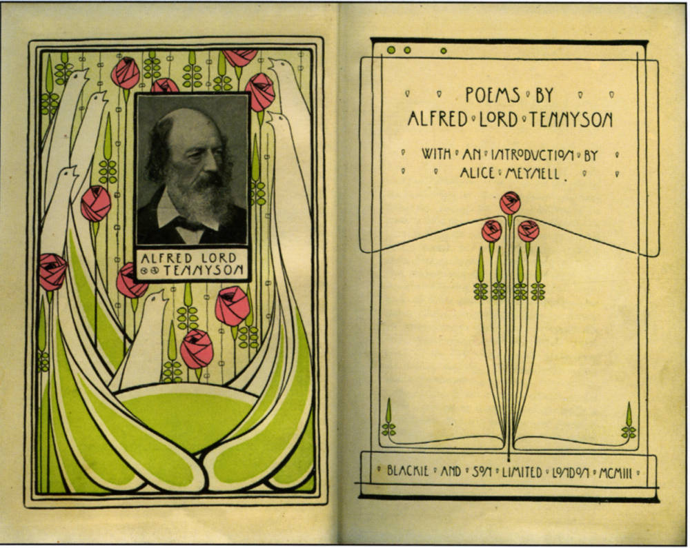
Left to right (a): Bindings for The Call of the Homeland; (b) Moral Tales; and title-page and frontispiece for (c) Tennyson’s Poems.
Morris’s abstracted floral designs are exemplified by R. B. Scott’s The Call of the Homeland (circa 1898), in which he presents his characteristic treatment of the Glasgow rose, and by a more abstracted version of foliate pattern-making in his front cover for Maria Edgeworth’s Moral Tales (1897) and Oeuvres Poetiques (1906); his title page for Alfred Tennyson’s Poems (1903) is another example of Morris’s bouquet, here combined with his elongated stems that recall nature but are geometrically regular. The ‘Red Letter’ Shakespeare series is likewise bound in a motif of radiating lines combined with an ovoid – a motif invoking both natural forms and classical order.
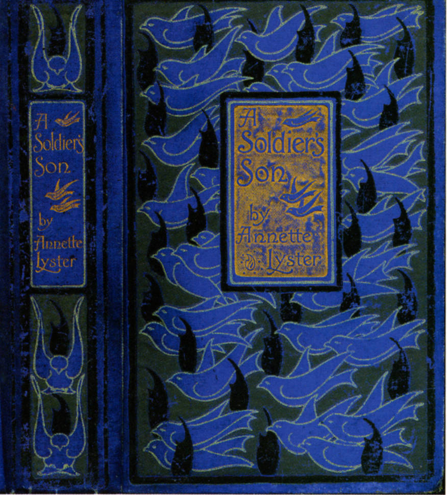
Right: Cover for A Soldier’s Son.
Other bindings are almost entirely linear and built on an interplay of vertical and radiating lines. The cover for English Lyric Poetry (1897) epitomizes this approach, and other variants are found in the liveries for Lever’s Harry Lorrequer and H. C. Davidson’s The Book of the Home (both late 90s). Each of these sets new standards for a mass-market, and Morris achieved wide-appeal with his bird-patterns. These appear in several variants. His Natural History of Animals is a reworking of the peacock motif that appears throughout Art Nouveau design, but more pleasing in its combination of austerity and lyricism are the songbirds that feature in pairs on the covers of the ‘Plain Text Poets’, and as a flock of repeating forms on the binding for Annette Lyster’s A Soldier’s Son (1898).
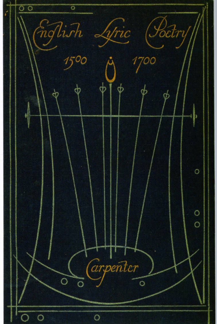
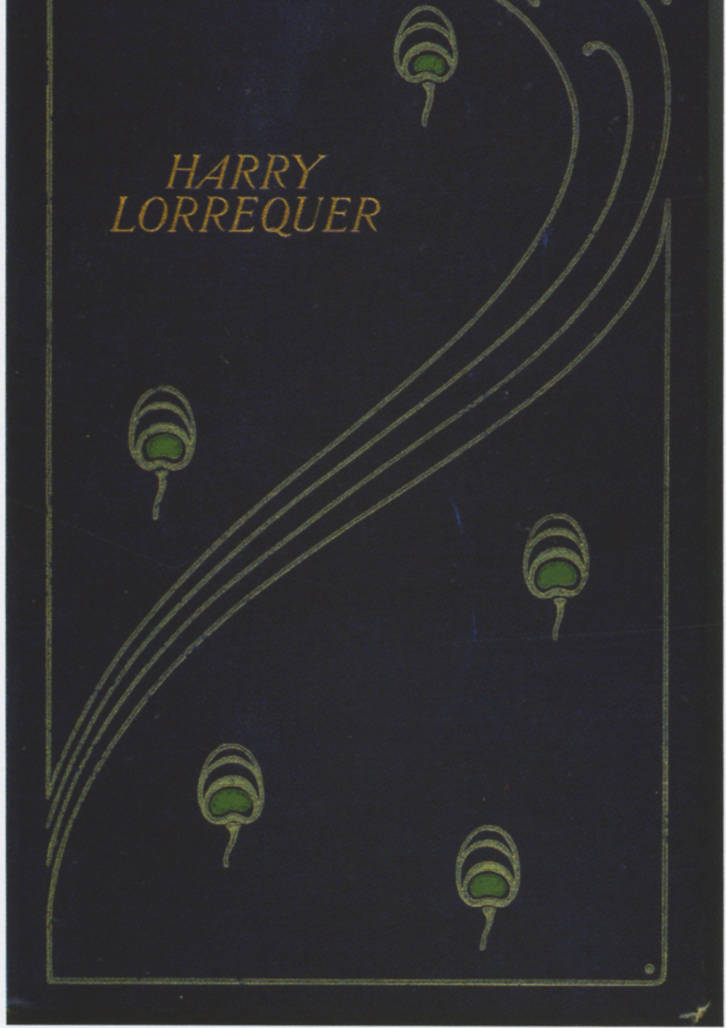
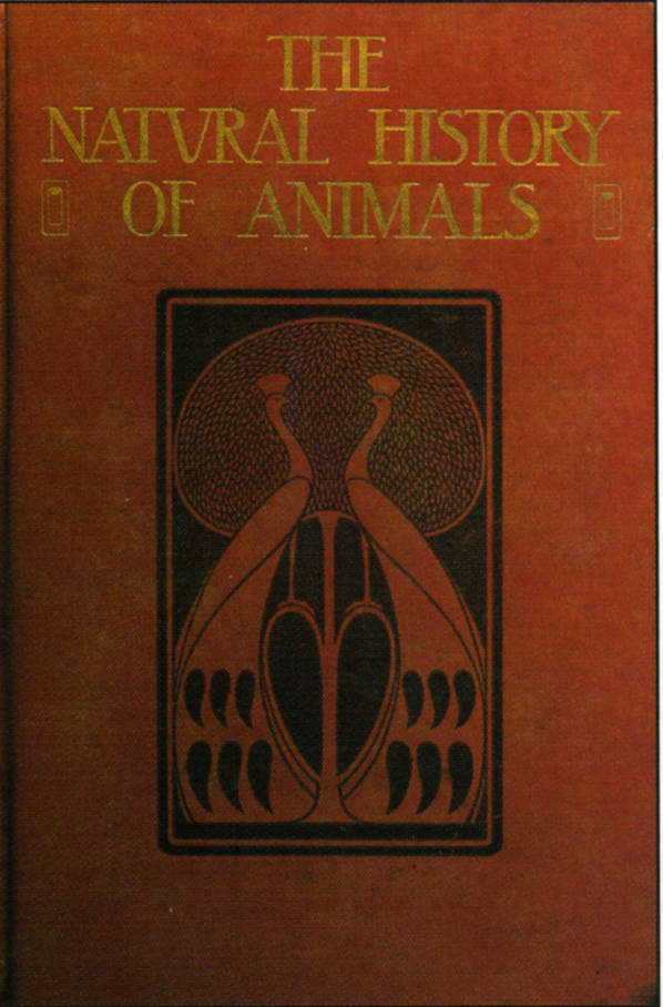
Left to right (a): Bindings for English Lyric Poetry; (b) Harry Lorrequer; and (c) The Natural History of Animals.
What is remarkable is the way in which Morris creates variation within a narrow vocabulary of motifs. Though many of his designs were applied to series, it is never the case that he repeats himself, forging a body of work that is both highly original and an important ingredient in the development of Scottish applied art.
Morris and the Relationship between the Binding and the Text
In the 1890s matching the cover with the text was generally regarded as a matter of functionality and good taste, and Gleeson White, among others, insisted that there should be relationship of appropriateness in books for the trade as there was in more expensive imprints for a select readership. Morris was bound by the aesthetics of his time, and it is perhaps surprising to find that little attention has been directed at his treatment of the consonance between his bindings and his texts. The assumption seems to be that Morris was a creator of autonomous designs whose aim was to create visual impact, rather than characterize the text. However, this view is misleading; on the contrary, Morris set out to present avant-garde designs while using those images to exemplify the books’ subject and tone.
His approach was problematized by the fact that Blackie’s catalogue was largely composed of series, which meant that much of Morris’s work was in the form of generic covers, rather than individual bindings. Nevertheless, he also produced a large corpus of distinctive work for single publications and multi-volume imprints.
His bindings for series meant that he had to encapsulate the character of multiple rather than single texts, projecting the works of Shakespeare, the English poets, and religious, practical and philosophical subjects. His solutions, in each case, were elegant and well-conceived. For Shakespeare he designed the ovoid form mentioned in the previous section, embodying a sophisticated elegance; and for his poetry books he deployed song-birds, which, though abstracted into simplified outlines, are still functional symbols, birds trilling in joyous celebration of the poets’ singing verses. Scottish Ballads represents this treatment.
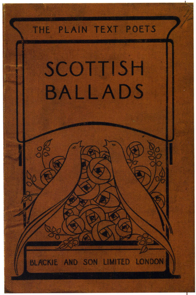
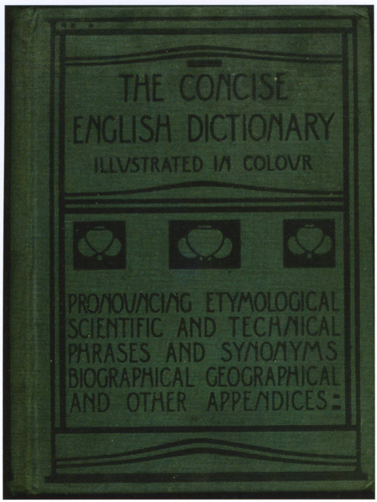
Bindings for (left) Scottish Ballads; and (right) The Concise English Dictionary.
Morris’s connecting of text and binding is equally well-considered in the case of single titles. Never limited by his style, which could have degenerated into a formula, he produced some startlingly innovative bindings in direct response to his texts’ contents. He simply but effectively captures the character of The Concise English Dictionary (1915): a book about words, it is appropriately visualized in a three-line title followed by another five listing the range of its information. Words on the exterior emblematize the words in its pages, and Morris infuses the whole with visual interest by using a highly-stylized letterpress separated into upper and lower zones; three abstracted blossoms, placed in squares and a rectangle, mark the divide. The division is made in the classical proportion of 1:3, and the whole effect is one of balance and rationality – a sign of the world of language and reason to match the dictionary’s contents. Morris also uses this matching strategy in his binding for The Whispering Winds (with the wind thrashing the girls’ hair); and for Science in Modern Life (1908) he characterizes the book’s concern with reason by symbolizing its tone in a cover made up of austere geometry. The same is true of Modern Power Generators (1908), a binding composed of two ovoids overlapped by straight lines that suggests the clean workings of modern technology.
It is sometimes the case, on the other hand, that he deploys a symbolic scheme that reflects the text’s content. The approach is sometimes straightforward. For Amelia Hutchinson’s The Reign of the Princess Naska (1899) he signals the royal theme by incorporating a coronet of hearts with four heraldic devices, repeating the same heart at the four corners of the front cover; he similarly presents Thomas Archer’s Queen Victoria (1901) in a red livery to suggest luxuriousness, with crowns decorating the upper board and the back-strip. These devices sit oddly with the other components of each design – which are made up of attenuated lines and Glasgow roses – but the effect is at least one of clarity. The books are about royalty, and the bindings signal their theme.
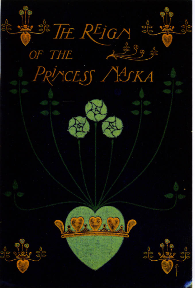
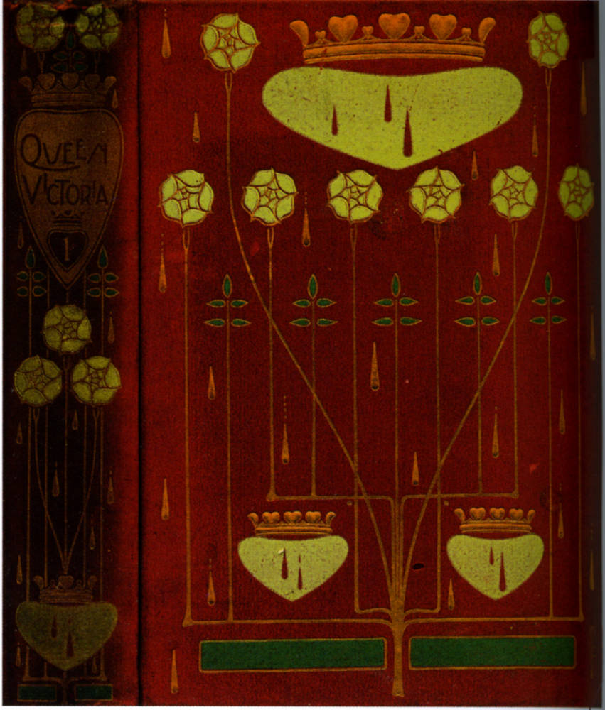
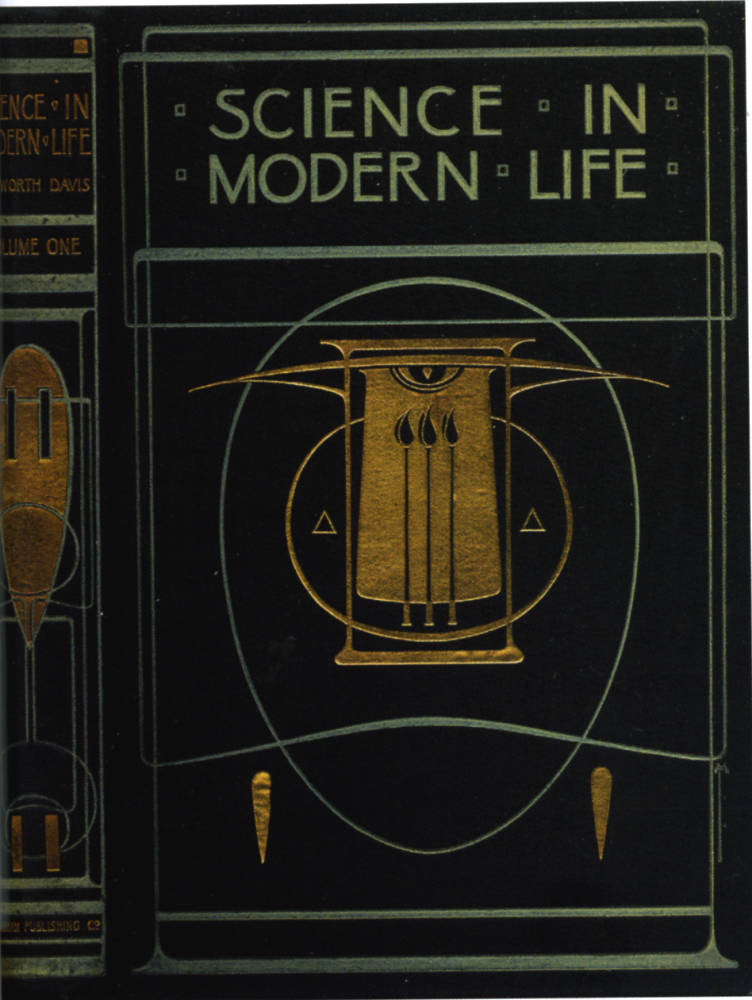
Left to right, Bindings for (a) The Reign of Princess Naska; (b) Queen Victoria; and (c) Science in Modern Life.
At the same time, Morris is sometimes prone to obscurity, deploying a personal symbolism that is inexplicable without his explanation. The intricate design for a Kempis’s The Imitation of Christ (1905) is a good example of this type of difficult work. The composition is made up of a series of what appear to be abstract forms, but Morris ascribes to them a number of meanings. As Cinnamon writes, when ‘a Mrs Brown wrote to Blackie for an explanation of the meaning of the cover device’, Morris replied in esoteric, theological terms:
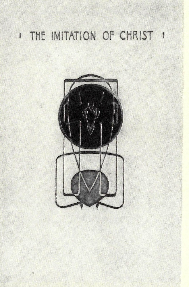
Right: Cover for Thomas à Kempis’s The Imitation of Christ.
Intimate with the base of the Cross is the Cor Sanctum. Attracted by which (in similar form, but insignificant in comparison) are the two similar hearts of Faith and Love. Interwoven with the Cross is the Vesica Piscis, extending within and beyond the Circles of Eternity; in the Centre of which are other five heart forms – having reference to the Cardinal Virtues (with Charity), and corresponding with the five Wounds of Christ. Continuous with the outline of the Cross itself is the emblem of the Tabula Eucharistae. [qtd. Cinamon 35]
This detailed quotation of Christian iconography seems strangely at odds with Morris’s bold abstraction and attempts to characterize his books in generic, abstract forms for a general audience; it also suggests that some of his other bindings could be constructed in symbolic rather than purely formal terms. In the absence of Morris’s guidance it is impossible to know. What we can say is that Morris was a highly original designer who revolutionized the appearance of books of the nineties, producing a version of Art Nouveau that stands in stark opposition to the competing styles of Ricketts, Beardsley, Granville Fell and Gleeson White.
Bibliography
Primary Works
Note: Blackie imprints almost always state their place of publication as London, even though the company was in Glasgow. London, Glasgow and Dublin are sometimes given.
Ainsworth-Davis, J. R. The Natural History of Animals. London: Gresham Publishing, n.d.
Ainsworth-Davis, J. R. Science in Modern Life. London: Gresham Publishing, 1908.
Annandale, Charles. The Concise English Dictionary. London: Blackie & Sons, 1915.
Archer, Thomas. Queen Victoria. London: Gresham Publishing, 1901.
Carpenter, Frederic Ives. English Lyric Poetry 1500-1700. London: Blackie & Sons, 1897.
Debenham, Mary C. The Whispering Winds. London: Blackie & Sons, 1895.
Edgeworth, Maria. Moral Tales. London: Blackie & Sons, n.d.
Kempis, Thomas, a. The Imitation of Christ. London: Blackie, 1905.
Lever, Thomas. Harry Lorrequer. London: Gresham Publishing, 1898.
Lyster, Annette. A Soldier's Son. London: Blackie & Sons, n.d.
Scott, R. P., and Keith T. Wallas. The Call of the Homeland. London: Blackie & Sons, n.d.
Shakespeare, William. Henry the Fifth. London: Gresham Publishing, 1898.
Stewart, Robert. Scottish Ballads. London: Blackie and Son, n.d.
Tennyson, Alfred Lord. Poems. London: Blackie & Sons, 1903.
Secondary Works
Cinamon, Gerald. ‘Talwin Morris, Blackie and The Glasgow Style.’ The Private Library 3rd Series, 10:1 (Spring 1987): 3–47.
‘EBS’, ‘Mr Talwin Morris, Designs for Cloth Bindings.’ The Studio 15 (1899): 38–44.
Euler, Laura. The Glasgow Style. Atglen, Pennsylvania: Schiffer, 2008.
Taylor, John Russell. The Art Nouveau Book in Britain. London: Methuen, 1966; revd. ed., 1980.
Tschudi-Madson, Stephan. The Art Nouveau Style. New York: Dover, 2002.
Wood, Esther. ‘British Trade Book Bindings and their Designers’. The Winter Number of The Studio, Special Number (1899–1900): 3–37.
Created 6 March 2022