
Introduction
First published in The Cornhill Magazine in 1862–3, and reprinted in 1880 as a handsome two-volume book with the images printed from the original blocks, Leighton’s illustrations for George Eliot’s Romola have been the subject of detailed investigation. The first and most influential treatment is Hugh Witemeyer’s, which forms a part of his monumental exploration of George Eliot and the Visual Arts (1979; reproduced on The Victorian Web). More recent commentaries can be found in work by Turner (1998, 1999) and Cooke (2010, pp. 147-62; 173-75; 185-86), with other accounts by Goldman (1996, 2004, pp. 209-10) and Suriano (2000, pp. 121-27).
Framed by the illustrative tradition known as ‘The Sixties’, and usually regarded as fine examples of the application of painterly standards to the smaller domain of the printed page, Leighton’s designs have always been controversial. Witemeyer’s claim that the illustrations are ‘heedless of the text’ (p.12) is provocative but difficult to refute; instead, critics have focused on the nature of Leighton’s interpretation. In one of several articles, Turner argues that the artist expands the text’s implications by focusing on sexuality, creating a series of ‘unsettling’ patterns (1999, p.178) in which Tito’s desire for Tessa is contrasted with his treatment of Romola. For Cooke, on the other hand, Leighton’s designs are primarily concerned with the fundamentals of life. As I explain,
The artist is … generally concerned … with the broad contrasts of unchanging human experience, using his designs to explore a sort of primal juxtaposition between solitariness and the bustle of society, youth and age, vitality and stagnation, vivid life and unchanging death. [Cooke, pp.160 – 61]
The arguments of Turner and Cooke can be applied to two of Leighton’s illustrations, and by exploring these illustrations in detail we can arrive at an understanding of some aspects of the artist’s response. I also consider some of the problems of placement and representation.
Love and Death
In the opening design to Romola, ‘The Blind Scholar and his Daughter’ The Cornhill Magazine, July 1862, facing p.1), Leighton presents an intriguing visualisation of Eliot’s text. Uneasily positioned in relation to its source material, it omits some information and adds other inflections of the artist’s own device. When we compare the illustration and the text we can see that Leighton’s design is far from a literal representation of its letterpress. Eliot’s words are highly specific:
The only spot of bright colour in the room was made by the hair of a tall maiden of seventeen or eighteen, who was standing before a carved leggio … such as is often seen in the choirs of Italian churches. The hair was of a reddish gold colour, enriched by an unbroken small ripple, such as may be seen in the sunset clouds on grandest autumnal evenings …Her hand was rested on the reading desk, and the other clasped the back of her father’s chair ... The blind father sat with head uplifted and turned a little aside towards his daughter, as if he were looking at her … His delicate paleness, set off by the black velvet cap which surmounted his drooping white hair …[Cornhill 36.]
When we look at the illustration, however, we see that much of what is specified is not represented visually. Romola’s hair has a ripple, and she does have a hand on the back of her father’s chair; however, her other hand is not on the reading desk; Bardo does not look up at his daughter; and there is only the slightest representation of his ‘drooping white hair’.
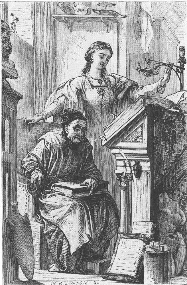
Leighton's The Blind Scholar and His Daughter. [Click on the image to enlarge it.]
Eliot wanted the illustrator to reinforce her effects by underlining them in visual equivalents, but Leighton provides what is essentially a visual paraphrase. Unsurprisingly, the author was irritated by the artist’s digressions, and not unreasonably expressed the opinion that she wished he had shown Bardo looking at his daughter, as specified (Cooke, p. 150). Her indignation is best encapsulated in Turner’s business-like question, ‘whose text is it anyway?’ (1998, p.17). However, Leighton’s strategy, one of selection and approximation, is carried forward in the following designs, and this lack of agreement problematizes the idea of Romola as a dual-text.
Where there should be consonance, there seems only dissonance: Eliot describes her scenes one way, Leighton another, making the text and illustrations seem only loosely related to each other. In the case of ‘The Blind Scholar’, the lack of connection is amplified by the fact that the image represents a scene which is not described on the page facing it, but appears 36 pages later (and following another full page design and two small vignettes) towards the end of the serial number. This means it is not possible to compare the text and the illustration in the way that it is possible to read Dickens’s texts while glancing at one of Phiz’s etchings, facing the letterpress or accessed by turning a single leaf. Leighton’s design is proleptic, but the effect is far from intimate, generates no anticipation whatever, and forces the reader/viewer to scan back and forwards over most of the instalment.
Yet the illustration does visualise information contained on page one. The image’s dramatic content turns up much later, but Leighton uses the design to provide a coded visualization of Eliot’s philosophical speculations on the nature of life, as outlined in several densely written paragraphs. It is most closely linked to the author’s belief that:
We are impressed with the broad sameness of the human lot, which never alters in the main headings of its history – hunger and labour, seed-time and harvest, love and death. [Cornhill 1]
This grappling with the great contrasts of life and time are given symbolic form in the arrangement of the figures and the deployment of emblems. The contrast of Bardo and Romola, with one decrepit and the other young and vigorous, is a visual sign of the relationship between youth and age, ‘seed-time and harvest’. Indeed, cast like this we can immediately see why Leighton disobeyed the textual detail which specifies Bardo’s looking at Romola; instead, he makes an explicit contrast between youth and age by linking their profiles, with their heads in parallel outline. The contrast of Romola and Bardo, age and youth, is further expressed by the incorporation of emblematic details. Romola, a child of nature, is wearing a dress embellished with a floral design, wears a floral necklace, has a flower in her hair and stands in front of a small vase of flowers on the window-sill: symbols of ‘seed-time’. Bardo, on the other hand, is associated with the static and unchanging, with life ‘harvested’ in the form of the inert furniture and fittings – objects which cannot grow or change. ‘Love and death’ are similarly conveyed in the contrast between the erotic classical statuary positioned to the bottom right, and the bust at the top left: one represents sexuality, contorted by desire; while the other is perhaps a funerary bust, and certainly a likeness of the dead.
So Leighton uses his design to crystallize Eliot’s philosophical musings; relatively uninterested in showing an exact depiction of the dramatic mis-en-scene, in this image he is more interested in visualizing the novel’s key themes than in recreating the trappings of setting and pose. This represents a distinct, cerebral approach to the source-material in which accuracy, as such, is compromised in the pursuit of a visual scheme that privileges the text’s underlying ideas, bringing one of them, the speculation on the rhythm of life, to the very forefront of our reading/viewing experience. Equally important, he forces the reader/viewer to decode the illustration, which is presented to us as a visual scheme with all of the iconographic complexity that we normally associate with the illustrations of Phiz.
Love and desire
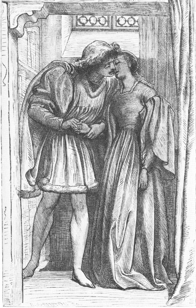
Leighton's The Furst Kiss. [Click on the image to enlarge it.]
Discussion of the previous illustration demonstrates that Leighton’s illustrations are focused on the novel’s intellectual content rather than representing its treatment of experience and the practical realities of Florentine life in the fifteenth century. Earlier critics have noted this orientation without penetrating the artist’s iconographies, and some have viewed Leighton’s responses as cold and uninvolving. In his classic study of 1928, Forrest Reid claims the illustrations ‘have a kind of cold, formal dignity’ but could barely be described as ‘sympathetic’ (p.207), and it is commonplace to speak of them, as Goldman does, as ‘austere’ (p.210). Without doubt, the illustrations are dense, sometimes forbidding texts, presenting a complex semiotic that demands to be read as one would read the intricate surfaces of Leighton’s paintings. Yet there are many occasions when the artist presents images of visceral intensity, visualizing the novel’s intense passions in a direct and imposing way.
Turner has written in detail of the illustrator’s treatment of the sexual conflicts which permeate the novel’s action (1999) and this interest can be traced, so Turner argues, in individual illustrations and in the relationships between them. Turner also writes of the psychological insightfulness of many of the images, dealing with matters of the heart in a manner far removed from any sense of the ‘cold’ aloofness remarked by Reid. In ‘The First Kiss’ we have an intense and uncomplicated representation of Tito and Romola in their first intimate moment (The Cornhill Magazine (July 1862): facing 289). It illustrates some simple lines:
The faces just met, and the dark curls mingled for an instant with the rippling gold …They were both contented … for that first blissful experience of mutual consciousness was the all the more exquisite for being unperturbed by immediate sensation. [294]
Uncluttered with emblematic detail, this illustration conveys the ‘blissful experience’ with an ‘exquisite’ directness and sensitivity. Focusing on the delicate holding of the hands and the enraptured facial expressions, it provides a powerful but understated representation of the novel’s romantic and sexual theme; as intense as any love-scene by Rossetti, and deploying the conventions of medievalist Pre-Raphaelitism, it shows how Leighton could change idiom when it served his purposes. Most of his illustrations are indeed characterized by classical restraint and the presentation of legible iconographies; but here, as in several of his designs, the emphasis is on the depiction of experience as it is felt, rather than an intellectualized reflection on its underlying meanings. Taken in conjunction with the illustration of the blind scholar, it figures the other polarity of Leighton’s complicated reading of Eliot’s text.
Works Cited
Cooke, Simon. Illustrated Periodicals of the 1860s. Pinner: PLA; London: The British Library; Newcastle, Delaware: Oak Knoll Press, 2010.
Cornhill Magazine, The. London: Smith, Elder, 1862–3.
Goldman, Paul.Victorian Illustration. Aldershot: Scolar, 1996.
Reid, Forrest.Illustrators of the Sixties. London: Faber & Gwyer, 1928; New York: Dover, 1970.
Suriano, Gregory R.Pre-Raphaelite Illustrators. Newcastle, Delware:
Turner, Mark. ‘Drawing Domestic Decline: Leighton’s version of Romola’.Frederic Leighton: Antiquity, Renaissance, Modernity. Eds. Tim Barringer & Elizabeth Prettejohn. New Haven: Yale University Press, 1999. pp. 169–192.
Turner, Mark. ‘George Eliot v Frederic Leighton: Whose Text is it Anyway?’From Author to Text: Re-reading George Eliot’s ‘Romola’. Eds. Caroline Levine & Mark W. Turner. Aldershot: Ashgate, 1998, pp. 17 –35.
Witemeyer, Hugh.George Eliot and the Visual Arts. New Haven, Yale University Press: 1979. [full text in the Victorian Web.]
Last modified 14 November 2012