
he elaborate bindings of illustrated gift books of the mid-nineteenth century are complex artefacts. Intended to create an effect of visual splendour when they were unwrapped on Christmas morning or presented as cadeaux at other times of the year, their ornamental surfaces are typically composed of gilt patterns mounted on coloured cloth, bevelled boards and decorative lettering. Showy, extravagant, excessive and never less than cheerfully imposing, such bindings occupy an ambiguous position between the functionality of the book, the materiality of applied art, and the sensuousness of the illuminated page. Their dissolving of formal structures and idioms makes them difficult to classify, a confusion intensified by the sculptural nature of their bevelled edges and embossed surfaces; mediating between literature and the purely ornamental, three-dimensionality and the flatness of the pages they enclose, which were often illustrated, they demand to be looked at and read, admired as a decorative object and held in the hand.
The ambiguous status of such books is further problematized by the question of the covers’ authorship. On the one hand are the liveries that are identified, usually with a signature, as the work of designers such as John Leighton, Robert Dudley, John Sliegh, W. R. Rogers and Albert Warren, and on the other a vast number of casings with no known creator. In his extended bibliography of trade bindings, Edmund King identifies almost a hundred unsigned items out of a total of 752 he studied (229–55), and there are certainly many more by unknown hands.
The work of the established designers can be analysed within their own terms as having stylistic consistency and purpose, but how, then, to make sense of the anonymous bindings? The easy solution is to dismiss them as purely commercial objects – cobbled together by random artisans to satisfy a vast demand, with little thought of aesthetics or style beyond the need to make them attractive. Indeed, contemporaries often thought of them in these terms. In reviews of ‘Books of the Season,’ which appeared in periodicals such as The Saturday Review and The Athenaeum, it was commonplace to describe new publications as impersonal ‘manufactures’ – a judgment applied to the text and illustrations but especially to the bindings. For many commentators, gift books were valueless, trinkets to satisfy the ostentatious tastes of consumers with more money than taste and a reflection of the publishers’ greed and willingness to exploit a market opportunity. They were certainly a source of easy profits at a time when most were priced between 5 shillings and a guinea: considerable sums equivalent to £15 and £60 in modern sterling.
The dismissal of these author-less covers as vulgar trash is open, nevertheless, to challenge. One way of revaluing them is to analyse them not as inferior objects – because they are anonymous – but as the earnest work of journeymen designers who manipulated the conventions of the discourse. In particular, their work can be assessed in terms of the designers’ use of key stylistic constituents, notably the visual languages of Gothic, Classicism, naturalism and Orientalism. In other words, the anonymous creators’ bindings can be repositioned as artefacts driven by genre and idiom rather than authorship, functioning as another aspect of Victorian eclecticism – of borrowing styles from the past and applying them to contemporary design. Within this structure, many outstanding works can be identified, and it is interesting to consider the rich variations on generic styles as these nameless practitioners made their unacknowledged mark on the traditions of binding ‘for the trade’.
Naturalism
Verisimilitude, or ‘copying from nature,’ is a key constituent in Victorian aesthetics and informs all aspects of art and literature. In the hands of binding designers it takes several forms. Some of the anonymous exteriors incorporate a motif illustrating a scene from the text, which may be presented as a chromolithographic inserts or series of inserts. The front board for Wordworth’s Poems for the Young (1866) exemplifies this approach. Made up of a roundel positioned in the centre and two panoramic strips positioned at the top and bottom, it represents three episodes from the poems: the central design is a copy after J. E. Millais, who provided the illustrations, and the other two are originals, acting as proleptic signs announcing externally the information contained in the letterpress. In many other cases this arrangement afforded the unknown designer the important task of establishing the text’s theme, tone, or characters, a strategy encapsulated by the artist's work for Shirley Hibberd’s Clever Dogs, Horses, etc [1868]. Though illustrated by Harrison Weir, the brief to represent a moment of characteristic cleverness – a horse operating a pump – is left to the anonymous author who adapts one of Weir’s designs to create the chromolithographic panel on the front cover; naturalistic motifs in gilt perform in the same way.

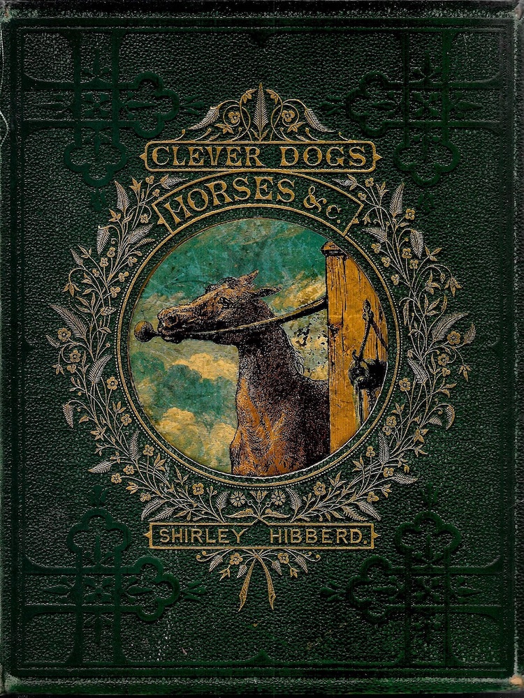
Left: A variant binding for Wordsworth’s Poems for the Young (1866), with its anonymous chromolithographic inserts; and Right: another coloured insert, this time for Hibberd’s Clever Dogs, Horses, etc (1868).
The most popular type of naturalism, however, is a version of rusticity, incorporating images of birds, other animals, flowers and tendrils. This imagery is derived from the ‘Germanic’ illustrations of Rethel; popular in the 1840s, it was extended in the unregulated hands of jobbing binding-designers. A good example is the gilt design embellishing Little Songs for Me to Sing [1867]. This delightful image is a complex arrangement, combining the discipline of a roundel with a closely observed representation of songbirds, butterflies, emanating leaves and intertwined stems; a more formal border encloses the design. Linked with Millais’s illustrations in the text, it was (probably) not by him but the work of an accomplished silent partner. Many other examples can be found: Beautiful Butterflies (1871) and Our Garden Friends and Foes (1864) are especially pleasing, and nature-scenes were routinely applied to everything from volumes of verse to works on gardening, farming, and the natural world.
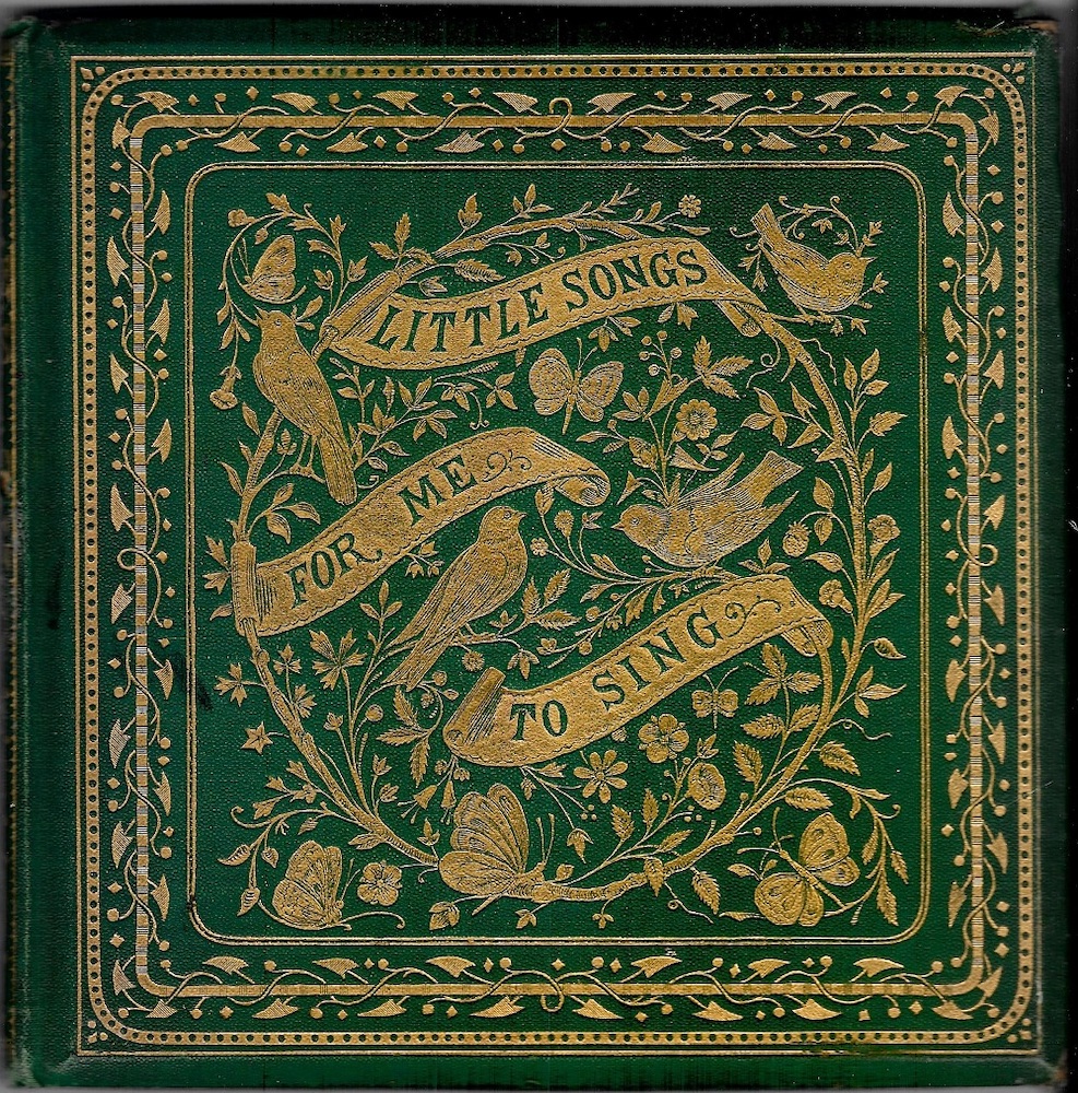
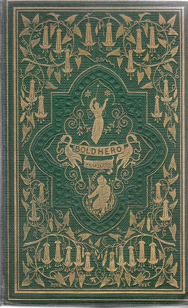
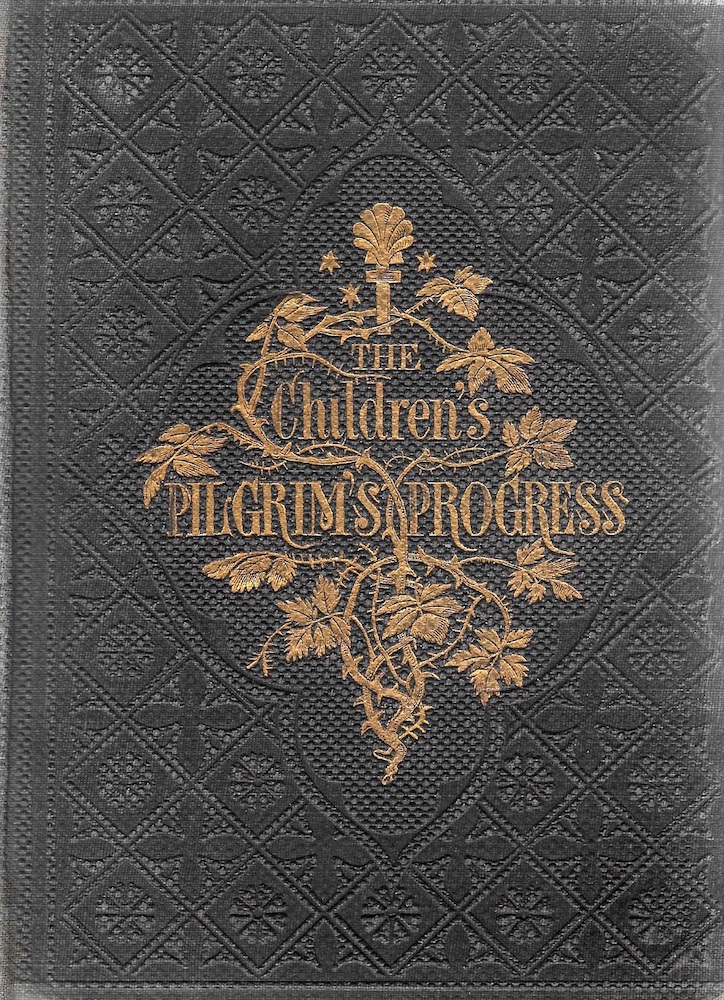
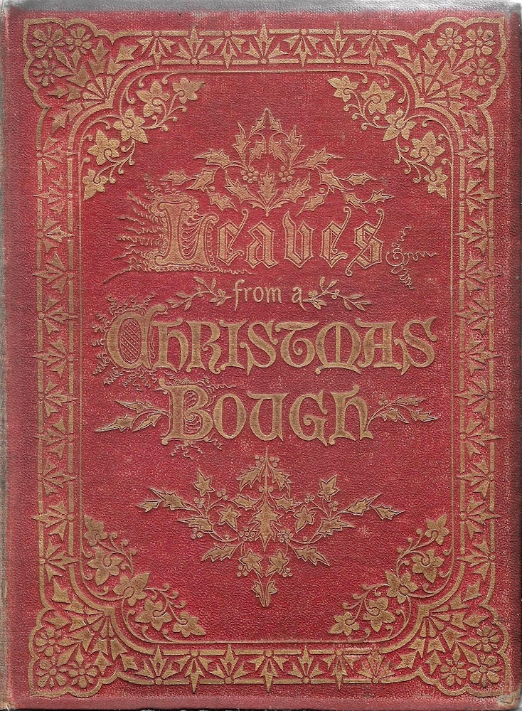
Some examples of anonymous decorative covers displaying natural imagery: (a) Little Songs for Me to Sing (1867), an aviary of trilling songbirds; (b) a sweet bouquet for Peter Parley’s [S. G. Goodrich’s] The Adventures of Dick Boldhero [1862]; (c) a foliate front board, perhaps by the book’s illustrator, E. H. Wehnert, for Bunyan’s A Pilgrim’s Progress (1860); and (d) Leaves from a Christmas Bough(1867).
Leaves as a motif in their own right also feature, with Christmas books displaying naturalistic renderings of holly as in Leaves from a Christmas Bough (1867). The equation of poetry and flowers (or ‘posies’) led to the production of numerous treatments of bouquets and floral cornucopia. Variations encompassed leaf-types, brambles, vines, creepers and all sorts of other flowers; these were usually depicted realistically as if they were botanical studies, so it is generally possible to identify the type of plant.

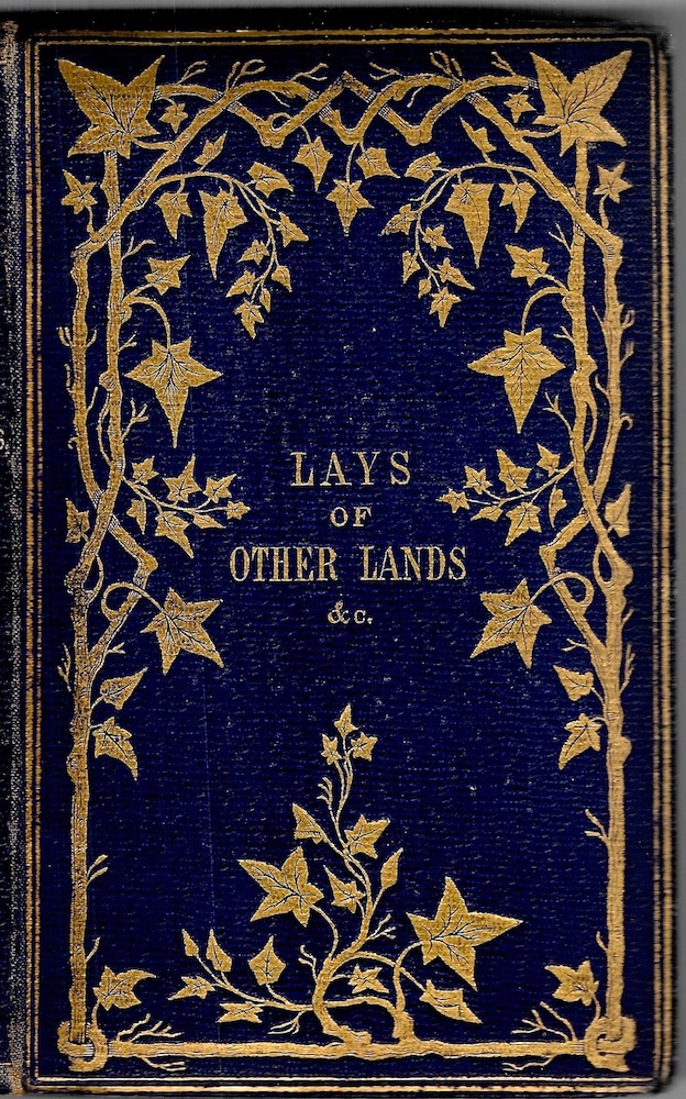
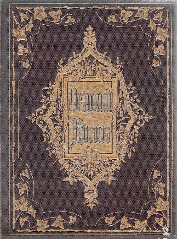
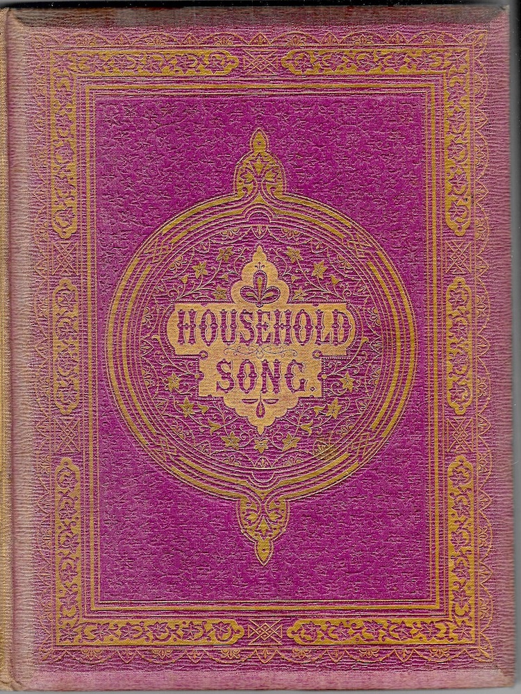
Some examples of the ivy-motif (a) Leighton’s design for Eliza Cook’s Poems (1861); (b) an anonymous design for W. Evans’s Lays of Other Lands (1861); (c) another unsigned cover for Original Poems (1868); (d) Household Song (1861), perhaps by Leighton.
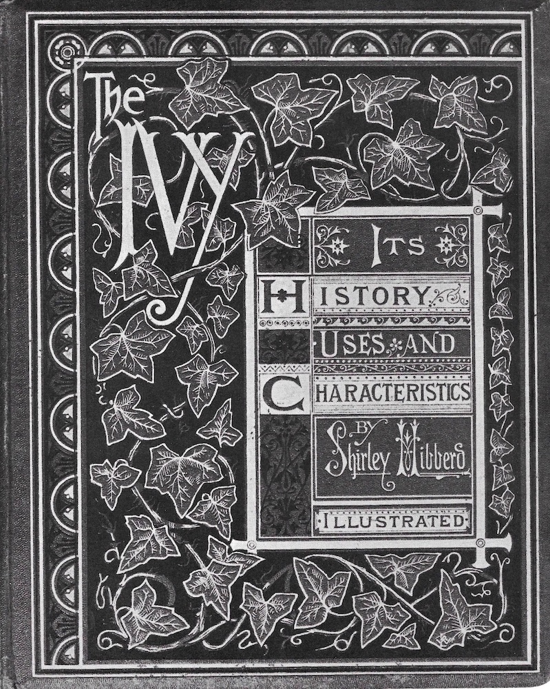
The front cover of Shirley Hibberd’s The Ivy (1872).
Within this genre, there was another subset in the form of covers embellished with gilt patterns of ivy. This motif was developed by Leighton and Warren, and there are many examples of anonymous treatments. It is not clear why the ivy should be privileged above other sorts of leaf, though it could be that its emblematic significance within the Victorian ‘language of flowers’ as a sign of memory is exploited in order to suggest that the reader will, or should, remember what are presented as memorable texts (especially when they were anything but memorable, and needed a lift). Conversely, it might be that it is simply a matter of the ivy having a pleasing shape, easily combined with infinite varieties in the disposition of its supporting stems. Certainly, the ivy-motif turns up in all sorts of lyrical compositions, animating the surface of the boards in a series of arabesques. The rustic front board for W. R. Evans’s Lays of Other Lands (1861) is a case in point; Original Poems (1868) another. Best of all, though, is the binding for Shirley Hibberd’s The Ivy (1872), where the fascination with the plant is applied to a text (accompanied with vivid chromolithographs) about ‘Its History, Uses and Characteristics.’ For once, the motif is related to the book it embellishes.
Gothic
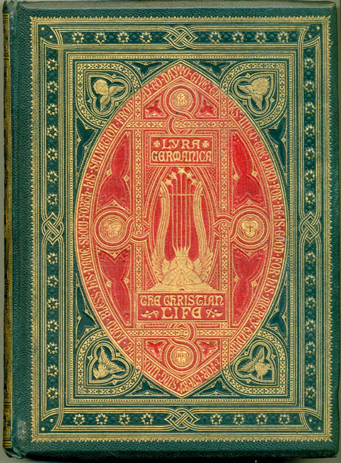
Driven forward by Pugin and the Gothic Revival of the 1840s and 50s, Gothic became a favourite source of imagery for book designers. It was given a special impetus in the work of Leighton, who decorated a large portion of his casings with devices derived from medieval art. The connection between Gothic architecture and Leighton’s bindings is made explicit in his design for Walter Scott’s Lay of the Last Minstrel (1854), which features a ‘Decorative’ ecclesiastical window as its central panel. Leighton is more interested, however, in the mandorla that featured as the frame surrounding Christ in Gothic sculpture and illuminated manuscripts. The mandorla (Italian: ‘almond’) is Leighton’s signature image and turns up in variant forms in his covers for A Round of Days (1866), Lyra Germanica (1868) Gray’s Elegy (1869) and on the bindings for many others. His promotion of the form was highly influential, and was carried forward in some hundreds of anonymous liveries.
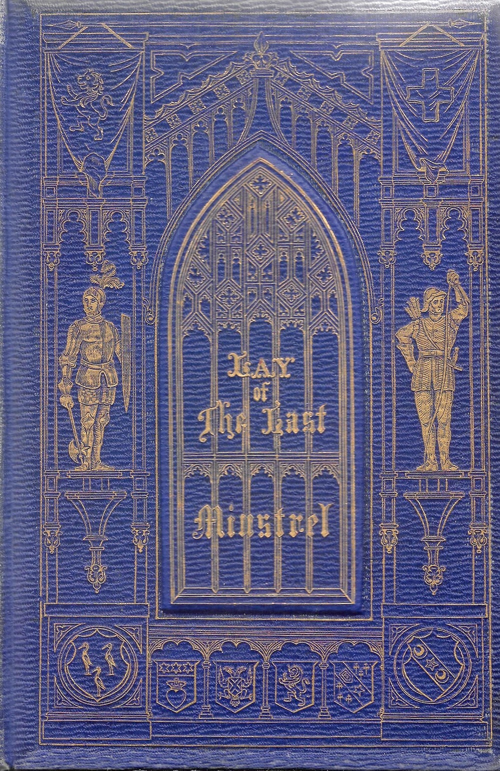
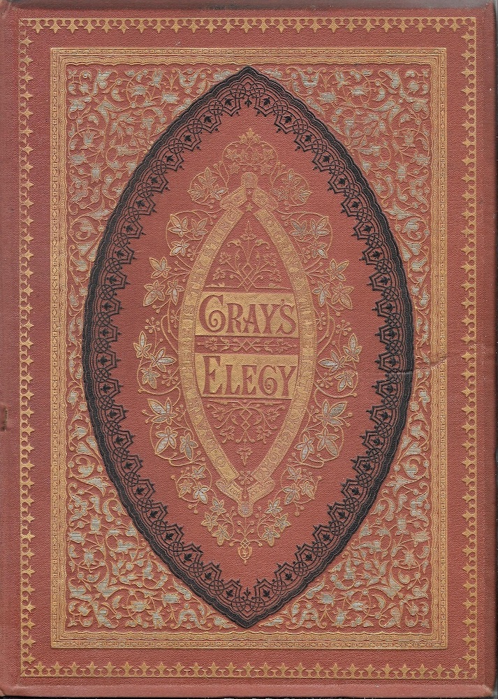
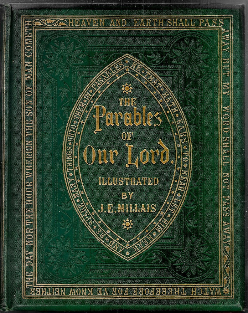

Some examples of Gothicism, anonymous and ascribed: (a) Leighton’s design for Scott’s Lay of the Last Minstrel (1854); (b) the same designer’s work for Gray’s Elegy (1869). (d) Unsigned front covers for Parables of Our Lord (1864) and Lyra Americana (1865).
Good examples include the pared-down design embellishing Parables of Our Lord(1864). Famous for its dramatic and moving illustrations by Millais, the book’s refined quality is projected by the imposing mandorla on the front cover; alluding to the iconography of the medieval church, it does not depict Christ but suggests His presence by recreating the traditional almond-shape. The effect is completed by quoting words from the Parables in the enclosing strip-work and border.
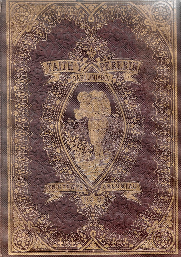
Another variant on the Gothic mandorla,
this time in the form of an anonymous cover
for a Welsh version of Bunyan’s allegory (1872).
Pious allusiveness is not the only function of this motif, however. More generally, the mandorla was used for purely decorative purposes, and as a means to focus attention on the title in the middle of the board, sometimes in conjunction with a figurative motif. Taith Y Pererin (1863), a Welsh translation of The Pilgrim’s Progress is typical of this approach, with Christian placed within another ovoid shape, and elsewhere it is combined with other ornamental devices. The inventiveness with which it was formed and revised is a strong assertion of the versatility of artists who manipulated an established visual language for their own purposes.
Classical and Renaissance
Gift books of the 1850s were often bound in cloth bindings embellished with neo-classical patterns in gilt, a favourite being an urn or vase, sometimes embellished with floral devices. In the 1860s, however, the emphasis was redirected to Renaissance neo-classicism, deploying a rich vocabulary of putti, swags, decorative roundels and cornices, and other motifs. Rogers made a significant contribution to the development of this style, and many anonymous designers explored the potentialities of this idiom.
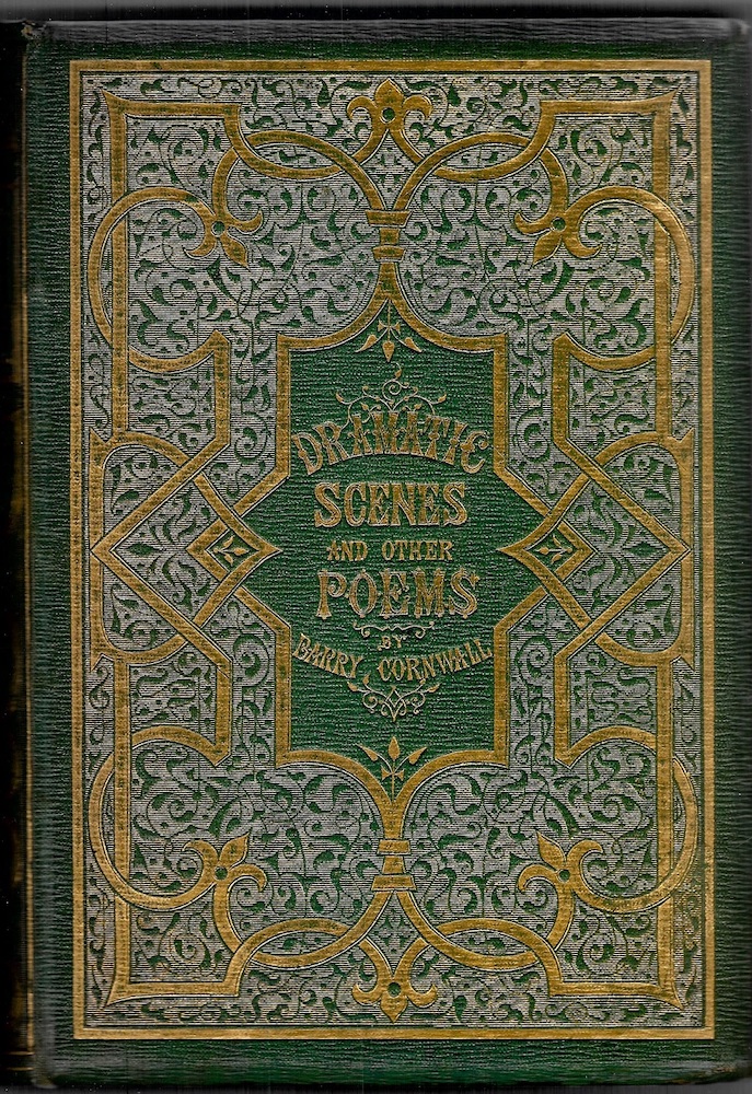
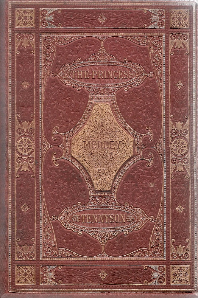
Three neo-classical designs by unknown designers: (a) cover for Barry Cornwall’s Dramatic Scenes and Other Poems (1858); (b) for Tennyson’s The Princess; and (c) for Poems and Pictures (1860).
The results were often (uncharacteristically) elegant and dignified. For Barry Cornwall’s [Bryan Procter’s] Dramatic Scenes (1858) the designer created an elaborate, symmetrical interlace in gold laid on a floral field of light green cloth: its impact is considerable, evoking the treasure-box of a Renaissance prince. The panelled, architectural cover for Alfred Tennyson’s The Princess (1866), is equally grand; conceived as a careful balance of parts, it could easily be part of the architecture of an Italian villa, and the same is true of the neo-classical livery of the re-issued Poems and Pictures (1860). In neither case is any thought given to the appropriateness of such designs, and there is no direct linkage between the covers and the text. What the artists set out to do, rather, was to suggest the civilizing nature of the books’ contents by projecting a style associated with the high culture of the Italian Renaissance.
Orientalism
Interest in Eastern cultures was a consequence of Britain’s imperialism, with the empire’s acquisition of territories in the Arab world. Orientalism was a theme in painting, and Islamic style was a feature of the applied arts. Book designers appropriated this generic styles as they did others. Warren, among the identified artists, made use of Arabic motifs to reflect their books’ contents, notably in his work for Thomas Moore’s ‘Oriental romance,’ Lalla Rookh (1860). A lyrical and mysterious version of this imagery also features on the unsigned livery for the Arabian Nights’ Entertainments [1870]. More often, though, the interest in this style was purely decorative, with many anonymous designers making use of the richness and exoticism of Islamic iconographies only to create a visual effect, even when there was only an arbitrary relationship, or no relationship at all, with their publication’s text.
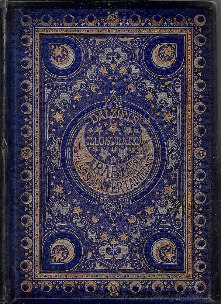

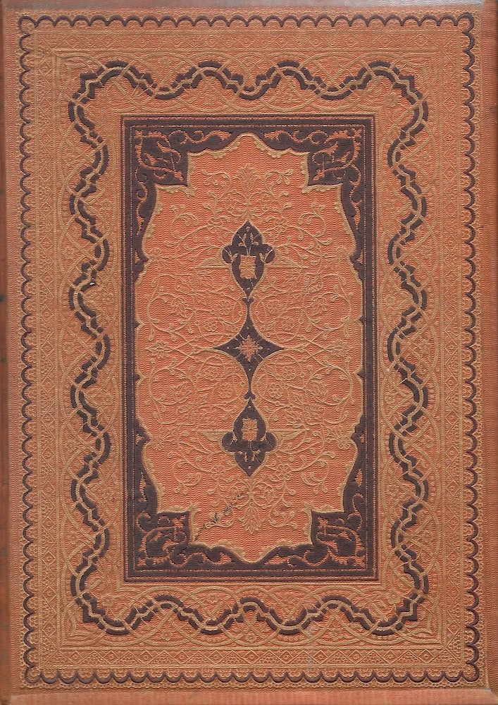
Three Oriental designs by unknown designers: (a) Dalziels’ Illustrated Arabian Nights’ Entertainments [1870]; (b) Goldsmith’s The Traveller [1858]; (c), James Graham’s The Sabbath (1857).
The Orientalist cover of Oliver Goldsmith’s The Traveller [1858] is typical of this approach. A few lines mention African journeys, but the text otherwise makes no mention of adventures in the East, and the binding, with its elaborate pattern in the manner of a Persian carpet, is entirely misleading. Designed to beguile the viewer, the cover is purely a source of visual pleasure rather than acting as a proleptic sign. The casing for James Graham’s The Sabbath (1857) is likewise impressive but inappropriate, and the exteriors of both publications are markedly at odds with the English ruralism of Miles Birket Foster’s illustrations.
Hybrids
The book artists’ stylistic promiscuity, with free borrowing from a diverse body of idioms, was extended by their free intermingling of those styles. As in Victorian architecture, again, it was not unusual for bindings to include motifs from different periods to create a synthetic, non-hierarchical fusion within the development of a single design – essentially a free movement from Gothic to naturalism or some other, arbitrary intermixing. Roses and Holly (1867–74) epitomizes the exploitation of the image-hoard as it developed over time. In its first incarnation (1867) the designer fuses Gothic (in the form of a mandorla), naturalism (in the roses and holly positioned concentrically within the mandorla), Renaissance ornamentalism (the outer border) and sun-rays (as in Baroque sculpture) emanating from the central panel. The result is absolutely excessive, as if the publishers were unsure of the quality of the contents – a curious mix of prose and poetry, along with a variety of illustrations both serious and comedic, intended to amuse and instruct: ideal material for jokes around the fire, but nothing to do with the yule. The holly on the front cover acts as a small reminder, although the publishers widened the book’s appeal as much as possible by pronouncing, in the subtitle, that it was intended as a ‘gift-book for all the year.’ When it comes to the edition of 1874, however, the design -balance has been changed; this time the upper board has been simplified, with the Gothic mandorla combined with the original roses along with hollies in black in the four spandrels. This process suggests that the various elements were cut on separate brass dies, and could be removed or re-applied as required.


The two versions of Roses and Holly: left, 1867, and right, 1874.
The overall effect of this approach depends on one’s point of view: to some it is aesthetic chaos, a reflection of the Philistinism of the bourgeois audience; while for others, it is another example of the unfettered inventiveness of those many silent practitioners who, alongside the better-known designers who signed their work and were named in advertisements, helped to create the muddled and complex discourse of Victorian trade-binding.
Bibliography
Primary
Bond, E. Leaves from a Christmas Bough. London: Routledge, 1867.
Bunyan, John. The Children’s Pilgrim’s Progress. London: Bell and Daldy, 1860.
Bunyan, John. Taith y Pererin. Wrexham: Hughes [1863].
Cook, Eliza. Poems. London: Routledge, 1861.
Cornwall, Barry [Bryan Procter]. Dramatic Scenes and Other Poems. New York: Appleton, 1857 [this is an American version of a British book, which is identical].
Dalziels’ Illustrated Arabian Nights’ Entertainments. London: Ward, Lock, & Tyler [1870].
Evans, W. R. Lays of Other Lands. London: Routledge, 1861.
Goldsmith, Oliver. The Traveller. London: Bogue [1858].
Graham, James. The Sabbath. London: Nisbet, 1857.
Gray, Thomas. An Elegy in a Country Churchyard. London: Sampson Low, 1869.
Hibberd, Shirley. Clever Dogs, Horses, etc. London: Partridge [1868].
Hibberd, Shirley. The Ivy: Its History, Uses and Characteristics. London: Groombridge, 1872.
Household Song. London: Kent, 1861.
Leslie, Henry. Little Songs for Me to Sing. London: Cassell, Petter, Galpin [1867].
Lyra Americana. London: The Religious Tract Society, 1865.
Original Poems. London: Routledge, 1868.
The Parables of Our Lord and Saviour Jesus Christ. London: Routledge, 1864.
Parley, Peter [S. G. Goodrich]. The Life, Travels, and Adventures of Dick Boldhero. London: Dalton & Hodge [1862].
Poems and Pictures. London: Sampson Low, 1860..
Roses and Holly. Edinburgh; Nimmo, 1867, 1874.
Scott, Walter.The Lay of the Last Minstrel. Edinburgh: Black, 1854.
Tennyson, Alfred. The Princess. London: Moxon, 1866.
Wordsworth, William. Wordsworth’s Poems for the Young. London: Strahan, 1866.
Secondary
King, Edmund. Victorian Decorated Trade Bindings, 1830–1880. London: The British Library & Newcastle: The Oak Knoll Press, 2003.
Created 30 May 2023