
ictorian book binding can be divided into two ‘golden’ periods: the first was the 1860s, when designers such as John Leighton and Albert Warren produced the extravagant styles of the gift book, while the second, running from around 1890 into the early years of the twentieth century, and sometimes continuing into the Twenties, was the great age of British Art Nouveau. During this time, a number of designers worked in the idiom of the ‘the Modern’ or ‘new art’: absorbing influences from Europe, British artists applied the tropes of Nouveau to a wide range of publications.
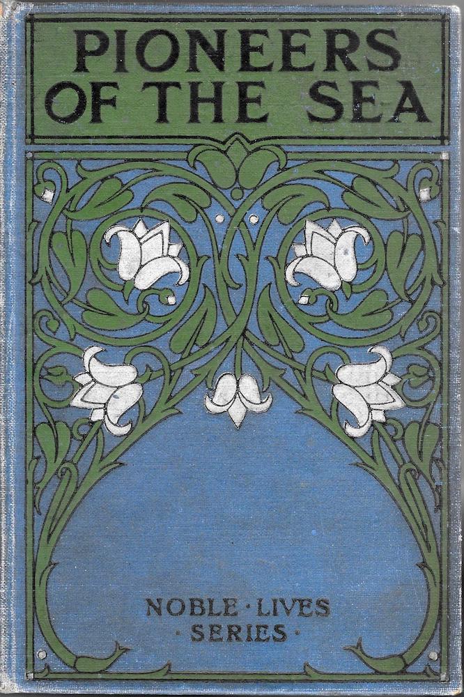
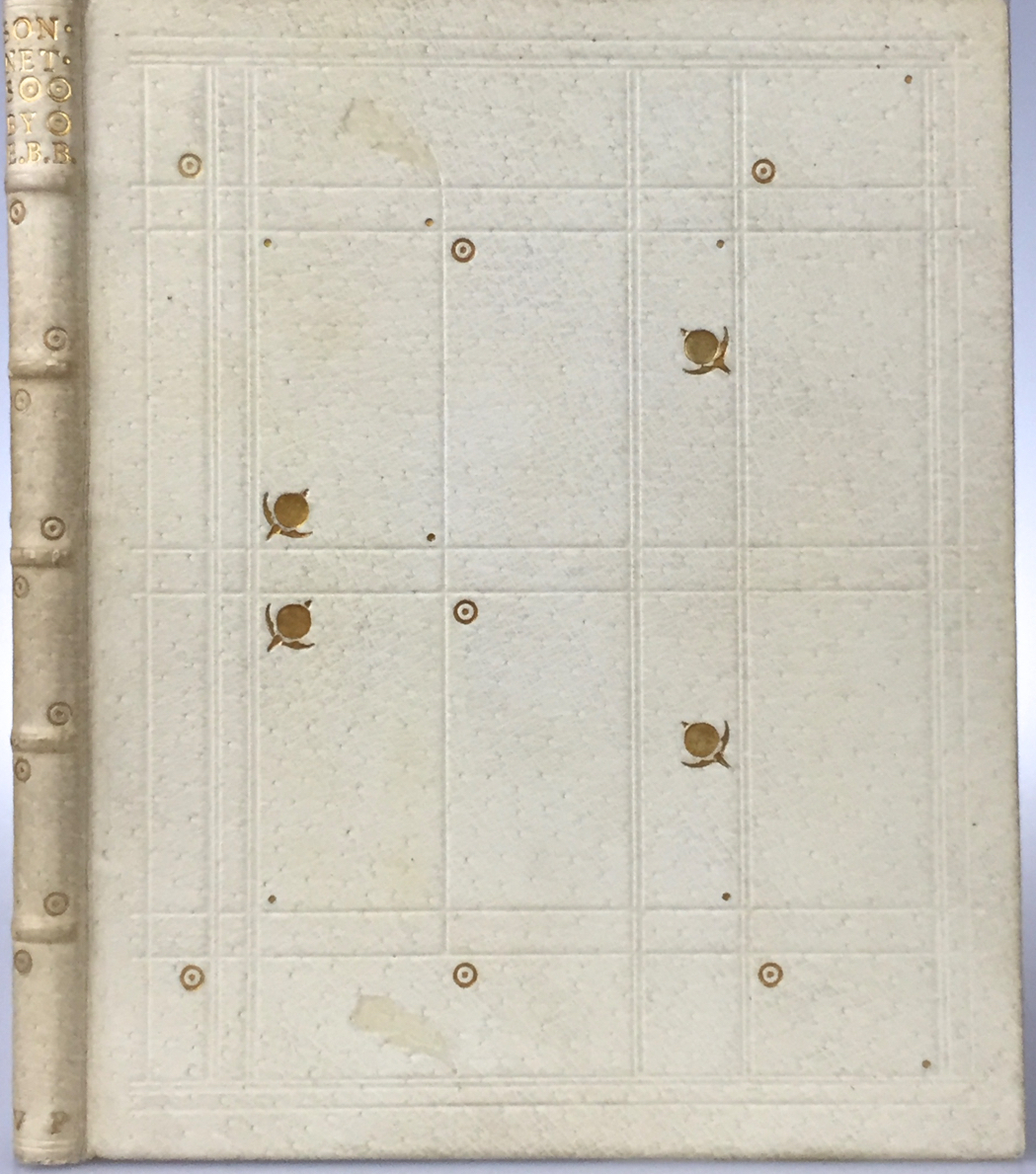
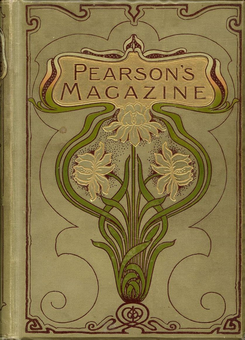
Left to right: (a) An anonymous binding for William Macdougall’s Pioneers of the Sea [1914]. (b) Binding for Sonnets by E.B.B. by Charles Ricketts (1897). (c) The elaborate front cover of Pearson’s Magazine (1899).
Luxury editions, in leather or vellum and aimed at an elite audience, were bound by the same aesthetic as the lower end of the market, and shared a visual language with cheap imprints enclosed in cloth and paper casings. On the one hand were singular works such as Charles Ricketts’s pigskin binding for Elizabeth Barrett Browning’s Sonnets (1897), and on the other an anonymous cloth livery for Pioneers of the Sea [1914]; the first was hand-crafted at the Vale Press and intended for a connoisseur, and the second a cheap, mass-produced reprint.
The ubiquity of the style reflected its status as a modern fad, and had the effect of democratizing taste, projecting an avant-garde style to the reading public at large: it fused ‘high’ and ‘low’ culture and abolished the hierarchical ordering of earlier Victorian design, where types of bindings were often rigorously demarcated along class-lines. In the nineties there was no difference between aesthetic standards of the top and the bottom; indeed, it was often noted that the most adventurous work was applied to inexpensive imprints, educating the public by offering the highest quality design for the least money. In the words of one commentator writing in The Studio in 1899, some of the best examples of Art Nouveau,
[it] must be remembered [were not] for the limited editions of high-priced volumes, prepared for the purpose of appealing only to the few who are conscious – perhaps rather too conscious – of possessing ‘cultural’ taste. On the contrary, they are issued upon popular volumes intended for the general reader. This simple fact would support an optimistic view of the improvement in taste of the average unit, that makes up the British public. [‘E.B.S’, 38]
Some practitioners, who inherited the political philosophy of William Morris’s Arts and Crafts, made a point of pursuing this dissemination of outstanding design, among them Gleeson White and Talwin Morris. At the same time, the style’s pervasiveness had the effect of transforming books which were not intended as gift books into ornamental objects, creating an alignment with the many other applications of European Art Nouveau as they appeared in the form of jewellery, furniture, sculpture and domestic objet d’art. Embellished with an elegant design, even the humblest hand-book or literary reprint could be viewed as a precious artefact, allowing audiences to partake of ‘high culture’ and allowing consumers to possess ‘fine examples’ of Art Nouveau in return for a ‘modest outlay’ (Seaton, 13). Talwin Morris, especially, laid great emphasis on what might be described as aesthetic uplift. No matter how dull or routine the commission, his small, inexpensive books are self-consciously beautiful and calculatedly pleasing; the front cover of Chaucer’s The Knightes Tale [circa 1900] is printed on gloss card, but its design, of songbirds singing in a bouquet of roses, drawn in fine abstraction, is a delicate celebration of the poet’s capacity to sing.
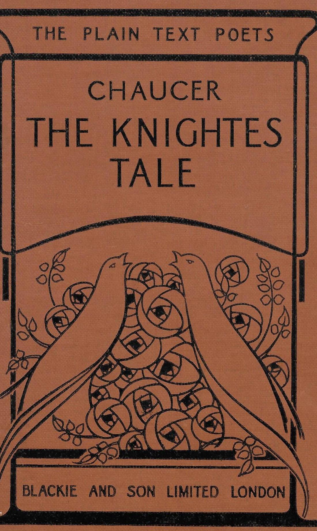
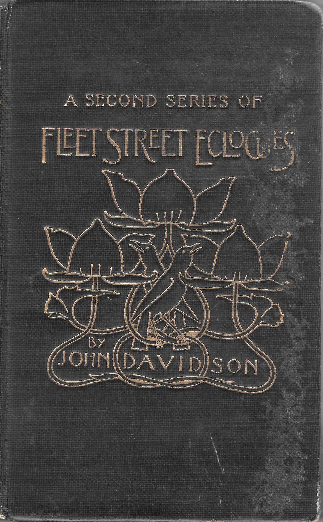
Left: Card binding for The Knightes Tale by Talwin Morris [1900]. Right: Cloth binding for Fleet Street Ecologues by J. Walter West (1896)
This sensitive approach, both ornamental and respectful of the books’ contents, can be traced in the many surviving examples of the style. In addition to Talwin Morris’s influential work, British Art Nouveau bindings were developed by Aubrey Beardsley, Charles Ricketts, Laurence Housman, Gleeson White, A. A. Turbayne, H. Granville Fell and W B Macdougall, along with lesser but characteristic practitioners such as Fred Mason, Garth Jones, Edward Hort New and Paul Woodroffe. This group was described by Esther Wood in her influential essay of 1899 as a ‘distinct school of designers’ (9) working for the trade, and the style was also practised by members of the handicraft unions, notably the Women’s Guild of Binders.
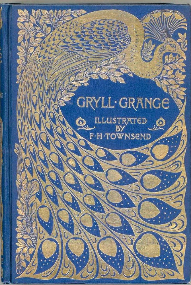
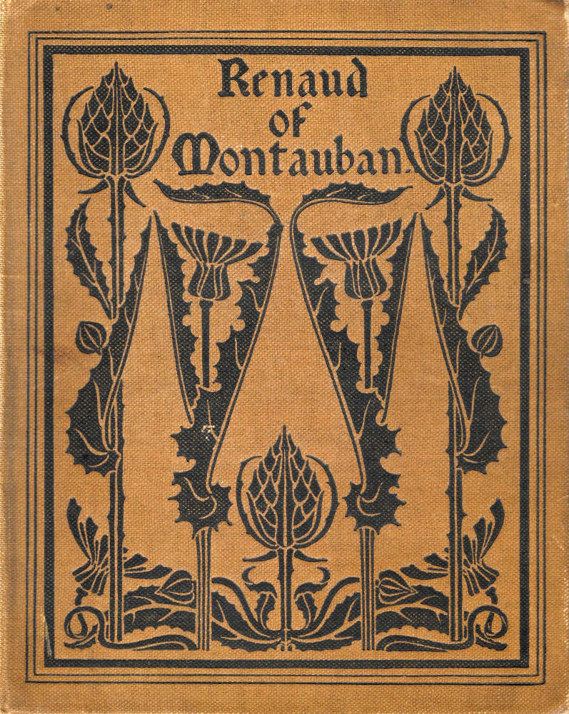
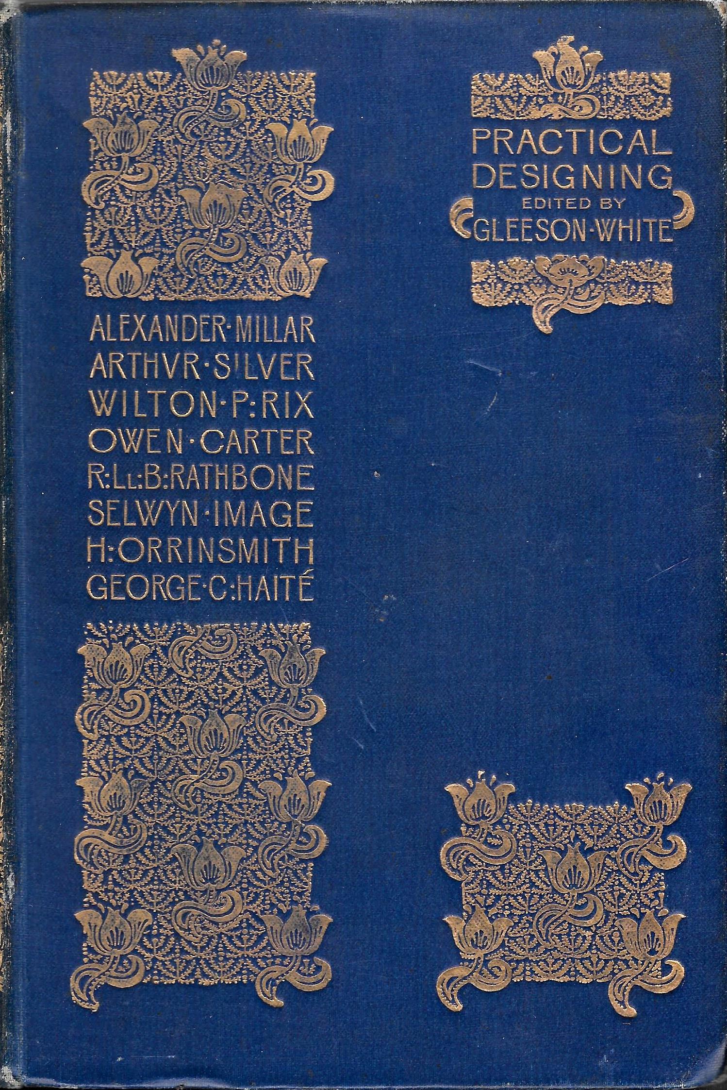
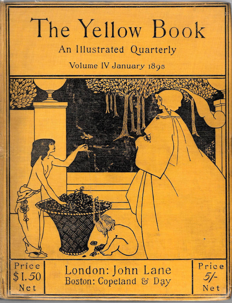
Left to right: (a) Binding for Gryll Grange by A. A. Turbayne (1896). (b) Cloth binding for Renaud of Montauban by Fred Mason (1897). (c) Cloth binding for Practical Designing by Joseph William Gleeson White (1893). (d) Binding for Laurence Housman’s A Farm in Fairyland by Housman (1894). (e) Cloth binding for The Yellow Book by Aubrey Beardsley (1894).
All of these contributors have been the subject of some detailed analysis in the form of a series of monographs and studies. Their influence was extensively noted at the time of production. Wood’s account identifies the important names and their individual signatures and in our own time the literature has expanded significantly. Charles Ricketts’s imagery is the recipient of analysis by critics such as Paul van Capelleveen, and several modern commentators have scrutinized the work of Talwin Morris, whose art has been anatomized at length by Gerald Cinamon; Althea Gyles’s covers, likewise, have been the subject of detailed scrutiny by Ian Fletcher and Arianna Antonielli.
Yet it is surprising to find that the overall shape of the discourse has rarely been examined. The only monograph is John Russell Taylor’s Art Nouveau Book in Britain, an important tome first published in 1966, reprinted in 1980 but now out of print. Taylor’s analysis is often penetrating, but he is not confined to bindings; exploring the effects of illustrations, layout and typography, he does not consider the outside of the book as a separate topic, and at the time of writing this essay (2020) the subject remains arcane. Indeed, Giles Barber’s comment, made in 1970, is still largely true: speaking of ‘English Publishers’ Bindings of the Nineties’, he remarks how academic study of the subject is a ‘byway’ (314) of scholarship, short of the wider conceptualization that is needed to make sense of it. In the following sections I aim to remedy this situation by providing an overview of British Art Nouveau book covers, with an emphasis on the main trends in stylistic developments and contexts in which they operated.
Definitions, Contexts, Meanings, Influences
The meaning of Art Nouveau as an all-embracing and international style is in some ways contentious: it is easy to identify, but difficult to explain as anything other than just another form of decoration. As an idiom applied to domestic objects it is sometimes viewed as a mode of pure escapism. Probing its social application, Walter Benjamin describes Nouveau as the embodiment of middle-class complacency, a bourgeois soporific which combines an imagery of sleeping women with sensuous lines and encourages a soft, ‘Aesthetic’ indifference to the real world; like Pre-Raphaelitism, it is accused of stifling social progress by somehow ‘keeping the revolutionary masses off the streets’ (Spuybroek, 262). But others have described it in more positive terms. In a fascinating study, Lucy Fischer offers a multifaceted explanation. According to her, the style’s curvaceous lines are in part a response to the jagged movement and dynamic change of the urban experience, acting as a means of capturing and controlling movement which she links to the development of early cinema.
These opposites position the style at two ends of the spectrum, as a matter of luxurious evasion or social engagement. In the case of bindings the situation is complicated by the fact that the conventions of Art Nouveau can be purely decorative, or reflective of social values; it all depends on the immediate context and the book’s purpose. We have only to consider some characteristic examples to see its duality. At one extreme is work with little relationship to the contents of the text and is purely ornamental in the manner of Turbayne’s casing for Maria Edgworth’s Ormond (1895). Conversely, Beardsley’s liveries for The Yellow Book provide a visual commentary on the counter-culture of the Decadence, offering a visual preparation for the challenging imagery and essays contained with the periodical’s pages. Sickly-sweet in tone, these works are mocking, erotic, ironic signs of the Nineties as a domain of degeneracy and hedonism. In his assessment of E. J. Cobden-Sanderson’s practice, Oscar Wilde insisted that we cannot help feeling that in ‘bookbinding art expresses primarily not the feeling of the worker but simply itself, its own beauty, its own wonder’, but Art Nouveau casings embrace both the ‘feeling’ of the designer’ and the ‘wonder’ of self-referring aesthetics.
On the whole, however, it is the decorative element that dominates, finding expression in the form of a well-defined visual language. Its central concern is the representation of nature. ‘The natural world’, Fischer notes, was ‘its dominant subject’, visualized in its focus on floral motifs and especially in its expressive deployment of a dynamic, swirling line, a ‘serpentine involution’, ‘undulating wave’ or ‘whiplash’. These arabesques are symbols of nature’s vitality, reminders of the curvaceous lines of plants, the movement of trees blown by swirling wind, the flowing of rivers, the rise and fall of birds, the perpetual rhythms of the seasons, the patterns of life, death, and regeneration. As Jeremy Howard explains, Art Nouveau is characterized by ‘a feeling for nature, an understanding of its rhythms, its organic potential’, crystallizing ‘the underlying rhythmic forms of life’ in ‘highly stylized organic forms’ (6–7). Pantheistic in feeling, and ultimately linked to the dynamic lines of Blake’s spiritualized perceptions of the universe, Art Nouveau visualizes nature in endlessly intricate, interlocking patterns. This undulating line features throughout British bindings, although the exact formulation is varied.
There are, however, two distinct variants. One is characterized by density and complexity, while the other is far lighter, using line economically and tending towards the minimalism that would later morph into Art Deco and Modernism. The first type is often exemplified by anonymous designs, such as those appearing on the front covers of a late Victorian edition of Tennyson’s Geraint and Enid and James Lane Allen’s A Kentucky Cardinal (1901). Both of these are symmetrical designs, overwhelmed with symbols of natural plenty and energy, and infused with the energy of a swirling arabesque.
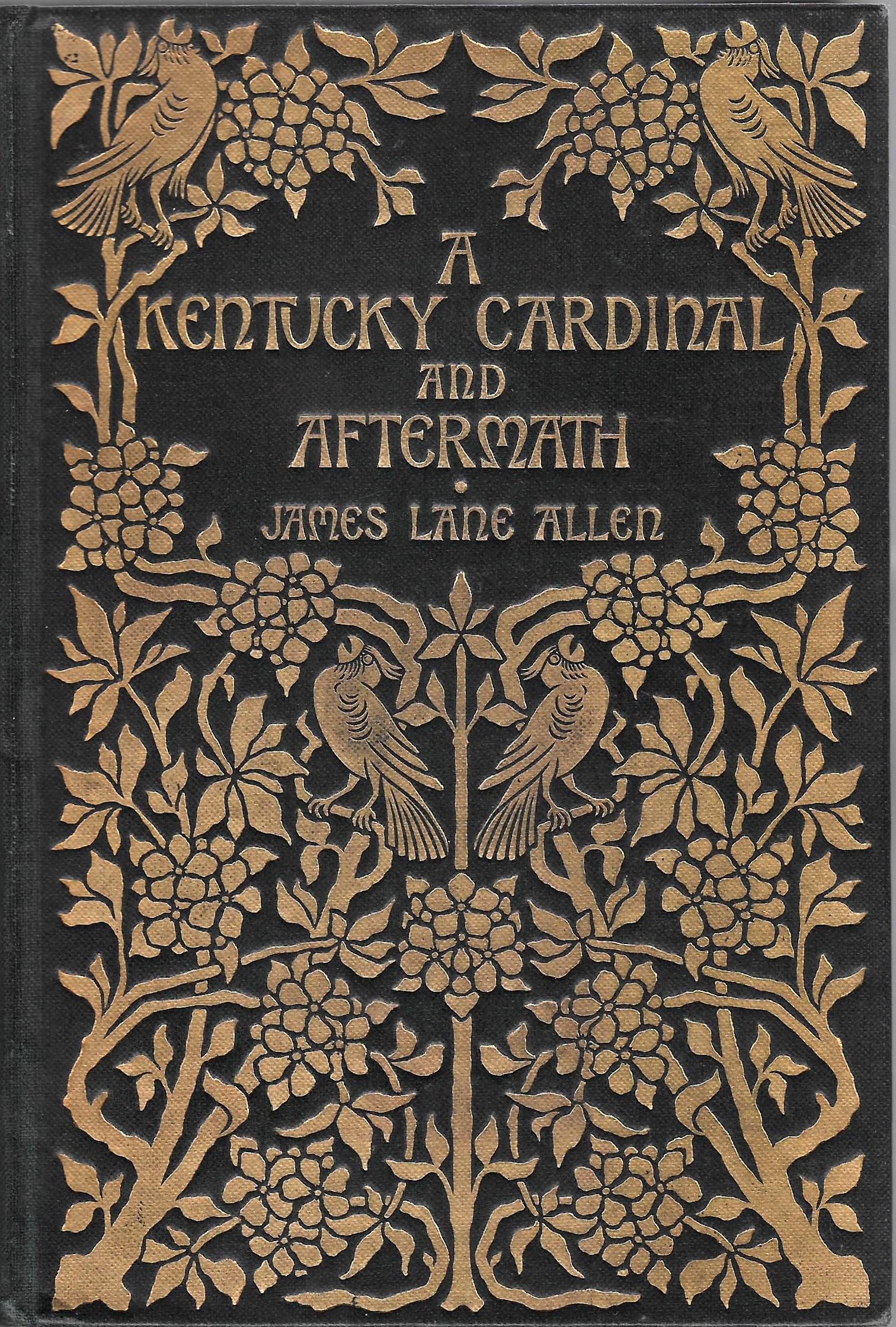
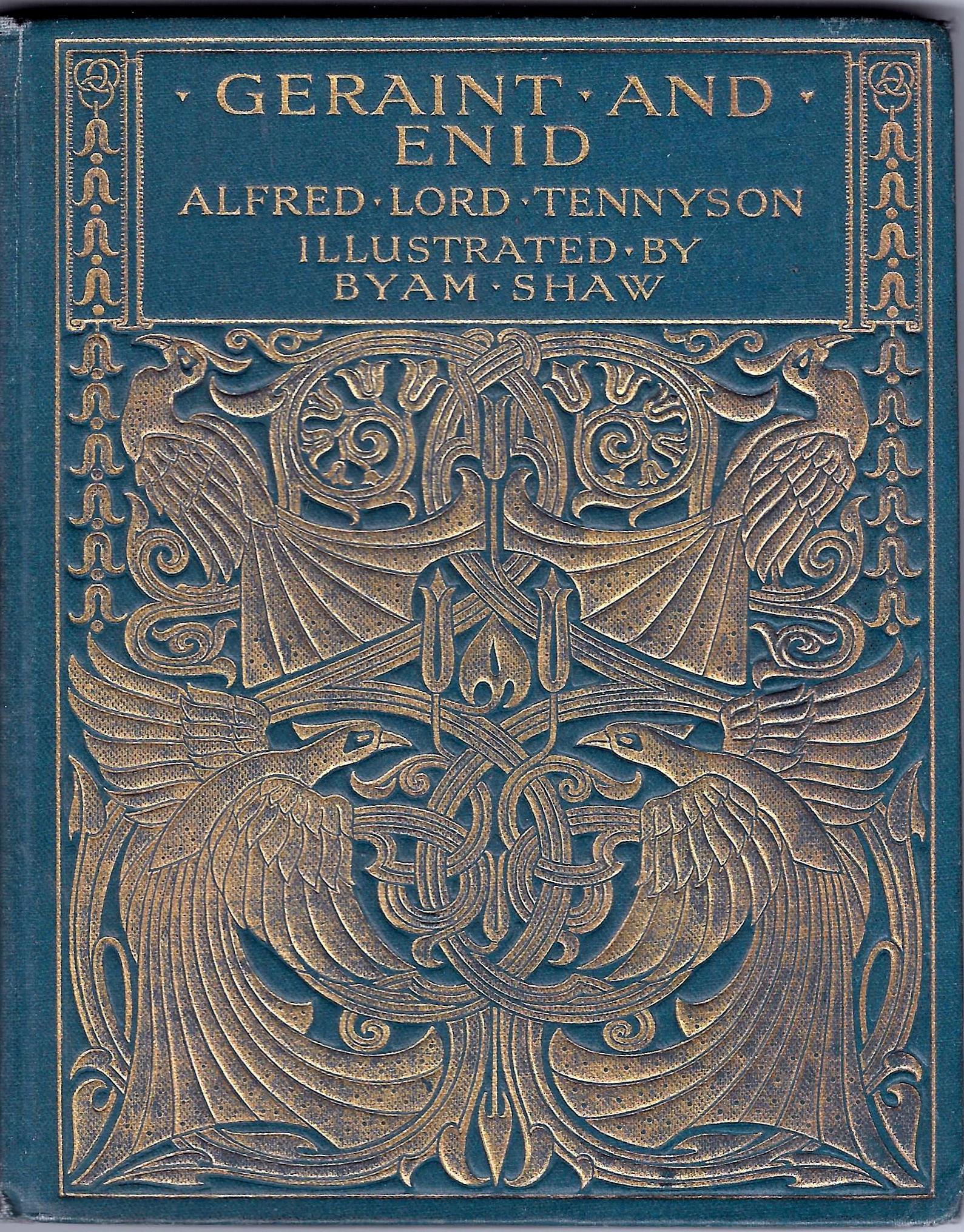
Left: Cloth binding for Tennyson's Geraint and Enid (anonymous, 1900). Right: Cloth binding for A Kentucky Cardinal by an anonymous designer (1901).
In the ‘lighter’ version, however, the emphasis is not on radiating excess but simplification, creating designs which are ovoid in form, or take the form of a sinuous line, or devolve into a stark verticality. Beardsley’s cover for Ernest Dowson’s Verses (1896) represents an extreme solution, presenting only a single line that divides into three, and other examples of an extreme simplification can be studied in Talwin Morris’s bindings for Shakespeare’s Two Gentlemen of Verona (1898) and Maria Edgworth’s Moral Tales (1897).
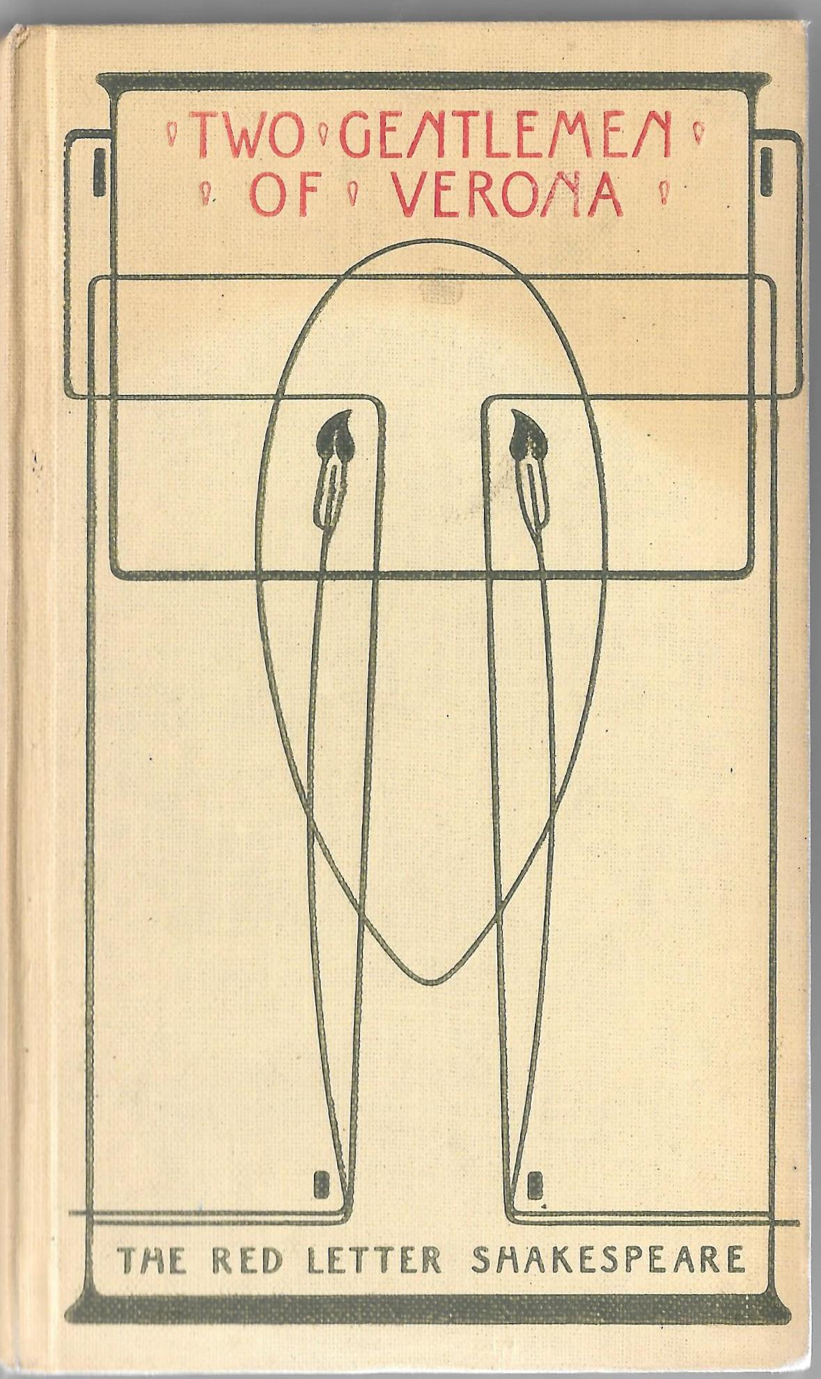
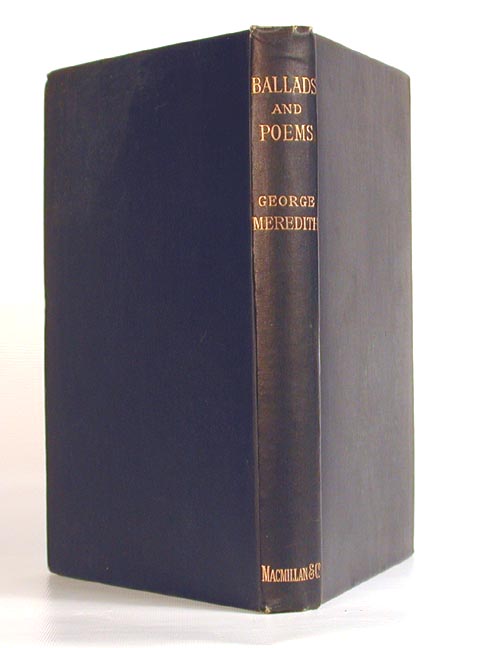
Left to right: (a) Binding for The Poems of Ernest Dowson by Aubrey Beardsley (1905). (b) Card binding for Two Gentlemen of Verona by Talwin Morris [1898]. (c) Cloth binding for Meredith's Ballads and Poems (an example of extreme simplification, 1887).
Though influenced by the developments in Europe and others from within Britain – such as the book bindings of D. G. Rossetti – these two approaches were more immediately inspired by contemporary sources. The first, more intricate style was largely a development of Arts and Crafts; while the second was the creation of the ‘Glasgow Four’ and responded to the designers’ exemplars in the form of furniture, domestic interiors and decorative artefacts. Initially, this can be framed in terms of an opposition between English and Scottish practice, although the two idioms sometimes fused and borrowed from each other.
Arts and Crafts and Art Nouveau: Some English Practitioners and the Style in England
The relationship between Arts and Crafts and Art Nouveau is often constructed in terms of an opposition. Speculating on the issue of definitions, John Russell Taylor comes up with some ‘rough lines of demarcation’:
To begin with, Arts and Crafts is essentially, as the label suggests, direct, unaffected, simple … [it] is fairly stolid and robust; and it is solidly traditional, often with a sort of revivalist fervour. Art Nouveau, on the other hand, is essentially sophisticated and eclectic, accepting and assimilating influences from everywhere … Japanese, Greek, Celtic, Pre-Raphaelite … [59]
Some of Taylor’s formulation is apt, especially the notion of Art Nouveau as being self-conscious, self-reflexive, or ‘sophisticated’, but he overplays the sense of difference between the two movements. In reality, British book bindings of the more intricate variety were heavily influenced by the aesthetics of William Morris’s Arts and Crafts and represent a development of its floral imagery and its emphasis on sinuous lines; the crowded, foliate patterns of Morris’s decorative borders and wallpapers are clearly taken up and refigured by Art Nouveau designers, and there is unquestionably an overlap between the two styles.
Several designers practice in both idioms, progressing from one to the other. Working at the historical moment when the older style began to give way before the new, Gleeson White created bindings in each style: some of his designs – such as the front cover for Mrs Bowditch’s New Vegetarian Dishes (1893) – have the congested intensity of Arts and Crafts, while others, notably his highly abstracted treatment of Malcolm Bell’s biography of Edward Burne-Jones (1893), are purely Nouveau. He also maps the very moment of interchange between the two styles, mingling the languages into a synthetic whole. In his binding for The Girls’ Own Annual (1895), for instance, he preserves the naturalism of Arts Crafts, a realistic approach applied to the fruit, blossom and roots, within the frame of a congested composition. Yet the emanating stem is essentially Art Nouveau in feeling, representing a vital energy, a metaphor for growth and the youthfulness of the annual’s readership. The effect is far more dynamic than any of Morris’s designs, with the stems and roots seeming to break out of oblong of the upper board. Gleeson White’s arabesque is sinuous in the manner of the French ‘whiplash’ or the Belgian ‘eel style’, and although he sometimes maintains a symbolic cornucopia of flowers, his emphasis is increasingly on linearity, as in his bindings for Adelaide Procter’s Legends and Lyrics (1892, 1895).
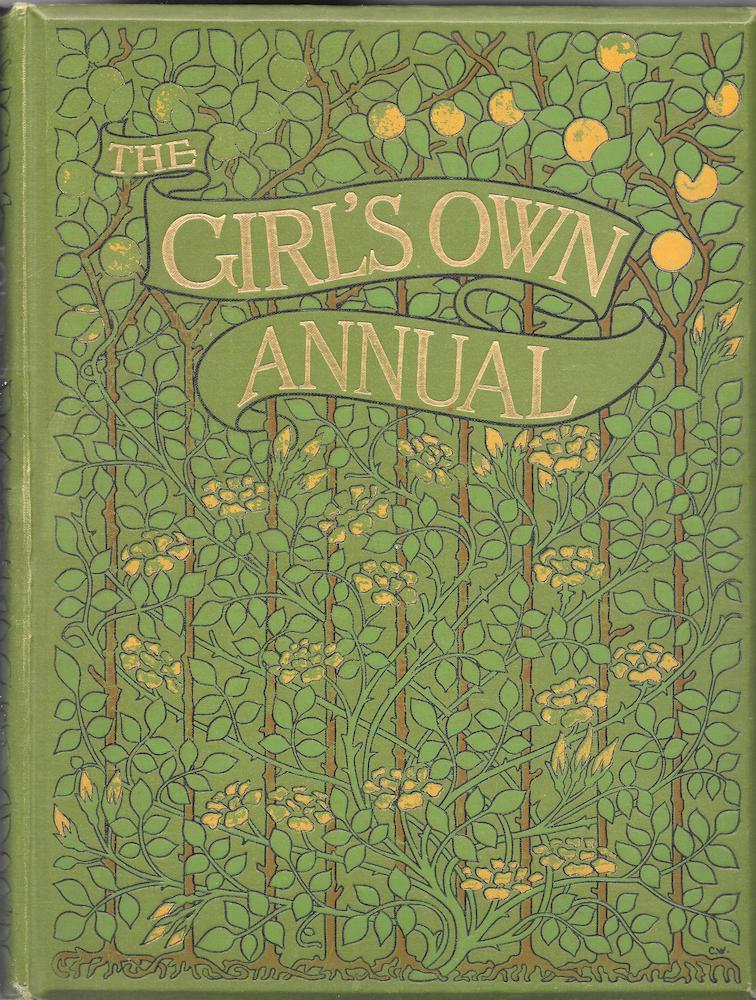
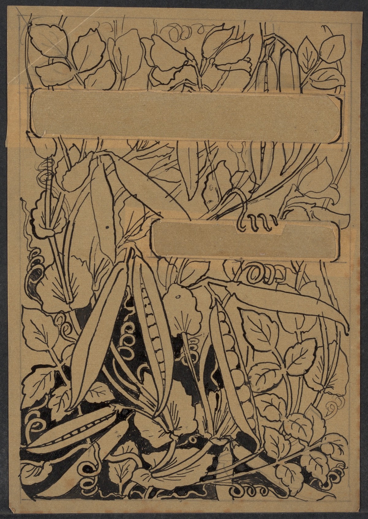
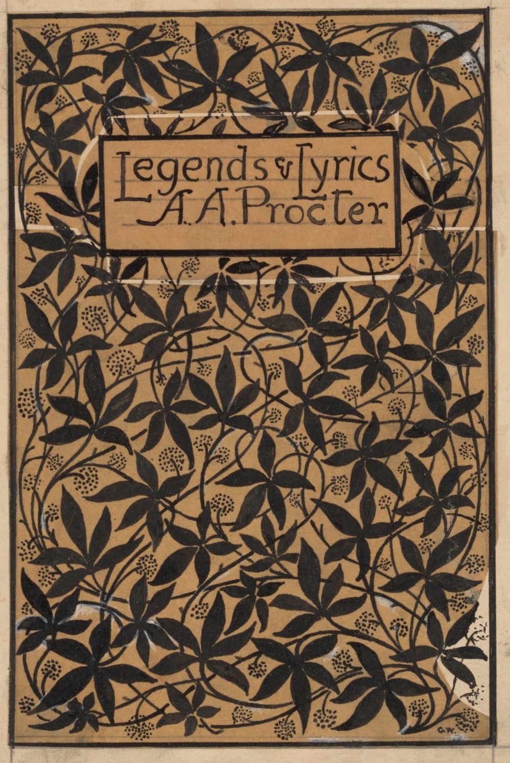
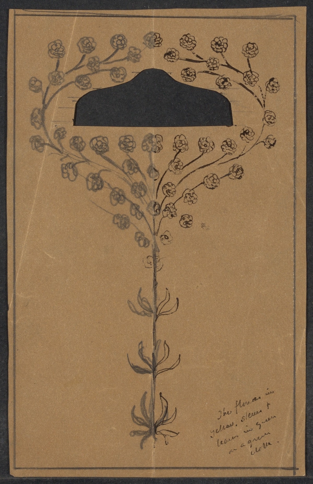
Left to right: (a) Cloth binding for The Girl’s Own Annual by Joseph William Gleeson White (1894). (b) Paper binding forNew Vegetarian Dishes by Gleeson White (1893). (c) Preparatory drawing forLegends and Lyrics by Gleeson White [1895]. (d) Proof for cloth binding of Legends and Lyrics by Gleeson White (1892).
The fine balance of flower imagery and muscular stems is likewise an integral part of the work of H. Granville Fell and A. A. Turbayne. In his design for Robert Herrick’s Lyrical Poems (1895), Granville Fell combines an intricate border of leaves with an enclosing tendril that seems to writhe around the perimeter. In Turbayne’s work, similarly, leaves are part of the design, but are subordinated to the twisting interlace that emanates – as in Gleeson White’s designs – from the bottom edge and radiates upwards, animating the front cover in a resplendence of gilt-lined excess. Turbayne’s work for Macmillan, for Reynard the Fox (1895) and for Charles Kingsley’s Westward Ho! (1895), are prime examples, and a small variation is provided in the form of his famous peacock covers, where the spreading tail is another sign of nature’s vitality in which we seem to see what Howard describes as ‘the underlying, rhythmic forms of life’ (7); though only intended as decoration, all such designs are expressive and poetic, glimpses of nature’s urge to live.
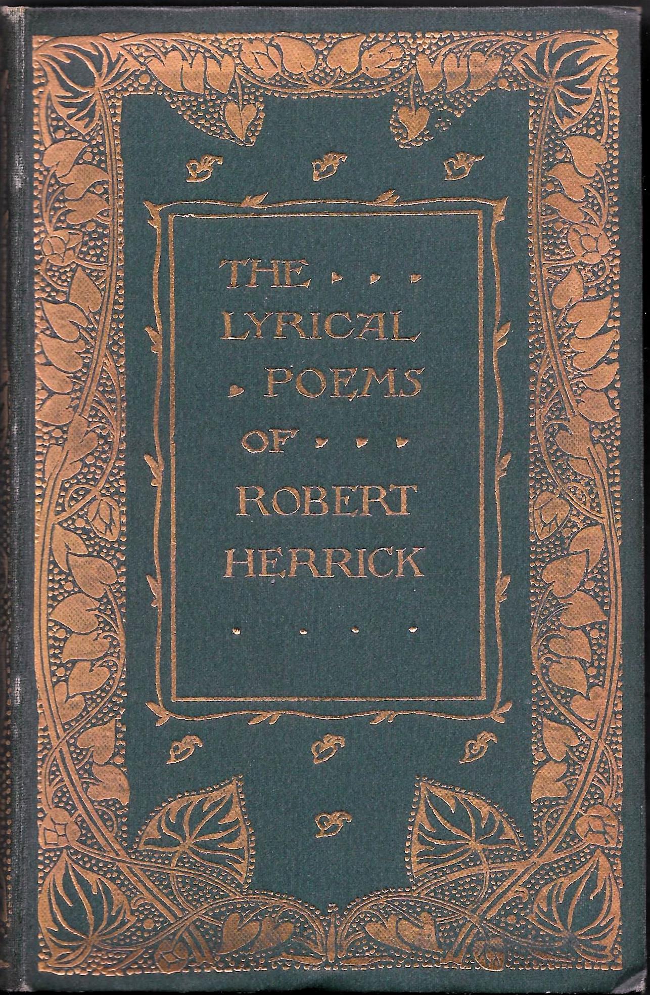
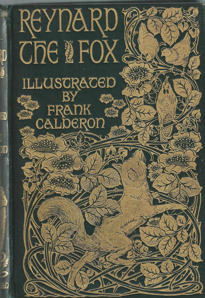
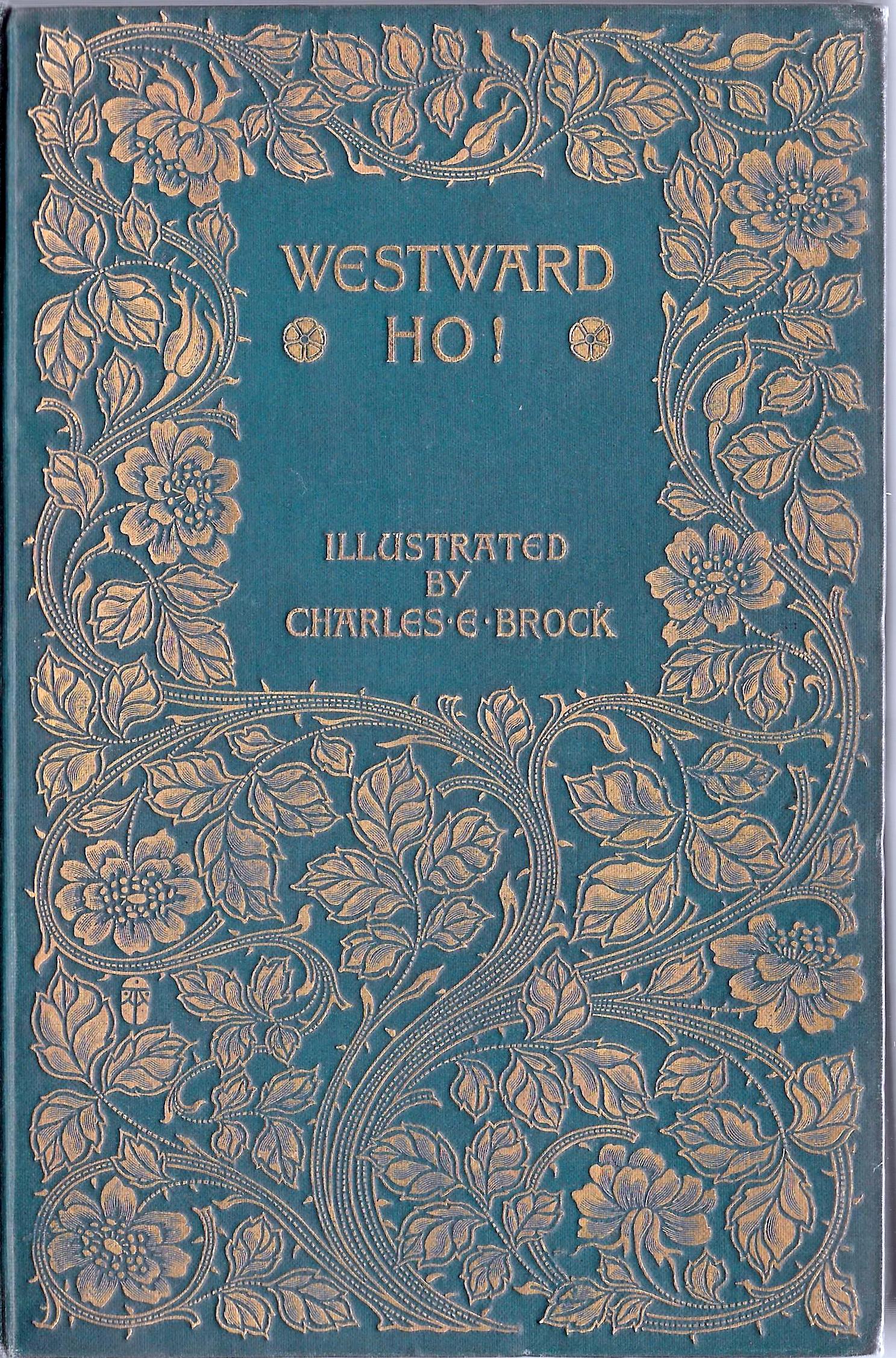
Left to right: (a) Cover for the cloth binding of The Lyrical Poems by H. Granville Fell [1895]. (b) Binding for Reynard the Fox by A. A. Turbayne (1895). (c) Binding for A. A. Turbayne's Westward Ho by A. A. Turbayne (1896).
Such optimistic imagery is developed throughout the discourse and is carried forward in many forms. Hugh Thompson’s design for Miss Mitford’s Our Village (1893) presents an animistic bouquet of poppies mounted on stems apparently moving of their own volition, and the same is true of the anonymous design for Washington Irving’s Rip van Winkle (1893). Althea Gyles’s rhythmic display for W. B. Yeats’s Poems (1899) provides another nuance and so does Miss Le Lacheur’s intricate gilt binding of flowers and stems, created within the Guild of Women’s Binders, for Chaucer’s Prologue to the Canterbury Tales (1899). Variants, deploying figurative elements, can be traced in the bindings of Garth Jones and several others who combined Pre-Raphaelite imagery with floral and arboreal displays.
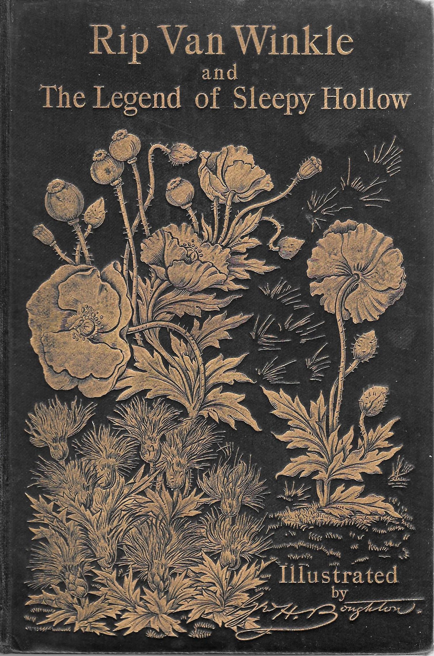
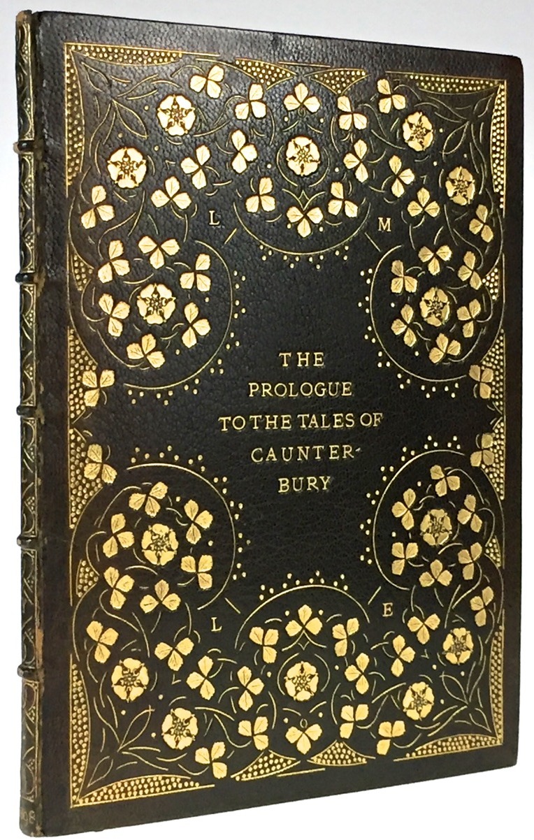
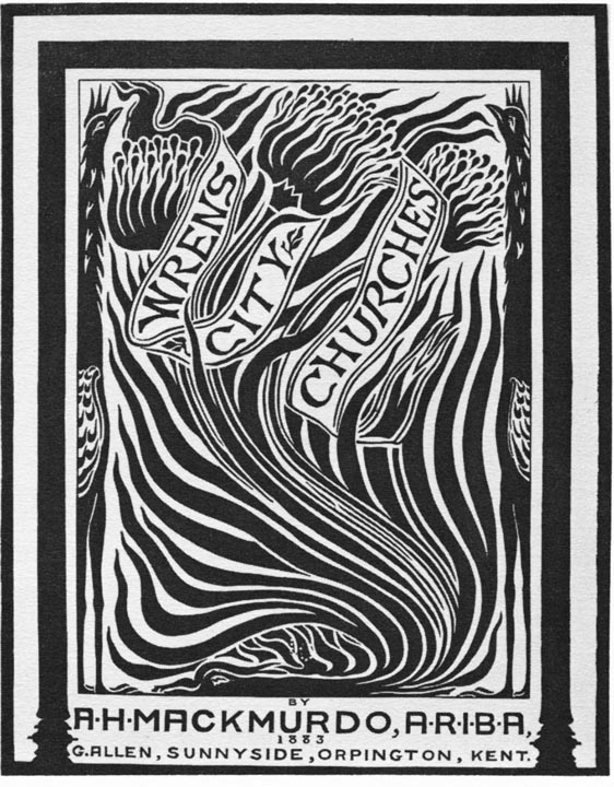
Left to right: (a) Cover for Rip van Winkle by an anonymous artist (cloth binding, 1893). (b) Binding for Chaucer's Prologue by Miss Le Lacheur (leather, 1897). (c) Wren's City Churches by Arthur Heygate Mackmurdo (woodcut on handmade paper, 1883).
Conversely, some designers dispense with all descriptive elements and focus on a sinuous pattern or interlace which becomes the primary element. This robust linearity is often presented as being radically different from earlier practice, but here, as in the treatment of cornucopia, exemplars were taken from artists working in the manner of Arts and Crafts. Prime influences were the designs of A. H. Mackmurdo and Selwyn Image. Mackmurdo designed furniture prefiguring Art Nouveau, and provides in one of his chairs a composition combining a flaming line and abstracted flowers, a model for later developments; though created in 1881, it could easily be the work of the late 90s. Mackmurdo’s title page for Wren’s Churches (1883) is likewise a turbulent pattern in preparation for what was to come, and the same is true of Image’s convoluted arabesque on the covers of The Century Guild Hobby Horse (1884) and ‘Michael Field’s’ The Tragic Mary(1890). These templates are taken up, distorted, manipulated, and developed in detail.
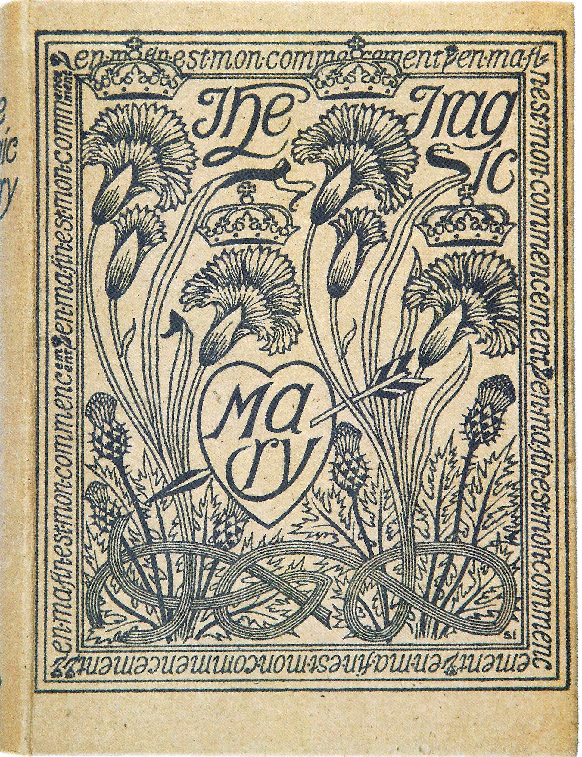
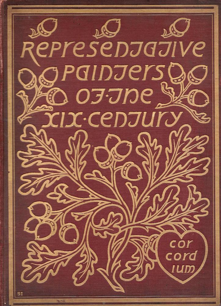
Left: Paper binding for The Tragic Mary by Selwyn Image (1890). Right: Cloth binding for Representative Painters of the Nineteenth Century by Selwyn Image (1899).
Laurence Housman typifies the linear approach in his arabesque for Christina Rossetti’s Goblin Market (1893). Though nominally an endlessly repeating tendril, the design is better understood as a play with line – a piece of knot-work which though organic is wittily tied to a fretwork as is it were the strings in a piece of tapestry, weaving on the loom. This hypnotic arrangement became a central part of Art Nouveau design in the nineties, a vigorous conceit derived from Housman’s original and re-shaped by several hands. Paul Woodroffe’s two bindings, for The Little Flowers of Saint Francis (1899) and The Little Flowers of Saint Benet (1901) are twisting variations, and Housman’s influence also had an impact in the United States, notably in the form of Will Bradley’s treatment of Richard Le Gallienne’s The Quest of the Golden Girl (1896). William Brown Macdougall’s covers further materialize this approach in the form of robust rhythms, nominally representing flowers and plants but more obviously reflecting the influence of Celtic art in which the endless line symbolizes endless regeneration and exactly matches the pantheism of the wider style; Garth Jones and Granville-Fell offer parallel treatments.
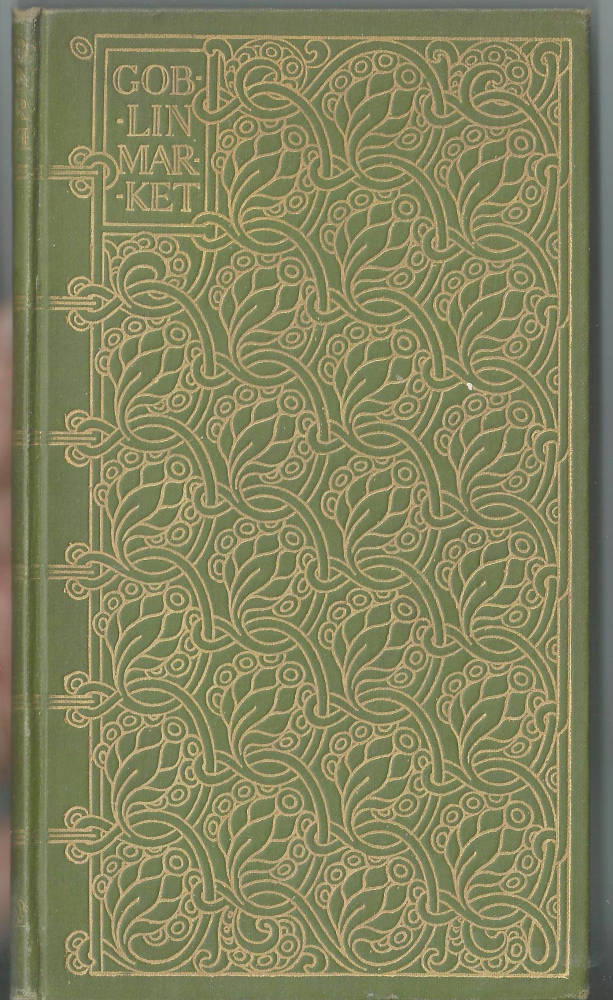
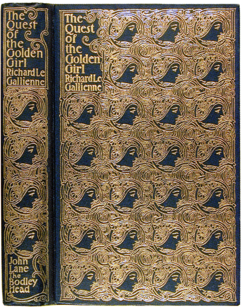
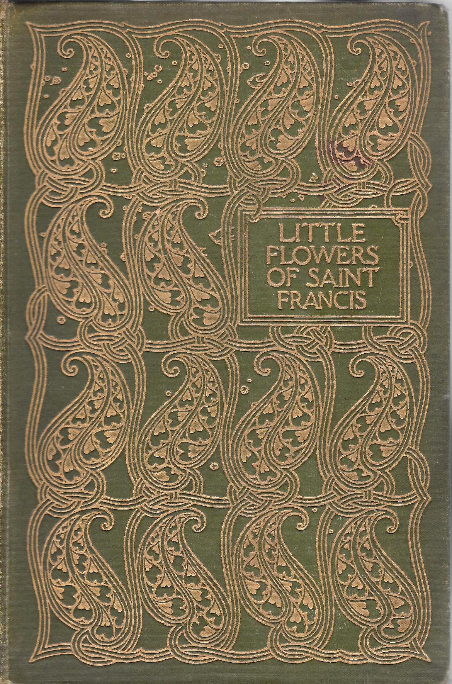
Left to right: (a) Binding for Christina Rossetti's Goblin Market by Laurence Housman (1893). (b) Binding for The Quest of the Golden Girl by Will Bradley (1896). (c) Binding of Little Flowers of St Francis by Paul Woodroffe (1899).
However, the foremost proponent of simplification in the English version of Art Nouveau was Aubrey Beardsley, especially in his work for Malory’s Morte D’Arthur(1894). Here there is no attempt to be either realistic or intricate: the swirling arabesque has been replaced with two rhyming sinuous lines to represent stalks, and the flowers and leaves have been codified into symbolic signs. Pattern is all, a visual equivalent to a musical refrain, embodying Walter Pater’s dictum, as expressed in his study of Giorgione (1873,) that all art ‘should aspire … to the condition of music’ and (to borrow Roger Fry’s later term), to be ‘pure form’ rather than mimesis. Oscar Wilde proclaims in his preface to The Picture of Dorian Gray (1890) that art should be ‘surface and symbol’ in pursuit of ‘Beauty’ – and this is precisely the effect Beardsley creates. His strategy was hugely influential, with several designers imitating his pristine economy. Often losing sight of binding’s function to embody the sense or tone of the book’s contents, much of their work is fine art as an end in itself: art for art’s sake.
There is particular emphasis on rhyming curvaceous forms. It is interesting, for example, to compare Beardsley’s Morte D’Arthur (1894) with Woodroffe’s cover for Israfel’s [Gertrude Hammond’s] Ivory, Apes and Peacocks (1899). In Woodroffe’s design Beardsley’s stems have morphed into peacock tails, but the sense of elegant interval is essentially the same. Similarly composed are Charles Ricketts’s designs for Wilde’s Poems(1892) and J. A. Symonds’s In the Key of Blue (1893), each of them composed as a bold arrangement of curvilinear lines. In the first, the curling outlines of the abstracted plants are accentuated by placing them against the geometrical straightness of three verticals topped by heraldic tree-canopies; emphasising curves by placing them over straight lines, Ricketts intensifies the notion of the curling line as a metaphor for process and change.
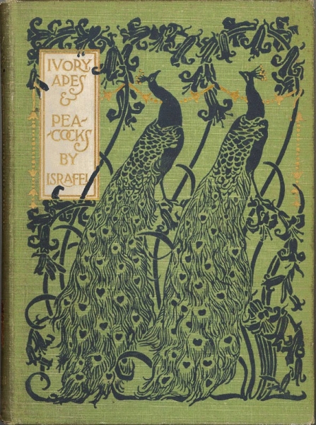
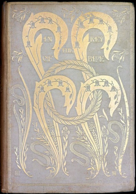
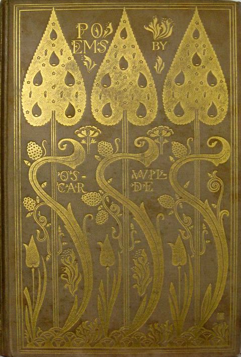
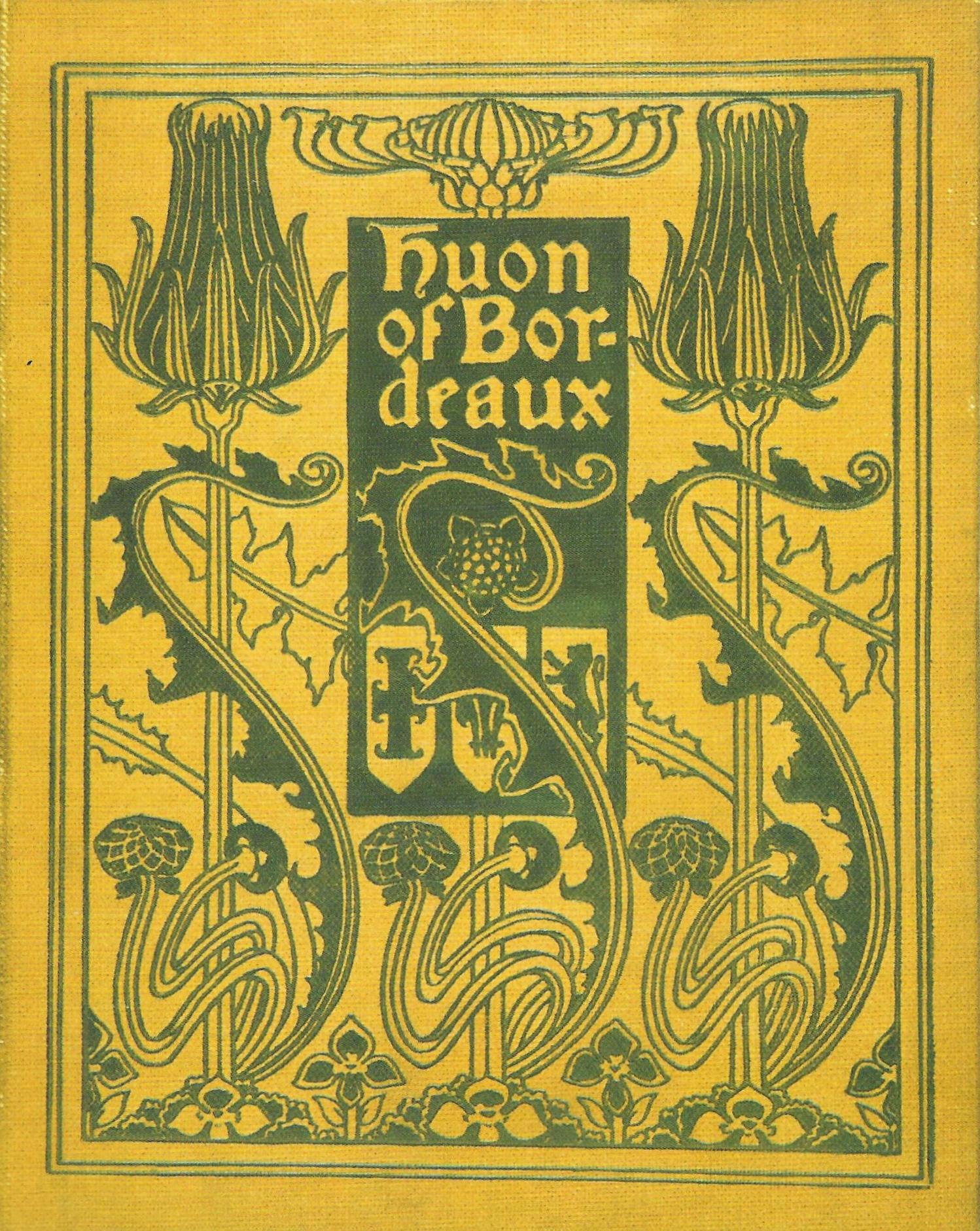
Left to right: (a) Cloth binding with gilt patterns by Aubrey Beardsley (1894 [1909]). (b) Binding by Paul Woodroffe — olive green cloth with designs printed in polychromatic inks (1899). (c) Cloth binding for Symonds' In the Key of Blue by Charles Ricketts (1893). (d) Cloth binding for Wilde’s Poems by Charles Ricketts (1892). (e) Cloth binding for Huon of Bordeaux by Fred Mason (1895)<>/p>
Moving on to create a synthesis of Beardsley’s and Ricketts’s designs, Fred Mason and A. A. Turbayne produced a number of designs in which the energy of line is barely contained against a geometrical framework. Ricketts’s Poems was also influential in helping to define a characteristic trope of Art Nouveau, the highly-conceptualized tree forms carried on extended lines. Turbayne manipulates this motif in his Life of Christ (1894), and it is continued by Gleeson White, Edmund Hort New, and numerous anonymous designers.
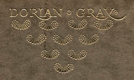
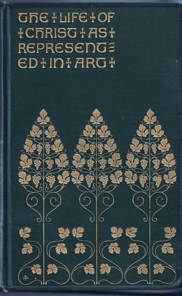
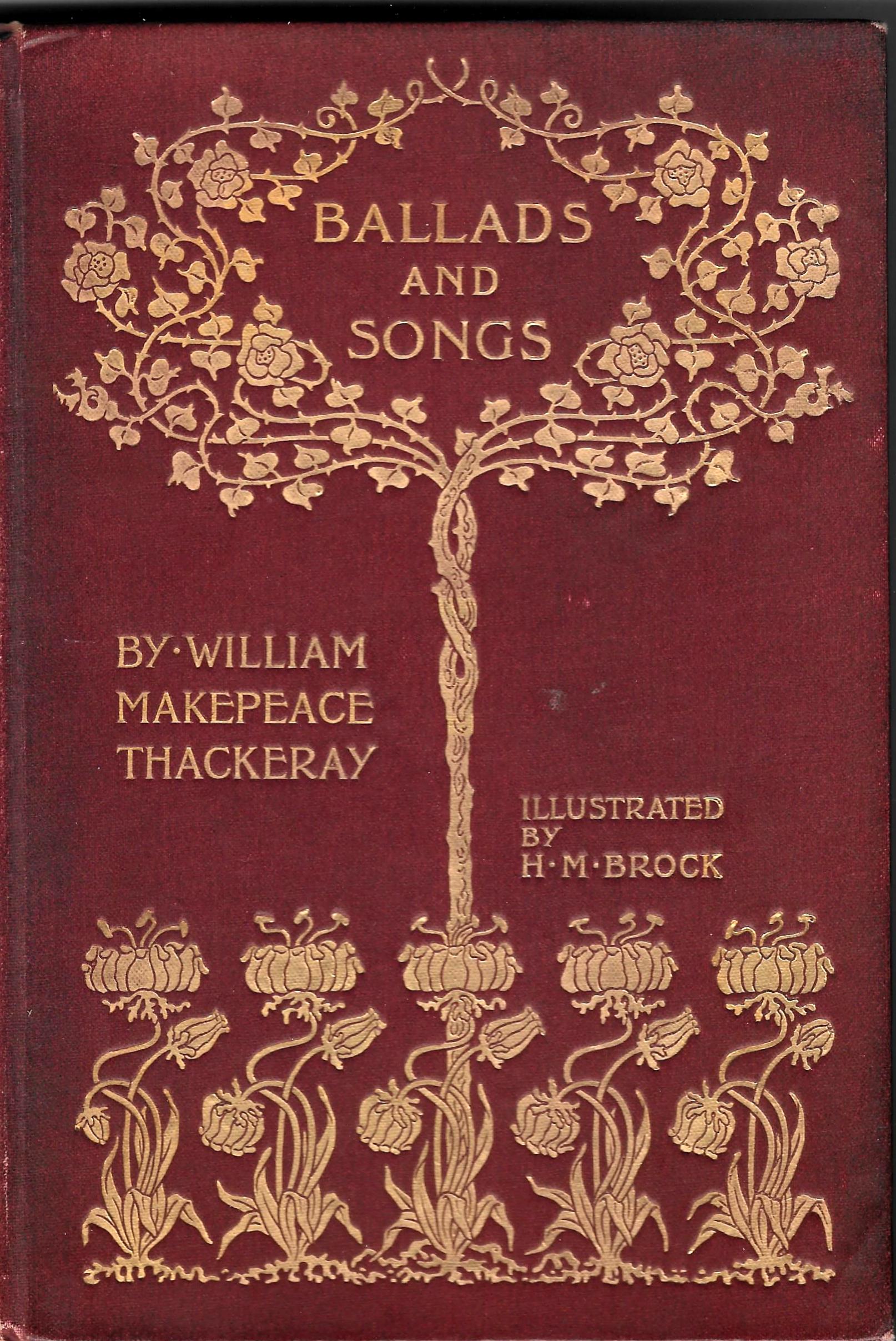
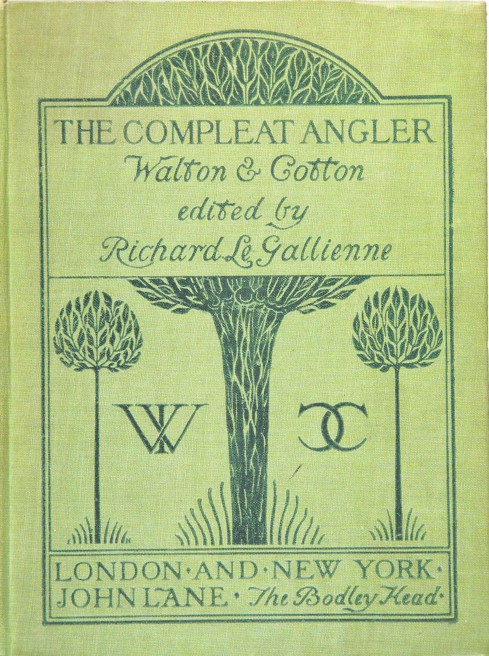
Left to right: (a) Detail of the Vellum backstrip and Card Boards for Charles Ricketts’s design for Oscar Wilde’s The Picture of Dorian Gray (1891). (b) Binding for The Life of Christ as Represented in Art designed by A. A. Turbayne (1894). (c) Cover — cloth binding — for Ballads and Songs by an anonymous artist (1906). (d) Cover design in pen and pencil on paper for Masterpieces of the Great Artists by Gleeson White (1895). (d) Cover for The Compleat Angler by Edmund Hort New, cloth binding (1895).
Simplification was always present, however, and is taken to its final formulation in England in a series of designs in which extravagant lines are reduced to austere minimalism, employing forms that are merely suggestive of organism. Ricketts’s cover for John Gray’s Silverpoints (1893) is an exquisite example of economy of means, evoking the natural world in the form of curving parallel lines and abstracted buds, and so are his works for Thomas Hardy’s Tess of the D’Urbervilles (1891) and The Pageant (1897), both of which consist of carefully-placed motifs in lyrical interval.
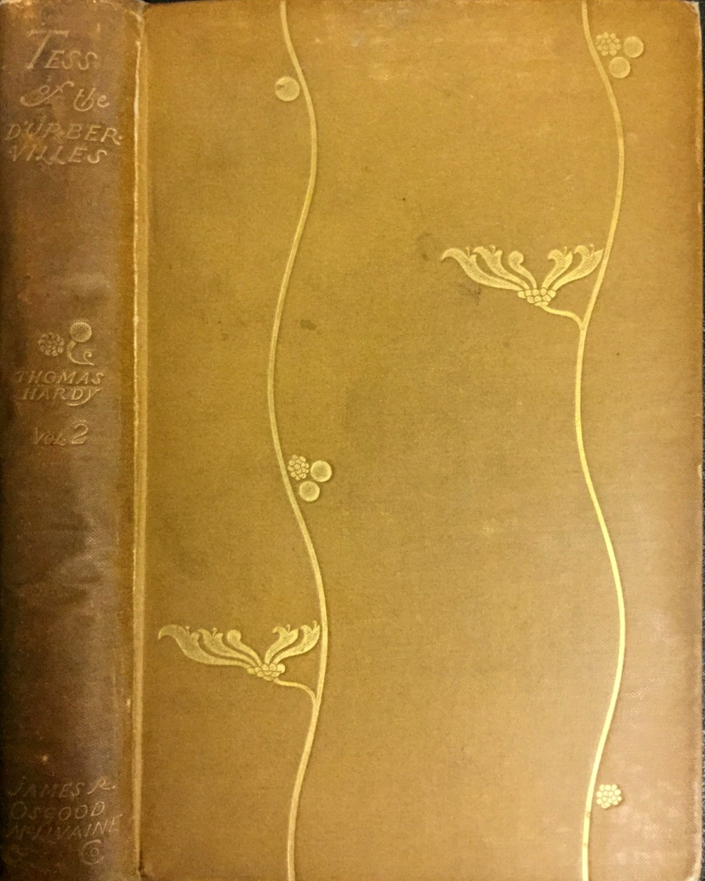
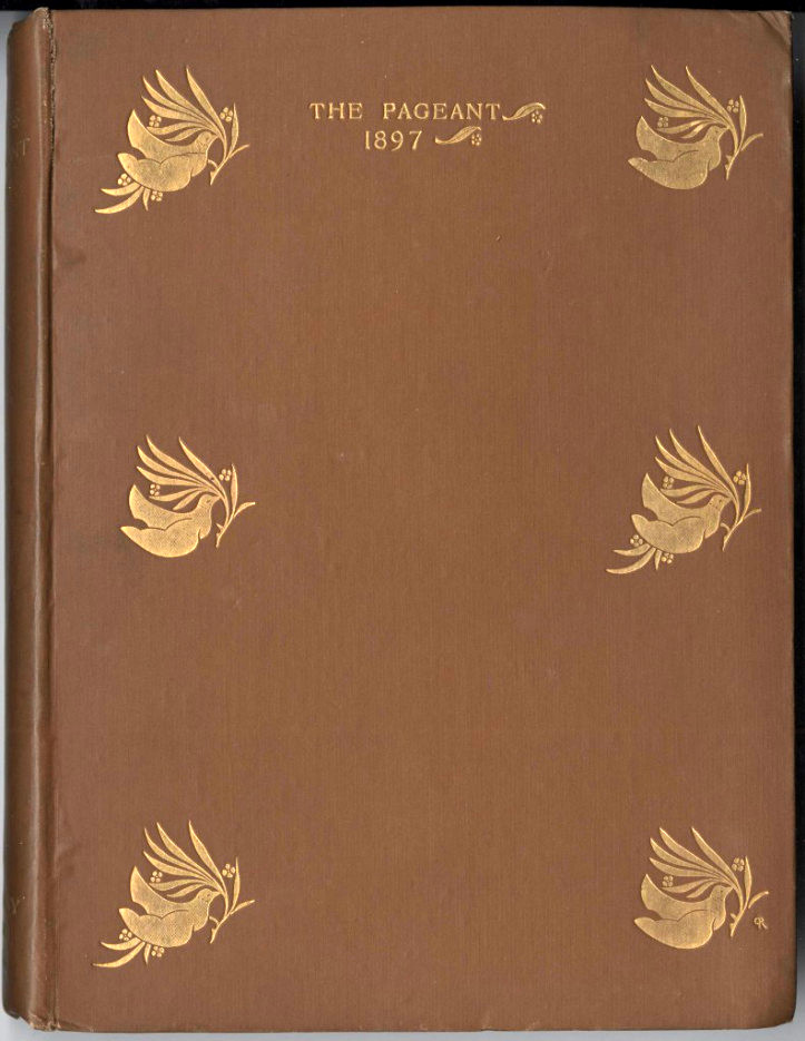
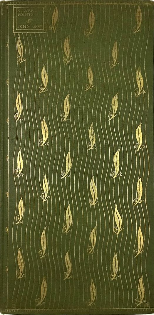
Left to right: (a) Binding for Thomas Hardy's Tess of the D'Urbervilles by Charles Ricketts (1891). (b) Binding for The Pageant (1897), also by Ricketts. (c) Binding by Ricketts for John Gray’s Silverpoints (1893).
We can see, in short, how English bindings of the period are the product of a complex narrative, an interweaving of influences and tendencies which curiously reflects the tangling of the Art Nouveau arabesque. At once naturalistic and abstract in their treatment of natural motifs, designers embrace both elaboration and simplification. What they always have is vitality, making all previous Victorian covers seem inert. In this respect, it is worth remembering Blake’s dictum that ‘energy is eternal delight’. Owing a familial relationship to his restless line, designers of the Nineties project a dynamic aesthetic.
The Glasgow School and Book Binding: Developments in Scotland
‘Art Nouveau’ was sometimes known as‘the Glasgow style’ in acknowledgment of the contribution made by C.R. Mackintosh, Margaret and Frances Macdonald, and Herbert McNair. Known as the ‘Glasgow Four’, this informal group revolutionized applied art, architecture and graphic design, establishing a vocabulary of ovoid shapes, extreme abstraction of natural motifs – notably the ‘Glasgow rose’ – elongated, attenuated and curvilinear lines, and flat pattern making. Promoted by Gleeson White in a series of articles in The Studio, this radical style was carried over into book design.
The principal book designers were Talwin Morris, Ethel Larcombe and Archie Campbell, each of whom created distinctive casings in the Glasgow style, many of them under the imprint of the Glasgow-based publisher, William Blackie. Morris was Blackie’s art director in the nineties and the early part of the twentieth century, and during this time he commissioned Larcombe and Campbell to produce casings in what was essentially a house-style.
It was Morris, however, who most perfectly embodies the aesthetics of the Glasgow School. A personal associate of the Four, his bindings recreate motifs and compositions which otherwise appear on the surfaces of furniture and domestic objects, blurring once again the distinctions between types of artefact. His cover for Maria Edgworth’s Moral Tales (1897) exemplifies his deployment of Glasgow imagery. Figured as a combination of two linear motifs – one on the front cover and another on the back-strip – this design unifies geometrical lines with organic stems overlaying them and culminating in abstracted flowers which are no more than green circles: all elements which appear in work by Mackintosh and other members of the group. Morris’s attenuated treatment of line arranged in a grid bears direct comparison with Margaret Macdonald’s bookplate for John Edwards, and also compares with Mackintosh’s domestic décor in the artist’s own home (now reconstructed in the Hunterian Art Gallery, University of Glasgow).
Morris’s covers for Gresham’s series of Shakespeare’s plays is similarly composed of the Glasgow lexicon, with an ovoid shape imposed on a geometrical grid with stylized plants placed symmetrically on top on it. Morris also visualizes the ‘Glasgow rose’ (which appears on the cover of The Call of the Homeland ); the peacock (The Natural History of Animals); the songbird (for Annette Lyster’s A Soldier’s Son); the spade-shaped leaf; and clusters of parallel, simplified stems, ‘controlled in a fluid but spare manner’ (Glasgow Style, 41), which emanate outwards as if inscribed on a vase (English Lyric Poetry).
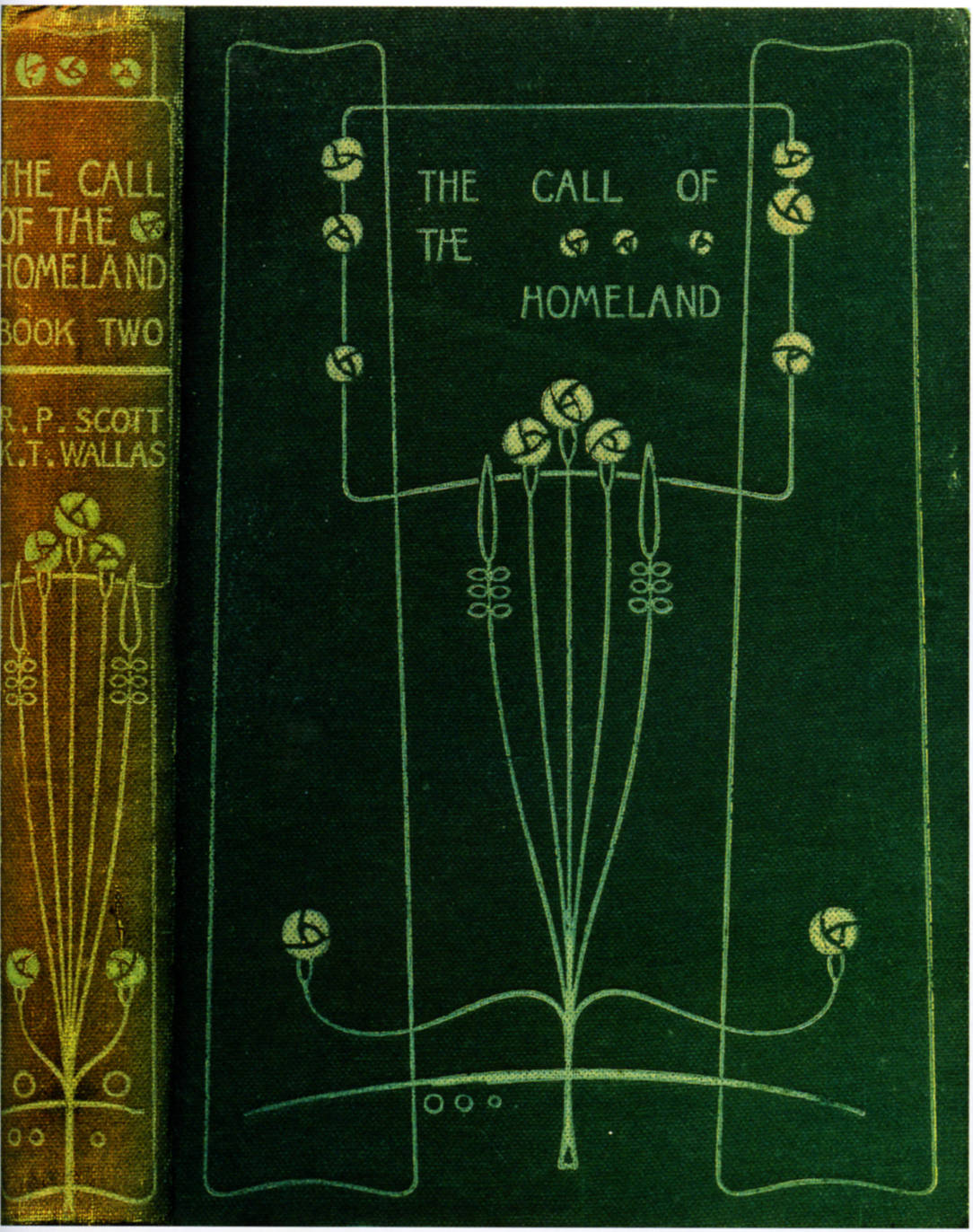
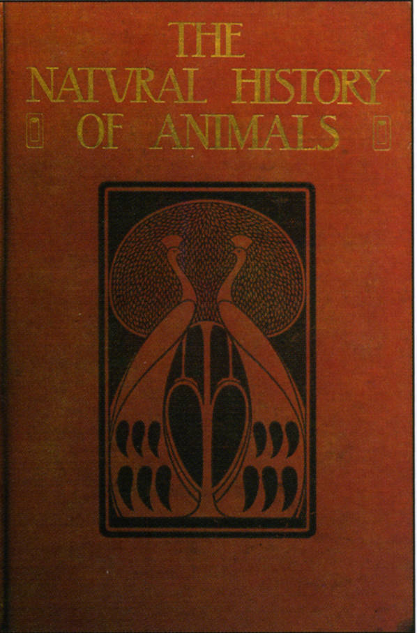
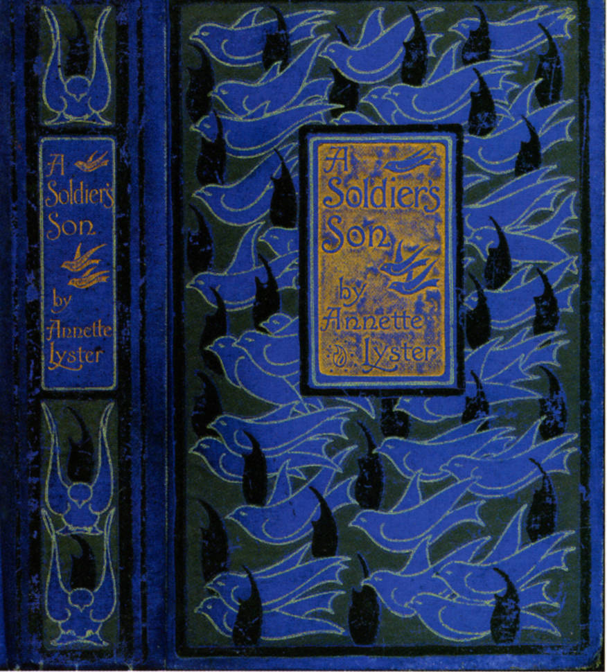
Left to right: (a) A binding by Talwin Morris for The Call of the Homeland [1900]. (b) Binding for Ernest Dowson’s Poems by Aubrey Beardsley (late edition, 1905; first published 1896). (c) Another binding by Morris for The Natural History of Animals [1900]. (d) And another by Morris for A Soldier’s Son [1900].
Though linked to the traditions of European Art Nouveau, Morris’s work provided a cool re-reading of the style which closely reflected British sensibilities. As Stephan Tschudi-Madsen remarks, the French emphasised the ‘whiplash rhythm’ while the Glasgow style was more emollient: ‘the curves flow more smoothly [than those of the French], producing an effect of … restfulness’ (The Art Nouveau Style) rather than restlessness. This spare imagery regarded as the epitome of elegance and refinement; not only the signature of Blackie and Gresham, it was widely imitated by other publishers and had an significant impact on the designers working within the Women’s Guild of Bookbinders.
Florence de Rheims offers her own interpretation of Talwin Morris’s style in her treatment of the leather binding for Picturesque Westminster (1902), including both spade-leaves and Glasgow roses. Constance Karslake similarly presents the highly-abstracted vocabulary popularized by Morris in her binding for Frank Gunsaulus’s Songs of Night and Day (1896); an anonymous designer of the Guild also figures this imagery in cover for Cowper’s Diverting History of John Gilpin (1899) which includes elongated, parallel lines and symbolic birds and flowers.
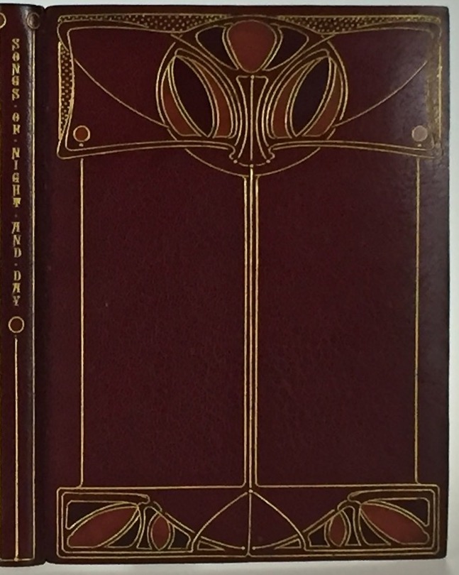
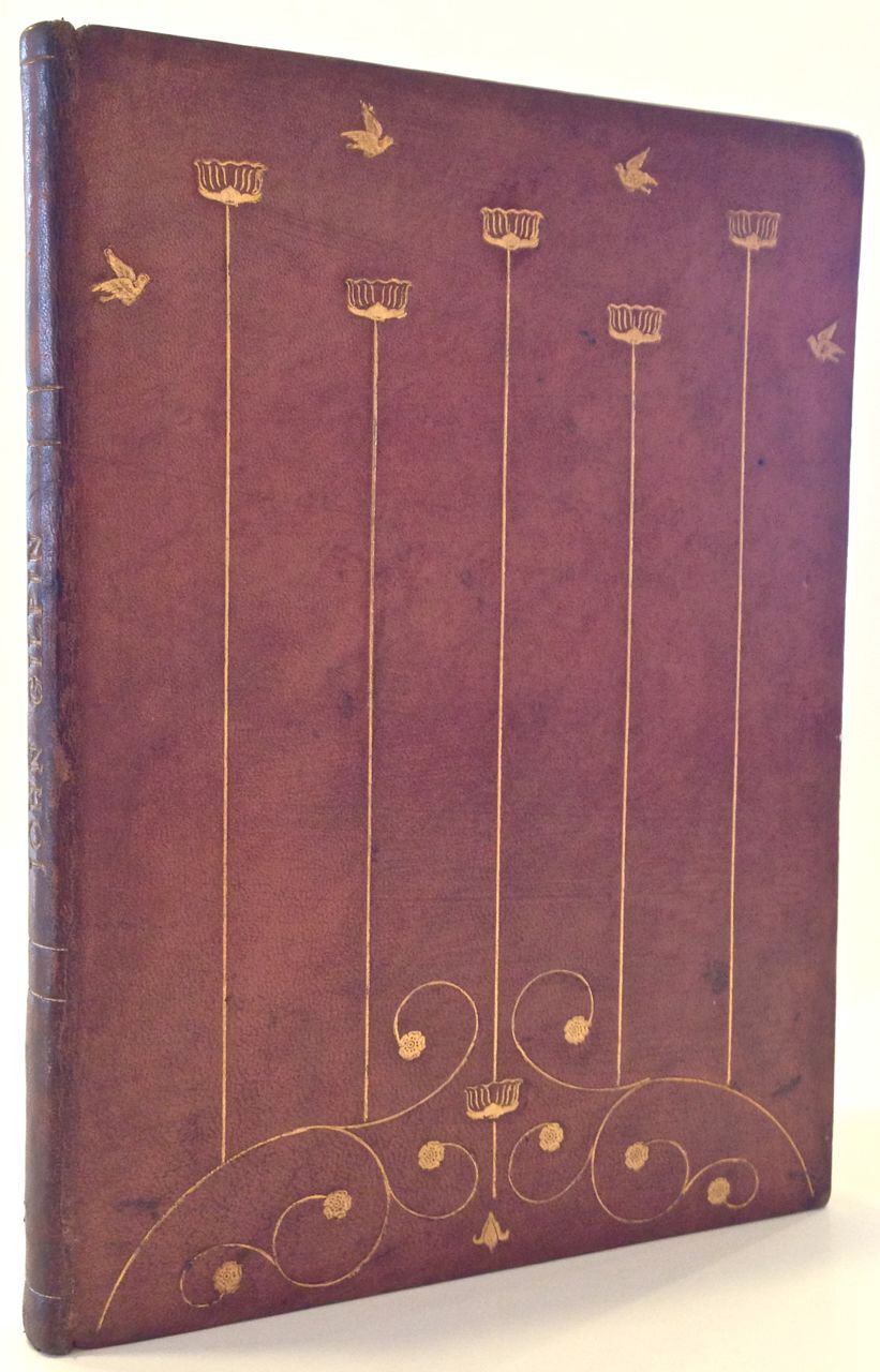
Left to right: (a) Leather binding by Florence de Rheims (1902). (b) Leather binding for Frank Gunsaulus's Songs of Night and Day by Constance Karslake (1896). (c) Leather binding for Cowper's Diverting History of John Gilpin by the Guild of Women Binders (c. 1899).
The Guild’s adoption of motifs from the Glasgow style epitomizes the free movement between modes of binding. It was in Glasgow itself, however, that Morris’s influence was most keenly felt. Work by Archie Campbell and Ethel Larcombe closely reflects Morris’s treatment of line and floral imagery. Campbell’s binding for The Modern Drapery (1914) is an example of a continuing tradition and the same is true of Larcombe’s Into the Haven [1914].
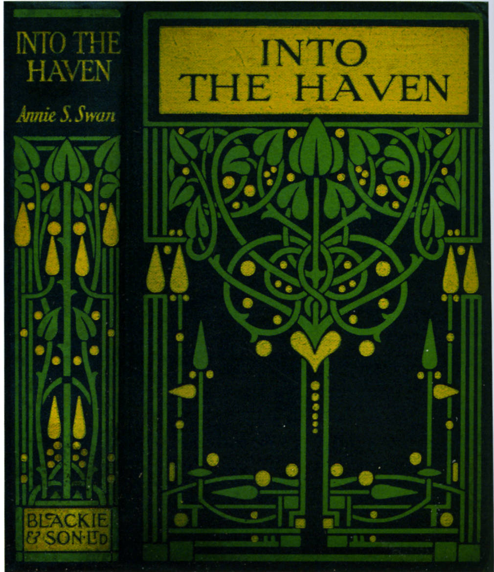
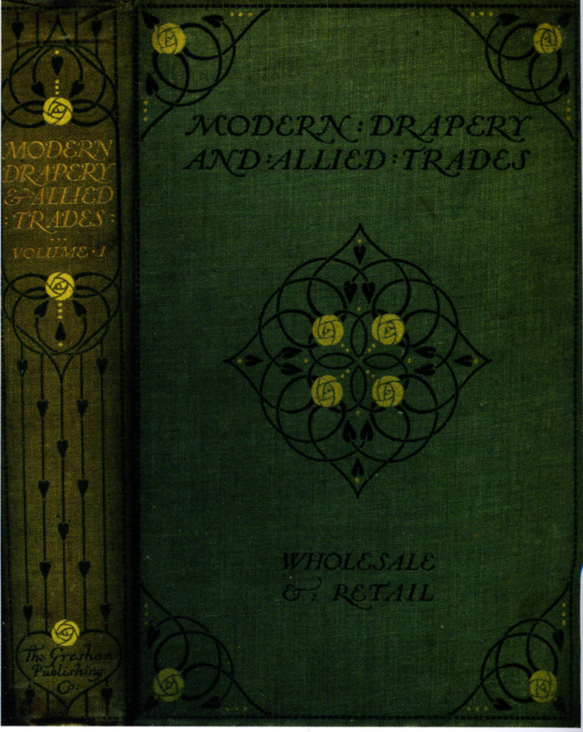
Left: Binding for Modern Drapery and Allied Trades designed by Archie Campbell (1914). Right: Binding for Into the Haven designed by Ethel Larcombe [1914].
The Glasgow style thus provides another strand to the version of Art Nouveau developed in England. Of the two variants, Scottish Nouveau is the more influential; free of the complications of Arts and Crafts, its economy and directness, especially its use of ‘lines’ delicate and strong’ (Wood, 28), lays the foundation for the Modernist aesthetics of the twenties and thirties.
Art Nouveau Publishers: Promoting the Style
‘British Art Nouveau was created by British designers, but their advocacy of the style was facilitated by forward-looking publishers and editors who wanted to educate public taste (‘E.B.S.’, 38) by promoting what was essentially the latest fashion in art: a ‘new art’ or an ‘art of (and for) the new’.
In London, the principal proponents were John Lane, Dent, Smithers, and Elkin Matthews, whose trade imprints, though sold to all, were largely directed at the progressive middle-classes. These companies published the work of Ricketts and Beardsley, who typically designed the books as a whole, furnishing illustrations, decorations, and bindings. Ricketts’s version of the new style was principally projected by Elkin Matthews. Matthews issued several of Wilde’s books, in each case offering a perfect blend of sophisticated writing and the latest in art: tonally suited to each other, Wilde and Ricketts create the ideal ‘book beautiful’. Beardsley likewise benefitted from the enlightened attitude of his publishers, drawing especially on John Lane. Lane gave Beardsley the essential opportunities to project his art, most daringly on the front covers of The Yellow Book. The publisher also ensured that Beardsley’s version of the new style would reach a wider audience by issuing the Keynote series – a curious collection of novellas with covers repeating the design on the title-page.
Beardsley’s position as Lane’s art-editor at work on The Yellow Book empowered him to promote his own imagery and to facilitate his practice on other publications. The power of the editor was an important ingredient in the development of Art Nouveau, and it is interesting to note that Beardsley’s significant role was matched by those of Gleeson White and Talwin Morris, each of whom were instrumental in modernizing their publishing houses by offering the latest and the best.
Gleeson White was art-editor for George Bell (1893–98), changing it from a rather mundane publisher of educational tomes – mainly art books and biographies – by endowing its catalogue with impressive covers. Many of these were created by Gleeson White, but he also commissioned a number of other cover-designers, among them Laurence Housman, whose binding for H. C. Marillier’s study of D. G. Rossetti is a striking example of the style (1892).
Talwin Morris, art-editor for William Blackie of Edinburgh, was similarly effective in sharpening the company’s identity by providing it with attractive volumes. The house of Blackie and Scottish Art Nouveau became synonymous in strict parallel to the association between Beardsley and Lane. Blackie allowed Morris to design whatever he wished, and Morris granted the same freedoms to those he commissioned. The Glasgow style was further promoted by Gresham, a company set up by Blackie in 1898 as an offshoot and intended purely as a mode of diversification. Gresham’s books were cheap imprints, but their designs are among the best of their type.
A final strand is provided by Macmillan, the publishers of the ‘Cranford’ series of classic reprints. Several of these books were illustrated by Hugh Thomson, who also designed the elaborate gilt bindings. Published as comfortable gift books for the Christmas market, these publications were a significant part of popularizing the new style, and in this respect Macmillan’s approach is as important as the seemingly more radical efforts of Blackie and the other London publishers.
Bibliography
Primary Sources: Books with Art Nouveau Bindings:—
Ainsworth-Davis, J. R. The Natural History of Animals. London: Gresham Publishing, n.d.
Allen, James Lane. A Kentucky Cardinal. London: Macmillan, 1901.
Bell, Malcolm. Sir Edward Burne-Jones. London: Bell, 1894.
Bowditch, Mrs. New Vegetarian Dishes.. London: Bell, 1893. (Gleeson White)
Browning, Elizabeth Barrett. Sonnets by E.B.B.. London: Hacon & Ricketts, The Vale Press, 1897. (Ricketts)
Carpenter, Frederic Ives. English Lyric Poetry 1500-1700. London: Blackie & Sons, 1897.
The Century Guild Hobby Horse (1886–92).
Chaucer, Geoffrey. The Knightes Tale. Glasgow: Blackie [1900].
Chaucer, Geoffrey. The Prologue to the Tales of Canterbury. Chelsea: The Ashendene Press, 1897.
Cowper, William. The Diverting History of John Gilpin. London: Guild of Women Binders, 1899.
Davidson, H. C. The Book of the Home. London: Blackie & Sons, 1900.
Dowson, Ernest. Verses. London: Smithers, 1896.
Edgeworth, Maria. Moral Tales. London: Blackie & Sons, n.d.
Edgeworth, Maria. Ormond. London: Macmillan, 1895.
Farrar, Frederick. The Life of Christ as Represented in Art. London: Adam & Charles Black, 1894.
Field, Michael [Katherine Harris Bradley and Edith Cooper]. The Tragic Mary. London: George Bell & Sons, 1890.
The Girl’s Own Annual XVI (October 1894–September 1895). London: The Leisure Hour Office, 1895.
Gray, Thomas. Silverpoints. London: Elkin Matthews & John Lane, 1893.
Gunsaulus, Frank. Songs of Night and Day. Chicago: McClurg & Co., 1896.
Hardy, Thomas. Tess of the D’Urbervilles. 3 Vols. London: Osgood McIlvaine, 1891.
Herrick, Robert. The Lyrical Poems. London: Dent [1895].
Housman, Laurence. A Farm in Fairyland. London: Kegan Paul, Trench, Trübner & Co., 1894.
‘Israfel’ [Gertrude Hammond]. Ivory, Apes and Peacocks. London: Unicorn Press, 1899.
Kingsley, Charles. Westwood Ho!. London: Macmillan, 1896.
Le Gallienne, Richard. The Quest of the Golden Girl. London, New York: John Lane, The Bodley Head, 1896.
The Little Flowers of Saint Benet. London: Kegan Paul, 1901.
The Little Flowers of Saint Francis of Assisi. London & Leamington: The Art and Book Company, 1899.
Lyster, Annette. A Soldier's Son. London: Blackie & Sons, n.d.
Mackmurdo, Arthur. Wren’s Churches. Orphington: George Allen, 1883.
Mitford, Mary Russell. Our Village. London: Macmillan, 1893.
Murphy, William S. Modern Drapery and Allied Trades.Glasgow: Gresham Publishing, 1914.
Peacock, Thomas Love. Gryll Grange. London: Macmillan, 1896.
The Pageant (1897).
Picturesque Westminster, Being a Collection of Sketches Illustrating Historic Landmarks and Places of Interest in the Ancient City of Westminster. London: Carl Hentscel, 1902.
Procter, A. Legends and Lyrics. London: Bell, 1895.
Procter, A. Legends and Lyrics. 2 Vols. London: Bell, 1892.
Reynard the Fox. London: Macmillan, 1895.
Rip Van Winkle. London: Macmillan, 1893.
Rossetti, Christina. Goblin Market. London: Macmillan, 1893.
Scott, R. P., and Keith T. Wallas. The Call of the Homeland. London: Blackie & Sons, n.d.
Shakespeare, William. The Two Gentlemen of Verona. Glasgow: Blackie [1904].
Steele, Robert (translator). Huon of Bordeaux. London: George Allen, 1895.
Steele, Robert (translator). "Renaud of Montauban. London: George Allen, 1897.
Symonds, J. A. In the Key of Blue. London: Elkin Matthews & John Lane, 1893.
Swan, Annie S. ">Into the Haven. Glasgow: Blackie and Son, n.d.
Tennyson, Alfred.Geraint and Enid. Illustrated by Byam Shaw. London: Jack [1899]. Yeats, W. B. Poems. London: T. Fisher Unwin, 1899. The Yellow Book. London: John Lane, 1893 –8. Wilde, Oscar. Poems. London: Elkin Matthews & John Lane, 1892. Secondary Sources:— Antonielli, Arianna. ‘Althea Gyles’ Symbolic (De) Codification of William Butler Yeats’ “Rose and Wind Poetry.”’ Studi Irlandesi: A Journal of Irish Studies 1:1 (2011): 271–301. Barber. Giles. ‘Rossetti, Ricketts and Some English Publishers’ Bindings of the Nineties’. The Library 25 (1970): 314–330. Cinamon, Gerald. ‘Talwin Morris, Blackie and the Glasgow Style’. The Private Library 3rd Series 10:1 (Spring 1987). E.B.S. ‘Mr Talwin Morris’s Designs for Cloth Bindings’. The Studio 15 (1899): 38–44.
Fischer, Lucy. Cinema by Design: Art Nouveau, Modernism, and Film History. New York: Columbia University Press, 2017. [online edition] Fletcher, Ian. ‘Poet and Designer: W. B. Yeats and Althea Gyles.’ Yeats Studies 1 (1971): 42–79. The Glasgow Style. Glasgow: Glasgow Museums, 1984. Howard, Jeremy. Art Nouveau: International and National Styles in Europe. Manchester: Manchester University Press, 1996. Seaton, Chris S. ‘The Book Designs of Talwin Morris’. Review of Scottish Culture 2 (1986): 13–18. Spuybroek, Lars. ‘The Aesthetics of Variation’.The Architecture of Continuity: Essays and Conversations. Rotterdam: V2 Publishing, 2008. The Studio. London: 1893–99. Taylor, John Russell. The Art Nouveau Book in Britain. London: Methuen, 1966. Tsuchdi-Madson, Stephan. The Art Nouveau Style: A Comprehensive Guide with 264 Illustrations. London: Dover, 2002. [online edition]. van Capelleveen, Paul. ‘Butterfly, Abstraction or Flower? Another Look at Charles Ricketts’ The Picture of Dorian Gray’. The Private Library Fifth Series 1:4 (Winter, 1998): 186–192. Wilde, Oscar. ‘Beauties of Book Binding’. Pall Mall Gazette (November 23, 1888). Reproduced in The Complete Works of Oscar Wilde. Vol. 6. New York: Bigelow, 1909, 103–4. Wood, Esther. ‘British Trade Book Bindings and Their Designers, Modern Book Bindings and Their Designers – The Studio, Special Winter No. (1899 –1900): 3–38. Created 29 February 2020