
[These illustrations by Robert Barnes for the weekly serialised version of Thomas Hardy's The Mayor of Casterbridge appeared in volume 33 of The Graphic between 2 January and 15 May 1886. Follow for a full list with links to illustrations.]
By THOMAS HARDY, Author of “Far from the Madding Crowd,” “A Pair of Blue Eyes,” &c. &c. [17]
he illustrator for Thomas Hardy's seventh serialised novel, The Mayor of Casterbridge, was Robert Barnes, a member of that highly talented group of artists on the staff of The Graphic, founded at the close of the golden decade of the British illustrated magazine, the 1860s. "After 1870, The Graphic still had on its staff most of the important graphic artists of the day: Fildes, Hall, Gregory, Houghton, Linton, Herkomer, Pinwell, Green, Woods, and Barnes" (Jackson 27). Although Hardy had been engaged in illustrated part-publication since 1872, when Tinsley's Magazine brought out A Pair of Blue Eyes with plates by J. A. Pasquier, this was only the novelist's second experience with such a mode of weekly serial publication in the large-format Graphic, which had published Hardy's novella The Romantic Adventures of a Milkmaid in June, 1883, and would later publish his Tess of the D'Urbervilles with weekly frontispiece illustrations by a team of artists led by Hubert Von Herkomer.
It seems as if The Graphic's editor, Arthur Locker, rather than Hardy made the choice of Barnes as illustrator for The Mayor of Casterbridge. The novelist must have been better pleased by Barnes's work than he had been by that of either of his two previous illustrators, Collier and Du Maurier, both of whom he had personally selected, only to be disappointed in their productions. Whereas Du Maurier in The Hand of Ethelberta in The Cornhill and A Laodicean in Harper's Weekly had demonstrated his ability to visualise the high-society drawing room and the London world of leisure and affluence, he had failed to convey a sense of Thomas Hardy's Wessex and its denizens. Collier, although competent as an illustrator of the architectural backdrops and landscape of Wessex and possessing the necessary skill to delineate faithfully a period costume piece, had failed to individualize his characters sufficiently, and often even failed to supply elucidating captions, with the result that the serial's readers were frustrated and confused rather than enlightened by his thirty-two plates for The Trumpet-Major in Good Words (1880). Perhaps pleasure with the narrative clarity and pictorial detail of Barnes's work was a factor in Hardy's approaching The Graphic with the later novel. The 4 July-26 December 1891 serialisation of Tess of the D'Urbervilles again featured large-scale composite woodblock illustrations (some of them occupying two full pages) which could convey a sense of the natural backdrop of Hardy's Wessex much better than, for example, the pocket-book-sized Belgravia: A London Magazine set up by Margaret Elizabeth Braddon in 1867 with her partner, the publisher John Maxwell. In this monthly literary journal had appeared The Return of the Native, illustrated by Arthur Hopkins, in 1878). However, the Tess plates lack the visual continuity and consistency of approach so evident in the sequence designed by Robert Barnes for The Mayor, which (unusually for a serial illustrator) he may have been able to read in its entirety (either in manuscript after January, 1885, or in proof after October, 1885) prior to rendering his visual interpretations.
There is a marked difference between [Hardy's] arrangements with the Graphic and all other magazines for which he supplied serials. By the time Macmillan's received the end of The Woodlanders, for instance, the first chapters had, as was customary, already started to appear. But everything for the Graphic was sent to them well in advance. It may be that this was a Graphic house rule — or perhaps the magazine made it a special requirement for Thomas Hardy alone [since he had a reputation for creating 'unsafe' sexual relationships among his characters]. [Seymour-Smith 321]
Although his drawings lack the originality of such artists as Walker and Pinwell, Barnes' "range was very much theirs, because he was at his best in rural genre subjects and one of his most important commissions was to illustrate the first serialisation of The Mayor of Casterbridge in The Graphic" (Houfe 226). In 1876 elected Associate of the Royal Watercolour Society, Barnes contributed to such periodicals as The Churchman's Family Magazine (1863), Once A Week (1864), The Cornhill (1864, 1869-70, 1884), Cassell's (1870 and 1890), The Illustrated London News (1872-7), and The Graphic (1880, 1885-89). His works appear in the collections of the Victoria and Albert and Dorset County Museums, the latter housing six of his twenty original drawings for the serialisation of The Mayor of Casterbridge in The Graphic.
In spite of the fact that all but three of the Barnes illustrations (those for 17 April, 8 and 15 May) were reproduced in the American serialisation of the novel in Harper's Weekly (2 January to 15 May, 1886), the Smith, Elder two-volume edition of The Mayor of Casterbridge (published on 10 May, 1886, just prior to the conclusion of the serial run) was not illustrated. Richard L. Purdy cites a letter by the editor of The Graphic, Arthur Locker, to Thomas Hardy dated October 20th, 1885, in which the editor mentions "an illustration for every three slips": "this appears to have been the instruction given to Barnes the artist" (Purdy 53), making twenty illustrations in total (as indeed there were). The term "slip," based on the number of column-inches per instalment, would seem to suggest a type-set strip of approximately 62 inches. Typically, an instalment consists of a picture page (with either 7.5" or 13.5" of type ranged in three columns), a second full page of type in three columns (42"), and a third page with a single, short column (2.5" or more). Twelve of the illustrations are 6.75" wide by 8.75" high; eight are 8.75" wide by 6.75" high. Since only two pictures illustrate a line on the first page of the serial number, whereas seventeen pictures illustrate lines on the verso, rarely could the reader see the complementary illustration and the 'word-picture' at the same time. According to a letter that Hardy wrote to Frederick Macmillan on 27 November 1885, the preparation of "the illustrations caused delay" (Collected Letters I, 138-9) in the magazine serialisation of The Mayor of Casterbridge. The Collected Letters of Thomas Hardy, Volume One (1840-1892), yields little further information about Hardy's attitude towards the illustrations or about his relationship with Barnes. Certainly, there is no evidence of Hardy's having corresponded with Barnes or having involved himself in the process of illustration as he did with Pasquier for A Pair of Blue Eyes, Collier for The Trumpet Major, and Hopkins for The Return of the Native, for whom Hardy served as pictorial advisor and collaborator by offering both trial sketches and comments on composition.
Noted for his skill with figures and genre subjects, Robert Barnes has been credited with the ability to produce characters who have apparently sprung "straight from English soil" (Reid, 269). All the Barnes figures that people the pages of his Graphic illustrations for Hardy's novel possess the robust solidity typical of his work elsewhere. As Reid suggests, "these men and women . . . are so limited in type that they might nearly all be members of a single family — a family of the well-to-do farming class, healthy, sturdy, producing no disquieting variations from the sound yeoman stock that has reached back from generation to generation. Barnes would have been the right man to illustrate George Eliot's earlier novels; he would have been the wrong man to illustrate the novels of Mr. Hardy" (256-57). Certainly, Barnes's depictions of Henchard and Farfrae do bear some familial likeness (perhaps as a consequence of Hardy's having Henchard remark, early in the novel, that the young Scot somehow reminds him of a deceased brother). However, Barnes distinguishes the two protagonists (after all, each is a mayor of Casterbridge) by providing the middle-aged man with a distinctive, 'perpendicular' nose (as described by Hardy on the very first page), undoubtedly a device to provide pictorial-narrative continuity: like a tag-line from Dickens, the unique facial feature makes the figure of Henchard immediately recognizable, no matter what his age or social standing. All the figures are "bold, strong, and very much alive," as Reid suggests — perhaps too much so if one considers that Joshua Jopp should be decidedly disreputable in attire and manner, and Henchard after his fall from municipal and commercial greatness at least somewhat so.
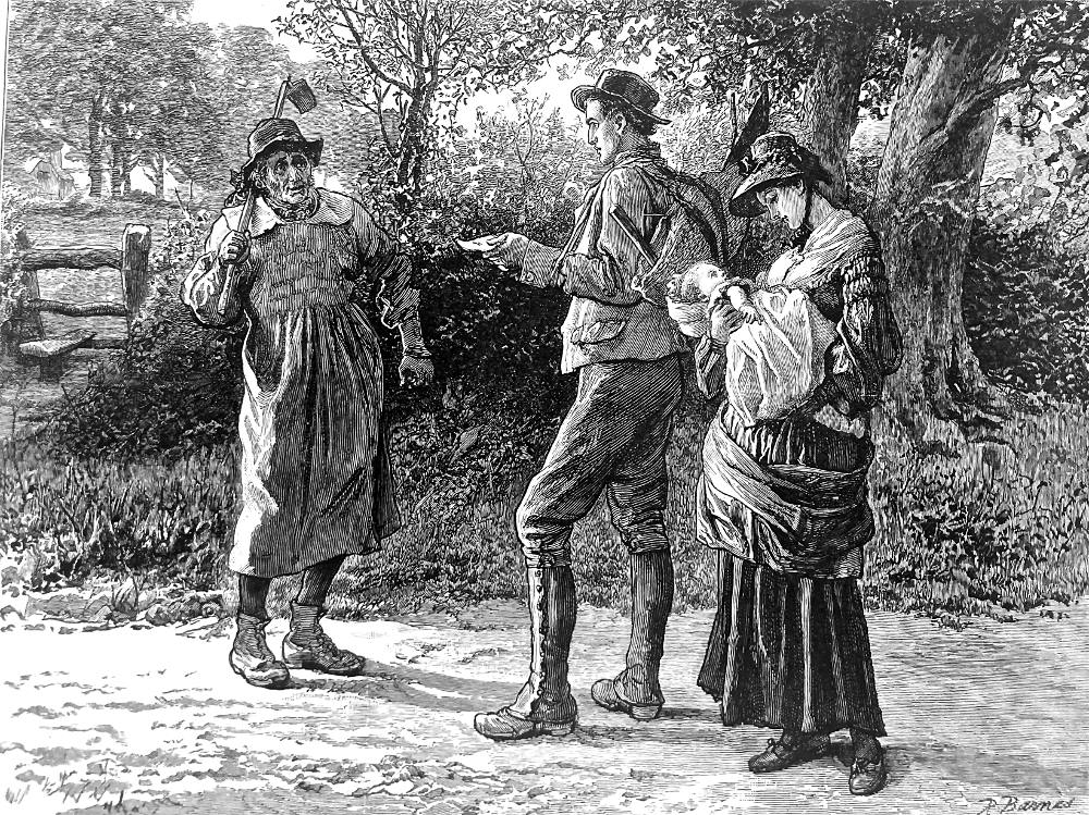
From Henchard's opening appearance (2 January 1886) Barnes depicts him (even though a comparative youth) as dignified and carefully dressed, though the clothing he and others wear is always appropriate to the geographical and temporal setting: southwest England in the 1840s. In the opening plate of the narrative-pictorial program, note the turnip-hoer's carefully recreated linen smock-frock (almost identical to one on display in the Dorset County Museum, Dorchester) and Henchard's fustian hay-trusser's garb. Although Barnes does not suggest the couple's weariness and dust-covered dishabille, he has paid careful attention to such details of costume as Henchard's buttoned gaiters and the labourer's boots, as well as to the various types of vegetation in the backdrop. He has even placed the ballad sheet the hay-trusser reads in the text in Henchard's right hand as he hears the unwelcome news from the native of Weydon-Priors. Susan appears heedless of the conversation so absorbed is she in her infant (young Susan's nose will be reproduced in plates of the second Elizabeth-Jane).
In the first two illustrations — (2 January 1886) "Hay-trussing —?" said the turnip-hoer, who had already begun shaking his head. "O no" (p. 17) and (9 January 1886) The hag opened a little basket behind the fire, and, looking up slyly, whispered, "Just a thought 'o rum in it?" (p. 41) — Barnes allows himself to be ruled by the text. Young Michael Henchard's brown corduroy jacket, breeches, tanned leggings, and black-glazed straw hat are all here, as is his rush basket with protruding hay-knife.
Susan, again true to the text, seems "pretty, even handsome" (17) as she looks down at her infant. That the worn-out trio have approached the outskirts of Weydon-Priors is suggested by the building to the extreme left. Henchard waves towards the village with his "sheet of ballads" (surprisingly small in Barnes' rendering, but significant as signifiers of Henchard's being literate) as he questions the phlegmatic turnip-hoer (his implement on his shoulder, but his dinner bag not visible). Already the skeptical hoer has begun to nod his head in the negative in response to the young hay-trusser's query about work. The boots, linen smock-frock, and rumpled hat of the native of Weydon-Priors, although not described in the text, are perfectly consistent with the attire of Dorset labourers of the period of the 1840s, as exhibits in the present Dorset County Museum indicate. Where Barnes has most significantly adjusted Hardy's text to suit his own pictorial sense is in the crisp, clean condition of the wayfarers' clothes. In Barnes' illustration (the first in the series, and on the opening page of The Graphic — and therefore intended to seize the would-be purchaser's attention) Michael and Susan Henchard bear no signs of "the thick hoar of dust which had accumulated on their shoes and clothing" (17), and there is no hint in the illustration of either their "disadvantageous shabbiness" or their near-destitution. They are young, healthy, and clear-complexioned in Barnes's rendering of them.
Barnes excelled at juvenile figures, so that his Elizabeth-Jane is as fetching in both face and figure as her mother in the first plate, as one might expect from reading Hardy's novel, although she seems to possess little of the intellectual striving with which Hardy invests her. The second plate, The hag opened a little basket behind the fire, and, looking up slily, whispered, "Just a thought o' rum in it?" (9 January 1886) shows a curious, shows a curious, thoughtful, and sympathetic young woman, but not one with the bitter smile of recognition at the "old trick" that led to her separation from her first husband. At first glance, we might take this self-confident beauty for Elizabeth-Jane, although Hardy's text indicates clearly that the mother has told the girl to "bide here" [42] "while her mother went forward") attired in respectable, middle-class mourning (suggestive of the death of the genial sailor who bought her all those years ago), in contrast to the crooked form and weathered face of Mrs. Goodenough and the rough-and-tumble working class folk behind her. Compare the figures' hands: the furmity-vendor's are sinewy, powerful, almost masculine; Susan's are more delicate, serviceable hands as in Her mother whispered as she drew near, 'Tis he." (16 January 1886). The artist's using yet another distinctive nose to provide an instantly recognizable feature is well illustrated in Barnes's depiction of the heroine, the same feature identifying her in "Then it's somebody wanting to see us both" (6 February 1886).
Barnes's conception of the bucolic past is almost archaeologically realistic in some matters (particularly costume) and romantic in others. Instead of dwelling, as Hardy does for example in Ch. 3, on the decline in "the real business of the fair" (41) at Weydon-Priors, Barnes draws the viewer's attention to the "Vanity Fair" aspect of the backdrop for the second meeting of Susan and the old furmity vendor, Mrs. Goodenough. With swirling crowds, fanciful banners, an 'erection' "devoted to shooting for nuts" (note the weapon being brandished by one customer), and possibly even a specimen of those "machines for testing rustic strength and weight" (41), the scene's set suggests festive gaiety rather than the pervasive Hardyan melancholy and economic decline which the text conveys in the absence of tradesmen's stalls and vehicles. One of Barnes's difficulties, of course, was that he was powerless to depict the absence of anything.
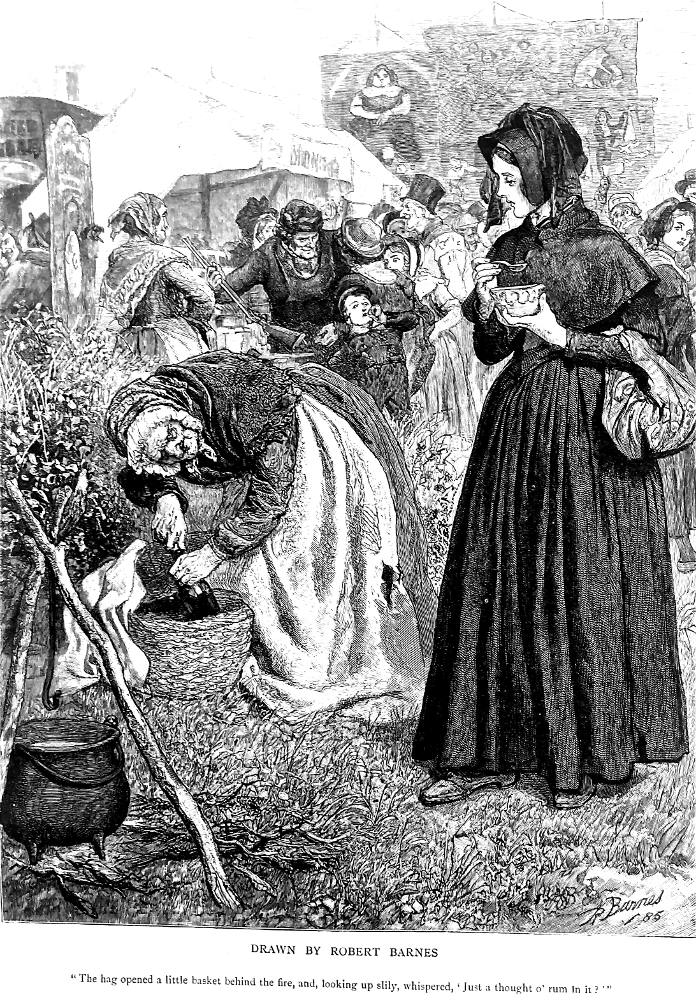
The respectable young woman (her weeds again in an immaculate condition hardly suggestive of many days spent traveling afoot) looks with innocent curiosity rather than sardonic detachment at the old furmity-vendor (her repetition of her offer of alcohol in the porridge suggestive of a machine-like nature that defies time) as the latter offers to put "Just a thought 'o rum in" (42) the bowl of gruel the younger woman holds, spoon poised. Hardy describes Elizabeth-Jane as carrying an old withy basket, transformed by Barnes into a more urban and less markedly Wessex-style reticule). The furmity-vendor is portrayed with detailed accuracy: her apron stained and ripped, her face and hands as gnarled as her basket from which, Caliban-like, she draws her liquor bottle. She is a witch who has lost her power, as is suggested by the lack of flame beneath her cauldron in the foreground; she has neither tent, nor benches, nor other customers as formerly, during the wife-sale. Her grizzled, bent condition is contrasted by the upright posture and clear features of the young woman, and by the vigorous life surrounding her. Although the furmity-vendor appears a third time in the novel (when Henchard acknowledges the truth of her accusation in court that he once sold his wife), she does not appear again in Barnes's program. However, Susan appears in the four of the first five scenes, and Elizabeth-Jane in eleven of the twenty plates, more, in fact than "The Man of Character" himself, for Michael Henchard appears in nine: plates 1, 5, 8, 9, 12, 14, 15, 17, and 20.
Even if Barnes' Mayor of Casterbridge illustrations do reveal the occasional want of imagination and a only occasional flair for the dramatic ("Where is the Skimmington, or Henchard's dummy floating in the weir?" one wonders), his female characters here do not run to the "bovine type of beauty" for which Reid has criticized Barnes. His illustrations reveal that Barnes was very much at home in the novel's rural, often working-class idiom, as the fourth plate (23 January), in which Farfrae sings a Scottish ballad at the King of Prussia (afterwards, in volume, The Three Mariners') indicates. Like a Sensation novelist, Barnes packs his scene with highly realistic costuming and stage properties (which Reg Terry terms "Detailism" in Victorian Polular Fiction 1860-1880). The pub's taproom (more like a cosy parlour, with its massive stone fireplace and high-backed settle) is full of village characters, in whose individualizing peculiarities Barnes delights. All thoroughly believable (and appropriate to the period and the geographical setting) are the workmen's caps, the bourgeois beaver hats, the pewter mugs, solid glasses, top boots, and long-stemmed clay pipes. A nice touch is the face of Elizabeth-Jane glimpsed from behind the settle, turned slightly to one side, listening intently but apparently visualising moments from her own experience as well as Farfrae's Scottish Highlands.
In the February 27th illustration one should appreciate the careful detail with which Barnes has drawn Henchard's bluff serving-woman, Nance Mockridge, as she stands as Hardy has described her, self-satisfied, judgmental, assertive, and arms crossed, while her stern employer, the man of substance and authoritative fashion, Henchard, respectably clad corn-factor and mayor, cross-examines Elizabeth regarding the rumour that his step-daughter once waited on tables at the King of Prussia Inn. The illustrator captures well the range of emotion evident in the three principals, and provides just enough of the stage set to make the dramatic scene utterly convincing as he elicits the viewer's sympathy for Elizabeth-Jane.
Apparently the best thing Barnes did in his 1868 collaboration with John Tenniel on The Mirage of Life was a "drawing on page 155 of a fight between two schoolboys" (Reid 258). The same vigorous delineation of the combatants, the sense of action, movement, and menace is well communicated in Barnes' drawing of the confrontational episode in Plate Seventeen (Chapter 37) in The Graphic for 24 April, 1886: "Now," said Henchard between gasps, "Your life is in my hands." As Arlene Jackson in Illustration and the Novels of Thomas Hardy (1981) notes, Barnes carries his figures beyond the recognizable types of genre painting because he consistently makes them "seem ready to break into movement" (96). Since the serialisation in The Graphic ran to twenty weekly numbers, Barnes's illustrations probably did not have to serve as aides-mémoire to Hardy's initial readers here as Arthur Hopkins' illustrations for Belgravia in 1878 did, for the initial readers of The Return of the Native. However, in each instance in The Graphic — and the realisation of the to-the-death wrestling match between Henchard and Farfrae is a pertinent example — the image is far more lasting in the reader's memory than the momentary impressions of scene and character derived from the initial reading, and may connote more than the text itself denoted. Even when a modern, volume-reader attempts to experience Hardy as his first nineteenth-century readers would have done, by attempting to process the chapters in their original serial groupings and pausing to reflect and anticipate as the magazine reader would have done, without the illustrations that initial nineteenth-century reading cannot be recreated. The difference between a part-reading in volume and an authentic serial or "part-reading" is that the illustrations, published usually as frontispieces or headpieces (as is the case of both three of Hopkins' illustrations for the Belgravia serialisation of The Return of the Native, and all of Barnes's twenty large-scale plates for The Mayor of Casterbridge) or to face a particular page (all twenty pictures illustrate specific lines, mostly on the second page of each instalment), condition the reader's response to the text, causing the reasder to flick back the page to compare a rhetorical 'word-picture' to its visual analogue.
Although they set the scene, providing both background details and strong notions about the appearance and behaviours of certain characters, Barnes's serial illustrations do not necessarily curtail the imaginative experience. Rather, they fix certain scenes in the mind as benchmarks of the story's action, telegraphing to the reader what one sensitive reader (a graphic artist, whose perception has sometimes in turn been corrected or influenced by that of the writer himself) has felt is memorable in the instalment about to be read. Then, too, an initial illustration tends to provide the reader with a "realization" (in the sense that Martin Meisel uses the term); that is, the reader, having seen the picture with its title drawn from the text, awaits its arrival in the lines of the text, so that the passage illustrated provides a moment of stasis, of reflection, and possibly even of comparison between the artist's and reader's conceptions of the scene. The reader must then mediate between the two images. "The collaboration of picture and text in the art of the novel is thus ultimately an attribute of style [i. e., the artist's interpretation of the text], operating as a presence and influence in the language as well as in the narrative organization" (Meisel, 56).
One must subordinate such aesthetic considerations about the illustrations as "Do the lines create an appropriate sense of setting, mood, and motion?" and "Does the design reinforce the plot and language of the text?" to the question of how well the pictures prepare the reader for what is to come in the text and affect his or her perception of the text as a whole. "The text continues its mode of progression, linear and temporal," as Meisel notes, "while the emblematic image the text has generated persists in ocular reality, giving to the whole a vivid extra dimension" (56). That 'extra dimension' Nodelman in First Words About Pictures terms "connotation" (10) and Meisel "style" (as opposed to the text's first dimension, which one may term "content").
In many instances, Barnes's style is simply not up to Hardy's text in terms of power of association, especially in the depiction of setting. Barnes, aware that his strength lies in his ability to depict people and costume, often avoids scenes requiring movement and action, such as the Skimmington, where he elects not to show the raucous procession but dwells instead upon the characters' reactions (somewhat melodramatic expressions on the faces of Elizabeth-Jane and Lucetta) in the May 1st illustration, Lucetta's eyes were straight upon the spectacle of the uncanny revel (477). The revellers, in fact, are directly represented by just two figures, one running so swiftly that he must hold onto his hat (left), and the other holding up a torch (right). The focus of the picture, the women's faces (the highlight presumably resulting from the reflected torches of the revellers off left), reveals the emotional impact on them of this public revelation of Lucetta's prior relationship with Henchard. However, as she was married to Henchard in Jersey in the serial version, the Skimmington here threatens Lucetta with exposure of her marriage to Farfrae as bigamous. In contrast to her companion, who is fainting rather than enduring the spectacle, Elizabeth seems almost mesmerized, momentarily frozen after the rapid motion implied by her thrown-back bonnet and upraised hand. The glare of the procession's torches is further suggested by the shadows which the railings cast on Lucetta and which the rosebush in the foreground casts upon Elizabeth.
The fashionable 1840s clothing of the women conveys almost as much information as their theatrical poses and expressions. Elizabeth is no longer in mourning as she was in the February 20th illustration, but wears the dress depicted in the illustrations for February 27th, March 13th, and March 27th. This visual continuity (so much Barnes's strength as it is John Collier's weakness in the plates for the serialisation of The Trumpet Major) is repeated in Lucetta's dress, which occurs in the April 17th illustration, thereby implying a contrast between her domestic happiness in her husband's confidence then depicted and her agony at the prospect of losing that confidence in the May 1st illustration. The dresses, the railing, and the rosebush are shown in carefully-drawn detail, as opposed to the shadowy street and town clock in the background. These generalized details, however, reveal that Barnes was unfamiliar with Hardy's Dorchester and the real situation of the Corn Street mansion, the clock being one found in such nearby towns as Salisbury and Winchester.
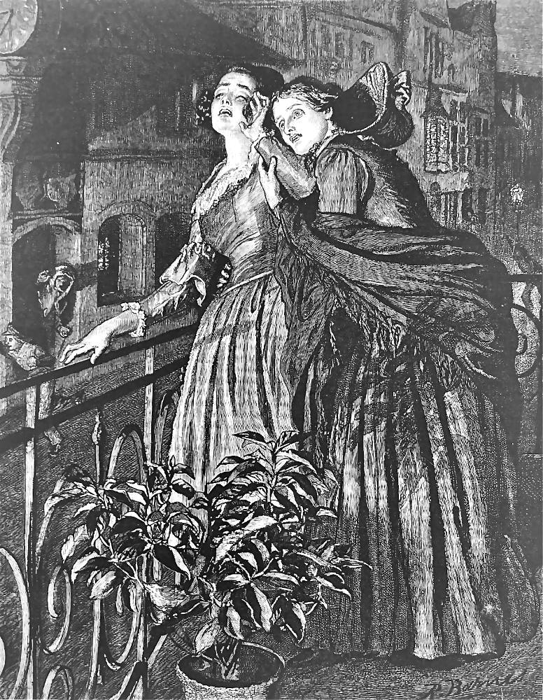
How much of each Barnes illustration is actually justified by Hardy's text and how much is the artist's invention? In the May 1st illustration, Lucetta's eyes were straight upon the spectacle of the uncanny revel (477), for example, the chief elements, the fully-drawn figures of the two women, are derived from the text only in so far as Hardy indicates that they are both on the balcony of the Corn Street mansion as the Skimmington ride passes. An examination of the details of the illustration indicates that Barnes carefully studied the relevant scene in Ch. XXXIX, integrating his illustration of Lucetta and Elizabeth Jane here with patterns established by previous renderings of them. Across Corn Street, for example, the town clock previously mentioned shows 8:35 in the evening, and the text suggests that it would have been somewhat after "eight o'clock" (477) when Elizabeth arrived, after Lucetta has overheard the exchange between the two housemaids about the identities of the two persons represented by the carefully costumed effigies. That no light reflects upon the women's faces from the interior of the house (right) is consistent with Hardy's mentioning that Lucetta "had not had the candles lighted," the room being illuminated only by firelight. The bonnet tipped back over Elizabeth's shoulders is consistent with her having "breathlessly" (478) addressed Lucetta as she entered the room. By the time that the pair can see the bacchic procession clearly from the balcony, "the rigid wildness of Lucetta's features" (478) has been succeeded by "a wild laugh as she stepped in" from outside. Barnes has therefore attempted to capture that moment that precedes the maniacal laugh and Lucetta's subsequent collapse in an epileptic fit. He shows Elizabeth with her right arm drawn protectively around her companion, her left hand holding Lucetta's right as she attempts "to pull her in." However, the spectacle to which Lucetta reacts is either advancing or directly beneath her at that point, and cannot have passed already as Barnes's illustration suggests. Furthermore, Hardy nowhere describes the balcony's petalless rose-bush to which Barnes accords some prominence by juxtaposition with the principals. Accordingly, one wonders if Barnes has added it for mere compositional or decorative effect, or whether he intends it to be a symbol, not so much of the insentience of vegetable life and its lack of awareness of the human condition (a theme which Hardy has already established), but of the fruitless issue of Lucetta's marriage to Farfrae. The petalless bush may be intended to foreshadow Lucetta's miscarriage.
Barnes's obvious bias towards neatness, tidiness, and cleanliness in the attire of the story's characters is evident elsewhere in Barnes's illustrations, so that the Joshua Jopp who meets the despondent Henchard on the bridge in the April 3rd illustration, Henchard turned slightly, and saw that the comer was Jopp, his old foreman (373), is far too reputable, as is Henchard himself after his fall from power, exile from affection, and exclusion from the community.
Susan Henchard's second and final appearance, in the January 30th illustration, is very different. Instead of supporting the scene as the youthful, straight-backed, and tall and yet sweetly maternal figure of the first plate, the shadows of the Roman arena engulf older Susan's bent figure as she leans for support and comfort on Michael's chest. Black, the colour of the mourning that she wears for the dead sailor who was not her legal husband, marks her for death, which the February 20th picture of Elizabeth Jane and Henchard in mourning signals has occurred. Henceforward, her daughter and husband tend to dominate the pictorial sequence: Elizabeth-Jane appears in eleven of the twenty illustrations (discounting the infant shown in the first picture), Henchard in nine, Farfrae in eight, and Lucetta in five.
Although her step-father is physically more impressive (Barnes shows him as an almost monumental figure, his clothing suggestive of the Victorian patriarchy against which the novel's women struggle), Elizabeth is consistently more appealing, glancing directly at the reader in the second and eleventh illustrations. Her glance towards the reader in the March 13th illustration, She knelt down on the hearth, and took her friend's hands excitedly in her own (293), suggests at once that she shares with the reader the knowledge that Lucetta is the 'unfortunate friend' who has compromised herself with two men. Barnes has achieved, then, a double vision temporally and narratively, for the glance may suggest one of two moments in Chapter XXIV. Either it is a wistful look that denotes the moment given in its title, Elizabeth's reflecting on her lost romance with Farfrae, after whom she has just "demurely" inquired, surmising that Lucetta has seen him by her friend's eyes having a "heightened brightness" and her cheeks an "advanced colour" (294). Or it is a knowing, ironic glance at the reader that suggests Elizabeth's not being "beguiled" by Lucetta's confession once removed. The look extends the picture beyond the comfortable drawing-room of High Place Hall and into the reader's own world, establishing a rapport between Elizabeth and the reader through the knowledge that only that character and the reader share. That the throne-like chair which Farfrae occupies in the 17 April illustration resembles that in which Captain Newsome (with appropriate sailor's mutton-chop whiskers) sits uneasily, as if about to rise, may be Barnes's way of revealing that both scenes are set in the same room.
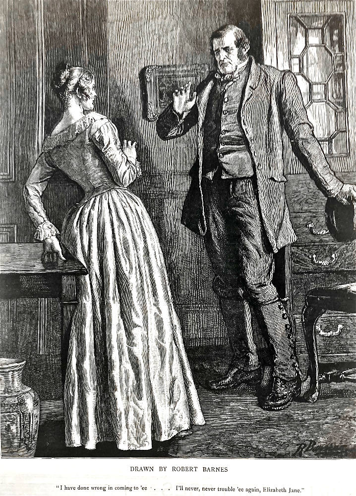
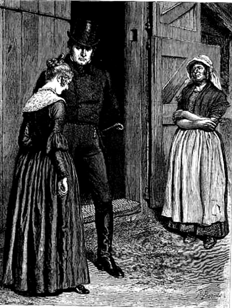
In the final large-scale illustration which culminates his twenty-part sequence for The Graphic's serialisation of Hardy's The Mayor of Casterbridge, "I have done wrong in coming to 'ee . . . I'll never, never trouble 'ee again, Elizabeth Jane" (529), Barnes studies his two chief figures intensely. Again the composition is highly theatrical, but again the artist conveys as much information through the costumes as through the melodramatic poses. Henchard's field-hand's dress (best indicated by his gaiters and sturdy boots, which recall his costume in the initial plate) and a peasant's soft hat (a sharp contrast to his fashionable Beaver hat in the April 3rd illustration) suggest his decline (or, more properly, his return to his former social status); his raised right hand suggests his attempting to allay Elizabeth Jane's alarm at seeing him after her sailor-father has returned as it were from the dead (for he was reported "lost at sea") to reveal Henchard's imposture. The true artistry in Barnes' depiction of the novel's tragic hero of the cornlands lies in the fallen face and steady, internalized gaze of the former mayor, clearly one used to command and to receive compliance. But he is also himself again, wearing a countryman's garb and speaking in those very accents for which he had rebuked his step-daughter earlier in "Did you do it, or didn't you? Where was it?" (Chapter XX). A man of the soil, he seems rough and clumsy in the smartly furnished room (note the elegant vase in the left foreground). Thus, Barnes' final plate addresses the text's problem of directing the reader's sympathies towards Henchard's character in spite of his misdeeds, of making the reader appreciate the ex-mayor's and ex-father's conflicting feelings regarding Elizabeth Jane and her marriage to his former protegé and recent rival. Like the printed text, the pictorial text invests Henchard with considerable inner life, showing him experiencing feelings ranging from tenderness, guilt, rage, and compassion, while giving Farfrae little inner life beyond an expression of affability.
In this final scene, Elizabeth-Jane, at one with the room in her elegant silk dress, recoils from Henchard as if he were the villain of a period melodrama, perhaps the hard-hearted employer of The Factory Lad (1832). She has upbraided him for his deceit, flushing up and pulling her hand away from the older man who has pretended to be her natural father. From Newson she now knows the truth. Her light-coloured gown suggests not only her separation from her former father (who has, as he rightly guesses, been replaced in her affections by her real father, the genial seafarer whom Barnes has depicted in the penultimate illustration, "Elizabeth, my child, come and hearken to what we are talking about and not bide staring out o' window as if ye didn't hear"), but also her having recently married Farfrae; we note that in both the April 17th and May 1st illustrations Barnes has Lucetta, the first Mrs. Farfrae, wearing a similar dress. Although the sleeves and necklines of the two dresses are somewhat different, the similar textures and colours suggest that Elizabeth has taken Lucetta's place maritally as Farfrae has assumed Henchard's position both politically, commercially, and socially.
Thus, Barnes' illustrations often suggest the various characters' emotions, and consistently represent the physical settings and psychological moods of Hardy's text. Consequently his illustrations tend to reinforce both Hardy's language, explicate the intricacies of his plot, and fully exploit the black-and-white medium for both atmospheric and thematic potential. Despite their somewhat stagey character, these twenty illustrations offer a consistent and convincing interpretation that conveys an apt sense of Hardy's characters. Most importantly, these illustrations each prepare the reader for some significant moment in each instalment's action, signalling in advance what important development in the story's action he may expect this week, and making it possible through each memorable dumb-show for the reader to keep track of a complex action over a five-month period. Jackson credits Barnes with providing "special insights into character" and illuminating the story's rhythms through "the realistic and metaphoric uses of detail, and the selective stresses created through choice of scene" (105).
The effect of Barnes's painstaking depiction of background detail is to provide for every character and every action illustrated an appropriate dramatic context that, among other things, must have enabled readers of the novel as serialised in twenty weekly parts in The Graphic to suspend their disbelief and credit a form of The Mayor of Casterbridge surcharged with coincidence and improbability. These elements Hardy muted somewhat in successive revisions, but, as Seymour-Smith argues, the novelist was not attempting to create a realistic but a "mythopoeic" (322) work whose affinities lie with Oedipus, Dr. Faustus, and King Lear rather than with contemporary, late-Victorian fiction.
Images scanned by the author. [You may use these images without prior permission for any scholarly or educational purpose as long as you (1) credit him and (2) link your document to this URL in a web document or cite the Victorian Web in a print one.]
Bibliography
Allingham, Philip V. "A Consideration of Robert Barnes' Illustrations for Thomas Hardy's The Mayor of Casterbridge as Serialised in the London Graphic: 2 January-15 May, 1886." Victorian Periodicals Review 28, 1 (Spring 1995): pp. 27-39

Barthes, Roland, The Responsibility of Forms: Critical Essays on Music, Art, and Representation, trans. Richard Howard. New York: Hill and Wang-Farrar, Straus and Giroux, 1985.
Bénézit, E. Dictionnaire Critique et Documentaire des Peintres, Sculpteurs, Dessinateurs et Graveurs. Paris: Librairie Gründ, 1976. Vol. 1.
Foster, Vanda. "'Unknown Gentleman' 1842. W. Higgins." A Visual History of Costume. London: B. J. Batsford Drama Book Publishers, 1984. Page 63.
Graves, Algernon. The Royal Academy of Art, A Complete Dictionary of Contributors and their work from its foundation in 1769 to 1904. London: Henry Graves and George Bell, 1905. Rpt. Kingsmead Reprints, 1970. Vol. 1 (A-D).
Hardy, Thomas. The Mayor of Casterbridge. The Graphic 33 (2 January-15 May 1886): pp. 17-542.
Houfe, Simon. The Dictionary of British Book Illustrators and Caricaturists 1800-1914. Woodbridge, Suffolk: Baron Publishing and the Antique Collectors' Club, 1978.
Jackson, Arlene M. Illustration and the Novels of Thomas Hardy. Totowa, NJ: Rowman and Littlefield, 1981.
Mallalieu, H. L. The Dictionary of British Watercolour Artists up to 1920. 2nd ed. Woodbridge, Suffolk: Antique Collectors' Club, 1986. Vol. 1.
Meisel, Martin. Realizations: Narrative, Pictorial, and Theatrical Arts in Nineteenth-Century England. Princeton: Princeton University Press, 1983.
Nodelman, Perry. First Words About Pictures. Athens: University of Georgia Press, 1988.
Purdy, Richard Little. Thomas Hardy: A Bibliographical Study. Oxford: Clarendon, 1954; rpt., 1978.
Purdy, Richard L., and Millgate, Michael (eds.). The Collected Letters of Thomas Hardy. Oxford: Clarendon, 1978. Vol. 1 (1840-1892).
Reid, Forrest.Illustrators of The Sixties. London: Faber and Gwyer, 1928; rpt. as Illustrators of the Eighteen Sixties. New York: Dover, 1975.
Seymour-Smith, Martin. Hardy. London: Bloomsbury, 1994.
Terry, Reginald C. Victorian Polular Fiction, 1860-1880. London: Macmillan, 1983.
Wright, Sarah Bird. "The Mayor of Casterbridge. Thomas Hardy A to Z: The Essential Reference to His Life and Work. New York: Facts On File, 2002. Pp. 207-216.
Created 28 July 2001
Last modified 18 April 2025