
Introduction: reading the illustrated periodical
Critical analysis of illustrated magazines of the 1860s has focused on a series of issues. Foremost among these is the question of the relationship between the written text and the illustrations and its impact on the reader, a topic explored in detail by Mary Leighton and Lisa Surridge (2008). Others have traced the practical collaborations between the various parties involved in the magazines’ production, a process Simon Cooke (2010) has characterized as a multi-faceted compromise between competing interests. There are nevertheless many areas that deserve further investigation. Rarely considered are the magazines’ material properties.
Of special interest, perhaps, is the way in which the periodicals were designed as crowd-pleasers, deploying a range of physical features in order to attract a variety of audiences. Of course, their principal attraction and selling point was their visual richness. Embellished by the artists of the Sixties, the journals presented illustrations which set out to beguile the reader/viewer’s eye, making their pages into another site of visual pleasure. Aimed at the middle-classes, they provided portable galleries of fine engravings in black and white that democratized the appeal of art and were supposed to improve the public’s taste, engaging their bourgeois readership through a process of cultural inclusiveness. However, other factors were at work as well. The illustrations (and written texts) were important, but so were the bindings, the journals’ physical dimensions, the quality of their printing, and the inclusion of advertisements. These elements were used to position the magazines within their markets and to appeal to specific cohorts of readers. The significance of these features, and the magazines’ changing status, is outlined in the following sections.
The illustrated periodical as material book
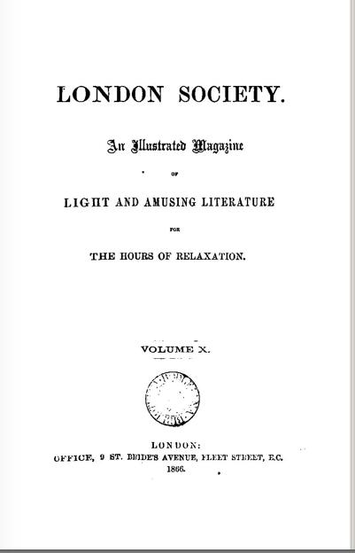
Illustrated periodicals of the 1860s are in many ways diverse, and material difference was accentuated as part of the process of competition. The full-page illustrations of The Cornhill Magazine were calculatedly pitted against the interpolated designs of Once a Week; and the plain covers of Good Words form a distinct contrast to the polychromatic wrapper of London Society. Each magazine expresses its individuality in physical terms, but there are many similarities as well.
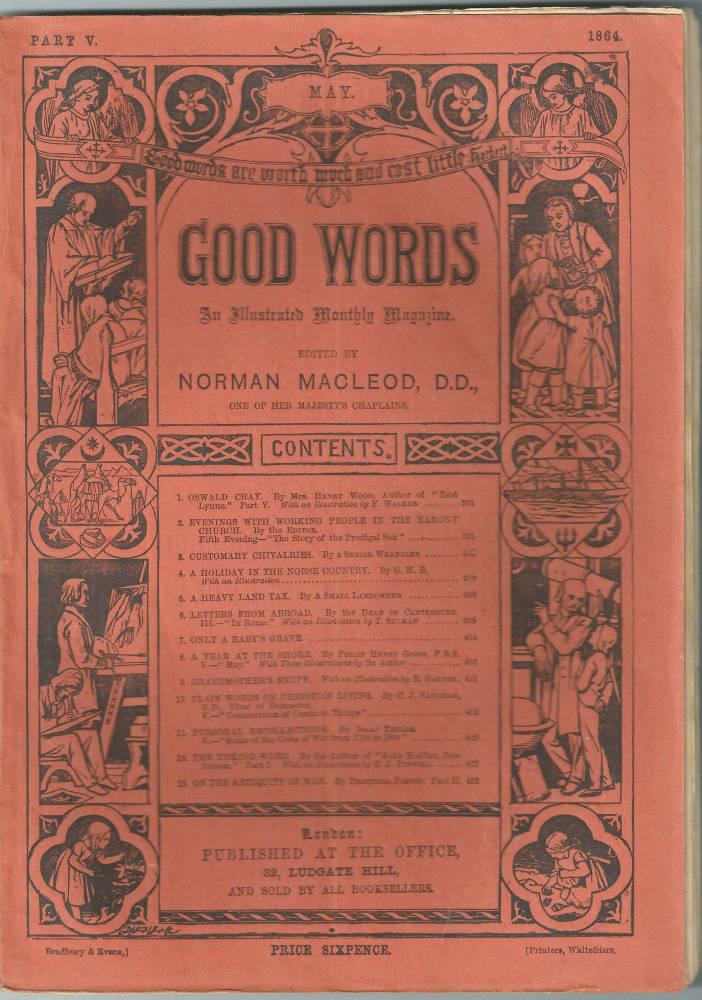
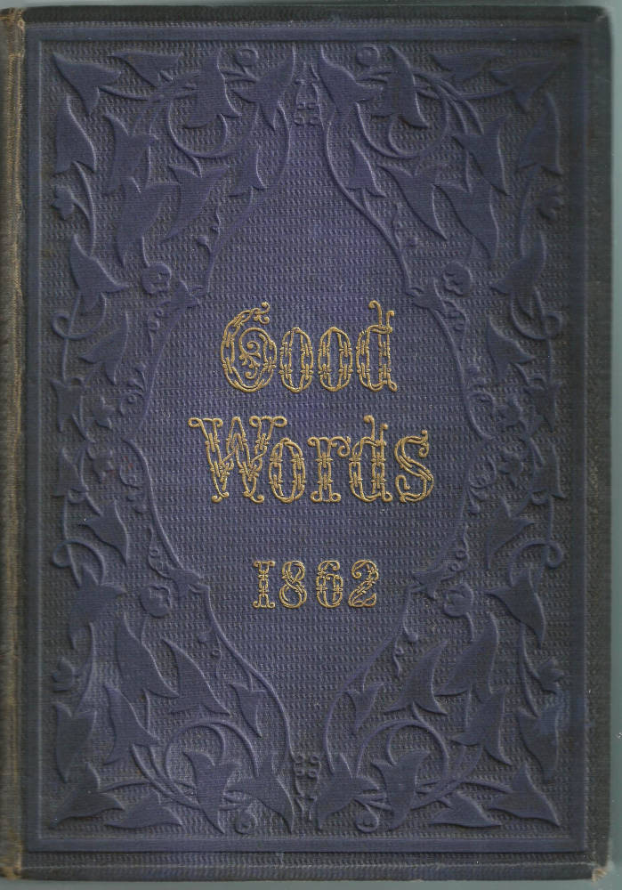

Three covers for Good Words: Left: The heavily symbolic limp paper wrapper of individual issues of the magazine. May 1864. Middle: Navy blue cloth gilt binding of the annual version of Good Words. 1862. Right: The 1880 annual issue. [Click on these images for larger pictures.]
The magazines were routinely published in two formats: first in a weekly or monthly issue, and then in a half-yearly volume which collected all of the numbers together; there were no quarterlies. The original issues were essentially ephemera, printed on relatively low quality paper, and stapled or glued together within a limp wrapper. The half-yearly editions, on the other hand, were of much higher quality. They were usually mounted on better paper and were not assembled from the individual issues as first published, but were re-printed on finer stock. Bound within a coloured cloth binding, they were embellished with gilt devices on the spine and upper board. The relationship between the first and second states is exemplified by the development of two of the prime periodicals of the period, Once a Weekand Good Words.
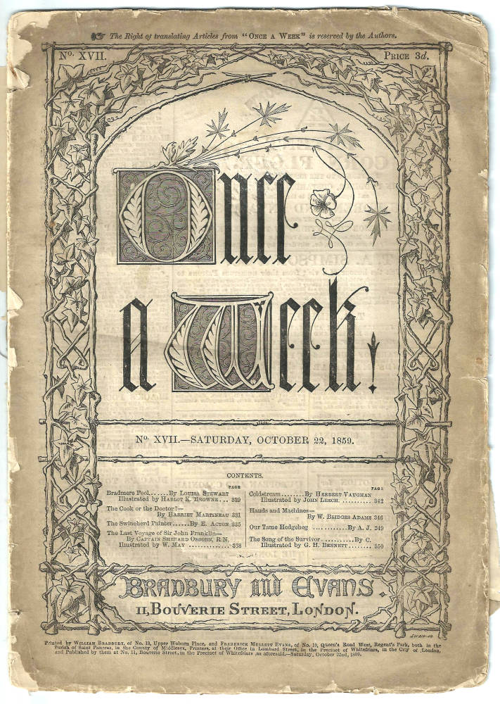
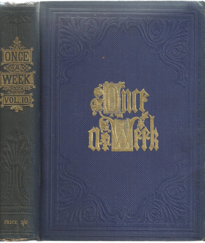
Two covers for Once a Week: Left: Limp paper binding on low-grade paper of the weekly issue. Middle: Blue cloth, with gilt lettering of the bi-annual issue, which was printed on good quality paper and sold as a gift-book in an embossed blue cloth with gilt lettering. Right: The plain cover of the richly illustrated London Society [Click on these images for larger pictures.]
The weekly issue of Once a Week was remarkably low-key. Small in format (9¾ x 7 inches) and sold at 3d, it contained 18–20 pages of dense columns of text with 5–7 interpolated wood-engravings which were printed using electrotypes at the same time as the letterpress. The paper was of low quality, and the relatively few survivors of this surprisingly delicate publication show signs of friable degeneration. Its front cover was embellished with a traditional rustic bower in the style of Germanic illustration, and there is a concerted effort to give it a visual impact that goes beyond the limitations of its inexpensive production.
The half-yearly, on the other hand, was a much grander affair: containing some 725 pages, bound in royal blue cloth and sold for 7 shillings and sixpence, it is glamorous where the weekly is plain. We should also note that the paper in Once a Week’s half-yearly version is of a much higher quality than the sheets used in the weekly. This enabled the illustrations to be better printed. The bound version noticeably excels in the printing of saturated blacks that turn to grey on light-weight paper, and the illustrations are generally better defined in their second state. This improved quality is important because many of the critics who acclaimed the magazine as the finest illustrated journal of its time were only able to see the bound rather than the original issue (although it is important to remember that Forrest Reid’s assessments were indeed the result of looking at the unbound periodicals).
Parallel comments can be made of the monthly Good Words. Originally issued in a plain brown wrapper displaying a panelled design, containing 80 pages and sold at 6d, its half-yearly binding was in an embossed blue cloth with gilt devices on the spine and front cover. This second version of 750 pages became ever more luxurious, and went through several changes in style as the century progressed.
There were in short some significant differences between the ephemeral and more permanent issues. They were other contrasts too. The weekly and monthly numbers usually contained advertisements as end-matter, notably in The Quiver and The Cornhill Magazine. These notices linked the weekly or monthly publications to the topical world of business and consumption in which they operated. However, they did not appear in the bound-up issues, which were intended to last and were not an appropriate setting for a method of selling that relied on immediacy and revision.
Audiences, class, and gender
The variations in presentation and content had important implications for the ways in which the periodicals were read, when they were read, and by whom. The mainstream illustrated literary magazines were always aimed at a large bourgeois audience, but their physical characteristics had important implications for their site of consumption, and for the gender of their readership.
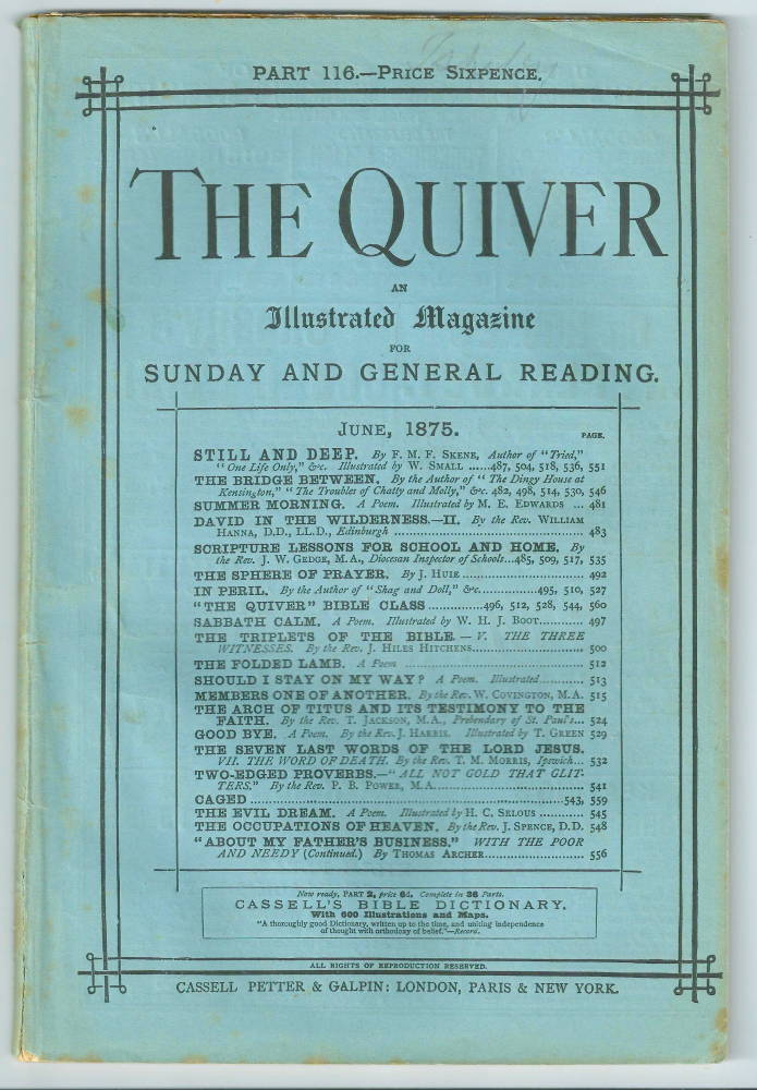
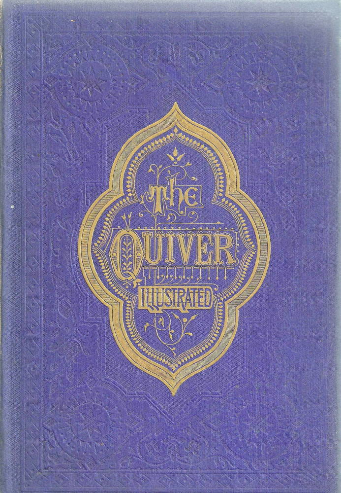
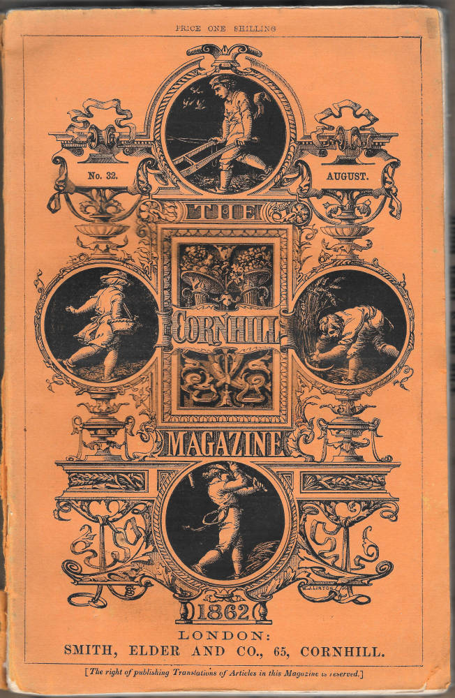
Two covers for The Quiver: Left: Limp paper binding on low-grade paper of the weekly issue. Middle: Blue cloth, with gilt lettering of the bi-annual issue, which was printed on good quality paper and sold as a gift-book in an embossed blue cloth with gilt lettering. Right: The cover of the Cornhill Magazine [Click on these images for larger pictures.]
Though pitched at both men and women, and containing written and visual material that had universal appeal, it is quite likely that magazines such as The Cornhill Magazine, The Quiver and Once a Week, were initially issued in a portable form so as to appeal to a male readership.
In particular, they could be read by middle-class men as entertainment on railway journeys, typically on a commute from home to work or journeying to a meeting, in cabs, and (most importantly of all) in the work-place itself. Small, light, and easily contained in a pocket, these were inexpensive publications that could be purchased from one of the platform stationers or corner-street newsagents that were appearing in the 1860s, read on the journey, kept for a quick scan at lunch-time, and perused on the way home. Varying in price between 3d (Once a Week) and a shilling (The Cornhill Magazine), they were cheap enough to be purchased on a regular basis and left behind on the train or otherwise discarded they once had been read.
Produced by industrial processes, the magazines of the 1860s catered for a class of readers whose lives were bound by patterns of activity and employment that were themselves the product of industrialization and economic expansion. The publishers, George Smith, Alexander Strahan, Bradbury and Evans, the Hogg brothers and all of those engaged in the trade were able to exploit this dynamic market. There were detractors, however. The rapid consumption of written and visual material was regarded by some contemporaries as yet another example of the degradation of culture – of words and images consumed by what was snobbishly regarded by the professional and privileged elites as an under-educated class of business-men, white-collar workers, and others engaged in trade.
Among the more outspoken critics, predictably, was John Ruskin. Ruskin deplored the consumable nature of contemporary magazines, arguing in Ariande Florentina(1876) how rapid production and consumption were eroding taste. His particular target was The Cornhill Magazine. Widely regarded as the most impressive of the magazines, Ruskin reviles it for its appeal to commuters:
[The] woodcuts [appearing in this journal] are favourably representative of the entire illustrative art industry of the modern press, industry enslaved to the ghastly service of catching the last gleams in the glued eyes of the daily more bestial English mob,— railroad born and bred, which drags itself about the black world it has withered under its breath, in one eternal grind and shriek,— gobbling,— staring,— chattering,— giggling,— trampling out every vestige of national honour and domestic peace, wherever it sets the staggering hoof … incapable of reading, of hearing, of thinking, of looking,—capable only of greed for money, lust for food, pride of dress, and the prurient itch of momentary curiosity for the politics last announced by the newsmonger, and the religion last rolled by the chemist into electuary for the dead [p.267].
Characteristically excessive in its approach, Ruskin’s moralizing is a commentary on contemporary society as well as its periodicals, and it is interesting to note that he dismisses an audience that must have been well-educated as a ‘mob’. But rapid consumption was only part of the magazines’ engagement with Victorian culture. Once they were re-issued in the bound versions there was a distinct shift from the male domain of middle-class work to the female space of home. The ephemeral versions were cheap, light, read and glanced at during the course of a working day; but the increased weight of the re-issued journals re-positioned them as artefacts to be perused at the fireside or propped up on the table. Their shift from male to female domains is further marked by the excision of advertisements (which linked them to the world of business) and by the adoption of a decorative casing which invariably included gilt edges and gilt decorations on the upper board. This re-packaging made them into varieties of gift-book, the ornamental publications that were traditionally associated with a female readership. Like gift-books the journals could now be placed neatly on a book-case and used as ornaments as much as reading-matter: a process that moved them from the dynamic and untidy world of the ephemeral magazine to the stable domain of home. They also had an increased durability, converting them into books to peruse over a period of time and shared, where appropriate, with children.
We can see, in other words, how publishers maximized the journals’ selling potential by issuing what is essentially the same material in two gender-marked domains, one for the busy middle-class man, and one for the middle-class wife. Simply by varying the mode of issue they exploited their markets to the full. This model also had the added advantage of being both focused and open-ended; though modified to reach its distinct audiences, it could adapt to impromptu reading situations, and was never exclusive. Women might read the periodicals on the train or in some other setting; and men might read their heavier pages in the bound-up versions when they came home from work.
Audience, class, and function
The physical size of illustrated magazine is a clue as to the reading venue in which it was supposed to be perused. The small, portable format of Good Words, Once a Week, The Cornhill Magazine, The Quiver, London Societyand The Argosy meant they could be consumed anywhere, but others, in the form of broadsheets and quartos, were definitely designed for home consumption. This partly corresponds with a gender division – men for work, women for home – but it also expresses varying subject-matters.
The heavier, literally larger periodicals, such as The Leisure Hour, The Sunday Magazine and The Sunday at Home were all large-scale, Evangelical magazines that could only be enjoyed in a domestic setting; none of them fits easily in a pocket, and their physical scale almost compels the reader to engage with the quiet reflection that is demanded by their pious content. The periodicals’ material format might thus be interpreted as the physical embodiment of their contents, influencing, if not always determining, the settings in which they should be viewed.
There was a class dimension at work in this arrangement too. The small, portable magazines responded to work-patterns that accommodated periods of reading; designed for a bourgeois audience, they responded to opportunities for leisure, sometimes in the work-place itself. However, those intended for the working-classes are noticeably larger, the sort only to be read in the reader’s own time. The Band of Hope Review is a good example of a magazine only fit for home-consumption, and so is the broadsheet, The British Workman.It was reported of the Workman that labourers met to read it at the fireside or in non-alcoholic drinking houses, but it is not likely that a labourer working in the field could bring out such a large, clumsy sheet and read it during his tea-break.
Life after death: illustrated periodicals in the twentieth century
Illustrated periodicals appeared in their own time in two distinct versions – as ephemera and as gift books – but in the first three or four decades of the twentieth century they were resurrected in another form. In addition to the survivors, many magazines were cut up for their illustrations. These images were mounted on card and treated as works of art in their own right. Freed of their moorings in dense columns of text or facing pages of writing, they were converted from illustrations into fine prints.
This procedure, known as ‘cut and mount’, was advocated by Forrest Reid in his influential study of 1928. Reid’s interest was purely in the illustrations (which he always refers to as ‘drawings’), and he suggested that the best way to appreciate them was to create a new context, lifting them out of the distractions of the letterpress and freeing the viewer from the chore of wading through thick tomes. As he explains in Illustrators of the Eighteen Sixties:
The magazines present ... a problem [my emphasis]. They are essential to a collection that pretends to any degree of completeness, but on the other hand they take up a great deal of room, and it is extremely tedious to have to turn over several hundred pages for the sake of perhaps a dozen, perhaps only two or three, drawings. To those whose shelf room is limited the temptation to extract the prints worth extracting becomes almost irresistible ... Not only will he be better able to classify his drawings, but the drawings themselves will look much better when mounted separately on white boards than when wedged between unattractive slabs of letterpress [p.11].
This procedure was adopted by numerous collectors, who converted themselves from hobbyists into connoisseurs simply by cutting out some images and mounting them on card. Several large collections were formed and were given to institutions in the United Kingdom and elsewhere. Reid gave his portfolio to the Ashmolean Museum, Oxford, and others can be viewed in England in the Barber Institute, University of Birmingham; Birmingham City Art Gallery; and The Fitzwilliam Museum, Cambridge. Aberystwyth University, Wales, and the Hunterian Gallery, University of Glasgow, Scotland, also have large collections. The National Gallery of New Zealand has a collection, and there may be others, undocumented, elsewhere.
In each of these collections we can see examples of meticulous work, with engravings mounted on card and carefully labelled with their dates, titles, and authorship. Reid opened up a world of collecting and connoisseurship, converting dusty old periodicals into a source of fine art. His intentions were honourable ones, but the end result, as charted by Robert Meyrick (p.179), was disastrous. Reid wanted to preserve the best of British art (as he saw it) by rescuing the fine illustrations from their journals; but the effect, to use his own term, though one only added as an afterthought, was a matter of ‘vandalism’ (p.11). Without doubt, his acolytes destroyed many of the remaining weeklies and monthlies that were still surviving in the 1920s and 30s, and were principally responsible for breaking up and dispersing many of the bound volumes.
Whatever was surviving at the end of the thirties was further subject to the privations and destruction of the Second World War. Unwanted books were pulped in order to facilitate the production of the utility paper used in new publications, and Victorian periodicals, by now out of fashion, were prime targets for recycling. Whatever was missed by the British Government was vulnerable to enemy action, and although it is difficult to quantify the scale of destruction it is quite likely that numbers of magazines were destroyed when the Nazis attacked the primary British cities – burning collections in private houses, in libraries where they were still in situ, and in the premises of long-established publishers and booksellers such as Bradbury and Evans (by now Bradbury & Agnew), whose archives in Bouverie Street were the victim of a direct hit.
These factors influence modern availability. The Cornhill, Good Words, Once a Week and The Quiver can still be found, at least in bound volumes; and so can The Leisure Hour. However, there are barely any surviving copies of The Shilling Magazine, The Dark Blue, Belgravia, The Argosy, and The Churchman’s Family Magazine. What was once entirely popular and populist in effect has now become the province of the research library and the collector with unlimited resources.
Works Cited
Cooke, Simon. Illustrated Periodicals of the 1860s. Pinner: PLA; London: The British Library; Newcastle, Delaware: Oak Knoll Press, 2010.
Goldman, Paul, and Cooke, Simon. ‘Introduction’. Reading Victorian Illustration, 1855–1875. Eds. Goldman and Cooke. Burlington, VT: Ashgate, 2012, pp.1–11.
Leighton, Mary Elizabeth & Surridge, Lisa. ‘The Plot Thickens: Towards a Narratological Analysis of Illustrated Serial Fiction in the 1860s’.Victorian Studies 51 (2008): 65–102.
Meyrick, Robert. ‘“Spoils of the Lumber Room”: Early Collectors of Wood-Engraved Illustrations from 1860s Periodicals’. Reading Victorian Illustration, 1855–1875. Eds. Paul Goldman and Simon Cooke. Burlington, VT: Ashgate, 2012, pp.179–200.
Reid, Forrest. Illustrators of the Eighteen Sixties. 1928; reprint, New York: Dover, 1975.
Ruskin, John. Ariadne Florentina. 1876; rpt. Orphington: George Allen, 1890.
Last modified 8 January 2024