
Want to know how to navigate the Victorian Web? Click here.
Introduction
any of the periodicals of the mid-nineteenth century were set up by an exceptional individual who used it as a business opportunity and a personal utterance. The Cornhill Magazine was the brainchild of George Smith of Smith, Elder; Thomas Bywater Smithies created The British Workman; and Good Words and Good Words for the Young were presented, as organs of belief, by Alexander Strahan. The Quiver(1861–1926) is yet another of these idiosyncratic journals. It was established in 1861 by John Cassell (1817–65), a self-made man and proponent of Evangelicalism and the Temperance Movement. Cassell’s earlier periodicals were intended for the labouring poor, and The Quiver, though offered at a middle-class rather than a proletarian audience, was essentially another piece of didacticism.
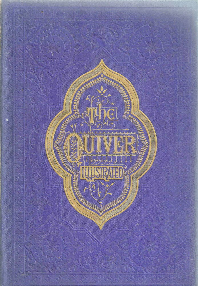
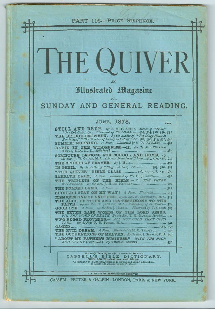
Left: The light blue paper binding for the magazine’s monthly issue. Right: The elaborate binding for the half-yearly issue [Click on these images for larger pictures.]
Simon Nowell-Smith has suggested that its immediate model was the ‘semi-religious’ journals (p.59) that were popular in America, and there is no doubt that Cassell began to plan The Quiver when he returned from a trip to New York. The magazine quickly took shape and under the publisher’s influence it was firmly focused on the teaching of morality and the promotion of faith. This aim was announced in the subtitle, which proclaimed its intention to work in ‘defence of biblical truth and the advancement of religion in the homes of the people’. It also set out, as defined in its first prospectus, to attempt to change its readers’ hearts and minds, and bring about their ‘intellectual, moral and spiritual improvement’.
Many of its texts are indeed religious and moralizing, yet The Quiver also published literature in the form of sentimental poems along with some middle-brow fiction. Mrs Wood’s (Ellen Price’s) The Channings appeared in 1861–62, and this was followed by the same author’s Mrs Halliburton’s Troubles (1862) and William Allair (1863).
Not quite sure of its pitch, and veering between sensation fiction and advice on how to pray, in its original form The Quiver sat awkwardly between Once a Week and Good Words. Sold at a penny and issued weekly, it was aimed at a wide bourgeois audience but never reached the elite readerships of its principal competitors. As Goldman explains, its appeal was ‘lower down the social and educational scale’ (Victorian Illustrated Books, p.38) than that of any of the prime periodicals. However, the magazine’s tone, content and orientation were changed in 1864, following a time of uncertainty in its fortunes. Seemingly perpetually threated by business problems that were the normal state of affairs for the unworldly Cassell, partners in the company of Cassell, Petter and Galpin re-launched his creation as ‘An Illustrated Magazine of Social, Intellectual, and Religious Progress’: a more liberal regime than before, and including bold illustrations in black and white.
The Quiver’s format and illustrations
erbert George Bonavia Hunt (1847–1917) was the first editor of the resurrected journal (replacing John Willis Clarke) and under his direction there were numerous changes. These were informed by a greater awareness of markets and market orientation, by an attempt to boost The Quiver’s appeal, and by an effort to re-define its identity. This fresh start was inaugurated in a ‘New Series’ launched on September 21 1864, and improvements and changes were intensified following Cassell’s death in 1865.
The weekly issue was continued at the price of one penny, but the magazine also appeared in a monthly, sold for sixpence. Production values in both formats were higher than before; better paper was used, it was more expensively printed, and within the average 15 or 16 pages that appeared each week there were usually two full-page designs and sometimes a single illustration occupying a quarter or half-page. A large design normally appeared on the first page within the front cover, a proleptic image intended to catch the reader/viewer’s attention and persuade him or her to read on. Sold on a Saturday, it catered for the leisure hours enjoyed on Sunday – a market sharply contested by The Sunday Magazine and Sunday at Home.
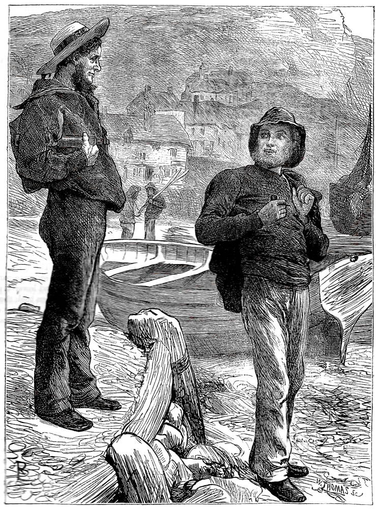
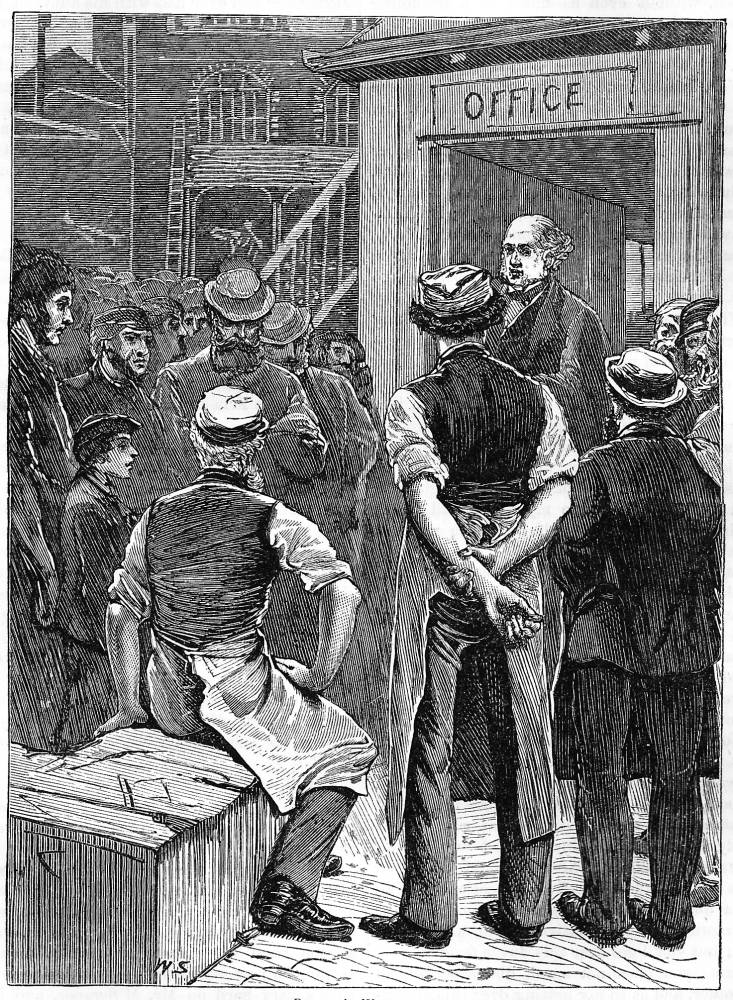
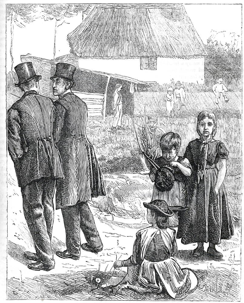
Left to right: (a) ‘What, Bob, off again’? by Robert Barnes. (b) ‘There’s no help for it’ by William Small. (c) Other People’s Windows by George Pinwell. [Click on these images for larger pictures.]
The magazine underwent another change in the early seventies, particularly in the format of the monthly. Developing the earlier version, this was presented as a densely-printed journal with 80 pages and seven or eight illustrations. The effect was more luxurious than before, with a light blue paper wrapper and a series of full-page designs. Its interior, with two closely printed columns and extensive advertising matter front and rear was clearly modelled on Good Words, which similarly presented 80 pages and an average of eight illustrations. The publishers also issued half-yearly volumes printed on toned paper, with better quality printing than in the usual weekly or monthly issue; these were bound in royal blue, with an elaborate gilt mandorla on the front board.
All of these formats – weekly, monthly and half-yearly – were put to good use presenting illustrations by Arthur Boyd Houghton, William Small, Robert Barnes, F. W. Lawson, George Pinwell, and a number of others. These artists visualized the magazine’s miscellaneous contents and were deployed, initially under Hunt’s direction, to play to their strengths. Pinwell provides a number of characteristically hard-hitting designs which materialize the journal’s representation of the life of the poor; Goldman regards them as amongst his best contributions to periodical literature (Victorian Illustration, p.120). A powerful image, which points to the utter distinction of class, is embodied in his response to Other People’s Windows (The Quiver, 2 February 1867, p.305), showing the difference between the ranks in a dramatic contrast between the turned backs of the respectable and the baffled gaze of the poor. Robert Barnes is more generous in illustrations such as ‘What, Bob, off again?’ (1869, ‘toned paper’ half-yearly edition, p.377), a sentimental exchange between two sailors. Also noteworthy are visualizations of poems, notably ‘By the Ravensbourne’ (1869, p.396) by S. L. Fildes in an austere outline style, and numerous others by Mary Ellen Edwards (who signed her plates as ‘M.E.E.’). J. D. Watson (1869, p.259) offers some fine work, and so does William Small, whose vigorous drawings depict urban living and everyday life. These illustrations were collected in Idyllic Pictures, a gift-book compendium issued by the publishers in 1867, and now the rarest of all Sixties gift-books.
Speaking only of the magazine, however, the effect is widely varied and heterogenous. Hunt and his team of sub-editors did not unify the journal as a whole, with wide disparities in the quality of the designs and a sometimes glaring dissonance between the text and its illustrations. It was nevertheless for a brief period (1865–69) a serious competitor to Good Words and The Cornhill Magazine. John Cassell chose the name ‘The Quiver’ in order to suggest variety, ‘long arrows and short arrows … all coming from this quiver of ours’ (Nowell-Smith, p.59). Not all its arrows strike true, but the magazine remains an important periodical, and one that repays further investigation.
Works Cited and Sources of Information

Cooke, Simon. Illustrated Periodicals of the 1860s. Pinner: PLA; London: The British Library; Newcastle, Delaware: Oak Knoll Press, 2010.
Dictionary of Nineteenth Century Journalism.Ed. Laura Brake. Gent: Academia Press, 2009.
Goldman, Paul. Victorian Illustrated Books: The Hey-Day of Wood-Engraving. London: The British Museum, 1994.
Goldman, Paul. Victorian Illustration: The Pre-Raphaelites, the Idyllic School and the High Victorians. Aldershot: Scolar, 1996; rev. ed., Lund Humphries, 2004.
Nowell-Smith, Simon. The House of Cassell, 1848–1958. London: Cassell, 1958.
Reid, Forrest. Illustrators of the Eighteen Sixties. 1928; New York: Dover, 1975.
White, Gleeson. English Illustration: The Sixties, 1855 –70. 1897; rpt. Bath: Kingsmead, 1970.
2 May 2013