

he Yellow Book is the best known of the ‘little magazines’ of the 1890s and is widely regarded as the most characteristic journal of its period. Acting as a mouthpiece for the values of the Decadence, it was a showcase for writers such as Henry James and Richard Le Gallienne, and an exhibition space for the illustrations of Aubrey Beardsley and the Birmingham School, the paintings of Walter Sickert and other artists of the late Victorian avant-garde. Set up by Beardsley and Henry Harland as art and literary editors and published by the forward-looking John Lane, the publisher most associated with the 90s, it was designedly provocative and iconoclastic, anti-establishment, and aimed at enlightened bourgeois audiences. As Beardsley explains in a letter to Robert Ross, it was intended as an antidote to ‘conventional magazines’ and an opportunity for those who could not otherwise ‘get their best stuff’ published because it was ‘a little risqué’ (Beardsley, Letters 61). A writer in the New York Times is even more direct, noting how the journal was ‘a “cheeky” performance, to be appreciated only by the dilettante, and not written for Philistines …’ (23).
The pitch was ambitious, but in reality the performance much weaker. The written material was sometimes tame, falling short of the daring intentions, and the circle of buyers relatively small. Offered as a quarterly and running for only 13 volumes (April 1894–April 1897), The Yellow Book ended abruptly with no mention of its impending termination; by the end of its issue its initial popularity had declined sharply, had poor sales, and was unsustainable. This was not, however, an unexpected outcome. Its appeal had been fatally damaged only a year after starting in April 1895, when Oscar Wilde was arrested: the press reported that he was carrying a copy of The Yellow Book when he was apprehended, and the periodical was immediately damned through an imagined association with Wilde and his ‘depravity.’ Lane’s offices in Vigo Street were attacked by a mob and Beardsley, who was supposedly one of Wilde’s circle, was forced to resign as Art Editor after just four numbers. These were disastrous consequences, based on public ignorance: the book under Wilde’s arm was not The Yellow Book but a French novel, Pierre Louÿs’s Aphrodite (May 80); Wilde never contributed to the periodical, and disliked it; and there was only antagonism between Wilde and Beardsley. Still, it was enough to damage the journal’s reputation. Valuable contributors declined to contribute and it became more conventional as it attracted fewer top talents.
The Yellow Book remains, nevertheless, a complex and contentious publication, with modern studies focusing on the literary rather than the artistic elements. It has been studied at some length by Lorraine Janzen Kooistra and Dennis Denisoff in their outstanding collection of resources, The Yellow Nineties Online – a detailed account which places the magazine in the context of other periodicals of the period such as The Savoy, which was founded as a rival to Lane’s periodical. However, much remains to be said about The Yellow Book’s visuality and the part it played in establishing the magazine’s identity, while projecting its radical aesthetics. Of special interest are the bindings. These are made up of two components: their yellowness, which did not change, and their imagery, which took the form of different designs, by a variety of artists for each of the issues. The process of publishing those bindings, and the economics of their production, are also important issues.
Why Yellow?
The Yellow Book's material form was unique, marking a difference with contemporary and long-established magazines. Bound in solid card boards and cloth rather than limp covers, as was usually the case with other periodicals until they were collected in half-yearly volumes, it was framed as book rather than a journal. Entitled a ‘book’ and endowed with the physicality of a more durable publication, it was designed to defy classification and elide the difference between the ephemeral and the substantial; as one critic observes, it had a ‘hybrid’ status (Doran 48). This approach made it eye-catching and novel, a provocative stand-out from the crowd of competitors; but the most important element in positioning the magazine was the livid yellowness of its binding, which was carefully chosen by Beardsley and Harland (Mass 61). ‘Why yellow?’ Israel Zangwill inquires, answering his own question with the observation that the reason for the ‘yellowness of the Yellow Book is not easy to discover’ (319). Nonetheless, it is possible to recover some of the editors’ reasons for deploying their distinctive palette.
First of all, yellow had the visual impact of a bright colour: noted for its ‘flaming’ intensity (Jackson 46), it completely dominated the booksellers' windows when it first appeared. As J. Lewis May reflects, ‘I filled the window of the little shop [of Lane and Co] in Vigo Street … with Yellow Books … creating such a night glow of yellow … (74). This ‘vivid splash of colour’ (Mass 61) was exactly the effect that Beardsley and Harland wanted to create; indeed, Beardsley had projected this sort of impact in his Prospectus, showing a woman perusing a resplendently yellow selection of tomes, queasily illuminated by the gaslight, in the street display of a bookshop.
Such visual outspokenness demanded acknowledgment. Some thought the covers ‘hideous’ (The Nation 340), being ‘wondrous ugly’ (Vanity Fair 240) or even ludicrous, a combination of ‘the yolk of an egg’ and a ‘dandelion’ (New York Times 23); but for others the binding had a refreshing intensity and individuality, as if the ‘sun had risen’ (May 74). The Yellow Book was a sharp contrast with other literary magazines, and seemed dynamic and new when compared with the liveries of The Cornhill Magazine (orange), The Quiver (light blue), Good Words (brown) and Once a Week (a plain white wrapper).
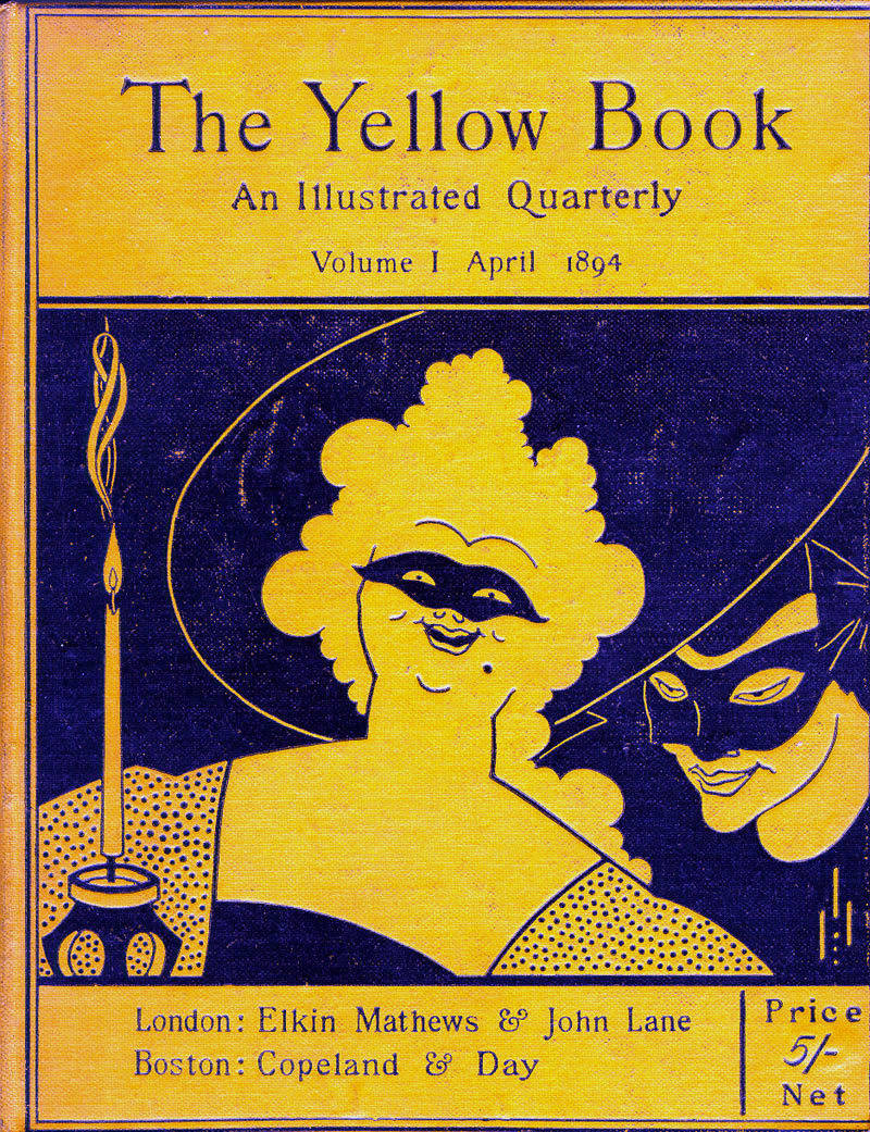
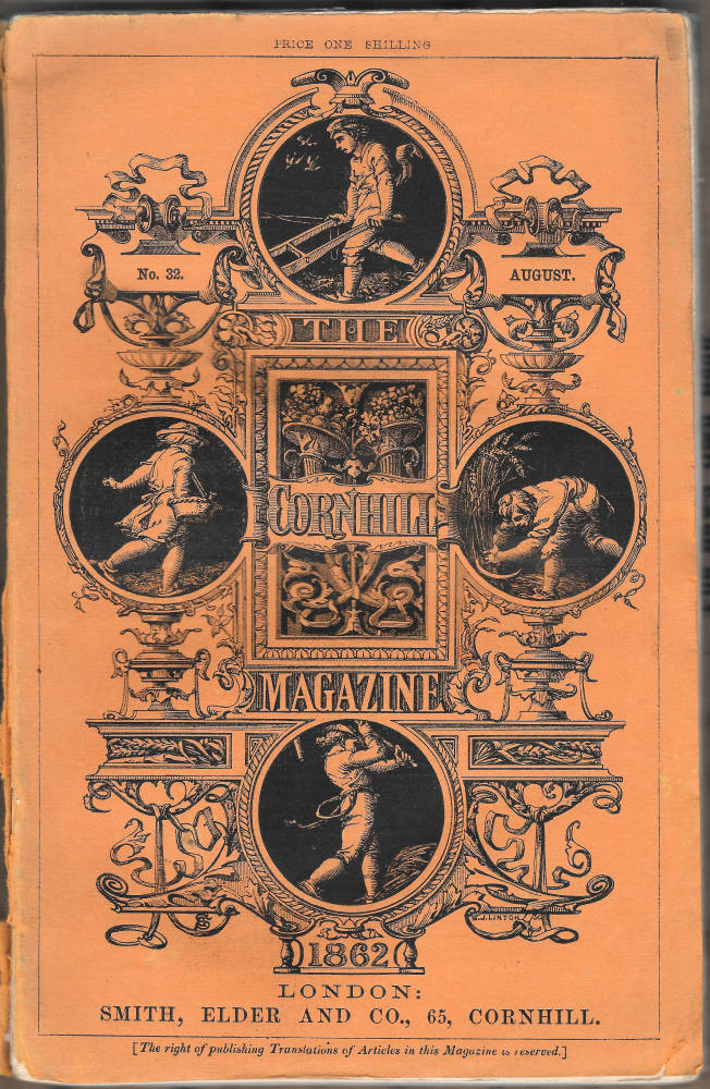


The colour-coding of the age: (a) The Yellow Book, volume 1; (b) The Cornhill Magazine; (c) Good Words; (d) The Quiver.
In this sense, yellow was a marketing ploy, a bright colour to disrupt the conventionality of traditional periodicals and position the journal in a novel space. But yellowness was much more than a pitch for sales; more especially, the magazine was branded in this way because the colour acted as a polysemic sign, and forged multiple associations with a range of meanings. Its symbolism has been conjectured at some length.
The magazine was certainly issued in yellow because this was believed at the time of publication to be the colour of modernity, giving rise to the concept of ‘the yellow nineties.’ Richard Le Gallienne (who contributed to the journal) sums up the significance of yellowness: citing Andrew Lang’s yellow fairy book, trends in home decoration, cheap, ‘yellow back’ fiction, and the preference for yellow in modern posters along with other examples, he ponders on the colour as a ‘dominant’ presence in late Victorian art, literature, culture, and everyday life. This topical association was very much exploited by the editors, although their use of modern associations was used, more especially, as a means to connect The Yellow Book with French fiction of the period, which was bound in yellow boards. The magazine was thus linked with the outré novels popular among the coteries and advanced readers on the other side of the Channel. Zangwill explains the situation, noting how ‘Yellow paper is mostly used in France, and France happens to be the country whose literature is most modern and daring. Thus a subtle association has been created between [The Yellow Book] and the ultra-modern’ (320).
That ‘ultra-modern’ was further characterized as the Decadence, so that yellow became the sign of the magazine’s status as a champion of the ‘wicked’ (Weintraub 137) and wickedness as it was practised in late Victorian culture. Wilde had made this connection in The Picture of Dorian Gray (1891), in which Lord Henry corrupts Dorian by giving him a French novel bound in yellow – probably Joris-Karl Huysmans’s À Rebours (1884) – and the significance of yellowness as a symbol of Decadent corruption seems to have had currency by the mid-1890s when The Yellow Book first appeared. Wilde’s arrest when carrying a yellow book reinforced the notion, making the colour into a cultural code, a short-cut showing of arrogance, recklessness, intellectualism, political radicalism, hedonism, effeminacy, homosexuality and anti-bourgeois subversiveness of all kinds: these were the daring, anti-establishment behaviours and attitudes enshrined in the Yellow Book’s outrageously vibrant covers. The magazine set out to affront and challenge and did so with a literal brilliance by using the colour most associated with troublesome intellectuals and the dangerously liberal.
So much is clear, but it is also interesting to note that Beardsley and Harland used yellowness to carry messages that went well beyond the topicality of contemporary vice. Writing in 1845, Frédéric Portal describes yellow as ‘the signification of the revelation of divine love’ (17), but Beardsley and Harland chose the colour for anything but sacred meanings; rather, they adopted it as a sign of wide-ranging transgressiveness which deliberately placed the magazine, once again, outside the domain of respectability.
Weintraub suggests that its daffodil covers invoked the ‘décor of the notorious and dandified pre-Victorian Regency’ (137), the world of fops and sexual freedom: an association that intersects with public understandings of Wilde and his coterie of aesthetes. In fact, The Yellow Book's colour connoted all sorts of universal taboo-breaking: as Sabine Doran remarks, ‘yellow had been a colour that stigmatized sexual deviance [and in] the Middle Ages prostitutes were forced to wear yellow signs’ (53). This resonance is sounded in Beardsley’s first four cover designs, with their images of prostitutes, and there is no doubt that in using yellow the editors alluded to the free expression of sexuality. At the same time, yellow could present as the sign of a range of immoral behaviours. Havelock Ellis notes how it could stand for jealousy, envy, treachery, betrayal and adultery, the colour of Judas, traitors, felons, the promiscuous and heretics (‘The Psychology of Yellow’); and for Zangwill it was the ‘colour of shame and of shameless womanhood’ as well as an emblem of the racially marginalized, being used to label Jews in a ghetto (319). Yellow was a dangerous colour, and it was adopted for The Yellow Book because it defined another, more fundamental stratum of anti-conventional, unorthodox, iconoclastic behaviour, and reinforced the magazine’s stance as an insult to small-minded respectability.
Underpinning all of these connotations of topical and generic immorality was the concept of yellow as the signifier of rottenness and corruption. The colour of urine, vomit and bile, it embodied the ‘evil passions’ (Havelock) which supposedly originated in the liver – and might remind readers of the bodily functions. Moreover, the affronting of expectations was clinched by the editors’ playing on the association of yellowness with sensationalism. Yellow-backs were generally cheap imprints of Sensational fiction, with their emphasis on the transgressive and strange, and the term ‘yellow journalism’ was coined in America in the early nineties to describe the wild misreporting and distortions of facts to create a sort of parallel universe of warped realities.
Both of these extreme states of mind fed into the Yellow Book's identity, and gave it an alluring edginess, both appealing and repulsive, posing a dare to conservative consumers. At its most extreme, yellow was the sign of neurosis, insanity and evil. Bram Stoker’s Dracula (1897), an examination of the interface between the supernatural and psychology, was issued in a livid yellow cover, and the colour’s rancid associations had been voiced earlier in the 90s in Charlotte Gilman Perkins’s The Yellow Wallpaper (1892). Here, again, yellow is the sign of ‘modern’ horror and madness, where the narrator’s yellow decoration is ‘not beautiful,’ reminding her everything to do with ‘old foul … things.’ It would be impossible to read these texts without thinking, or at least making an unconscious connection, with Lane’s playfully subversive magazine.
In The Yellow Book, then, yellowness was used as an emblematic colour which played on all of these negative but tempting connotations, with due recognition of its role simply to make it stand out. Beardsley and Harland deployed colour to position the magazine, and many observers recognized their attempts to label the journal as taboo-breaking, insolent and challenging. Weintraub notes with unconscious irony (given that yellow is the colour of bile) that its reception was ‘jaundiced’ (137), and Holbrook Jackson sums up how readers ‘were puzzled and shocked and delighted’ by the magazine’s livid tone, which they immediately associated with ill-temper and ‘all that was bizarre and queer in art and life … naked and unashamed’ (46). Fortunately for the magazine, the only way to deal with the temptation of wickedness, as Wilde might suggest, was to yield to it.
The Covers’ Imagery: Beardsley to Reed
The Yellow Book’s yellowness marks it out as the avant-garde, and so do the designs featuring on its bindings. These were done by a mixture of new and up-and-coming artists: Beardsley (4); Patten Wilson (2); J. D. Mackenzie (1); David Young Cameron (1); Mabel Deamer (1); John Illingworth-Kay (1); Nellie Syrett (1); and Ethel Reed (2). With the exception of Cameron, who was mainly a painter, all were done by graphic artists engaged with poster-design and book and magazine illustration. Each artist produced designs for the front cover and spine and each contributed to the magazine’s projection of a set of values. The process was not consistent, however, and over the span of the 13 volumes the cover designs reflect the uncertainties and changes surrounding The Yellow Book's identity as it strove to reach out to its audiences.

Beardsley’s covers for the first four issues of the magazine.
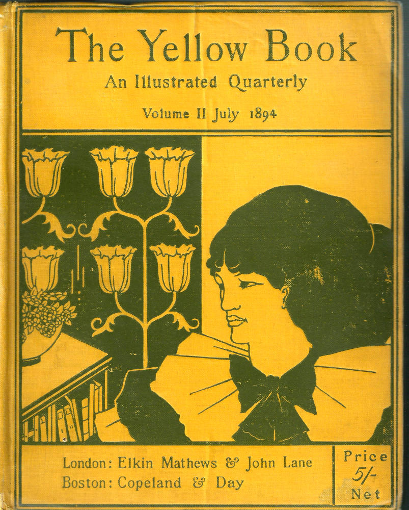
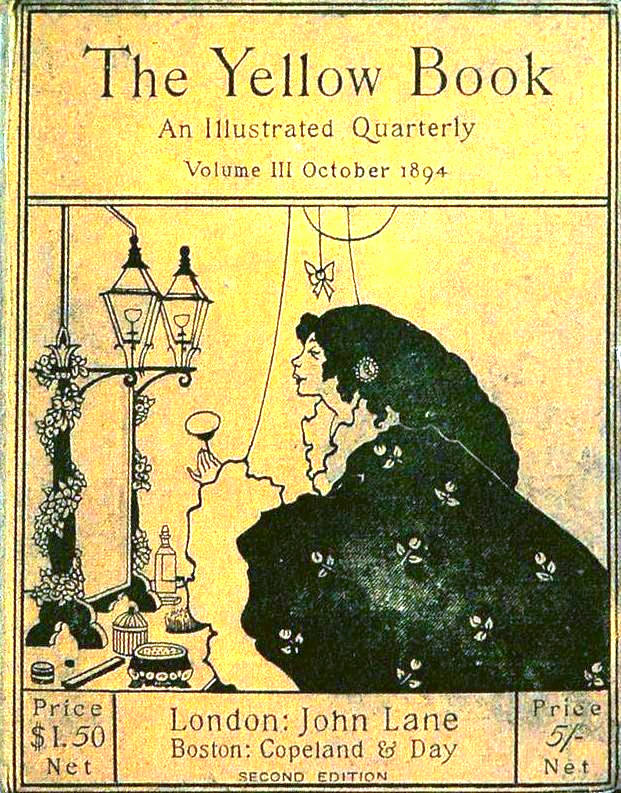
Beardsley’s four designs are provocative, asserting and exploring the implications of the magazine’s yellowness. All of them present versions of late Victorian modernity, a practice he carries over from his other bindings: for example, women are the prime subjects – in contrast to the masculine image appearing on the front cover of the more conventional Cornhill Magazine – and affirm the presence of the ‘New Woman’ of the 90s. In numbers two and three the scene is of two young females, one (2) in her library, while the other (3) depicts a self-assured debutante in her boudoir. To viewers of the twenty-first century the imagery is unremarkable, but for contemporary readers the presentation of self-confident women – one a thinker or at least a reader, and one shown in the private spaces of her bedroom who may be an upper-class escort – must have had a considerable impact. Here was Beardsley visualizing the social changes of the late-nineteenth century. Implicitly questioning Victorian patriarchies, he enshrines the magazine’s radicalism in the form of a gender re-orientation, making a direct appeal to independent woman while challenging the notion that forward-thinking is purely a masculine pursuit.
Beardsley reinforces this ‘shocking’ modernity (Jackson 126), ‘naked and unashamed’ (46), by dressing the two characters in the latest female fashions, aligning the magazine not only with modernity in the generic sense but with the ever-changing topicality of the modish, the fad, the craze, the sensation of the moment. Moreover, he clinches this confrontational up-to-date-ness by subverting sexual taboos.
Numbers two and three are outrageous; however, the opening number is the initial shock, with its image of two masked figures, one a man and one a woman. The facial expressions are enigmatic, with slanted eyes and ambiguous smiles, but the implication is clear: she is a ‘lady of pleasure’ and he is her client, having just whispered his proposal in her ear. This image links to the notion of yellow as the sign of promiscuity as the colour of prostitution, and Beardsley calculatedly challenges Victorian proprieties by confronting his initial readers with a women, Jackson remarks, ‘who smirked at the public,’ as she announces the magazine’s arrival as ‘newness in excelsis,’ unlike anything that ‘had been seen before’ (46). The magazine, Beardsley insists, will be a domain of pleasure, of eroticism, dominant women and playful men – a zone of leisure he also defines in the masque-like composition, with characters placed in either a theatre or a brothel, appearing on the rear board. Indeed, he develops his message in his fourth cover: no longer modern, in this image he depicts a neo-classical paradise, a mock-version of Frederic Leighton’s epic paintings of Arcadian fantasy in which a languorous woman takes a flower from a semi-naked, androgynous child.
The magazine’s modernity is registered, this time, in a calculated, satirical quotation of the tropes of Aestheticism. Invoking the traditions of Art-for-Art’s Sake, Beardsley aligns The Yellow Book not only with the latest (im) morality, but with the latest developments in aesthetics as they were expressed in the fascination with a self-referring Beauty as it appeared in Decadent literary and visual culture. In his covers, Beardsley insists, Art and the Beautiful are an end in themselves, even though they act illustratively to define the magazine’s values.
In so doing he foregrounds the modern by practising a ‘modern art.’ If The Yellow Book was to be viewed as new and modish, Beardsley understood that its art must itself be a new take, a stepping forward to position the periodical not only within the conventions of the Decadence but within the expanding outlines of the avant-garde. To do this, he offers cover designs which are his latest – and indeed the latest – version of British Art Nouveau as it stood in 1894–5.
Beardsley’s radical style is exemplified by his opening number. Composed of flattened and simplified forms described in a line which varies between the geometrical and the arabesque, the image projects the artist’s pared-down, dynamic treatment of the ‘New Style.’ Equally avant-garde is his use of absolute contrasts of black and what would be white in an illustration printed on paper, but are here rendered as an opposition of blocked masses and yellow voids. The cover for the second issue presents this spatial device and so does the fourth, which works on a juxtaposition of the open lines in the foreground and the blackness in the background. In adopting this approach Beardsley alludes to the style of the Japanese woodcut, so making another connection with the latest developments in British art.
Stressing formal newness as certainly as he emphasises the modernity of his covers’ subject-matter, Beardsley sets The Yellow Book on a distinct trajectory: contemporary purchasers were left in no doubt as to what sort of magazine they were buying. If the yellowness was not enough to insist on its identity as piece of provocation, the Art Editor’s bindings clinched the point.
Indeed, Beardsley’s covers are a direct introduction to the outspoken modernism of the earliest numbers, with the bindings acting as an introduction to the reproductions of paintings and drawings by leading artists – among them William Rothenstein, Joseph Pennell, Laurence Housman and Walter Sickert. The Yellow Book acts a showcase for the most advanced in modern art, and the same is true of much, if not all, of the writing.
Beardsley’s unique covers were largely instrumental in gaining the audiences the magazine needed to engage with this material, but his abrupt departure in 1895 meant the could not sustain the journal’s appeal. Without doubt, he would have continued in the same daring vein, and a surviving drawing shows that he planned to offer another of his own, perverse versions of neo-classicism – an approach he would immediate apply to his designs for The Savoy. For some critics, the loss of Beardsley meant that the magazine’s covers went into decline as they were taken over by other artists, and there is no doubt that the bindings for the remaining nine issues, are far less intense than the initial four. Nevertheless, a great deal of talent was employed to carry the brand forward; while not as striking as Beardsley’s work, these covers embody aspects of his original scheme and continue to promote the idea of the journal’s edgy modernism.
Beardsley’s appeal to the New Woman was privileged in several of the bindings. Taking over from Beardsley, Patten Wilson provides two designs (numbers 5 and 6) in which he expands the Yellow Book’s imagery of confident young women. For number 5 he depicts a reclining figure reading a book – an image in sequence with Beardsley’s design for issue 2; it might almost be the same girl, who, having taken a tome from the bookcase shown earlier, is now immersed in it. Wilson reiterates the connection between an advanced female readership and The Yellow Book, dressing his character in the fashionable kimono-style outfits of the period and adding small modish details such as her sandals and the striped sofa. The effect is elegant, again positioning the magazine as a sophisticated periodical for the most enlightened of readerships.
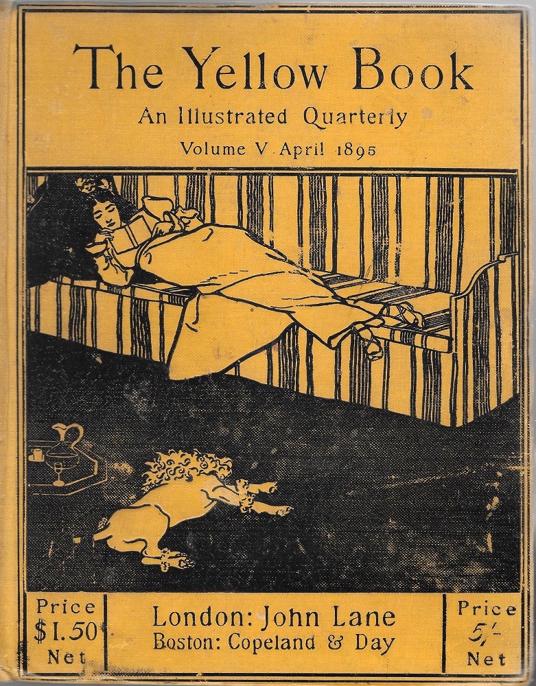
Patten Wilson’s cover for The Yellow Book, 5.
The appeal to modern women is again conveyed in designs by two female designers, Nellie Syrett and Ethel Reed. Syrett provides a striking cover for issue 11, showing three young women, essentially three identical Pre-Raphaelite beauties, excitedly looking at something in the sky. A reviewer in The Westminster Gazette thought the image ‘rather amusing’ (3) and described the open-mouthed figures as gobe-mouches (fly-catchers), but it is better read as a deliberate piece of punning intrigue: are they looking at the yellow sun, to encourage the reader to look at the periodical? Or is it an assertion of the vitality of young women, dispersing fustiness and tradition to symbolize The Yellow Book's attempt at novelty and newness? The vitality of youth is certainly promoted by Reed in her cover for number 12 in which the artist shows the profile of a young women bedecked with flowers and (it seems) looking into a flame-like form. As enigmatic as Syrett’s image, Reed creates a dynamic fusion of modernity and excess, combining newness and mystery, and inviting the reader to read on, just as Beardsley’s strange compositions, by turns erotic and sinister, invoked the viewer’s curiosity.
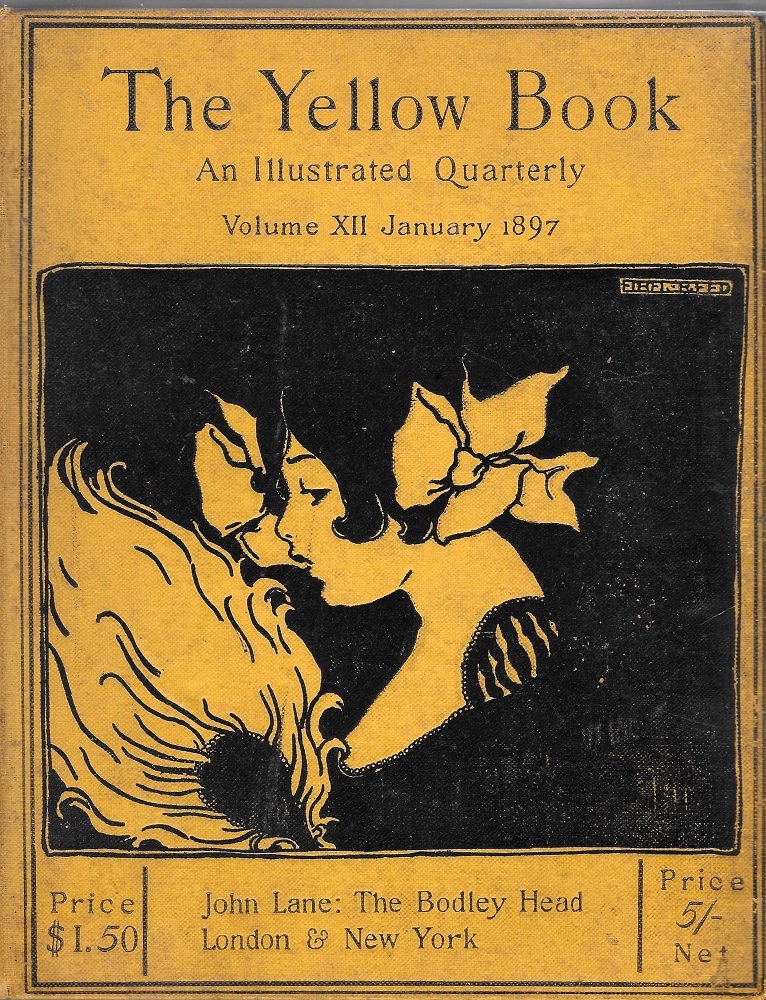

Left: Syrett’s design for volume 11 and Right: Reed’s for volume 12.
Post-Beardsley cover designers similarly worked on his quotations of modern art. In the cover for issue 6, for example, Patten Wilson alludes to Aestheticism and the influence of Japanese design by showing his female figure as a Japanese woman dressed in a kimono and holding a parasol; the mythological figure (a mermaid or merman) also links to contemporary art, this time to the neo-classical paintings of painters such as J. W. Waterhouse. J. D. Mackenzie likewise refers to Aestheticism’s notion of Beauty in his depiction of a bouquet of gigantic flowers (issue 7), and for number 9 Mabel Deamer presents a fairy riding on a butterfly – the creature most associated with Art-for-Art’s Sake as the moniker adopted by J. W. Whistler.
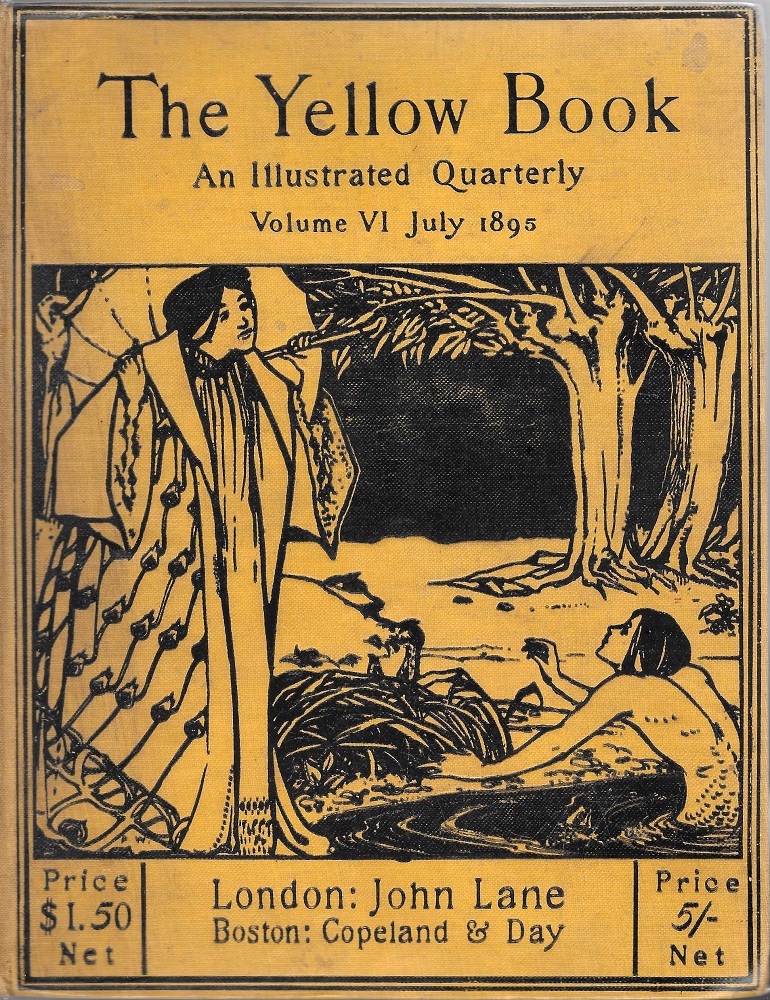

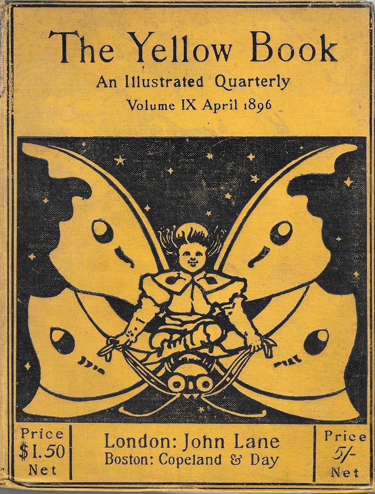
Left to right: a) Patten Wilson’s design for volume 6; b) Mackenzie’s for 7; and c) Deamer’s for number 9.
This sort of eclecticism makes multiple connections with the complex aesthetics of the 1890s, but all of the designers project the magazine’s modernity in the style of Art Nouveau. Continuing Beardsley’s focus, they embody the bold new idiom in a series of sinuous compositions. Sometimes the curvaceous line of Nouveau is applied to figurative subjects, such as David Young Cameron’s heraldic devices (8), Deamer’s butterfly (9) and Reed’s flowing burst of flame (12); in part representational and in part abstraction, all of these images mediate between the two. In at least two designs, however, the abstraction of Art Nouveau comes to the fore: John Illingworth-Kay of the Silver Studio provides a piece of pure newness (10) in the form of a typically organic Nouveau motif, an emanating flower composed of rhythmic, sinuous lines; and Reed goes even further in her abstracted composition of two fighting cockerels as patterns defined by the ‘whiplash’ line of the New Art (13).
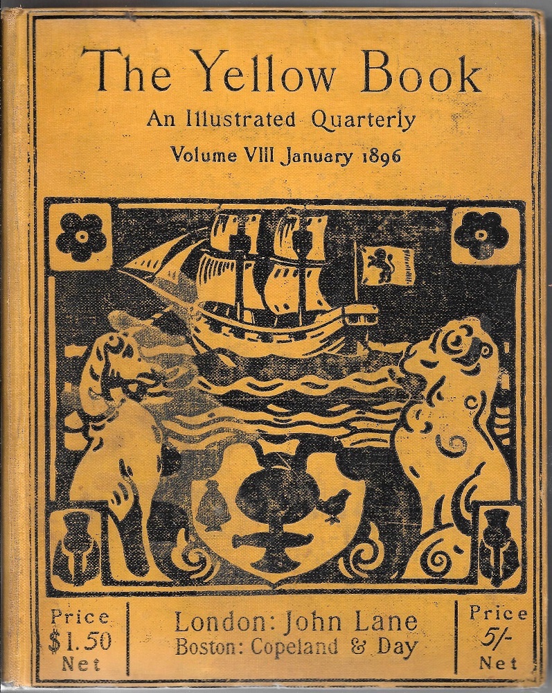
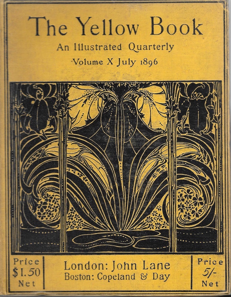

(a) Cameron’s design for volume 8; (b) Illingworth Kay’s for 10; and (c) Reed’s for 13.
These front covers stress the magazine’s aesthetic topicality, using art to promote its status, as Weintraub observes, as a periodical that acts as ‘a bridge between late Victorianism and the 20th century’ (136). This role is emphasised by the spines and by the designs on the rear boards, all of which are in the style of Art Nouveau.
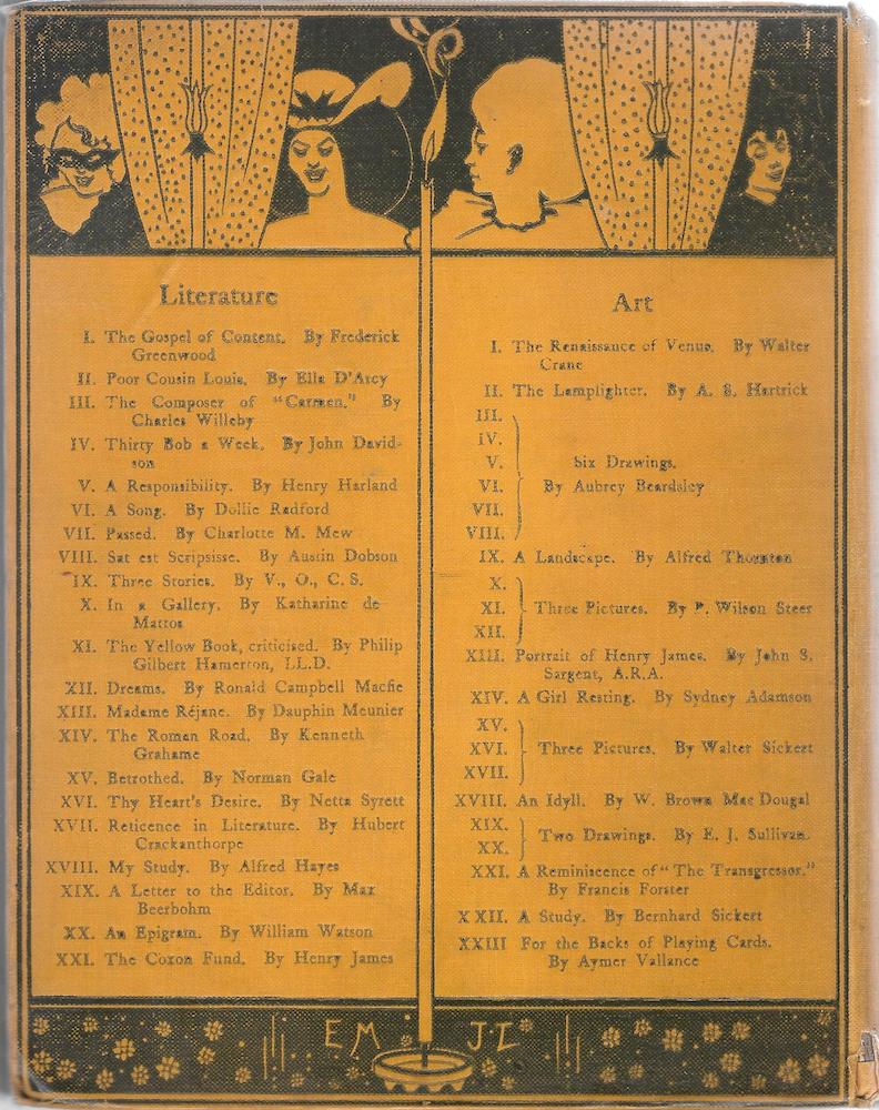
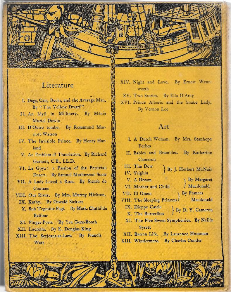

Spines and rear boards. (a) Beardsley’s design; (b) Patten Wilson’s; (c) a selection of spines, left to right, by Beardsley, Wilson, Deamer and Reed.
Yet there were many dissenting voices, and not every contemporary consumer was impressed with this sort of daring up-to-date-ness. With the advantage of hindsight modern scholars can position The Yellow Book as the epitome of its time, but for many of the original audience it was just another passing gimmick – an over-deliberate exploitation of trends in taste. So it is not surprising to find that it was often regarded as contrivedly novel and overstated, with contemporary reviews adopting a mocking, satirical stance. Always the mirror of its time, Punch embodied this scepticism in a series of parodies which mocked what it saw as the bindings’ faux-sophistication. ‘From the Queer and Yellow Book’ by an anonymous artist travesties the theatrical imagery of Beardsley designs (1895), while registering the connection with homosexuality that would lead to such difficulties; another, also in Punch, mocks the magazine’s un-British allusion to French fiction, calling it a periodical for ‘anglo-phobes.’
One of Punch’s parodies of Beardsley’s style.
Fighting Lane: Some Practicalities
Nevertheless, The Yellow Book was a sophisticated cultural artefact which, under the direction of Beardsley and Harland, manipulated its materiality to express its modernity. However, its success was limited: as noted earlier, it only ran for 13 issues and did not, it seems, achieve the circulation that was needed to make it profitable for the publisher. As a strong proponent of the avant-garde in art and literature, Lane had taken a risk in producing Harland and Beardsley’s project, and the impact of the scandal surrounding Wilde had a considerable impact on the magazine’s economic viability. A venture that set out to experimental and daring, a challenge to orthodox taste, The Yellow Book was ruined by the very conservatism it set out to defy.
Yet examination of correspondence in the Lane archives reveals that the magazine was never secure from a financial point of view. From the start, the publisher invested little in its new venture, seemed more willing to risk his reputation than his money, and lacked the business acumen it make resilient and able to withstand a down-turn. As Laurence Housman remarks, ‘Lane was always friendly’ but ‘not always business-like … Probably he was running his output on a small amount of capital’ (118). This situation meant there was little to pay contributors, and from the start The Yellow Book expected its artists and writers to articulate the latest trends, and to educate public taste, on a shoe-string.
Writing of the opening of the magazine in a letter of June 12 1894, Harland remarks on how the initial contributors would work for low prices because the journal was experimental (John Lane Archive), and because they wanted to work for a forward-looking publisher who could promote their ‘modern’ credentials. This was especially important given that many of The Yellow Book's artists were at the early stages of their careers, and needed advancement. In the words of David Young Cameron, who designed the front cover for issue 8, ‘It is such a pleasure working for you (Lane) that the matter of price is quite safe … I would rather work for you for less’ than the wages paid by ‘unsympathetic people’ (Cameron to Lane, 20 June 1896).
But how little is surprising. Each volume cost £200 to produce, and out of this amount the art-work cost £50; however, the richly illustrated nature of the magazine –with its combination of photogravure reproductions of paintings and drawings, and original graphic art in black and white – meant that individual contributors were very underpaid. At a time when at least £15 would usually be paid for a single design, a price carried forward from the 1860s, the Yellow Book artists received much less. Indeed, its fees were completely out of line with what we would call an ‘industry norm.’ For volume 3 Beardsley provided a cover design, a title-page and two designs: his fee for the work, not including payment for his other duties as art editor, was £15. Cameron charged £5 for his cover and title-page (issue 8, letter to Lane 24 December 1895), though John Illingworth Kay tried to gain a more substantial two guineas for his binding design (issue 10, letter to Lane, 13 July 1896).
This was the penalty to pay for appearing in a strikingly up-to-date, reputation-making periodical, and there is no doubt that the transaction was exploitative, with the publisher making sure that his ambitious young cast of talent was kept under economic control. Most, like Cameron, were willing to accept the situation for the sake of their careers, but relationships with Lane quickly soured when he delayed payments, seemed reluctant to pay, and forced his contributors to nag. Illingworth Kay was reduced to this position in the correspondence already mentioned, and Young’s exasperation is vividly conveyed in a series of letters which mark a transition from his original grateful praise of the publisher’s liberality to the irritated request that he pay up (1896–97). As Housman remarks, ‘cheques were sometimes long in coming from him, and when pressed … his response was more promise than performance’ (118).
The running of The Yellow Book was thus hindered by the publisher’s often difficult behaviour. Given this situation it is remarkable it managed to continue for even its short run, but during that time its covers of striking yellow and unusual designs were more than enough to visualize its radical values and help to promote the new art of the 1890s.
Acknowledgments
All material quoted from the John Lane Company Records, Harry Ransom Center, The University of Texas at Austin is reproduced with permission. Sincere thanks are also due to Nancy Jackson, the archivist in charge of the copies of the John Lane material held in the archive of City University, Birmingham. Ms Jackson facilitated visits and did valuable research to assist the preparation of this essay.
Links to Related Material
- The Yellow Book
- The Yellow Book: A Centenary Exhibition
- Another parody of Beardsley and The Yellow Book in Punch
- The Boom in Yellow (by Richard Le Galliene)
- Shades of Yellow: Representations of Change and Decay in Victorian Literature
Bibliography
Manuscripts
Copies of letters and other material held in The John Lane Archive, City University, Birmingham, U.K.
Primary Printed Sources
[Beardsley, Aubrey]. The Letters of Aubrey Beardsley. Eds. J. L. Duncan and W.G. Good. Rutherford: Farleigh Dickinson University Press, 1970.
The Cornhill Magazine (1860–1944).
Good Words (1860–1910).
Once a Week (1859–1880).
Perkins, Charlotte Gilman. The Yellow Wallpaper (1892); online edition at https://www.gutenberg.org/files/1952/1952-h/1952-h.htm
Punch (1895).
The Quiver (1861–1956).
The Savoy (1896).
Stoker, Bram. Dracula. London: Constable, 1897.
Wilde, Oscar. The Picture of Dorian Gray. London: Ward Lock, 1891.
The Yellow Book, issues 1–13 (April 1894–April 1897).
Secondary
Doran, Sabine. The Culture of Yellow, or the Visual Politics of Late Modernity. London: Bloomsbury, 2013.
Gallienne, Richard Le. ‘The Boom in Yellow,’ Prose Fancies (1896); see "Links to Related Material" above.
Ellis, Havelock. ‘The Psychology of Yellow,’ Popular Science Monthly 68 (May 1906). Online edition.
Housman, Laurence. The Unexpected Years. London: Cape, 1937.
Jackson, Holbrook. The Eighteen Nineties. London: Grant Richards, 1922.
May, J. Lewis. John Lane and the Nineties. London: Lane, 1936.
Portal, Frédéric. An Essay on Symbolic Colours. London: John Weale, 1845.
Weintraub, Stanley. ‘The Yellow Book: a Reappraissal,’ The Journal of General Education 16:2 (July 1964): 136–152.
‘The Yellow Book,’ The Nation (24 May 1894).
‘The Yellow Book,’ New York Times (19 August 1894).
‘The Yellow Book,’ Vanity Fair (19 April 1894).
‘The Yellow Book,’ The Westminster Review (21 January 1897).
The Yellow Nineties Online. Eds. Lorraine Kooistra and Denis Denisoff.
Zangwill, Isaac. ‘Without Prejudice,’ Pall Mall Magazine (6 May-August 1895): 319–320.
Created 20 June 2023